10 Fonts That’ll Be Popular With Designers in 2023
A new year is a time for reflection. And one thing that designers should constantly be reflecting on is whether their font choices have become too staid and formulaic. Don’t get us wrong: classic typography is classic for a reason, and there’s nothing wrong with returning to fonts that just—well, work—when they’re the most appropriate choice for a project. But valuing popular workhorses doesn’t mean you can’t stay alive to fresh possibilities. Discovering and experimenting with new fonts—whether new to the world in general or just new to you personally—is a great way to reinvigorate your practice and give you exciting new perspectives on your work.
Shillington is here to help. Running a graphic design bootcamp means we know a fair bit about type—so here’s a list of 10 popular fonts that more designers have taken note of lately.
Some are brand new, and some are old favorites given a new lease of life. But they’re all worth checking out, and some of them may be just what you need to kick your graphic design portfolio into gear in 2023.
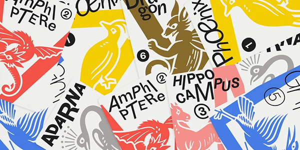
New from Monotype Studio’s Emilios Theofanous, Touvlo – which means ‘brick’ in Greek – captures the spirit of early British grotesque typefaces while letting its own lively personality and energy shine. With a total of 24 weights in three styles across three variable fonts, this zestful, modern interpretation of a classic genre is flexible enough to work well in even the most complex typographic layouts or unexpected and peculiar settings.
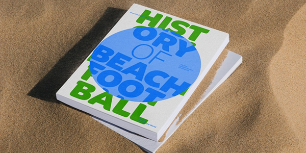
Binate combines the characteristics of a workhorse sans-serif and an elegant brush-inspired display style. Its apertures are crisp and rigid, evoking a utilitarian approach. But at the same time, experimenting with some of Binate’s lower hooks can help your designs look more approachable and friendly. Meanwhile, its impressive weight range makes it suitable for everything from tiny details on packaging to large formats such as billboards and posters.
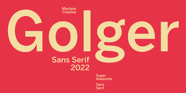
Golger Sans is a classic contemporary sans-serif, with bold weight stroke and a fun character, not least from its smattering of ligatures. Designed by Gilang Maulana, this font supports an impressive 100+ languages. A good choice for logo design, social media, movie titles, books, short and long texts, and for coupling with script fonts.
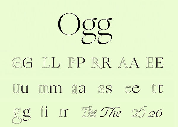
Ogg is a calligraphic serif superfamily designed by Lucas Sharp with the help of Connor Davenport, Wei Huang, Greg Gazdowicz and Noe Blanco. Its design was inspired by the lettering of 20th-century calligrapher Oscar Ogg, and the font captures the unique mix of calligraphic and typographic form Ogg achieved through his use of hand-carved pen nibs, brushes and white-out. It comes in five weights and a total of 10 fonts.

Neue Haas Grotesk evolved, in the late 1950s, into Helvetica. But over the years, designer Christian Schwartz believes Helvetica lost some of the features that made the original typeface so good. This digital revival is his attempt to set the record straight. With eight display weights, from Thin to Black, plus a further three weights drawn specifically for text, this is a versatile font for the contemporary world but with all the cleanness and legibility of the original.
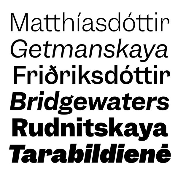
Garnett is a sturdy, contemporary grotesque infused with the affable quirkiness of 19th-century metal type. Designed by Connor Davenport, originally as part of an undergraduate thesis project, its sans serif design also incorporates a touch of American Gothic influence. The family is available in six weights with matching italics.
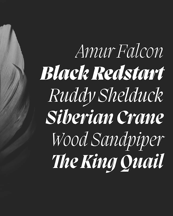
Migra is a serif font inspired by migratory birds, which aims to add sparkle and grace to any of your designs. It’s notable for its condensed proportions, with sharp and spindly serifs. Created by Valerio Monopoli, this font is available in eight weights and 16 styles, with 568 glyphs each, including gestural Italics and sundry special ligatures.
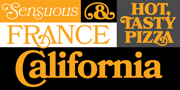
Designed by Mark Simonson, Bookmania is a fresh digital revival of the Bookman typefaces of the 20th century, which were known for their ornate swashes. Bookmania features a generous 680 swash characters and is a good choice for evoking a vintage 1970s look within your designs. This font is available in five weights, each with matching italics and small caps styles.
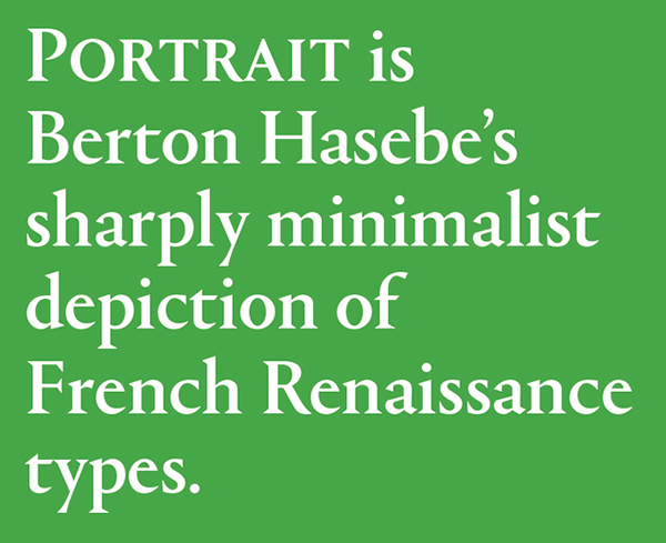
Portrait is a serif font designed by Berton Hasebe. A minimalist depiction of French Renaissance typefaces, such as Garamond and Granjon, Portrait marries classical proportions with triangular Latin serifs. Available in four distinct subfamilies – Portrait, Portrait Text, Portrait Condensed and Portrait Inline – it’s aggressive in its simplicity but nuanced in its details and covers a wide range of tones.
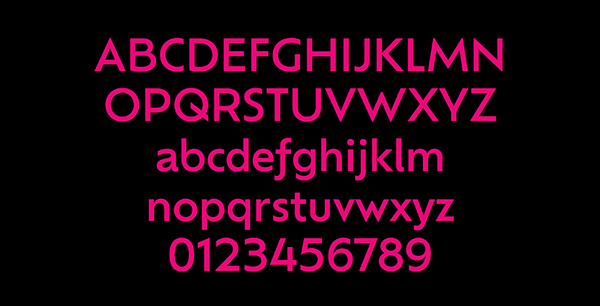
Ofelia is a geometric sans-serif font designed to perform well in any situation. This versatile family comes in two optical sizes, Text and Display, and the former contains five weights, ranging from Light through to Bold. Its overall geometric character speaks in a contemporary neutral voice, while earmark glyphs provide a gestural touch. These fonts are equipped with small caps, old style and tabular figures, and alternate versions of ‘a’ and ‘l’.
There you have it, 10 amazing typefaces to use in your design work in 2023.
Though, there are still loads of other fascinating fonts out there, check out our popular fonts of 2021 and popular fonts of 2022 for more inspiration.
Loving the look of these fonts? Want to get more hands on with type? Shillington’s on campus or online graphic design course is the best way to become a graphic designer—in just 3 months full-time or 9 months part-time.
https://blog.shillingtoneducation.com/popular-fonts-2023/