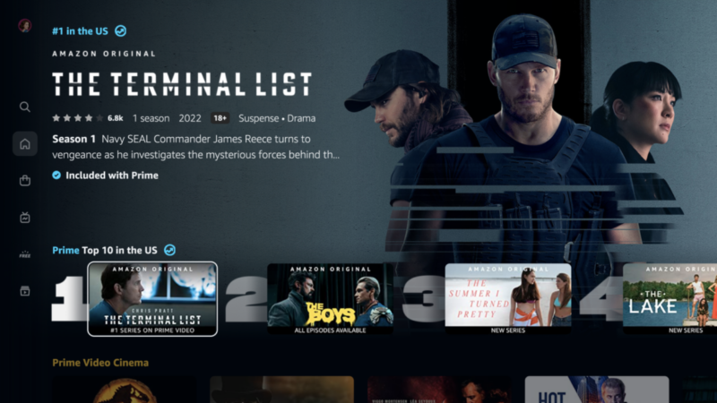
Amazon Prime Video finally gets a desperately needed redesign

Amazon Prime Video may have a compelling value proposition and some great original series to watch, but its interface has always been hideous compared to what competitors offer. Granted, the current state of affairs is what it is partly because the one we’re using now is a decade old, give or take. But it wasn’t all that attractive even back then.
Fortunately, Amazon is completely overhauling the Amazon Prime Video design at long last. The updated interface will start rolling out to users this week.
At first glance, the redesign is all about modernizing the look and making the experience more similar to what you get with just about every other streaming service. But it also addresses one of the biggest user complaints that isn’t just about looks: It offers a more elegant way to tell which videos are available free to Prime subscribers, and which ones you have to pay a la carte for.
Content that is available as part of Prime has a subtle blue checkmark on the bottom-left corner of the key art. If it requires an additional spend, an orange shopping bag icon is shown instead.
The new look will be familiar to anyone who has used Netflix, Peacock, or other popular streaming services of late: It’s a vertically scrolling series of categories, each of which is a horizontally scrolling list of shows and movies.
The main navigation bar has moved to the left side of the screen, allowing easier access as you scroll. It used to be stuck to the top. The menu items include Search, Home, Store, Live TV, Free, and My Stuff. Going into any of those can lead to subcategories, too.
According to Variety and The Verge, Amazon has been working on the redesign for 18 months. The timing couldn’t be better: The company’s $1 billion The Lord of the Rings TV show premieres in September, as does the new Thursday Night Football schedule. That content, alongside the redesign, could help Amazon Prime Video gain some renewed attention in a streaming video landscape where Netflix, Disney+, and HBO Max tend to attract more buzz.
The updated interface is rolling out to Android and popular streaming TV platforms like Roku, Apple TV, and of course Amazon Fire TV this week. The web and iOS will come in the next few months.
https://arstechnica.com/?p=1867889