An Interview with Fontfabric
This interview was conducted live on Twitter, July 29, 2021.
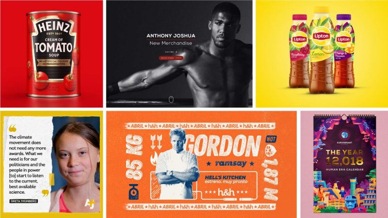
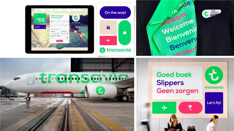
It was my pleasure to interview the brilliantly talented folk at Fontfabric. Their clients include high-profile brands like Nike, Lipton, Hyundai, CNET, and the US national football team. We talked about how they got started, what makes them tick, and about their new release, Audela.
ILT: Thanks for joining us today, Svet and Plamen. My first question for you is: What made you get into type design as a career and how did you first start?
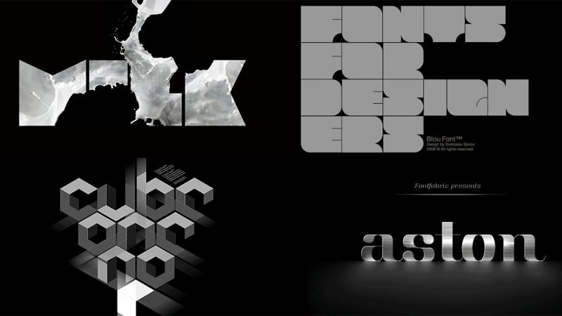
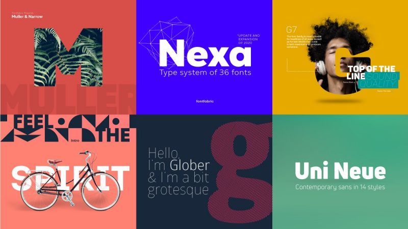
Svet: Truth is, at first I didn’t imagine I’ll be creating workhorse fonts like Helvetica or Futura. Looking way back, I entered the type world with a ‘blow’. Or ‘Blou’ to be exact — my first typeface. It’s basically a solid slightly rounded square shapes all lined up. This gave me a lot of freedom with the visual presentation. I incorporated “smoky” glowing graphics in the letters and it came out really cool. It was then, I got the idea of presenting fonts in the most inspiring way possible. It’s a hallmark of Fontfabric even now.
Plamen: Ever since I started growing as a creative professional I was captivated by the power of letters. First, in the form of street art, and later on uncovering the world of typography. I idolized font designers and Adrian Frutiger became my rock star. A huge part of my metamorphosis was the ILT blog — a plаce I enjoy to this day. It was also one of the main sources for in-depth information about typography and font development before I fully dedicated myself to the craft.
ILT: It’s always encouraging to hear that the blog played at least a small part in your early development. But how and when did Fontfabric get started?
Svet: It was at the end of 2018. It happened naturally as a result of my desire to mold and recreate letterforms in various styles. It all started on a small (very peculiar) laptop in an unremarkable room. Kind of like in the stories of big IT companies. The rest is history.
ILT: Do you design typefaces individually or as a team?
Svet: I flew solo for the first five years and then started thinking about turning it into a shared experience. A complex product on a design and technical level like this requires more than one pair of eyes. And so, since 2014 we’ve been growing the foundry as a team.
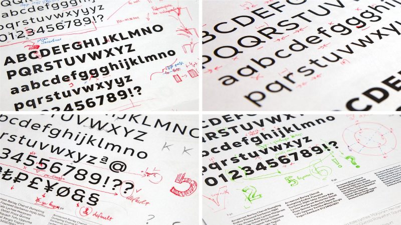
Plamen: I believe working as a team and looking for creative solutions together is highly valuable here. The Type Director’s involvement is essential but the best results come from discussions and analysis. Fontfabric assembles a multidisciplinary team and this helps us look at typefaces from several different angles. We split projects among the team so each stage is covered by different people. This gives us confidence that by the end we’ll have a well-rounded final product.
ILT: And that’s a nice segue into my next question: What’s the most important aspect of type design?
Svet: There are many, but if I have to narrow it down: to show something personal, specific in the most appropriate, expressive, and functional way, all the while keeping the individuality intact. This might mean following the latest trends or sticking to the classics.
Plamen: Every project oughts to have a function. It’s important to carry out digital products guided by the people’s needs, not our own. Matching this mindset with exceptional dedication to detail is most important for me.
ILT: What do you like most and least about type design?
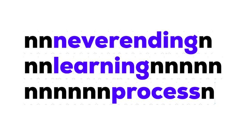
Svet: The best moment is building and shaping the first five or seven letters. Afterward, the “boredom curve” gets steeper, but we insist on getting every aspect right. I think that’s about when a font designer goes from good to great. Lots of people can create a set of letters and numbers, but not all can translate it to several scripts and get it to work flawlessly. Kerning speaks volumes too. Another aspect that brings me joy is skillful font usage—this adds value and meaning to our work.

Plamen: I love my job because it offers constant learning and growth. Every project is a new challenge. One might need to get familiar with an exotic script or look for solutions to a technical issue. All the while trying to put a personal spin on a specific style.
ILT: Which are your favorite characters or glyphs to draw?
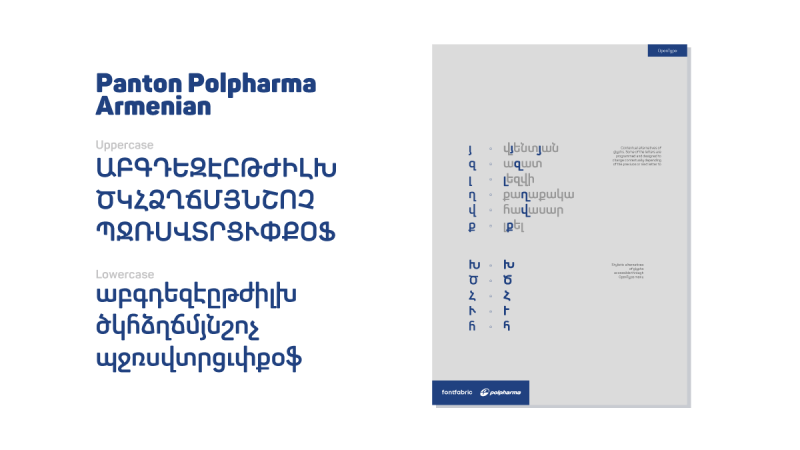
Plamen: Most often, letters and symbols from foreign languages. I enjoy exploring the mechanics of different scripts, their phonetic and constructive features. My favorite letter might just be the lowercase Cyrillic “b” (“б”). That’s one of the most distinctive letters which immediately shows me if a typeface supports high-quality Cyrillic.
ILT: On a more personal note, if you were not type designers what would you be doing?
Svet: I can only guess, but I imagine it would be connected to letters somehow. I would be growing as a visual & graphic designer with a focus on typography, to say the least. It’s safe to say I would still be using the same methods and laws but on a different scale.
Plamen: The technical aspects of typography and other fields have always been my thing. I’d like to think I would be working with AI—one of the most curious matters for me as of late.
ILT: You are a prolific foundry with a large portfolio. How do decide on new typeface directions?
Plamen: We work with different creative directions to bring variety to the products we put out there. With time, we succeeded in becoming popular in the stylistic of geometric grotesque fonts. Right now, we’re expanding our products by implementing new gripping ideas.
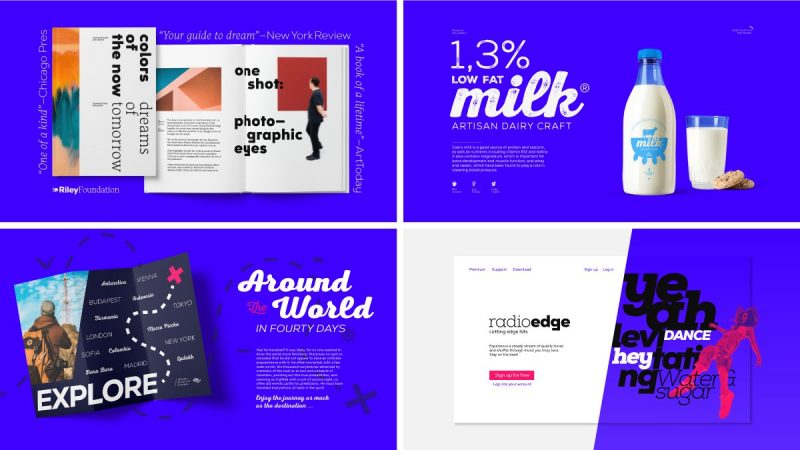
ILT: Talking of new directions: You recently released Audela as part of our foundry launch. Where do you expect to see it used first?
Plamen: The collaborative efforts on Audela started in 2018 when we had our very first intern—Lea Bruneau. Together we decided to work on a serif type family which puts a contemporary spin on classic development methods.
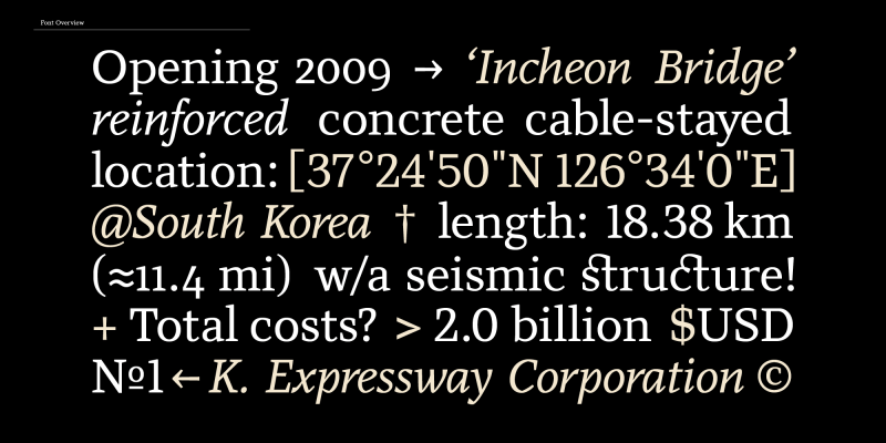
Audela works exceptionally well in text blocks and shines with elegance in the bigger sizes. We decided on editorial for its main purpose and I hope to see a use case that will leave me pleasantly surprised soon enough.
ILT: You have designed many of today’s most popular typefaces. What’s it like to see your work everywhere?
Svet: It feels like winning the Audience Recognition Award… It’s a special type of connection. What’s even more valuable though, is getting to share my excitement with people who don’t give me a blank stare whenever I point at a packaging design with my fonts.
Now, I’ve got my family and team to celebrate with. And of course, the best design community ever. It’s also pretty cool to see my early fonts used anywhere. It rarely happens but the last time it did I almost emptied a whole shelf in a boutique grocery store.
Discover more Fontfabric fonts.

