Anthropic Debuts Claude Design for Building Marketing Assets, Decks, and UIs
Anthropic Labs, the team dedicated to incubating and testing experimental AI products like within Anthropic, today unveiled Claude Design, an AI-powered platform that automates the creation of designs, slides, one-pagers, and other marketing and sales collateral. It’s designed to be easy to use for both experienced designers and nontechnical users.
The product is built on Claude Opus 4.7, the upgraded version of Anthropic’s flagship model, launched Thursday.
The product is poised to rival other design software titans like Figma and Adobe, both of which have been aggressively investing in AI tools to streamline design workflows, including prompt-based interface and asset generation.
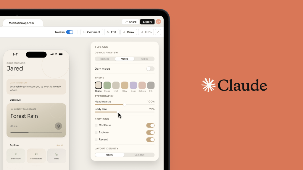
Designers, marketers, creatives, and sales teams can use Claude Design through a familiar natural language interface. They can simply tell the system what it wants to make and watch Claude produce an output based on that input. Then, users can edit the asset directly, or prompt Claude to make changes through chat conversation, inline comments, or custom sliders, a Claude tool that lets users manipulate images, data, or other elements in real time.
During onboarding, users plug in foundational reference materials like design files and codebase. Claude Design then creates a design system that will be used as the de-facto standards for each project, standardizing colors, typography, and other design elements. Users can update or refine the design system, and can create more than one.
Once they’re set up, users can input text prompts, refer Claude Design to their codebase, upload documents and visuals, or even pull elements straight from a website using Claude’s web capture feature. Claude Design will produce outputs based on these inputs; then, users can make edits to polish their designs and can collaborate with colleagues in a shared interface with Claude. Then, designs can be exported in various formats or plugged into Claude Code to start building.
Claude Design is currently in a research beta with select companies, including design software platform Canva, cloud monitoring software company Datadog, and online learning platform Brilliant.

Testing teams have used Claude Design to build product mockups and wireframes, pitch decks and presentations, alongside marketing content like social media content, webpages, and campaign visuals. Claude Design also allows users to create more advanced prototypes and digital experiences sans manual coding, including voice interactions, video elements, 3D visuals, and special effects.
Canva, which in theory could view AI asset generators like Claude Design as competitors, considering the platform has its own native AI-powered visual generation tools, has worked with Anthropic for a year. The company is leaning into the partnership further as it tries out Claude Design. The company’s CEO and cofounder Melanie Perkins said the integration will make it “seamless for people to bring ideas and drafts from Claude Design into Canva, where they instantly become fully editable and collaborative designs ready to refine, share, and publish.”
At Datadog, Claude Design has already proved capable of shortening iteration periods and “enabling live design during conversations,” according to product manager Aneesh Kethini. “We’ve gone from a rough idea to a working prototype before anyone leaves the room, and the output stays true to our brand and design guidelines. What used to take a week of back-and-forth between briefs, mockups, and review rounds now happens in a single conversation.”
Anthropic hopes the new product will appeal to both advanced designers and nontechnical users. “Even experienced designers have to ration exploration—there’s rarely time to prototype a dozen directions, so you limit yourself to a few. And for founders, product managers and marketers with an idea but not a design background, creating and sharing those ideas can be daunting. Claude Design gives designers room to explore widely and everyone else a way to produce visual work,” the company said in a press release shared with ADWEEK.
Claude Design is accessible to Claude Pro, Max, Team, and Enterprise subscribers.

https://www.adweek.com/media/anthropic-debuts-claude-design-for-building-marketing-assets-decks-and-uis/