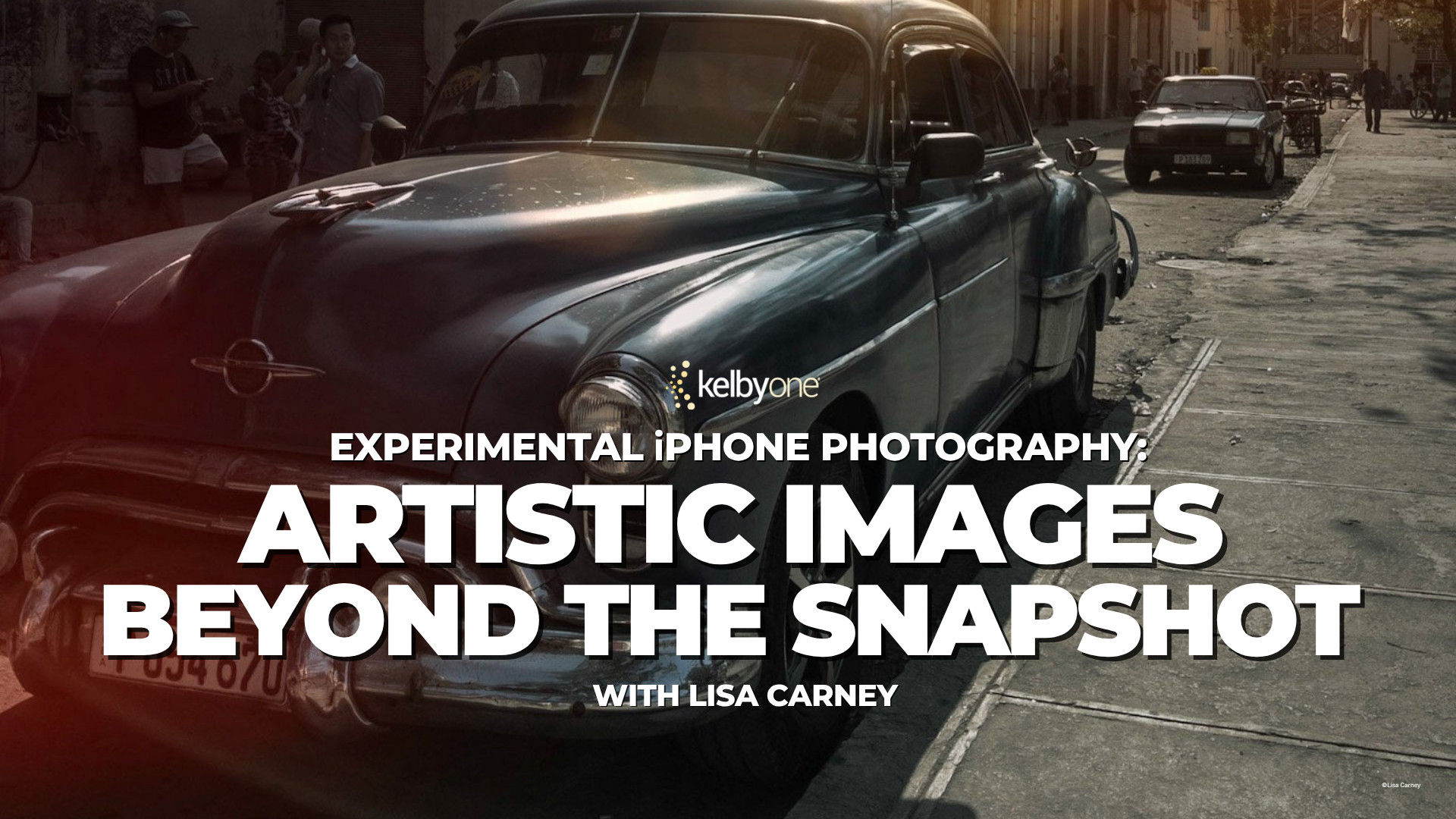
Experimental iPhone Photography: Artistic Images Beyond the Snapshot with Lisa Carney
Your iPhone is capable of much more than documenting the moment.
In this new class, Lisa Carney explores a creative approach to mobile photography, showing how techniques like motion blur, reflections, double exposures, silhouettes, and abstract compositions can transform everyday scenes into expressive works of art. She also demonstrates how apps including Photoshop, Lightroom, Mextures, Tintype, and Prisma can help bring those creative ideas to life.
If you’ve ever wanted your iPhone photography to feel more personal, artistic, and uniquely your own, this class is full of ideas you’ll want to try. Watch it here today.
(You can purchase this class for just $39, or subscribe to KelbyOne and get access to this course plus our entire library for only $19.99 a month. Try it risk-free with our 100% money-back guarantee.)
One Week Away from Three Days of Creative Inspiration
The Photographing People Conference is almost here, and if you’ve been looking for fresh ideas to bring more impact to your people photography, now’s the perfect time to jump in.
Across three days of live online training, 19 world-class instructors will share practical techniques for lighting, posing, editing, storytelling, mobile photography, and creative portrait work. You’ll also see how today’s editing tools can help transform everyday images into polished, professional-looking photographs without overcomplicating your workflow.
Beyond the sessions themselves, one of the highlights of the conference is the attendee photo contest. Submit your favorite photo of a person to the conference gallery, see what fellow photographers are creating, and you’ll also be entered for a chance to win prizes from our generous sponsors.
Best of all, every session is available to watch again for a full year, so you can revisit techniques and practice at your own pace.
Join us online July 20–22 and be part of an incredible community of photographers who love creating images of people.
This Week on The Grid: Blind Photo Critiques & Photoshop Fixes
This week’s episode of The Grid wasn’t just about critiquing photographs—it was also packed with useful editing techniques in Camera Raw and Photoshop.
Working through viewer-submitted images, Scott Kelby and Erik Kuna demonstrated practical ways to improve everything from fireworks and Milky Way landscapes to portraits, weddings, architecture, and underwater photography. Viewers got a look at Photoshop’s Generative Expand in action, along with techniques for blending a tracked night sky with a blue hour foreground and making subtle edits that strengthen the overall image.
One theme carried through nearly every critique: editing can absolutely improve a photograph, but it’s strongest when it’s supporting good composition, thoughtful posing, and a clear visual story.
If you’re looking for practical Photoshop and Camera Raw techniques you can add to your workflow, this episode is worth watching.
If you’ve ever looked at a portrait taken with your camera’s built-in flash or a speedlight mounted directly on the hot shoe and thought it looked harsh, flat, or just plain uninspiring, you’re not imagining it.
The biggest problem isn’t the flash itself. It’s where the light is coming from.
When your flash is mounted directly above the camera, the light travels in exactly the same direction as your lens. That removes shadows, flattens facial features, creates distracting reflections, and often leaves your subject looking as though they were photographed under a security light.
Professional photographers have known for years that moving the light away from the camera is one of the quickest ways to dramatically improve an image.
Why Off-Camera Flash Looks Better
The human eye is used to seeing light come from the side, above, through windows, or from the sun. Directional light creates depth, texture, and dimension.
By moving your flash even a short distance away from the camera, you immediately begin creating:
More natural-looking shadows
Better separation from the background
Improved facial modeling
More interesting catchlights in the eyes
A softer, more three-dimensional look
It’s one of the simplest changes you can make that produces a professional-looking result.
The Challenge
Traditional off-camera flash isn’t always convenient. You often need a light stand, wireless triggers, extra bags, and more time to set everything up. That’s fine in a controlled studio, but much less practical when photographing events, weddings, travel, or environmental portraits.
Many photographers simply leave the flash on the camera because it’s quicker. Unfortunately, that usually means accepting lower-quality light.
Instead of carrying a full lighting kit, it allows photographers to move their flash off-axis while keeping everything attached to the camera. The result is dramatically improved lighting without dramatically increasing the size of your setup.
It’s compact, lightweight, and quick to deploy, making it ideal for photographers who need to work fast without sacrificing image quality.
Whether you’re photographing people indoors, creating environmental portraits, or shooting events, getting the flash away from the lens can completely transform the look of your images.
See the Difference for Yourself
On Camera FlashWith Bracket & Bounce
Scott Kelby has spent decades teaching photographers around the world and has seen just about every lighting setup imaginable.
In his video on PlatypodTV, he explains why he prefers the Bracket & Bounce system, demonstrates the difference between traditional on-camera flash and off-camera lighting, and shows just how much of an impact a small change in light position can make.
If you’ve ever wondered why your flash photos don’t quite have that professional look, this video does an excellent job of showing exactly why.
What’s New In Lightroom with Scott Kelby & Terry White
Adobe’s been busy, and Lightroom has picked up some really useful new features across Classic, Cloud, and Mobile.
In this week’s class, Scott Kelby joins Adobe’s Terry White for a hands-on look at everything that’s new. Instead of simply walking through a list of features, they put each update to work on real images so you can see exactly what it does and decide whether it belongs in your everyday workflow. They cover the new duplicate finder, Assisted Culling, dramatically faster noise reduction, AI-powered video clips, and plenty of other practical improvements that can save time and streamline your editing.
If you’ve been wondering which Lightroom updates are actually worth using, this class is a great place to start.
You can purchase the class for just $39, or subscribe to KelbyOne and get access to this course plus our entire library for just $19.99 a month. Cancel anytime with our 100% money-back guarantee.
This Week on The Grid: Smarter Editing in Lightroom & Photoshop
This week’s episode of The Grid is packed with editing techniques you can put to work right away. Scott Kelby and Erik Kuna cover everything from processing fireworks photos in Lightroom to putting the new Platypod Bracket & Bounce through a real-world lighting test for better portraits.
Scott also takes a close look at the latest Lightroom and Camera Raw updates, making the case that the most underrated new feature isn’t duplicate detection—it’s the dramatically improved Select Subject masking. The enhanced masking tools make it faster and easier to create accurate selections, whether you’re refining portraits, replacing backgrounds, or making targeted adjustments.
The episode also includes a walkthrough of Scott’s fireworks editing workflow, plus Erik’s demonstration of how an affordable star tracker can help produce cleaner, more detailed Milky Way images.
Whether you’re looking to improve your editing workflow or pick up a few new shooting techniques, there’s plenty here to inspire your next project. Watch the replay below.
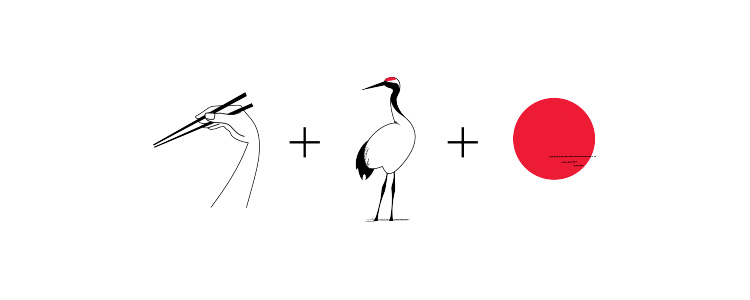
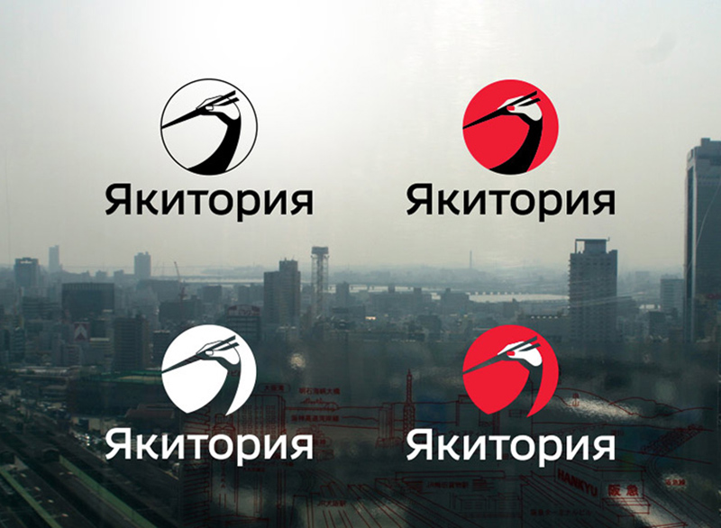
This illustrative logo for a chain of Japanese restaurants caught my eye. It was designed by Egor Zhgun of Art. Lebedev Studio in 2014. The studio’s case study dates back a while but you can catch that here.
The triple meaning makes the design — the chopsticks in hand, the red-crowned crane, and the rising sun. The crane is a Japanese symbol of longevity and good fortune, so it hints at the culture without clichés like the torii gates or cherry blossom. Set against the Hinomaru disc, it’s a lovely, memorable mark.
Founded in Moscow in 1995 by Artemy Lebedev, Art. Lebedev Studio is one of Russia’s best-known design firms, working across graphic design, identities, industrial design, wayfinding, typefaces and more. The studio sums up its approach as simple, elegant, logical solutions that stay true to the intended meaning. The Yakitoriya logo do.
This week on The Grid, Scott Kelby took the reins for another entertaining round of Blind Photo Critiques, reviewing a diverse collection of viewer-submitted images from nearly every genre imaginable.
The lineup included creative portraits, travel photography, automotive detail shots, street scenes, wildlife, macro, underwater, and even astrophotography. As always, Scott offered straightforward feedback on what worked, what could be improved, and how a few thoughtful edits could take an image even further.
He demonstrated practical techniques in Lightroom, Camera Raw, and Photoshop, including using the People Masking tool to recover overexposed skin, creating the look of a long exposure with Motion Blur, expanding compositions with Generative Expand, and experimenting with Generative Fill—with results that were… let’s just say not always successful.
Scott also shared updates on upcoming travel photography workshops, talked about his new iPhone photography book, and gave a preview of the upcoming Photographing People Conference. Although technical issues kept Erik Kuna off camera, he still joined the conversation from California via the live chat to add a few comments along the way.
If you enjoy learning through real-world critiques and practical editing demonstrations, this episode is packed with ideas you can use on your own photos. Watch the replay below and follow along.
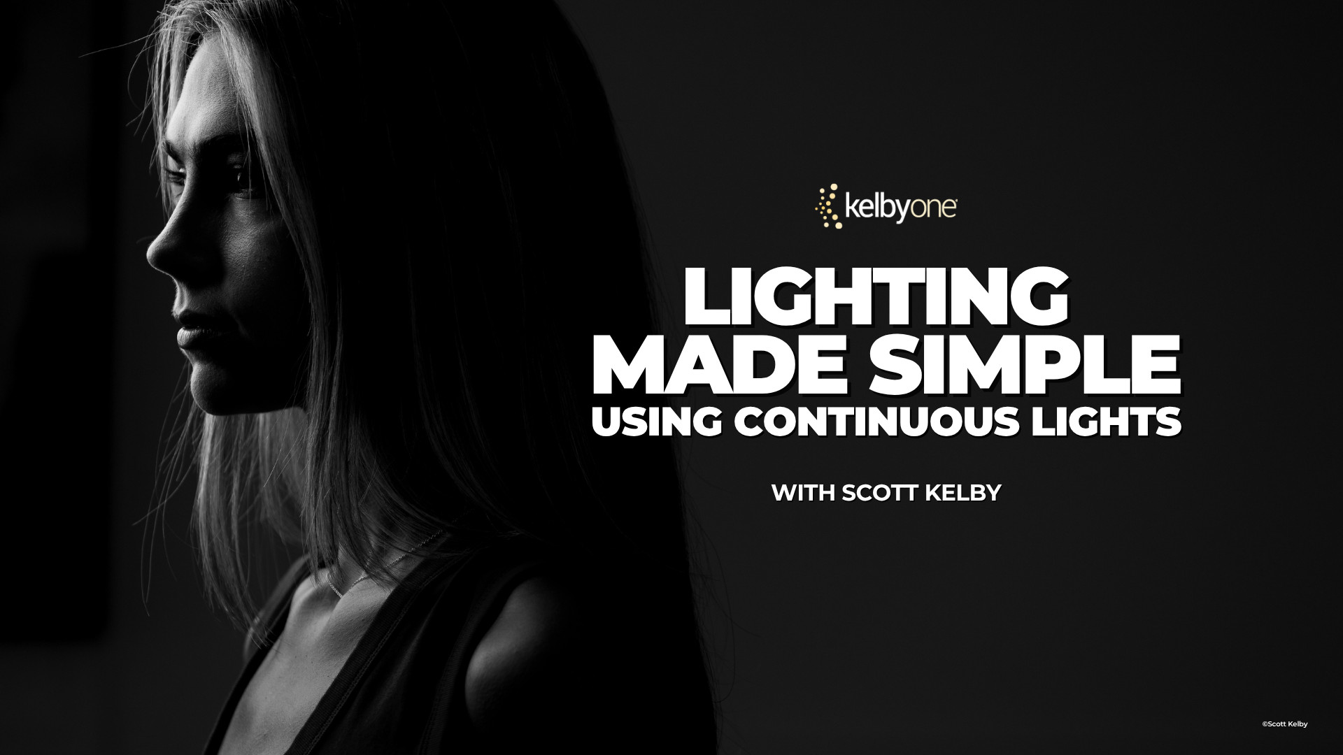
Lighting Made Simple Using Continuous Lights with Scott Kelby
If lighting has ever felt intimidating, you’re definitely not alone.
For many photographers, lighting is where things get complicated. Flash triggers, power settings, test shots, and technical jargon can make it feel harder than it needs to be.
Using continuous lights, Scott demonstrates a simple “what you see is what you get” workflow that makes it easier to understand exactly how light affects your subject. You’ll see how to build a setup in just a few minutes, work through a live portrait session, and create a variety of popular lighting styles, including split lighting, Rembrandt lighting, rim lighting, and more.
The class also covers shooting tethered directly into Lightroom, making it easy to evaluate your images and make adjustments as you work.
Whether you’re brand new to lighting or simply looking for a more straightforward approach, this class offers a practical path to better portraits. Watch Scott tell you more about it below.
Enter the Photographing People Conference Photography Contest
One of our favorite parts of every conference is seeing what attendees create, and the Photographing People Conference Photography Contest is your chance to share your work with the community.
If you’re a paid registered attendee, you’re eligible to enter. Just submit your best people photos, and you’re in. Portraits, family moments, street photography, travel photos, candid moments, posed portraits—whatever your thing is, we want to see it.
Not only will your image be featured in the conference gallery for fellow attendees to enjoy, but you’ll also be entered for a chance to win prizes from our sponsors and be featured on KelbyOne’s social channels.
More Than a Contest
The gallery is one of the most fun parts of the conference experience.
As submissions start rolling in, you’ll be able to browse images from photographers around the world and see the many different ways people approach photographing people. You’ll find everything from creative portraits and family photography to street scenes, travel images, candid moments, and more.
It’s inspiring, educational, and a great reminder that there are countless ways to tell stories with people in front of your camera.
How to Enter
If you’re registered for the Photographing People Conference, simply submit your favorite image using the button below. We can’t wait to see what you’ve been creating!
Submission Deadline: July 21, 2026 at 11:59 PM EDT