Mastering ON1 Photo RAW 2023: A Comprehensive Guide for All Skill Levels

Whether you’re a beginner, have never heard of ON1 Photo RAW, or want to enhance your editing skills, this ultimate guide is perfect for you. Learn how to navigate and utilize the powerful features of ON1 Photo RAW 2023, the leading raw photo editor, to create stunning images.

Introduction

Are you ready to unlock the full potential of your photos using ON1 Photo RAW 2023? Check out this video from the ON1 VP of Product, Dan Harlacher. Whether you’re a beginner in photo editing or an experienced photographer seeking to elevate your photo editing software skills, this video guide will meet your needs. This video will give you an excellent resource to explore the features and editing techniques in ON1 Photo RAW 2023, a powerful raw photo editor that can transform your images. 

[embedded content]

Getting Started with ON1 Photo RAW 2023

For anyone new to ON1 Photo RAW or unfamiliar with raw photo editing, fear not. We’ll begin by introducing the basics, guiding you through the process of importing and organizing your photos within the software. You’ll quickly learn how to efficiently manage your image library and easily locate your files for editing. ON1 Photo RAW uses a browser-based approach making it super simple to get up and running quickly.

Exploring Editing and Retouching Techniques

Once your photos are organized, it’s time to dive into the editing world. You’ll discover the tools and adjustment options available in ON1 Photo RAW 2023. From basic adjustments like exposure and color correction to more advanced techniques such as selective editing and retouching, this guide equips you with the knowledge to enhance your images with precision and creativity.

Unleashing the Power of ON1 Photo RAW 2023

For those looking to take their photo editing skills to the next level, Dan explores some of the more advanced features of ON1 Photo RAW 2023, such as layer-based editing, creating complex composites, and quickly adding stunning effects. You will get an excellent review of the versatile masking tools that allow you to apply adjustments and seamlessly blend multiple photos selectively.

Exporting Your Final Masterpieces

Once you’ve perfected your edits, it’s time to share your work with the world. Discover the various export options within ON1 Photo RAW 2023, including formats, sizes, and metadata settings. Learn how to showcase your images in the best possible way, whether it’s for web sharing, printing, or professional use.

Conclusion

ON1 Photo RAW 2023 is an incredible raw photo editor that can transform your photography. Whether you’re just starting, have never heard of ON1 Photo RAW, or are an experienced photographer seeking to enhance your skills, this comprehensive guide has something for everyone. We hope you take advantage of the software’s powerful features and learn editing techniques that will elevate your images to new heights. Unlock your creativity and master the art of raw photo editing with ON1 Photo RAW 2023.

https://layersmagazine.com/mastering-on1-photo-raw-2023-a-comprehensive-guide-for-all-skill-levels.html


Enjoy All the Adobe Creative Cloud Apps for Just $29.99 for Three Months

Disclosure: Our goal is to feature products and services that we think you’ll find interesting and useful. If you purchase them, Entrepreneur may get a small share of the revenue from the sale from our commerce partners.

Finances Online reported that it takes Americans an average of six days to get their business started. If you’re an entrepreneur with a brand-new idea that needs some creative touches, you can make the process even more seamless with a subscription to Adobe Creative Cloud All Apps.

Adobe Creative Cloud All Apps gives you access to the fleet of Adobe essentials — over 20 creative apps that include everything from Photoshop to Fill and Sign. And new customers can currently score a three-month subscription with 100GB of cloud storage for just $29.99 — the best price available online — for a limited time. No coupon code is required, and you can stack multiple subscriptions if needed.

Adobe Creative Cloud All Apps is a one-stop shop for all things production and design, making it a must-have for busy entrepreneurs wearing multiple hats. This subscription includes more than 20 of their most popular and widely used applications, perfect for photography, social media, and graphic design.

You’ll get access to Photoshop on your device, which has a wide range of uses for nearly any entrepreneur, and popular photo-editing apps like Lightroom and Lightroom Classic. There are also apps for audio recording, mixing, and restoration, like Audition, InCopy, which helps you make text edits, and Adobe Fresco if you need to draw or paint on touch or stylus devices.

For those not in creative fields, there are also important applications like Adobe Scan, which recognizes text automatically, and Fill and Sign, which helps you easily fill, sign, and send forms. Acrobat Reader is also included, making dealing with PDFs more convenient.

New customers can snag a three-month subscription to Adobe Creative Cloud All Apps 100GB (or stack multiple for an extended subscription period) for the best price online, just $29.99 (reg. $247) — no coupon necessary.

Prices subject to change.

https://www.entrepreneur.com/science-technology/enjoy-all-the-adobe-creative-cloud-apps-for-just-2999-for/452988


Flipper Taps

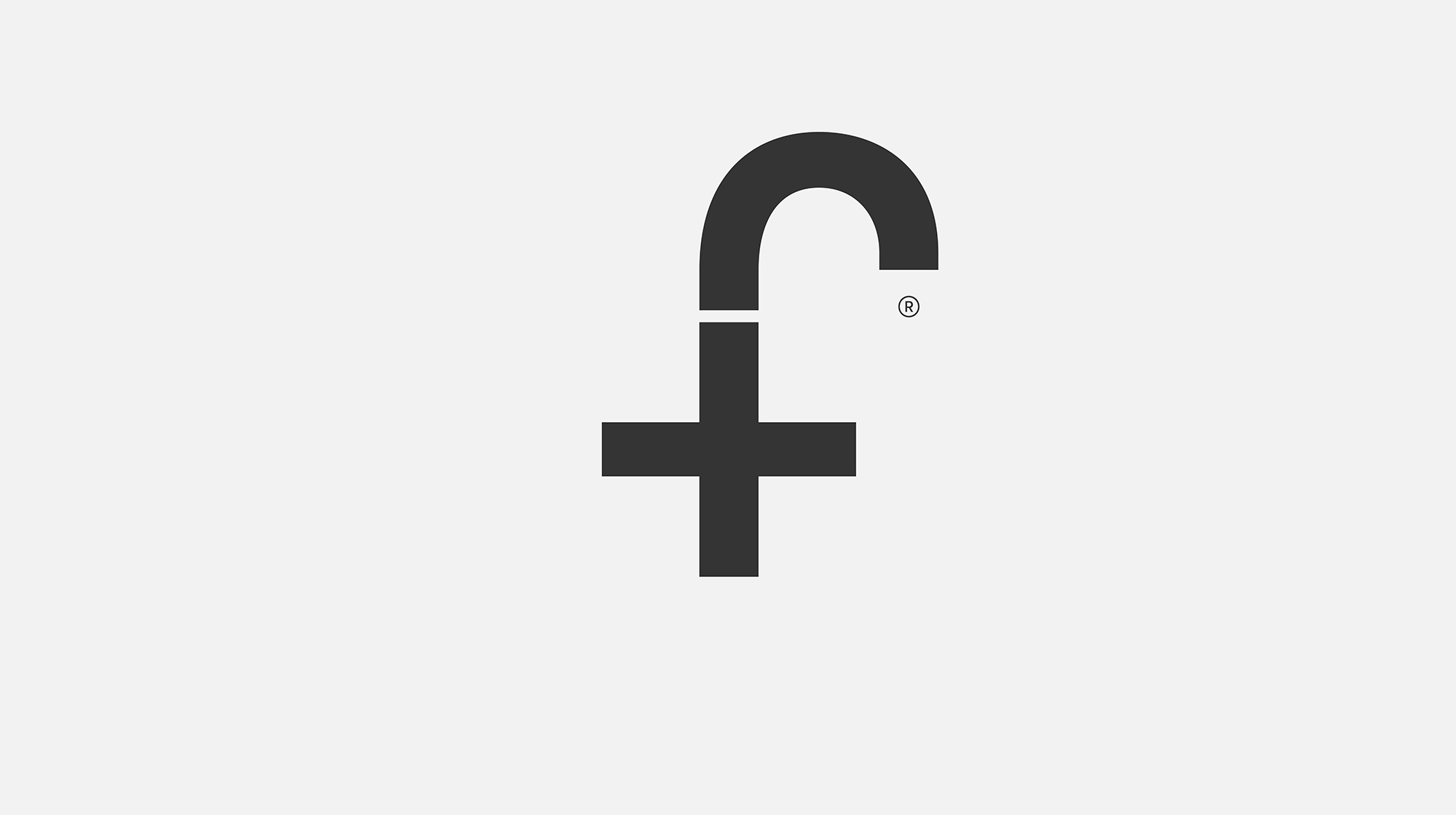
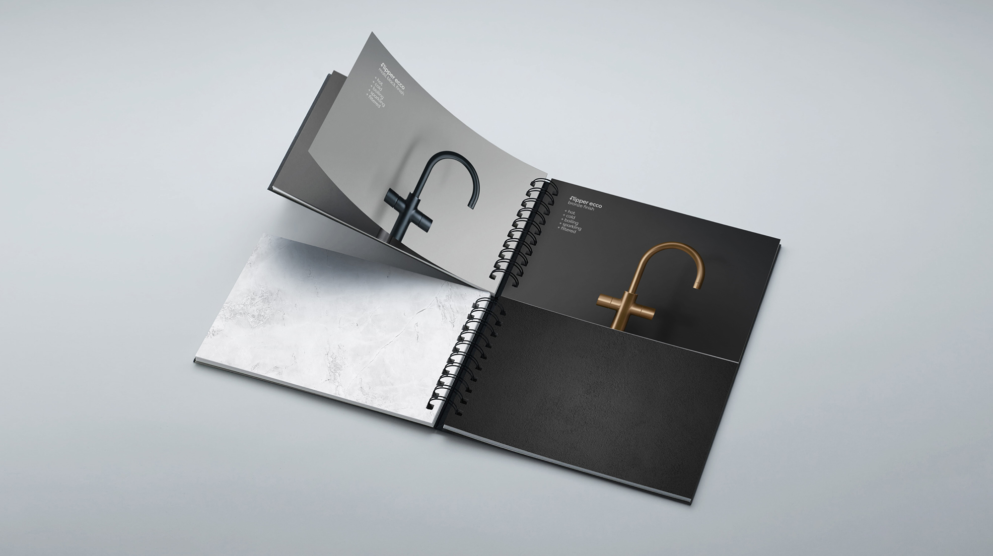
Red Dot Studio in London were tasked with the naming and identity creation for a new range of taps. The 5-in-1 taps flip between delivering hot, cold, filtered, sparkling, and boiling water, so the name Flipper was coined to articulate versatility. The Flipper Taps logo combines the letter F with the shape of the tap (and a plus symbol, because “more”). It’s the type of design that, in my experience, often takes considerably more persuasion when it comes to achieving client consensus than it would with a more detailed logo. A nice touch with the positioning of the trademark symbol, too.

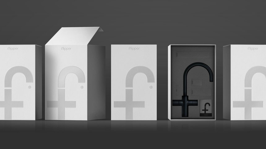
The F monogram is the primary identity element, showcased on stationery, packaging, communications, and engraved as a hallmark on products.

Congratulations to all involved for winning a D&AD pencil. Here’s to the next one.

Creative director: Sam Lachlan, Christian Eager
Designer: Angus Meikle
Senior visualiser: Tim Stayne
Photographer: Anna Lachlan

More creative designs in the archives with this small sampling of Woody Pirtle logos.

https://www.logodesignlove.com/flipper-taps


How to Become a Shoe Designer 

Are you creative with a good eye for fashion ensembles? Can you determine what type of footwear best matches any outfit? Then you should consider a career as a shoe designer. Below we tell you how to enter this exciting field. 

Studies for Shoe Designers

There are different entry points to becoming a shoe designer. Firstly, you can start with an entry-level job and work your way up the levels as you acquire experience. Secondly, you can become an apprentice if you can find a shoe designer willing to mentor you. Thirdly, you can obtain a university qualification.

If you choose university, you can study footwear exclusively, or you can take it as part of a more comprehensive fashion postgraduate degree. You will need to learn the technical aspects of shoe design as well as the art of creating fashionable footwear. This link can help you get started.

To enter a postgraduate course, you will need an applicable degree in a suitable subject. However, you may want to start with an art/design diploma before progressing to a degree. 

Salaries for Shoe Designers

You can earn a good income as a shoe designer. The salary range varies between £20,000 and £40,000, based on your level of experience. As an entry-level employee, you will start out at the lower end of this range and work your way to the top in 40-hour weeks. 

Of course, if you are a shoe design prodigy, you will be rising beyond this and designing top-notch, fashionable footwear that are displayed on the runway. Then your earnings will be astronomical. Take Rick Owens, whose net worth in 2023 is six million dollars! See the Rick Owen Converse sneaker available online through SSENSE to get an idea of what top designers create.

Essential Skills for Shoe Designers

Nowadays, design makes great use of technology, so you need to be PC literate and able to adapt to relevant software. You will require knowledge on how shoes are manufactured, and the processes involved. Another requirement is your approach to detail, which must be finely tuned. You need to be creative and able to invent designs or alter the way existing ones look. This requires using your initiative, being flexible, and an ability to cope with change and constructive criticism. Ambition is necessary as the field can be very competitive. You must be self-driven and willing to work long hours, stay up to date with trends, and attend functions and events to showcase shoe designs.

Performing Daily Tasks

CAD software (computer-aided design) is used for shoe design. However, you will also need to be able to draw clear sketches of your ideas before getting into the actual dimensions and details. Research is an important skill. You need to read up on different materials and how they function in order to design comfortable footwear. It is also vital to stay abreast of trends in the industry. You will be adapting designs that have already been created or coming up with brand new designs. 

When prototypes or product samples are made, you will supervise the process, and make changes as it progresses. The final quality needs to be checked. Marketing skills are necessary as you will have to meet with design teams and pitch your ideas. There are always cost factors to consider, and you may have to work within a budgetary limitation. Time to produce items must also be factored in.

The sky is the limit for talented shoe designers. 


Follow @positive_mag on twitter for the last updates https://www.positive-magazine.com/how-to-become-a-shoe-designer/?utm_source=rss&utm_medium=rss&utm_campaign=how-to-become-a-shoe-designer


Crafting WCAG Compliant Articles

Crafting WCAG Compliant Articles: A Guide by Go Media, Cleveland’s Premier Website Design and Development Agency

At Go Media, we believe in the power of inclusive digital experiences. In today’s article, we’ll delve into the world of WCAG compliance and explore what companies need to consider when authoring articles that meet these accessibility standards. By adhering to the Web Content Accessibility Guidelines (WCAG), you can ensure that your content is accessible to a broader audience, including individuals with disabilities. Let’s dive in!

1. Structuring Content for Accessibility:

When creating articles, pay attention to the structure of your content. Properly utilize heading tags (H1, H2, etc.) to organize your text hierarchically. This not only improves the readability and organization of your content but also assists users who rely on screen readers to navigate through your article seamlessly.

2. Descriptive Alt Text for Images:

Images play a vital role in blog posts, but it’s crucial to make them accessible to everyone. Provide descriptive alternative text (alt text) for all images, ensuring it conveys the purpose and meaning of the visual content. Alt text allows individuals with visual impairments to comprehend the context and relevance of the images within your articles.

3. Meaningful Link Text:

Avoid using generic phrases like “click here” or “read more” when creating links within your articles. Instead, use descriptive and meaningful link text that provides context and accurately describes the destination. By doing so, you empower users who navigate via assistive technologies to comprehend the purpose of the link without confusion.

4. Readability and Plain Language:

Keep your writing clear, concise, and easy to understand. Use plain language that is free of jargon, complex sentence structures, and ambiguous wording. This practice not only benefits individuals with cognitive disabilities but also aids those who rely on screen readers to consume your content.

5. Ensuring Color Contrast:

Maintain sufficient color contrast between text and background elements to enhance legibility. Individuals with low vision or color blindness rely on adequate contrast ratios to read your articles comfortably. Familiarize yourself with WCAG guidelines on color contrast and strive to meet the recommended ratios.

6. Keyboard Accessibility:

Ensure that your articles can be easily accessed and navigated using only the keyboard. Some users rely on keyboard navigation due to mobility impairments or other disabilities. By guaranteeing that interactive elements such as buttons and links are easily reachable and operable via keyboard, you provide an inclusive experience for all users.

7. Video and Audio Accessibility:

If your articles contain video or audio content, make them accessible by providing captions or link to transcripts. Captions enable individuals who are deaf or hard of hearing to understand the audio content, while transcripts provide an alternative way for all users to access the information. Additionally, include controls for pausing, playing, and adjusting the volume of multimedia elements.

8. Consistent Navigation and Structure:

Maintaining a consistent navigation structure throughout your articles and website is essential. Use clear headings, subheadings, and other formatting elements consistently. This ensures that users, including those with disabilities, can easily understand the organization of your content and navigate through it effortlessly.

9. Responsive Design:

In today’s multi-device landscape, it’s crucial to ensure that your articles are responsive and adapt to different screen sizes and devices. Responsive design allows users with disabilities, who may rely on different devices or assistive technologies, to access your content seamlessly. Test your articles on various devices to ensure a consistent and accessible experience.

10. Regular Testing and Validation:

Don’t forget to regularly test your articles for accessibility using automated tools and manual checks. Tools like WAVE or Lighthouse can help identify potential accessibility issues, allowing you to make the necessary adjustments. Stay proactive in ensuring your content remains accessible and up to

Crafting WCAG compliant articles is an important step towards building a more inclusive online environment.

By following these guidelines, writers and marketers can make their content accessible to a wider audience, including individuals with disabilities. At Go Media, we’re passionate about creating digital experiences that prioritize accessibility. Join us in championing inclusivity on the web and making a positive impact for all users.

Remember, accessibility is an ongoing commitment. Stay informed about the latest updates and changes to WCAG guidelines, and continue to evolve your practices to provide the best possible user experience for everyone. Together, we can make the web a more accessible and inclusive place.

https://gomedia.com/tutorials/crafting-wcag-compliant-articles-a-guide-by-go-media-clevelands-premier-website-design-and-development-agency/


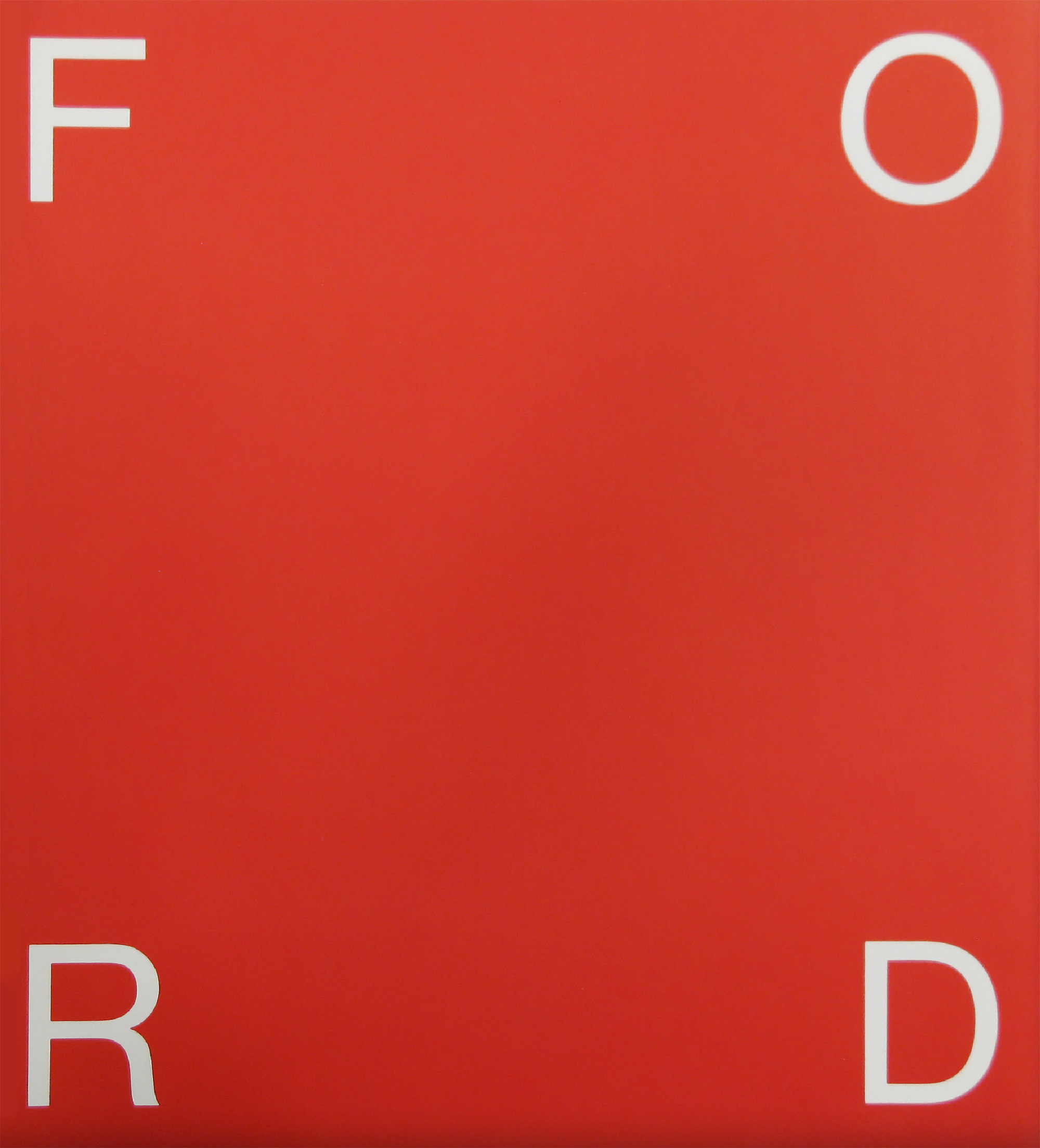
Paul Rand’s Ford presentation

In March of 1966, Paul Rand finished his Ford logo presentation book. It was a proposal to Ford Motor Company for a new house mark. I’ve always found it intriguing to read the words Rand used in his logo presentations. The story, the confidence, the rationale, the salesmanship. The presentation has been transcribed here for reference.

1903 was the year the Wright Brothers successfully flew their airplane at Kitty Hawk. It was also the year Henry Ford built his first motor car.

It was a time of startling contrasts. Dynamic technological progress vied with the elaborate and sentimental habits of a post-Victorian age. It was an era characterized by potted palms, velvet mohair, and handlebar moustaches.

It was natural, then, that the artistic conventions of the time should attach themselves to the new technology. And it was inevitable that machine ornamentation, trademarks and signatures should draw inspiration from the art forms of the day.

Graphic identification was viewed more as artistic embellishment than functional necessity. Business logotypes had a kind of “raised pinky” elegance inspired by a variety of 17th century Copperplate scripts, weighted and vulgarized to suit the needs of commerce. Fanciful typefaces and ornamental extravagances of every description further typified the mood of the time. One was, however, affected more by the ingenuous charm of these designs than by their genuine look. And “charming graphics” were hardly a match for the daring mechanical imagination of the day.

The graphics of 1900 were, in a sense, a product of the time: life was more elaborate, more ceremonious. There were fancy speeches, fancy customs, fancy hats and fancy parlors — all, indeed, compatible with fancy nameplates and escutcheons. Industrial graphics, like “Home Sweet Home,” were a kind of sentimental sedative, a style which, even today, would be eminently more suited to a make-believe world, to the circus and amusement park, to pink lemonade and soda pop, than to the practical world of the machine.

Makers not only of automobiles, but of coffee machines and lawn mowers, face powders, drugs and corn plasters signed their wares in the anonymous style. The world was flooded with “heavied up” scripts, fancy frills and shapely frames. Ironically, what started out to be the signature of the individual and his product turned out to be less a mark of its maker than of its time.

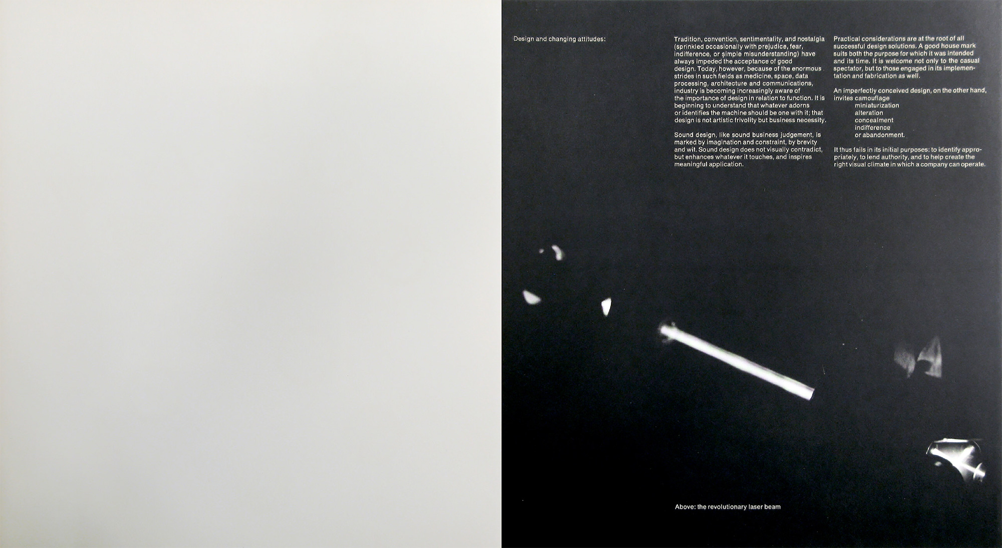
Design and changing attitudes
Tradition, convention, sentimentality, and nostalgia (sprinkled occasionally with prejudice, fear, indifference, or simple misunderstanding) have always impeded the acceptance of good design. Today, however, because of the enormous strides in such fields as medicine, space, data processing, architecture and communications, industry is becoming increasingly aware of the importance of design in relation to function. It is beginning to understand that whatever adorns or identifies the machine should be one with it; that design is not artistic frivolity but business necessity.

Sound design, like sound business judgement, is marked by imagination and constraint, by brevity and wit. Sound design does not visually contradict, but enhances whatever it touches, and inspires meaningful application.

Practical considerations are at the root of all successful design solutions. A good house mark suits both the purpose for which it was intended and its time. It is welcome not only to the casual spectator, but to those engaged in its implementation and fabrication as well.

An imperfectly conceived design, on the other hand, invites camouflage, miniaturisation, alteration, concealment, indifference, or abandonment.

It thus fails in its initial purposes: to identify appropriately, to lend authority, and to help create the right visual climate in which a company can operate.

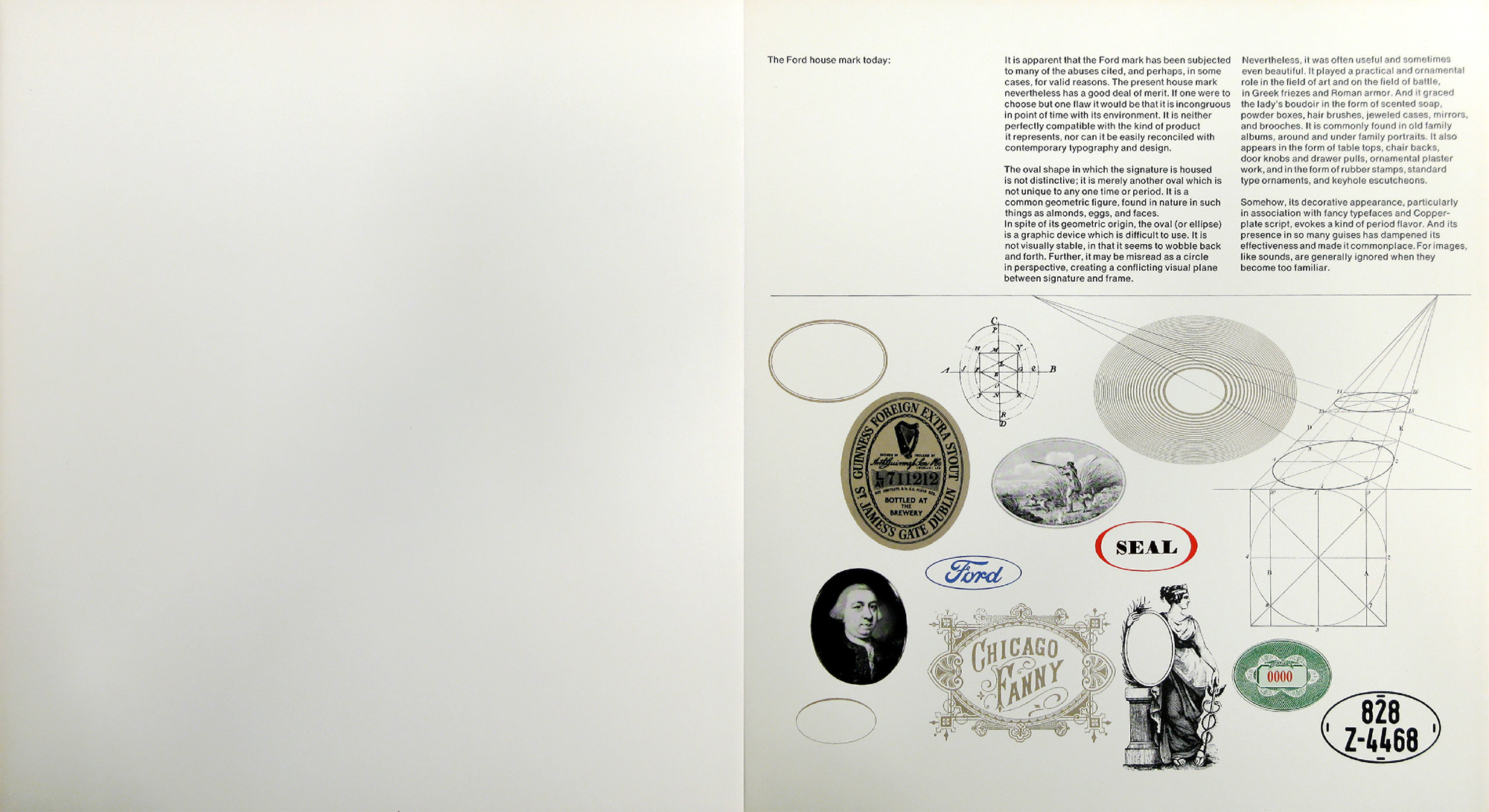
The Ford house mark today
It is apparent that the Ford mark has been subjected to many of the abuses cited, and perhaps, in some cases, for valid reasons. The present house mark nevertheless has a good deal of merit. If one were to choose but one flaw it would be that it is incongruous in point of time with its environment. It is neither perfectly compatible with the kind of product it represents, nor can it be easily reconciled with contemporary typography and design.

The oval shape in which the signature is housed is not distinctive; it is merely another oval which is not unique to any one time or period. It is a common geometric figure, found in nature in such things as almonds, eggs, and faces.

In spite of its geometric origin, the oval (or ellipse) is a graphic device which is difficult to use. It is not visually stable, in that it seems to wobble back and forth. Further, it may be misread as a circle in perspective, creating a conflicting visual plane between signature and frame. Nevertheless, it was often useful and sometimes even beautiful. It played a practical and ornamental role in the field of art and on the field of battle, in Greek friezes and Roman armor. And it graced the lady’s boudoir in the form of scented soap, powder boxes, hair brushes, jeweled cases, mirrors, and brooches. It is commonly found in old family albums, around and under family portraits. It also appears in the form of table tops, chair backs, door knobs and drawer pulls, ornamental plaster work, and in the form of rubber stamps, standard type ornaments, and keyhole escutcheons.

Somehow, its decorative appearance, particularly in association with fancy typefaces and Copperplate script, evokes a kind of period flavor. And its presence in so many guises has dampened its effectiveness and made it commonplace. For images, like sounds, are generally ignored when they become too familiar.

Criteria for a new Ford house mark
A new logotype is not a passing fashion, but a permanent and enduring symbol, to be used again and again on countless objects, for countless people, and for countless years. Faced with the problem of designing the new house mark, the question arises, if a change is desirable, to what degree?

One may:

  1. modify the old mark without changing its basic style and feeling
  2. make a new design without any reference whatsoever to the old mark or
  3. make a significant change in style while retaining meaningful identifying characteristics of the old house mark.

The first of these choices would simply be a 20th century variation on a 17th century theme, a half measure which might do little but emasculate the original by stressing meaningless stylistic eccentricities while possibly eliminating essentials. The second choice would be conjecturable, since it could jeopardize certain benefits accumulated through the years.

The best alternative, it seems, would be the third, for it gets at the heart of the matter: attempting to interpret the essential qualities of the old mark not by slavish imitation but in a style which would make it both a product of the present and a reflection of its past. Common sense dictates that the principal characteristics which give the mark its familiar silhouette should somehow be retained and, if possible, transformed in a new and significant way. This transformation, hopefully, should be accomplished without doing violence to the visual impression created by the old one.

The degree of change, however, must be carefully weighed. If changes are slight and superficial, then the effort and expense involved in such a vast undertaking would be sheer waste. If, on the other hand, they are so drastic that any similarity between the old and new images is no longer apparent, then it is conceivable that whatever benefits have been accumulating over the years will be impaired. Obviously, then, there must be an interaction between the two: the new house mark must be sufficiently reminiscent of its predecessor to have a familiar ring, and yet different enough from it to look fresh, timely, and timeless.

The house mark of Ford Motor Company should reflect the authority and confidence the company and its products merit. It should look functional and it should be functional. It should not be characterized by melodramatic swirls and theatrical flourishes, but by a frank and unpretentious, almost disarming simplicity, achieved by means of geometry and ordered relationships, with simple lines and forms that are measurable and manageable, and which reflect the precision of the machines they help to identify. It should suggest strength, speed, efficiency and utility. It should be clear and concise, with a kind of beauty and precision which flow not from the quill but from the compass and ruling pen. It will then emerge an integral part of the machine design, rather than decorative decalcomania.

In the design of a house mark, it is difficult to overemphasize the importance of simplicity. Simple things are obviously easier to remember, often easier to fabricate, and always easier to apply. Simplicity gets to the heart of a problem. It generates awareness by its brevity, inspires confidence by its understatement, believability by its frankness, and memorability by its uniqueness. It is the embodiment of form and content.

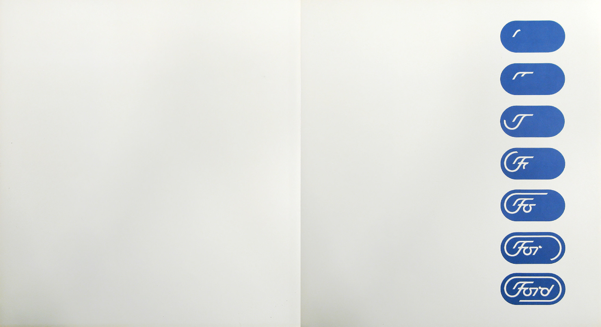
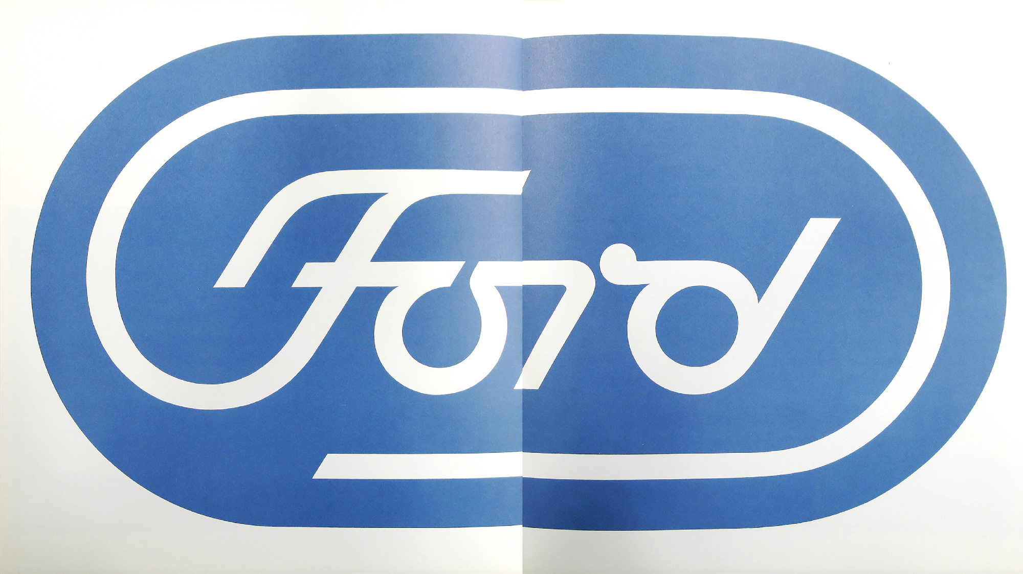
The proposed house mark for Ford Motor Company has been designed with these thoughts in mind. It is shown on the following page in animated form…

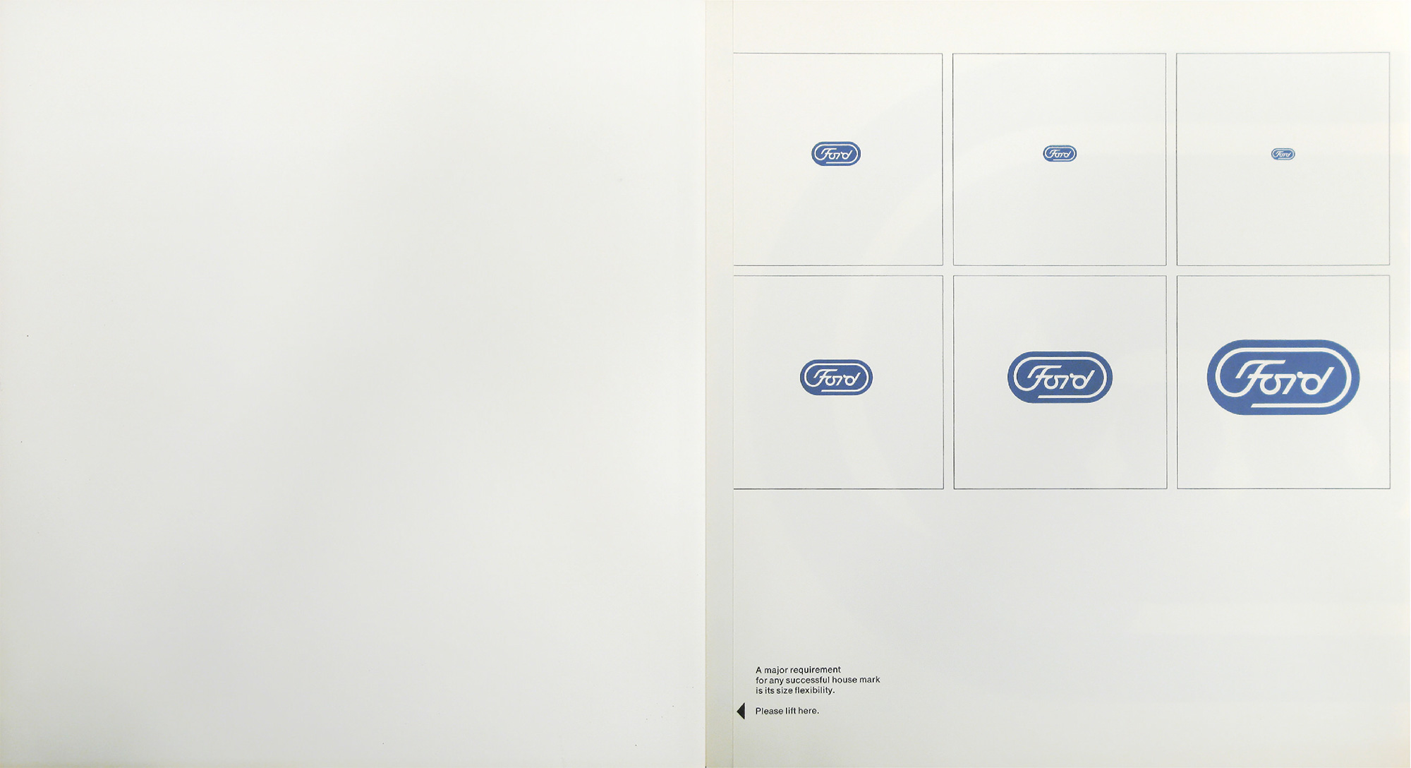
A major requirement for any house mark is its size flexibility.

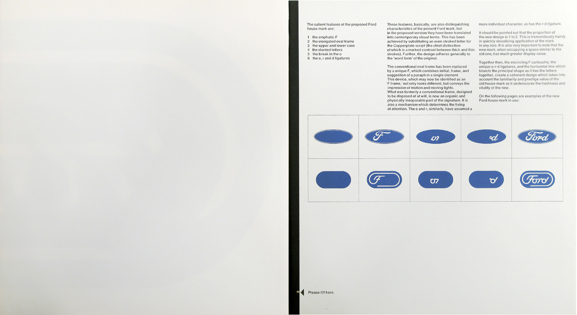
The salient features of the proposed Ford house mark are:

  1. the emphatic F
  2. the elongated oval frame
  3. the upper and lower case
  4. the slanted letters
  5. the break in the o
  6. the o, r and d ligatures

These features, basically, are also distinguishing characteristics of the present Ford mark, but in the proposed version they have been translated into contemporary visual terms. This has been achieved by substituting an even stroked letter for the Copperplate script (the chief distinction of which is a marked contrast between thick and thin strokes). Further, the design adheres generally to the “word form” of the original.

The conventional oval frame has been replaced by a unique F, which combines initial, frame, and suggestion of a paraph in a single element. This device, which may now be identified as an “F frame,” not only looks different, but conveys the impression of motion and moving lights. What was formerly a conventional frame, designed to be disposed of at will, is now an organic and physically inseparable part of the signature. It is also a mechanism which determines the fixing of attention. The o and r, similarly, have assumed more individual character, as has the r-d ligature.

It should be pointed out that the proportion of the new design is 1 to 2. This is tremendously handy in quickly visualizing application of the mark in any size. It is also very important to note that the new mark, when occupying a space similar to the old one, has much greater display value.

Together then, the encircling F cartouche, the unique o-r-d ligatures, and the horizontal line which bisects the principal shape as it ties the letters together, create a coherent design which takes into account the familiarity and prestige value of the old house mark as it underscores the freshness and vitality of the new.

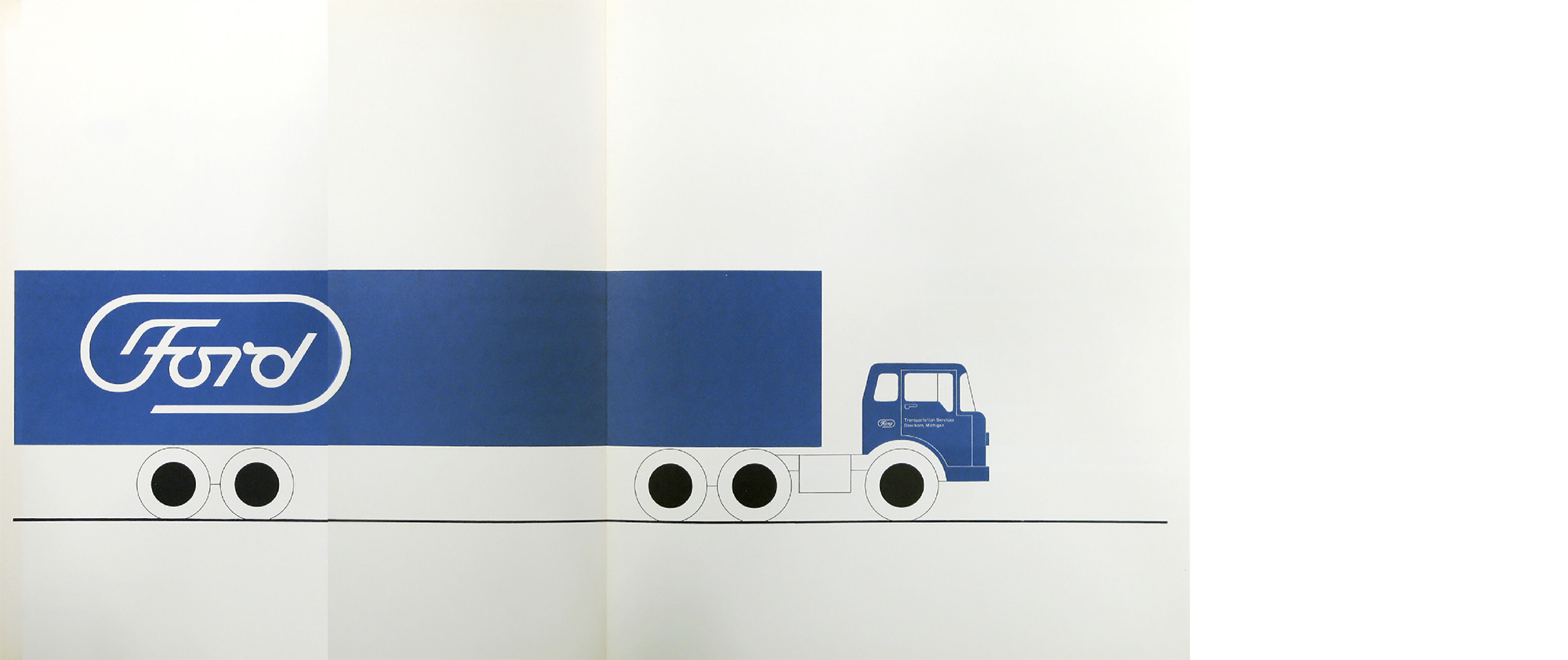
On the following pages are examples of the new Ford house mark in use:

Overall background of Ford marks serves many useful purposes. On this owner’s manual, it helps to distinguish between Corporate and product identity. It may be used as a background for such miscellaneous items as:

packaging
general advertising
direct mail
legal documents
office forms
curtain fabrics
wallpapers

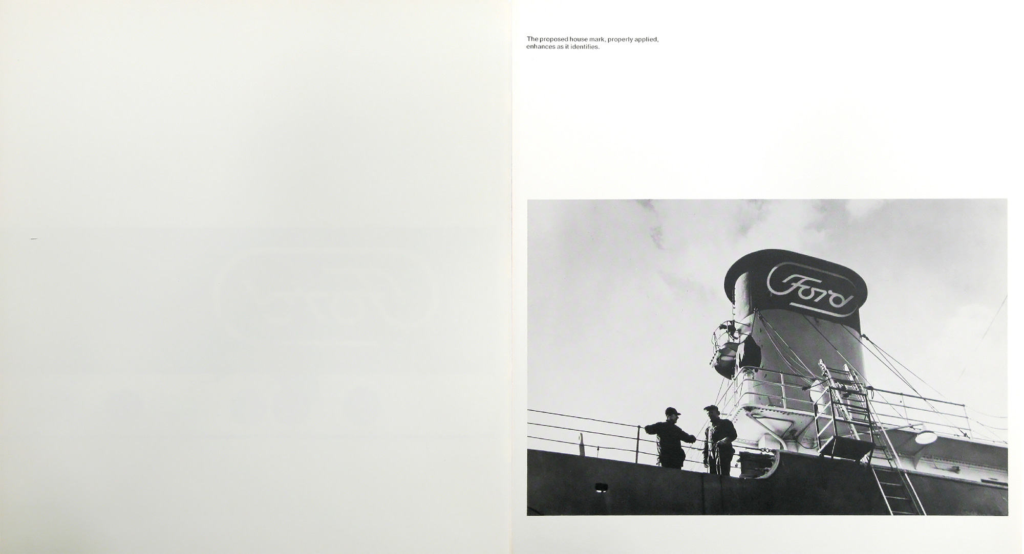
The proposed house mark, properly applied, enhances as it identifies.

Signs that say… Safe Driving.

The Paul Rand Ford logo presentation is archived on paulrand.design, along with various other logo books from the renowned designer.

Related, from the archives, how Paul Rand presented logos to clients.

https://www.logodesignlove.com/ford-logo-paul-rand



Clarence Pearson Hornung

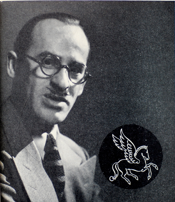
Clarence P Hornung (1899–1997) was an American printer, publisher, typographer, and designer of logos and trademarks. He designed for book publishers such as Encyclopedia Britannica, Vanguard Press, and the Book League of America.
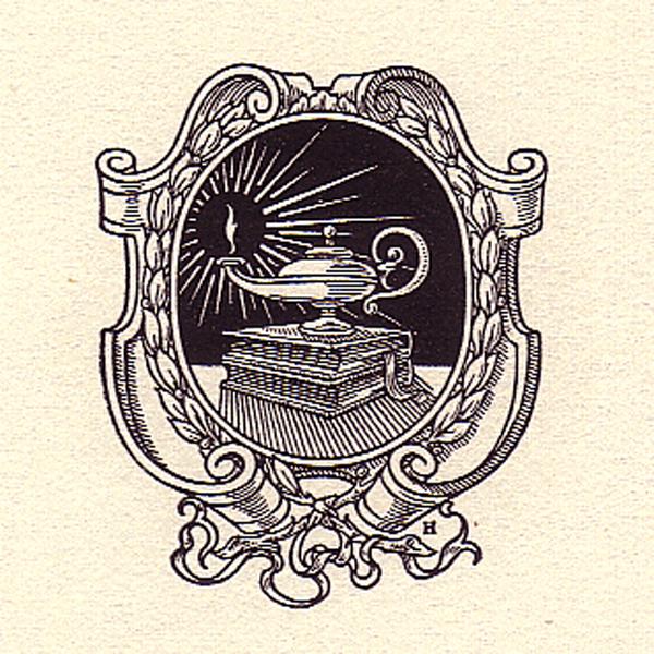

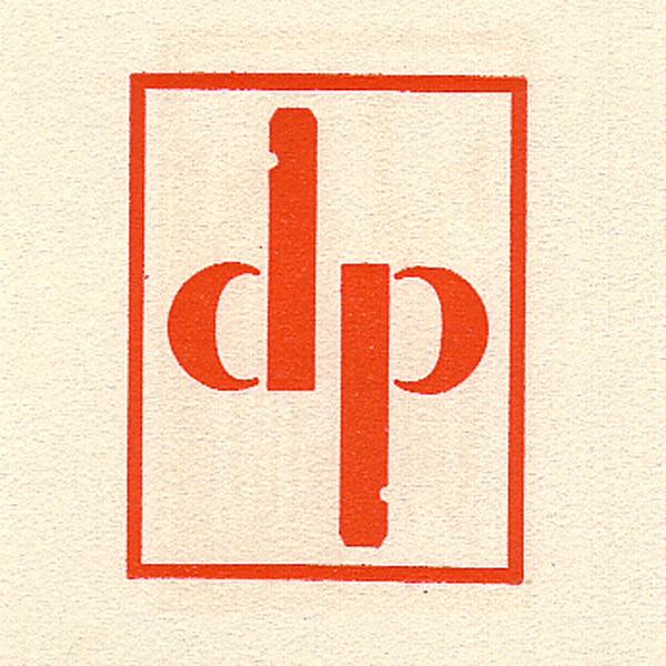
Clarence P Hornung photo
Clarence P Hornung, via Letterology

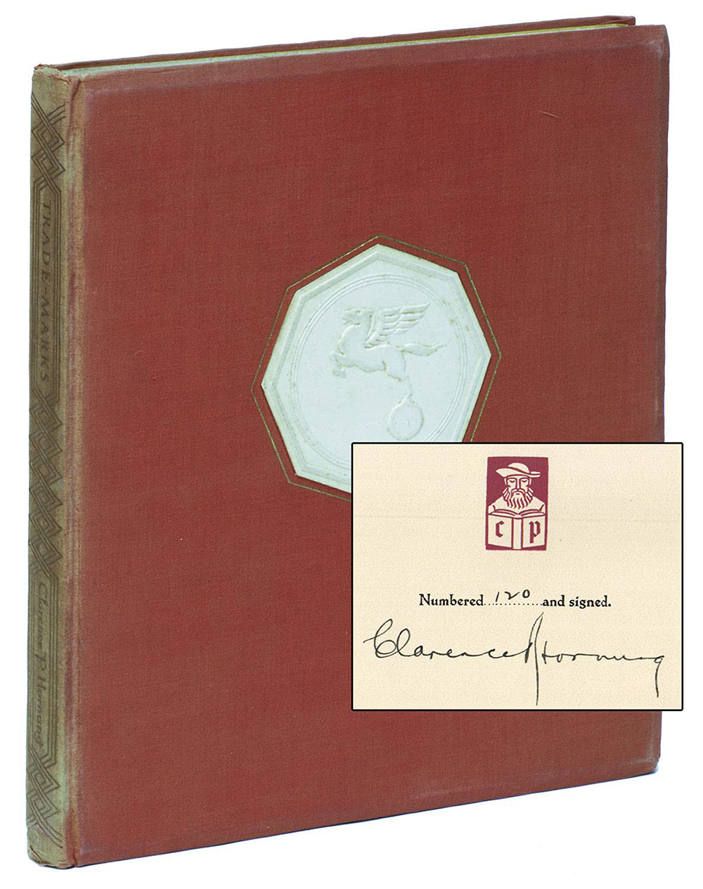
In 1930, Caxton Press published the book Trade-Marks Designed By Clarence P Hornung.

Trademarks Designed by Clarence Hornung book
Photo via Type Punch Matrix

The colophon states that 750 copies were printed in December 1930, with 650 copies for sale. Each volume was hand-signed and numbered by Hornung, and the American Institute of Graphic Arts named it one of their 50 Books of the Year in 1932. More details on Designers & Books, by Randall Ross of Modernism 101.

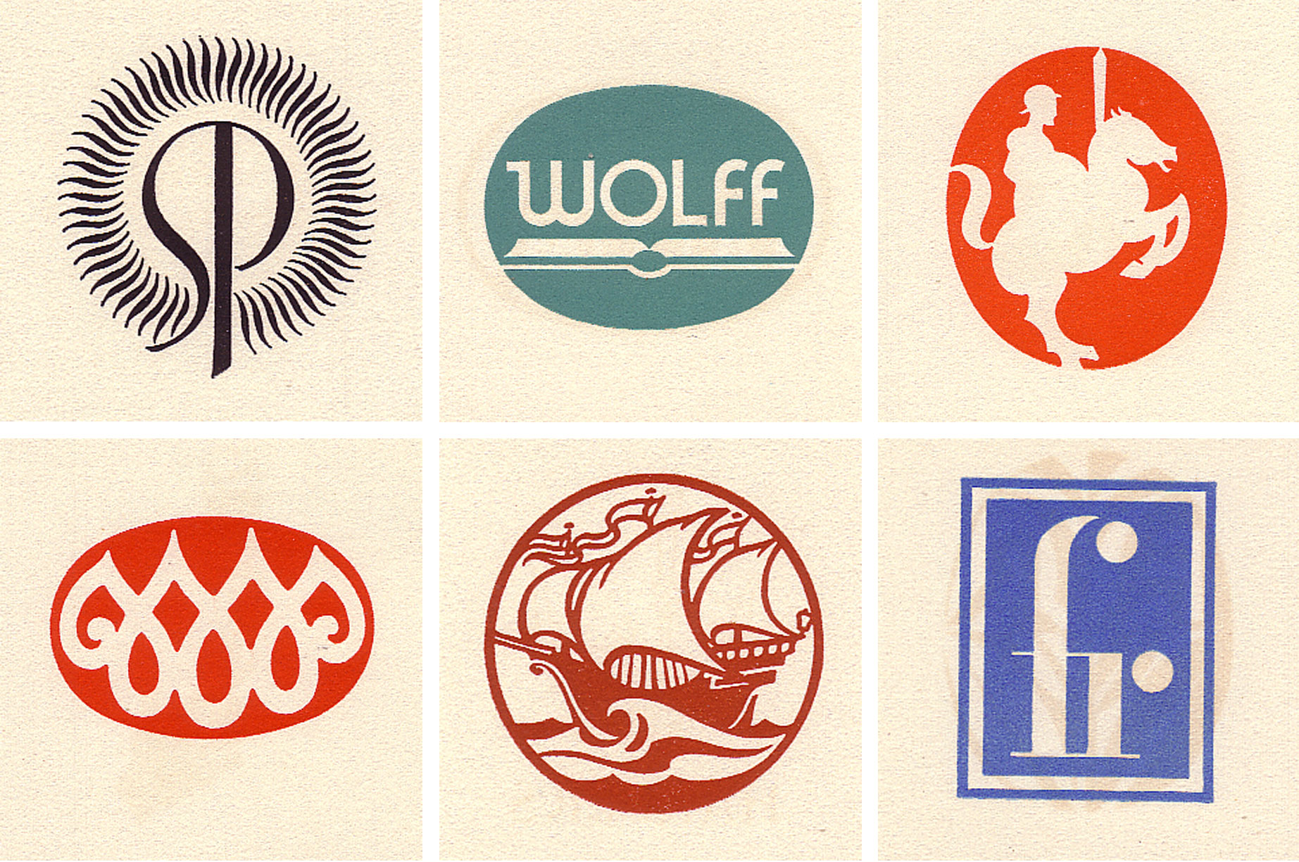
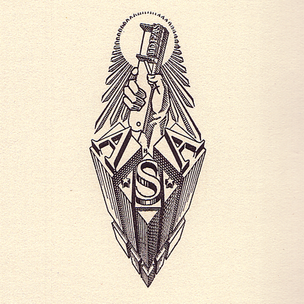
53 trademarks were displayed within the homage. Here’s a selection.

Advertising Agency Services logo
Advertising Agency Services (typographers)
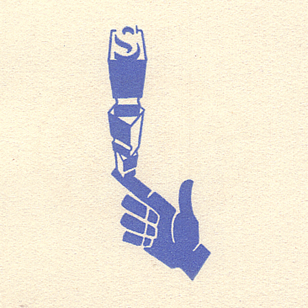
Advertising Arts & Crafts logo
Advertising Arts & Crafts (publishers)
Golden Hind Press logo
Golden Hind Press (private press)
Sunflower Press logo
Sunflower Press (printers)
Albert Schiller logo
Albert Schiller (typographer)
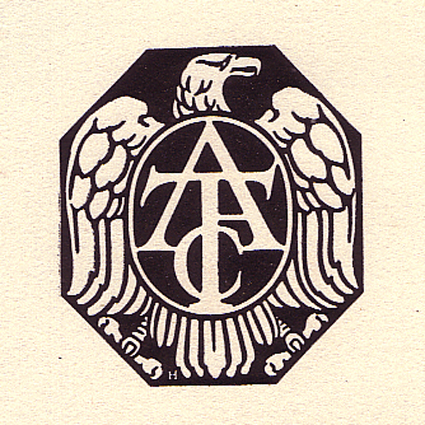
American Type Founders logo
American Type Founders (manufacturers)
Charles Scribners’ Sons logo
“Architecture” Charles Scribners’ Sons (publishers)
Book League of America logo
Book League of America (publishers)
Brown House logo
Brown House (publishers)
Caxton Press logo
Caxton Press (printers)
Charles Scribners’ Sons logo
Charles Scribners’ Sons (publishers)
Club & Campus logo
Club & Campus (publishers)
Detroy Press logo, by Clarence Hornung
Detroy Press (printers)
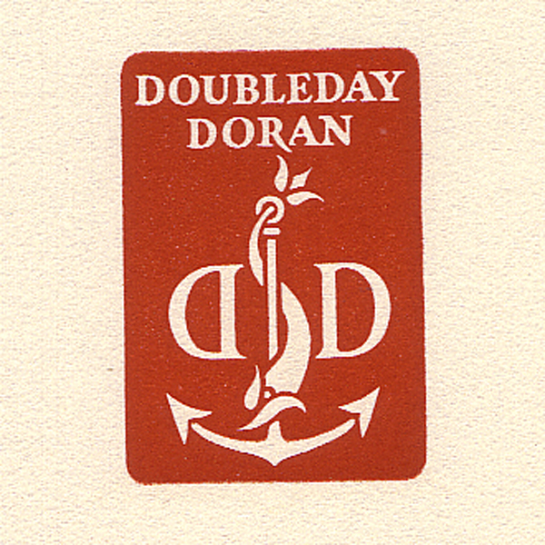
Doubleday & Doran logo, by Clarence Hornung
Doubleday & Doran (publishers)
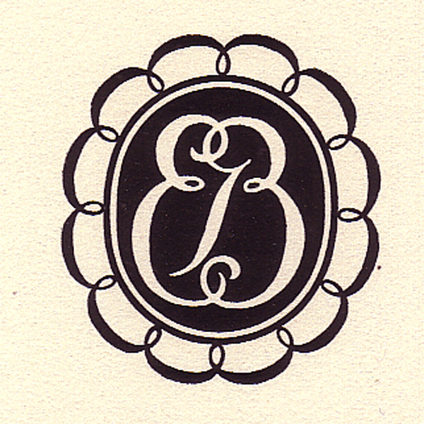
Emil Georg Sahlin logo, by Clarence Hornung
Emil Georg Sahlin (printers)
Encyclopaedia Britannica logo, by Clarence Hornung
Encyclopaedia Britannica (publishers)
Farrar & Rinehart logo, by Clarence Hornung
Farrar & Rinehart (publishers)

There’s not a great deal of info to be found online about the late designer, but Hornung was clearly interested in a broad range of design topics. LibraryThing lists the following books by Clarence Hornung.

  • 2000 Early Advertising Cuts
  • Advertising Designs of Walter Dorwin Teague
  • Allover Patterns for Designers and Craftsmen
  • An Old-Fashioned Christmas in Illustration and Decoration
  • Classic Border Designs by Twentieth-Century Masters
  • Early Advertising Alphabets, Initials, and Typographic Ornaments
  • Geometric Patterns and How to Create Them
  • Handbook of Early Advertising Art: Pictorial Volume
  • Handbook of Early Advertising Art: Typographical & Ornamental Volume
  • Handbook of Designs and Devices
  • Lettering from A to Z
  • The American Eagle in Art and Design
  • Traditional Japanese Stencil Designs
  • Traditional Japanese Crest Designs
  • Treasury of American Design
  • Two Hundred Years of American Graphic Art
  • Will Bradley: His Graphic Art

Some of those would be lovely to look through.

Many thanks to Lux Mentis Booksellers (an online archive hard-to-find books) for scanning the trademarks above (a few more here).

Info elsewhere:
Clarence P Hornung, on Wikipedia
Rare & Beautiful: The Man Who Designed 500 Logos, on Designers & Books
Clarence Hornung, The Master of Marks, on Letterology
Handbook of Designs and Devices, on Amazon.com

If you liked this, you might also like to read about renowned Polish designer Karol Śliwka (1932–2018).

https://www.logodesignlove.com/clarence-hornung


Get a Powerful Start with the Ultimate Photography Bundle

This opportunity shouldn’t be overlooked! Whether you are a new photographer or have been involved in photography for years, this bundle provides something for everyone at every level. Upgrade your skillset from experienced photographers and master editing techniques using $1000+ worth of materials: renowned courses, software assets, and creative content to achieve stunning results.

Ultimate Photography Bundle for New Users (includes Luminar Neo lifetime license)

Ultimate Photography Bundle for those who already own Luminar Neo

Educational courses

Broaden your photography editing expertise with high caliber courses from renowned photographers. With this selection, you can be sure to find the right combination of landscape, portrait and drone lessons for amateurs or professionals alike. 

  • Full Editing Course on landscape photography from Albert Dros
    Professional photographer Albert Dros — whose work has graced some of the world’s biggest brands — reveals his editing secrets and teaches you how best to capture that perfect outdoor moment, whether on location or in post-production. Delve into exposure blending, focus stacking, noise reduction and much more – equipping yourself with all the tools necessary for beautiful landscapes every time.
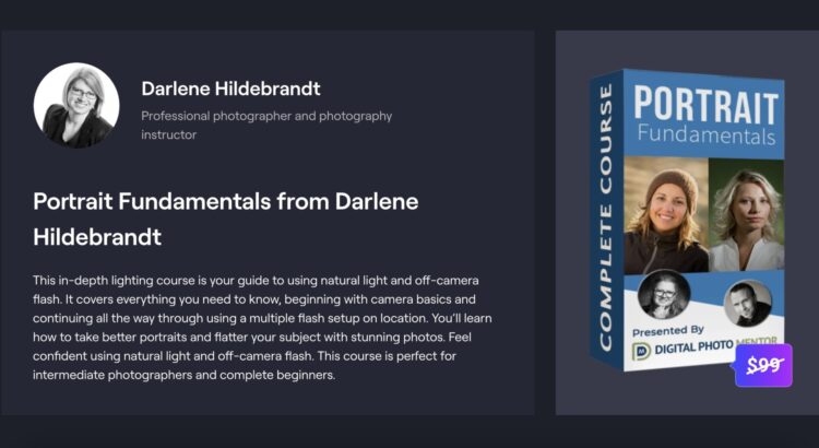
  • Portrait Fundamentals from Darlene Hildebrandt
    From camera basics right through to using multiple flash rigs on location, this comprehensive guide will teach the fundamentals of radiant light capturing so that each shot can be as flattering as possible with stunning results! Perfect for experienced photographers or complete beginners – hone in those vital techniques and become an expert at lighting portraits.
  • Drone Cinematography Crash Course from Stewart and Alina Carrol
    Learn the ins and outs of drone cinematography – look no further than Stewart & Alina Carroll, a husband-wife filmmaking team since 2012. Take their intensive 100-minute crash course filmed in Scotland’s breathtaking Highlands. In this class you’ll gain insights on how to fly like a pro with any drone, adjust settings for stunning footage, use 5 steps for cinematic results every time plus tips and tricks specifically designed to help develop creative approaches – all presented during 3 live flight adventures.

Creative content

Try a professional style on your photos with collections of creative content from real pros.

  • With selection of LUTs and Skies by Mathew Browne, you can enhance your photos to tell more powerful stories. Each item is optimized for Luminar, Photoshop, or Lightroom so that achieving picture-perfect shots becomes even more convenient. Leverage 24 nature inspired LUTs plus 8k footages perfect as background skies – now’s the time to make an impression with every snap.
  • Looking for an exquisite touch to add vibrancy and beauty to your photographs? Rene Ledrado’s captivating collections might help you – 25 Northern European skies in 8K resolution, plus 12 Classic B&W presets with timeless elegance! Transform any image into a memorable masterpiece.

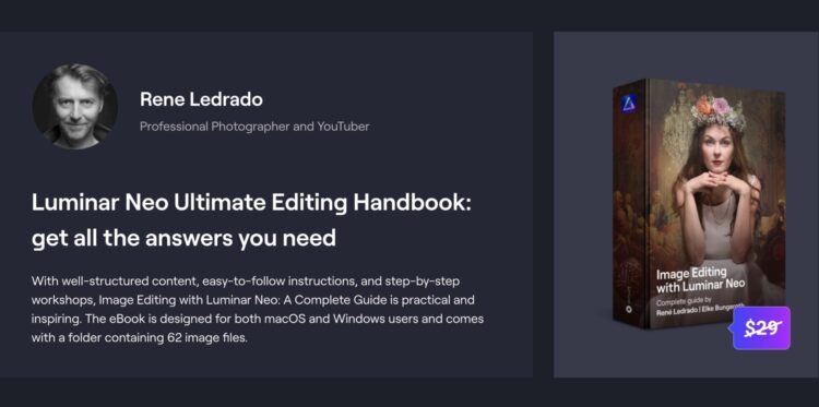
Furthermore build up an impressive arsenal of tools such as 125 LUTs, Skies Presets and Overlays from Luminar team members. You can experiment with them within Luminar, in Photoshop or Lightroom). Learn how to apply assets and more from “Image Editing with Luminar Neo: A Complete Guide”: well-structured content, easy-to-follow instructions, and step-by-step workshops, practical and inspiring. The eBook is designed for both macOS and Windows users and comes with a folder containing 62 image files for practice.

The Ultimate Photography Bundle is truly a one of a kind package, available to photographers of all levels. With access to courses taught by world-renowned photographers, an array of creative content from real pros, and an assortment of tools from the Luminar team, you can be sure to expand your knowledge base and perfect your craft quickly and easily. 

Don’t miss out on the chance to unlock the offer – take control of your photos today. Discover the Ultimate Photography Bundle and upgrade your skills.

Ultimate Photography Bundle for New Users (includes Luminar Neo lifetime license)

Ultimate Photography Bundle for those who already own Luminar Neo

https://layersmagazine.com/get-a-powerful-start-with-the-ultimate-photography-bundle.html


Unilever’s Latest Play to Tackle Food Waste? A ‘Smart’ Mayonnaise Jar

.article-native-ad { border-bottom: 1px solid #ddd; margin: 0 45px; padding-bottom: 20px; margin-bottom: 20px; } .article-native-ad svg { color: #ddd; font-size: 34px; margin-top: 10px; } .article-native-ad p { line-height:1.5; padding:0!important; padding-left: 10px!important; } .article-native-ad strong { font-weight:500; color:rgb(46,179,178); }

Join iconic brands and world-class marketing leaders at Brandweek to unlock powerful insights and impact-driven strategies. Attend in Miami or virtually, Sept. 11–14. Save 50% with early-bird passes.

Right now, your refrigerator’s door bin might be home to some almost-off milk, a scattering of garlic bulbs and a jar of relish from 2022. Now, Unilever has actually made something useful for you to put in there: a “Smart Jar” that tells you if your fridge is at the right temperature.

In 2019, the CPG’s then-chief executive (CEO) Alan Jope said it would offload brands that lacked purposeful messaging. In 2021, Hellmann’s mayonnaise took up the cause of fighting food waste under the banner of “Make Taste, Not Waste.”

#paywall-subscribe { margin:0; padding: 1rem 2.4rem; } #paywall-subscribe .holder { background-color:#eee; border:15px solid #f2f2f2; padding:30px; margin:0 auto!important; text-align:center; } #paywall-subscribe a.underline { color:#000; text-decoration:underline; } #paywall-subscribe img { margin-bottom:10px; width: 140px!important; height: auto!important; } #paywall-subscribe h3 { font-weight:bold; font-size:16px; text-transform:uppercase; width:80%; margin:0 auto; margin-bottom:20px; text-align:center; } #paywall-subscribe h3 span { display:block; font-size:14px; } #paywall-subscribe h2 { font-weight:800; font-size:24px; text-transform:uppercase; } #paywall-subscribe p { font-size: 16px; color:#000; padding: 0; } #paywall-subscribe .cta { margin-top:20px; margin-bottom:10px; font-size:14px; text-transform:capitalize; color: #fff; background-color: #E50000; border:none; padding:12px 28px; text-decoration:none; -webkit-transition: .3s ease; -moz-transition: .3s ease; -o-transition: .3s ease; -ms-transition: .3s ease; transition: .3s ease; } #paywall-subscribe .cta:hover { color: #fff; background-color: #181818; transform: scale(1.02); } #paywall-subscribe .already-a-member { font-size:14px; } @media (max-width: 1024px) { #paywall-subscribe .holder { border:12px solid #f2f2f2; padding:25px; } #paywall-subscribe img { width: 120px!important; } } @media (max-width: 768px) { #paywall-subscribe .holder { border:10px solid #f2f2f2; padding:20px; } #paywall-subscribe img { width: 100px!important; } #paywall-subscribe h3 { font-size:14px; } #paywall-subscribe h3 span { font-size:12px; } #paywall-subscribe h2 { font-size:18px; } #paywall-subscribe p { font-size:14px; } #paywall-subscribe .cta { font-size:12px; padding:10px 24px; } #paywall-subscribe .already-a-member { font-size:11px; } } AW+

WORK SMARTER – LEARN, GROW AND BE INSPIRED.

Subscribe today!

To Read the Full Story Become an Adweek+ Subscriber

View Subscription Options

Already a member? Sign in

https://www.adweek.com/brand-marketing/unilever-tackles-food-waste-smart-mayonnaise-jar/


The Best Photo Effects Software Plugin for Photoshop

It is no secret that Photoshop is an incredibly powerful image editing tool for all kinds of photographers. However, if you aren’t an expert Photoshop user, you may find the program difficult to use and lacking in easy-to-apply effects to make your photos look better in just a few simple clicks. 

If you’ve browsed the internet lately, you’ve probably seen various Photoshop plugins meant to be launched directly from Photoshop to achieve specific effects on your images. Different plugins exist for different things, from editing your portraits, fixing noise, or even using AI technology to replace your skies. Knowing which Photoshop plugins will offer you the best value to improve your photo editing workflow is hard. 

One of the best photo effects plugins for Photoshop on the market today is ON1 Effects. This photo effects software is simply the best when it comes to ease of use, and ON1 Effects combines a simple yet effective interface with powerful effects to help shape your photo edit and make every shot portfolio worthy. Here are some of the best features of ON1 Effects:

Before and after using ON1 Effects to enhance this photo.

31+ Photo Effects

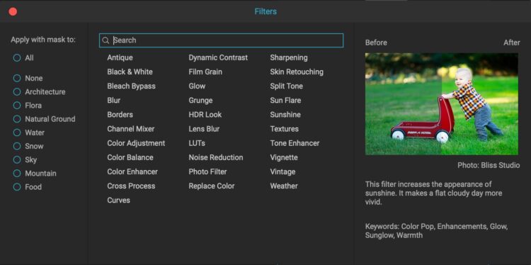
ON1 Effects is loaded with photo effects of all kinds. Whether you want to add a vintage film look to your photos or make a simple color adjustment, ON1 has an effect for that. Even for new users, finding the effect you are looking for with the search bar is very easy. Best of all (for new users), hovering over the effect with your mouse will give you a short paragraph telling you what the effect does, as well as an example image showing you what you can do with the effect.

More than 30 photo effects are included. The search bar makes it easy to find the effect you are looking for.

Achieve Photo Effects That Aren’t Available in Photoshop

Photoshop is certainly lacking in photo editing effects, especially ones that are easy to apply. Applying a simple glow to your photos takes numerous layers and a knowledge of blend modes. In ON1 Effects, you have many options to apply different effects with one simple click. Once the photo effect is applied, you can easily adjust the sliders to fine-tune the results to your image. 

Best of all, ON1 Effects is far easier to use than Photoshop. Even if you can create a unique effect in Photoshop, it is usually far easier to apply in ON1 Effects. Since each effect is named in a way that makes sense, you don’t have to spend your time on YouTube trying to figure out how to make a special filter to create your desired effect in Photoshop.

Mask Your Photo Effect

Once you’ve selected and applied a photo effect, it can be easily masked in ON1 Effects. While Photoshop offers tools for masking, they aren’t easy to use or understand without advanced knowledge. In ON1, it is as simple as clicking the mask button and then selecting a brush to paint on the mask with or using “Lumen” to make luminosity masks. Using luminosity masks has never been easier, and they’ll allow you the most precise mask on your photo based on the lightness values of each part of the image.

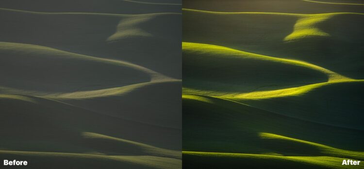
Before and after using ON1 Effects. Just 6 total effects were used to make this image.

Complete Built-In Library of Effects, Presets, and Instant Previews

If you want a quick and easy edit, ON1 Effects has tons of preset effects you can choose from for nearly any kind of photography. Some of the presets are even AI-based, where the software will automatically apply effects and use masking to make your photo look amazing — in just one click.

If you’re batch editing multiple photos and want to apply the same effects repeatedly, creating a preset to reuse numerous times is easy. Lastly, you can favorite specific presets to find them easier each time you launch the program.

Advanced Features

ON1 Effects isn’t just for the amateur photographer. This photo effects software contains many advanced features that pros and amateurs alike will love to use. In addition to the easy luminosity masking mentioned above, ON1 Effects includes blend modes, color range masking, and various selection tools to ensure that the desired effect is only applied where you want it. While these advanced features are all offered in Photoshop, using them in ON1 Effects is far easier and faster.

Use with Photoshop Smart Objects for Non-Destructive Edits

If you make your photo layer a smart object in Photoshop, you can launch ON1 Effects as a smart filter. Essentially, this means that you can make non-destructive edits to your photos. At any point in time during your edit, click on the smart filter to re-launch ON1 Effects to make adjustments to your photo effects.

Using the “Desert Glow” Preset to enhance this photo in just a few clicks.

Regardless of your skill level or experience in photo retouching software, ON1 Effects is a photo effects plugin you absolutely must add to your digital workspace. If you’re a novice or intermediate photo editor, you’ll love having ON1 Effects to apply beautiful filters to your photo and then continue editing in Photoshop. Since the plugin is so easy to use, it takes little to no time to learn how to apply some of the many great effects to your photos. For professional photographers, this is just one more tool to add to your kit that can easily be launched anytime during your edit. ON1 Effects is just one more thing you can add to your workflow, and best of all, you can use it to apply non-destructive effects to your photos. No matter your skill level, ON1 Effects truly is a photo effects software that every Photoshop user should own.

https://layersmagazine.com/the-best-photo-effects-software-plugin-for-photoshop.html