Steven Heller’s Font of the Month: Farandole & Lustik
September 7, 2022
Experimentation is risky. Experimental type design is risk-plus. As a risky-endeavor the Farandole family from Francis Chouquet is an object of my affection not because it always succeeds but because it takes chances. The trick to the unorthodox use of this illustrated assortment of random shapes, is seen in the combinations of mixed, overlapping, opaque colors just like a child’s pre-school art kit. The theory behind the face makes sense. Farandole is indeed as loosely designed as a child’s collage (a trait that will be appreciated by many non-children too).
As a functionally playful font Farandole has inherent flaws. I admit that these flaws might have been the rationale for designing the font to begin with. In the test settings I made on screen it was rather challenging to get the desired effect – rather than have command of each element, the amorphic shapes were hard to tame.
The frustration is not in the outcome as evidenced on this site in the color specimen for the Farandole family (in which caps and lowercase alphabets, though eccentric, are perfectly constructed, in multicolored samples). The big challenge is actually getting to the point where these doodle-like abstractions are transformed into representational letters. Maybe its my own challenged cognitive elasticity… or not?
For a font-as-toy, I much prefer Chouquet’s even more abstract Lustik Front and Lustik Back designs, which employ fewer hand drawn elemental shapes (square, dot, triangle) which offer the promise of way more colorful, overlayed and translucent surprises using less mental exertion for a far more viscerally satisfying return.
Obviously, Chouquet enjoys to play. Vive la play! I’m glad to have had the happy opportunity to amuse myself for myself.
Editors’s note: Soon we’ll publish some simple and super-useful tips on working with layer fonts. Stay tuned!
Steven Heller is nothing short of a legend in the design community. Award-winning graphic designer, author and editor of hundreds of books (yes, 100s!) and one of the world’s foremost authorities on graphic design history; and arguably its best design commentator. Follow Steven on the must-read The Daily Heller and read his latest book, Growing Up Underground: A Memoir of Counterculture New York.
5 Things to Know About Using Plugins in Photoshop
You can do a lot in Photoshop. It’s no secret that Photoshop is one of, if not the most powerful photo editing programs in the world. For years, Adobe’s pinnacle program has been the gold standard in photo editing. In the last few years, Photoshop plugins have been on the rise, and there are now thousands of different plugins available for Photoshop.
These plugins can do a variety of things, from adding special effects, to removing noise, or even resizing your photo or using AI technology to remove stray hairs from your model. Many plugins allow you to do things to your image that you otherwise can’t do in Photoshop, while others just have an easier, or more effective way to do things that are already possible to do in Photoshop.
If you’re a Photoshop user and you do not yet have any plugins, you’re missing out. Having powerful Photoshop plugins can expand the power and capabilities of Photoshop by using other software that integrates very well with Photoshop and its non-destructive layer editing system.
Take ON1 for example. For the last 17+ years they’ve been developing Photoshop plugins to create a faster and easier workflow for photographers.
In this post, we’ll look at 5 things that you should know about using plugins in Photoshop.
#1 Plugins Can Give You “Finishing Move” Effects and Filters
Many plugins, especially ON1 Effects, offer many effects that work great to give your photos a finished look. Consider these effects to be like a photo filter that you’d apply at the end of your edit, but they are highly customizable and look much better than your average Instagram photo filter. Some of the best effects for finishing off a photo include Vignette, Dynamic Contrast, and Sharpening. These all work with the single click of a button, and then you have sliders to fine-tune each effect. You can reproduce a lot of these effects and styles in Photoshop alone, but it is really time consuming and difficult to remember all of the steps. Having these styles built right into the plugin saves a ton of time.
#2 Plugins Allow You to Do Things that You Don’t Know How to Do in Photoshop in an Easier Way
Plugins allow you to do things that you otherwise would not know how to do. Photoshop is an advanced program with tons of tools and techniques, but oftentimes these tools are overly complex. Usually, plugins have a very simple and highly effective way to create your desired outcome. Take masking as an example. It can still take a bit of practice to get good masks in Photoshop. A lot of plugins have easier to use masking tools to let you take total control of how your image ends up looking.
#3 Using Plugins with Smart Objects Provides a Completely Non-Destructive Workflow
One of the benefits of using Photoshop is using a non-destructive workflow, and plugins are compatible with this non-destructive workflow. When you’re editing your photo as a smart object, you can launch the plugin from Photoshop with the smart object selected. Then, after you make adjustments, the plugin will appear under the smart object. If you wish to make adjustments to the plugin later, simply double click on the plugin and it will reopen that particular plugin for re-adjustment.
#4 Plugins like ON1 NoNoise AI Provide Much Higher-Quality Noise Reduction than Photoshop
For photo editing, Photoshop is truly the jack of all trades. Because Photoshop is such a large program, many things that you might be able to do, you can do better in a plugin that is dedicated to doing just one single thing. One great example is noise reduction. The options for reducing noise in Photoshop are pretty minimal, and the available options don’t work as well as a plugin. ON1 NoNoise AI uses AI technology to reduce noise, and therefore provide a much higher quality result than Photoshop. See the examples below for a comparison.
#5 Plugins Can Be Used at Any Time While Editing
Most Photoshop plugins can be used at any time during the photo editing process. While some effects created by plugins may work better at the beginning of your edit, other effects might seem more logical to apply at the end. Any of the ON1 Plugins can be used at any time during the editing process during Photoshop, so you don’t need to drastically change your current workflow to incorporate plugins.
The printed book has been the supreme discipline of typography ever since moveable type was invented. Today, more text is read on screens than on paper, yet books continue to provide great opportunities for typographers to showcase their skills. Since books are about extended amounts of body copy, legibility in text sizes is a minimum requirement for all fonts on this list. I’ve had the pleasure to work with most of them myself — you’ll notice that I like my books classical but with a contemporary twist.
by Moritz Kleinsorge / Identity Letters When this superfamily was released, it was the type tool I had always waited for and I even had the honor of baptizing it “Allrounder.” Allrounder Grotesk and its Granjon-inspired serif counterpart, Allrounder Antiqua, are based on very different skeletons and design principles, yet they share the same vertical metrics and are fine-tuned to generate the same color on the page. This feature makes typesetting nonfiction books, dictionaries, and other books with a complex a piece of cake. The third Allrounder member, Allrounder Monument, an all-caps display typeface, is great for titles.
by Ramiro Espinoza / Retype Transitional serif faces like Dejanire are among the most popular choices for books (and long text in general). Starting out as the polished version of an anonymous 18th-century display typeface, Dejanire was expanded by Ramiro Espinoza into an impressive superfamily. Its contemporary appearance, a large supply of styles—including a Jewel variant and a matching sans—, and its stockpile of useful features are a blessing for the demanding typographer.
by Nick Shinn / Shinntype At 1600+ glyphs, this aptly titled serif face of the Scotch Modern genre and its early grotesque-style sans-serif counterpart, Figgins Sans, are both well-drawn and well-equipped. Granted, it’s not a style that will go with every kind of content. But if it fits yours, you can be sure that this suite is up for any challenge book design has to offer.
by Robert Strauch / Lazydogs Typefoundry Not the most versatile font family in terms of the number of fonts (there’s only 3 of them), Fabiol focuses on what it does best: setting lavishly beautiful body copy. I don’t know exactly how Robert Strauch and the Lazydogs team pulled it off—this hybrid serif typeface doesn’t have a “handmade” look, by all means, yet it’s as warm-blooded and soulful as it gets. What I do know is that working with Fabiol is a joy. The fonts contain a bunch of useful features for book typography—and a chipper set of fleurons.
by Juanjo López / Huy! Fonts Juanjo’s fonts are drawn flawlessly and sport a generous character set. With Graveur Variable, you get Renaissance quality galore: an elegant, dignified garalde with a fresh look and can be easily paired with more contemporary designs. Its Variable Font axes make it especially versatile. This might be your new workhorse.
by Jos Buivenga & Martin Majoor / The Questa Project Another superfamily that makes book design easier and more pleasant, Questa comes with a clean, contemporary look. Unlike the previously mentioned Allrounder fonts, the serif, sans, and slab variants of Questa share the same skeleton. This makes for a more uniform look when using different subfamilies on the same page.
by Martin Majoor Not a serif, not strictly a sans, either: a flare-serif typeface wouldn’t be my first choice for extended amounts of text. Comma Base, however, sets a very nice body copy. I would indeed like to see it used for an entire book.
by Kaja Słojewska & Plamen Motev / Fontfabric Not only does Alkes support Latin, Cyrillic, and Greek—it was specifically tailored to harmonize between the three scripts. Kaja Słojewska’s contemporary humanist design with its heavy serifs makes for a friendly look and a pleasant reading experience.
by David Březina & Sláva Jevčinová / Rosetta Hardly an industry secret, the Skolar superfamily is exceptional in more than one way. Its impressive range of features and language support let you tackle even complex academic typesetting, while its nifty design will enhance the look of any text straight out of the box. Skolar and Skolar Sans are the Swiss army knives of book design.
by Rob Keller / Mota Italic Can a typeface that was optimized for body copy brim with personality? One look at Vesper says it can. Sporting woodcut-like broken curves, Rob Keller’s design from 2008 was one of the pioneers in this sub-genre of text faces. Flashy when used large, legible in small sizes.
by Jos Buivenga / exljbris Font Foundry Yes, it’s a geometric sans-serif. You’re wondering why it made it on this list? Easy: Antona sets a surprisingly calm, legible body copy with an even color. Its large counters and open apertures make for fluent reading in all sizes. If you must use a geometric sans for your book, this is a good one to start with.
by Henning Skibbe / Character Type This superfamily was meant to be used in newspapers (obviously). Its demeanor is everything but restrained. However, depending on the complexity of your book’s layout and topic, you might well benefit from the range of styles and characters available in News Sans and News Serif.
by Philip Lammert / Vibrant Types A sturdy and fairly wide design, Adelbrook evokes early humanist types but is positively contemporary upon closer inspection. The resulting look may be a bit unconventional for a novel but will work great in layouts at the intersection of book end editorial design.
by Ludwig Übele / Ludwig Type A humanist sans-serif typeface with organic qualities. Niko’s three widths with low contrast in the middle weights, open shapes, and even texture make it a top choice for nonfiction books and any kind of text to be published both in print and as an ebook. It looks really crisp on-screen.
by Paul Hickson & Pat Hickson / London Type Foundry Sometimes, you just need a Garamond. This one is an especially beautiful rendition. Yes, it’s just one weight, yes, the character set is limited, and yes, there’s no italic. To make up for it, there is a set of 26 original initials to help you realize your visions of classic book design.
by Nils Thomsen / TypeMates Pensum Pro is my personal champion for long text and one of my all-time favorite typefaces—always distinct, never obtrusive. The middle weights make for a neat and even texture in body copy while the more flashy Thin and Black ends of the spectrum let you go big or go home. Pensum Pro sports lavishly beautiful italics and a powerful glyph set for Latin-based languages. Pensum Pro alone will go a long way, but in case you need even more, there’s a whole superfamily to discover.
About the author
Johannes López Ayala is a designer, writer, and artist based in Germany. With a background in languages, he studied Industrial Design and Communication Design, worked in big-corp marketing, managed an art gallery, and eventually took to type. He completed the postgraduate Expert class Type design at the Plantin Institute of Typography, Antwerp, in 2022.
In addition to his professional work as a creative director at Tipogris Books and Brands, he has been teaching as a lecturer at Rhine-Waal University of Applied Sciences. Follow Johannes on Twitter and read his irregular type reviews at 366Fonts.
Graphis
Seems like it’s been around forever. I stop by the website every once in a while, normally after clicking a link in an article, or clicking through from a logo in an image search. I think to myself, oh, this is good, I should add it to the site.
Then I go back to whatever I was doing.
So a number of years later than expected, here’s a signpost to the Graphis logo archives, where a record’s kept for the likes of these, and many more.
Our Price logo, by CDT (Carroll, Dempsey and Thirkell)
For my international readers, Our Price was a chain of record stores in the UK and Ireland.
Endura Nail Corporation logo, by Mat AlancherilBritish Railways logo, by Design Research UnitMurray Piano Services logo, by Mike MeadusAcademie de Musique logo, by Alain RochonYale Mountaineering Club logo, by Ian JamiesonAsel Art Center logo, by Woody Pirtle
Decimal logo, by Samuel KuoLazar Greenhouses logo, by Alvaro Perez
Of course, it’s not just logos on show. Graphis has a respected award program for posters, annual reports, photography, advertising, and more. One of my favourite studios, Baxter & Bailey (their Little Green Pig logo makes me smile), just picked up this trophy for a series of posters.
The Graphis’ “G” trophy
That’s a nice trophy.
Graphis also publishes books and magazines on design, communication, and the arts, with a vast archive dating back to 1944 when it was founded in Switzerland by Walter Herdeg and Dr Walter Amstutz.
In 1986, the company was sold to B Martin Pedersen, and a few years later, the headquarters were relocated from Zürich to New York City.
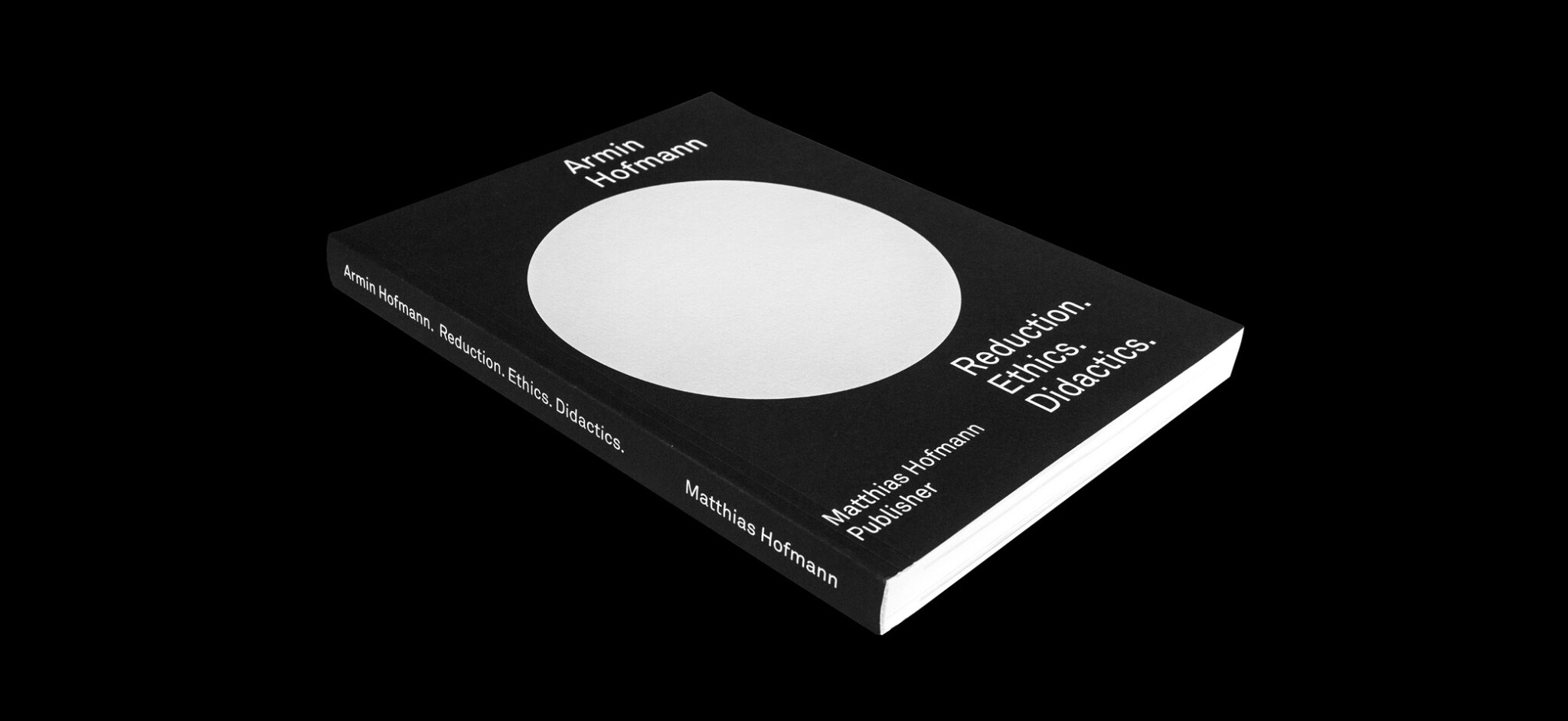
Through his extensive design and educational work, Armin Hofmann (1920–2020) is considered one of the most influential graphic designers in Switzerland. He made a significant contribution to the international reputation of Swiss graphic design and influenced generations of graphic designers and teachers around the world.
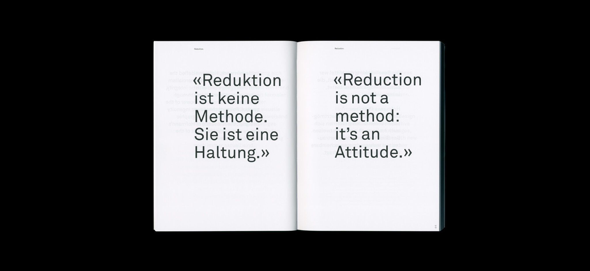
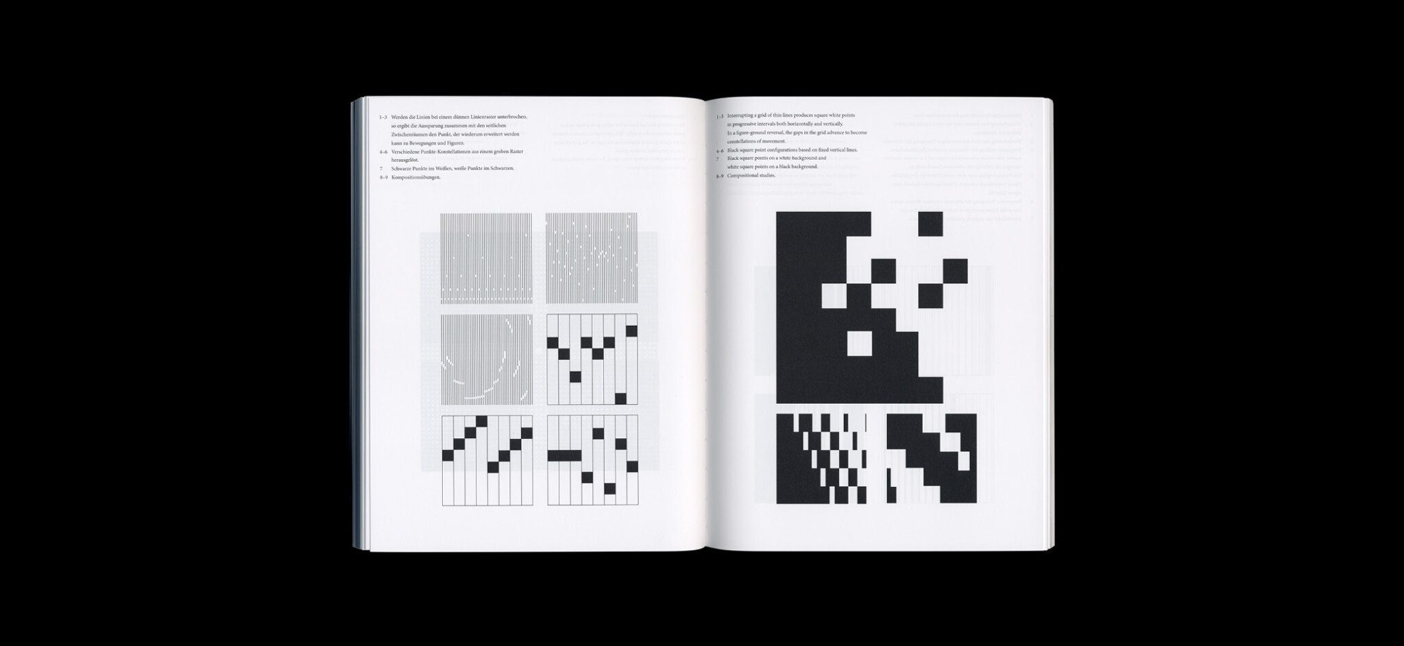
The German / English book showcases a comprehensive overview of Armin Hofmann’s creative work, his professional convictions, and the didactic principles he developed. Thanks to the exclusive access to non-public original sources (his entire creative output, original manuscripts, unpublished texts, sketches, and photographs), the book offers an unparalleled immersion into the work of the celebrated designer.
Guest essays give an insight into Hofmann’s teaching and influence, and also included is a limited edition catalogue of sketches and techniques.
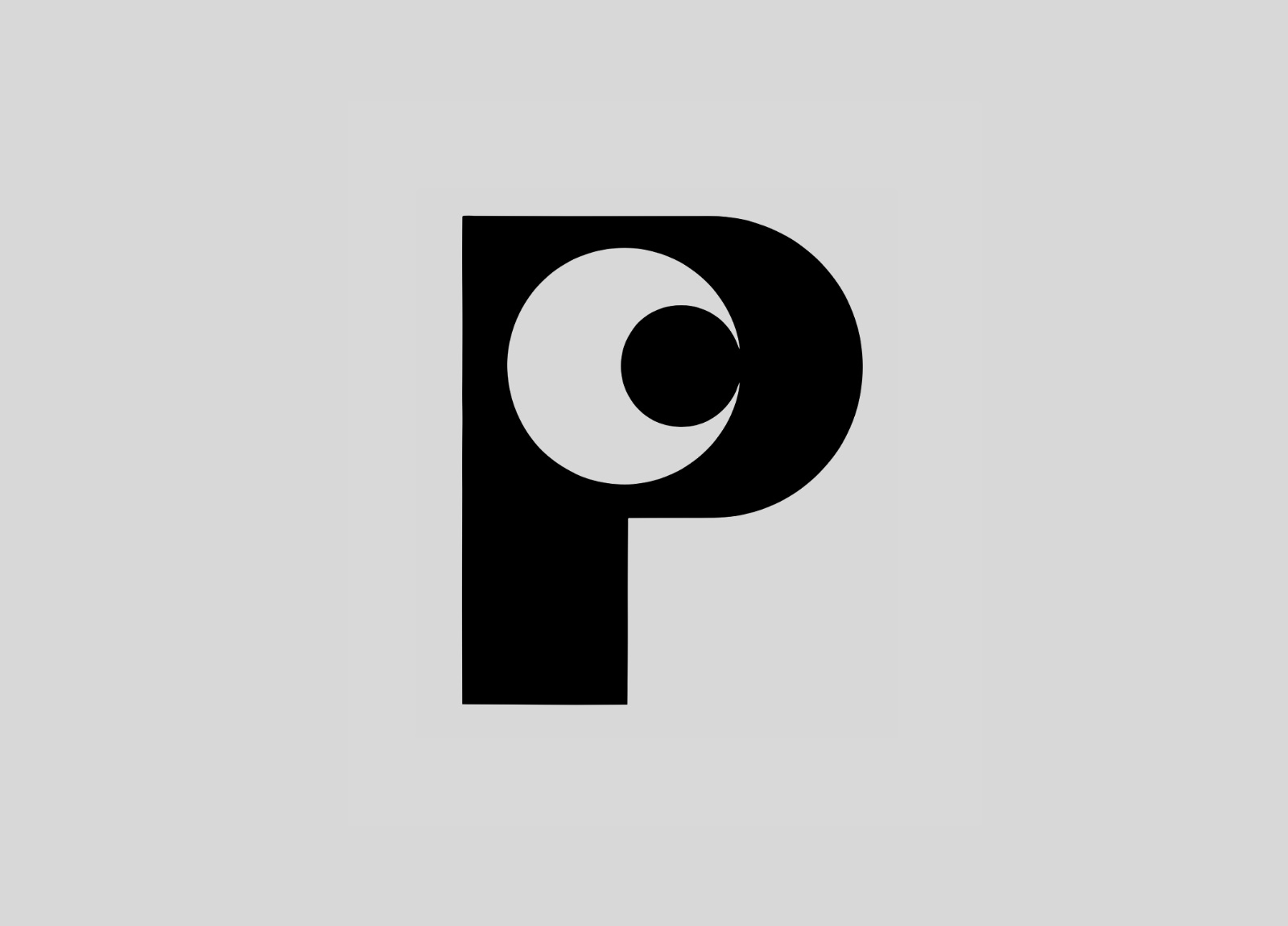
While his logo work isn’t what he was most known for — many of Hofmann’s poster designs have been exhibited at MoMA — the marks he created showed a playful timelessness that undoubtedly influenced the enduring simplicity of more contemporary designs. For example, this, from 1964, for Swiss textiles firm Pfauen Mode.
And this, for Schweizerische Landesausstellung (Expo 64), held in Lausanne.
Often restricting himself to just one colour, one sign, to reduce as far as possible, you can see some other Armin Hofmann logos on Logobook and Thinking Form.
Paul Rand said of his contemporary, “As a human being he is simple and unassuming. As a teacher, he has few equals. As a practitioner, he ranks among the best […] He is a rare bird, a daredevil driver, a mountain climber, a teacher par excellence, and a guru. Yet it is difficult, really, to pin him down.”
Naming a typeface is like naming a newborn baby, kitten or puppy. The name either must reveal heritage or suggest personality. Sometimes a name triggers obvious connections; for example, the given or surname of the designer(s) or client the face has been designed for makes a lot of sense. Other times the name is a deliberate enigma — the representation of a particular quirk either visible in the type design or a secret reference that only few persons will understand. I, for one, cannot understand why Art Grootfontein calls his new bold display family Bangel (a bangel — as opposed to a bagel — is loosely worn ornamental bracelet or anklet) especially since this design is solid and unornamented — but no less fun!
Bangel Solid, Black and Ultra Black are perfectly suited for modern newspaper and magazine headlines, posters, packages, just about anything. While very readable, the lowercase also evokes a light-hearted contemporary sensibility. My preference is for the lowercase letters. The caps alone do not provide the same witty energy as the lowercase settings. I also enjoy the curious anomaly: The bottom of the “g”, for instance, is ‘mistakenly’ cut off, leaving what looks like a tail. This works because our brains perceive the shape of the “g” even when part of it is missing; while the “y”, “p”, “j” and (I assume, although I don’t see it in the sample) “q” cannot be so cut off without losing its identifying form.
The most aesthetically pleasing letters are when the “u” and “n” are combined in a word like “thunder” — they fit harmoniously together, producing a pleasant space between the tail of the “u” and the nose of the “n”. Also pleasing is the “r”, which on its own has a quality that simply tickles the eye. Speaking of “eye”, my favorite letter is the lowercase “i”. It is possible that this “i” is the rationale for calling the font Bangel, as the dot reminds me of a hanging bangel.
The one quibble is with the need for either Bangel Black Rounded (which looks like Bangel Black slightly out of focus) or Bangel Black Wave (which I predict will become a typography student’s favorite because I see a lot of this forced distortion lately), when Solid, Black, and Ultra Black are all the options any typographer needs.
Steven Heller is nothing short of a legend in the design community. Award-winning graphic designer, author and editor of hundreds of books (yes, 100s!) and one of the world’s foremost authorities on graphic design history; and arguably its best design commentator. Follow Steven on the must-read The Daily Heller and read his latest book, Type Speaks.
Featured Fonts
Last month another 21 indie foundries joined ILT. In this issue of Featured Fonts, I’d like to introduce you to a small sample of the many great new fonts they brought with them:
Rollerscript
One of my new favorite informal handwriting fonts. Rollerscript also comes in two flavors: Smooth and Rough. The latter kind of mimics paper texture. Both styles are cool. And there’s a discount when you get both fonts ($60).
And if that’s not enough to convince you that Rollerscript is a must-have script, then it comes with a huge number of alternates, & 100 ligatures, for that authentic handwriting feel.
Farandole
For sure, the most fun you’ll have with layer fonts. Farandole, by Francis Chouquet, is a gem.
Play with the layers by adjusting transparency or adding filters like ‘multiply’ for great overprint effects. And there’s also a scribbly hand-drawn decorative layer, if you want to turn the fun dial to 12.
Houschka
A geometric sans with soft edges and some thoroughly charming details. Meet the new Houschka superfamily from G-Type. Especially fond of Houschka Rounded and that domed-topped A!
2 of the 4 Houschka font families are 42% off for a limited time!
Bay Sans
Bay Sans from Blast Foundry is a solid and versatile sans serif with great details, and available in scores of weights.
Oh, and did I tell you, Bay Sans comes with tons of optional swashes! Great for drop caps and logos, and one of my goto typefaces for typesetting quotations.
Edie & Eddy
Brand new from TypeMates foundry is a superfamily comprising 4 font families: Edie & Eddy can be used for just about anything. They’d make great webfonts; the slab family would look awesome on book covers and posters. Edie & Eddy Text is ideal for editorial design in print or on the web.
Designed by Lisa Fischbach, Edie & Eddy also supports Vietnamese.
Manometer
Manometer by Fontador, a super-heavyweight thumping slab serif with slim counters. Ideal for: 1. Punchy headlines & titles; 2. Posters; 3. Space rocket branding?
Shelf Regular from Type & Roll is free to download for now. Part of a great humanist sans family of fonts that’s especially suited to text, editorial and information design, and branding.
In 1958 Bradbury Thompson developed the ‘monoalphabet’, a type whose distinctive concept was that uppercase and lowercase forms were identical. The monoalphabet was modeled on his favorite serif face, Baskerville, with lowercase a, e, m, and n mixed with uppercase letters.
In use, the only way to distinguish case was through size. Thompson, a mid-century modern designer with a penchant for classical typography, stated in the journal Westvaco Inspirations for Printers, that he edited and designed, that his motivation was not a decorative one but rather was “motivated by an interest in a more practical typography, rather than the desire to create a unique effect, as might be the reader’s conclusion upon first observation.”
Monalphabet was elegant, readable and unadorned, save for the distinctive comingling of the cases. The face was based upon “the reasoning that one alphabet is not only sufficient but that it simplifies writing, typewriting, editing, layout and typesetting, as well as the elementary teaching of spelling and composition.”
A similar motivation appears to underpin Craig Eliason’s design for the Ambicase font family, about which he writes: “Uppercase? Lowercase? Why not both?!”
That’s where the overt similarities end. Ambicase is executed with more elegantly stylistic flourish, including swashes and swirls designed to emphasize its decorative character and playful vigor. While monalphabet was a radical attempt to simplify written language, Ambicase is a concoction designed to please the eye. Although with each alphabet both cases are employed in a single font, Thompson’s monalaphabet seeks to forever alter convention while Eliason’s Ambicase offers an unconventional alternative to typographic aesthetics of the moment — and does it pleasingly well.
Steven Heller is nothing short of a legend in the design community. Award-winning graphic designer, author and editor of hundreds of books (yes, 100s!) and one of the world’s foremost authorities on graphic design history; and arguably its best design commentator. Follow Steven on the must-read The Daily Heller and read his latest book, Type Speaks.
21 New Foundries Join ILT
One year ago today, ILT launched its own font store. Our mission is to create a healthy and creative ecosystem for the creators and users of type, and over the past year we’ve launched:
Today, we welcome 21 new indie foundries to ILT. They bring hundreds of great new typefaces. Below are just some of our favorites:
Art Grootfontein
Rocking round counters and a g with fantastic flair, Bangel is just a small taste of Art’s fantastic fonts.
Alanna Munro
Need a high contrast elegant stencil family, or a sturdy serif? Then take Sahlia and Avona Serif for a spin.
Anagata
ត្រីក្រាញ់ឃើញសុភាទន្សាយហើយមានចិត្តត្រេកអរណាស់ និយាយអង្វរថា បងសុភាទន្សាយអាណិតខ្ញុំត្បិតត្រីទាំងអស់ក្នុងបឹងគេប្រើខ្ញុំមក ឲ្យអញ្ជើញបងសុភាទន្សាយទៅ. And supports Khmer, in case you didn’t notice!
Blast Foundry
Bay Sans is a solid and versatile sans serif with great details, and available in scores of weights.
Blancoletters
From the bold Basque-style forms of Harri to the blend of geometric form and calligraphic detail in Ingeo, and the splendid humanist slab serif family, Karela.
CJ Type
Dunbar Low is one of our favorites with its geometric shapes and super low x-height.
FamiraFonts
Sonar Sans blends geometric forms warmed by humanist details. Ideal for branding and identity work.
Francis Chouquet
Whether it’s the clever layers of Farandole or Lustik, or the slim counters of Cuatro, Francis has a font you’re sure to love with.
Organon Sans is a gorgeous flared sans with some calligraphic details. Rollerscript, a fluid and legible must-have handwriting font.
Interrobang Type
Retro chic from Cassette, bold but charming quirks in the Escape, and back to the future with Ray Gun.
Letterjuice
It’s the name! Juicy letters from the rolling and ribbonesque Baldufa to the razor-sharf wedge serifs of Quars.
London Type Foundry
A big fan of LDN Northbank with weight in unexpected places; and the curlicue terminals of the lovely Art Deco inspired LDN Belgravia.
Ludwig Type
From the playful ‘marshmollowness’ of Daisy through to the more serious sans and serif workhorses, Brenta and Aspen.
Missy Meyer Fonts
Informal but brilliant. Particularly like the bouncing baseline in Spring Herbs, and the subtle flaring in the strokes of Pickled Limes.
ROHH Type Foundry
From floral details in Eckhart Color to the geometric precision of Rothorn. Just two of many great typefaces from ROHH.
Teeline Fonts
Ambicase Modern is an absolute gem and a must-have — available in two optical sizes. And be sure to try out the fantastic and neon-esque Feneon families too.
Type & Roll
New new fonts from a brand new foundry! Innovative inline styles in a hyper-squarish slab called Slag. Be sure to check out Site and Shelf too.
Typemates
Resonay is a beautifully compact and elegant family of layer fonts. Comes with over 2,000 glyphs and more than 200 lowercase ligatures!
TypeThis!Studio
The Bendy reverse contrast of Horizona makes it an instant favorite.
Vibrant Types
Vibrant indeed! Slandic is a favorite, turning handwritten forms into a brilliant unconnected and angular monoline script.
A year ago we launched I Love Typography’s font store, entering a crowded marketplace dominated by a few big players with very deep pockets. We did this not because it was easy — it wasn’t — but because we felt that there is a deep imbalance in our industry that is stacked against independent foundries. We firmly believed that the future of our industry depends on the ability of small and mid-sized foundries to flourish. So, we needed a font retailer that puts the health of our creative industry ahead of everything else. We needed to work towards a future other than the one we could see coming.
Our mission is to create a healthy and creative eco-system for the creators and users of type. In our first year of trading, we launched several initiatives that would bring us closer to that goal:
Bold Friday
Bold Friday is our take on Black Friday, the largest day in retail business in the calendar year. Last November, we passed on all revenue to the foundries and kept nothing for us. We have committed to do this on all Black Fridays, because it allows the foundries to offer deeper discounts that help customers get access to more fonts. The foundries win, the customers win, and we are happy with that!
Mentorship Program
In March we launched a mentorship program for women-led or co-led foundries. We will not achieve gender equality or equity in our industry if women are not at the table, driving strategy forward and having a say in the trajectory that we collectively move in. The number of foundries with women in leadership position is quite small, and we hope that our mentorship program will encourage more women to step up.
Font Fashion Week
In April we hosted the first Font Fashion Week, an occasion for foundries to launch new typefaces — we launched 12 new typeface families in total — and to celebrate trends in type design today. The purpose is to empower independent foundries by harnessing the collective power of the group. Launching typefaces together provides a larger spotlight for the foundries to shine in. The next Font Fashion Week is October 3–7.
ILT Academy
We would like to remove the linguistic and geographical barriers towards type education. To that end, we launched the online ILT Academy in May, offering online type design courses in a variety of languages. We have so far offered Arabic type design (in English) and Latin type design (in Japanese). Upcoming courses include font production, advanced Latin type design, Greek, Cyrillic, and Devanagari.
These initiatives were the highlights of our first 365 days as a font retailer. Accompanying us on our journey were 61 foundries who represent some of the best type designers practicing today. It is our joy and our honor to represent them, and an infinite source of inspiration as we highlight and discover the beautiful typefaces they’ve created. To them we send a million thanks as we renew our pledge to them that we will continue to be a fair partner.
Today we start the next 365 days in type, and to our journey we welcome another 21 foundries who join us, bringing us to a total of 82 foundries launched in one year, and almost 1,200 typeface families. As we expand our family and our offering, we keep one goal in mind: that we will curate the typefaces and foundries that come onto our site, so that when a visitor comes looking for fonts, the journey of font discovery is one filled with inspiration and wonder.
Finally, to the loyal customers who chose us for their font purchases, thank you for your trust and we will continue to share with you our deepest love for type design and typography. Hope to see you again soon!


 Steven Heller is nothing short of a legend in the design community. Award-winning graphic designer, author and editor of hundreds of books (yes, 100s!) and one of the world’s foremost authorities on graphic design history; and arguably its best design commentator. Follow Steven on the must-read The Daily Heller and read his latest book, Growing Up Underground: A Memoir of Counterculture New York.




 Steven Heller is nothing short of a legend in the design community. Award-winning graphic designer, author and editor of hundreds of books (yes, 100s!) and one of the world’s foremost authorities on graphic design history; and arguably its best design commentator. Follow Steven on the must-read


 Steven Heller is nothing short of a legend in the design community. Award-winning graphic designer, author and editor of hundreds of books (yes, 100s!) and one of the world’s foremost authorities on graphic design history; and arguably its best design commentator. Follow Steven on the must-read


