ON1 Releases the Next-Generation Photo Enlargement Software

ON1 Resize, powered by Genuine Fractals, has been the gold standard for photo resizing and preparing your photo’s final output, and it has been for over twenty years. ON1 says the new ON1 Resize AI is by far the most significant improvement they’ve made to their industry-leading photo enlargement software since the early days of Genuine Fractals.

In the past, interpolation methods were used to add new pixels to photos to make them bigger. You simply can’t stretch an image to be bigger without adding pixels, or the photo becomes pixelated in appearance. ON1 Resize AI uses state-of-art machine learning to create the details and sharpness that get lost when photos are enlarged. Resize AI goes well beyond just keeping the edges sharp. It interprets elements in photos like animal fur, tree bark, feathers, grass, leaves, rock, and skin to man-made textures like concrete, fabric, or brick and keeps those details looking crisp in the enlarged photo. In some instances, Resize AI can create details to keep your enlarged images looking even more clean and crisp than the original. 

“We trained ON1 Resize AI on a variety of photos. It can see textures like rocks, skin, fur, feathers, masonry, tree bark, etc. You get the idea. The technology can recreate these textures and make them look realistic in the enlarged photos making super crisp and clean enlargements” says Dan Harlacher, VP of Product.

How It Stands Out from the Competition

ON1 Resize AI is the perfect solution for cropping a section out of your photo if your lens can’t get you close enough or preparing and printing your biggest and best photos. It can crop, resize, and sharpen all at once. It can add wings for printing on canvas or create tiles for a mosaic. You can also batch process images and print them right from the app. 

You will be amazed by what you can do with ON1 Resize AI. ON1 Resize AI works as a plugin for Adobe Lightroom and Photoshop. Resize AI goes beyond the average plugins. In Lightroom you can batch process easily with powerful new resizing options. And in Photoshop it can handle layered files with masks, alpha channels, text, and adjustment layers in RGB as well as CMYK, Grayscale and LAB.

“I can see a lot of photographers using this app to crop out sections of their photos. Let’s say you forgot your long lens at home and can’t get close enough to your subject. You can still get a really good photo and even better print with ON1 Resize AI,” adds Craig Keudell, President and CEO of ON1.

Resize AI’s primary features include:

  • Create large prints. Easily crop to a specific paper size, resize the photo with the ultimate detail, and then print it directly or save the file to send to a photo lab.
  • Crisp details. Resize AI upscales your photo to any size and sharpens the final details incredibly well. Even crop a portion of a photo and still have amazing quality and detail which equates to having a longer lens.
  • Breathe new life into old photos. With older digital photos, you can remaster old images, making them bigger, sharper, and cleaner than ever before.
  • Reduce JPG artifacts. Whether you have over-compressed or photos that are small in size, Resize AI can reduce the compression artifacts while creating new details.
  • Gallery Wraps. This feature can add reflected or stretched wings to the edge of your photo to make a canvas gallery wrap.
  • Tiling. Divide the photo into tiles make it easier to print a mural. 
  • Batch processing and export. Enlarge a group of photos all at once, and control how they are named, saved, file type, and more. 
  • Print presets for easy automation. When it comes to preparing photos for print, knowing the proper resolution for your printer and the correct amount of sharpening for your paper choice can be daunting. In Resize AI, just pick the printer, the type of paper, and the size.
  • Complete printing support. Includes a full print engine to print directly from the app, whether used in standalone mode, or as a plug-in. You can even use Resize’s soft proofing feature to see how your photo will look when printed using specific printer and paper profiles.
  • Powerful workflow integration. Resize AI works either as a standalone application, or as a plugin for Capture One or Adobe’s Lightroom Classic, Photoshop, and Photoshop Elements. 

[embedded content]

https://layersmagazine.com/on1-releases-the-next-generation-photo-enlargement-software.html


Steven Heller’s Font of the Month: Astronef Super

May 4, 2022

Choosing the best typeface for a particular job is a commitment — a gamble, too — that cannot be made in a vacuum. With so many current display type options in the world, the decision over which to select cannot be made without testing it out. But I don’t need to tell you: You are the typographic pros.

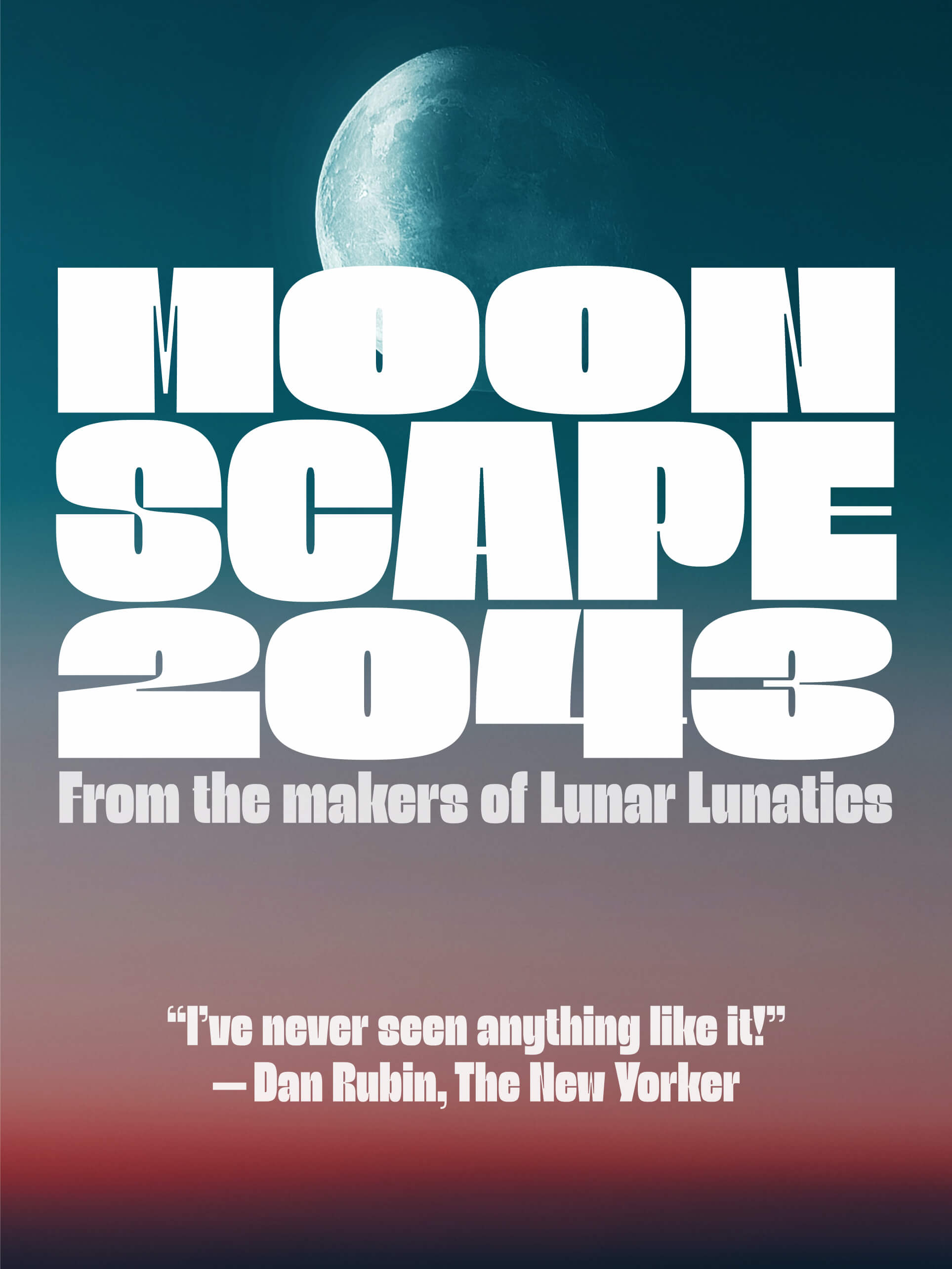
There are so many styles that are readable and have eye-catching appeal. But my decision underscores a current interest in the question: “What typeface will represent the early 2000s (in the way that say, Lubalin’s Avant Garde represents the mid-1970s)? For this the accolade goes to Astronef Super Condensed, Astronef Super Normal, Astronef Super Wide designed by Jean François Porchez.

It is not a retro-futurist design but rather symbolically intones past and present. It retains some classic elements while emphasizing more contemporary traits: The contrast between fat and thin lines. The cap W, M and N, for instance. There are also a few novel forms such as the cap P and Q (mind your Ps and Qs, as the saying goes), that each have sensuously appealing and unconventional curves.

My favorite member of the Astronef family? Super Condensed is a tad anemic. Super Wide is fun to test drive but harder to maneuver because the letters seem bloated, reminiscent of monster truck wheels. My foot to the pedal is for Super Normal; it works great for headlines, subheads and even as a potential wordmark that has a P & Q in the name. And there’s nothing wrong with normal.

Font of the Month: ASTRONEF SUPER
Designer: Jean François Porchez Foundry:  Typofonderie
Three styles: Condensed, Normal, Wide

Steven Heller is nothing short of a legend in the design community. Award-winning graphic designer, author and editor of hundreds of books (yes, 100s!) and one of the world’s foremost authorities on graphic design history; and arguably its best design commentator. Follow Steven on the must-read The Daily Heller and read his latest book, Type Speaks.


Lens Flares & Film Effects in Lightroom with Boris FX Optics

By Ross Shain

If you enjoy exploring lighting and special effects in your edits and would like to do more in Lightroom without jumping to Photoshop, this tutorial might be for you. Boris FX Optics is a unique plugin, literally packed with creative options. Optics can be used for subtle lighting and color grades to full blown Marvel film style photo manipulations. Here, I’ll show how Optics can be used to add cinematic lens flares, particles and chromatic aberrations to make your shots stand out. The tutorial was done with Optics in Lightroom Classic, but the same steps will work with Photoshop, or the Optics standalone application. 

if you’d like to follow along, I’ve provided a quick screen recording that you can pause, rewind and follow at your own pace. (You can download this source image from Unsplash.) And if you don’t own Optics, you can download and install the free 15-day trial to follow along. 

[embedded content]

Launching Optics

Apply Optics in Lightroom classic by selecting Photo>Edit in>Boris FX Optics. 

I recommend, choosing Edit a Copy. 

Adding Light Effects

Optics has its own interface with a layer system on the upper left and effect categories below the image. We’ll start by choosing the Light category and selecting S_LensFlare effect. This will add the Lens Flare effect to our image and we can choose from the flare presets in the lower left. Optics ships with 126 Lens Flare presets and all can be edited, customized and saved.

Position the lens flare by clicking on the center of the flare and drag. You can also position the pivot, or adjust the position sliders on the right in the Parameters window. 

I chose the Zeiss LWZ flare prest and positioned the flare to the top lext of the image. To zoom the image canvas in/out, use the middle mouse scroll wheel OR short cut keys I + O. 

To add a smoky feel to the lens flare, twirl down the Atmosphere tab in the parameter window. Increase the Atmosphere Amplitude and Frequency settings to your liking. 

Optics allows you to stack and edit unlimited effect layers. Next, we will Add a New Layer, by selecting the Add Layer icon in the upper left or using shortcut key (CMD/CTRL + L). 

Particles for Dummies?

Now, to add more depth and atmosphere, we will explore the Particle Illusion category. Here you will find hundreds of environmental effects like smoke, clouds, explosions, fireworks, and so much more. The particle effects are generated by a powerful animation engine but the interface hides much of the complexity typically found in 3D animation tools. 

Particle effects are broken into sub categories (Clouds, Water, Fireworks, etc), but if we want to search them all, choose PI Complete. We can scroll through the presets or use the search window. 

I’ll type “Seed” in the search window to find a floating dust particle emitter. I will position the emitter to the upper left to accentuate the lighting effect. Particles properties such as position, number, and size can be edited in the Parameter window, making Optics such a value add compared to buying overlays or stock images. Its addictive making your own effects libraries. 

More Light Effects

We can add a new layer again (CMD/CTRL + L) and continue to explore effects. In the Light category, one of my favorite effects is S_GlowDarks which adds a beautiful, diffused glow to the darks — all in one effect. I chose a preset called  “Beauty Pass”, then dialed the layer’s opacity down in the upper left. Every layer in Optics has blending modes and masks for combining and isolating effects. 

Finalizing the Look with Film Lab

Once I am happy with my lighting or effects, I typically use the effects found in the Film Lab category to add grain and a color grade. You can find hundreds of color, black & white, and historical film process presets in the Film Stocks effect. I chose the Cross Processing effects and preset “Cross Processing 2”, then dialed the opacity for this effect down to 40 in the layer opacity. 

Final Touch: Chromatic Aberrations

Lastly, to really make digital images look more like film, I like to apply “chromatic aberrations” to add a little color fringing and movement.  There are a couple ways to do this in Optics, but I like the “Chromatic Aberration – Subtle” preset which is found in the S_WarpChroma effect. 

Comparing and Exit: 

Above the viewer, find compare modes to view the before/after images with “side by side” or “split screen” options. Optics is always procedural, meaning you can simply double click on any effect layer to edit the corresponding parameters. 

If you are happy with your your image edit in Optics, simple select the Apply button in the lower right OR go to File>Exit, short cut key (CTRL/CMD + Q) and select Save. 

More About Optics:

I hope you enjoyed this Optics tutorial. If you’d like to learn more, here are a couple useful links: 

Optics Tutorials

Optics User Forum

For a limited time, take 25% off Optics! 

Optics is available to purchase OR choose an annual or monthly subscription plan. 

Visit Boris FX and enter code on checkout: Kelby25 

https://layersmagazine.com/lens-flares-film-effects-in-lightroom-with-boris-fx-optics.html


The Month in Type: Fun type

For those who missed our first Font Fashion Week — and it was a huge success — you can now catch all of the talks on our YouTube channel. We also have some blog posts (with more on the way) about brand new typefaces released during the event. And mark your calendars! Our next Font Fashion Week kicks off October 3.

Type crit with a twist: You’ve been Georged!

First up, something that will surely make you smile. It made my day. ‘Type crits’ are a crucial aspect of type design, with type designers becoming so obsessed over the details that it’s sometimes hard to see the wood for the trees. Enter Sir George Edmondson, father of James Edmondson of Oh No Type Co. fame. I’m thinking he should be invited to type conferences across the world. Watch it here.

Design Inspiration

You know bold? You can’t handle the bold! This beast via Posterlad.

Hoping these come with the dog!

36 days of type

Some favs from the recently concluded 36 Days of type:

Cuteness overload from studiomuti from Cape Town:

This alphabet by Andrew Footit!:

Get to the point

Ever wondered about points and picas and how we came to measure type in these units? Then head over to  the The League podcast, where Olivia explains how they came to be.

The wisdom of Na Kim

A great audio interview with Na Kim, associate creative director at the book publisher Farrar, Straus and Giroux.

RECOMMENDED READING

The Daily Heller: Saul Mandel’s Illustrative Design. Suzy Mandel-Canter discusses the brilliant creative legacy of her father.

The best fonts?

The best fonts for online reading. Interesting, but of course comprehension suffers with increased speed. Is our only goal to read faster? Interesting research nonetheless.

Faking it!

From the Wired archives: Meet the Font Detectives Who Ferret Out Fakery

Design research

Another thought-provoking piece over at Design Regression: Do we remember the visual appearance of words?

BOOKS

A new book about making type — from our friends at TypeTogether. Building Ligatures: the power of type.

Discover the meaning behind emojis in the new book, EMOJISM (Vietnamese). And kudos to Print for highlighting books written in languages other than English!

Sign Painting: A practical guide to tools, materials and techniques by Mike Meyers.

BRANDING

I’m liking the fun rebrand for M&M’s: For All Funkind.

[embedded content]

Cool branding for Petit Planet by Studio fnt:

SOME NEW FONTS!

An interesting 4-axis icons font from Google. Very clever and pretty darn useful with the four axis: fill, weight, grade, and optical size. Congratulations to those who worked on this cool project: Thomas Phinney, Lisa Huang, and Vassil Kateliev (let me know if I’ve left someone out!)

Deep breaths, please

Exposure, by Federico Parra Barrios, making the most of variable font tech.

EVENTS

Typographics

Typographics festival is a con­fer­ence about the the contem­porary use of type. Book your tickets now. It takes place June 17–18 at Cooper Union in New York City.

Ascenders

Ascenders portfolio-based competition. Regular deadline is April 30th!

Granshan

This year’s Granshan conference, Sign of the Times, is a two-day hybrid event. There is a fantastic roster of speakers, including our very own Nadine Chahine! Get your tickets soon — the conference kicks off on Friday, May 20th. Catch the full schedule here.

Learn with ILT Academy

We are excited to announce the launch of ILT Academy. The courses will encompass different script systems and will be taught in a variety of languages in order to be as inclusive as possible. ILT will also offer courses that are centered around the business of running a foundry such as font production, sales, and marketing. The academic program will be curated by our CEO, Dr. Nadine Chahine, and the teaching staff will consist of award-winning designers and expert specialists who are leaders in their own fields.

We launch with two courses in Arabic and Latin type design. Check out our ILT Academy page for more. With have so many more fantastic courses to come, but I won’t spill the beans just yet!

And one more thing…

With all that’s going on in the world, I’d like to end on a lighter note:

Thanks for tuning in!

The ILT team.


Fonts to Fall in Love With

In last week’s newsletter we looked at some of the fantastic fonts released during out first Font Fashion Week. In this second part, we introduce you to six families that we’re sure you’ll want to get to know better. Without further ado … drum roll…

Bakewell

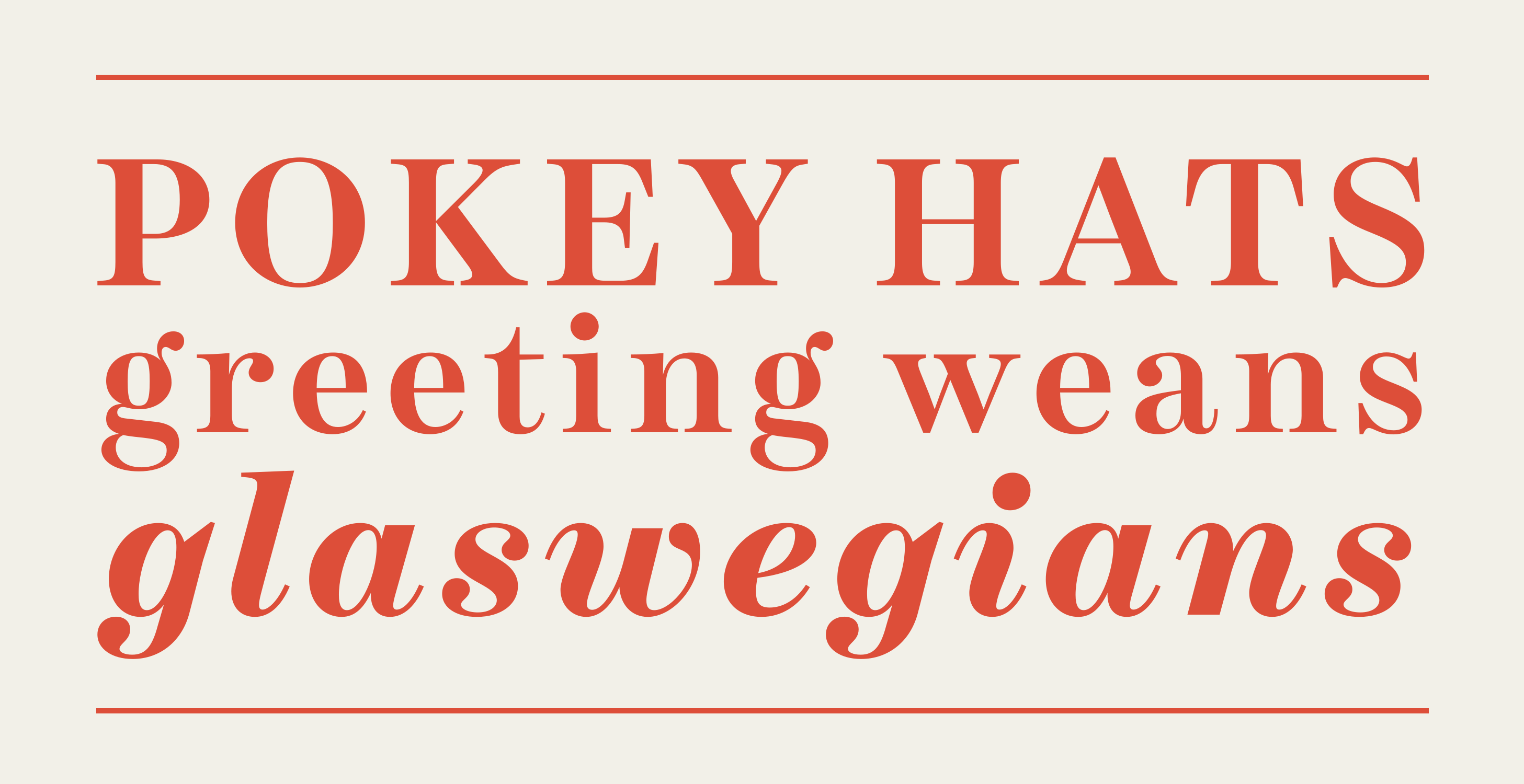
I really enjoyed Kimmy’s talk about the inspiration and design process behind her brand new Bakewell superfamily. It’s low contrast sans-serif with ball terminals, Influenced by the Scotch Moderns but with plenty of Kimmy’s own design flair. I’m especially fond of the hairline! Individual fonts from just $24.

Dunhill Script

From a longtime master of script typefaces, calligrapher and type designer extraordinaire, Richard Lipton, brings up the splendid ne Dunhill Script. The full family of five weights is a steal at just  $39.50.

Rockhopper

Always innovative and ahead of the curve is Jeremy Tankard. His latest family, a rounded sans with a twist, is as surprising as it is beautiful. A rounded sans with optional, multidirectional swashes! During Font Fashion Week, Jeremy sat down to explain how it all works. You can catch it on our YouTube channel. And you can buy the Rockhopper fonts from ILT, of course.

Fello

A little gem from our friends at the Australian Type Foundry: A brand new geometric sans with an industrial edge, and some fantastic alternates. Love the alternative g! Fello is on sale for a limited time. The full family of three fonts is just $54.

Aiglon

This new sans from design legend Jean François Porchez combines features of geometric sans and grotesques, lending it much more warmth and character than your average geo-sans. Aiglon is available in five widths. I’m a huge fan of the condensed.

Schotis Display

Schotis Display from Huy! Fonts is a welcome companion to Schotis Text and is designed for headlines and other larger settings. Perfect fro you editorial and branding toolbox. The italic is especially good.

[see part 1]


Fantastic New Fonts

During our first and hugely successful Font Fashion Week, we saw the release of 12 new font families. Today we feature half of them — from fonts that can sing and dance to those with a typewriter pedigree, and fonts that sparkle! Buckle up!

BOUCAN

First up is a typeface that blends high-tech with fun. Boucan, by the super-talented Malou Verlomme, was also Steven heller’s pick for his Font of the Month! Boucan is also available as a variable font and is an absolute steal for just $30!

BODONI EGYPTIAN MONO

Bodoni Egyptian Mono is a welcome addition to Nick Shinn’s Bodoni Egyptian family. I’m a huge fan and am particularly fond of the italic! Nick gave us the scoop in a recent interview. Oh, and for a limited time is 50% off, so hurry.

PROXIMA SERA

The new Proxima Sera is the long-awaited serif companion to one of the world’s most popular typefaces, Proxima Nova. If you’re curious about the origin and dev of this new font family from Mark Simonson then be sure to check out his Font Fashion Week talk on YouTube.

GWEN

Not only is the brand-new Gwen from the fine folk at Fontfabric an absolute gem, but it sparkles like one too. Look at those tittels! Standout letter are many, but let’s start with that g, G, R!

LAYORT

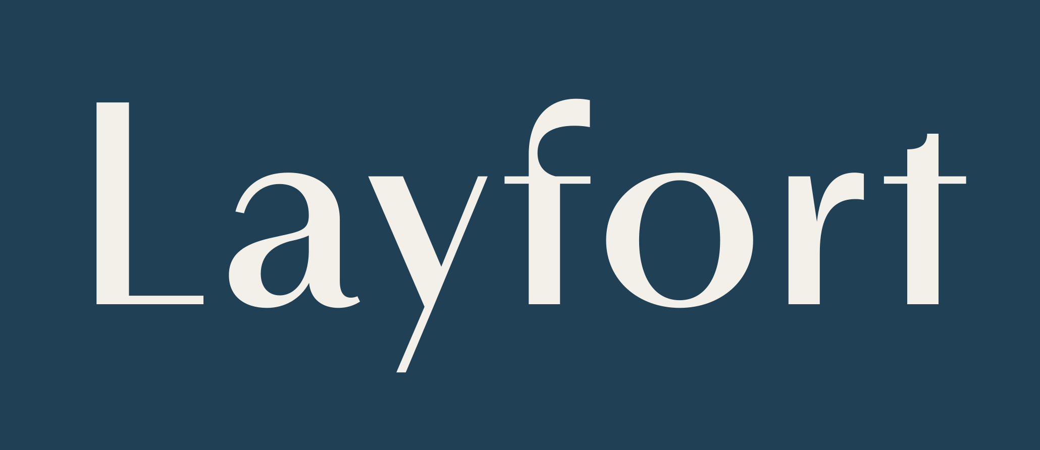
Layfort from Identity Letters is a beautiful take on Art Deco meets Industrial. We interviewed Layfort’s designer, Moritz Kleinsorge, 

TRAGIC GROTESK

We round up this first tranche of releases with Character Type’s Tragic Grotesk. My favorite letters: g and G. Available in 16 styles, from just $20. 40% off right now!

Be sure to join us next week for more new releases. If you missed the recent Font Fashion Week talks, catch up on our YouTube channel.

We regularly update our home page with quality curated fonts, so be sure to visit often!


Bodoni Egyptian Mono

In a landscape filled with thousands of typefaces, Bodoni Egyptian Mono is an unexpected design that mixes together wildly divergent DNAs. The result might take a moment to get used to, and it works best in paragraph settings where the idiosyncrasies of monospacing are lost a bit, and it feels quite comfortable to read there. Its designer, Nick Shinn, is not one to shy away from experimentation, and in the interview below he explains the background of the design and how it came to be. There’s even talk of a ’50s style cookbook so do read on!

In 2001 you released Bodoni Egyptian which is a hybrid of those two styles. Fast forward to 2022 and we now welcome Bodoni Egyptian Mono. What has prompted the expansion of the design space into a monospace one as well? 

Someone commented, back then, that it looked kind of typewriterish, and I held that thought. Then late last year a client was working on a branding with deliberately gappy and uneven letter spacing, which I thought looked very cool. And it occurred to me, contrarian as ever, that while monospaced typefaces invariably design out irregular spacing, to the extent of hugely distorting letter forms, it might be possible to achieve a more dignified effect, retaining much of the classic letter proportions. Also, I’ve designed several monowidth typefaces already (for instance, Parity Sans), but they are all unicase — a novelty — so it seemed about time to do a “proper” monowidth style!

What is the key differentiator of Bodoni Egyptian Mono from other monospaced typefaces?


Several. The small x-height, of course, which makes the caps much more condensed than the lower case (while leaving plenty of room for Vietnamese accents). And also the copious range of “expert” features, such as small caps, superior and inferior figures, and alternate old style figures — rendered throughout a five-weight family in both roman and italic.

Quite unique, as far as I know, is how the Fraction feature is coded to make double-width “slash” fractions (while still observing the fixed width glyph constraint) — much more legible than the usual nut fractions.

Is there a particular usage that you had in mind while drawing?


I tested the Fraction feature on recipes. I’ve long cherished a cookbook of my mother-in-law’s recipes, rigorously laid out, typed and mimeographed in the 1950s. Real home-made vibe!

Bodoni Egyptian Mono is designed and drawn for the Variable Font format, but I haven’t gotten around to productizing that just yet. If someone buys the full range of weights, roman and/or italic, they will get the VF upgrade free of charge.
 
Is there a specific size range that you feel the typeface is best suited for?

For text, certainly, in the “typed manuscript” mode, but for display purposes the monowidth constraint offers interesting possibilities. Michael C. Place’s design system for Nike in 2018, for instance, exploited the grid with monowidth typography, to great effect. I’ve tried to capture some of that structured layout quality in the specimens.

Where would you like to see Bodoni Egyptian Mono being used?

I never consider that. But weird is good. I love it when people do things with my fonts that I would never have imagined.

Bodoni Egyptian Mono is released as part of ILT’s Font Fashion Week.


Schotis Display font family

Schotis Display joins the Font Runway at Font Fashion Week

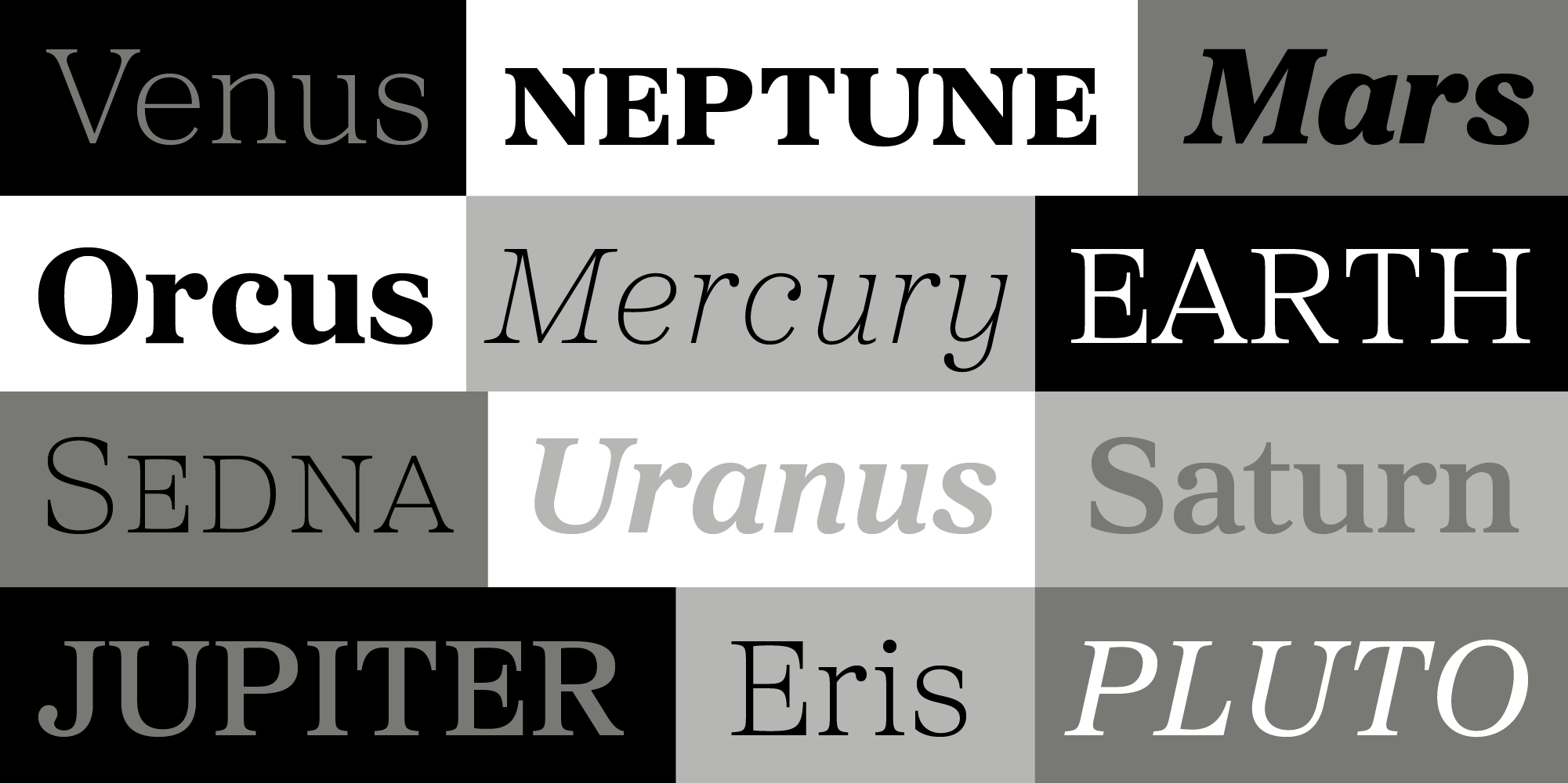
Schotis Display is the companion to Schotis Text and is meant to be used in headlines, in subheadings, and other larger settings. Its design is inspired by 19th-century Scotch Romans, but has a thoroughly contemporary look. Schotis has many standout characters, notably the lowercase g! Looking at the ball terminals, the smooth transitions of arches into stems and the dynamic curves of the uppercase S, one marvels at how smooth it all feels, and how pleasant the reading experience is. We wanted to dig deeper into how its designer, Juanjo López, went about achieving such an effect, so we asked him a few questions:

Scotch Romans are known to be highly legible designs. What are the most important design factors that you keep in mind while drawing?

There are many ways a design can promote legibility, and in this case the generously wide proportion is the main factor which makes Schotis such a legible design. A large x-height and the carefully crafted contrast also work together to present a smooth reading experience.

What are the key differences between Schotis Text and Schotis Display?

The main difference is the contrast between thin & thick strokes. Schotis Display has higher contrast, without going to extremes, and maintains the same overall proportions. I don’t like when display versions of text faces are too narrow, so I tried to maintain that wide and pleasant feel. Several characters have also changed their shapes for a more attention-catching design that gives the typeface its charm.

Where would you like to see this typeface used? Any clients in particular that you feel would be a great match?

I would like to see it used for editorial purposes, especially in magazines and books. I think Schotis is a very useful typeface for any designer’s toolbox. Schotis is my “safe option” for running texts because everything feels legible and smart when set in it!

Schotis Display feels well suited for newspaper design where sometimes typefaces are automatically compressed to fit certain headlines within constrained space. How much compression do you think Schotis Display can handle before the design and legibility is affected?

I designed Schotis mainly for less stressed purposes as in magazines or books. I think Schotis Display can handle a fair amount of negative tracking, and a bit of compression in big sizes, but I always kept in mind the possibility of a Condensed version to tackle this problem. Maybe in the future.

Schotis Display is beautifully drawn. How would you describe the perfect curve? How can one explain to a non-type designer, why a curve is well drawn? 

There are many kinds of perfect curves. Usually we think an even curve without any bumps as perfect, but unevenness is sometimes more beautiful than boring cold perfection. It all depends on the designer’s intentions, and with Schotis my aim was to draw even and calm curves.

However, if we accept even as perfect I’d say the feeling of a well-drawn curve is the same as the feeling of a well-drawn curve when driving. With a constant speed, a single smooth turn and taking full advantage of the width of the road layout you can have a good curve – true for both driving and drawing.

Schotis Display has seven weights plus matching italics, with 1100 glyphs per font, with a very extended character set for Latin based languages as well as Vietnamese, and shows all its potential with OpenType-savvy applications. Every font includes small caps, ligatures, old-style, lining, proportional and tabular figures, superscript, subscript, numerators, denominators, and fractions.


Layfort font family

There is always room for exploration along the intersecting lines of different typographic styles. Layfort takes its inspiration from Art Deco typefaces and crosses that with a dash of industrial flavor to arrive at a distinct typographic voice. It feels fashionable but without frills, relaxed in a luxurious rhythm but with a serious undertone. Its tempo is irregular — its characters have distinctly varying widths — which conjures the bygone era of almost a century ago. This is not to say that Layfort is out of place in today’s world. On the contrary, that industriousness brings forth a hard-working typeface that does its job effortlessly and elegantly.

Below is a fascinating interview with Layfort’s designer and principal at Identity Letters, Moritz Kleinsorge.

What are, to your mind, the defining features of the Art Deco style in type?

In the early days of sans-serifs, this new genre looked somewhat quirky and unrefined. A century later, Art Déco was a key period in the transformation of sans-serif type. This era defined a vocabulary of shapes, and created a visual language that to this day we perceive as “elegant”. It elevated the sans-serif to a new level: decorative, prestigious, posh. Graphic features like elongated, flowing forms and geometric modularization gained some traction.

It was the stylized look of a pronounced stroke contrast in geometric sans-serif type that particularly fascinated me. I don’t know if the type designers of this period were inspired by Didone typefaces, sign-painting, or something else; but the look of narrow, high-contrast, sans-serif capitals with a vertical stroke axis has become iconic for the period. Even people who aren’t into type at all easily recognize it.

Is there a particular client that would be a perfect fit for Layfort?

My typefaces seem to be popular with architects, museums, and other cultural institutions — something I’m very happy about. I did keep these industries in the back of my mind while designing Layfort. The blend of then and now (without sliding into a retro look) lends itself to an architectural, monumental, or historical context.

In general, any brand or company that wants to convey the qualities of tradition or artisan craftsmanship while cultivating a progressive and forward-looking attitude can benefit from Layfort. And, of course, the industry most memorably connected to the Roaring Twenties, fashion.

Layfort seems like a perfect fit for a fashion brand. If it were a person, what would it be wearing?

One thing’s for sure: Layfort wears a hat! It could be a smooth cloche hat with a Coco Chanel Little Black Dress or a super-elegant yet comfortable Jean Patou outfit — at once feminine and confident. It could also be a Frank Sinatra-style Trilby hat and suspenders over a fine white Brooks Brothers shirt, but with rolled-up sleeves, ready for whatever hard work needs to be done. My listening to Sinatra’s classic songs while working on Layfort around Christmas may have influenced that latter image.

You mention that Layfort has an industrial feel to it. How do you draw that into a typeface, and how does that affect the way the typeface is used?

As mentioned before, early sans-serifs weren’t as stylized and refined as the strictly Art Déco designs of the following century. I wanted to bring some of that “industrial innocence”, if I may, into the design of Layfort. Its proportions aren’t harmonized and they are much closer to early grotesques than something from the Jazz Age. Later in the design process, I also opted for square dots and punctuation marks, giving it a more rigid, static, but also more contemporary and straightforward look. This, as well as additional design decisions like creating the “t” without a hook, sets the focus on an industrial flair — with rectangular shapes almost like the steel beams of the Chrysler Building and other iconic New York skyscrapers.

However, I want my clients to have the flexibility of adjusting the mood of the typeface on their own, so I also included the round dots and punctuation marks that I initially designed Layfort with. If you activate that OpenType Stylistic Set, in an instant, Layfort becomes more friendly and approachable.

So, Layfort is a great choice out of the box, but depending on your brief or personal preference, some OpenType-powered fine-tuning will go a long way when you’re using it.

We’ve seen Art Deco furniture make a come back in recent years. Do you see a similar trend for Art Deco inspired typefaces?

While I do not keep track of new type releases in general (except for the industry’s major ones) and prefer to rely on my own trend analysis and inspiration, I think there have been quite a few Art Déco-inspired typeface releases in recent times, but these were mostly caps-only display fonts aimed at a hobbyist market. As for reliable “workhorse fonts”, there’s still a lot of potential in the spirited appeal of Art Déco. And I’m sure that the time of generic geometric or grotesque typefaces will end soon, and we’re already seeing fewer of them released these recently.

The Layfort font family is available from the ILT store.

[This interview and font family release is part of ILT’s Font Fashion Week]


Steven Heller’s Font of the Month: Boucan

April 5, 2022

For this installment of Font of the Month I choose a typeface that is fashionable, stylish and ready for the runway. Of all the excellent specimens making their respective debuts during Font Fashion Week, my eye is drawn to the three disparate styles (or let’s say fraternal triplets) in the Boucan family, designed by Malou Verlomme, for the bold yet lighthearted comic qualities and a kinetic sensation that each one exudes.

Consisting of only caps – that may not be the most versatile for everyday wear – Boucan’s are the kind of characters that designers will want to experiment with. Each has a je ne sais quoi that enlivens a page, screen or poster – they also scale up and down with ease. Each letter is designed to intermingle with its neighbor. When letterspacing is tight and touching words become readable patterns.

Boucan 02 is the most grotesque (in a good way) of the family and allows for curious and eclectic combinations. For example, the “I” is reminiscent of a lava lamp and when juxtaposed with the letter “N” it forms a pattern that is both functional (i.e. legible) and decorative (i.e. ornamental). Incidentally, the “N” resembles a circus clown’s ballooning trousers, while the “A” suggests a bow-legged cowboy.

The characters of Boucan 05 are composed of static saw-teeth so that when, for example, combinations of letters in words like “AND” or “IN” or “OF” produce fanciful diamond perforations between the touching letters. I could even see a designer creating a fully iterated word-mark by juxtaposing some of Boucan 05’s letters together.

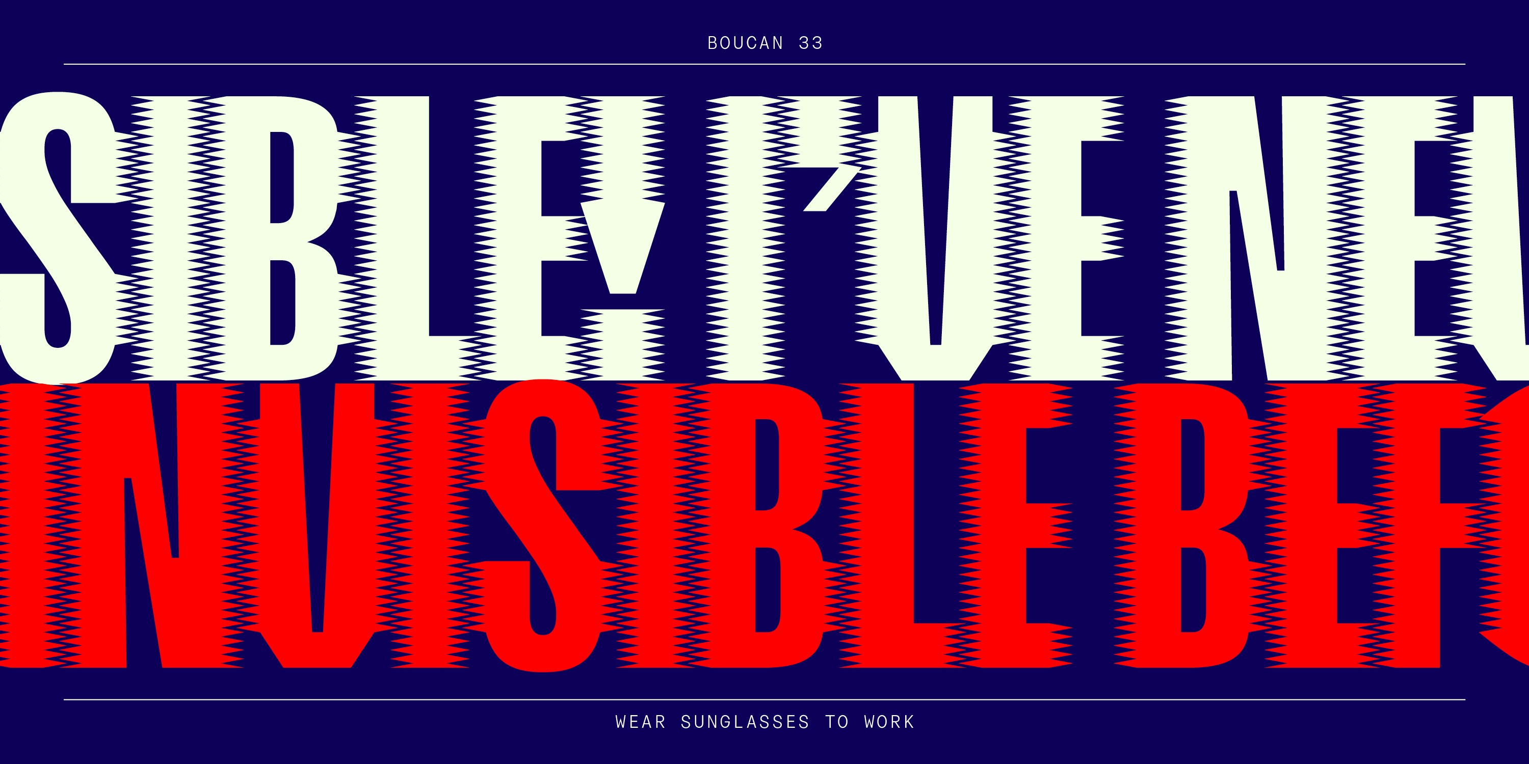
Finally, Boucan 33 is the most kinetic of the batch. Each letter includes perfectly composed motion lines that are somewhat reminiscent of Fortunato Depero’s Futurist drawing style. Ingeniously, the motion lines (what look like little comb teeth) serve as a graphic Velcro by binding the letters together into words.

Although the Boucan family, is not made for serious documents, it is well suited for serious play – which is sorely needed these days. On Font Fashion Week, I recommend trying the Boucan line on to see if it fits – I think you’ll like the cut.

Font of the Month: BOUCAN
Designer: Malou Verlomme Foundry:  Malou Verlomme
Seven styles: 00, 02, 03, 05, 09, 17, 33
variable font (1 axis)

Steven Heller is nothing short of a legend in the design community. Award-winning graphic designer, author and editor of hundreds of books (yes, 100s!) and one of the world’s foremost authorities on graphic design history; and arguably its best design commentator. Follow Steven on the must-read The Daily Heller and read his latest book, Type Speaks.