Grunge Effects in Design: Raw, Gritty, and Always in Style!

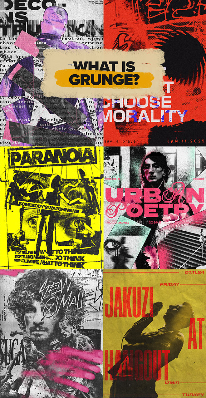
It’s raw. It’s messy. And it refuses to play by the rules. Grunge isn’t just a style—it’s an attitude. From underground zines to modern digital design, grunge has always been a rebellion against perfection. But why does this chaotic, textured look never seem to go away? Let’s break it down in this design trend deep dive.

Grunge Effects in Design: Raw, Gritty, and Always in Style!

Subscribe to the Spoon Graphics YouTube Channel

https://blog.spoongraphics.co.uk/tutorials/videos/grunge-effects-in-design-raw-gritty-and-always-in-style


Delta Makes the Difference 

By Larry Tiefenbrunn, MD 
CEO and inventor, Platypod Pro LLC 

Don’t get me wrong. I absolutely love tripods. I personally own about a half a dozen of them of all different brands. I use them for studio work, group portraiture, even some product shots.  

However, when I’m out and about, the last thing I want to do is carry around unnecessarily heavy equipment. And I certainly don’t want to be told by security guards (#TripodPolice) that I can’t use a tripod to take long exposures for whatever reasons they conjure up. A compact flat tripod that slips into my camera bag, that doesn’t take up the space of a telephoto lens, is why I invented the very first Platypod, and that is why I have dedicated 10 years of time to this company… so that I can share my idea with like-minded photographers.  

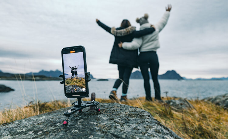
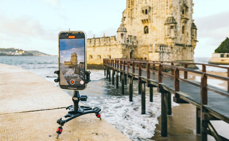
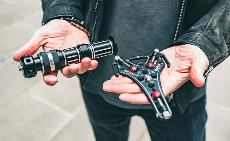
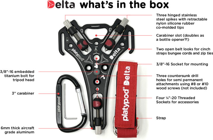
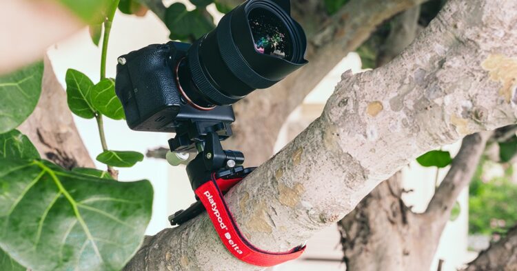
After several iterations of “the world‘s most compact tripod base” I have taken the very best features of our patented designs, and coalesced them into what I believe is going to be the most popular tripod of its kind, the Platypod Delta. The triangular design, flip out legs and adaptations to straps and 1/4” threaded accessories make this the fastest and most versatile Platypod to date. You just add on your own tripod head to this plate, and you are ready to shoot photo or video. Don’t have a spare tripod head? Look at any of our Platyball ballhead models or the Platypod grip for your smart phone. 

What is new and different about Delta? 

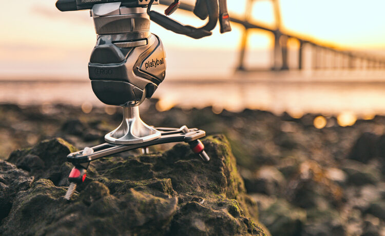
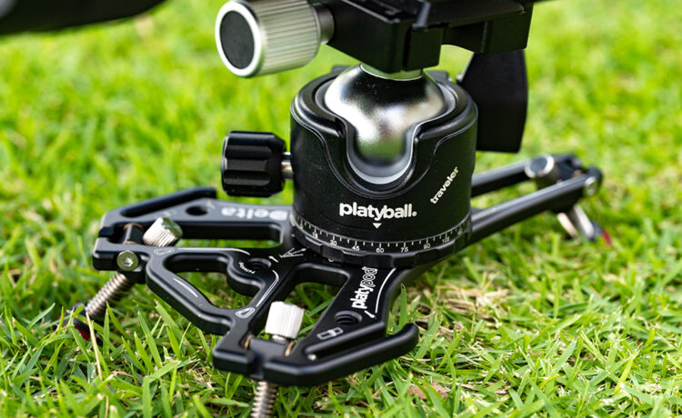
Δ Flip out hinged spikes – when we introduced the recent Platypod eXtreme, everyone was so happy that they no longer had to insert each spike individually. They could now simply pull out the hinges and flip the spikes into place. Our previous hand sized model, the Platypod ultra also required the spikes to be carried in a separate wallet which was not as convenient. For Delta, we designed all new heavy duty hinges with adjustable tension (with included 2 mm Allen wrench). Three 1/4 inch threaded spikes take three or four seconds to deploy.  

They also incorporate our unique nylon/silicone retractable feet to reveal the sharp spikes for stone and concrete, or conversely, to cover them with a soft rubber tip to protect delicate surfaces. 

[embedded content]

Δ Triangular design – All our previous designs relied upon a primarily four legged system for added stability. The sacrifice however was speed since on almost any uneven surface some degree of leg adjustment was necessary for balance as well as to avoid jitter. The three legged system allows instant stability upon spike deployment. 

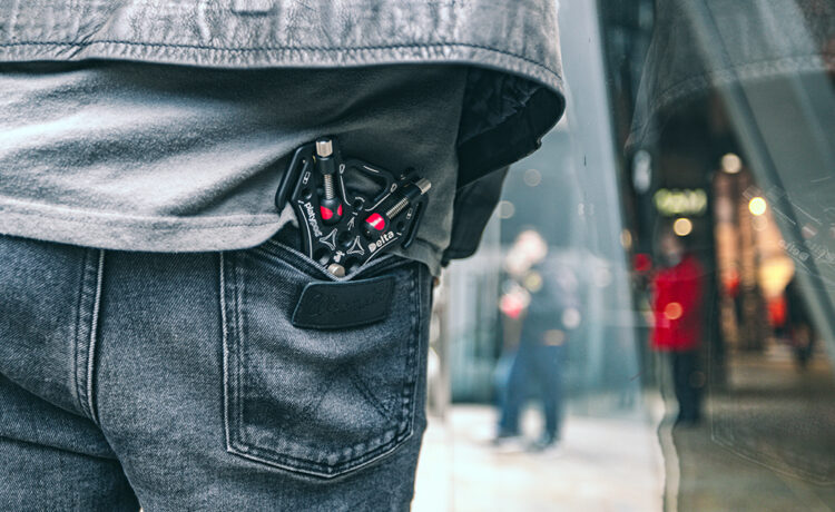
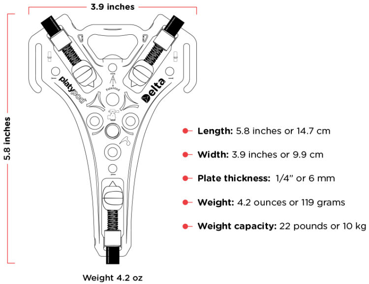
Δ Super lightweight design – at only 4.2 ounces including spikes and tips this is our most lightweight and compact Platypod with a substantially smaller surface area due to the aircraft like cut out design. We bumped up the thickness of the metal from 5 mm to 6 mm to maintain maximum strength and stability. Fits beautifully into any camera bag or your pocket. 

What remains the same? 

It is compatible with our entire product line and maintains the Platypod features our users love: 

…and yes, it really does open beer bottles. 

Delta is available for discounted pre-order via Kickstarter now through February 15, 2025 and later on at platypod.com  

Platypod®️ Delta Travel Tripod by Larry Tiefenbrunn — Kickstarter 

https://layersmagazine.com/delta-makes-the-difference.html


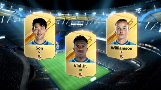
The Intersection of Design, AI and Creativity With PepsiCo’s Mauro Porcini


.article-native-ad { border-bottom: 1px solid #ddd; margin: 0 45px; padding-bottom: 20px; margin-bottom: 20px; } .article-native-ad svg { color: #ddd; font-size: 34px; margin-top: 10px; } .article-native-ad p { line-height:1.5; padding:0!important; padding-left: 10px!important; } .article-native-ad strong { font-weight:500; color:rgb(46,179,178); }

Introducing the Adweek Podcast Network. Access infinite inspiration in your pocket on everything from career advice and creativity to metaverse marketing and more. Browse all podcasts.

Welcome to another special episode of the Marketing Vanguard podcast. Today, host Jenny Rooney speaks with Mauro Porcini, svp and chief design officer at PepsiCo, to discuss the vital role of design in corporate innovation. 

Porcini shares his insights on how design creates value for consumers, the difference between design and creativity, and the importance of collaboration across disciplines. He also discusses his experience redesigning the Pepsi brand and the transformative potential of AI in enhancing design. Tune in for a captivating conversation that explores how design thinking can drive success in large organizations.

“I am genuinely excited about the role of AI in design,” he says on the podcast. “It can enhance our capabilities, speed up processes, and offer new perspectives. However, the human touch—intuition and creativity—is irreplaceable when turning those insights into real-world success.”

Since 2012, Porcini has transformed the company’s approach to innovation through design. Under his leadership, the PepsiCo Design function has garnered over 2,100 awards, significantly impacting iconic brands like Pepsi, Lay’s, and Gatorade.

Previously, he was chief design officer at 3M and has received accolades including Fortune’s 40 Under 40 and a knighthood from the Italian president. He’s also the author of The Human Side of Innovation and serves on various boards, including the Design Management Institute and the Politecnico of Milan Foundation in the U.S.

Key takeaways: 

01:50 The Importance of Vision in Design: Porcini emphasizes the importance of having a vision or “dream” as a designer, particularly in a large corporation like PepsiCo. He believes that reaching a vast audience and creating value—whether functional or emotional—is essential. Porcini stresses the significance of understanding people’s needs and desires to produce valuable products and experiences. He sees design as a key enabler for creating value, urging companies to recognize its importance. Ultimately, Porcini champions human-centric design, asserting that by prioritizing value for people, companies can also achieve financial success.

04:42 Difference Between Design and Creativity: Porcini defines design as the discipline focused on creating solutions for specific human needs and wants, encompassing products, brands, and services. He emphasizes three lenses in design thinking: desirability (people), viability (business), and feasibility (technology). Creativity, described as “intuition in action,” serves as the enabler for finding optimal solutions through an iterative process. He argues that intuition is not solely emotional but can be nurtured and developed over time, drawing on a wealth of experiences and knowledge. He references philosopher Baruch Spinoza, highlighting the connection between intuition and reason in arriving at solutions quickly and effectively.

18:36 Collaboration between Design and Marketing: Porcini highlights the exceptional talent he encounters at PepsiCo, noting the importance of understanding one’s strengths and limitations. He believes the best marketers embrace diverse thinking, combining operational efficiency and creativity. Porcini emphasizes the need to respect and empower different forms of creativity, arguing that the ideal marketer balances creative and operational skills. He asserts that curiosity about diverse perspectives drives innovation, enabling teams to learn from dissimilar backgrounds. Ultimately, Porcini underscores that effective leadership fosters an inclusive environment where empathy and collaboration unite individuals toward a common goal.

https://www.adweek.com/brand-marketing/marketing-vanguard-design-ai-creativity-pepsico-mauro-porcini/


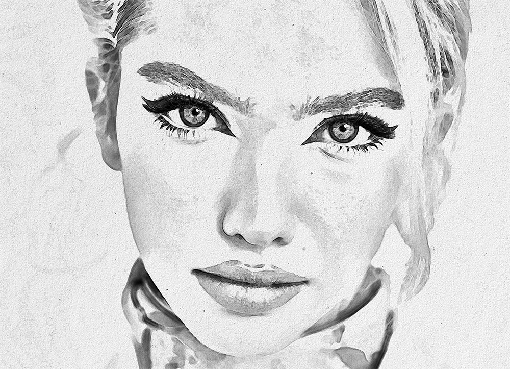
Photoshop Pencil Sketch Effect Tutorial

Join my mailing list and
receive a free design
resources bundle!

Stay up to date with Spoon Graphics by having new content delivered to your email inbox. As a way to say thanks, you’ll also gain instant access to my free bundle of design resources.

Download the FREE bundle I’m already subscribed

https://blog.spoongraphics.co.uk/tutorials/videos/photoshop-pencil-sketch-effect-tutorial


Illustrator Spotlight: Bráulio Amado

A selection of poster designs and album artwork by one of our all-time favs, graphic designer and illustrator Bráulio Amado (previously featured here). The word selection is really doing some heavy lifting here because I included roughly a million images. Born in Portugal and currently based in New York City, Amado has created things for outlets like The New York Times and A24 as well as artists like Andre 3000, Frank Ocean, and Robyn. You can view his entire archive of work here.

Check out more from Bráulio Amado below!

https://www.booooooom.com/2024/08/05/illustrator-spotlight-braulio-amado/


2024 Logo Trend Report

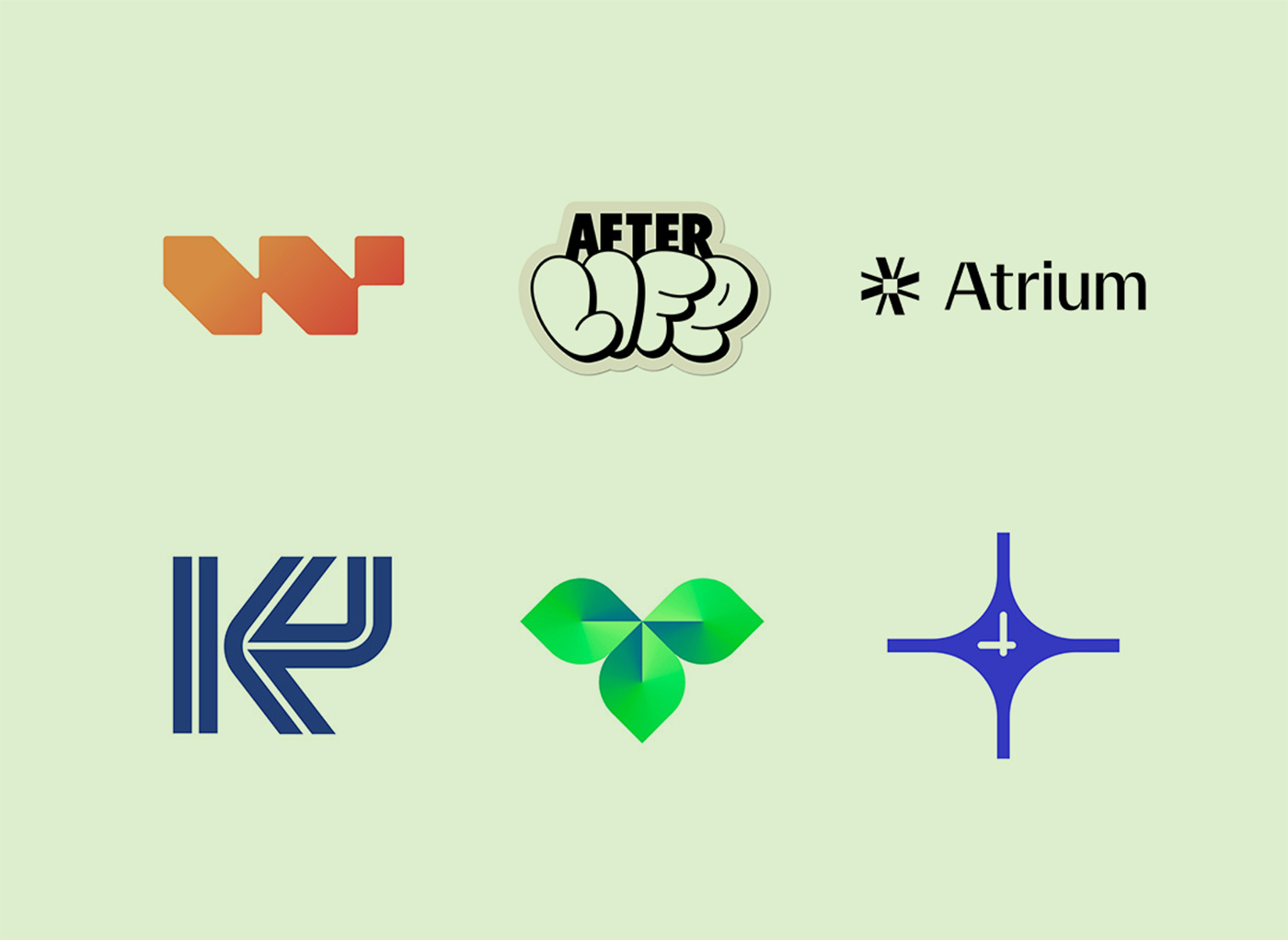
Each year, for more than 20 years, Bill Gardner of Gardner Design has been studying thousands of logos to select the strongest fit for the year’s Trend Report.

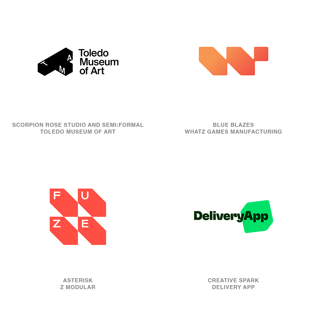
“Flat Box” logos (above) by Scorpion Rose Studio and Semi:Formal, Blue Blazes, Asterisk, and Creative Spark.

Speaking about the collection, Bill said, “As ever, this report is an observation of the logo design industry and isn’t meant as a guide for best practices. Trends are trajectories that evolve and modify over time, not a passing fad. Use these ideas to expand your design acumen while pushing your own design to the next level and keep the trajectory moving to the next iteration.”

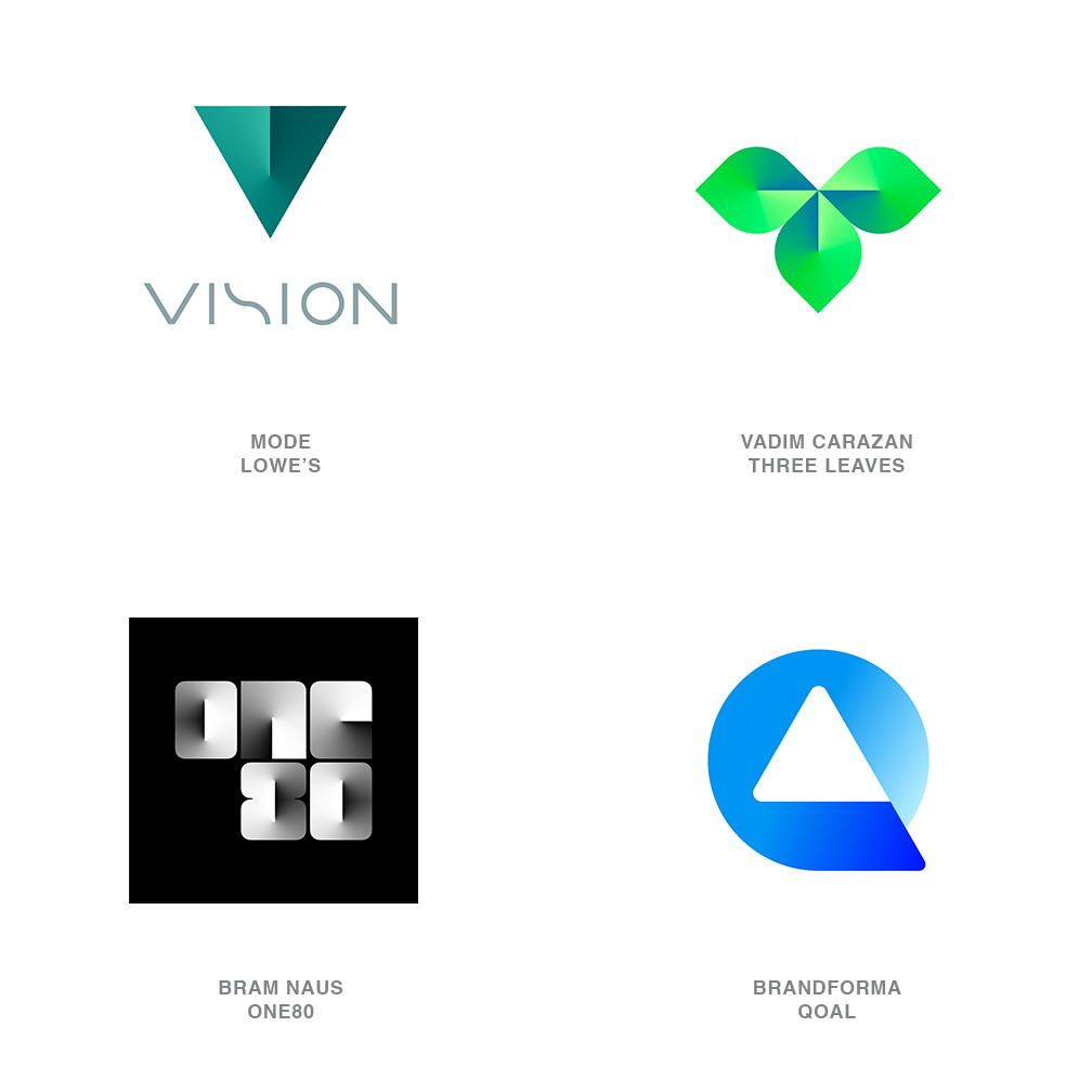
“Radar Sweep” logos (above) by Mode, Vadim Carazan, Bram Naus, and Brandforma.

Bill points out that trendy and trends are not the same. “Trends are directions — the way in which something will most likely go. Trendy is more ephemeral. Renowned designer Tom Geismar said it best when he shared with me, ‘Nothing dulls so quickly as the cutting edge.’”

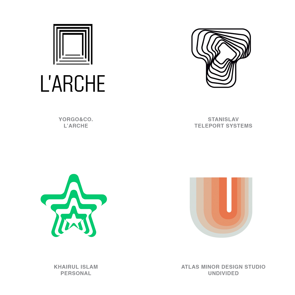
“Passages” logos (above) by Yorgo&Co, Stanislav, Khairul Islam, and Atlas Minor Design Studio.

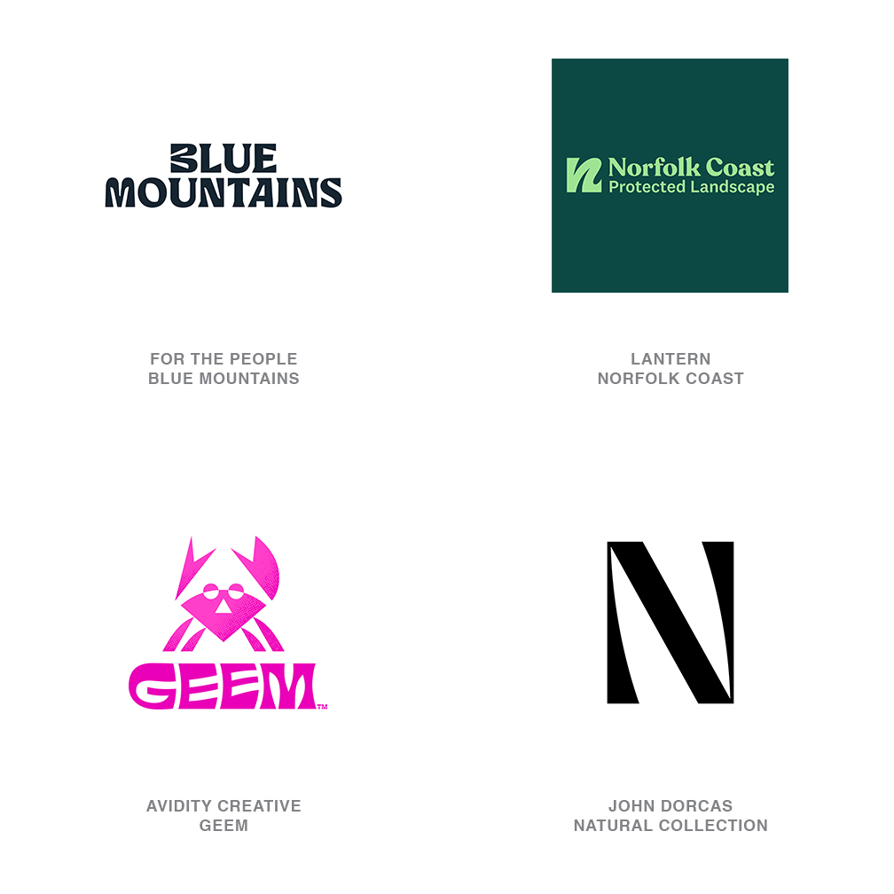
“Bell Bottoms” logos (above) by For The People, Lantern, Avidity Creative, and John Dorcas.

One step ahead

Some years ago, Lucy Bourton, senior editor at It’s Nice That, discussed graphic design with Paula Scher. Paula let Lucy in on a secret for spotting trends and tastes that made me smile while reading: “If you look through design history and you see something that looks really radical, that’s what you’re going to be doing now. If you think it’s nice, that’s what you’ve already been doing. If you think it’s tired, that’s what you were doing five years ago. But if you think it’s ugly, that’s what you’re going to be doing in five years.”

More of the discussion here: One Step Ahead

Bill Gardner is the founder of LogoLounge.com, a repository site where members can post their logo design work and search the works of others by keyword, designer’s name, client type, and more.

For this year’s full selection: 2024 Logo Trend Report

https://www.logodesignlove.com/2024-logo-trend-report


Easily Replace Backgrounds in Photos with ON1 by Dan Harlacher

Hello, fellow photographers. I’m Dan Harlacher from ON1, the creators of some amazing photography apps and plugins! I’m excited to show you the new Quick Mask AI tool in ON1 Photo RAW 2024.5. This tool is incredibly powerful and makes background replacements super simple. To illustrate its capabilities, I’ll walk you through three examples, from simple to complex. I also created this short video outlining each of these steps!

Example 1:
Simple Background Replacement

Let’s start with a straightforward example—a bird photo. The original background is dull and shot in low light, resulting in a noisy image. Here’s the step-by-step process to enhance and replace the background:

  1. Noise Reduction and Sharpening: First, the photo includes a lot of noise and is a little out of focus. So, I used NoNoise AI and Tack Sharp AI to remove the noise and restore the details.
  1. Brightness Adjustment: Next, I brightened the image using the “Tone and Color” adjustments, increasing the exposure by about a stop and adjusting the blacks to enhance contrast.
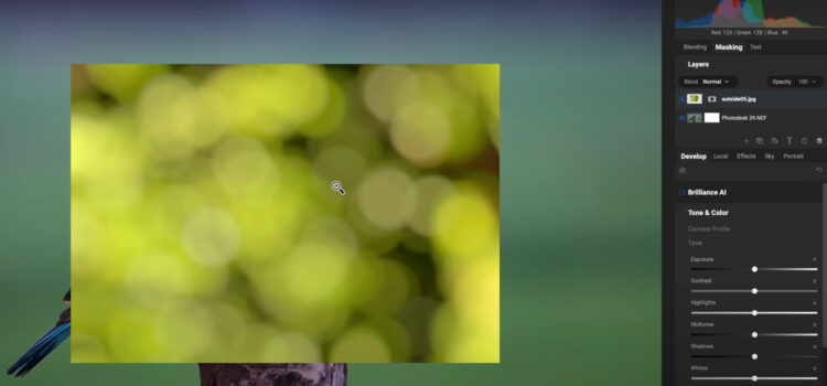
  1. Adding a New Background: I selected a new background from the ON1 Extras, specifically a bokeh image, and used the “Transform” tool to fit it perfectly behind the bird.
  1. Masking the Old Background: Using the Quick Mask AI tool, I clicked on the bird to keep it and removed the old background. The result was a clean separation, allowing the new background to shine.
  1. Final Adjustments: Finally, I adjusted the background’s tone and color to complement the bird’s colors, creating a harmonious and vibrant image.

Example 2:
Intermediate Background Replacement with Blending

I worked with a studio shot against a neutral backdrop for a more complex scenario. 

Here’s the approach:

  1. Initial Adjustments: I cropped out unwanted elements, like a soft box in the corner.
  1. Layering a New Background: I added a new studio backdrop, flipped it to match the lighting, and scaled it to fit.
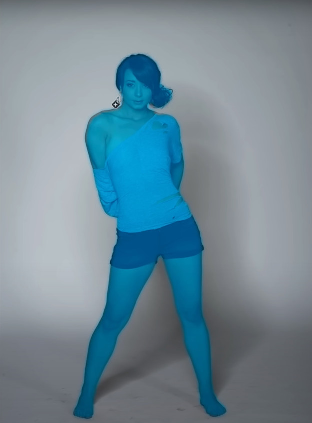
  1. Blending Backgrounds: Using Quick Mask AI, I masked out the original background but retained the shadows and the floor’s shape by reducing the mask’s opacity. This blended the new backdrop seamlessly with the original, maintaining a realistic look.
    1. Color Adjustments: I tinted the new background using a photo filter to match the subject’s shorts, ensuring a cohesive color scheme.
    1. Edge Refinement: I used the Chisel tool and Refine brush to clean up any remaining halos or edges, particularly around hair, for a polished finish.

    Example 3:
    Advanced Background Replacement with Color Corrections

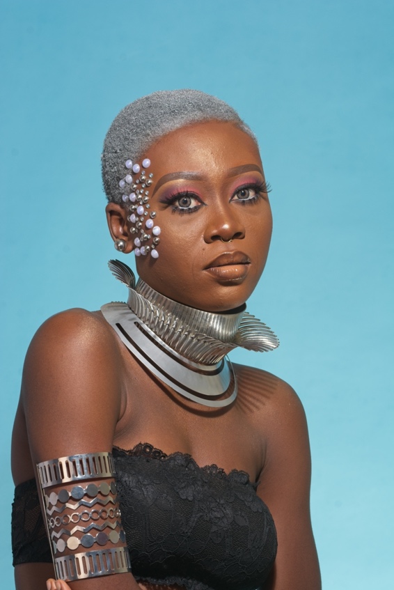
    The third example involves a challenging shot with a bright blue background that reflects onto the subject’s metallic necklace and skin. 

    Here’s how I tackled it:

    1. Exposure Adjustment: I lowered the exposure to correct the image’s brightness.
    1. New Background Addition: I selected a new background and used the Transform tool to scale and position it.
    1. Masking and Cleaning Up: Quick Mask AI helped remove the old background. However, blue reflections remained on the subject, requiring further refinements.
    1. Local Color Adjustments: I used local adjustments to desaturate the necklace’s blue reflections and repainted the skin edges with a flesh color using the paint with color option. This corrected the color cast without altering the luminosity.
    1. Final Touches: The result was a natural-looking edge with the correct colors, eliminating unnatural blue hues.

    Conclusion

    These examples highlight the incredible versatility and power of the Quick Mask AI tool in ON1 Photo RAW 2024.5. Whether dealing with simple or complex scenarios, this tool makes background replacements and composites much easier.

    About ON1 Photo RAW

    Elevate your photo editing game with a 30-day free trial of ON1 Photo RAW—no credit card required. Perfect for photographers of all skill levels, ON1 Photo RAW offers an intuitive yet powerful platform that blends speed, versatility, and quality into one AI-powered application. It’s the ultimate AI photo editor and includes everything a photographer needs in one application. Try ON1 Photo RAW for free and experience why it’s the top Lightroom Alternative, giving you the ultimate control to bring your photographic visions to life.

    https://layersmagazine.com/easily-replace-backgrounds-in-photos-with-on1-by-dan-harlacher.html


    100 Days

    Each year, the students of SVA’s Masters in Branding program spend 100 days documenting their process with a chosen creative endeavour.

    This year, Print Mag has been showcasing each student. Here are a few 100 Days projects that stood out from a logo perspective.

    Kaylin Ingram’s fun Brand Castles is a hint at the ephemeral nature of business, like castles in the sand. Follow on Instagram.

    Marisa Goldberg takes a craft approach with The Brand Blanket, knitting 100 logos. Almost finished on Instagram.

    Brand What Ifs is a series by Deane Cruz who wonders what well-known brands would look like if they branched into new markets. Also updating through Instagram.

    More projects from the Masters in Branding students on Print Magazine’s SVA 100 Days page.

    https://www.logodesignlove.com/100-days


    The Future of Design and AI’s Role in Creativity With Canva

    .article-native-ad { border-bottom: 1px solid #ddd; margin: 0 45px; padding-bottom: 20px; margin-bottom: 20px; } .article-native-ad svg { color: #ddd; font-size: 34px; margin-top: 10px; } .article-native-ad p { line-height:1.5; padding:0!important; padding-left: 10px!important; } .article-native-ad strong { font-weight:500; color:rgb(46,179,178); }

    Leaders from Glossier, Shopify, Mastercard and more will take the stage at Brandweek to share what strategies set them apart and how they incorporate the most valued emerging trends. Register to join us this September 23–26 in Phoenix, Arizona.

    In this episode of The Speed of Culture, Matt Britton sits down with Cat van der Werff, executive creative director at Canva. Van der Werff shares her journey from an aspiring artist in New Zealand to leading the creative direction at Canva. She also explores Canva’s mission to democratize design, the importance of empowering individuals and enterprises, and the potential for AI to enhance human creativity.

    Canva has transformed from a startup into a global design powerhouse, leveling the playing field for visual communication. The company’s “What Will You Design Today?” campaign introduces its wide range of users, from teenage activists to Zoom.

    As ECD, van der Werff has been instrumental in shaping Canva’s brand and vision. Originating from New Zealand, her journey began in art school and led her to various branding agencies in Paris and Sydney.

    Joining Canva in 2017 as its first brand designer, van der Werff has played a crucial role in shaping Canva’s brand identity and leading a team of 100 creatives. Her dedication to empowering creativity and solving real-world problems makes her a key thought leader in the design industry.

    “The core brand tenets that we have today are human and inspiring and empowering, and those are the things that have led all of the creative that we do,” she says.

    Listen to Cat Van der Werff on the Speed of Culture podcast and gain insights into the future of design, the power of AI and how Canva continues to empower creativity worldwide.

    Key takeaways:

    • 00:02:30-00:04:07 Building Canva’s Brand Identity — In the early days of Canva, the focus was on establishing a robust brand identity. Starting with just a logo, van der Werff worked closely with the founders to develop Canva’s core brand values: human, inspiring and empowering. This foundation has guided the company’s creative direction and ensured consistent and impactful branding across all touch points. Defining a brand’s core values is an important investment and essential to creating a strong and cohesive identity.
    • 00:04:42-00:05:13 Empowering Creativity Through Design — Canva’s mission is to democratize design, making it accessible to everyone. Van der Werff explains how Canva provides a simple and intuitive design journey that caters to various needs, from creating resumes to marketing materials. This approach removes technical barriers, and brands that work to empower their users can emerge as champions of accessibility and innovation in their respective markets. It also means they can reach a broader audience, enhance user satisfaction and foster loyalty.
    • 00:07:33-00:08:37 Evolution of Canva’s Product Offerings — Van der Werff highlights the evolution of Canva’s product, which started with basic templates and snowballed into an offering with a wide range of design tools and features. By continually expanding its library and integrating new technologies, Canva has remained relevant and valuable to its users. To meet the changing needs of audiences, brands must continuously innovate and expand their offerings with new features and technologies.
    • 00:14:09-00:15:00 The Role of AI in Canva’s Future — AI plays a significant role in Canva’s strategy, enhancing the design process and enabling users to work more efficiently. Van der Werff discusses the launch of Magic Studio, which includes AI-powered tools like Magic Design and Magic Write. These tools help users generate designs and copy quickly, making the creative process more efficient. AI has the potential to help software brands help their customers with streamlined workflows and enhanced productivity.
    • 00:18:27-00:19:39 Scaling Creativity in Large Organizations — Though Canva started as a DIY tool for everyday people, it’s quickly become a critical design tool for businesses of all sizes—including enterprises. Van der Werff explains how Canva’s brand kit and templates ensure that even non-designers can create on-brand materials. This approach helps large organizations scale their creative output without compromising brand integrity. B2B brands going after the enterprise need to consider how they can offer tools and processes that deliver scalability while helping their audience maintain brand standards.

    https://www.adweek.com/brand-marketing/the-future-of-design-and-ais-role-in-creativity-with-canva/


    The World Games 2025 logo

    In December 2023, the Chengdu 2025 Organising Committee (OC) initiated a national contest to create the logo, mascot and slogan of The World Games 2025.

    There were 3,562 logo entries, and in early April 2024 a meeting was convened in Chengdu to narrow the entries down to ten finalists. Following professional refinement, five candidate emblems emerged and were put to a public vote. More than 220,000 “likes” were cast. The logo designed by British designer John Fairley won with 55,679 votes, and on May 17th 2024, after joint review by the OC and the IWGA, The World Games 2025 logo was unveiled.

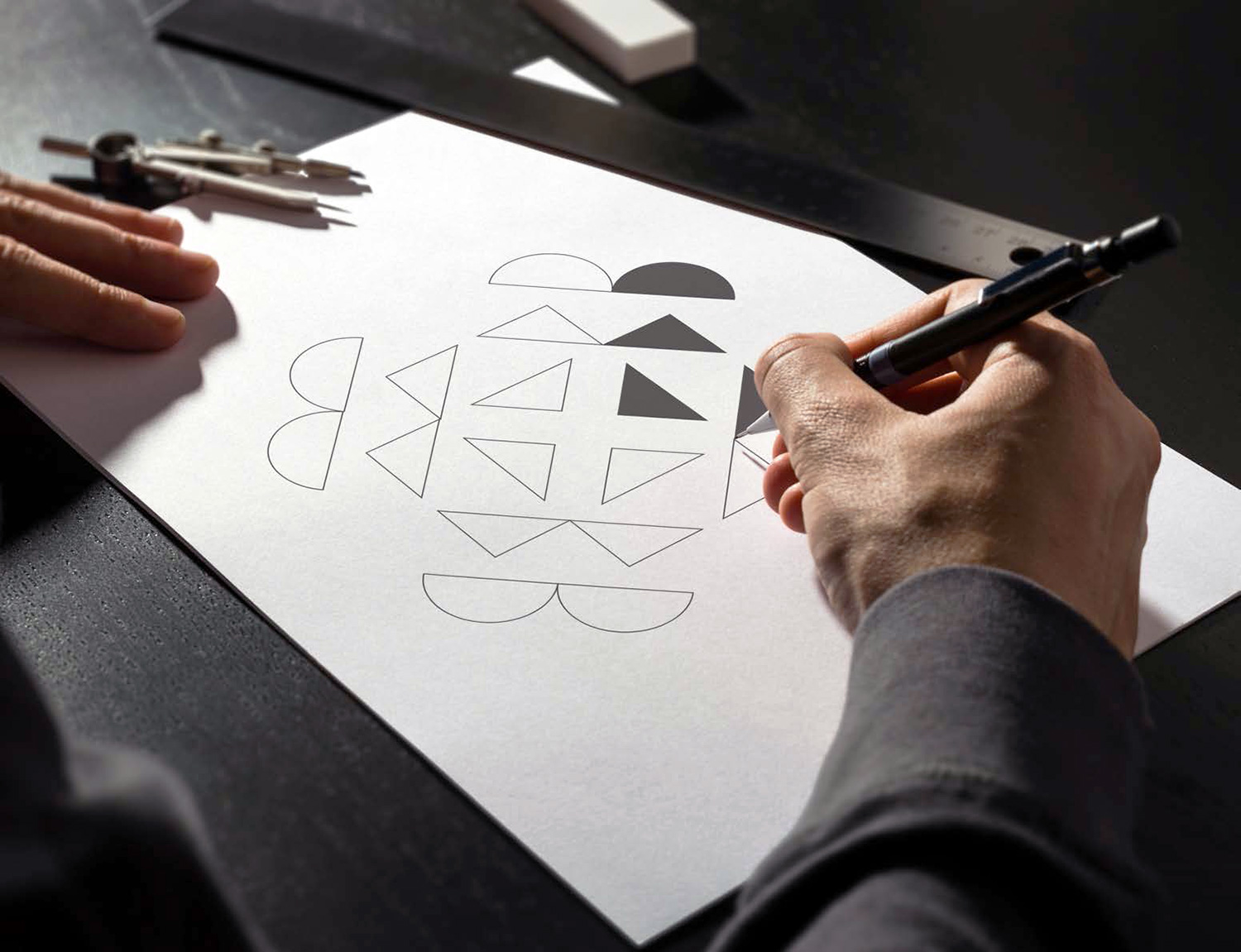
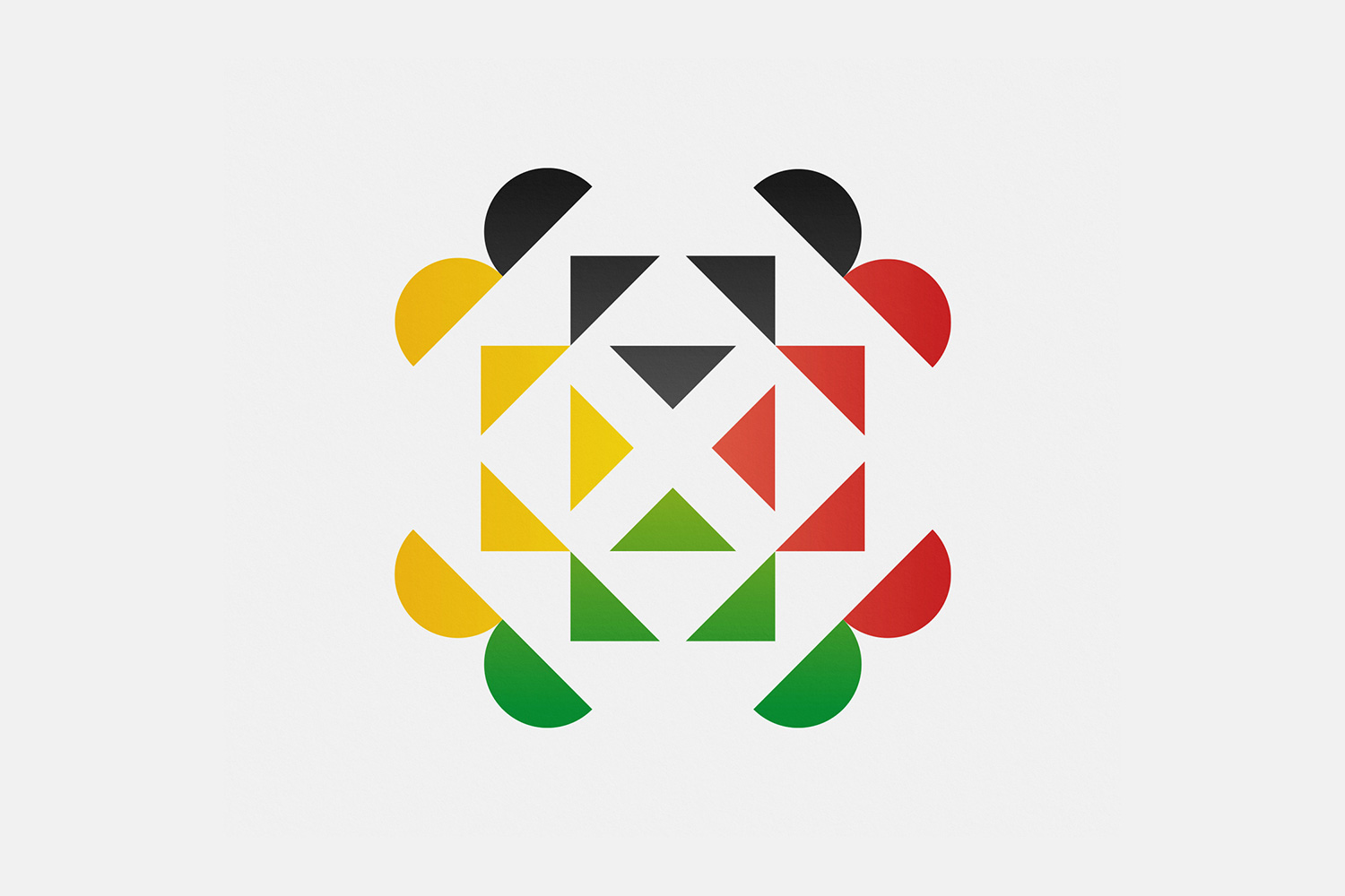
    John Fairley kindly shared details on the variety of ideas within the mark — perhaps the most obvious being the stylised panda face that John replicated and rotated. I didn’t pick up on the panda at first glance, but once noticed it can’t be unseen.

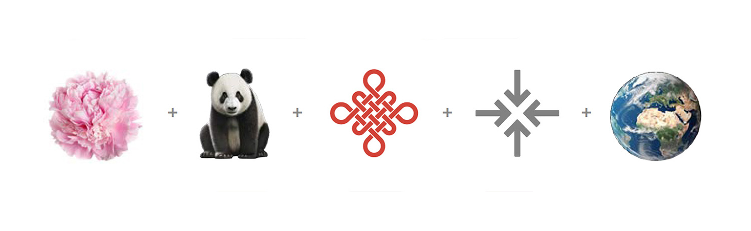
    “My logo design draws inspiration from the Chinese peony, the panda, a Chinese knot, arrows, and the world, seamlessly intertwining to represent The World Games in Chengdu’s essence.

    “The panda bear, revered as a Chinese national treasure and adored worldwide, encapsulates the host country’s identity and cultural significance. Integrating the panda’s face into the logo establishes a strong connection to Chengdu whilst evoking a sense of familiarity and affection among audiences globally.

    “The Chinese knot, symbolising unity, prosperity and luck adds depth and meaning to the design.

    “The arrows, expressing internationality, convey the scale and convergence of diverse cultures. They symbolise the shared journey towards athletic excellence and camaraderie.

    “This combination effectively represents the spirit of the Games, Chengdu and the rich traditions of China. I hope that it captures the values of unity, diversity, and cultural heritage while also being visually appealing and memorable, making it a fitting representation of the Chengdu World Games in 2025.”

    While I’m no fan of open calls for design submissions, because as designers our ideas are our most valuable product, I can certainly appreciate the craft in individual entries. Sincere congratulations to John Fairley for his winning design. Having seen his presentation deck I doubt there were many submissions with same clarity and depth of thought.

    As a side-note on the design contest approach, the contest terms are particularly harsh as they seemingly rule-out the ability for contributing designers to showcase their work. Pro bono would always be my preferred way for designers to freely offer their ideas (something I recently commented on in a piece for Readymag about free pitching).

    About The World Games 2025

    The twelfth edition of the multi-sport event will be held between 7–17 August 2025 in Chengdu and will feature no less than 35 sports, 61 disciplines and a total of 254 medal events. Among others, the sports include korfball, lacrosse, tug of war, billiards, and drone racing.

    More from John Fairley.

    https://www.logodesignlove.com/the-world-games-2025-logo