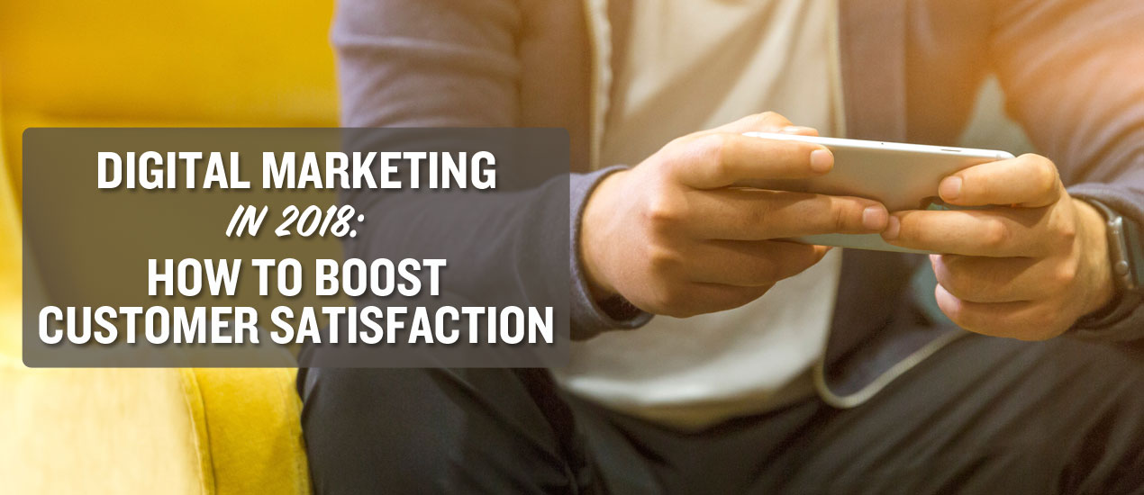
Digital Marketing in 2018: How to Boost Customer Satisfaction?
With the rise of the web, people’s approach to making purchases has changed significantly. They are now aware of how important they are to small businesses trying to survive in such a competitive marketplace. And, in return for their loyalty, they expect you to provide them with the exceptional buying experience and they won’t accept anything less than that.
Your customers not interested in your products only. Namely, they want to know the story behind your brand, as well. They expect you to answer their questions fast, connect with them on social networks, and create relevant and interesting content. They don’t want to waste their time, either. If your site takes more than 3 seconds to load, they will abandon it and look for your competitors. The same goes for your navigation, mobile-friendliness, content, and the overall visual appeal of your site.
Given all these facts, here is how you should do digital marketing in 2018.
Prepare for the Google Mobile-First Index
If you haven’t heard yet that Google has finally rolled out their mobile-first index, then you’re living under a rock. This has become one of the hottest news in the digital marketing sphere, but what does it actually mean? From now on, Google will focus on the mobile version of your site when indexing it.
So, make sure you optimize your site for mobile searchers. After all, 60% of all web searches are done via mobile devices. Make your keywords longer and more conversational to optimize them for voice search. Use Google’s AMPs to speed up your site significantly. Your navigation should be simpler, while all important elements of your website should be above the fold. For additional information, take a look at what Google says about preparing your site for the mobile-first index.
Show Appreciation
Do you know that an average U.S. household participates in about 29 loyalty programs? They love them for different reasons- some join these programs to save money, while others want to receive a reward for their loyalty. For some, the availability of rewards programs is the major factor that determines whether they will buy from you or not.
Now, loyalty programs vary and you need to choose the option that works for your target audience. You could give them points or vouchers that can be later redeemed at your stores or offer them exclusive deals for every purchase or referral they make. However, recent studies point out that people have labeled financial rewards or highly targeted incentives far more enticing. So, to make customized loyalty programs, you could offer personalized visa gift cards, with your customers’ names on them or even organize a contest and let them win your premium products.
Focus on User-Generated Content
Let’s face it- people trust other customers more than you. According to the Local Customer Review Survey, 85% of them trust online reviews as much as their friends, while 73% of them will trust your business more if your customers’ reviews are positive.
In light of statistics like this, it’s obvious that user-generated content (UGC) is one of those tactics you simply cannot allow to ignore. After all, it’s your customers that sell your products today.
Use your social networks to invite people to share their own videos of your products or services.
Boost the visibility of this content by sharing it regularly and creating dedicated hashtags.
Most importantly, you need to know what works for each of the social networks you use. Share live stories and videos on Facebook, post photos on Twitter, while the user-generated content your Instagram account could be the combination of these forms of UGC.
Use Social Networks to Offer Instant Feedback
In the past, your communication with your customers was based on phone calls and emails. However, the times have changed and, today, your communication channels cannot be observed in isolation. All instant messaging apps, video conferencing tools, social networks, email providers, and telemarketing strategies are highly intertwined, creating what we call the omnichannel approach to communication.
Today, your customers can move from one device to another uninterruptedly. They can find your phone number on your site and call you instantly, not having to switch between different apps. They can scan your QR code that will lead them to the piece of content they want to read or a product they want to buy. They can stumble upon your business on social networks, read the reviews, ask questions, and follow the link to your site to learn more about you.
If you’re too busy answering your customers’ messages regularly, then hire someone to do so for you. Even better, use a chatbot. Even this is still a pretty new concept, chatbots are predicted to revolutionize the digital marketing industry in 2018. Namely, these AI-powered tools have become smarter and more intuitive. They will provide your customers with relevant, real-time feedback and, at the same time, do all repetitive and time-consuming tasks for you.
You can use social media monitoring tools to keep track of your brand or product mentions. Whenever someone mentions you, you’ll get notified. This is called social listening and it’s immensely important in providing your customers with real-time customers services and collecting their feedback.
Create Interactive Content
Gone are the days when you could write a 1000-word blog post and generate a bunch of links, shares, and comments. We’re living in the era of augmented reality and people expect your content to surprise and excite them. So, update your content strategy with interactive content, the one your customers can actively participate in, such as polls and quizzes. Don’t forget about visual content, especially videos, as they’re expected to account for 82% of the total internet traffic by 2020.
Tell your Customers a Story
You’re not doing content marketing for SEO purposes solely. You’re creating your content for your customers. And, to engage them and get them emotionally involved, each article you write needs to have a good story to back it.
That’s what storytelling is about.
Namely, 92% of people emphasized that they expect all major brands to create ads that feel like stories. Stories share a real-life experience, add the human element to your brand promotion, and evoke nostalgia and empathy. Most importantly, as they don’t seem overly promotional, they will take your relationship with your customers to a completely new, more personal level.
Over to You
Digital marketing is not about promoting your business and ranking higher on Google. It’s also about building and nurturing strong relationships with your target audience. That’s exactly what will set you apart from a sea of businesses similar to yours.
Hope these tips help!
Digital Marketing in 2018: How to Boost Customer Satisfaction?


