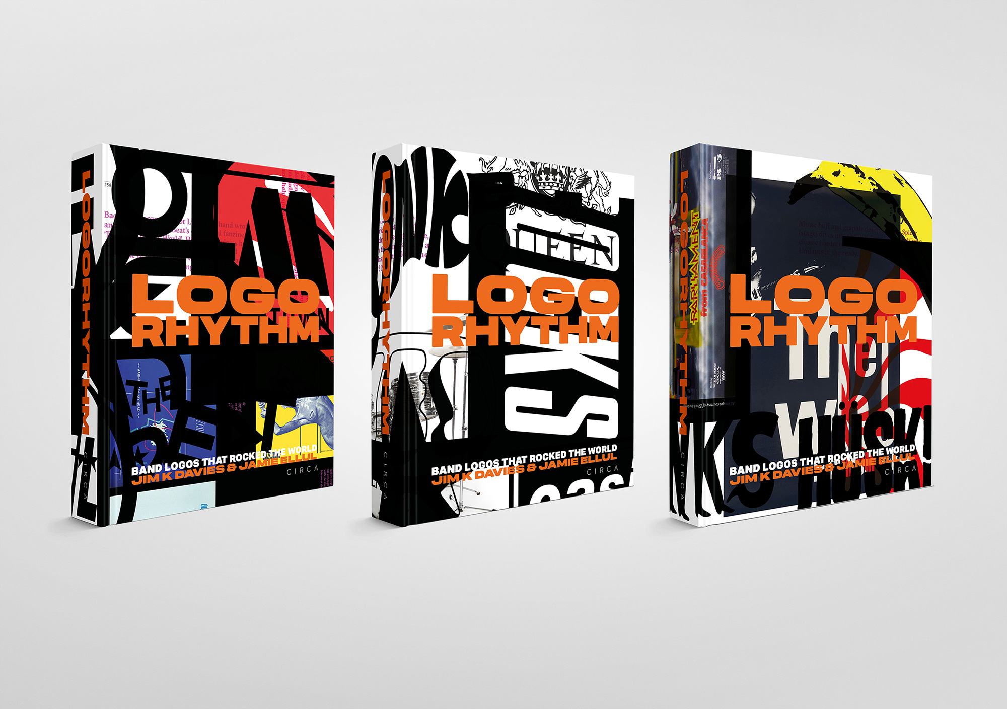
Logo Rhythm

Logo Rhythm: Band Logos that Rocked the World (on Kickstarter) features more than 90 design stories behind iconic band logos from the 1960s to present day.

“Many of the band logo design trailblazers are no longer with us. Some of their stories have been lost in the mists of time. Logo Rhythm does its damnedest to put this right. To give credit where it’s due. To sing the praises of the unsung designer or guitarist or drummer’s girlfriend who came up with the idea.”

Written and edited by Jim K Davies of totalcontent, designed and co-written by Jamie Ellul of Supple Studio, the book includes contributions from luminaries of the design and music industries. There are two forewords, one by broadcaster and songwriter Tom Robinson, the other by graphics guru Malcolm Garrett.

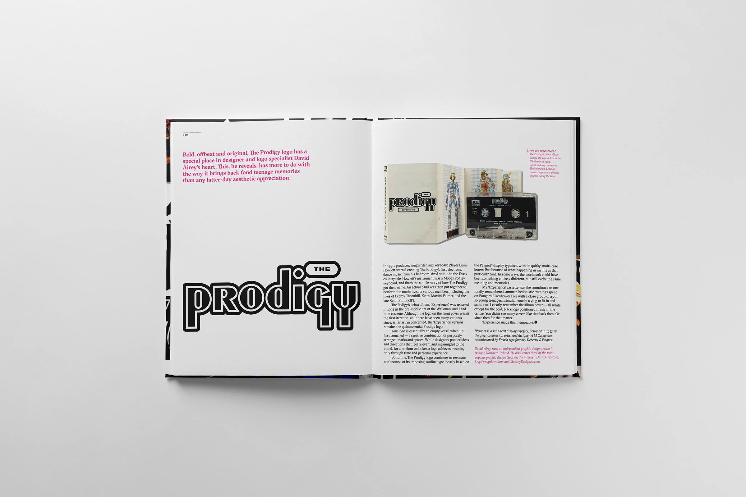
It was a real pleasure to be asked to contribute, sharing a few thoughts on the Prodigy logo and the nostalgia it conjures.

“The Prodigy logo continues to resonate not because of its imposing, outline type loosely based on the Peignot display typeface, with its quirky ‘multi-case’ letters. But because of what was happening in my life at that particular time. In some ways, the wordmark could have been something entirely different, but still evoke the same personal meaning and memories.”

Other contributing designers include the likes of Jonathan Barnbrook, Kosh, John Pache, Michael Johnson, Mark Porter, Chris Bigg, and Craig Ward.

Contributing musicians include Mick Avory of The Kinks, Horace Panter of The Specials, Jim McCarty of The Yardbirds, Alex Kapranos of Franz Ferdinand, Alan Gorrie of Average White Band, and more.

A lavish 440 pages will be printed in five colours on uncoated stock. The case-bound, foil-blocked cover has a split run of four different designs, due for delivery in August 2024.

Looks fantastic. Back the Kickstarter.

https://www.logodesignlove.com/logo-rhythm


Wonka

How did the Wonka logo project come about, and what were you responsible for?

I was approached for the work mid-2022 by an old design director of mine, Stephen Goalby. He had since moved on and was heading up the animation department at Framestore. I’d demonstrated a lot of calligraphy and crafted type skills at the agency we worked together as so I reckon that’s why he wanted me to work on the project. My responsibility was purely from a typographic and graphic perspective. The team at Framework then beautifully animated and placed it throughout the film.

Were any design details essential?

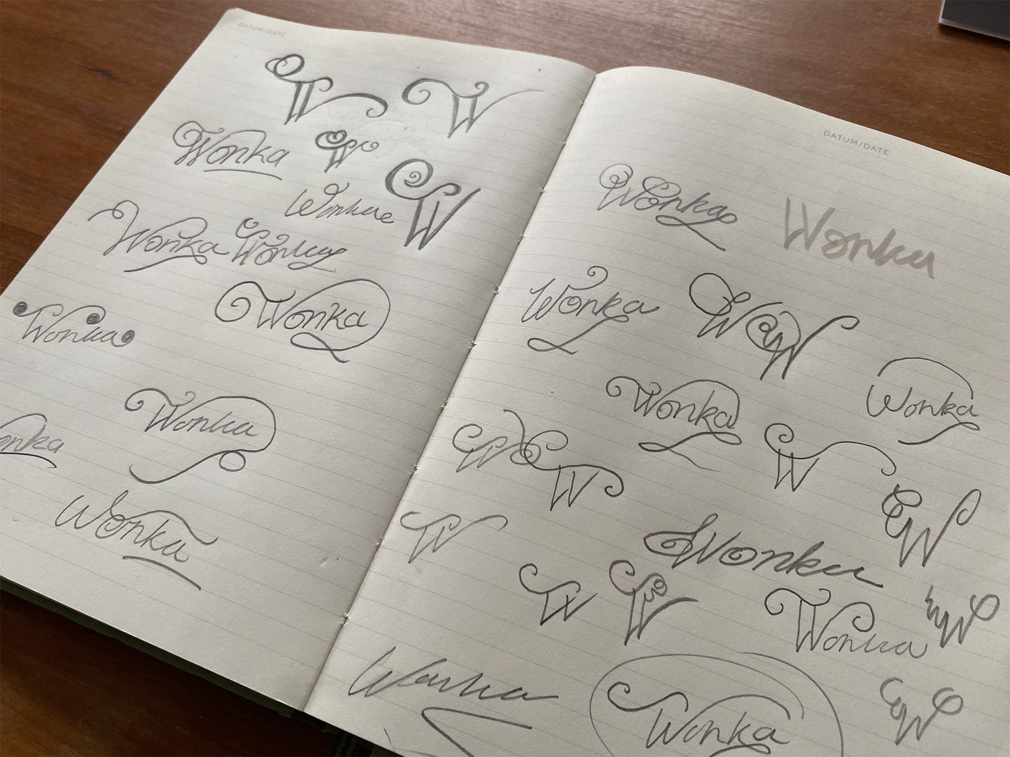
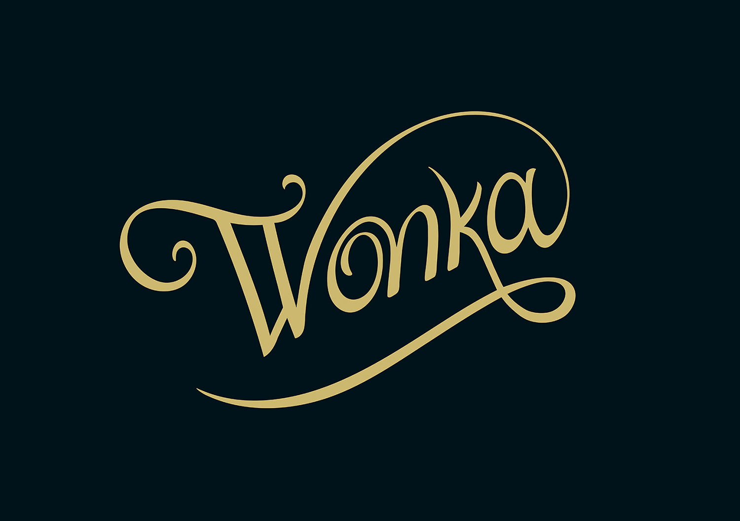
The key part of the brief was that the studio wanted me to explore a Wonka logo with an elaborate W in a scripted style that eluded to Wonka’s mum’s handwriting in one of the beginning scenes.

How much back and forth was there with the client, and what did you find most challenging about the work?

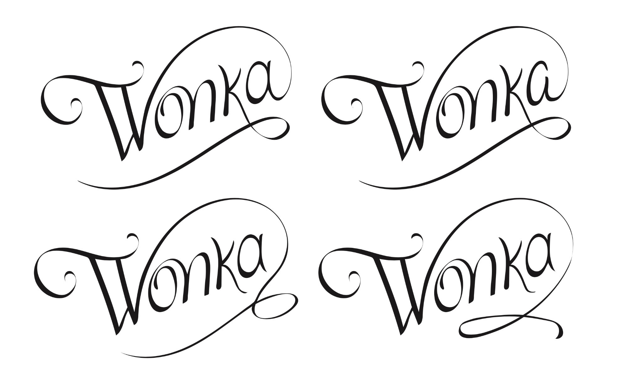
There were a fair few rounds of iterations and tweaks; which comes with the territory of logo and typography work. I did lots of exploration with the W and then the challenge was incorporating that with the rest of the type ensuring a perfect balance between the flourished W ascender with the descender of the k.

How long did it take from start to finish, and where does this project sit alongside the others you’ve worked on?

It’s a unique project, as it was my first time working for graphics for film. Having your work on a cinema screen has such immediate gratification, so from that sense it’s hard to compare. People have really connected with it, and the feedback I’ve had has been incredible. From that perspective alone it’s hands down my most prestigious job.

More from Alexandria Vernon. Catch her on Instagram, too.

https://www.logodesignlove.com/wonka


Tony’s Chocolonely

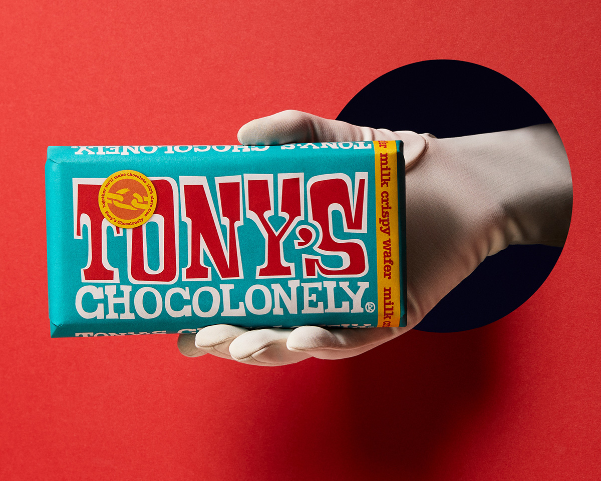
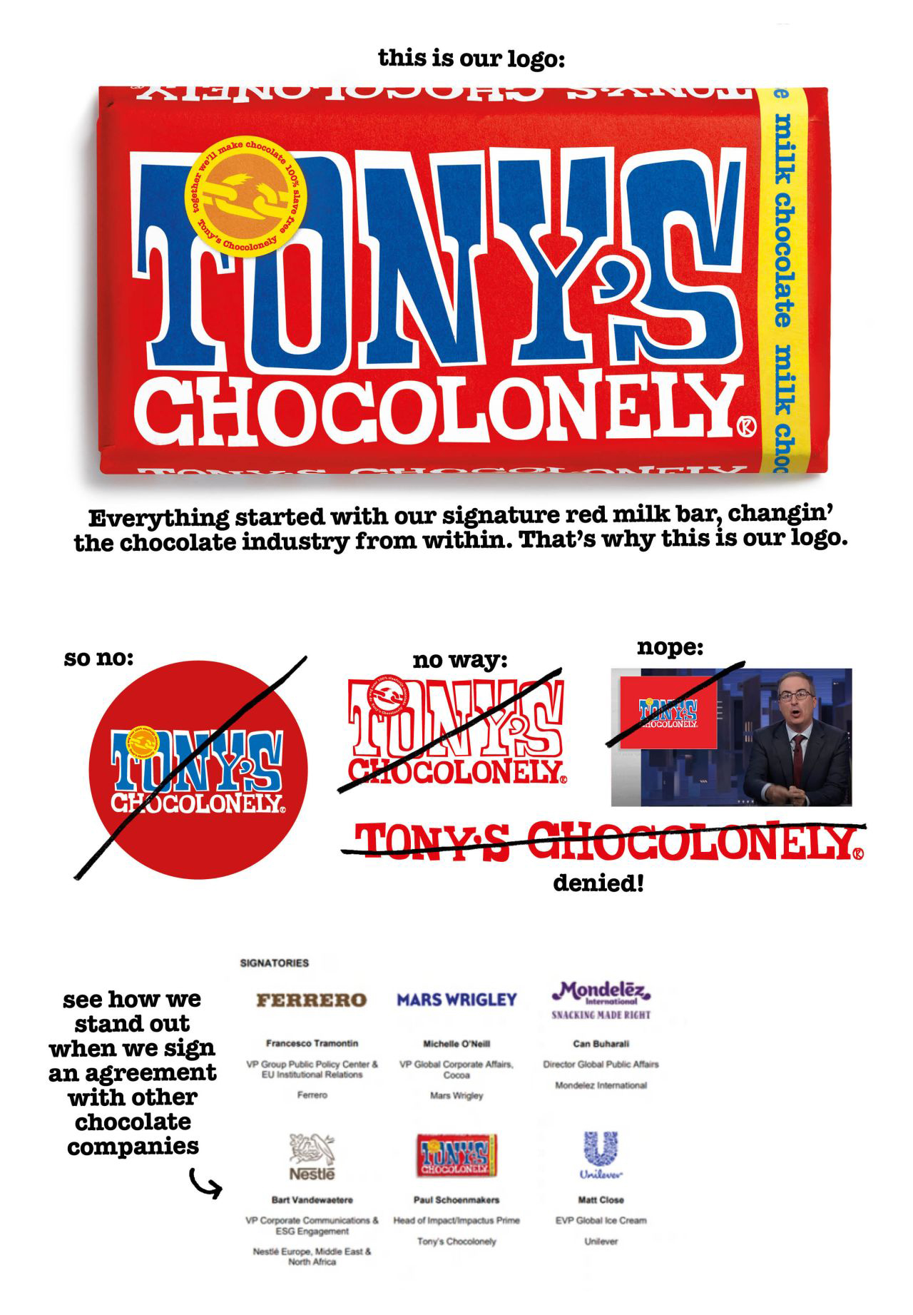
An interesting image popped up in my LinkedIn feed about the Tony’s Chocolonely logo, posted by Tony’s creative director Arjen Klinkenberg.

Here it is.

In the comments beneath the post Arjen was asked how the logo would be used on smaller media, such as a pen. He replied, “I would start with asking why would we want to brand a pen, as an impact company that makes chocolate?”

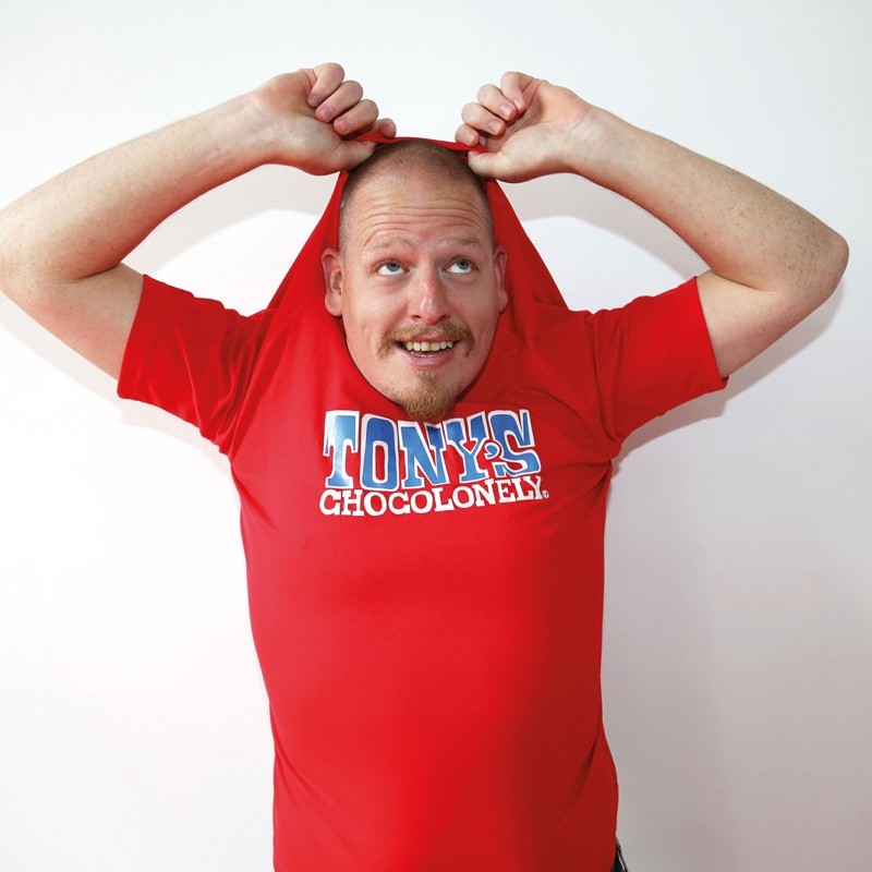
Micky Ogando, founder at Austin-based Bakery, then weighed in with an astute comment, “…you’re not wearing ‘the product photo logo’ on your T-shirt in your LinkedIn profile, instead, you’re wearing the real logo, the vector one, the one printed on the package that is found on shelves. Better to keep Tony’s real, steady on the mission, not push for a trendy byline about using the product as the logo, when it clearly isn’t.”

Arjen Klinkenberg Tony’s Chocolonely
Arjen Klinkenberg, Tony’s Chocolonely

Micky has a point.

Tony’s Chocolonely point of sale
Photo via Lee Newman
Tony’s Chocolonely exhibition stand
Photo via graphicmill.co.uk

I mean, the logo’s on the chocolate.

Tony’s Chocolonely bar

But I’m really using Arjen’s LinkedIn post as an excuse to feature a brand making a positive impact, because paying a higher price for cocoa and turning a profit clearly isn’t easy.

More about the chocolate brand on Creative Review: Getting to know Tony’s Chocolonely.

A related read, Brands to avoid: Mars and Cadbury among chocolate firms criticised in ethics report.

https://www.logodesignlove.com/tonys-chocolonely


Join Us Tonight for an After Hours Book Chat with Scott Kelby!

Scott just released a new Photoshop book, so you know what that means—it’s time for a Book Chat! Join us TONIGHT, Thursday 12/14 for some tips and tricks from the book, Q&As, amazing book deals, cool prizes, and lots of laughs. Hope to see you there! It’s over on Scott’s Facebook page: facebook.com/skelby.

https://layersmagazine.com/join-us-tonight-for-an-after-hours-book-chat-with-scott-kelby.html


Book Spotlight!

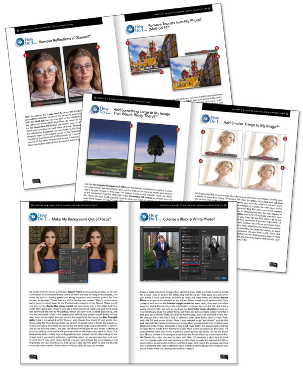
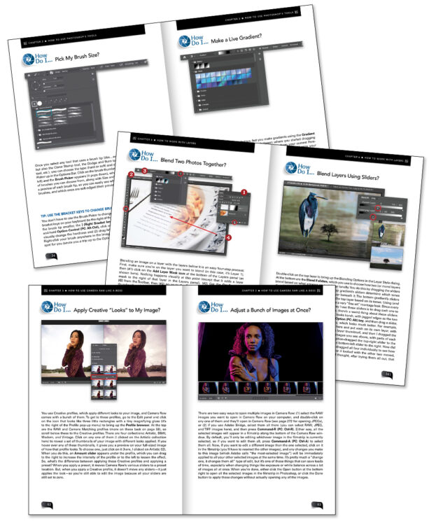
How Do I Do That In Photoshop? 2nd Edition by Scott Kelby

Scott is back with a totally updated and revised new edition of his bestselling book. Here’s how this book works: When you need to know how to do a particular thing in Photoshop, you turn to the chapter where it would be found (Layers, Printing, Masking, Special Effects, etc.), find the thing you need to do (it’s easy; each page covers just one single topic), and Scott tells you exactly how to do it just like he was sitting there beside you, using the same casual style as if he were telling a friend. That way, you get back to editing your images fast! Order your print book or eBook today.

KelbyOne members: Remember, you can save 50% on ALL titles from Rocky Nook using their discount code found under Perks in your Dashboard!

https://layersmagazine.com/book-spotlight.html


Discover ON1 Photo RAW 2024–Amazing Photo Editing Software

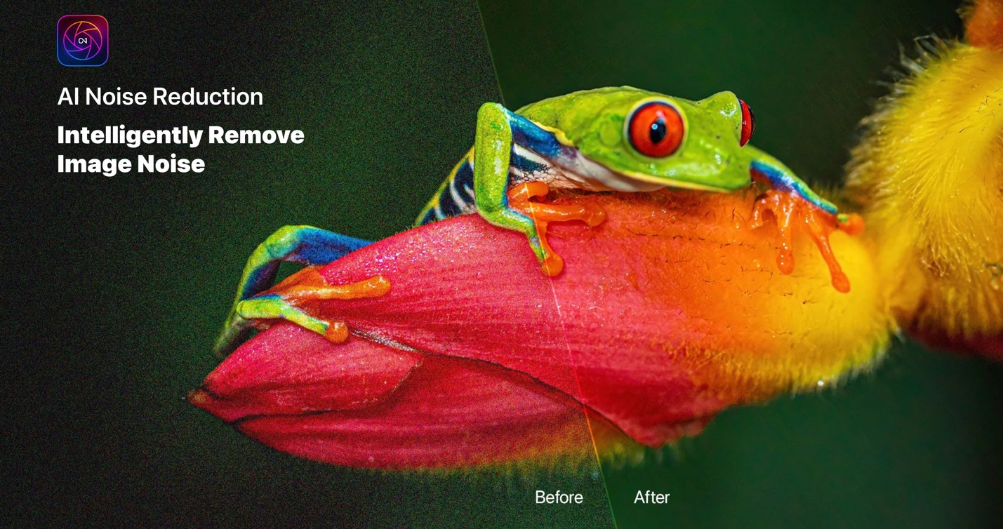
Hey there, fellow photographers! Dan Harlacher here. I’m the VP of Product at ON1 and am thrilled to introduce you to the new ON1 Photo RAW 2024, the ultimate raw photo editor. At ON1, we understand that diving into a new app can be overwhelming, especially with one as robust as Photo RAW. I’m here to ensure you have the best possible experience. Our goal with ON1 Photo RAW was to give photographers creative freedom and allow them to take advantage of the latest AI technologies without replacing them. Our AI-driven features are designed to give you a more efficient workflow and the highest image quality. Now, let’s talk about ON1 Photo RAW 2024. If you like what you see, download our free 30-day trial and follow along in the video.

[embedded content]

Organizing Your Photos

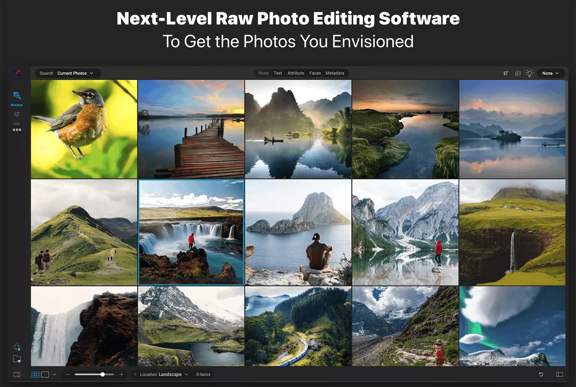
Organization is critical to a smooth and efficient photo editing workflow. With ON1 Photo RAW 2024, it’s incredibly easy to browse folders, use the filmstrip view, and even leverage star ratings to keep your photo library organized—no more hunting for that perfect shot. The new and powerful search capability will also quickly get you to the photos you need.

Editing Basics

The true power of Photo RAW lies in its editing capabilities. In the video, I guide you through the fundamental tabs in the Edit module, starting with Develop and moving on to Local Adjustments, Effects, Sky, and Portrait. You will get a great idea of what the app can do as I cover the basics first and then dive into advanced techniques to take your editing skills to the next level.

Advanced Editing Techniques

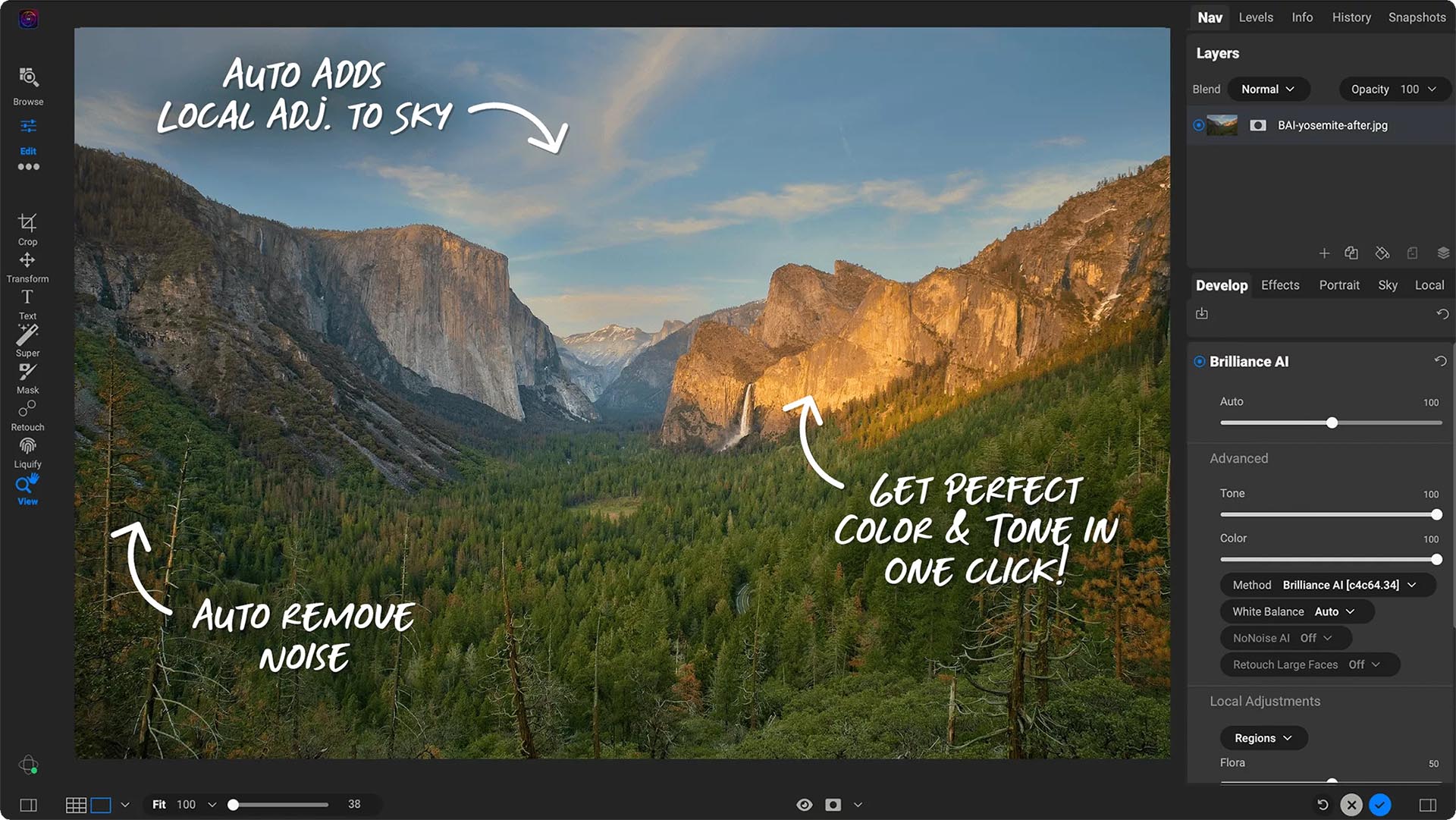
Some of the more advanced editing techniques are also included in Photo RAW. I suggest looking at the magic of the all-new Brilliance AI for automatic adjustments. From cropping to healing brush usage and targeted adjustments with Super Select AI, you’ll see how Photo RAW makes it ultra simple to enhance specific elements in your photos like never before.

Presets and Filters

Photo RAW 2024 comes packed with presets and filters to add that extra flair to your images so you can style them to your specific tastes. You can quickly apply presets, create your own, and use filters to achieve stunning effects. Whether you are a beginner or an experienced photographer, these tools will become your creative sidekicks.

Portrait Retouching

I also demonstrate how Photo RAW makes portrait retouching a breeze with AI-powered features, from smoothing skin to enhancing facial features and even replacing backgrounds. It’s one of the easiest tools for all your retouching needs.

Advanced Features: Layers and Resize AI

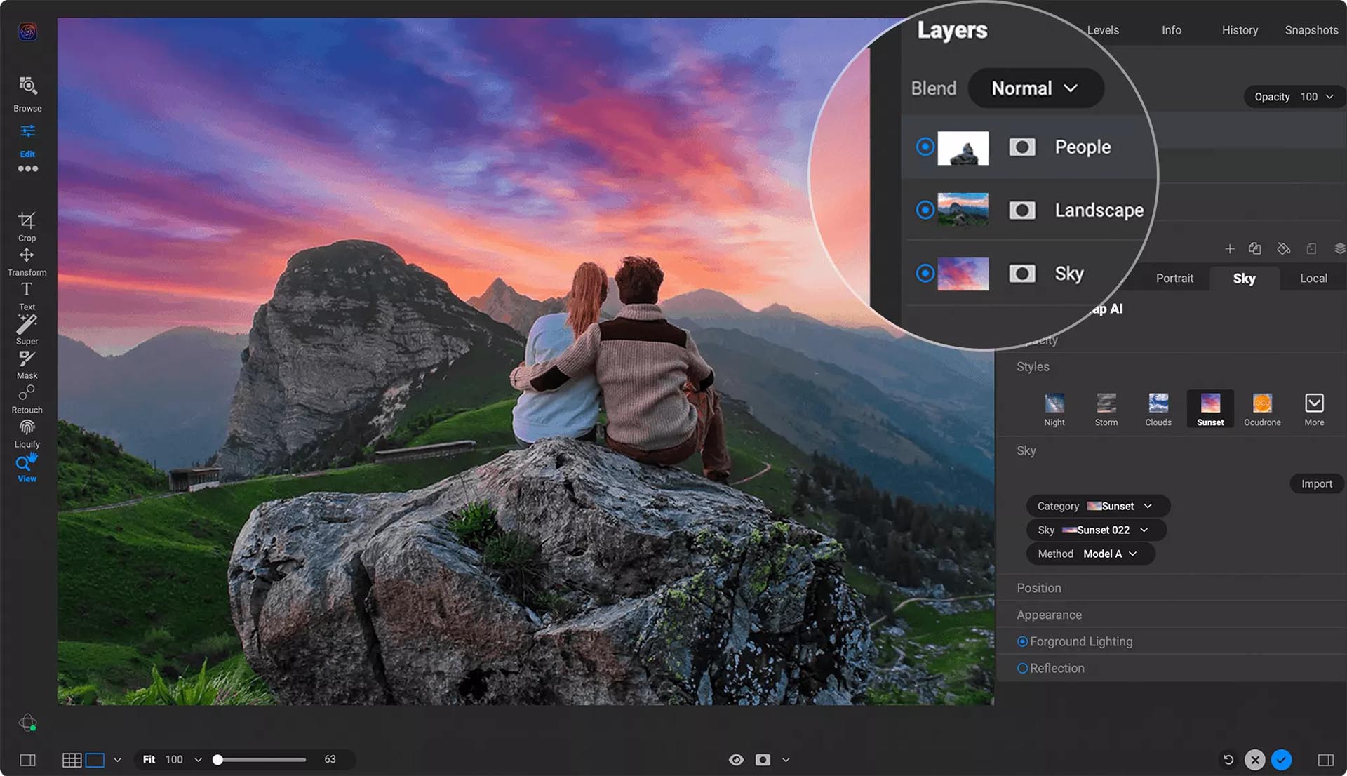
ON1 Photo RAW also has a layered workflow. Think of it as having Lightroom and Photoshop combined but for photographers. This empowers you to tackle tasks typically associated with advanced editing software like Photoshop. Plus, we’ll explore the Resize AI module, ensuring your photos maintain top-notch quality even when upscaled.

The Complete Ecosystem

But wait, there’s more! Photo RAW isn’t just a desktop application – it’s part of a complete ecosystem. The mobile app for iOS and Android and our cloud syncing service allow you to seamlessly work across all your devices and access your edited photos.

Learning Resources and Support

ON1 Photo RAW 2024 comes with a healthy amount of resources so you get the most out of your purchase. There is a detailed user guide, free video tutorials, or our exclusive education community–ON1 Plus, and you’ll find everything you need to master Photo RAW. A

Conclusion

As you embark on your photography adventures, I am grateful for you considering ON1. I can’t wait to see the incredible creations you’ll achieve with this powerful photo editing tool. Whether a hobbyist or a pro, ON1 Photo RAW has the tools and support to take your photography to new heights. Let’s capture those moments and create something extraordinary together!

Get your free 30-day trial of ON1 Photo RAW 2024!

https://layersmagazine.com/discover-on1-photo-raw-2024-amazing-photo-editing-software.html


Upgrade Your Editing Game with GenSwap in Luminar Neo

Take advantage of fantastic Cyber Week deals from Luminar!

At its core, Luminar Neo is about pushing the boundaries of photo editing by creating intuitive, powerful and easy-to-use tools that are accessible to photographers of all skill levels. With the goal of rewriting the rules and inspiring users to transcend the ordinary, Luminar Neo offers photographers the ability to leverage the power of next-gen AI-powered photo editing software. One of Luminar Neo’s newest groundbreaking features is GenSwap, a generative AI tool that redefines editing possibilities. 

What is GenSwap?

GenSwap is a game changer that allows photographers to swap, alter and replace specific elements within photos. Using intelligent technologies, GenSwap analyzes photos and integrates AI-generated visuals that seamlessly fit in with the rest of your picture. 

Here are a few ways to explore its capabilities:

Color Customization: Effortlessly adjust and alter colors with just a few clicks. By providing a prompt to GenSwap, photographers can change the color palette of an entire photograph. From vibrant reds to serene blues or eclectic patterns, color enhancements can elevate visual appeal without compromising the photo’s integrity.

Landscape Refinement: Transform a murky lake into pristine, crystalline water to make aquatic scenes appear more vivid and inviting. A simple change can affect the overall ambiance of the shot, intensifying its impact.

Picturesque Details: Adding a bee to a flower or enhancing other foreground elements can significantly amplify the visual narrative. GenSwap seamlessly integrates these details, making the photo more dynamic and immersive.

Background and Foreground Alterations: Beyond specific components, GenSwap allows for nuanced adjustments to both foreground and background elements. Whether it’s enhancing lighting, adjusting perspectives or refining textures, photographers have the flexibility to fine-tune every aspect of their composition.

With the simple input of a prompt, you can make precise modifications to photos while maintaining a natural and cohesive visual narrative. 

You can even get imaginative with GenSwap by blending reality with the fantastical. By integrating mythical elements into everyday scenes, you can infuse dreamlike qualities into your photos to give them a unique storytelling angle.

GenSwap’s intuitive algorithms understand the intricacies of your images. They can help you effortlessly refine the composition of your landscape shots or remove imperfections from portraits to enhance details, colors and textures.

With GenSwap, the possibilities are endless. Experience a new level of creative freedom without the restrictions of conventional editing techniques.

Cyber Week Offers:

This Cyber Week, discover the full capabilities of GenSwap by taking advantage of irresistible deals on Luminar Neo subscriptions:

Step into the future of photo editing this Cyber Week and harness the transformative power of GenSwap. Secure these exclusive deals today before they vanish!

https://layersmagazine.com/upgrade-your-editing-game-with-genswap-in-luminar-neo.html


The Verge’s Dramatic Redesign Boosts Loyalty Even as Readership Dwindles


.article-native-ad { border-bottom: 1px solid #ddd; margin: 0 45px; padding-bottom: 20px; margin-bottom: 20px; } .article-native-ad svg { color: #ddd; font-size: 34px; margin-top: 10px; } .article-native-ad p { line-height:1.5; padding:0!important; padding-left: 10px!important; } .article-native-ad strong { font-weight:500; color:rgb(46,179,178); }

Experience the buzz at NexTech, Adweek’s innovative conference for the newest tools in marketing technology. Talk with experts on generative AI, audience management, automation, the metaverse and more. Register.

When The Verge launched its redesigned website last September, editor-in-chief Nilay Patel admitted that the effort was motivated, in part, by a desire to capture readership from Twitter users fleeing the platform.

One year later, the Twitter prediction has proven prescient, and thanks to new site features and ad products, people are coming back to The Verge more often.  

From January to September, The Verge saw its readership increase 15%, according to Patel. In the same timeframe, its loyal user base, which it defines as a reader who visits the site at least five times per month, increased 62%. (Twitter, now X, has lost 13% of its daily active users since Elon Musk bought the platform in October 2022, per Apptopia).

“Our total user base is growing, but specifically, the user base is shifting to loyal readers,” said Helen Havlak, the publisher of The Verge. “So, the site is doing a great job of converting fly-by readers into loyal readers.”

Despite these increases, in the months following the September 2022 redesign, The Verge saw year-over-year traffic decrease every month except for June 2023, according to Comscore. From September 2021 to August 2022, the publisher averaged 17.3 million visitors per month, per Comscore. From September 2022, when the redesign occurred, to August 2023, the site averaged 11 million monthly visitors.

The technology publisher is not alone in this drop-off; website traffic has been down across the industry, the result of fewer social and search referrals, among other factors. And even the most meticulous redesigns can result in short-term declines in traffic of between 10% and 15%, according to web design consultant Deborah Carver, founder of The Content Technologist.

Loyalty over fly-by scale

According to Havlak, the drop in overall traffic—or algorithmic audiences—is a less meaningful metric than loyal users. She also expects total traffic in Q4 to outpace total traffic from the same time period last year.

Some, like The Verge, will have an easier time focusing on loyalty over a fly-by scale. Its homepage is consistently the highest-trafficked single page across the entire Vox Media portfolio, according to Patel, and its strong brand identity and 11-year lifespan have helped it cultivate a devoted audience. 

“We have to make something that inspires people to pay us directly,” Patel said. “We have gotten drunk on cheap algorithmic traffic for too long, and all of those pipes are about to get flooded by bargain-bin content.”

Stickier site features boost loyalty

The Verge redesigned its website to resemble Twitter because social platforms have historically done a better job than publishers in building products that people come back to, said Patel.

To channel the spirit of a social interface, The Verge introduced its news feed feature. It also unveiled Storystream, a hybrid product that combines live blog and article formats to cover events that unfold over days or weeks, such as a trial. On average, readers spend four minutes longer on these “slow blogs” than traditional articles, said Havlak.

The new interface also led to an uptick in the clickthrough rate for content on the homepage, which has risen 25% on desktop and 48% on mobile, according to Havlak. 

Comments, too, which the new site has made more prominent, have increased in volume—total comments are up 90%, while comment rate is up 248%. The Verge views commenting as a proxy for engagement, although Carver is reluctant to do so.

Early success from more native ads

The facelift has also opened up opportunities for new ad products, according to Patel, though the publisher declined to provide specific revenue figures or performance metrics.

One, called Quick Posts, acts as a native ad that the publisher can use to promote in-house products like newsletters or product review guides.

In September, the publisher unveiled a proprietary ad product that appears in the news feed. The seamless fit and familiar user experience of the feature aims to increase ad performance, although the publisher said it was too soon to share success metrics.

The news feed product also uses the same dimensions as social creative, which could make it an easier buy for advertisers, said Paul DeJarnatt, vp and head of digital at Novus Media. 

“A redesign on its own doesn’t convince me to buy media from a website. We make decisions based on data,” DeJarnatt said. “But if the redesign encourages the reader to engage more with ads, then maybe.”
.font-primary { } .font-secondary { } #meter-count { position: fixed; z-index: 9999999; bottom: 0; width:96%; margin: 2%; -webkit-border-radius: 4px; -moz-border-radius: 4px; border-radius: 4px; -webkit-box-shadow: 0 0px 15px 4px rgba(0,0,0,.2); box-shadow:0 0px 15px 4px rgba(0,0,0,.2); padding: 15px 0; color:#fff; background-color:#343a40; } #meter-count .icon { width: auto; opacity:.8; } #meter-count .icon svg { height: 36px; width: auto; } #meter-count .btn-subscribe { font-size:14px; font-weight:bold; padding:7px 18px; color: #fff; background-color: #2eb3b2; border:none; text-transform: capitalize; margin-right:10px; } #meter-count .btn-subscribe:hover { color: #fff; opacity:.8; } #meter-count .btn-signin { font-size:14px; font-weight:bold; padding:7px 14px; color: #fff; background-color: #121212; border:none; text-transform: capitalize; } #meter-count .btn-signin:hover { color: #fff; opacity:.8; } #meter-count h3 { color:#fff!important; letter-spacing:0px!important; margin:0; padding:0; font-size:16px; line-height:1.5; font-weight:700; margin: 0!important; padding: 0!important; } #meter-count h3 span { color:#E50000!important; font-weight:900; } #meter-count p { font-size:14px; font-weight:500; line-height:1.4; color:#eee!important; margin: 0!important; padding: 0!important; } #meter-count .close { color:#fff; display:block; position:absolute; top: 4px; right:4px; z-index: 999999; } #meter-count .close svg { display:block; color:#fff; height:16px; width:auto; cursor:pointer; } #meter-count .close:hover svg { color:#E50000; } #meter-count .fw-600 { font-weight:600; } @media (max-width: 1079px) { #meter-count .icon { margin:0; padding:0; display:none; } } @media (max-width: 768px) { #meter-count { margin: 0; -webkit-border-radius: 0px; -moz-border-radius: 0px; border-radius: 0px; width:100%; -webkit-box-shadow: 0 -8px 10px -4px rgba(0,0,0,0.3); box-shadow: 0 -8px 10px -4px rgba(0,0,0,0.3); } #meter-count .icon { margin:0; padding:0; display:none; } #meter-count h3 { color:#fff!important; font-size:14px; } #meter-count p { color:#fff!important; font-size: 12px; font-weight: 500; } #meter-count .btn-subscribe, #meter-count .btn-signin { font-size:12px; padding:7px 12px; } #meter-count .btn-signin { display:none; } #meter-count .close svg { height:14px; } }

Enjoying Adweek’s Content? Register for More Access!

https://www.adweek.com/media/the-verge-redesign-loyalty-readership-dwindles/


Game+Logo

Dan Clarke of Arkotype curates Game+Logo, a wistful Twitter profile featuring logos, wordmarks, and monograms from the video game industry.

I’ve cherrypicked some favourites.

Two-player Bubble Bobble on the arcade machine in Bangor Cineplex. Wrestlefest edged it, though.

Searching for details about The Links logo (above) I found this spellbinding piece of musical history — Everyday, performed in Omaha, Nebraska by The Links.

Shout out to classic multiplayer Everybody’s Golf.

I remember Syndicate — one of Bullfrog’s early successes. Theme Park was another.

The Last of Us is an all-time favourite, sat in the dark late at night.

The HAL logo is named “Inutamago” (Dog Eggs).
After the Atari 2600, the SEGA Mega Drive II was the second console in my house. Memories of two-player on Madden 94 with my big brother. Brilliant.

More at Game+Logo. Thank you, Dan.

Related in the archives: The Atari logo, behind “the Fuji”

https://www.logodesignlove.com/video-game-logos


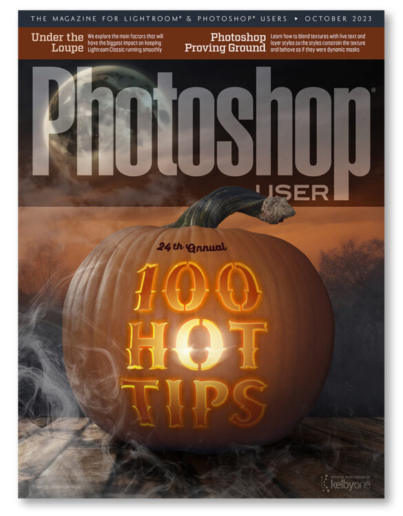
The October 2023 Issue of Photoshop User Is Now Available!

The latest issue of Photoshop User magazine is always available to read with a free KelbyOne membership. Pro members have access to more than 100 back issues! Click here to join today to start learning from some of the top instructors in the Photoshop, Lightroom, and photography industry.

In this issue, we continue our annual tradition of bringing you 100 of the hottest tips by 10 of the coolest gurus in the industry, plus we explore ways to improve Lightroom Classic’s performance, experiment with blending textures with live text and using layer styles as dynamic masks, mimicking infrared effects in Photoshop, turning midday lighting into golden-hour lighting, creating designs for packaging, and so much more!

This issue’s cover designed by Jessica Maldonado

Current KelbyOne members can log into their account to access the new issue, or you can visit https://kelbyone.com/magazine to sign up and start reading today.

KelbyOne Pro members have access to more than 120 back issues of Photoshop User magazine all the way back to January 2012, plus all 64 issues of Lightroom Magazine. Not a Pro member yet? Click here for more information.

https://layersmagazine.com/the-october-2023-issue-of-photoshop-user-is-now-available.html