Logo Rewind

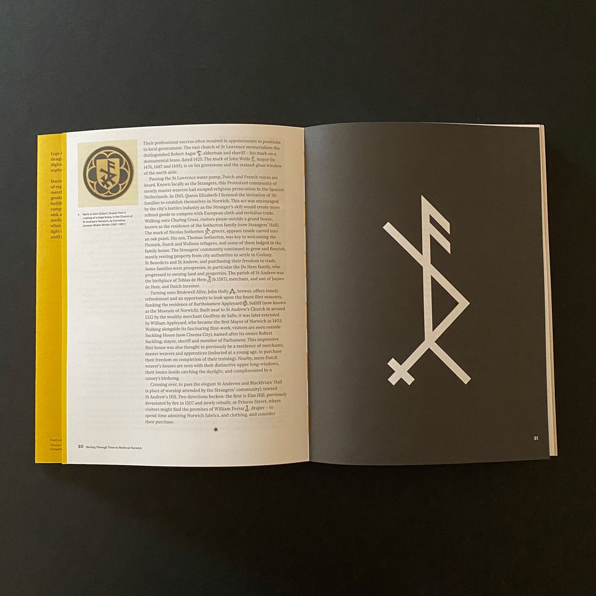
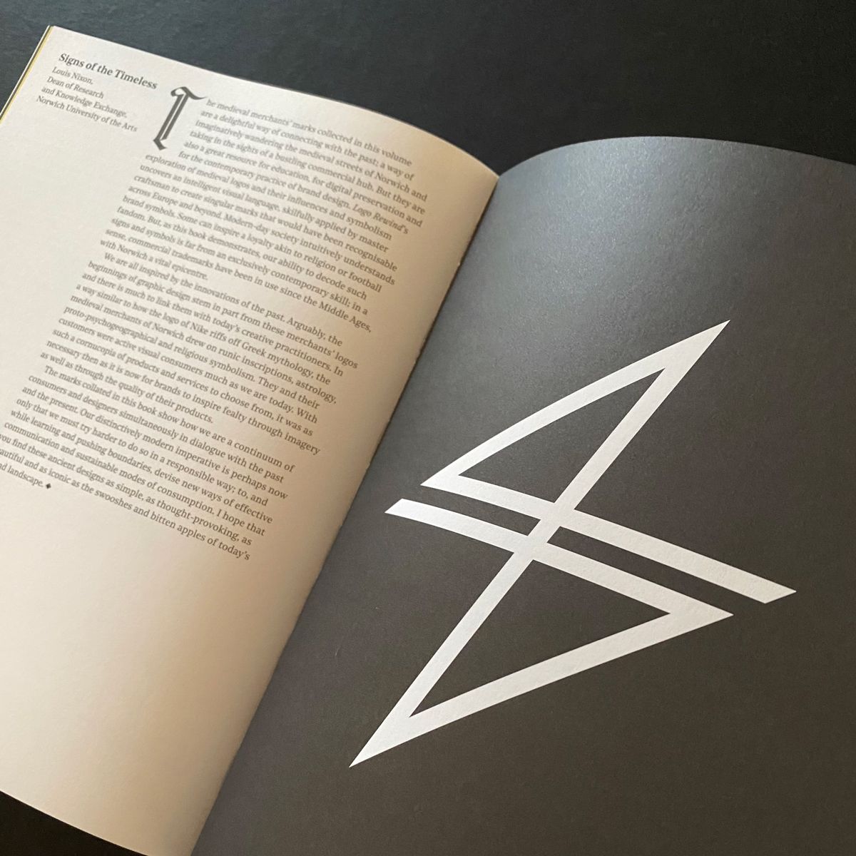
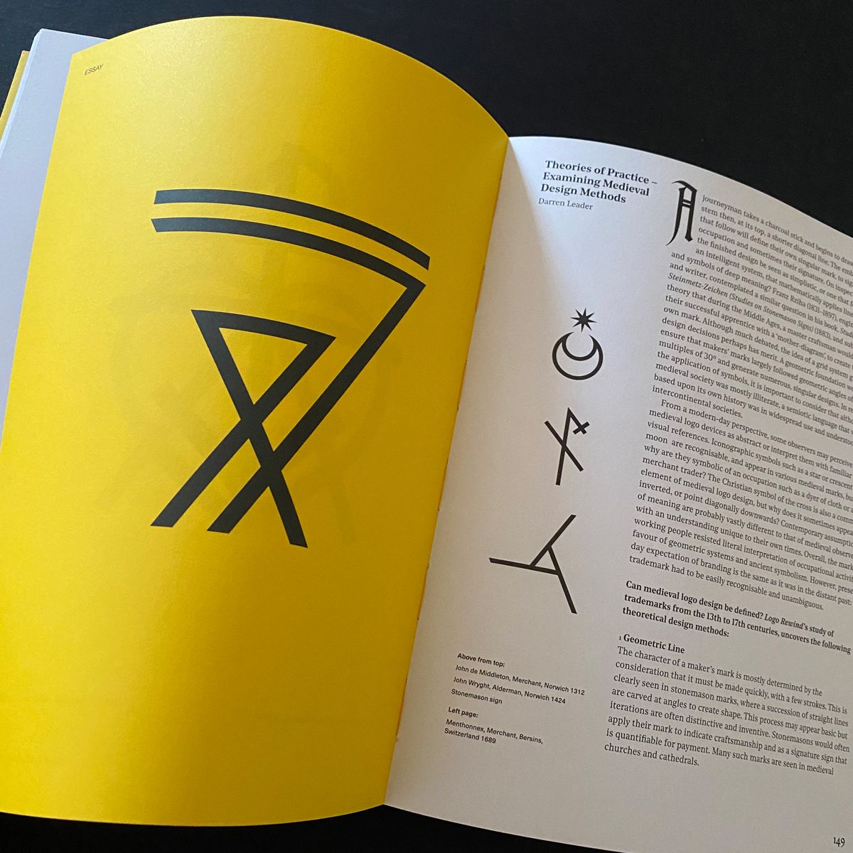
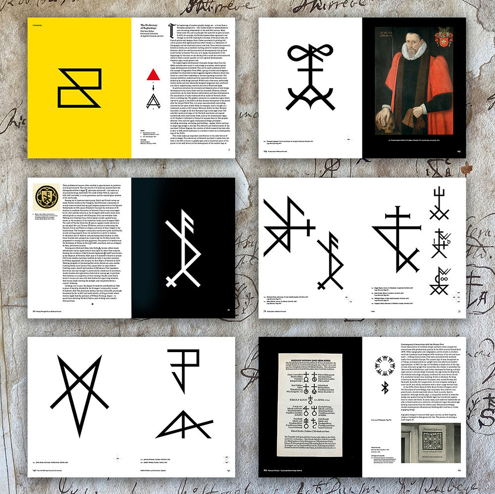
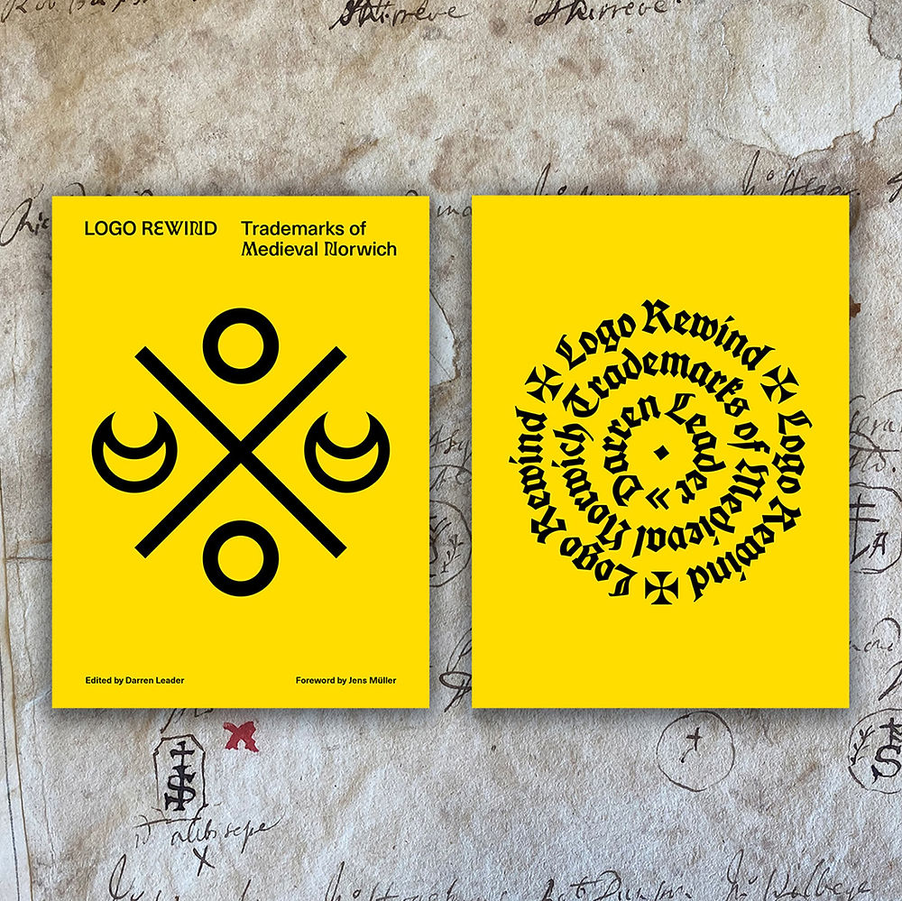
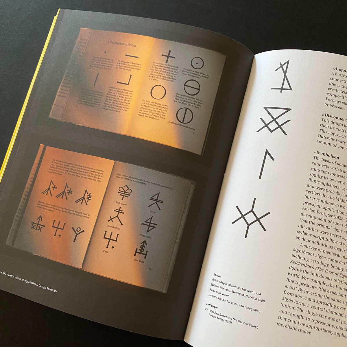
Logo Rewind, by designer Darren Leader, is a book about the visual language of Medieval Norwich, England. It preserves the city’s medieval “logos” and documents the history of Norwich’s past and its impact upon the earliest era of commercial branding.

“During the 14th–16th centuries Norwich was a centre of regional and continental trade with products defined by merchants’ marks. These marks were emblems stamped onto goods and carved into the facades, beams and windows of buildings across the city. Each logo had to be different from its competitor and distinguishable by a mostly illiterate population and, as such, are precursors of today’s brand logos.

“Norwich’s medieval marks are in fact an early example of commercial branding overlooked by contemporary graphic design. This is a practice previously thought not to have begun in earnest until the late 19th century. They are almost entirely unknown by the public, specifically the national and the international design community, and independent designer, researcher and educator, Darren Leader has collected and digitally remade more than two hundred trademarks from Medieval Norwich, together with added biographic detail recorded in the early 1700s by the antiquarian John Kirkpatrick (1687–1728).

“The marks themselves are strikingly modern in feel, the merchants having crafted a visual language based upon angular lines and geometric shapes reminiscent both of 21st century branding and logo design and the ‘less is more’ aesthetic of modernism, sharing an intention to create captivating brand symbols that communicate with the minimum of elements. Many merchants’ marks are still visible across Norwich today — carved above door frames, engraved in stone, or rendered in stain glass inside churches and on gravestones to indicate the passing of a merchant. This book would provide the perfect guide for, among other things, a personal exploration of the city’s architectural palimpsest.”

Logo Rewind includes a foreword by Jens Müller and an introduction by Minnie Moll, with essays that explore the histories of logos and merchants’ marks, examples of previous historic preservation, and a new collection of digitally remade marks, annotated with their name, occupation, location, and year of identification.

This looks like a lovely piece of design history. I look forward to getting a copy. Currently available for pre-order from UEA Publishing Project.

https://www.logodesignlove.com/logo-rewind


Paris 2024 logo

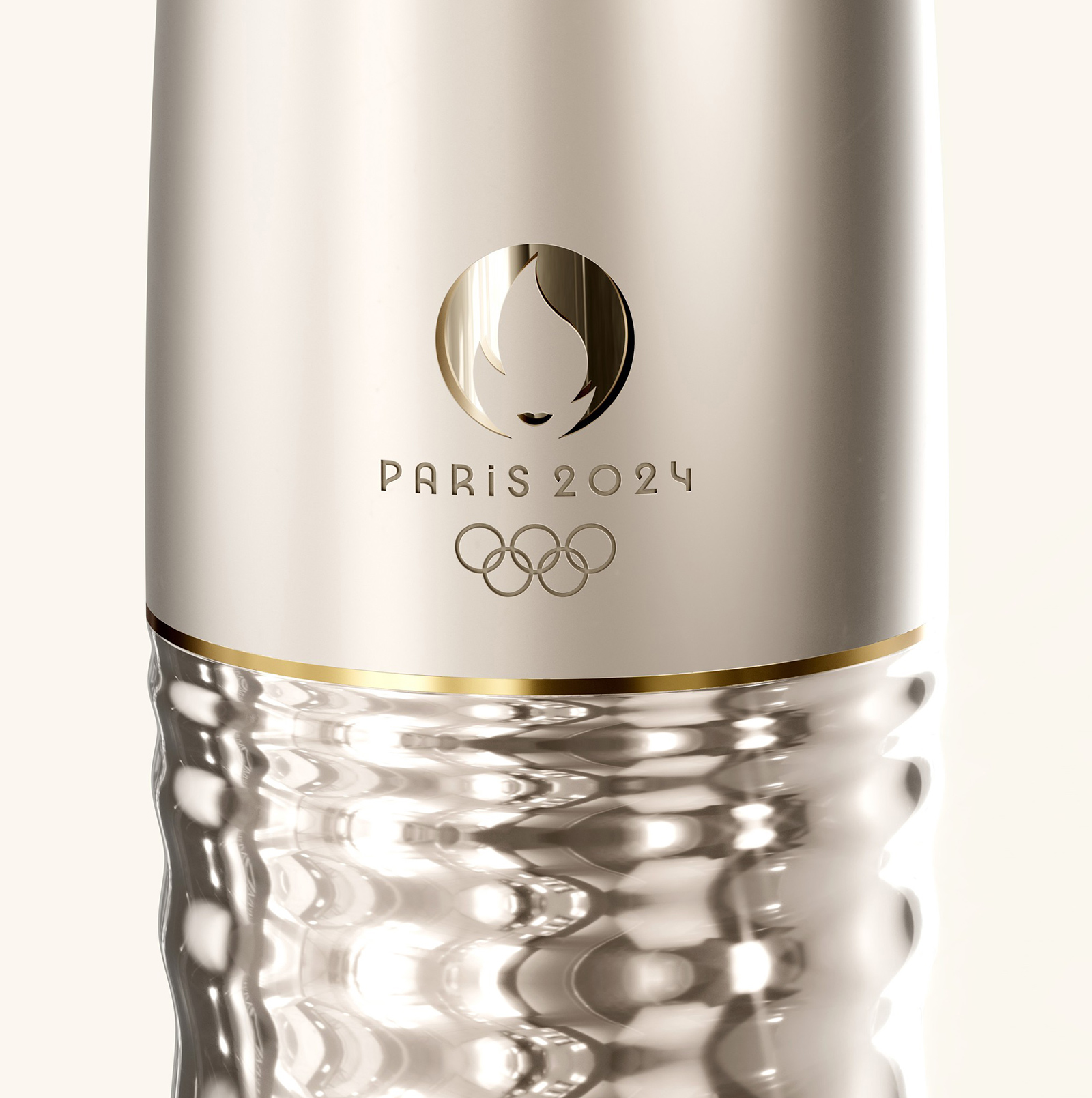
The logo for Paris 2024 combines three separate symbols — the gold medal, the flame, and Marianne (the personification of the French Republic).

“Each of these symbols reflects a part of our identity and values. It is also the first time in history the same emblem has been used for both the Olympic Games and the Paralympic Games.”
— paris2024.org

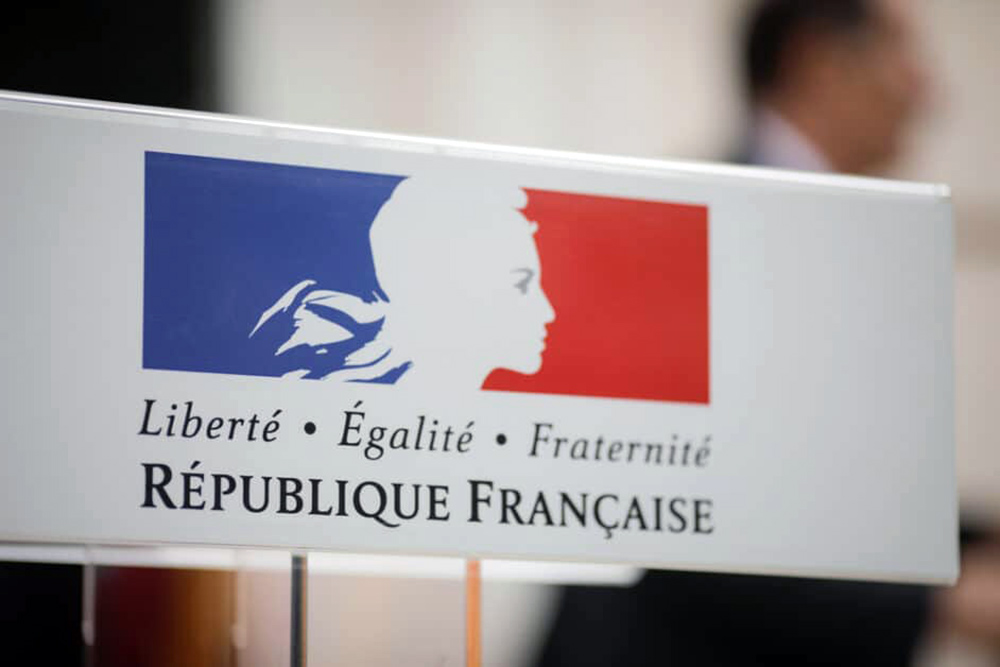
Marianne is an allegorical figure with a ubiquitous presence in France. She can be seen in the official logo of the French Republic, on stamps and in town halls and law courts, albeit with a much more detailed and traditional look.

According to cnews.fr, as general rule, a new representation of Marianne is chosen each time a new French presidential term begins.

Watch a 1-minute YouTube video introducing the Paris logo.

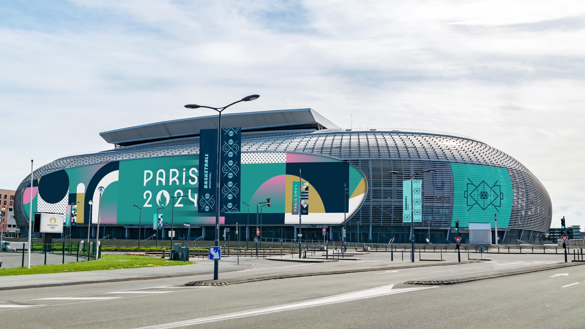
Following the logo unveiling, the next phase of the Paris 2024 Olympics visual identity was revealed.

“A mix of sharp lines and simple graphic shapes come together in an interchangeable grid system that is a nod to the Art Deco style seen during the 1924 Olympics, also held in Paris.”

More imagery on Creative Review.

With almost every high-profile logo launch, not everyone liked what they saw. Can’t please them all.

More about the Paris 2024 design, including the colour scheme, Art Deco-inspired typeface, and games iconography.

https://www.logodesignlove.com/paris-2024-logo


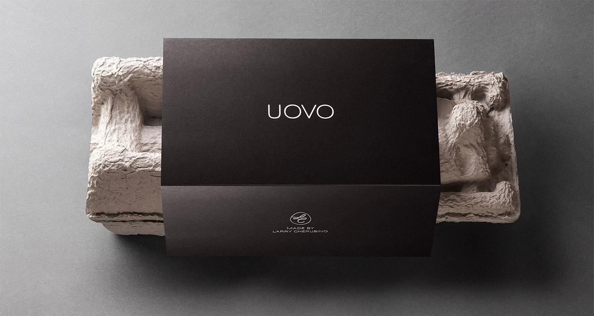
Uovo

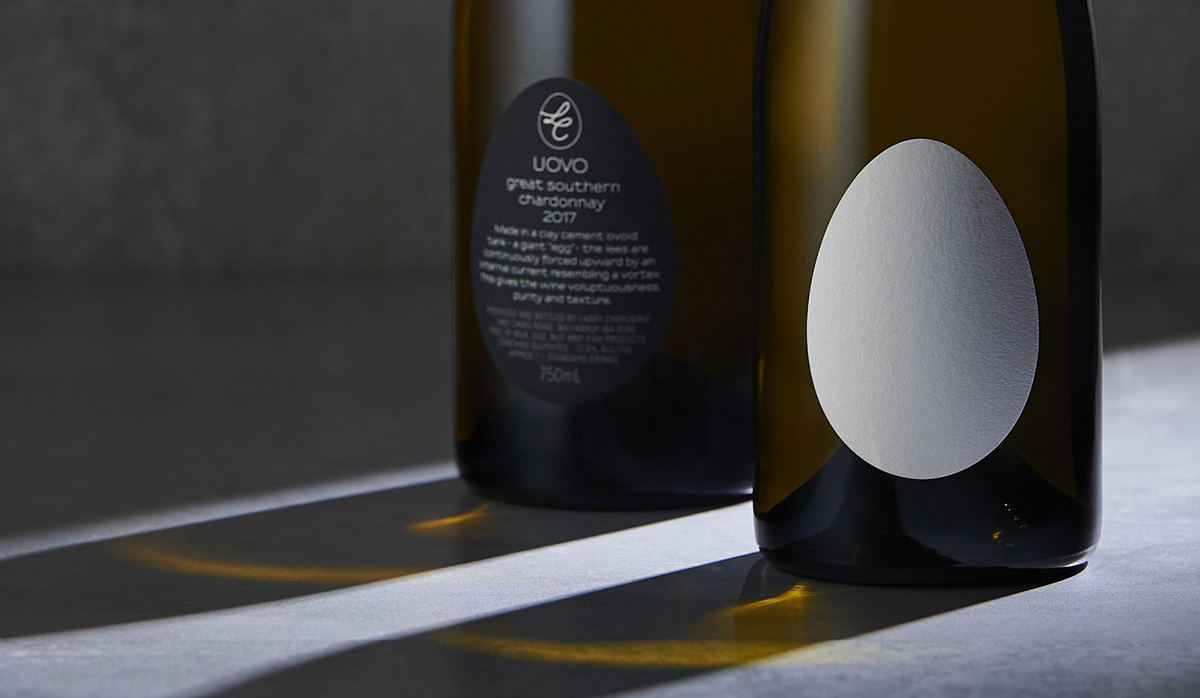
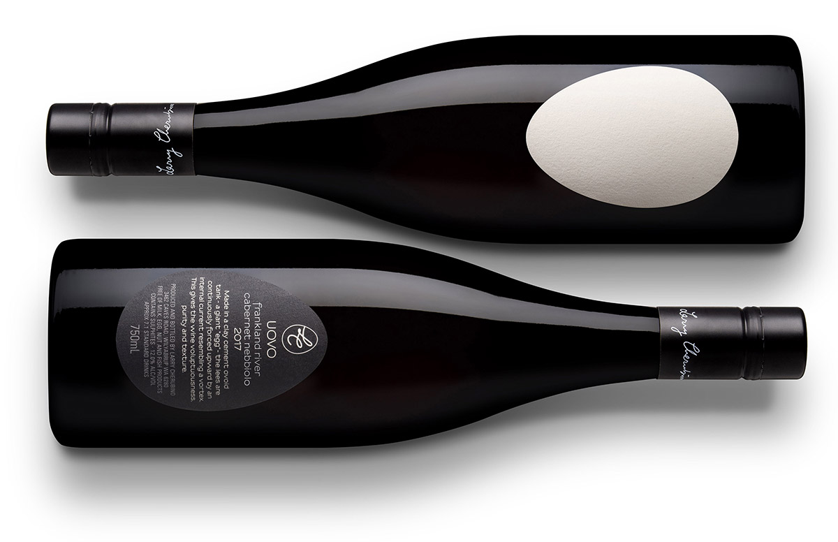
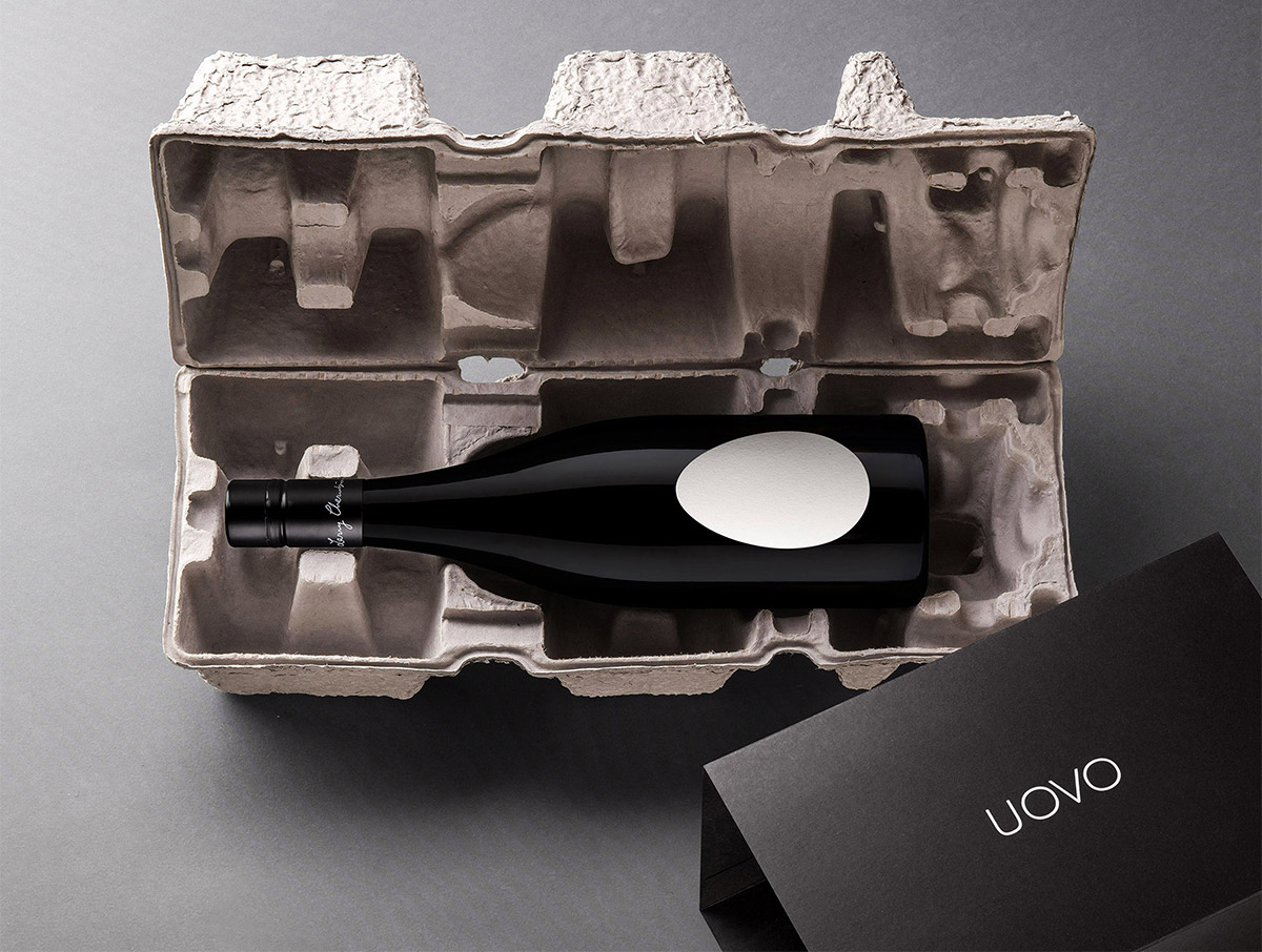
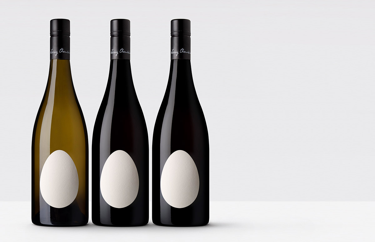
A slightly different feature, added for the symbolism depicted by the label rather than for the Uovo wordmark. That said, when a shopper sees the bottle, the egg-shaped label could be considered a form of logo (a visual emblem, at the very least).

Spotted while browsing the website of Denomination, a design studio in Sydney, London, and San Francisco that specialises in the drinks market. From the portfolio…

“When winemaker Larry Cherubino had three giant concrete ‘egg’ tanks delivered to his winery, he knew the packaging [and Uovo logo] had to reflect this revolutionary way of maturing wine. Wine made within the ovoid shape is purer than anything achieved traditionally, as the lees [the sediment of wine in the barrel] are continuously forced upward by a naturally occurring vortex, creating wines with a purity and texture that is unsurpassed. Named ‘Uovo’ (egg in Italian) Cherubino wanted the packaging to reflect the unique hand-made winemaking process and delicate nature of the wines.”

“The strikingly simple label, executed in a warm white eggshell textured paper, immediately conveys the brand name as well as the highly unusual form of the wine tank. To reflect the pure, stripped-back nature of the winemaking, the label is devoid of graphics, letting the shape alone become an intriguing and unique identifier.”

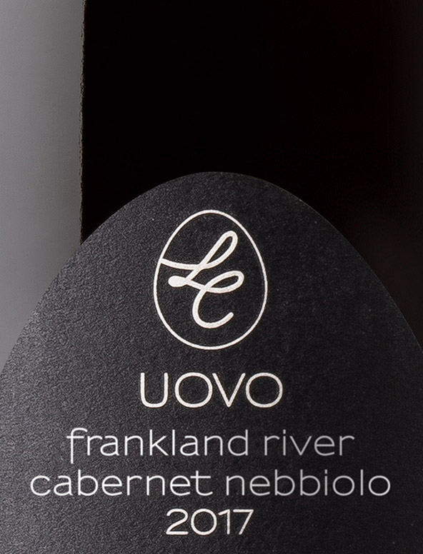
A nice little touch to place the LC monogram within an egg, rather than the original confines seen on the Larry Cherubino website.

On the design execution, if I was to change one thing it’d be the Uovo wordmark. I’d add marginally more width to the U as I think it’d create more visual balance with the OVO characters, and I’d reduce the spacing between the U and O to even-out the kerning.

But look at this.

Each bottle is packaged in its own “egg” box — a moulded pulp wine mailer customised with an outer sleeve.

The production method, the brand name, the label shape, the palette, the packaging. Put it all together, that’s memorable.

More from Denomination.

https://www.logodesignlove.com/uovo-logo


Illustrator Typography: How to Create Custom Script Type

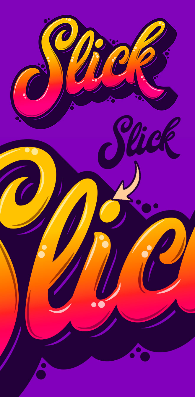
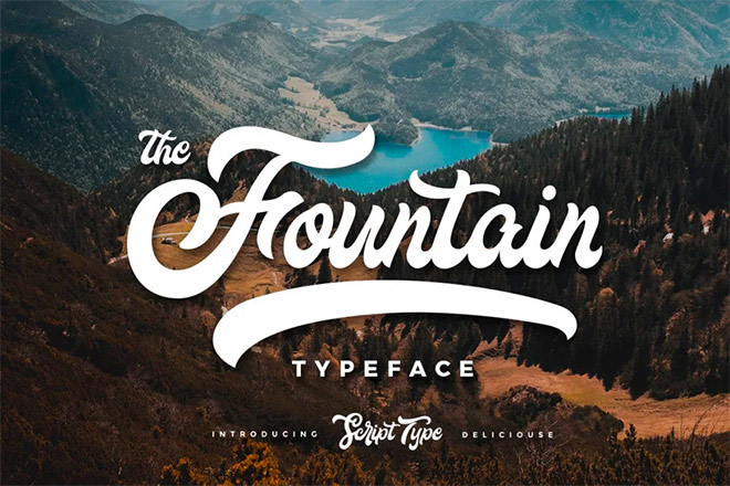
Usually custom typography pieces would be drawn by hand, but today I’ll share the secret of how you can still create trendy lettering by customising ready-made fonts in Adobe Illustrator. If you are a whizz at illustrating your own script text, the same vector shading techniques can be applied to your artwork once it has been traced to give it more impact with vibrant colours.

Illustrator Typography: How to Create Custom Script Type

► Get up to 30% off the Fountain Typeface – https://spoon.graphics/fountain

Download with membership

https://blog.spoongraphics.co.uk/tutorials/videos/illustrator-typography-how-to-create-custom-script-type


Take a Page From the Motion Identity Playbook


.article-native-ad { border-bottom: 1px solid #ddd; margin: 0 45px; padding-bottom: 20px; margin-bottom: 20px; } .article-native-ad svg { color: #ddd; font-size: 34px; margin-top: 10px; } .article-native-ad p { line-height:1.5; padding:0!important; padding-left: 10px!important; } .article-native-ad strong { font-weight:500; color:rgb(46,179,178); }

Don’t miss Brandweek, Adweek’s ultimate experience for marketers, September 11-14 in Miami. Connect with peers and gain insights and inspiration from top brand marketers and industry icons at Glossier, Coca-Cola, Taco Bell and more. Register.

It’s no secret that the social media landscape is changing at a breaking speed. Instagram and TikTok are placing evermore emphasis on video, tweaking their algorithms to favor moving content over static images. Reels are drawing the lion’s share of attention in people’s feeds, and we’re yet to see the full impact of Generative AI on content creation.

Add to all this our ever-reducing attention spans and the challenge is clear: It is now harder than ever for brands to engage audiences without video. The necessity for creating a consistent cadence of content that incorporates motion design and animation is driving a very real need for brands to enhance their visual identities by adding motion identity guidelines.

Beyond ubiquitous phone screens, the sustained benefit of establishing a robust motion identity is that it can add memorability and meaning for a brand in virtually every space and place. While a visual identity system provides the essentials—logo, colors, typography, imagery, icons, patterns—a motion identity expands this toolbox into the realm of video with principles, behaviors, guidelines and templates that establish new dimensions of the brand, such as timing, pacing and rhythm. A library of animation styles can be set for the most-used applications, while flexible guidelines encourage inventive play for special occasions. A great motion identity not only helps engage people in new ways, but also empowers brand teams to be creative, consistent and cohesive anywhere video is essential—which, arguably, is everywhere now.

Here’s how to evolve your design ecosystem to continually captivate your intended audience without investing the time and resources required for a full rebrand. 

The motion identity playbook

The entertainment industry pioneered the practice of establishing an ownable motion identity for each distinct sub-brand, especially in television. Every TV channel since the 1950s has used motion graphics as the “glue” that lets viewers know what they’re watching, what’s next and what’s new.

As social media platforms prioritize video, screens replace billboards and 5G internet reaches more people, it is vital for all business sectors to learn from the entertainment brand design playbook. The good news is, most established brands already have an extensive visual system and the foundational elements to help establish a motion behavior in place. Pinterest, for example, elevated its existing identity system through motion last year; usage of a motion behavior system that nods to user habits—the tactility of pinning on cork and the process of collaging ideas—brought the brand to life.

The need for distinguishable motion design far exceeds basic functionality: Motion is inherently emotional. It enables a brand to communicate to audiences with a unique style and personality that is emblematic of its brand position. Today, it’s not just entertainment brands that need motion design—every company needs the ability to engage, excite and entertain audiences across all the platforms where video thrives. With so many brands, from Accenture to Zoom, now creating animation and incorporating motion graphics into social posts, the question is how to draw the eye in a way that ties all your brand elements together.

Entertainment brands may have written the book, but what are the translatable rules that any brand can lift from its pages?

Understand your brand essence

To create a cohesive brand experience that resonates with your intended audience, you need to know your brand’s personality, values and target audience inside out. This foundational brand strategy inspires the principles and attributes that can be translated into motion. For example, Sesame Workshop’s approach to education and philanthropy is all about putting children on a positive path. To visually bring that promise to life, the nonprofit’s new motion identity is anchored by an ecosystem of streets and intersections that expand the brand’s visual vernacular.

Think beyond logos

While animated logos are a crucial aspect of a motion identity, we all know there is so much more to a brand design than its logo. A strong, enduring brand needs a flexible identity that can extend into motion on every screen. What are those touch points that matter most—websites, social and video platforms, retail environments, events? Each is an opportunity to create a more meaningful interaction with new and prospective customers. Consider how brand elements such as animated typography, iconography, illustrations or video can combine to underscore the larger brand story. A landscape audit of your brand’s touch points alongside other leaders across the cultural landscape can provide immediate insight into where a motion identity will provide a more cohesive and exciting brand experience.

Create clear guidelines

While off-the-shelf templates are excellent for budding video creators, purpose-built animation toolkits and motion identity guidelines—rules and specifications around position, scale, rotation, easing, depth and layering—are necessities for established brands. These toolkits are designed to connect a brand’s strategy to an ownable style of motion design that differentiates and elevates the brand experience. This supports more emotional brand storytelling and empowers internal teams to implement motion across platforms.

Consistency is key

Maintaining consistency across all motion elements establishes a unified brand identity. This calls for congruous use of color schemes, typography and visual style to ensure a brand is recognizable and travels well across digital platforms. I’m a particular fan of DixonBaxi’s on-screen graphics work for the Premier League—it transfers seamlessly from TV broadcasts to match day marketing, to EA Sports’ FIFA video game.

Test and iterate

One of the best ways for brands to stay culturally relevant and meaningful is to continually evolve. This is the realm of strategic design optimization, where modest investments in evolving a brand offer immediate impacts. Regularly test and refine your motion identity to ensure it aligns with changing audience preferences and platform trends, collecting and analyzing engagement metrics to make informed decisions for further optimization.

Set for success

A motion identity has become a necessity for brands aiming to stay competitive. It helps capture attention, differentiate from competitors and create memorable brand experiences that build both immediate and lasting relationships. What better tool than motion graphics to tell Uber’s evolving story as a platform for global mobility? The company’s 2018 rebrand came at a time of significant change, with new leadership and a strategic shift from growth-focused rideshare company to people-centered platform helping the world move. A new visual identity and motion system tied all the new brand elements together. Five years later, the identity is still going strong. 

By carefully designing and evolving a motion identity, any brand can ensure it stays relevant in today’s video-driven landscape. Go one step further—reverse the typical branding process to make motion identity the primary driver, as entertainment brands do—and you’ll edge ahead of the curve.
.font-primary { } .font-secondary { } #meter-count { position: fixed; z-index: 9999999; bottom: 0; width:96%; margin: 2%; -webkit-border-radius: 4px; -moz-border-radius: 4px; border-radius: 4px; -webkit-box-shadow: 0 0px 15px 4px rgba(0,0,0,.2); box-shadow:0 0px 15px 4px rgba(0,0,0,.2); padding: 15px 0; color:#fff; background-color:#343a40; } #meter-count .icon { width: auto; opacity:.8; } #meter-count .icon svg { height: 36px; width: auto; } #meter-count .btn-subscribe { font-size:14px; font-weight:bold; padding:7px 18px; color: #fff; background-color: #2eb3b2; border:none; text-transform: capitalize; margin-right:10px; } #meter-count .btn-subscribe:hover { color: #fff; opacity:.8; } #meter-count .btn-signin { font-size:14px; font-weight:bold; padding:7px 14px; color: #fff; background-color: #121212; border:none; text-transform: capitalize; } #meter-count .btn-signin:hover { color: #fff; opacity:.8; } #meter-count h3 { color:#fff!important; letter-spacing:0px!important; margin:0; padding:0; font-size:16px; line-height:1.5; font-weight:700; margin: 0!important; padding: 0!important; } #meter-count h3 span { color:#E50000!important; font-weight:900; } #meter-count p { font-size:14px; font-weight:500; line-height:1.4; color:#eee!important; margin: 0!important; padding: 0!important; } #meter-count .close { color:#fff; display:block; position:absolute; top: 4px; right:4px; z-index: 999999; } #meter-count .close svg { display:block; color:#fff; height:16px; width:auto; cursor:pointer; } #meter-count .close:hover svg { color:#E50000; } #meter-count .fw-600 { font-weight:600; } @media (max-width: 1079px) { #meter-count .icon { margin:0; padding:0; display:none; } } @media (max-width: 768px) { #meter-count { margin: 0; -webkit-border-radius: 0px; -moz-border-radius: 0px; border-radius: 0px; width:100%; -webkit-box-shadow: 0 -8px 10px -4px rgba(0,0,0,0.3); box-shadow: 0 -8px 10px -4px rgba(0,0,0,0.3); } #meter-count .icon { margin:0; padding:0; display:none; } #meter-count h3 { color:#fff!important; font-size:14px; } #meter-count p { color:#fff!important; font-size: 12px; font-weight: 500; } #meter-count .btn-subscribe, #meter-count .btn-signin { font-size:12px; padding:7px 12px; } #meter-count .btn-signin { display:none; } #meter-count .close svg { height:14px; } }

Enjoying Adweek’s Content? Register for More Access!

https://www.adweek.com/brand-marketing/take-a-page-from-the-motion-identity-playbook/


The Speed of Culture Podcast: The Power of People, Passion and Purpose


.article-native-ad { border-bottom: 1px solid #ddd; margin: 0 45px; padding-bottom: 20px; margin-bottom: 20px; } .article-native-ad svg { color: #ddd; font-size: 34px; margin-top: 10px; } .article-native-ad p { line-height:1.5; padding:0!important; padding-left: 10px!important; } .article-native-ad strong { font-weight:500; color:rgb(46,179,178); }

Don’t miss Brandweek, Adweek’s ultimate experience for marketers, September 11-14 in Miami. Connect with peers and gain insights and inspiration from top brand marketers and industry icons at Glossier, Coca-Cola, Taco Bell and more. Register.
Design plays a vital role in crafting meaningful experiences and driving innovation across industries.

Whether it’s product, graphic or user experience, design is about more than aesthetics. Designers must grasp user needs, solve complex issues and ultimately create value. To explore design’s impact on consumer and business growth, we sat down with Mauro Porcini, svp and chief design officer at PepsiCo.

Porcini holds the distinction of being PepsiCo’s inaugural chief design officer, a role he assumed in 2012. He has been instrumental to integrating design thinking into PepsiCo’s organizational ethos. Through his leadership, Porcini has led a new approach to innovation by design, influencing both the company’s product platforms and brands.

Porcini joins Suzy founder and CEO Matt Britton on the latest episode of The Speed of Culture podcast to discuss the intersection of design and business, the power of purpose-driven brands, and the significance of seeking happiness in one’s career journey. 

Learn more about design’s transformative power in the key takeaways from the episode below.

Highlights:

  • 01:25 – 07:07 — Connecting the Worlds of Design and Business — Porcini sees design as a realm of art and creativity that can interact with business, strategy, finance and marketing. Acting as a mediator, his role is to bridge the gap between these areas. He stresses the mutual respect that must be fostered between these two worlds, acknowledging their unique potentials and gaps and understanding how to create real value for the company and its consumers. He also points out today’s unique alignment between financial and human value, unlike in the past.
  • 07:07 – 09:29 — Maslow’s Pyramid and Purpose-Driven Brands — From product to packaging, service to content, today’s consumers demand not just good, but extraordinary. Porcini believes the definition of extraordinary can be found in Maslow’s Pyramid, which encompasses functional value, emotional value and, at the very top, purpose. Brands need to tap into this purposeful dimension, standing for something beyond profit by contributing to society and giving back. Understanding consumers deeply and meeting their functional, emotional and purposeful needs is essential for success in every brand touch point. 
  • 14:37 – 23:24 — The Power of the Shiny Object — Porcini emphasizes the pivotal role of human centricity, which is connected to the ability to make things happen. Human centricity allows insights to be transformed into prototypes and ultimately, products. Prototyping’s power lies in aligning the organization around ideas and catalyzing cohesive teamwork, both internally and externally. Moreover, the shiny object effect excites stakeholders and secures vital sponsorship and resources.
  • 23:24 – 28:42 — Purposeful Innovation — Brands with massive reach possess incredible potential for positive impact through design. Beyond generating significant business value, such changes can create positive outcomes for people and the planet. Porcini considers the CPG industry’s challenges, like excessive packaging and the sustainability initiatives that showcase the power of scale combined with purposeful innovation.
  • 28:50 – 34:35 — Top Trends and Technology — Porcini identifies three major trends driving change across industries: sustainability, health and wellness, and personalization. While these trends vary across sectors, their essence remains constant. Businesses must explore how technology can revolutionize these realms, unlocking fresh opportunities and innovation. For instance, PepsiCo’s Gatorade Gx Sweat Patch exemplifies tech-enabled personalization. It analyzes sweat composition, suggests a customized Gatorade mix via an app, and syncs with a smart, eco-friendly bottle. 
  • 34:40 – 41:03 — Projecting Pepsi Into the Future — The new Pepsi logo received overwhelmingly positive feedback, with a 99% favorable sentiment and over 7 billion impressions. Redesigning a globally recognized and cherished logo was a challenge. Striking a balance between the brand’s essence and its future was vital. Moreover, Porcini underscores the necessity for a logo that seamlessly integrates into the digital realm, a pivotal factor in today’s marketing landscape. 
  • 41:05 – 48:32 — Finding Happiness in Your Career — Porcini reminds us to prioritize happiness in your career, as it not only benefits you but also enhances productivity within your company. If you are not happy, take proactive steps—communicate your needs, initiate change and, if necessary, embrace leaving for the sake of your own well-being and the company’s success. Maintain your passion by always having a dream, setting goals and embarking on continuous projects. This drive keeps you engaged and fulfilled.

https://www.adweek.com/brand-marketing/the-speed-of-culture-podcast-mauro-porcini-pepsico/


Discover Common Photo Editing Mistakes and How to Avoid Them

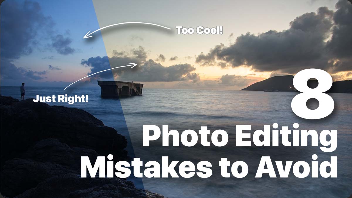
In the age of digital photography, editing your photos is an integral part of the creative process. However, it’s important to exercise caution and avoid common mistakes that can detract from the natural beauty of your photos. In this blog post, we explore eight prevalent photo editing mistakes and offer some practical tips on how to avoid them. In the following video we use ON1 Photo RAW, powerful photo editing software that’s like having Lightroom and Photoshop in one application.

[embedded content]

Overdoing Filters and Effects

Using filters and effects can be tempting, but exercise moderation. Instead of muddying up your photo, opt for a balanced approach. Consider using milder filters or adjusting the opacity slider. To maintain the photo’s integrity, selectively apply the entire Effects tab rather than just one filter.

Ignoring White Balance – Too Cool or Too Warm

White balance significantly impacts the overall look and feel of your photos. Avoid the mistake of leaving your images too cool or too warm. Correct white balance using tools like the white balance dropper or temperature slider. Experiment by pushing the slider to the extreme and then easing it back into a natural temperature.

Oversaturating Colors and Vibrance

Vibrant colors can be visually appealing, but it’s important to maintain a natural and clean look. Avoid the common mistake of oversaturating colors, as it can lead to distracting and unrealistic results. Desaturate the image completely and gradually reintroduce color. Using a reference image and matching color saturation can also help achieve realistic colors.

Excessive Detail and Sharpening

Excessive detail and sharpening can give your photo a “crunched” or overprocessed appearance. Understand the best practices for adding detail and texture to your photos. Remember that the structure slider modifies the entire photo when applying adjustments globally. Consider using selective techniques like masks or local adjustments to maintain a natural appearance.

Disregarding Noise – Use NoNoise AI

Noise can diminish the quality of your images and remove essential details. Address noise-related issues using tools like NoNoise AI, which effectively reduces noise while preserving image details. By eliminating noise, you can create visually appealing and professional-looking photographs.

Bad Exposure Adjustments

Overdoing exposure adjustments during editing can negatively impact your photos. Use clipping warnings to ensure you retain details in the highlights and shadows. Utilize local adjustments to selectively apply exposure changes where needed. Techniques like dodging and burning in Local Adjustments can help you control exposure more precisely without making global adjustments.

Not Cropping and Leveling

Cropping your photos can eliminate distractions and create a stronger composition. Ensure your images appear natural by leveling them to straighten the horizon. Use overlays and the level tool to align the grid with the horizon effectively. Mastering the art of cropping and leveling can enhance the overall impact of your images.

Not Feathering Masks

Feathering is essential for blending adjustments and filters naturally into your images. Avoid leaving harsh edges in your masks, as they can make your edits look unnatural. Adjust the brush’s softness or feather your luminosity or color range masks to create a smooth transition between masked and unmasked areas. Remember to feather masks appropriately and decide when a hard edge is necessary.

Conclusion

By avoiding these common photo editing mistakes, you will quickly see the quality and impact it will have on your images. Remember to exercise moderation with filters and effects, correct white balance, maintain natural colors, apply detail and sharpening judiciously, address noise, adjust exposure carefully, crop and level strategically, and feather masks for seamless blending. With these tips in mind, you’ll be on your way to creating stunning and visually pleasing photographs. Happy editing!

https://layersmagazine.com/discover-common-photo-editing-mistakes-and-how-to-avoid-them.html


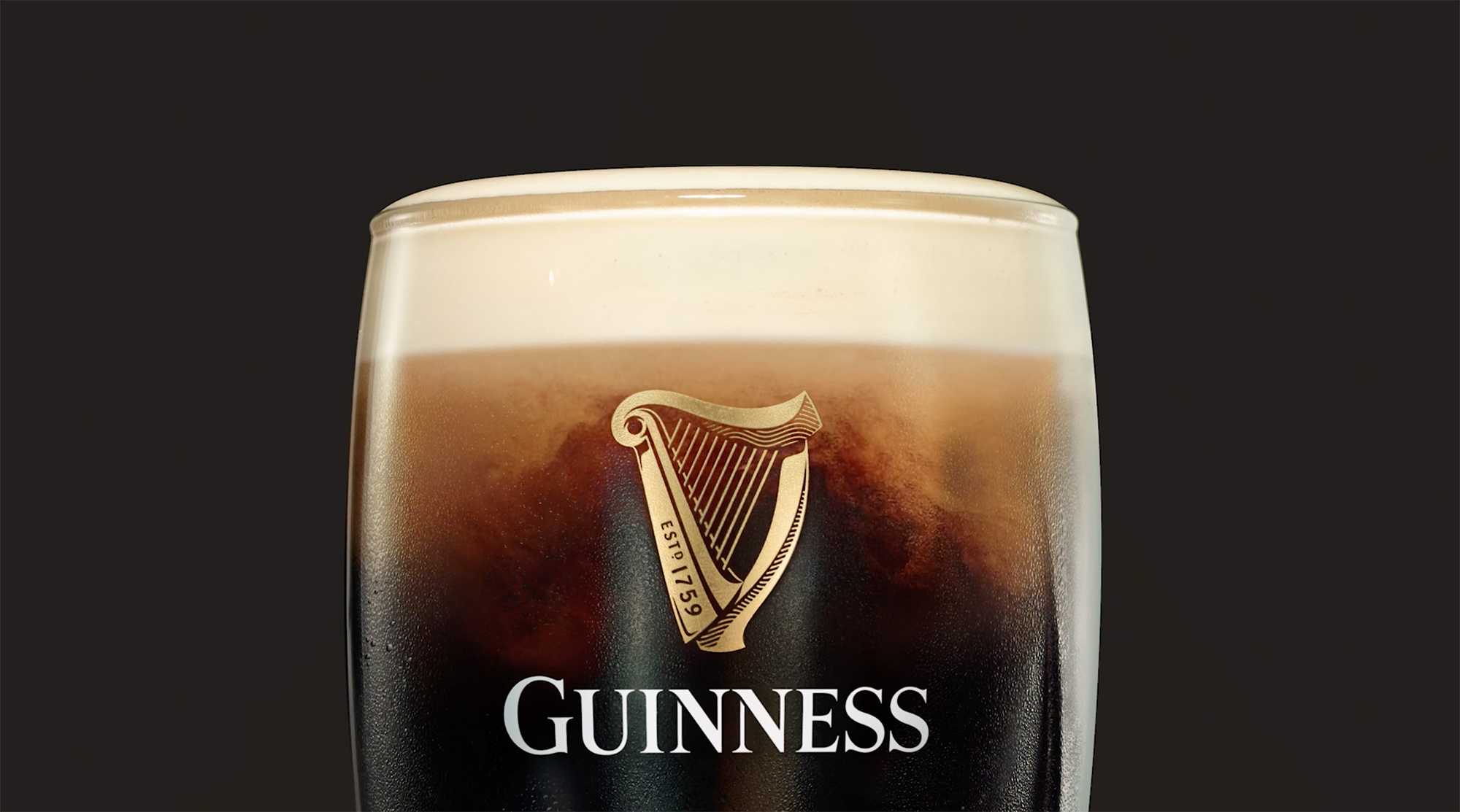
The Guinness harp

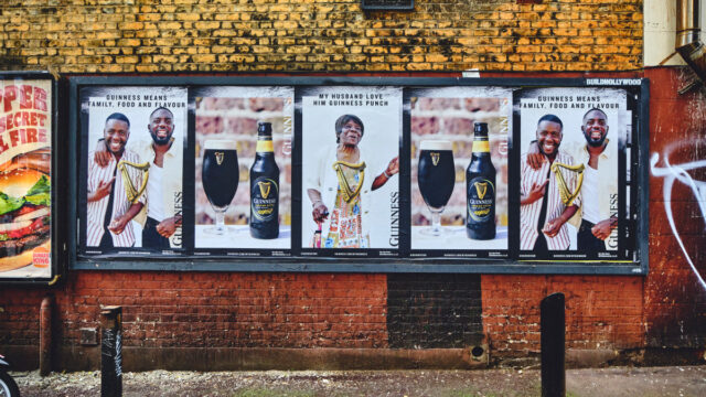
The development of the Guinness harp trademark is closely linked to the history of the brand’s packaging and advertising. Until the 20th century, Guinness was supplied in bulk to bottling firms and publicans, who transferred it from wooden casks to bottles. When bottling Guinness, each bottler or pub owner used their own label, resulting in the appearance of a range of names and label designs.

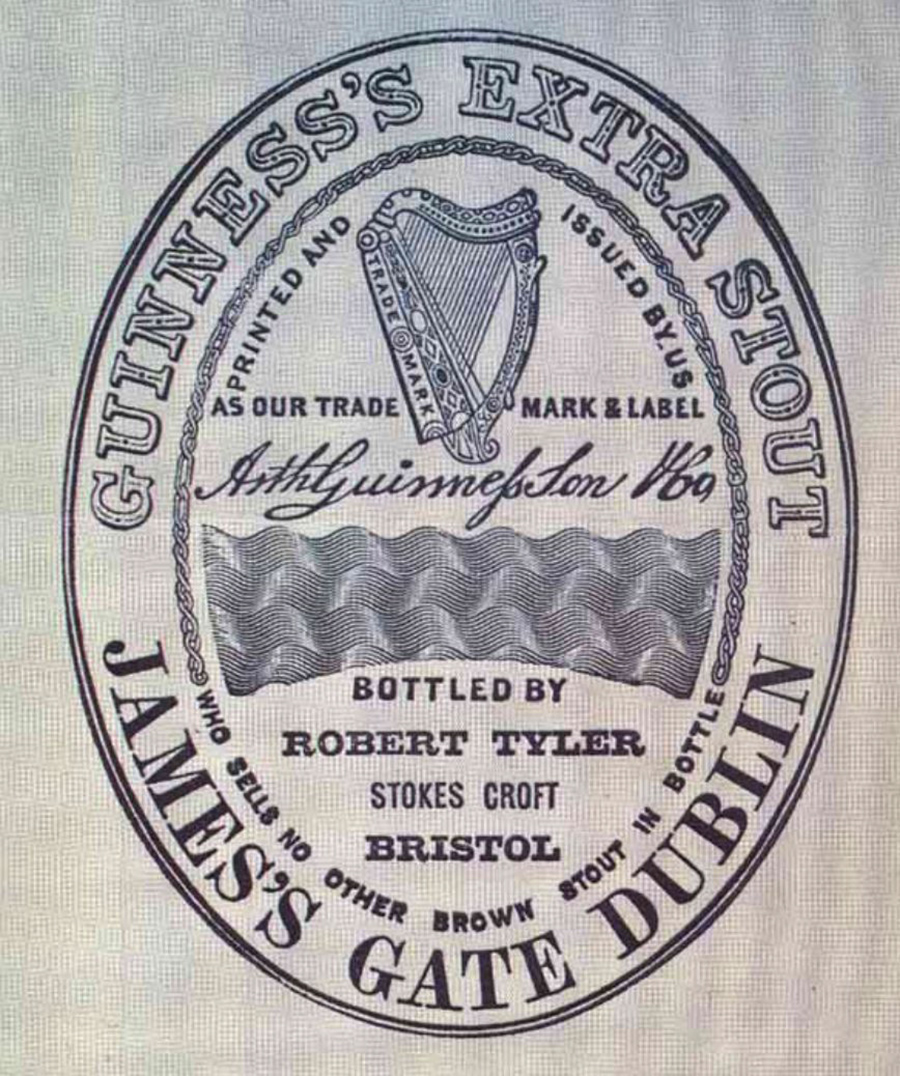
To protect the brand amidst overseas growth throughout the 19th century, the company created its own trademark bottle label. This label, introduced in 1862, was the now famous, buff-coloured oval. It was the first step toward establishing a Guinness visual identity. The company printed and supplied the label to its bottlers, who had to guarantee they’d sell “no other brown stout in a bottle.” It was an early form of quality control, ensuring the pub owner wouldn’t “mix” various stouts and call it Guinness.

The main features of the trademark label were the harp, the Guinness name, and the Arthur Guinness signature. They evolved into the three core elements of the Guinness identity, and remain as such today.

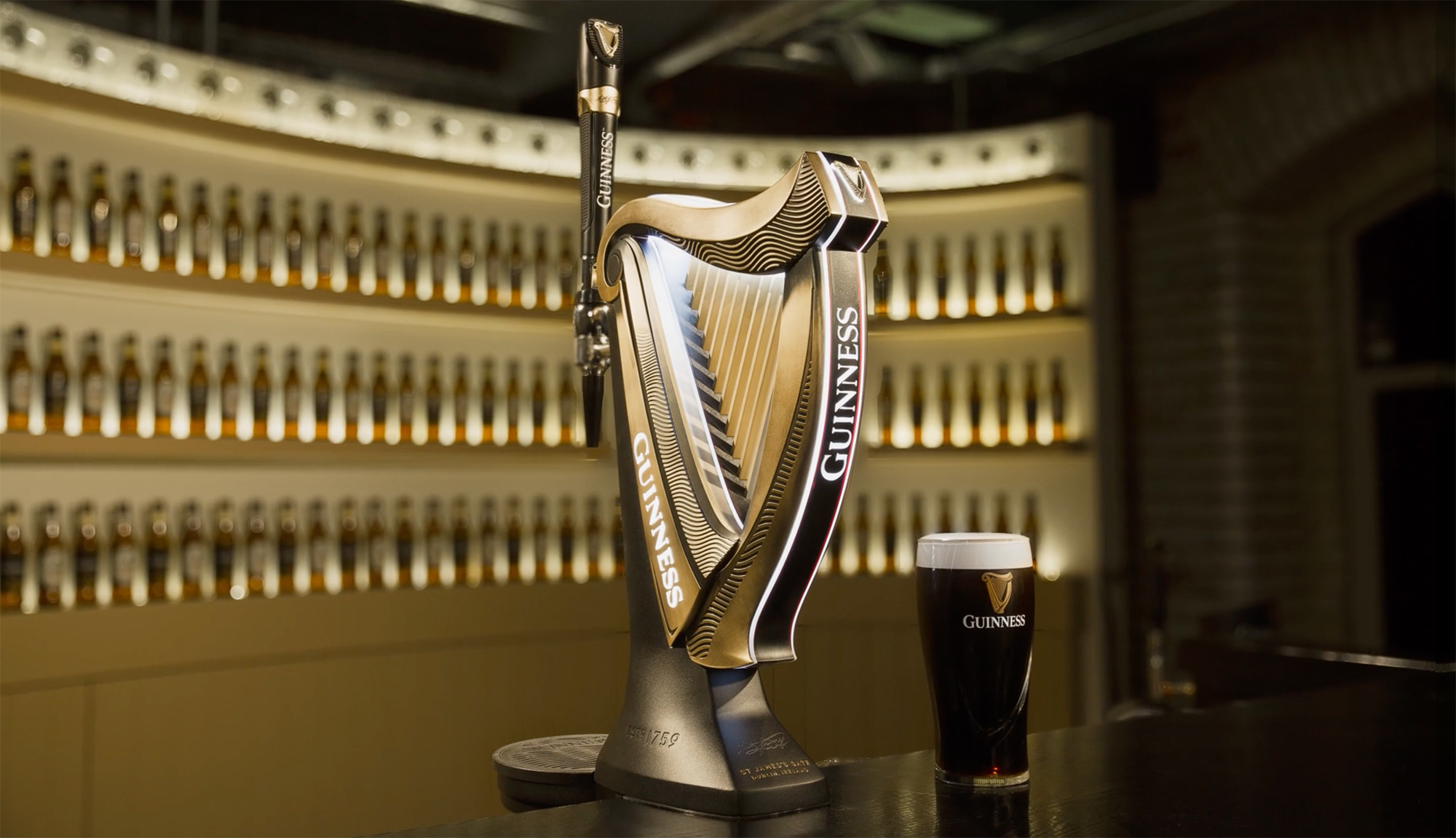
In 1876, fourteen years after the label was introduced, Guinness registered the harp as a trademark. The design is based on a famous 14th century Irish harp known as the O’Neill, or Brian Boru harp, preserved in the library of Trinity College Dublin.

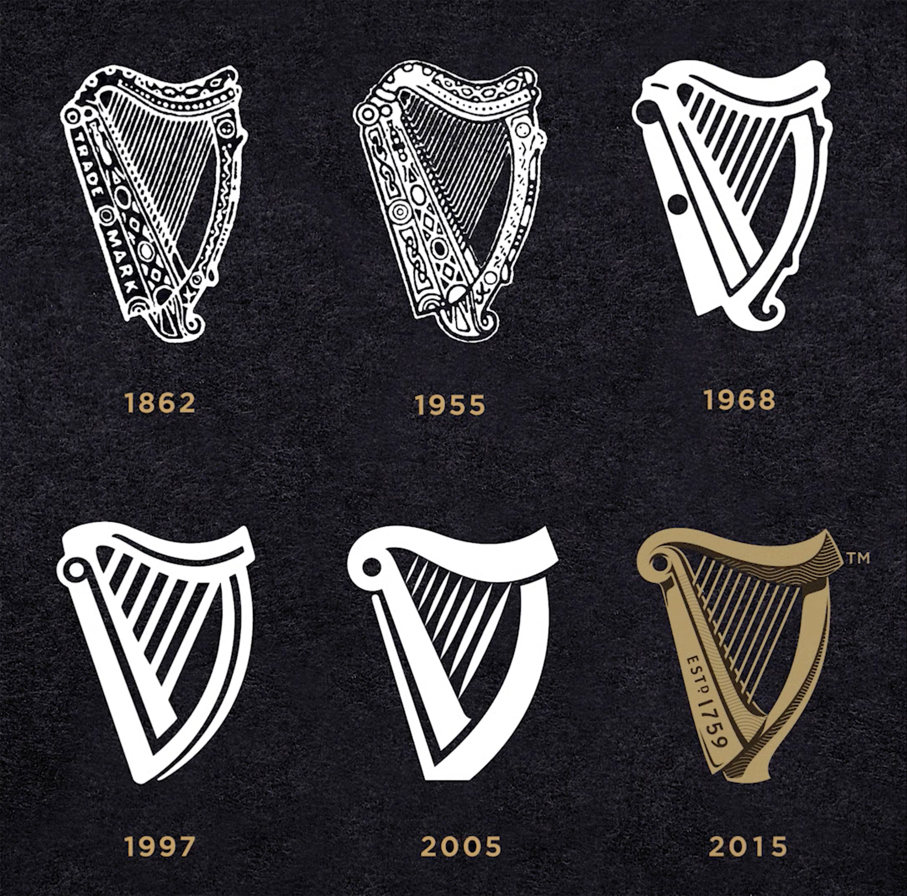
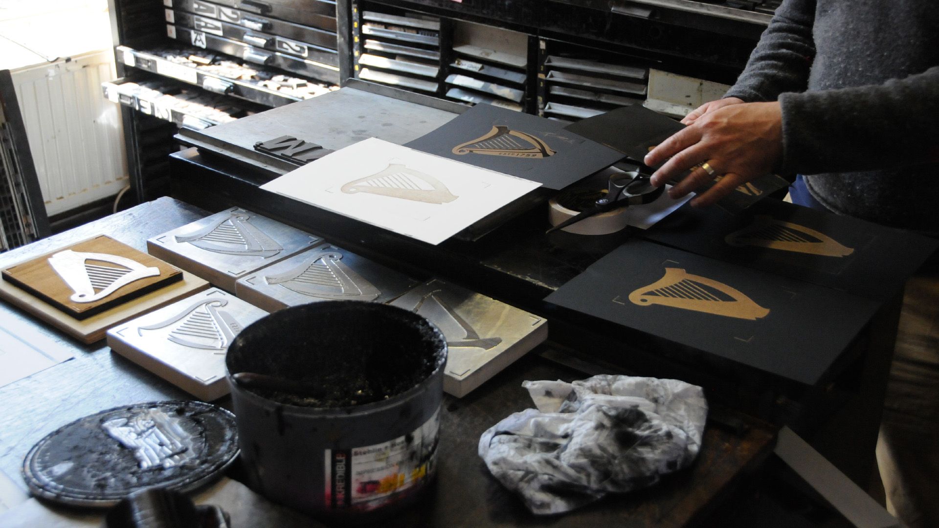
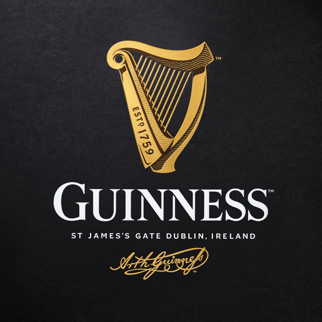
Various changes have been made since its first appearance, with the 1968 version particularly notable for the simplified appearance and a reduction in the number of strings. The most recent iteration was by London-based Design Bridge, working in collaboration with Gerry Barney — the man responsible for the Harp designs in 1968 and 2005. As an aside, Barney also designed by the iconic British Rail double-arrow logo while working at the Design Research Unit.

The harp is also the official national emblem of the Republic of Ireland, and can be found on the country’s coins and on the front of Irish passports. The difference between the Guinness harp and the Republic’s harp lies in the position of the straight edge, or sound board. The straight edge on the Guinness harp always appears on the left, while the Republic’s harp is on the right for differentiation.

The harp has reportedly been recognised as a symbol of Ireland since the 13th century. References can be read on the Wikipedia page for Ireland’s coat of arms, and Old Moore’s Almanac asks, “Did Ireland’s national symbol come from Guinness?”

Info via Guinness Storehouse, IrishCentral, and Reinhardt.edu.

Head over to Hop Culture for more on the story of Guinness and its international appeal.

https://www.logodesignlove.com/guinness-logo


Vinyl Records

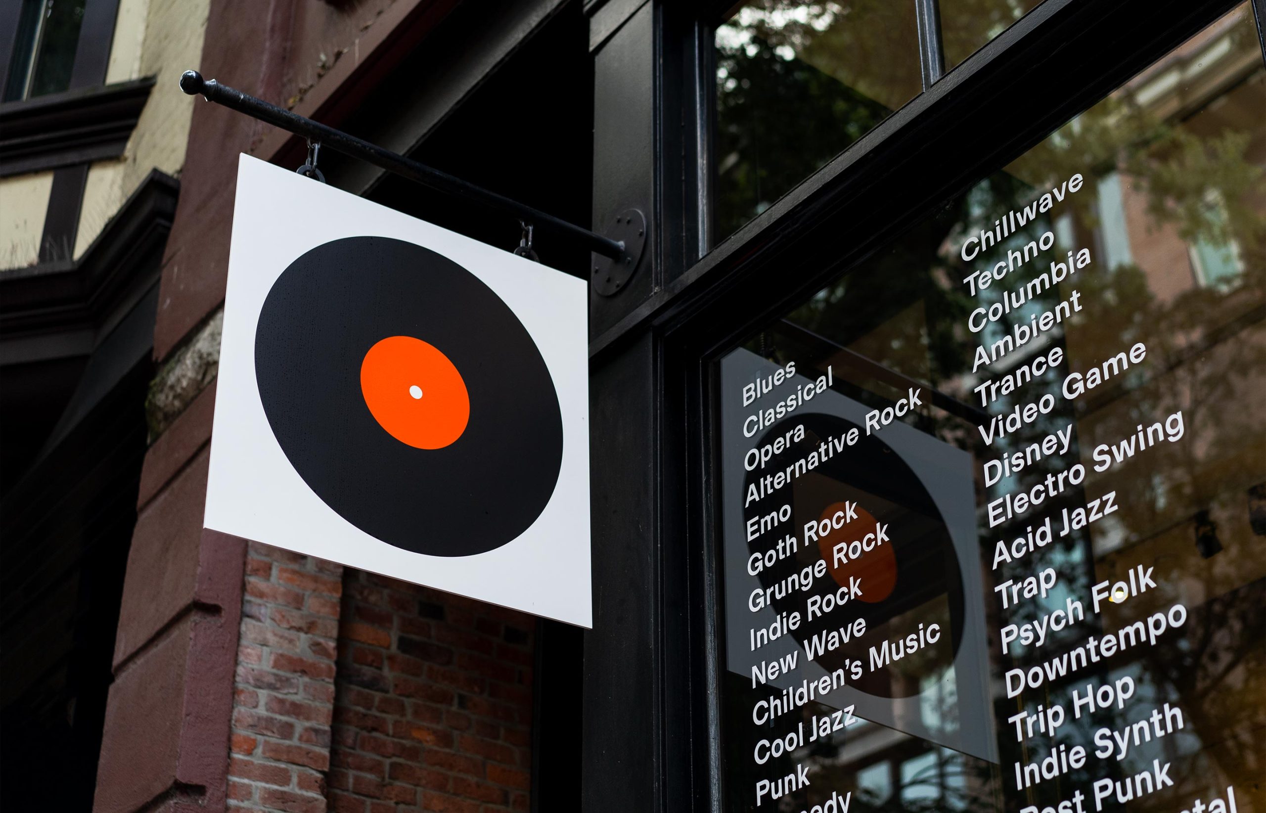
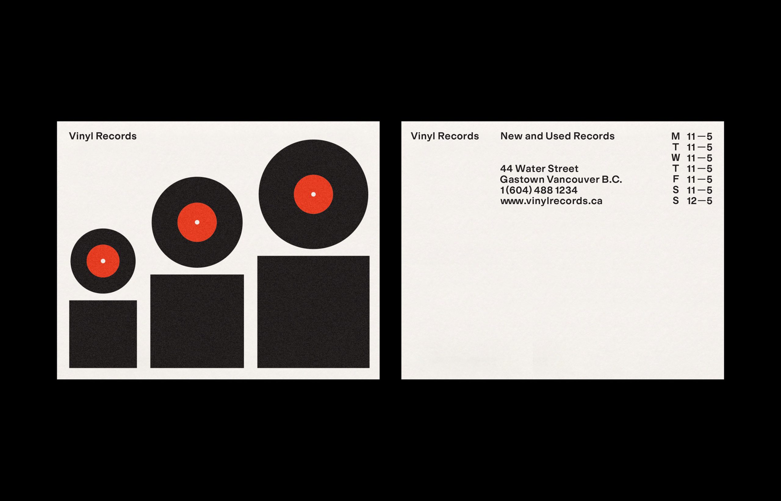
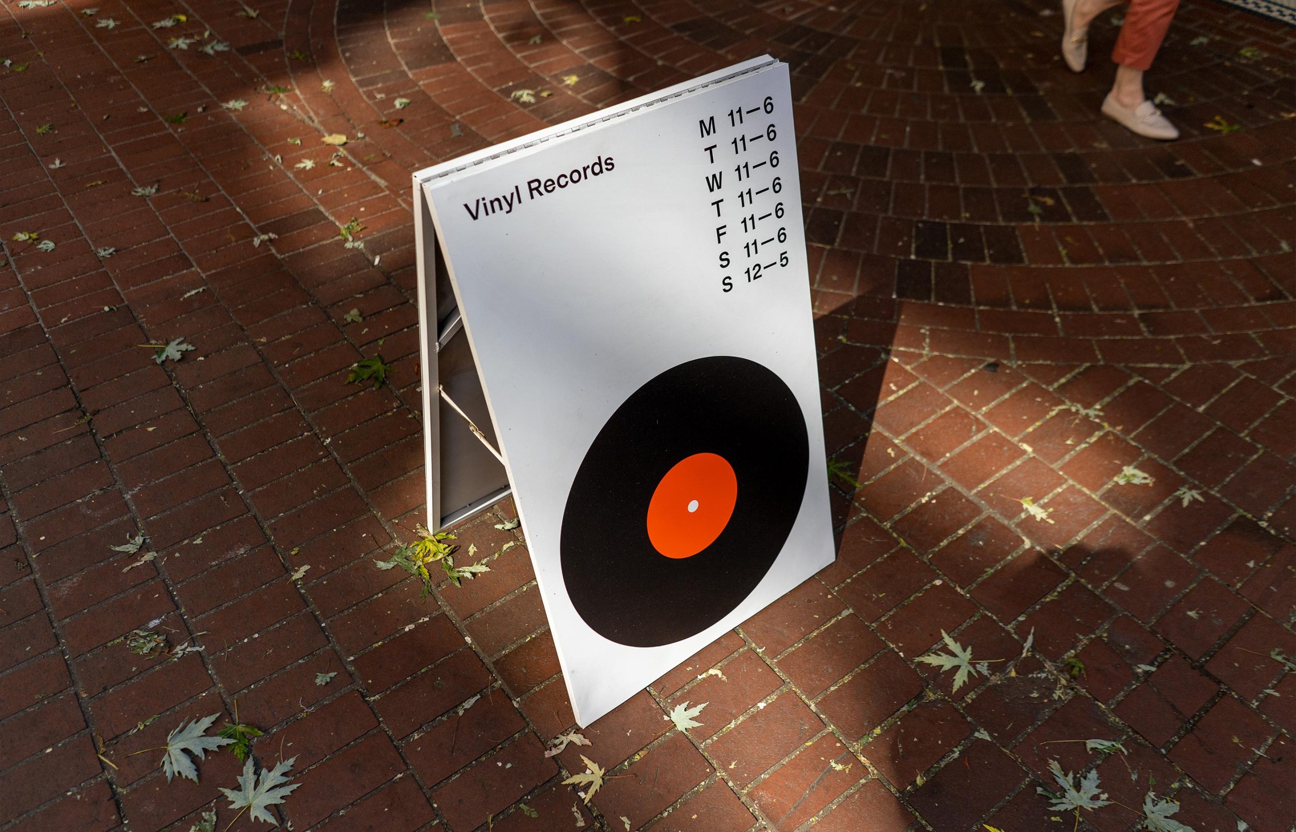
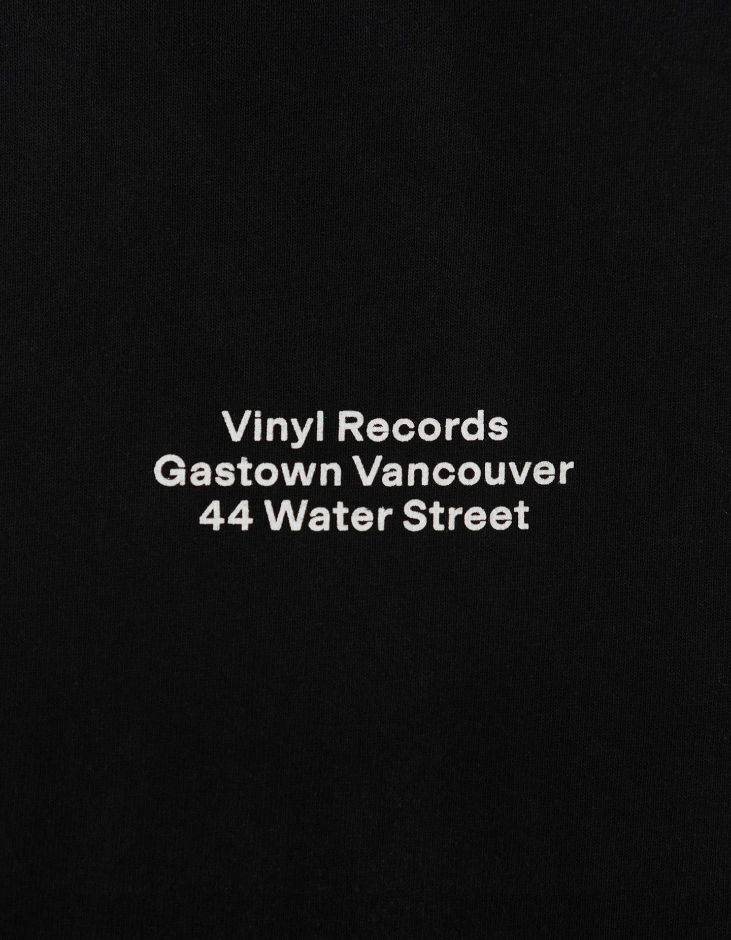
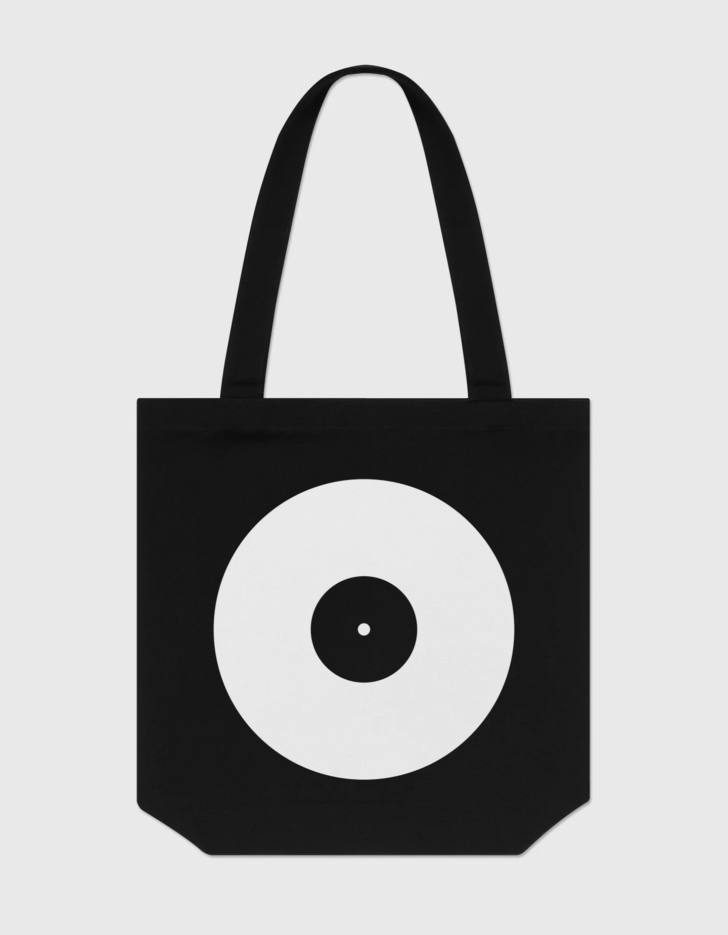
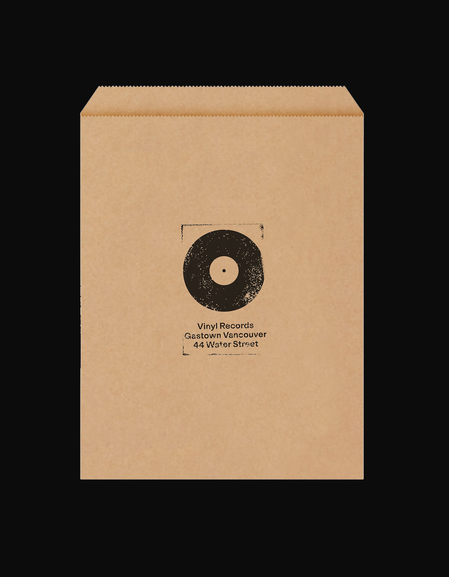
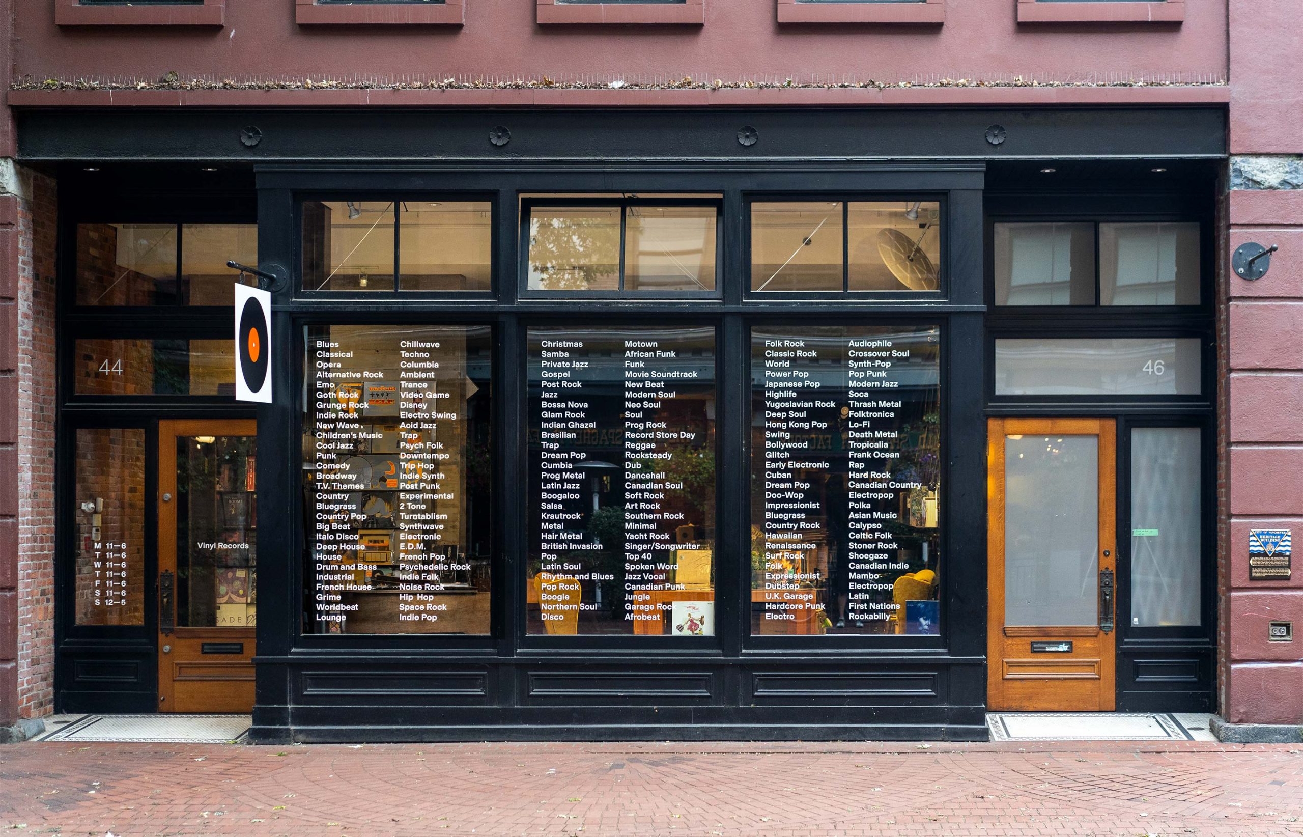
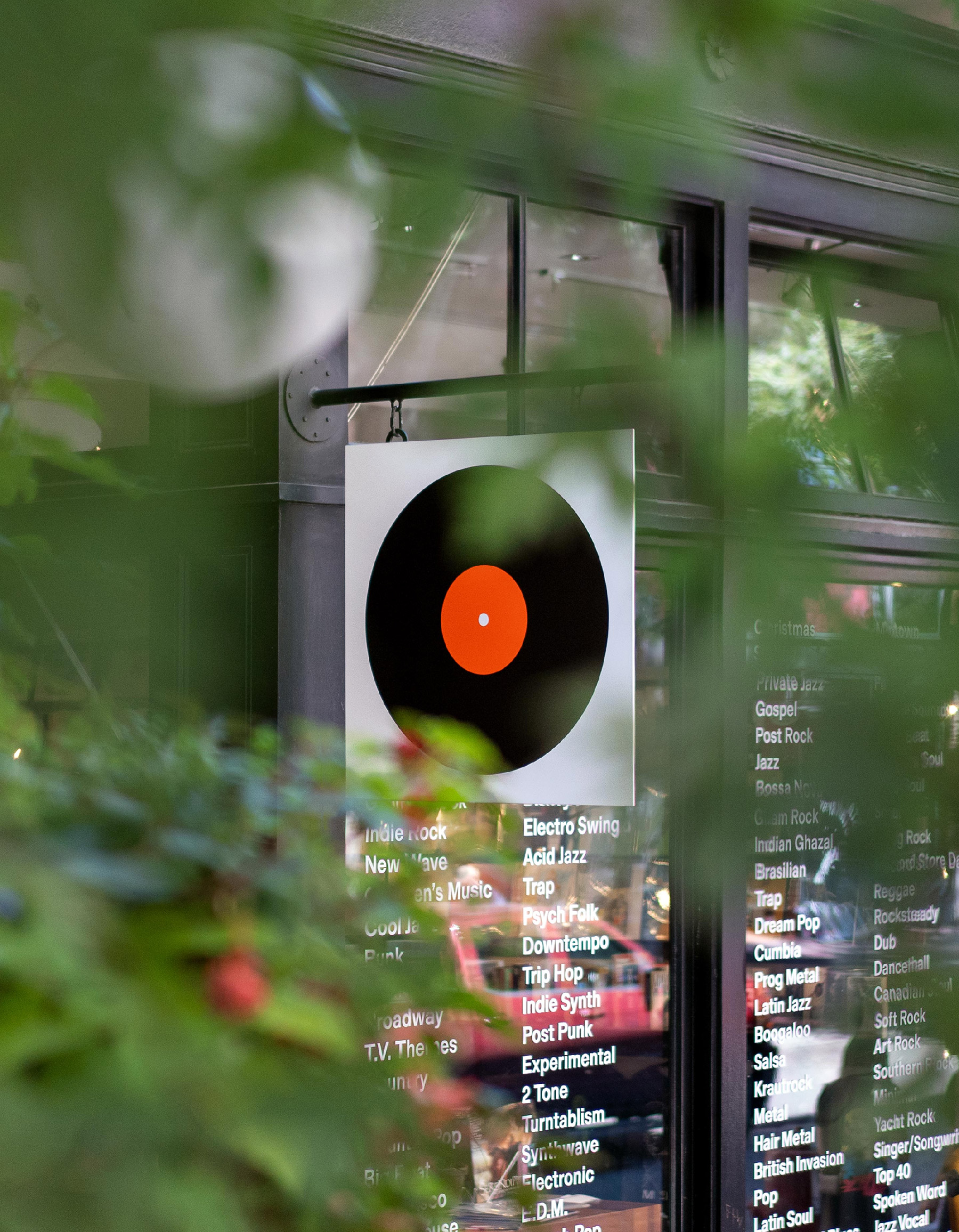
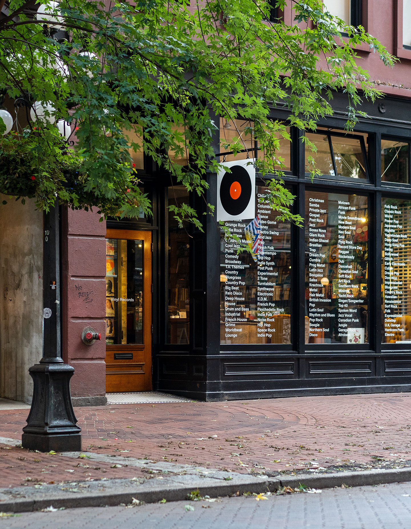
The eye-catching Vinyl Records logo and identity was designed by Canadian studio Tomorrow, for the Vancouver record store.

Such a simple mark. Bold, colourful, unmistakably vinyl.

“Our ambition was to help revitalize a historic neighbourhood with the mass appeal of music. Our strategic approach was to create a brand that was universal, like music. Be the art gallery, not the art.”

More from Tomorrow. Via Visuelle.

https://www.logodesignlove.com/vinyl-records


Effortlessly Discover All Your Photos with ON1 Photo Keyword AI

ON1 has introduced an exciting new AI photo organizer, ON1 Photo Keyword AI 2023. This application harnesses the power of machine learning to make your photos easily discoverable and organized. As a leading provider of innovative photo editing software apps, ON1 focuses on photographers, and they understand the challenges we all face when organizing our extensive photo collections. With ON1 Photo Keyword AI, it’s a highly simple-to-use solution that leverages AI technology to streamline these time-consuming tasks, like searching and tagging photos, allowing photographers to focus on their favorite images.

[embedded content]

Key Features in Photo Keyword AI

  • Automatic Keyword Generation and AI-Powered Organization
  • Lightning-Fast Browser and Comprehensive Metadata Support
  • Versatile File Format Support and Advanced Search Functionality
  • Effortless Duplicate Detection and Batch Processing
  • Unique Features and Other Integrations

Automatic Keyword Generation and AI-Powered Organization

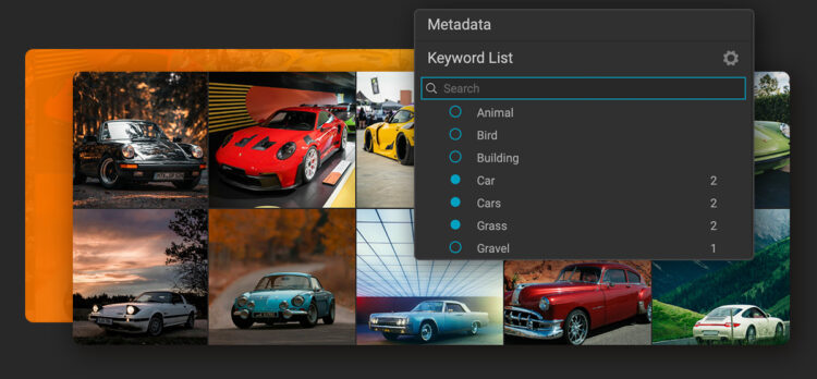
The key feature of ON1 Photo Keyword AI is its automatic keyword generation capability, eliminating the need for manually tagging photos. This app employs advanced machine learning algorithms to achieve results. The application scans each image and will recognize over 800 objects and photo elements. It will also add related keywords automatically, ensuring accurate search results. Most importantly, ON1 Photo Keyword AI works locally on your computer, so security and privacy are not of concern since none of your photos need to go up to the cloud.

Beyond tagging photos with keywords, ON1 Photo Keyword AI offers a range of additional features. It can detect faces, estimate age and gender, determine location using GPS metadata, and classify photos based on various photographic traits such as key, contrast, vividness, focal length, and predominant color. This will enable anyone to quickly locate specific images within their extensive collections, saving them valuable time and effort.

Lightning-Fast Browser and Comprehensive Metadata Support

ON1 Photo Keyword AI is built around a lightning-fast photo browser that allows users to view, organize, and cull their photos quickly. The software provides complete metadata support, including nested keywords, descriptions, EXIF, IPTC, and XMP, which ensures all relevant information is captured and easily accessible within the application. Importing photos from memory cards, cameras, or phones is a breeze with the built-in import dialog, which allows users to select images, specify destinations, rename files, and add metadata simultaneously. 

Versatile File Format Support & Advanced Search Functionality

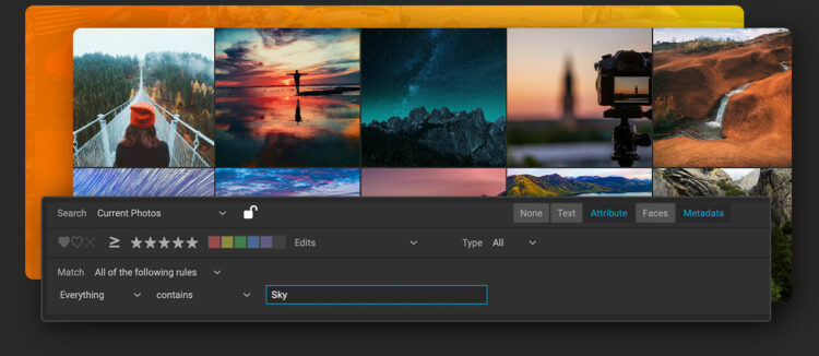
ON1 Photo Keyword AI supports many file formats, including support for raw photos from over 800 cameras and PSD, TIF, JPG, PNG, HEVC, and most video files. Its versatile search functionality allows users to search any metadata field by typing a word or phrase. Additionally, users can search by star and color ratings, number of faces, age and gender, file type, camera settings, size, and more. These advanced search capabilities enable simultaneous searches across multiple fields, with the ability to save searches for future use as well.

Effortless Duplicate Detection and Batch Processing

Finding duplicates and similar photos is also simple to do with ON1 Photo Keyword AI. The software’s batch-processing feature allows users to export copies of their photos in different formats, customize file naming, control metadata, and even add watermarks. For photographers looking to showcase their best work, ON1 Photo Keyword AI includes a fully color-managed workflow for printing photos, with soft proofing previews, print packages, and contact sheets.

Unique Features and Integration

ON1 Photo Keyword AI sets itself apart from the competition using a browse-first approach that allows photographers to organize their photos according to their preferences without extensive cataloging or cloud uploading. The built-in import dialog simplifies downloading photos from various devices, while the automatic XMP embedding ensures that all automatic keywords and metadata remain viewable and searchable in other applications like Adobe Lightroom Classic or Capture One.

Start Editing Like a Pro with ON1

ON1 strives to provide holistic solutions to photo editing. ON1 photo editing software apps for helping both professionals and beginner photographers achieve the best-finished images. This software offers photographers a simple approach to editing photos and saves time to get you back in the field, behind your camera. Start editing your photos like a professional with ON1 today!

Learn More About ON1 Photo Editing Software

https://layersmagazine.com/effortlessly-discover-all-your-photos-with-on1-photo-keyword-ai.html