Domino’s Unveils First Rebrand in Over a Decade, With a Jingle by Shaboozey
Domino’s has a new look.
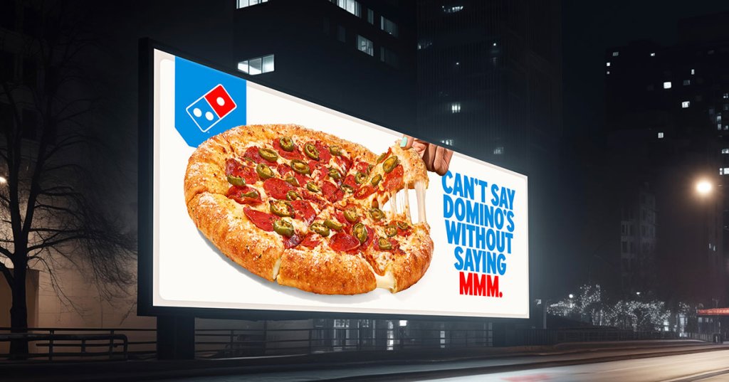
Today, the pizza chain unveiled its first rebrand since 2012, created with its agency of record, WorkInProgress. The refresh gives Domino’s signature red and blue a sharper, more vibrant edge meant to evoke the center of a flame.
The overhaul also introduces a custom typeface, Domino’s Sans, and a new jingle from Grammy-nominated country artist Shaboozey, all unified under the trademark “Dommmino’s,” with an extra “mmm.”
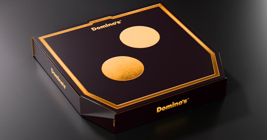
The brand’s packaging got a makeover, too. The pizza boxes are simpler and brighter and resemble the logo when two are placed back to back. The black boxes for Handmade Pan and Parmesan Stuffed Crust pizzas now feature black and metallic gold accents designed to convey indulgence and a more premium feel.
Kate Trumbull, executive vice president and global chief marketing officer at Domino’s, told ADWEEK that the rebrand is part of the company’s effort to stay relevant, even after growing its market share by 1% annually for the past decade in the quick-service pizza restaurant category.
“As a nearly 65-year-old brand, we know that to stay strong and relevant we need to always remain modern and bold for our current and future customers,” she said.
Taking a risk
Trumbull acknowledged the risks that come with any rebrand. Global brands from Jaguar to Cracker Barrel have recently faced backlash for their new visual identities.
“We’ve taken a thoughtful approach by listening closely to our customers and franchisees, as well as conducting consumer research to understand what makes Domino’s special,” she said. “We’re keeping our iconic logo, something consumers know and love, but updating our colors to more vibrant shades of red and blue to make the brand craveable for the next generation of pizza lovers.”
“It’s about enhancing what makes us great versus change for the sake of change,” she continued.
The rebrand was nearly two years in the making, said Matt Talbot, co-founder and chief creative officer of WorkInProgress.
But throughout, one guiding principle remained clear.
“Our muse is always pizza,” Talbot said. “We wanted it to feel hot like pizza, adding brightness and saturation to our reds and blues, which also nods to Domino’s colors from the 70s and 80s.”
Domino’s plans to roll out the new brand elements through next year, starting in the U.S. and select international markets before expanding globally.
“We are the biggest pizza nerds on the planet,” said Trumbull. “We call ourselves Dominoids. That means that our level of obsession can sometimes come off as quirky. No matter what though, it’s passionate, it’s real.”
That enthusiasm appears to be shared by fans. According to Domino’s, early research shows that 67% of consumers approve of the new look.
https://www.adweek.com/creativity/dominos-unveils-first-rebrand-in-over-a-decade-with-a-jingle-by-shaboozey/