How to adapt a brand for kids
How do you design for a kid-friendly range without losing any of the original brand’s spirit – and is there a special way to draw kids to unusual and global flavours? B&B Studio helped us find out.
With its combination of a bowl and samurai helmet, the logo for UK brand Kabuto Noodles is one of the most iconic in the food market, clever enough to be highlighted in the most recent revision to A Smile In The Mind by Beryl McAlhone and David Stuart, the pre-eminent guide to witty thinking in design.
Its creator was B&B Studio, who’ve recently revamped the brand for its new child-focused range, Kabuto Kids. Don’t call it a rebrand, though.
“It definitely wasn’t that,” Lisa Desforges tells us, B&B Studio’s strategy director. “Instead, our ambition was to create something recognisably Kabuto, but still clearly created with children in mind. At the end of the day, although we need to appeal to kids, the target consumer – particularly with this kind of product – is the parent.
“We were keen to appeal to existing Kabuto fans with a new range of products for their family,” Lisa continues, “as well as bring new consumers to the category who are looking for a healthy convenient kids’ meal or snack.”
Broken down into bite-sized (or tyke-sized) chunks, Digital Arts got the inside scoop of this steaming hot project from the studio, showing exactly how the studio adapted an existing brand for kids.
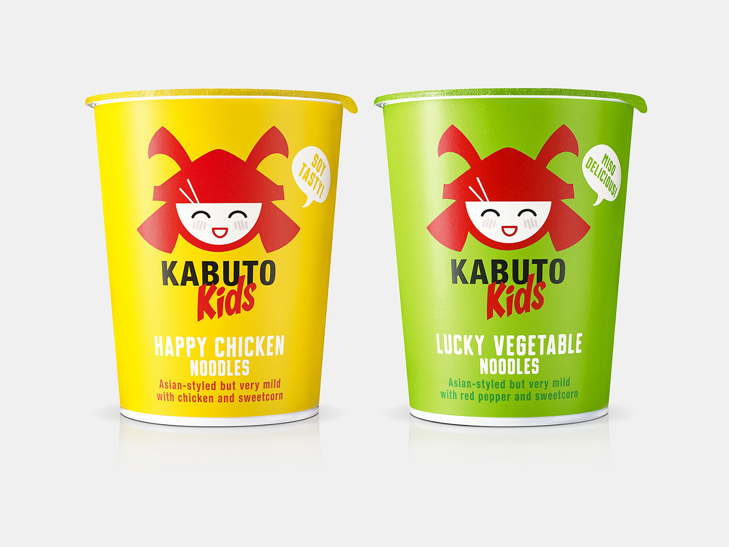
Kabuto characters – from front to back
“The single biggest shift from the core Kabuto identity was the addition of facial features, transforming the more abstract helmet/bowl logo into a fun kid-friendly character,” Lisa reveals.
“The challenge was making not only the visual identity of the brand, but also its personality and tone of voice relevant for a younger audience. For us, Kabuto has always been about wit, and we wanted to maintain that slightly sophisticated approach to humour rather than go all-out childish fun.
“The faces in the logo and back-of-pack games (below) are all infused with an Asian inspiration that is likely more familiar to adults than it is to kids, so it retains a knowing wit that we hope grown-ups will enjoy.”

Kabuto’s Colours
“The colour schemes were flavour-led – yellow for chicken and green for vegetable – to enable variant-ing on-shelf.
“This also helps differentiate the kids range from core,” Lisa continues, “which has a consistent brand colour with partial colour-coding.”
A tasty tone of voice
“We added a ‘Kids’ sub-brand to the logotype, using a characterful Asian-influenced font to feel more youthful yet still authentic,” Lisa says as we move onto the flavour of the wording created for Kabuto Kids. But can words help convince kids to try unusual flavours they may have never tried before?
“The range was created due to customer demand in the first place – we already knew kids were eating and enjoying Kabuto so we weren’t overly concerned,” she reveals. “Additionally, the client had created easy and more mild flavours with a child’s palette in mind.
“But we did create new flavour names – Happy Chicken and Lucky Vegetable – to bring a playful yet still Asian-influenced style to the naming and tone of voice that we thought would resonate well with kids and overcome any inhibitions.”
See more Kabuto and Kabuto Kids product shots on the B&B site.
Read next: How to design for value brands
https://www.digitalartsonline.co.uk/features/graphic-design/how-adapt-brand-for-kids/