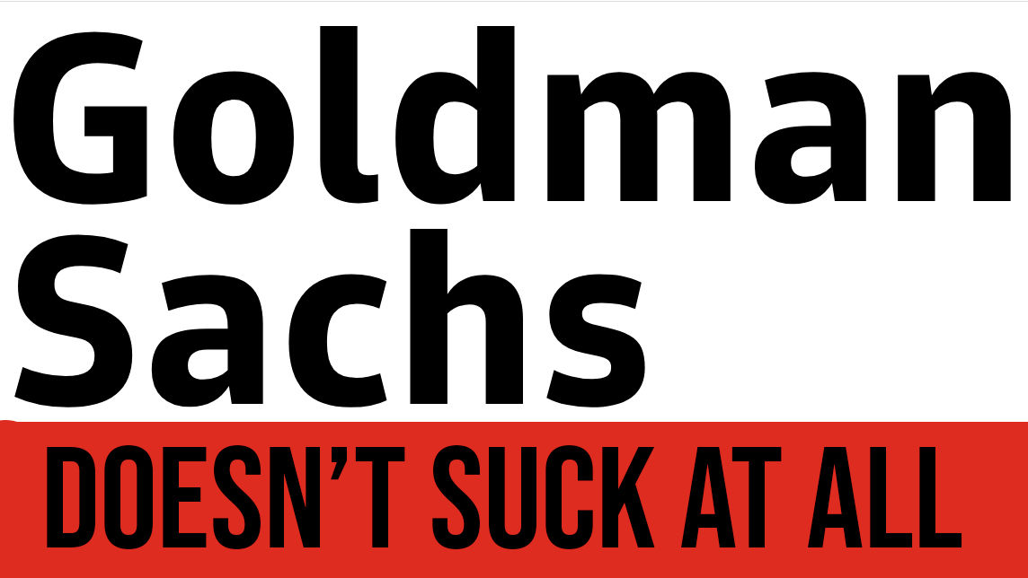
Oh look, big business releases a font you can’t criticise it with

Bow down before Goldman Sans.
We all love a free font, but it sometimes pays to read the small print before downloading one.
Case in point: big business stalwart Goldman Sachs, which has recently released its own type in Goldman Sans, described as a ‘clean, modern typeface designed for the needs of digital finance.’
Now, while we’re pleased such a corporate big boy has indulged in a little creativity – indeed, it has its very own design platform – we still can’t condone how the license for the font forbids you to ‘disparage or suggest any affiliation with or endorsement by Goldman Sachs.’
We’d like to see how Goldman will be able to both action and monitor this. Interestingly, they can change and terminate the license at any time, which is something you don’t usually see with free fonts.
It’s almost like a big recession is coming, and Goldman wants to cover its ass as much as possible.
Good luck with that, mate. Anyway, the real question is, what’s it like as a creative to design for a company of so illiberal a nature?
Download the font here if you dare.
Related: Our best free fonts guide which we won’t be adding Goldman Sans to
https://www.digitalartsonline.co.uk/news/graphic-design/oh-look-big-business-releases-font-you-cant-criticise-it-with/