Play this simple design game to test your UI knowledge
Can’t Unsee is a web-based game that presents two choices of iOS interface designs, and asks the user a simple question: Which one is more correct? There are three rounds that ramp up in difficulty, asking you to pick between two mock-ups presented side by side that start out with design choices that seem obviously wrong, but then escalate to images that are nearly indistinguishable. Created by software engineer Alex Kotliarskyi with product designer Amanda Hum, it’s a game of “spot the differences,” but only one of the choices is the right one.
Of course, what makes something good is subjective, but most of the answers are based on universally accepted design traits like even spacing between text blocks and consistent capitalization. Even for non-designers like me, the answers came intuitively — mostly based on common sense, but also based on years of seeing the same iOS design principles on my phone screen, which guided me toward what felt more familiar and “right.”

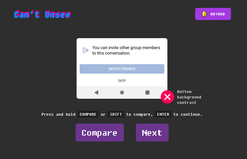
I will admit I didn’t always agree with the correct choice, like this question below that deemed “button background contrast” as the reason to select the choice on the right. I know from experience that companies can deliberately make design choices like this to guide users into making certain decisions, like in the case of aggressive share buttons or, in this case, inviting friends to a conversation. But what if I don’t want to invite a random person into my private conversations? Choices like making a button seem more like the one you’re “supposed” to press can be misleading.


Still, the game makes for some fun, educational practice for anyone who wants to exercise their creative eye. I scored 7030 in about eight minutes (mostly because I didn’t know I was being timed. Time is a factor, people!), and I learned something new, too.
https://www.theverge.com/2019/2/8/18217198/cant-unsee-ui-ux-design-game