What’s causing Australia’s devastating fire weather?

Satellite photo of smoke over Australia.
Enlarge / Smoke billows from fires around Canberra.

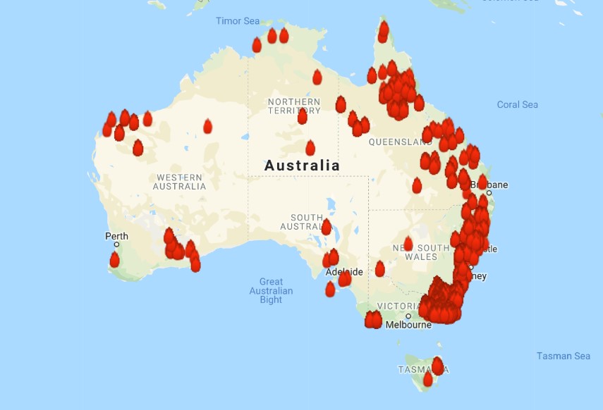
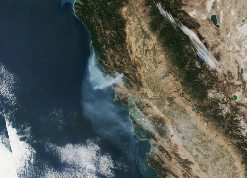
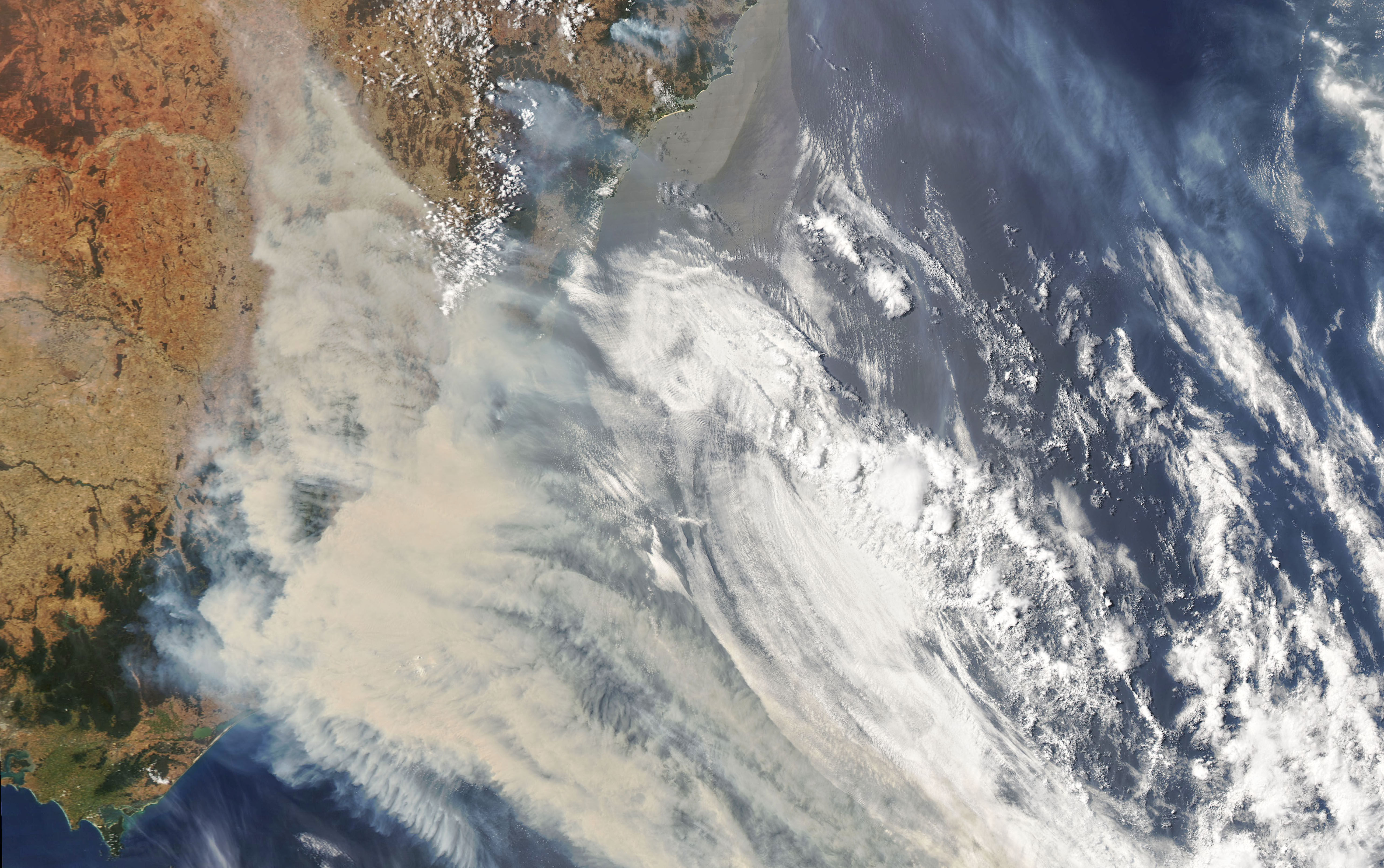
An absolutely astonishing set of bushfires is burning around Australia currently, producing surreal images like those of evacuees fleeing to beaches—or boats—for safety. The situation has been particularly dangerous in Victoria and New South Wales, where fires have surrounded Sydney, choking the air with smoke. So much smoke, in fact, that even New Zealand has been significantly impacted by it over 2,000 kilometers away.

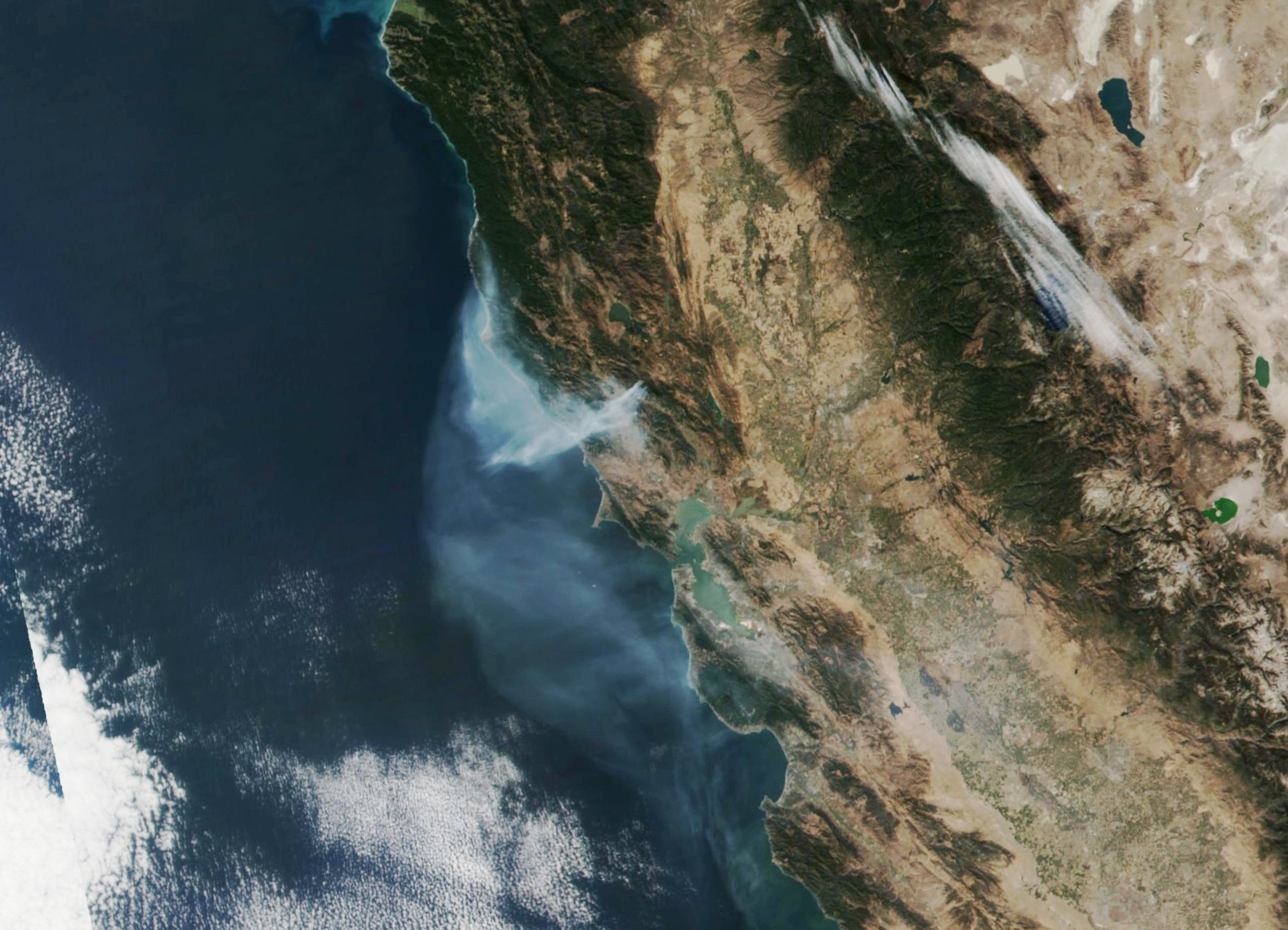
So far, almost 15 million acres of land have burned. For comparison, California’s nightmare 2018 fire season burned around 2 million acres.

Unfortunately, the weather has yet to turn helpful, although there are some encouraging signs for the near future. Saturday, specifically, saw worsening conditions, and Victoria activated emergency powers for the first time amidst ongoing evacuations.

Most recent map of active fires in Australia.
Enlarge / Most recent map of active fires in Australia.

So what has been driving these fires to such extremes? Obviously, it’s the trio of hot, dry, and windy, but these conditions are occurring due to a combination of long-term trends and short-term weather patterns.

First the long-term context. Last year was both the hottest and driest on record for Australia, extending a drought. Like the rest of the world, Australia’s temperatures are climbing to ever-higher records as the climate warms, which boosts evaporation and strengthens droughts in situations like this. Rainfall trends are less clear, but declines have been partly attributed to climate change for at least some regions.

On December 18, Australia saw the nation’s hottest day on record, hitting an average of nearly 42°C (over 107°F). That eclipsed the previous record, set just one day earlier.

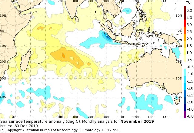
Besides the long-term warming trend, a couple of factors have been responsible. Although Australia’s climate is closely linked to the El Niño Southern Oscillation in the Pacific Ocean, that particular seesaw has been in a neutral state. There is another, similar oscillation in the Indian Ocean, however, called the Indian Ocean Dipole, which has been in a strongly positive phase recently. That means that waters in the western Indian Ocean have been warmer than average, with cooler temperatures to the east. This has the effect of pushing rainy weather away from Australia.

Indian Ocean surface temperatures above and below average in November 2019.

And in the last few months, an unusual pattern in the Antarctic stratosphere has weakened the pole-circling winds. That has also helped produce clear skies in Australia as well as strong westerly winds blowing dry air seaward over Victoria and New South Wales—stoking the fires.

On Saturday, a cold front passed through southeastern Australia and reached the Sydney area in the evening. That may sound like a welcome reprieve, but it came with strong winds at the end of a very hot day—temperatures outside Sydney went as high as 48.9°C (120°F). The winds also shifted from westerly to southerly, pushing the fires in a different direction.

[embedded content]
The forecast ahead of Saturday’s weather.

The good news is that the Indian Ocean Dipole has relaxed into a neutral state in the past week, which is clearing the way for Australia’s monsoon season to begin in the northern part of the country. Some areas in the south are set to see a little bit of rain soon, as well. That may help, but there’s no end to the fire conditions in the forecast yet.

https://arstechnica.com/?p=1638719


Forecasting El Niño with entropy—a year in advance

A strong El Niño developed in 2015, visible here from temperature departures from average.
Enlarge / A strong El Niño developed in 2015, visible here from temperature departures from average.

We generally think of weather as something that changes by the day, or the week at the most. But there are also slower patterns that exist in the background, nudging your daily weather in one direction or another. One of the most consequential is the El Niño Southern Oscillation—a pattern of sea surface temperatures along the equatorial Pacific that affects temperature and precipitation averages in many places around the world.

In the El Niño phase of this oscillation, warm water from the western side of the Pacific leaks eastward toward South America, creating a broad belt of warm water at the surface. The opposite phase, known as La Niña, sees strong trade winds blow that warm water back to the west, pulling up cold water from the deeps along South America. The Pacific randomly wobbles between these phases from one year to the next, peaking late in the calendar.

Since this oscillation has such a meaningful impact on weather patterns—from heavy precipitation in California to drought in Australia—forecasting the wobble can provide useful seasonal outlooks. And because it changes fairly slowly, current forecasts are actually quite good out to about six months. It would be nice to extend that out further, but scientists have repeatedly run into what they’ve termed a “spring predictability barrier.” Until they see how the spring season plays out, the models have a hard time forecasting the rest of the year.

A new study led by Jun Meng, Jingfang Fan, and Josef Ludescher at the Potsdam Institute for Climate Impact Research showcases a creative new method that might hop that barrier.

This method doesn’t involve a better simulation model or some new source of data. Instead, it analyzes sea surface temperature data in a new way, generating a prediction of the strength of El Niño events a full year in advance. That analysis, borrowed from medical science, measures the degree of order or disorder (that is, entropy) in the data. It turns out that years with high disorder tend to precede strong El Niño events that peak a year later.

What does it mean for the data to be disorderly? Essentially, the analysis looks for signs that temperatures in different locations across the relevant portion of the Pacific are changing in sync with each other. The researchers broke the area into 22 grid boxes, comparing temperature in each box to the others for consistent patterns.

An example of temperature data from different grid boxes within the region used to measure the El Niño Southern Oscillation.
Enlarge / An example of temperature data from different grid boxes within the region used to measure the El Niño Southern Oscillation.

https://arstechnica.com/?p=1637219


Here’s what to expect for US winter weather after a cool October

The Kincade Fire burns north of California's Bay Area on October 29.
Enlarge / The Kincade Fire burns north of California’s Bay Area on October 29.

Each month, the US National Oceanic and Atmospheric Administration (NOAA) puts out an analysis of the previous month’s weather after the final tally. The most recent update covers an odd October for the US, where the month included some terrifying wildfire conditions in California. This latest analysis also provides the long-range outlook for the winter months.

October provides another good reminder to Americans that their country is not the entire planet. Courtesy of the jet stream doing its thing, the western US experienced notably cool temperatures for much of the month. A dozen states had Octobers that ranked somewhere around the 8th coldest on record. Despite warmer temperatures along the East Coast, it was ranked as the 21st coldest for the nation.

Looking globally, however, the western US was an outlier. Overall, it was the 2nd warmest October on record, behind only 2015. And with most of 2019 behind us, the final number for the year is crystallizing. NOAA puts the odds of 2019 being among the five warmest years on record at more than 99.9%. (So they’re saying there’s a chance.) More specifically, there’s now about an 85% probability of coming in second behind 2016—exactly the prediction we shared in early February.

Of course, October also saw a number of fires in California, and the state was in near-constant warnings of dangerous fire conditions, which were accompanied by massive (imposed) power outages and evacuations. We saw a repeat of the ugly combination of weather that led to deadly fires in recent years—a late arrival of the rainy season and strong Santa Ana and Diablo wind events.

Many areas hit record measures for vegetation dryness, including the nearly 78,000 acres that burned in the Kincade Fire north of the Bay Area. And as high air pressure formed over the interior of the West, the ingredients were there for fast, dry, warm winds racing downslope over California mountains and toward the sea, stoking wildfires like bellows.

California wasn’t the only place feeling dry, as drought conditions extended across the Southwest, and only enough rain fell to barely help with drought in southern Texas. But again, the eastern half of the country was very different, with a great deal of precipitation lifting last month to the 8th wettest October on record for the nation as a whole.

https://arstechnica.com/?p=1622495


The oceans absorbed extra CO₂ in the 2000s

Plankton swirls in the Gulf of Aden between Yemen and Somalia.
Enlarge / Plankton swirls in the Gulf of Aden between Yemen and Somalia.

Tracking climate change means (among other things) tracking annual changes in global greenhouse gas emissions and the corresponding increases in the atmospheric CO2 concentration. This can get confusing, though, because there isn’t a perfect year-to-year correlation between the two.

Our CO2 emissions are released into the atmosphere, but the atmosphere interacts with other parts of Earth’s carbon cycle, which pull some CO2 out. In the short term, the two sinks that matter most are the oceans and the ecosystems on land. CO2 dissolves into seawater to maintain an equilibrium with the air, and photosynthetic organisms on land and in the oceans take in CO2. Shifting ocean currents or weather on land that affects plant growth will alter the amount of CO2 being taken out of the atmosphere.

It’s typically been thought that land ecosystems were the dominant source of this variability. But a team of researchers led by Tim DeVries at the University of California, Santa Barbara and Corinne Le Quéré at the University of East Anglia decided to investigate just how much of a role the oceans are playing.

A confusing picture

Changes in land and ocean sinks lead to a significant amount of variability in how much CO2 increases each year. Even though human-caused emissions have gone up pretty smoothly, one year can see the concentration go up 2.5 parts per million, while the next it increases 1.7 parts per million.

This is especially challenging because the two key numbers can be used to check each other. Estimating emissions from each country each year can be tricky, so the atmospheric concentration is, in a way, the ultimate “proof in the pudding” that we have those estimates correct. But just watching the concentration change can’t tell you exactly what emissions were that year.

The annual increase in atmospheric CO<sub>2</sub> varies a bit over time. It has also gradually gotten larger as global emissions increased.
Enlarge / The annual increase in atmospheric CO2 varies a bit over time. It has also gradually gotten larger as global emissions increased.

Every year, a group of researchers publishes updated estimates of the activity of all the different parts of the carbon cycle, doing the math that helps show how human-caused CO2 emissions fit into the big picture. That task relies on measurements and national emissions accounting estimates, but it also relies on model simulations of the oceans and ecosystems on land. These help show how the year’s weather and ocean circulation patterns ought to be affecting their uptake of CO2.

Of course, no model is a perfect representation of reality, so it’s worth checking those numbers.

In this study, the researchers compared the models with two other methods of tracking the land and ocean carbon cycle. One takes measurements of carbon in the ocean, as well as things like the CFCs that cause ozone depletion, and uses an independent model to work out how much of these gases has to move into the ocean over time in a way that matches all the data. Another method uses available measurements of CO2 in the air just above the sea surface and in the water just below it to figure out how much the ocean is taking in.

A model comparison

Some interesting things pop out when comparing results from each of these methods over the last three decades. The overall trends line up pretty well. The decade-to-decade variation, however, is smaller in the models typically used for the annual carbon cycle updates. The other two approaches show larger swings in the amount of CO2 going into the ocean during the 1990s and 2000s.

Land ecosystems had swings in the same directions, but the oceans contributed a larger influence than we had generally realized, which means a little less came from the land.

Of the CO<sub>2</sub> humans emit by burning fossil fuels or clearing forests, some goes into the oceans and land ecosystems (blue line) while the rest stays in the atmosphere (yellow line).
Enlarge / Of the CO2 humans emit by burning fossil fuels or clearing forests, some goes into the oceans and land ecosystems (blue line) while the rest stays in the atmosphere (yellow line).

In the 1990s, a couple interesting things happened. The major eruption of Mount Pinatubo in 1991 affected climate around the world for a couple years, and the land and ocean consequently soaked up a little extra CO2 during that time. But the 1990s also saw mostly El Niño conditions in the Pacific (including an incredibly strong El Niño in 1998), which reduced the amount of carbon flowing into the oceans and land ecosystems.

The different methods showed that the oceans were responsible for roughly 10 percent of that variation, with most of it coming from changes on land.

In the 2000s, on the other hand, the uptake of carbon from the atmosphere climbed in years dominated by La Niña conditions in the Pacific. And here, the methods put the ocean’s contribution at about 40 percent.

In both cases, the models used for the annual updates had the ocean’s role at half that (or less). The annual studies come close to balancing the books, but there’s always a slight mismatch between the totals of each part of the carbon cycle and the measured change in the atmosphere. If the models for ocean and land ecosystem uptake aren’t varying enough, they’re probably contributing to that mismatch.

For now, this study can help the climate curious make sense of atmospheric CO2 numbers. But beyond that, a better scientific understanding of how the carbon cycle responds to climate variability can help improve all kinds of model projections into the future. More of certain measurements being made around the world would certainly make that easier.

PNAS, 2019. DOI: 10.1073/pnas.1900371116 (About DOIs).

https://arstechnica.com/?p=1512725