Using Python to recover SEO site traffic (Part three)

Using Python to recover SEO site traffic (Part three)

When you incorporate machine learning techniques to speed up SEO recovery, the results can be amazing.

This is the third and last installment from our series on using Python to speed SEO traffic recovery. In part one, I explained how our unique approach, that we call “winners vs losers” helps us quickly narrow down the pages losing traffic to find the main reason for the drop. In part two, we improved on our initial approach to manually group pages using regular expressions, which is very useful when you have sites with thousands or millions of pages, which is typically the case with ecommerce sites. In part three, we will learn something really exciting. We will learn to automatically group pages using machine learning.

As mentioned before, you can find the code used in part one, two and three in this Google Colab notebook.

Let’s get started.

URL matching vs content matching

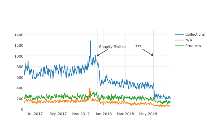
When we grouped pages manually in part two, we benefited from the fact the URLs groups had clear patterns (collections, products, and the others) but it is often the case where there are no patterns in the URL. For example, Yahoo Stores’ sites use a flat URL structure with no directory paths. Our manual approach wouldn’t work in this case.

Fortunately, it is possible to group pages by their contents because most page templates have different content structures. They serve different user needs, so that needs to be the case.

How can we organize pages by their content? We can use DOM element selectors for this. We will specifically use XPaths.

Example of using DOM elements to organize pages by their content

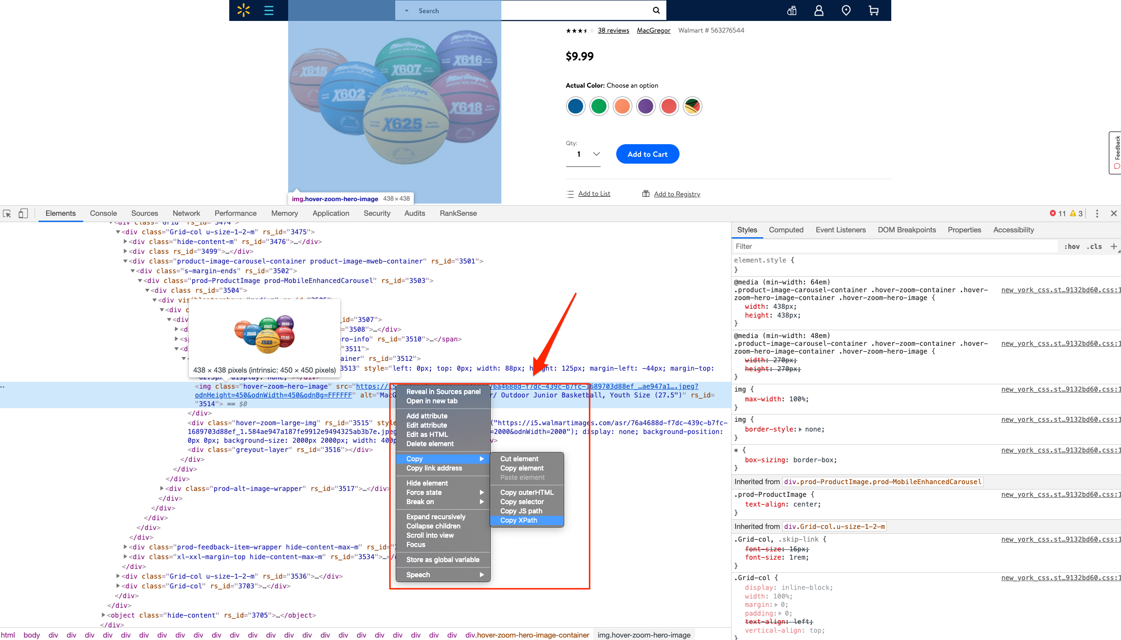
For example, I can use the presence of a big product image to know the page is a product detail page. I can grab the product image address in the document (its XPath) by right-clicking on it in Chrome and choosing “Inspect,” then right-clicking to copy the XPath.

We can identify other page groups by finding page elements that are unique to them. However, note that while this would allow us to group Yahoo Store-type sites, it would still be a manual process to create the groups.

A scientist’s bottom-up approach

In order to group pages automatically, we need to use a statistical approach. In other words, we need to find patterns in the data that we can use to cluster similar pages together because they share similar statistics. This is a perfect problem for machine learning algorithms.

BloomReach, a digital experience platform vendor, shared their machine learning solution to this problem. To summarize it, they first manually selected cleaned features from the HTML tags like class IDs, CSS style sheet names, and the others. Then, they automatically grouped pages based on the presence and variability of these features. In their tests, they achieved around 90% accuracy, which is pretty good.

When you give problems like this to scientists and engineers with no domain expertise, they will generally come up with complicated, bottom-up solutions. The scientist will say, “Here is the data I have, let me try different computer science ideas I know until I find a good solution.”

One of the reasons I advocate practitioners learn programming is that you can start solving problems using your domain expertise and find shortcuts like the one I will share next.

Hamlet’s observation and a simpler solution

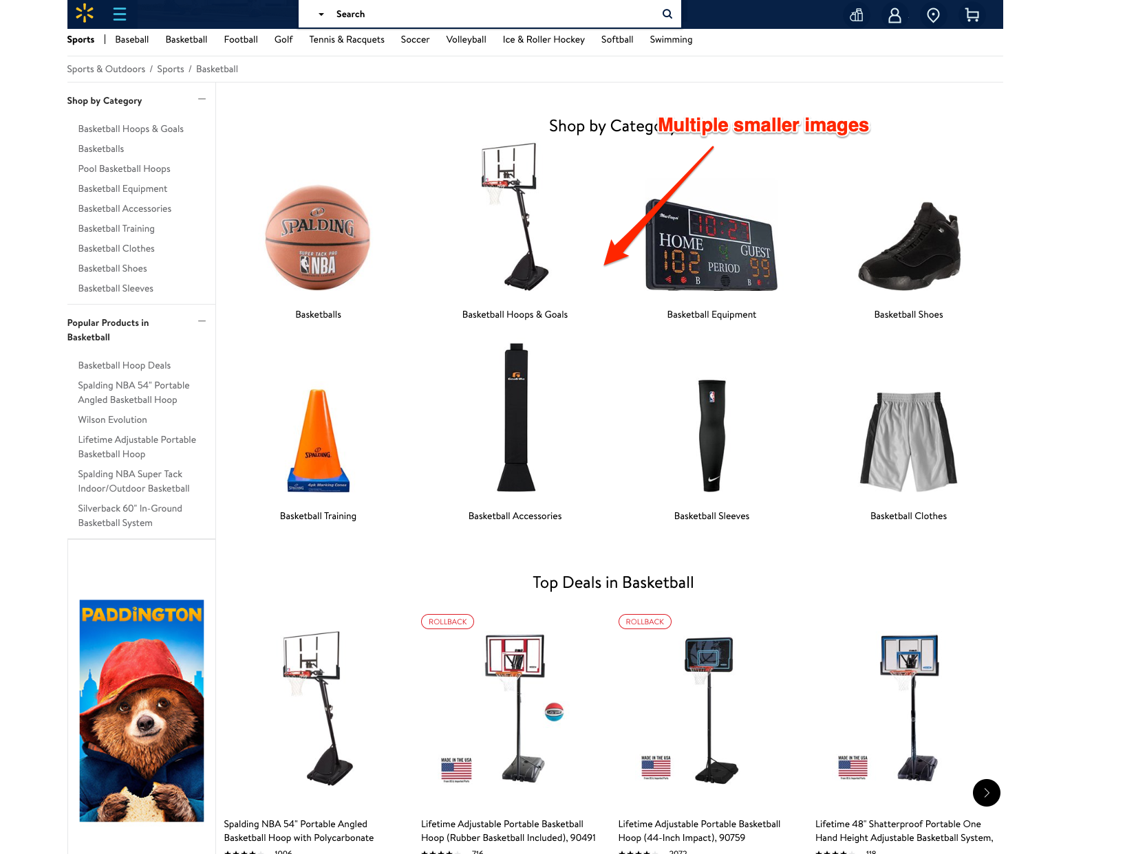
For most ecommerce sites, most page templates include images (and input elements), and those generally change in quantity and size.

Hamlet's observation for a simpler approach based on domain-level observationsHamlet's observation for a simpler approach by testing the quantity and size of images

I decided to test the quantity and size of images, and the number of input elements as my features set. We were able to achieve 97.5% accuracy in our tests. This is a much simpler and effective approach for this specific problem. All of this is possible because I didn’t start with the data I could access, but with a simpler domain-level observation.

I am not trying to say my approach is superior, as they have tested theirs in millions of pages and I’ve only tested this on a few thousand. My point is that as a practitioner you should learn this stuff so you can contribute your own expertise and creativity.

Now let’s get to the fun part and get to code some machine learning code in Python!

Collecting training data

We need training data to build a model. This training data needs to come pre-labeled with “correct” answers so that the model can learn from the correct answers and make its own predictions on unseen data.

In our case, as discussed above, we’ll use our intuition that most product pages have one or more large images on the page, and most category type pages have many smaller images on the page.

What’s more, product pages typically have more form elements than category pages (for filling in quantity, color, and more).

Unfortunately, crawling a web page for this data requires knowledge of web browser automation, and image manipulation, which are outside the scope of this post. Feel free to study this GitHub gist we put together to learn more.

Here we load the raw data already collected.

Feature engineering

Each row of the form_counts data frame above corresponds to a single URL and provides a count of both form elements, and input elements contained on that page.

Meanwhile, in the img_counts data frame, each row corresponds to a single image from a particular page. Each image has an associated file size, height, and width. Pages are more than likely to have multiple images on each page, and so there are many rows corresponding to each URL.

It is often the case that HTML documents don’t include explicit image dimensions. We are using a little trick to compensate for this. We are capturing the size of the image files, which would be proportional to the multiplication of the width and the length of the images.

We want our image counts and image file sizes to be treated as categorical features, not numerical ones. When a numerical feature, say new visitors, increases it generally implies improvement, but we don’t want bigger images to imply improvement. A common technique to do this is called one-hot encoding.

Most site pages can have an arbitrary number of images. We are going to further process our dataset by bucketing images into 50 groups. This technique is called “binning”.

Here is what our processed data set looks like.

Example view of processed data for "binning"

Adding ground truth labels

As we already have correct labels from our manual regex approach, we can use them to create the correct labels to feed the model.

We also need to split our dataset randomly into a training set and a test set. This allows us to train the machine learning model on one set of data, and test it on another set that it’s never seen before. We do this to prevent our model from simply “memorizing” the training data and doing terribly on new, unseen data. You can check it out at the link given below:

Model training and grid search

Finally, the good stuff!

All the steps above, the data collection and preparation, are generally the hardest part to code. The machine learning code is generally quite simple.

We’re using the well-known Scikitlearn python library to train a number of popular models using a bunch of standard hyperparameters (settings for fine-tuning a model). Scikitlearn will run through all of them to find the best one, we simply need to feed in the X variables (our feature engineering parameters above) and the Y variables (the correct labels) to each model, and perform the .fit() function and voila!

Evaluating performance

Graph for evaluating image performances through a linear pattern

After running the grid search, we find our winning model to be the Linear SVM (0.974) and Logistic regression (0.968) coming at a close second. Even with such high accuracy, a machine learning model will make mistakes. If it doesn’t make any mistakes, then there is definitely something wrong with the code.

In order to understand where the model performs best and worst, we will use another useful machine learning tool, the confusion matrix.

Graph of the confusion matrix to evaluate image performance

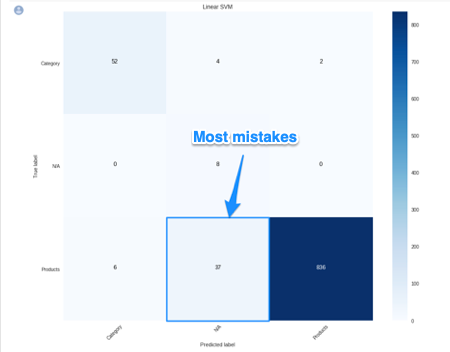
When looking at a confusion matrix, focus on the diagonal squares. The counts there are correct predictions and the counts outside are failures. In the confusion matrix above we can quickly see that the model does really well-labeling products, but terribly labeling pages that are not product or categories. Intuitively, we can assume that such pages would not have consistent image usage.

Here is the code to put together the confusion matrix:

Finally, here is the code to plot the model evaluation:

Resources to learn more

You might be thinking that this is a lot of work to just tell page groups, and you are right!

Screenshot of a query on custom PageTypes and DataLayer

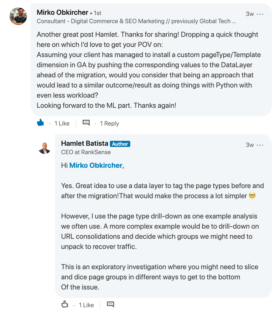
Mirko Obkircher commented in my article for part two that there is a much simpler approach, which is to have your client set up a Google Analytics data layer with the page group type. Very smart recommendation, Mirko!

I am using this example for illustration purposes. What if the issue requires a deeper exploratory investigation? If you already started the analysis using Python, your creativity and knowledge are the only limits.

If you want to jump onto the machine learning bandwagon, here are some resources I recommend to learn more:

Got any tips or queries? Share it in the comments.

Hamlet Batista is the CEO and founder of RankSense, an agile SEO platform for online retailers and manufacturers. He can be found on Twitter .

Related reading

Complete guide to Google Search Console

Google tests AR for Google Maps Considerations for businesses across local search, hyperlocal SEO, and UX

robots.txt best practice guide

How to pick the best website audit tool for your digital agency

https://searchenginewatch.com/2019/04/17/using-python-to-recover-seo-site-traffic-part-three/


Using Python to recover SEO site traffic (Part two)

using python to recover SEO site traffic (part 2)

Automating the process of narrowing down site traffic issues with Python gives you the opportunity to help your clients recover fast.

This is the second part of a three-part series. In part one, I introduced our approach to nail down the pages losing traffic. We call it the “winners vs losers” analysis. If you have a big site, reviewing individual pages losing traffic as we did on part one might not give you a good sense of what the problem is. So, in part two we will create manual page groups using regular expressions. If you stick around to read part three, I will show you how to group pages automatically using machine learning.

You can find the code used in part one, two and three in this Google Colab notebook. Let’s walk over part two and learn some Python.

Incorporating redirects

As the site our analyzing moved from one platform to another, the URLs changed, and a decent number of redirects were put in place. In order to track winners and losers more accurately, we want to follow the redirects from the first set of pages. We were not really comparing apples to apples in part one. If we want to get a fully accurate look at the winners and losers, we’ll have to try to discover where the source pages are redirecting to, then repeat the comparison.

1. Python requests

We’ll use the requests library which simplifies web scraping, to send an HTTP HEAD request to each URL in our Google Analytics data set, and if it returns a 3xx redirect, we’ll record the ultimate destination and re-run our winners and losers analysis with the correct, final URLs. HTTP HEAD requests speed up the process and save bandwidth as the web server only returns headers, not full HTML responses.

Below are two functions we’ll use to do this. The first function takes in a single URL and returns the status code and any resulting redirect location (or None if there isn’t a redirect.)

The second function takes in a list of URLs and runs the first function on each of them, saving all the results in a list.

View the code on

Gist.

This process might take a while (depending on the number of URLs). Please note that we introduce a delay between requests because we don’t want to overload the server with our requests and potentially cause it to crash. We also only check for valid redirect status codes 301, 302, 307. It is not wise to check the full range as for example 304 means the page didn’t change.

Once we have the redirects, however, we can repeat the winners and losers analysis exactly as before.

2. Using combine_first

In part one we learned about different join types. We first need to do a left merge/join to append the redirect information to our original Google Analytics data frame while keeping the data for rows with no URLs in common.

To make sure that we use either the original URL or the redirect URL if it exists, we use another data frame method called combine_first() to create a true_url column. For more information on exactly how this method works, see the combine_first documentation.

We also extract the path from the URLs and format the dates to Python DateTime objects.

View the code on

Gist.

3. Computing totals before and after the switch

View the code on

Gist.

4. Recalculating winners vs losers

View the code on

Gist.

5. Sanity check

View the code on

Gist.

This is what the output looks like.

Example of the output

Using regular expressions to group pages

Many websites have well-structured URLs that make their page types easy to parse. For example, a page with any one of the following paths given below is pretty clearly a paginated category page.

/category/toys?page=1

/c/childrens-toys/3/

Meanwhile, a path structure like the paths given below might be a product page.

/category/toys/basketball-product-1.html

/category/toys/p/action-figure.html

We need a way to categorize these pages based on the structure of the text contained in the URL. Luckily this type of problem (that is, examining structured text) can be tackled very easily with a “Domain Specific Language” known as Regular Expressions or “regex.”

Regex expressions can be extremely complicated, or extremely simple. For example, the following regex query (written in python) would allow you to find the exact phrase “find me” in a string of text.

regex = r"find me"

Let’s try it out real quick.

text = "If you can find me in this string of text, you win! But if you can't find me, you lose"
regex = r"find me" print("Match index", "\tMatch text")
for match in re.finditer(regex, text): print(match.start(), "\t\t", match.group())

The output should be:

Match index Match text
11 find me
69 find me

Grouping by URL

Now we make use of a slightly more advanced regex expression that contains a negative lookahead.

Fully understanding the following regex expressions is left as an exercise for the reader, but suffice it to say we’re looking for “Collection” (aka “category”) pages and “Product” pages. We create a new column called “group” where we label any rows whose true_url match our regex string accordingly.

Finally, we simply re-run our winners and losers’ analysis but instead of grouping by individual URLs like we did before, we group by the page type we found using regex.

View the code on

Gist.

The output looks like this:

Example of output using regular expressions

Plotting the results

Finally, we’ll plot the results of our regex-based analysis, to get a feel for which groups are doing better or worse. We’re going to use an open source plotting library called Plotly to do so.

In our first set of charts, we’ll define 3 bar charts that will go on the same plot, corresponding to the traffic differences, data from before, and data from after our cutoff point respectively.

We then tell Plotly to save an HTML file containing our interactive plot, and then we’ll display the HTML within the notebook environment.

Notice that Plotly has grouped together our bar charts based on the “group” variable that we passed to all the bar charts on the x-axis, so now we can see that the “collections” group very clearly has had the biggest difference between our two time periods.

View the code on

Gist.

We get this nice plot which you can interact within the Jupyter notebook!

Graph on the traffic using Jupyter notebook for plotting results

Next up we’ll plot a line graph showing the traffic over time for all of our groups. Similar to the one above, we’ll create three separate lines that will go on the same chart. This time, however, we do it dynamically with a “for loop”.

After we create the line graph, we can add some annotations using the Layout parameter when creating the Plotly figure.

View the code on

Gist.

This produces this painful to see, but valuable chart.

graph on plotted results using Plotly

Results

From the bar chart and our line graph, we can see two separate events occurred with the “Collections” type pages which caused a loss in traffic. Unlike the uncategorized pages or the product pages, something has gone wrong with collections pages in particular.

From here we can take off our programmer hats, and put on our SEO hats and go digging for the cause of this traffic loss, now that we know that it’s the “Collections” pages which were affected the most.

During further work with this client, we narrowed down the issue to massive consolidation of category pages during the move. We helped them recreate them from the old site and linked them from a new HTML sitemap with all the pages, as they didn’t want these old pages in the main navigation.

Manually grouping pages is a valuable technique, but a lot of work if you need to work with many brands. In part three, the final part of the series, I will discuss a clever technique to group pages automatically using machine learning.

Hamlet Batista is the CEO and founder of RankSense, an agile SEO platform for online retailers and manufacturers. He can be found on Twitter .

Related reading

cybersecurity in SEO, how website security affects your SEO performance

google ads conversion rates by industry

https://searchenginewatch.com/2019/03/08/using-python-to-recover-seo-site-traffic-part-two/


Using Python to recover SEO site traffic (Part one)

Helping a client recover from a bad redesign or site migration is probably one of the most critical jobs you can face as an SEO.

The traditional approach of conducting a full forensic SEO audit works well most of the time, but what if there was a way to speed things up? You could potentially save your client a lot of money in opportunity cost.

Last November, I spoke at TechSEO Boost and presented a technique my team and I regularly use to analyze traffic drops. It allows us to pinpoint this painful problem quickly and with surgical precision. As far as I know, there are no tools that currently implement this technique. I coded this solution using Python.

This is the first part of a three-part series. In part two, we will manually group the pages using regular expressions and in part three we will group them automatically using machine learning techniques. Let’s walk over part one and have some fun!

Winners vs losers

SEO traffic after a switch to shopify, traffic takes a hit

Last June we signed up a client that moved from Ecommerce V3 to Shopify and the SEO traffic took a big hit. The owner set up 301 redirects between the old and new sites but made a number of unwise changes like merging a large number of categories and rewriting titles during the move.

When traffic drops, some parts of the site underperform while others don’t. I like to isolate them in order to 1) focus all efforts on the underperforming parts, and 2) learn from the parts that are doing well.

I call this analysis the “Winners vs Losers” analysis. Here, winners are the parts that do well, and losers the ones that do badly.

visual analysis of winners and losers to figure out why traffic changed

A visualization of the analysis looks like the chart above. I was able to narrow down the issue to the category pages (Collection pages) and found that the main issue was caused by the site owner merging and eliminating too many categories during the move.

Let’s walk over the steps to put this kind of analysis together in Python.

You can reference my carefully documented Google Colab notebook here.

Getting the data

We want to programmatically compare two separate time frames in Google Analytics (before and after the traffic drop), and we’re going to use the Google Analytics API to do it.

Google Analytics Query Explorer provides the simplest approach to do this in Python.

  1. Head on over to the Google Analytics Query Explorer
  2. Click on the button at the top that says “Click here to Authorize” and follow the steps provided.
  3. Use the dropdown menu to select the website you want to get data from.
  4. Fill in the “metrics” parameter with “ga:newUsers” in order to track new visits.
  5. Complete the “dimensions” parameter with “ga:landingPagePath” in order to get the page URLs.
  6. Fill in the “segment” parameter with “gaid::-5” in order to track organic search visits.
  7. Hit “Run Query” and let it run
  8. Scroll down to the bottom of the page and look for the text box that says “API Query URI.”
    1. Check the box underneath it that says “Include current access_token in the Query URI (will expire in ~60 minutes).”
    2. At the end of the URL in the text box you should now see access_token=string-of-text-here. You will use this string of text in the code snippet below as  the variable called token (make sure to paste it inside the quotes)
  9. Now, scroll back up to where we built the query, and look for the parameter that was filled in for you called “ids.” You will use this in the code snippet below as the variable called “gaid.” Again, it should go inside the quotes.
  10. Run the cell once you’ve filled in the gaid and token variables to instantiate them, and we’re good to go!

First, let’s define placeholder variables to pass to the API

metrics = “,”.join([“ga:users”,”ga:newUsers”])

dimensions = “,”.join([“ga:landingPagePath”, “ga:date”])

segment = “gaid::-5”

# Required, please fill in with your own GA information example: ga:23322342

gaid = “ga:23322342”

# Example: string-of-text-here from step 8.2

token = “”

# Example https://www.example.com or http://example.org

base_site_url = “”

# You can change the start and end dates as you like

start = “2017-06-01”

end = “2018-06-30”

The first function combines the placeholder variables we filled in above with an API URL to get Google Analytics data. We make additional API requests and merge them in case the results exceed the 10,000 limit.

def GAData(gaid, start, end, metrics, dimensions, 

           segment, token, max_results=10000):

  “””Creates a generator that yields GA API data 

     in chunks of size `max_results`”””

  #build uri w/ params

  api_uri = “https://www.googleapis.com/analytics/v3/data/ga?ids={gaid}&”\

             “start-date={start}&end-date={end}&metrics={metrics}&”\

             “dimensions={dimensions}&segment={segment}&access_token={token}&”\

             “max-results={max_results}”

  # insert uri params

  api_uri = api_uri.format(

      gaid=gaid,

      start=start,

      end=end,

      metrics=metrics,

      dimensions=dimensions,

      segment=segment,

      token=token,

      max_results=max_results

  )

  # Using yield to make a generator in an

  # attempt to be memory efficient, since data is downloaded in chunks

  r = requests.get(api_uri)

  data = r.json()

  yield data

  if data.get(“nextLink”, None):

    while data.get(“nextLink”):

      new_uri = data.get(“nextLink”)

      new_uri += “&access_token={token}”.format(token=token)

      r = requests.get(new_uri)

      data = r.json()

      yield data

In the second function, we load the Google Analytics Query Explorer API response into a pandas DataFrame to simplify our analysis.

import pandas as pd

def to_df(gadata):

  “””Takes in a generator from GAData() 

     creates a dataframe from the rows”””

  df = None

  for data in gadata:

    if df is None:

      df = pd.DataFrame(

          data[‘rows’], 

          columns=[x[‘name’] for x in data[‘columnHeaders’]]

      )

    else:

      newdf = pd.DataFrame(

          data[‘rows’], 

          columns=[x[‘name’] for x in data[‘columnHeaders’]]

      )

      df = df.append(newdf)

    print(“Gathered {} rows”.format(len(df)))

  return df

Now, we can call the functions to load the Google Analytics data.

data = GAData(gaid=gaid, metrics=metrics, start=start, 

                end=end, dimensions=dimensions, segment=segment, 

                token=token)

data = to_df(data)

Analyzing the data

Let’s start by just getting a look at the data. We’ll use the .head() method of DataFrames to take a look at the first few rows. Think of this as glancing at only the top few rows of an Excel spreadsheet.

data.head(5)

This displays the first five rows of the data frame.

Most of the data is not in the right format for proper analysis, so let’s perform some data transformations.

First, let’s convert the date to a datetime object and the metrics to numeric values.

data[‘ga:date’] = pd.to_datetime(data[‘ga:date’])

data[‘ga:users’] = pd.to_numeric(data[‘ga:users’])

data[‘ga:newUsers’] = pd.to_numeric(data[‘ga:newUsers’])

Next, we will need the landing page URL, which are relative and include URL parameters in two additional formats: 1) as absolute urls, and 2) as relative paths (without the URL parameters).

from urllib.parse import urlparse, urljoin

data[‘path’] = data[‘ga:landingPagePath’].apply(lambda x: urlparse(x).path)

data[‘url’] = urljoin(base_site_url, data[‘path’])

Now the fun part begins.

The goal of our analysis is to see which pages lost traffic after a particular date–compared to the period before that date–and which gained traffic after that date.

The example date chosen below corresponds to the exact midpoint of our start and end variables used above to gather the data, so that the data both before and after the date is similarly sized.

We begin the analysis by grouping each URL together by their path and adding up the newUsers for each URL. We do this with the built-in pandas method: .groupby(), which takes a column name as an input and groups together each unique value in that column.

The .sum() method then takes the sum of every other column in the data frame within each group.

For more information on these methods please see the Pandas documentation for groupby.

For those who might be familiar with SQL, this is analogous to a GROUP BY clause with a SUM in the select clause

# Change this depending on your needs

MIDPOINT_DATE = “2017-12-15”

before = data[data[‘ga:date’] < pd.to_datetime(MIDPOINT_DATE)]

after = data[data[‘ga:date’] >= pd.to_datetime(MIDPOINT_DATE)]

# Traffic totals before Shopify switch

totals_before = before[[“ga:landingPagePath”, “ga:newUsers”]]\

                .groupby(“ga:landingPagePath”).sum()

totals_before = totals_before.reset_index()\

                .sort_values(“ga:newUsers”, ascending=False)

# Traffic totals after Shopify switch

totals_after = after[[“ga:landingPagePath”, “ga:newUsers”]]\

               .groupby(“ga:landingPagePath”).sum()

totals_after = totals_after.reset_index()\

               .sort_values(“ga:newUsers”, ascending=False)

You can check the totals before and after with this code and double check with the Google Analytics numbers.

print(“Traffic Totals Before: “)

print(“Row count: “, len(totals_before))

print(“Traffic Totals After: “)

print(“Row count: “, len(totals_after))

Next up we merge the two data frames, so that we have a single column corresponding to the URL, and two columns corresponding to the totals before and after the date.

We have different options when merging as illustrated above. Here, we use an “outer” merge, because even if a URL didn’t show up in the “before” period, we still want it to be a part of this merged dataframe. We’ll fill in the blanks with zeros after the merge.

# Comparing pages from before and after the switch

change = totals_after.merge(totals_before, 

                            left_on=”ga:landingPagePath”, 

                            right_on=”ga:landingPagePath”, 

                            suffixes=[“_after”, “_before”], 

                            how=”outer”)

change.fillna(0, inplace=True)

Difference and percentage change

Pandas dataframes make simple calculations on whole columns easy. We can take the difference of two columns and divide two columns and it will perform that operation on every row for us. We will take the difference of the two totals columns, and divide by the “before” column to get the percent change before and after out midpoint date.

Using this percent_change column we can then filter our dataframe to get the winners, the losers and those URLs with no change.

change[‘difference’] = change[‘ga:newUsers_after’] – change[‘ga:newUsers_before’]

change[‘percent_change’] = change[‘difference’] / change[‘ga:newUsers_before’]

winners = change[change[‘percent_change’] > 0]

losers = change[change[‘percent_change’] < 0]

no_change = change[change[‘percent_change’] == 0]

Sanity check

Finally, we do a quick sanity check to make sure that all the traffic from the original data frame is still accounted for after all of our analysis. To do this, we simply take the sum of all traffic for both the original data frame and the two columns of our change dataframe.

# Checking that the total traffic adds up

data[‘ga:newUsers’].sum() == change[[‘ga:newUsers_after’, ‘ga:newUsers_before’]].sum().sum()

It should be True.

Results

Sorting by the difference in our losers data frame, and taking the .head(10), we can see the top 10 losers in our analysis. In other words, these pages lost the most total traffic between the two periods before and after the midpoint date.

losers.sort_values(“difference”).head(10)

You can do the same to review the winners and try to learn from them.

winners.sort_values(“difference”, ascending=False).head(10)

You can export the losing pages to a CSV or Excel using this.

losers.to_csv(“./losing-pages.csv”)

This seems like a lot of work to analyze just one site–and it is!

The magic happens when you reuse this code on new clients and simply need to replace the placeholder variables at the top of the script.

In part two, we will make the output more useful by grouping the losing (and winning) pages by their types to get the chart I included above.

Related reading

SEO tips tools guides 2018

guide to google analytics terms

SEO travel mistakes to avoid in 2019

https://searchenginewatch.com/2019/02/06/using-python-to-recover-seo-site-traffic-part-one/