The Continued ‘Blanding’ Trend That Goes Against Industry Research
It’s no secret that collaboration is essential to growth, but the how of it isn’t always so clear—and it’s the understanding of how that is a true competitive advantage. Join Adweek X, a uniquely formatted event on December 4 in LA, to unlock fresh perspectives, true collaboration and growth.
Strong brand cues increase brand saliency by 52% and have the ability to more than double a company’s future growth prospects, Kantar discovered in 2021.
Further data from Kantar through its BrandZ research on distinctive brand assets showed that logos and shapes were the strongest assets, with a distinctive font significantly less so. It also connected financial outcomes: Brands in the top third for brand asset strength had higher average valuations ($2 billion) vs. the bottom third ($881 million).
And yet, in recent years, some legacy brands have introduced stripped-back identities, or “blanding” as it is unkindly described by some in the design sector.
Earlier this year, Johnson & Johnson (J&J) took a pared back approach to its logo that was described by Vanessa Broadhurst, evp of global corporate affairs, as communicating “our bold approach to innovation in healthcare, while staying true to the care we have for our patients around the world.”
The “modernized” sans-serif logo still featured the red color but lost the joined-up lettering based on co-founder James Wood Johnson’s signature that had been a hallmark of the company since 1887.
J&J is just the latest in a line of major brands that have minimalized their much-recognized brand emblems recently.
“J&J’s logo has always been recognizable to most, and with it comes a lot of history. Unfortunately, it’s joined a long list of global brands in blandification,” commented Omar Fahmi, creative director and lead digital designer at Virgin Media O2.
“The logo was beautifully cursive, balanced, recognizable and gave a nod to its founder, not too dissimilar to the Virgin brand,” he added. “J&J’s curves were as recognizable as the letters used in Coca-Cola’s logo.”
The eclectic list of companies that have recently pared back their logos includes world-famous names such as Burberry, which dropped its original Equestrian Knight that had been in place since 1901, Pringles, Burger King, Yves Saint Laurent, Intel and Sprite. And perhaps the less said about Twitter’s new incarnation, the better.
We’ve got one of the best, most recognizable logos in the world. So I feel like we love it and use it as we should.
Nic Taylor, svp and head, Our Lego Agency
In February, however, after four years, Burberry’s then-newly appointed chief creative officer Daniel Lee chose to reintroduce the Knight emblem alongside the more recent identity. In the company’s end-of-year report, chief executive Jonathan Akeroyd explained that the move was to bring more clarity to the brand as it refocused on its British luxury credentials.
The route to normalization
“Normalization is a process of chipping away at the idiosyncrasies, of averaging out. Simplification, done well, is about chipping away at the forgettable, non-essential stuff, until you’re left with the most distinction from the fewest marks,” explained Tim Owen, head of strategy at Turner Duckworth. “There are lots of good reasons to do that, mostly media reasons—those simple but distinct marks being easier to reproduce, easier and quicker to see.”
Among design traditionalists, however, it has not been a popular trend. They’ve grown concerned that all logos will start to look the same; meanwhile, it does seem to work for safety-minded marketers.
“Do we ever find the simple swoosh or half-eaten apple bland or boring?” countered Eric Chia, executive creative director of design at Digitas. “Sometimes this new form might look bland to us visually, but it opens up ways that a brand can express itself.”
Not looking to introduce any change to its brand marque is Lego, which has had its current iteration in place since 1998. It’s a revision of the logotype introduced in 1973, although it has faced many iterations going back to its launch in 1934.

“I’m a big fan of consistency,” Nic Taylor, svp and head of Our Lego Agency, told Adweek. “Therefore, changing logos—especially famous ones that people really recognize—I wouldn’t. It has to be an extreme case to want to do that, and we’ve got one of the best, most recognizable logos in the world. So, I feel like we love it and use it as we should.”
The counter-movement
The pushback against simplification has already begun.
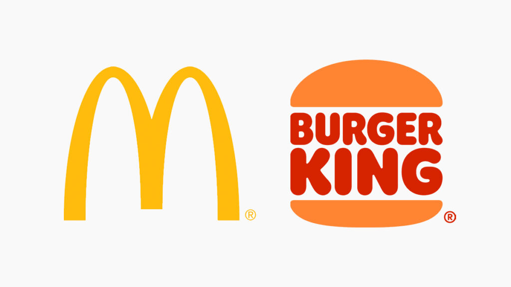
In 2019, the Harvard Business Review ran a study to discover the attributes of a successful logo. The researchers analyzed 423 business-to-consumer brands while also acquiring each brand’s financial information (net sales, advertising, research and development spending, and total assets).
The logos were then categorized as descriptive (Burger King) and nondescriptive (McDonald’s), as well as other design characteristics such as symmetry, shape and color. These, alongside the financial results, acted as control variables and found a descriptive logo had a greater positive effect on sales than a nondescriptive one.
And with every trend, there is eventually a counter-trend, and this is no different as brands still want to stand out against the competition to achieve their potential.
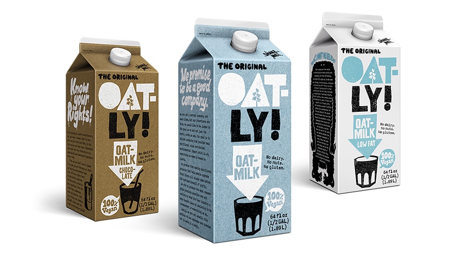
According to Tim Owen, principal at marketing and business development consultancy Fulcrum Partners, the independent fast-moving consumer goods (FMCG) space is moving in the opposite direction from blanding, citing direct-to-consumer (D2C) brands such as Tony’s Chocolonely and Oatly as having introduced some eye-catching marques.
Liquid Death, with its distinctive skull emblem, is another brand keeping things interesting, mainly because it’s a company without a long history.
“It’s a bubble,” Owen cautioned. “The minute those DTC brands venture out into the retail and social space, the loss of that distinction is apparent. Because without distinction there is no memory, and without memory, there is no fame. Distinction is one of those things that has mattered forever and will continue to do so. It is why Bowie was distinct, why Wedgewood was distinct, and why religion cultivates distinction. Because without distinction, there is no fame.”

Nick Vaus, partner and creative director at Free the Birds, added that the use of distinctive assets remains “indispensable” as part of brands’ marketing within a saturated market, aiding consumers to form emotional connections in the process.
“Brands with a unique and easily recognizable identity typically enjoy greater customer loyalty, as customers can swiftly identify and trust them. In today’s age of digital information overload, a distinctive brand can stand out and leave a lasting impression,” Vaus said.
“Hence, when contemplating brand redesigns (especially for heritage brands), it’s crucial to approach them thoughtfully to preserve the brand’s personality and values.”
https://www.adweek.com/brand-marketing/blanding-trend-brand-logos-burberry/