The Creative Cases For and Against Jaguar’s Bold, Divisive Rebrand
ADWEEK House is headed to Las Vegas on January 8! Our house is your house to unwind, recharge and network during the industry’s largest consumer tech moment. RSVP.
When you think of luxury, British-founded car marque Jaguar, what is the first image that springs to mind?
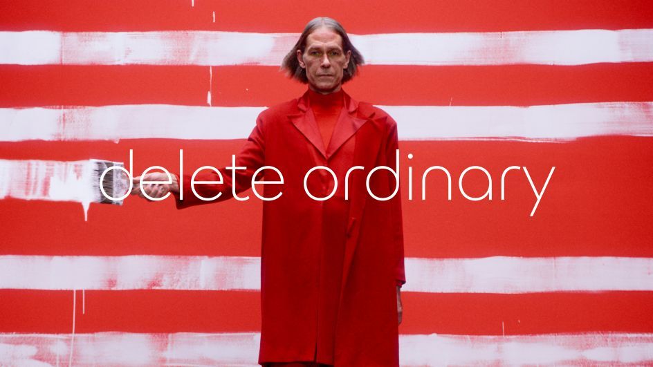
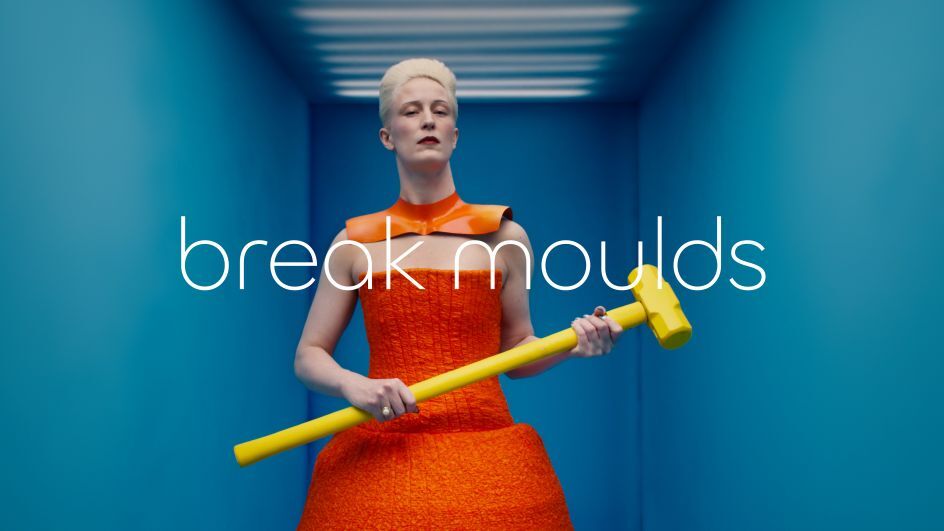
Perhaps it’s the brand’s growling cat emblem. Maybe it’s Ben Kingsley’s starring role in its “Good to Be Bad” F-Type campaign. What about an Avant Garde-style film showcasing a diverse cohort of models in luminous outfits set to a techno soundtrack?
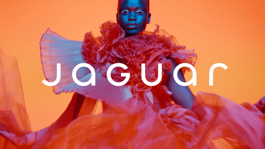
If that’s not where your mind went, you’re not alone. The internet is divided by “Copy Nothing,” a car-free campaign from the brand’s in-house creative team. The brand says that the campaign is the “physical manifestation” of its new philosophy: “Exuberant Modernism.”
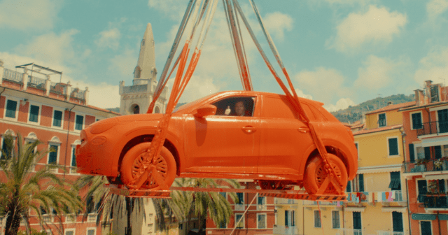
The work drops as Jaguar pauses new car sales for a year to develop a new range of all-electric vehicles planned to go on sale in 2025. Jaguar has been sharing EV design teasers this week, hinting that this campaign is just the start of its journey to capture the next generation of drivers.
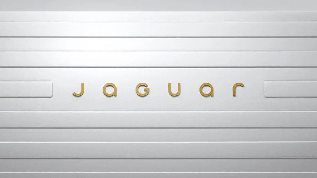
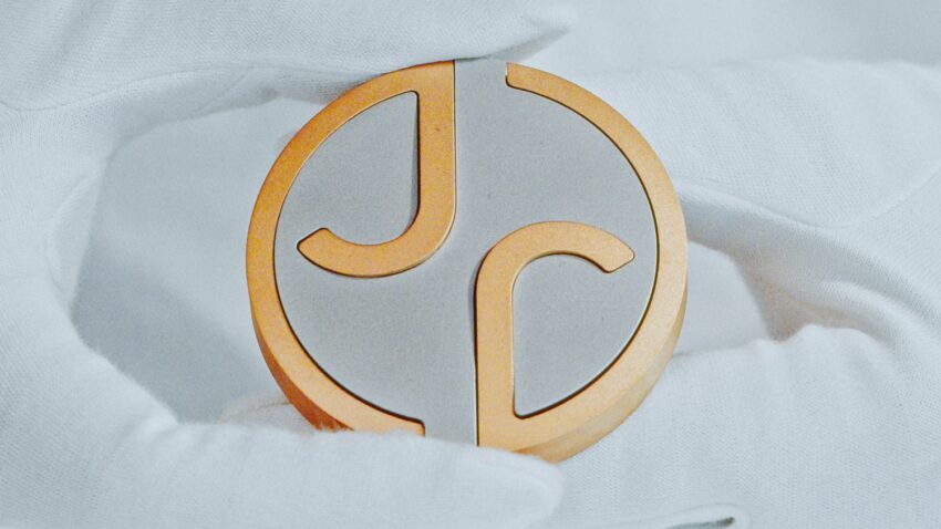
Additionally, Jaguar has unveiled a wholesale rebrand including a new logo blending lower- and uppercase fonts. It’s also revamped its iconic Jaguar leaper and debuted a new monogram that will replace its growling cat that has adorned grilles, bonnets, and steering wheels for decades.
“This is a reimagining that recaptures the essence of Jaguar, returning it to the values that once made it so loved, but making it relevant for a contemporary audience,” said Professor Gerry McGovern OBE, Jaguar’s chief creative officer, in a statement.
The internet isn’t so sure. The brand has drawn ire and confusion from creatives and consumers for seemingly disregarding its rich legacy and history.
Jaguar’s swift backlash
Elon Musk, X owner and CEO of Tesla, waded into the debate by asking, “do you sell cars?” His comment prompted discussion about the casting of the ad and accusations of “woke” marketing from conservative activists.
Elsewhere, consumer electronics brand Nothing playfully took aim at the relaunch by uploading a similar logo on X and changing its bio to “Copy Jaguar.”
But what do creatives make of the ad? ADWEEK asked for their thoughts. Some were for the relaunch, some were against it, and one was even on the fence.
Keep scrolling to hear their hot takes.
The Case For…
‘It’s breaking away from the category tropes‘
Manfredi Ricca, global chief strategy officer, Interbrand

“On Monday almost no one was particularly interested in Jaguar. It’s now Thursday, and millions are waiting for Jaguar to unveil its take on an EV.
“That’s what bold brand moves do—they turn people’s heads, shift their expectations, and yes, cause a bit of discomfort in the process.
“Many have criticized Jaguar for not reviving the brand’s DNA, but they’re missing the point. Jaguar has always been about doing things differently, and that’s what it is doing right now. It’s breaking away from the category tropes, showing up like a creative business rather than a car manufacturer.
“If the product and the experience go on to live up to that, Jaguar will connect deeply with some rather than superficially with many as you’d expect from a daring luxury brand.”
‘This is a radical reinvention for a new generation’
James Ramsden, ECD, Coley Porter Bell
“Brands need more individuality, creativity, and expression. There have been exciting and progressive car identities over the past few years including Renault, Citroen, Honda, and Audi. So, this feels like Jaguar is showing how it can be progressive and bold, too.
“The ads is striking, colorful, inclusive, and dramatic; exactly what electrification and the future of cars should feel more like. It’s a radical reinvention of a business wanting to appeal to a new generation. It’s just a shame it walked away from some of the iconic, treasured, and beautiful icons that have occupied the brand’s DNA for generations.
“If you’re going to ‘break the mold’, you’d better have one hell of a range of cars full of innovations and shape language, with a new buyer experience, ready to roll… this we wait to see.”
The Case Against…
‘It’s a departure with no connection to Jaguar’s legacy‘
Anjela Freyja, creative director of design & brand, Joan
“Jaguar has walked away from almost a century of established brand equity—a risky move for a company already facing significant challenges. The new direction seems designed to capture a Volkswagen-like audience with visual cues towards The Jetsons and The Hunger Games. It’s a departure with no connection to the brand’s legacy.
“This is what is most disappointing about this rebrand: its disregard for its rich history. A history that provided Jaguar with a strong and alluring brand world. And while it may not have fully resonated with today’s audience, it had immense potential to evolve for a more electric, modern, and mass audience.
“That is the rebrand I would’ve loved to see.”
‘It’s more ’70s Star Trek,’ than Jaguar’
Claire Parker, group creative partner, The Chase
“Oh dear, I’m well and truly in the ‘against’ camp. When I first saw the redesigned growler and the mixed-case typography, it felt like an ad for Tropicana. Instead of embodying modern luxury, the identity feels inconsistent—hesitant, even—a far cry from Jaguar’s traditionally bold confidence.
“The backlash stems from this disconnect. The rebrand’s experimental typography and overly modernized leaper lack the timeless sophistication needed for such a leap. I’m all for change, but it should be rooted in the truth and personality of the brand.
“I would have leaned into Jaguar’s legacy, blending its classic design cues with understated touches to signify the future. Minimal yet meaningful updates could have highlighted Jaguar’s unique point of difference while maintaining its identity.
“The accompanying brand film underscores these issues. Its view of the future is more ’70s Star Trek than Jaguar—high camp and cliched. Much like the film, the campaign risks becoming a fleeting blip rather than a bold step forward. Jaguar could have embraced the future while remaining quintessentially itself, instead of heading into a galaxy of uncertainty.”
‘Heritage is a weapon, not a weakness’
Harry Sandhu, senior creative, JvM London
“Where did the teeth go?
“I’m against Jaguar’s new rebrand. Not because it’s minimalist, but because it’s soulless. My first reaction? A slow blink. For a brand built on thrill and elegance, this feels like a misfire.
“Jaguar has always been about feeling. The growl of an engine. The thrill of something unapologetic, something that didn’t just arrive, it demanded your attention. This rebrand doesn’t demand anything. It’s safe. And safe isn’t what Jaguar was made for.
“The backlash is obvious. Strip away the parts of a brand that make it human, and you leave people cold. Jaguar’s fallen into the ‘blanding’ trap, so polished it disappears. Compare this to Burberry’s branding under Daniel Lee. It reached back, dug into their roots, and brought the Equestrian Knight back to life. Burberry feels reborn, not rinsed. Jaguar could’ve done the same.
“If I were in the room, I’d have told them to stop trying to impress and start trying to connect. Heritage is a weapon, not a weakness. Imagine reworking that iconic leaping cat into something for the electric age, a symbol of movement, elegance, power. Keep the thrill, but evolve it.
“A rebrand isn’t just a logo; it’s an emotional statement. And this one feels like it’s been focus-grouped into oblivion. Jaguar didn’t need to be quieter. It needed to remind us why it mattered in the first place. Because right now, it’s not roaring. It’s barely breathing.”
On the fence…
‘Writing this off is like judging a show on its pilot episode’
Chris Eichenseer, founder, Someoddpilot
“There’s something beautiful and irreverent about it, and I love that ethos. I’m for it. It’s hard to know at this point how self-aware is is, but the intent is right.
“Jaguar has thrown itself so hard into culture that we’re talking about it right now. If the markers for luxury have evolved, perhaps tech-forward is where it’s headed, then it makes sense to find the brand’s voice there. At the same time, equity is to be treasured. Hold onto it forever. But it doesn’t have to be the lead story every day.
“It’s pretty jarring, and I can understand where the backlash comes from. But also, it’s only day one. I have to believe there is an entire architecture underneath this rollout that supports the heritage needs of the brand and allows for expansive new creative and storytelling narratives.
“Writing this off is like judging a show on its pilot episode and not taking in the story across time. It’s a teaser, not the entire idea.”
https://www.adweek.com/brand-marketing/creatives-weigh-in-on-jaguars-rebrand/