The designers who made their own colourful world from traditional Japanese paper
Geometric glamour from the Kapitza sisters.
You’re a good designer, you’ve set up your own business, maybe your own studio team. But have you ever crafted your own world for people walk around in?
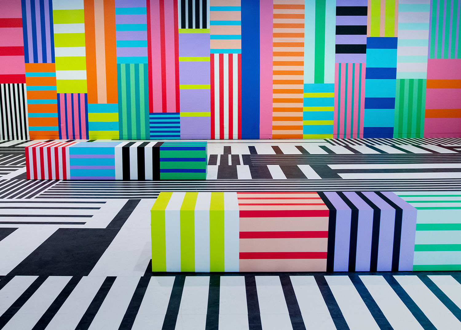
London double-act Kapitza did just that for the most recent Vienna Design Week, installing a ‘Kapitza World’ to greet visitors upon entry as designed with their customary geometric glamour.

For the site-specific project, urban adhesive tape was repurposed to create a multi-coloured mural of vertical and horizontal interactions and arrangements, all meticulously tailored to the exact dimensions of the 115 sq. metre space.
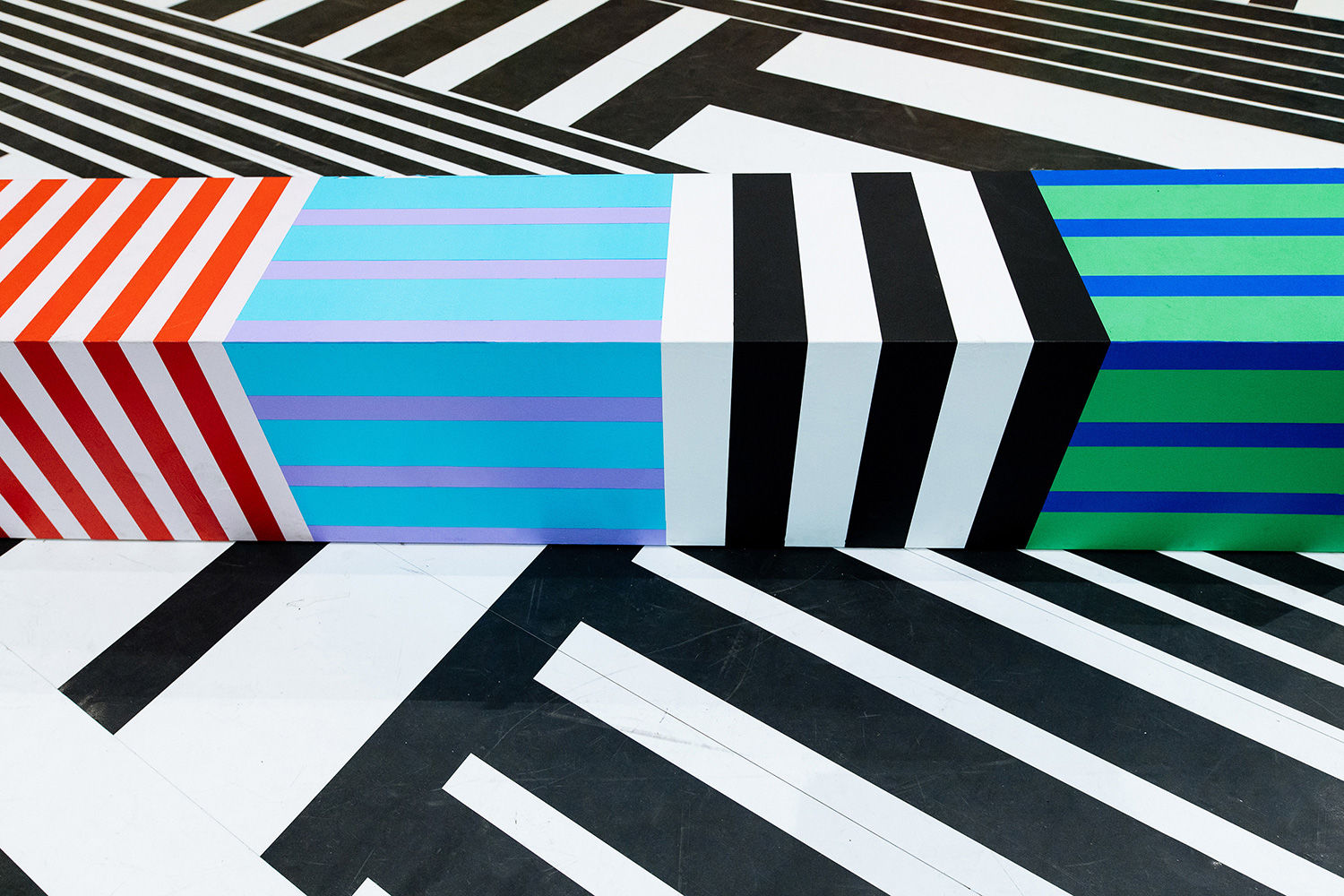
The interior was adorned throughout with washi tape, a traditional coloured Japanese paper tape to create the mural. Using only environmentally friendly paper-based tapes, it took a team of eight specialist three days to install.
“The brief was to create an exciting space to welcome visitors on entering the building,” sisters Nicole and Petra Kapitza explain. “Prior to this project we had only designed wall installations, and from this we learned that as soon as you create a large scale artwork the parameters change.
“It really helps us to have large format printer and to print out designs in their real size.
“As the project was in collaboration with MT masking tape, the installation had to be realised entirely with washi tape (one of their stocks in trade).

“We had been designing smaller washi tapes and sheets for interior use for MT and the idea arose to create something large scale with tapes they already have.
“It was very inspiring to work with the limitations of the widths and colours and exciting to do a large scale installation. The tapes are made from paper and we found it easier to work with them as they can be removed and reapplied, so it’s possible to make corrections.”
Our plan in Vienna
“First, we went to Vienna to take photographs of the space and experience it for ourselves,” Kapitza tell me about how their World came into place. We imagined how visitors would move around the building and how we would like them to interact with our installation.
“Back in the studio we worked with the floor plans to get exact measurements. We decided early on that we would like to create a site specific artwork and use the existing wall panels as a starting point.

“As we could use only washi tapes in predefined widths of 5, 10 and 20cm, we had to work out a detailed plan to show which colour tape in which width would be used where (see below).
“The challenges were that we had to create art for a very large space with very small strips of tape.

Colour and geometry
“Colour combinations are really important in our projects. We see a colour always in the context of the colours around it and each colour affects and changes the colour next to it.
“For a large installation like this it is important to take into consideration how a colour combination looks from afar, i.e. how do two colours visually blend together, do they create the colour we want or just a muddled brown?


“In this project we carefully chose each stripe combination taking into consideration the widths of the stripes. Then we created a rhythm by deciding which combinations are placed next to each other.
“Geometry particularly played a role in the black and white design of the floor. Again, we wanted to create a rhythm through the changing widths of white and black stripes. We wanted to avoid any repetition, so it all had to be mathematically worked out in detail.”

High-res images copyright Stefanie Freynschlag.
Related: Our pattern design tutorials
https://www.digitalartsonline.co.uk/features/graphic-design/designers-who-made-their-own-world-from-traditional-japanese-paper-colourful-patterns/