Top 20 Fonts That Will Be Popular With Designers in 2021
Considering how much the world has changed since this time last year, making general predictions for what the next 12 months have in store is a tall order. But when it comes to design, we at Shillington feel we’re on steadier ground. With the profession having survived, even prospered through 2020, we’re fairly sure it can cope with anything that 2021 can throw at us. And that makes us relatively confident about suggesting the top 20 fonts will be popular with designers in the year ahead.
Some of these are fresh new fonts you may not yet have heard of. But graphic design is never just about the new and hip, so we’ve included some older, more established fonts, too. Many of these have continued to make waves in the design industry, while others have been recently spotted making a much-deserved revival. Overall, though, all these fonts offer an excellent opportunity to spice up your designs and give your work a refreshed and unique look.
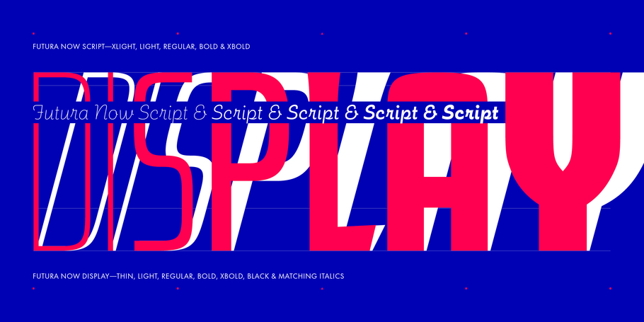
Created by Monotype and containing 102 styles, Futura Now is the definitive version of Futura, the classic sans-serif that defined modern typography. Thrillingly, it’s also now available as a variable font, delivering limitless styles in a tidy digital footprint.

Top 20 Fonts: FS Renaissance
A unique collaboration between lettering artist and designer Craig Black and creative type director Pedro Arilla, FS Renaissance is a display stencil font… but not a traditional stencil design. The cuts are not rigid, but interactions that are hand-crafted between each element, emphasising the concept of a typeface as a piece of art or sculpture.
Top 20 Fonts: Neue Haas Grotesk
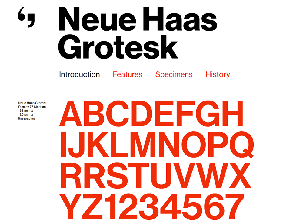
Designed by Christian Schwartz, Neue Haas Grotesk is a modern interpretation of the classic typeface designed in 1957-1961 by Max Miedinger, with art direction by Eduard Hoffmann. That eventually evolved into Helvetica, but Schwartz believes that the digitising of Helvetica involved too many compromises; hence this new digital version of Neue Haas Grotesk is designed to capture to be more faithful to the original. And the best news of all: it’s now available from Google Fonts, for free!
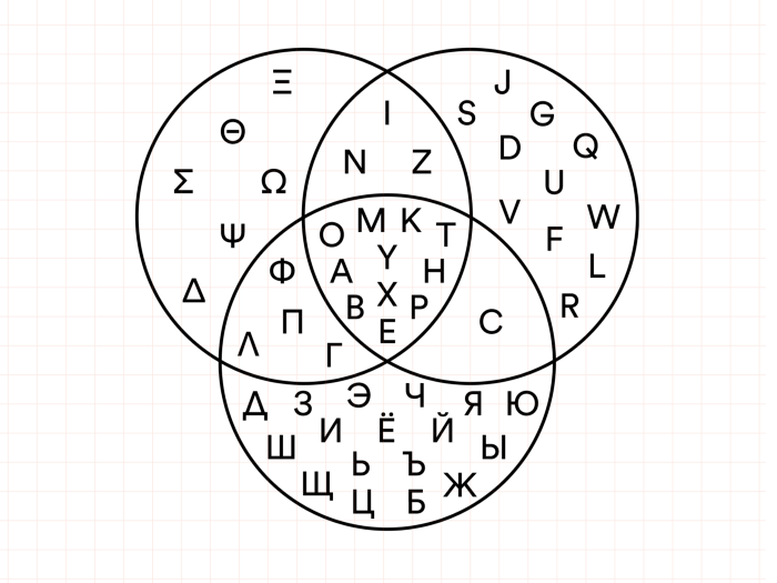
Circular is a sans-serif font designed by Laurenz Brunner and released through Lineto. While broadly geometric, it benefits from some quirky elements that make it more attractive and distinctive than most of its ilk.
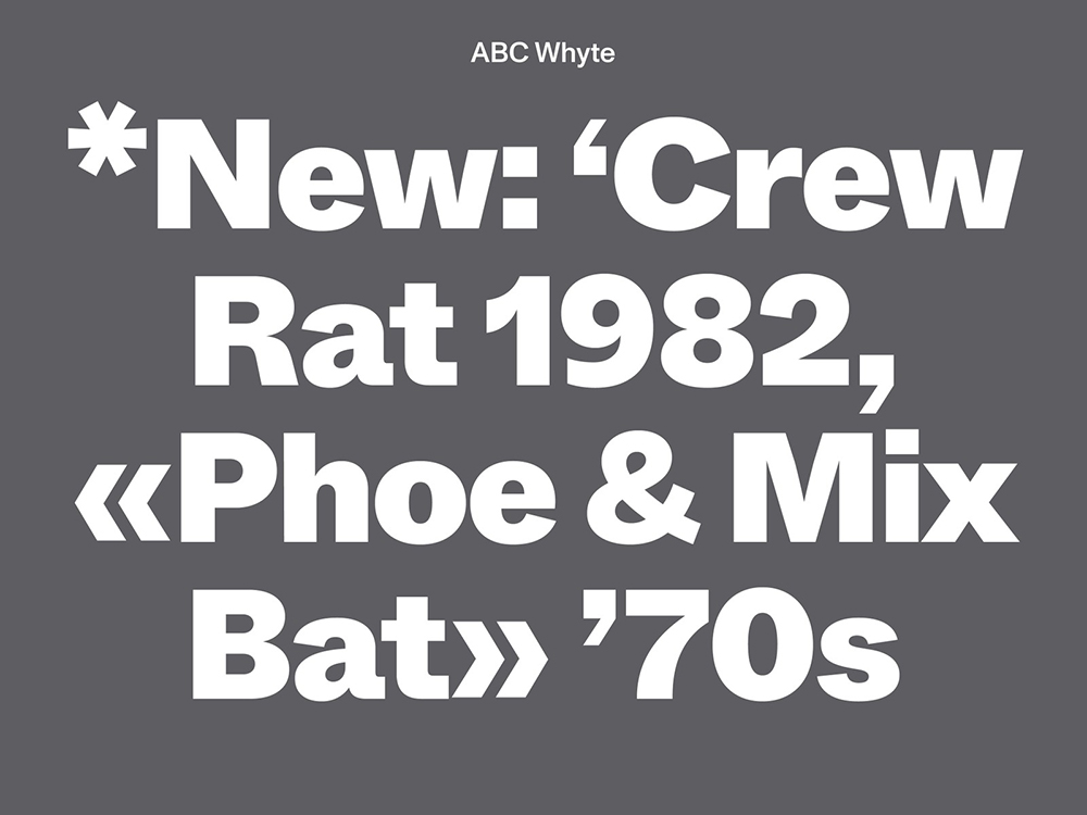
A revival of the sans-serif ABC Whyte by Fabian Harb, this new version by Dinamo has smooth and sharp transitions, and comes in 10 weights with corresponding italics. Most excitingly, it’s a variable font; an innovative and useful technology we’re sure will be super-popular in 2021, now that it’s supported by InDesign.
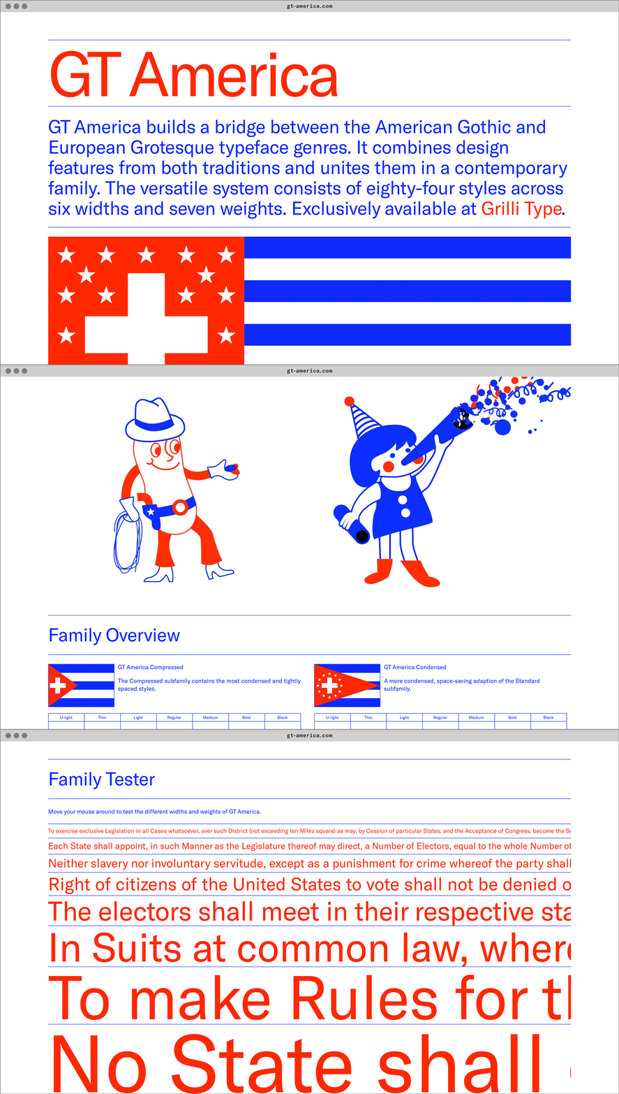
Designed by Noël Leu and Seb McLauchlan, GT America is essentially the missing bridge between 19th century American Gothics and 20th century European neo-grotesk typefaces. Available in 84 styles, it brings together the best design features from both traditions, in the widths and weights where they function most optimally.
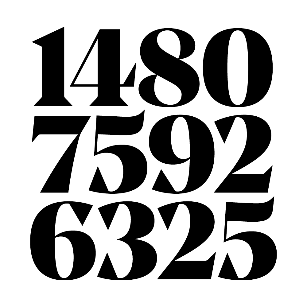
Noe Display is a display typeface with sparkle and bite. What makes it unique is the audacious way its strokes end; large, wedge-shaped serifs come to a sharp point, and arches are capped with prominent triangular beaks. This font’s four weights have a nearly constant hairline weight, offering several degrees of drama and impact, as the stems thicken from regular to black.
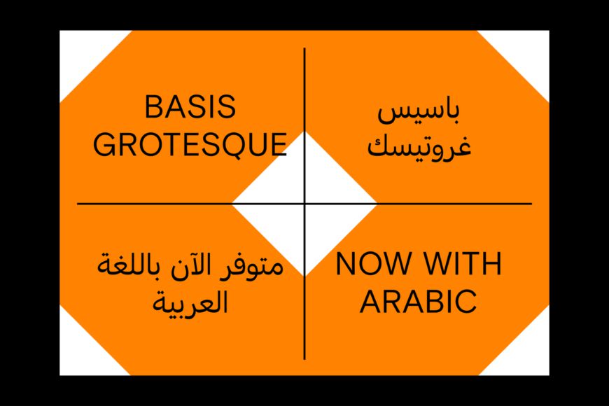
Basis Grotesque was originally drawn in a regular weight for the redesign of photography magazine Hotshoe. Colophon then developed and released the font, three years later, for commercial use. Intentional skeletal similarity among the weights is balanced by a diverse collection of types, and complemented by monospaced cuts in both regular and bold weights, along with partner italics.

Top 20 Fonts: Eksell Display
Eksell Display was a unique serif typeface from 1962 from legendary Swedish designer Olle Eksell (1918–2007). The original letterforms were drawn in Olle’s five metre-square studio in Stockholm, six years after he designed the classic Mazetti eyes. In this version, these letters have been carefully digitised and developed into a family of four optical styles.

Top 20 Fonts: Lars
Sans-serif font Lars is designed to be impartial and versatile. Featuring a stylistic set of rounded glyphs, a ‘footed’ number 1, a simplified ampersand and a case-sensitive feature, this family covers a wide range of languages, and provides great legibility.
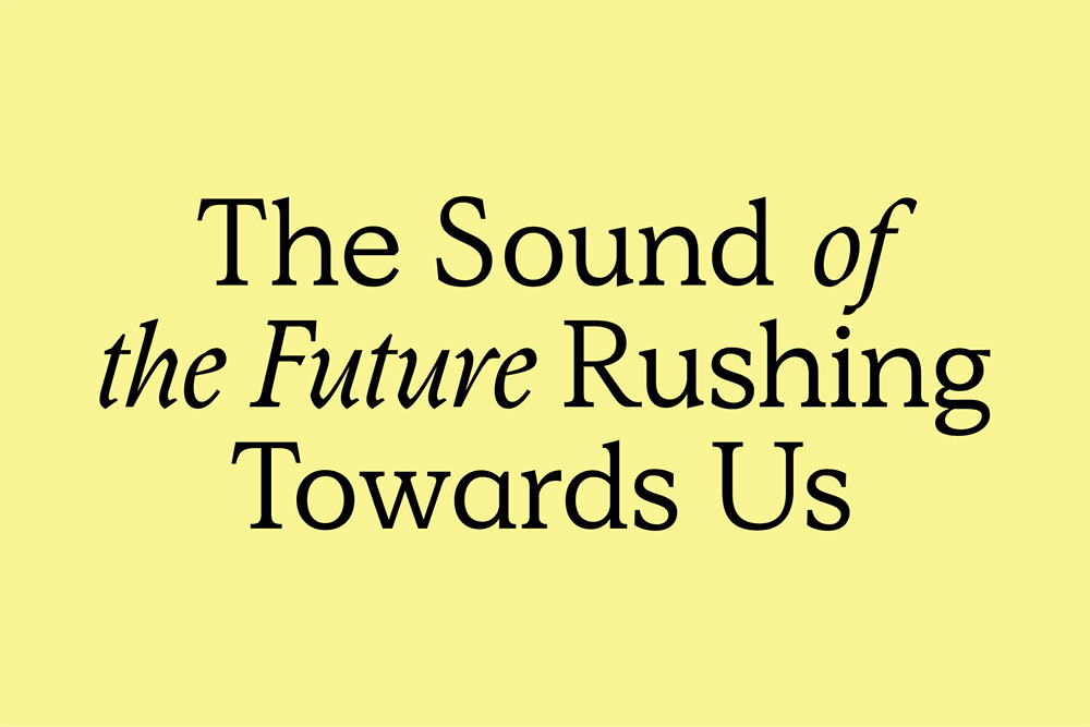
The debut font of artist and designer Justin Sloane, Simula is a serif that’s both functional and unexpected in its small details. The result of four years of drawing and redrawing, this mechanical re-interpretation of calligraphic form flouts convention brilliantly and beautifully.
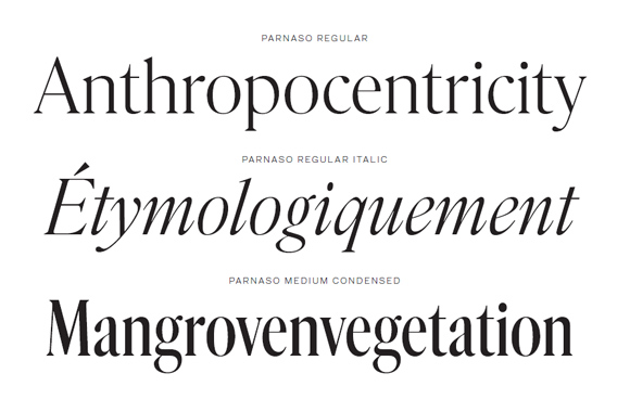
Tight, skinny and humanist serifs are really in vogue at the moment, and here’s a great example. Inspired by the 19th-century revivals of Old Style Romans, Parnaso is a great choice for a display typeface in editorial or advertising work, with its high contrast and sharp details.
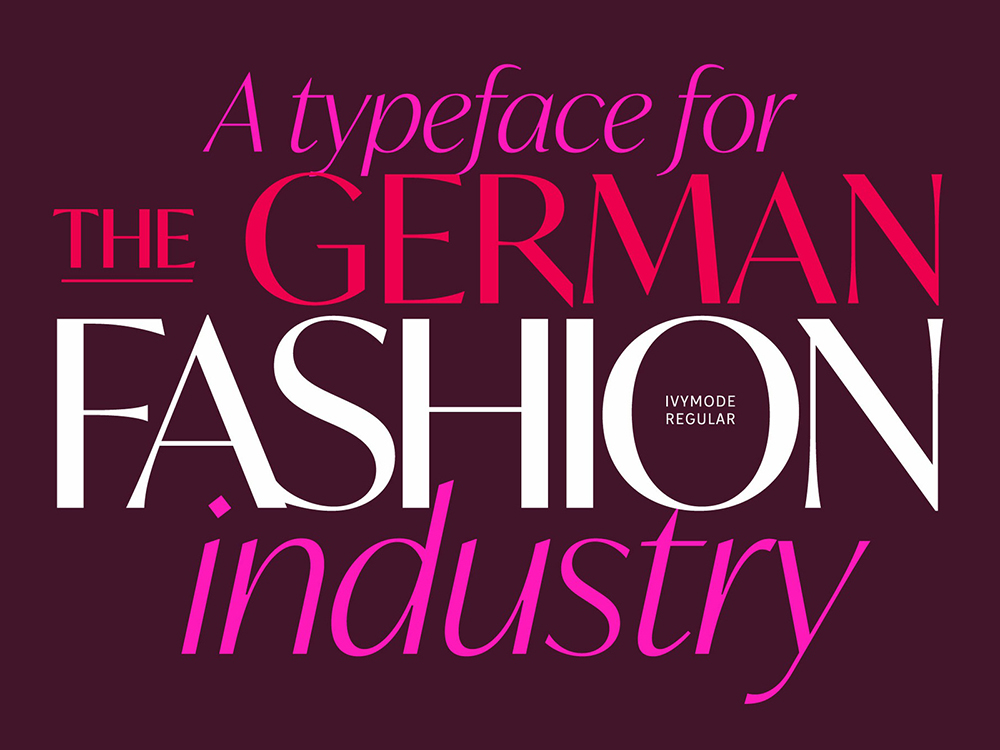
IvyMode is a sans-serif typeface developed especially for magazines by Jan Maack. Available in 10 styles, it’s ideally placed for luxury brands and high fashion. With high contrast and flared stroke endings, the family is available in five weights with matching italics.
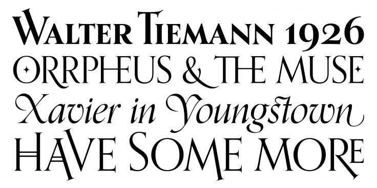
Orpheus by Canada Type is inspired by two serif typefaces originally designed by Walter Tiemann in 1928, which became popular within packaging and entertainment design. With a flowing italic design that’s strongly influenced by calligraphy, Orpheus combines classic Roman proportions with art deco sensibilities.
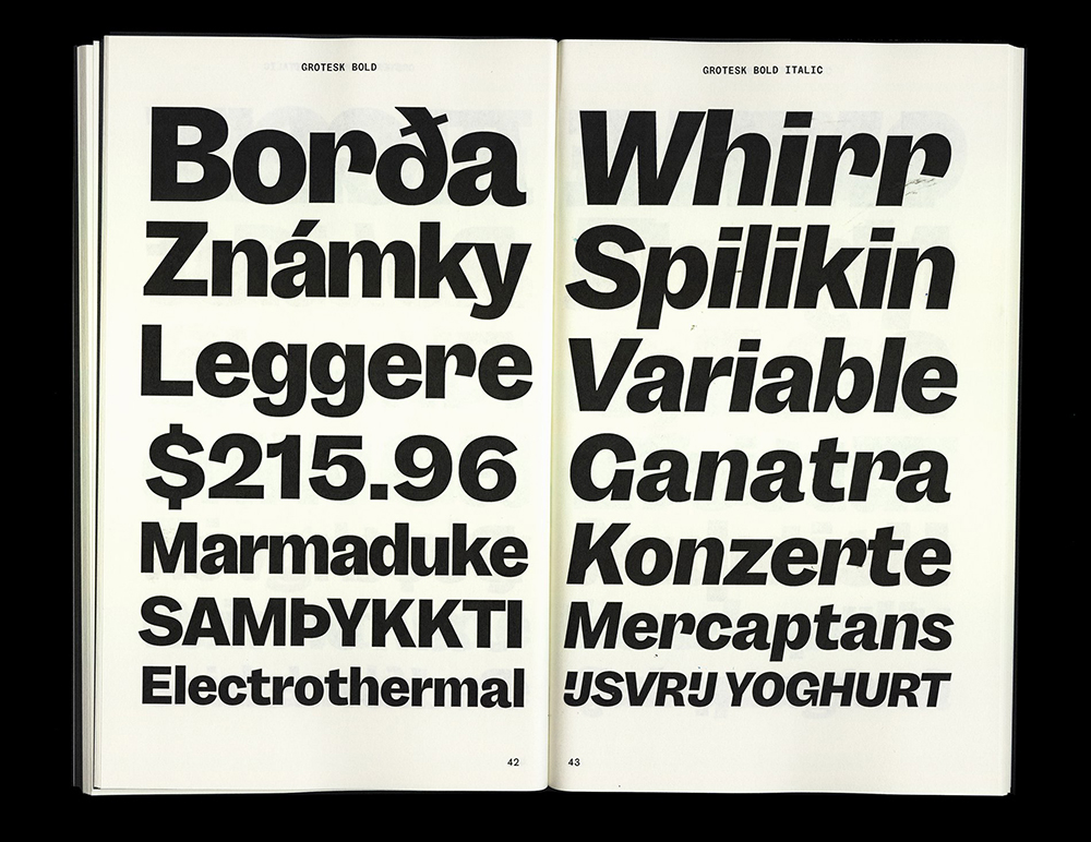
Garnett is a sturdy, contemporary grotesk designed by Connor Davenport and published through Sharp Type. Inspired by the quirky grotesques of nineteenth-century Britain, and influenced by American Gothic, the family is available in six weights with matching italics.
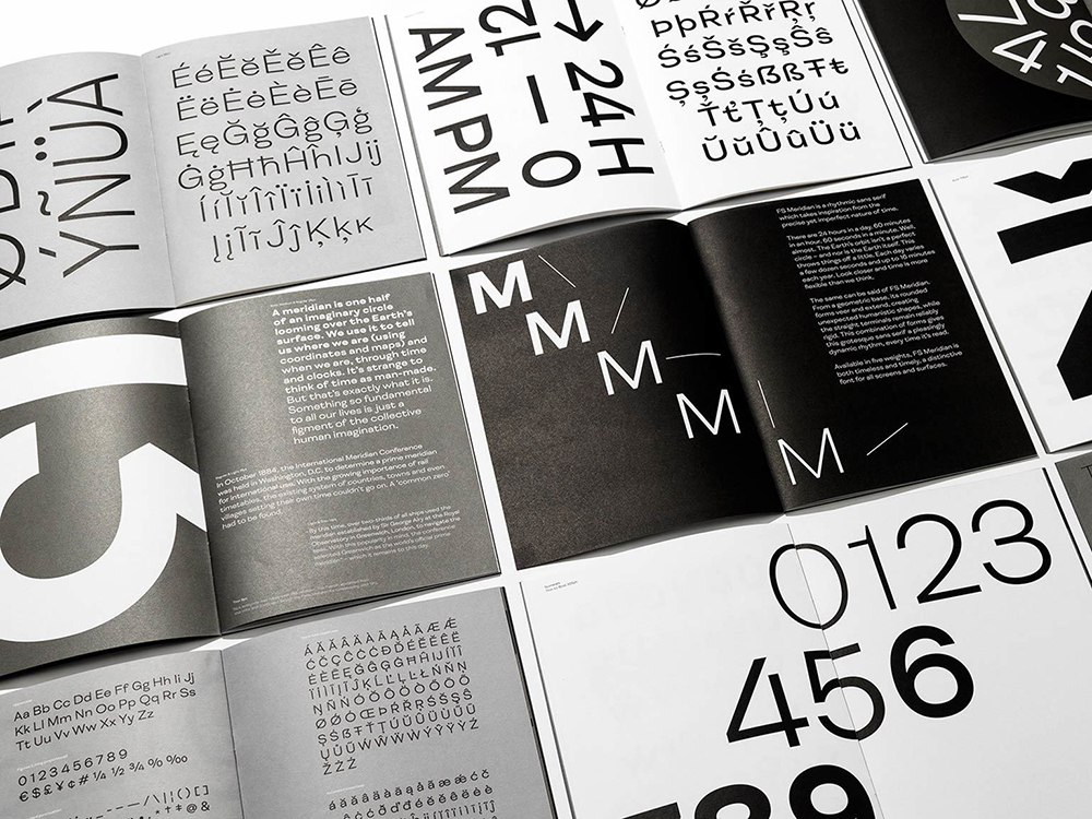
A geometric grotesque, which takes inspiration from the precise yet imperfect nature of time (hence the name), FS Meridian is bang on trend. This rhythmic typeface boasts a wide monoline appearance, humanistic elements and extended forms.
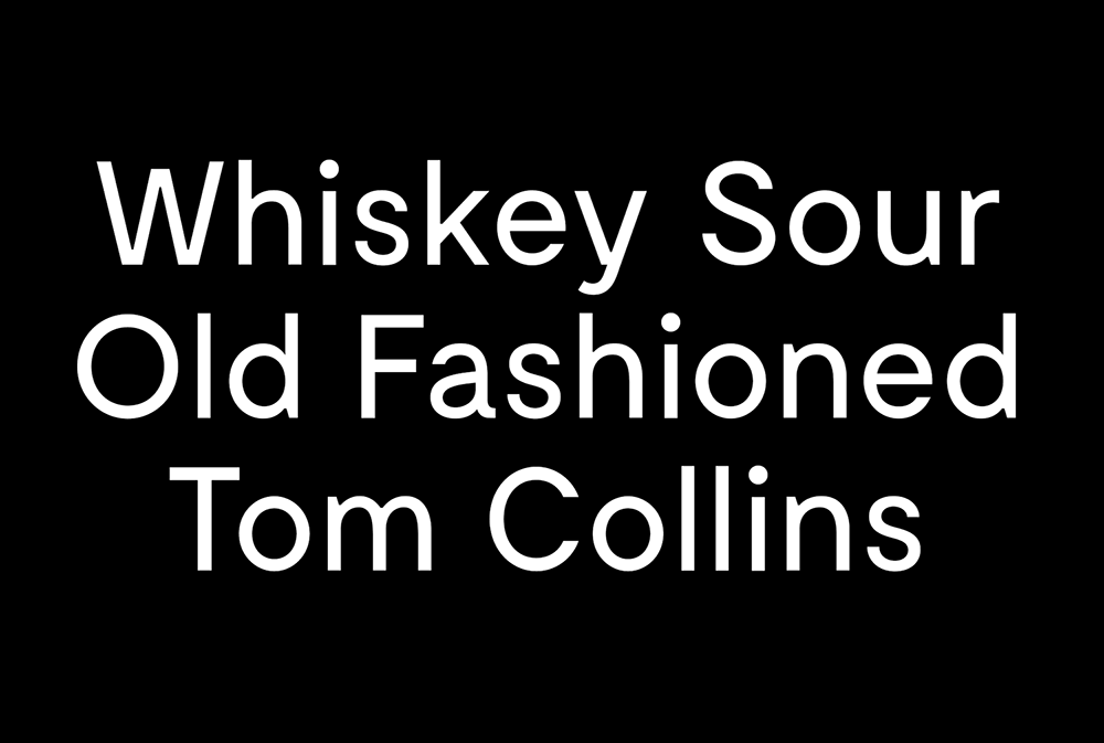
Moderat is a geometric sans-serif characterised by low stroke contrast, closed apertures and angular details. Suitable for both body copy and display type, the font consists of 42 styles, ranging from thin to black in three widths (Condensed, Standard and Extended), with corresponding Italics and six mono styles.
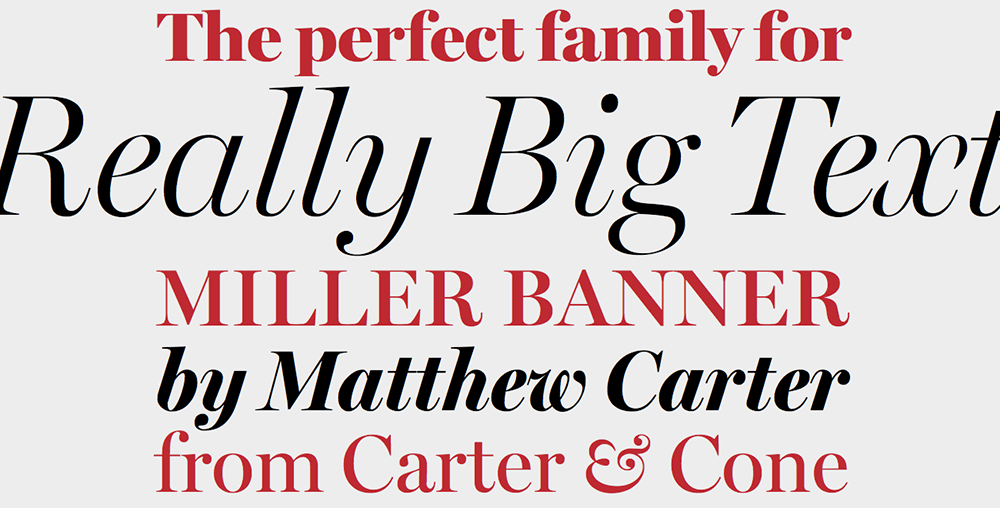
Miller Banner is an evolution by Richard Lipton of Matthew Carter’s popular Miller series that’s been optimised for very large settings. With sharpened hairlines and more dramatic contrasts, it’s perfect for use in banner headlines and titles.
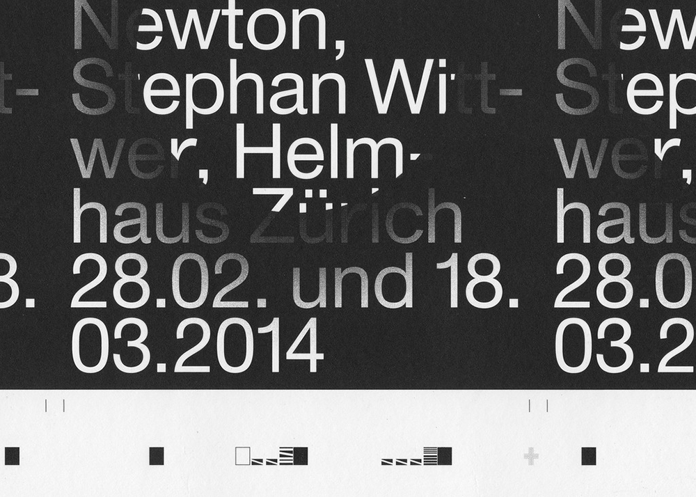
ABC Monument Grotesk is a confident font with a defiantly raw and unpolished feel. Featuring unrefined and idiosyncratic shapes, it’s available in seven different weights, including italic, mono and semi-mono cuts, as well as heavy and black with corresponding italics.

Top 20 Fonts: Bely
Bely is an adventurous serif font designed by Roxane Gataud that features sharp, triangular serifs and open apertures. It’s available in two weights with matching italics, along with the display font Display, which features a marked degree of contrast between its thick and thin strokes. See it in action in Shillington student Ella Dawson’s Altrincham project.
Want to get hands on with some of these beautiful fonts? Study graphic design with Shillington and graduate in three months full-time or nine months part-time in London, New York, Sydney, Manchester, Melbourne, Brisbane or Online.
https://www.shillingtoneducation.com/blog/top-20-fonts-2021/