


I love the work of the Concept Arts advertising agency.
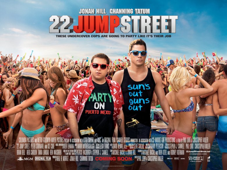
The type package in this particular project 22 Jump Street looks similar to what they would use on a NBA jersey. It’s definitely a contrast to what both characters are wearing. The use of shadowing in the title gives it a nice dimension and hierarchy to the sub heading. The actor’s names still stand out even when they are placed smaller on top of the movie title. ‘Jump’ being red adds so much depth and yet doesn’t take away from the whole title.
Location: Los Angeles, United States
Link: https://www.conceptarts.com
