February 15, 2020
For the first in this new series of Fonts in Focus, we visited the New York offices of Hoefler & Co. For this second installment, we remain in New York, just fifteen minutes’ walk from Broadway to Lafayette street and the stateside offices of Commercial Type, established in 2007 and headed by Christian Schwartz in New York and Paul Barnes in London.
Commercial Type has been pretty busy with a spate of new releases, including an entire offshoot sub-foundry, Commercial Classics, dedicated to reviving and reinterpreting historical types. However, good that they are, today’s episode is dedicated to an earlier release, that somehow I entirely overlooked.
Saint Paul & the Stencils
Only in recent years have I come around to stencil typefaces. I was never particularly enamored of them, until the release of several especially good and novel examples. Also, reading James Mosley’s charming tribute to stencil lettering, warmed me to the genre. Not quite a Damascene epiphany, but you might say I’m a recent convert — hallelujah!

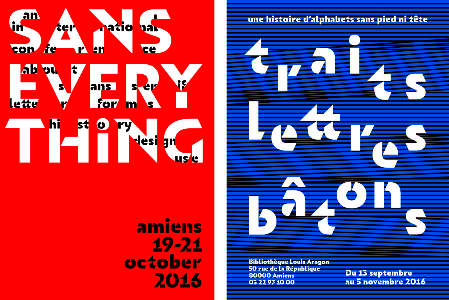
Let’s start at the beginning. Orientation was designed in 2015. It was commissioned as a way-finding system for student housing in Roubaix, France. As the letterforms would be painted onto the exteriors of buildings, the client stipulated stenciled letterforms. Designed by Sandrine Nugue in Paris, Orientation was published by Commercial Type at the end of 2018.

When you decide to draw a stencil typeface, one of the major decisions surrounds how you will slice the letterforms (some call these missing parts or slices, pylons). Where strokes join and overlap (juntions) is an obvious starting point, but that alone will produce a regular typeface that has been dismembered. I’m a huge fan of how Sandrine has chosen to slice up her letterforms. It’s pretty obvious that the slices are not arbitrarily imposed on an existing design but were planned from the outset. That’s not to say that regular letterforms cannot be successfully ‘stencilized’ — good type designers can do that; but when the missing parts of letters become building blocks (albeit invisible) from the get-go, then it really shows in the final design.

Most often, in stencil types, the cuts are rectangular. In Orientation, all the cuts are v-shaped and pretty large. Perhaps my favorite feature is how those cuts sometimes substitute or double-up as counters (enclosed space within letterforms); for example the v-cut in the letter a doubles as a counter; in the letter e, it resembles its eye (see figure above).

In 2019, Orientation was awarded the Certificate of Typographic Excellence from the Type Directors Club. I’m hoping to see it used more in editorial design settings, on posters and, of course, for signage and wayfinding. Something that might surprise you, is how well this typeface performs at relativey small sizes, where the slices and negative space really comes into its own in shaping entire words. That being said, Orientation is not your grandmother’s stencil type, and is happiest when served up big and bold.

Sandrine Nugue’s Orientation is available in three weights, with matching italics, from Commercial Type.

