Welcome to our monthly roundup of typography, fonts, branding, and graphic design news and inspiration. From Pimp my Wordle and missing webfonts to interviews, must-read books, and design trends — it’s all in the Month in Type.
We’re proud to have the brilliant Blaze Type sponsoring this February edition of the Month in Type. Be sure to check out their foundry page and Osmose.
Font Fashion Week
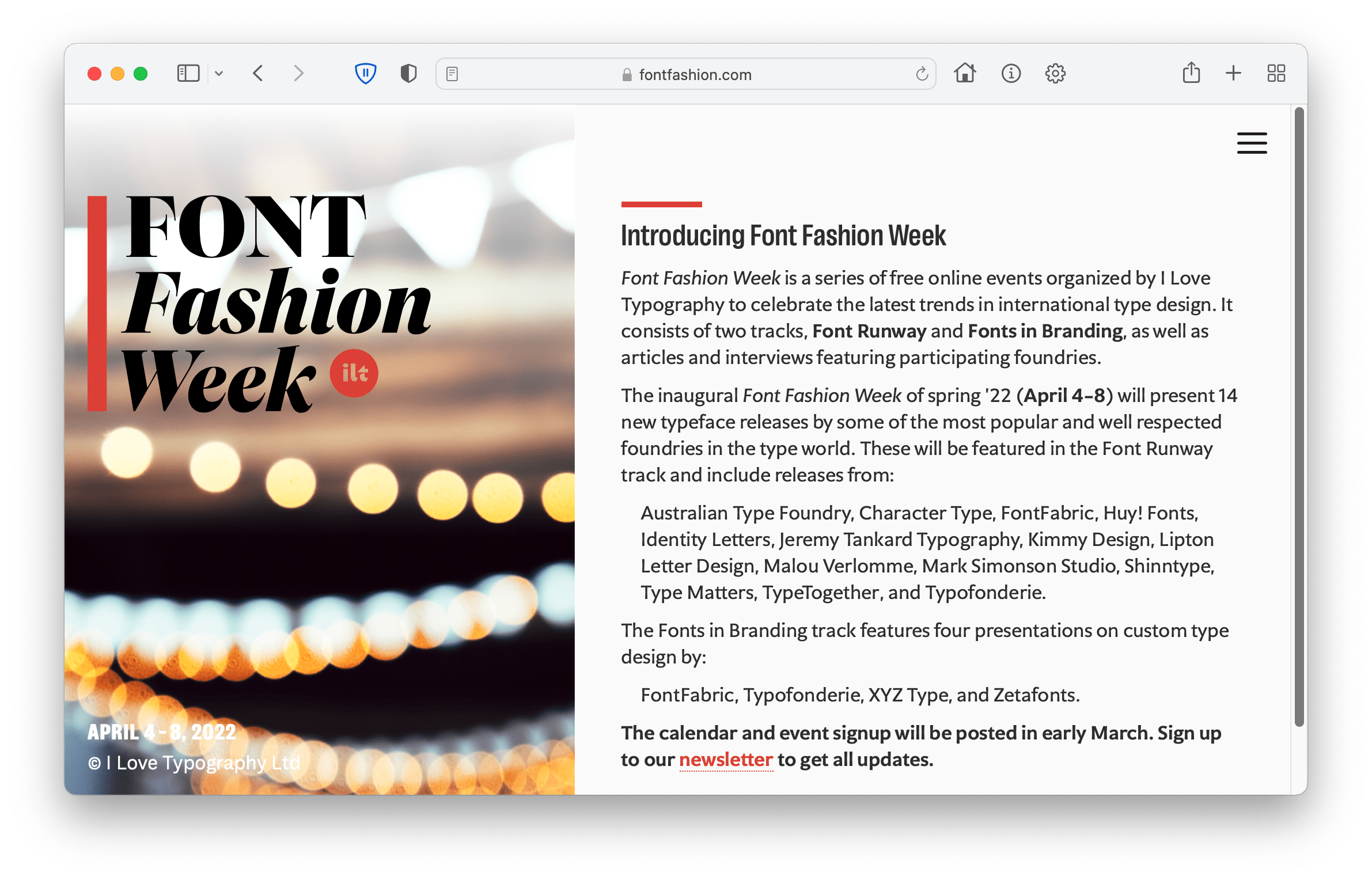
If you missed January’s Month in Type, then catch up here. But before we get to news in general, we have some pretty exciting news of our own: We’re thrilled to announce our first Font Fashion Week which will take place April 4–8. See our Font Fashion microsite for more details. We’ll be posting a full schedule of events in early March.
Typographic Inspiration
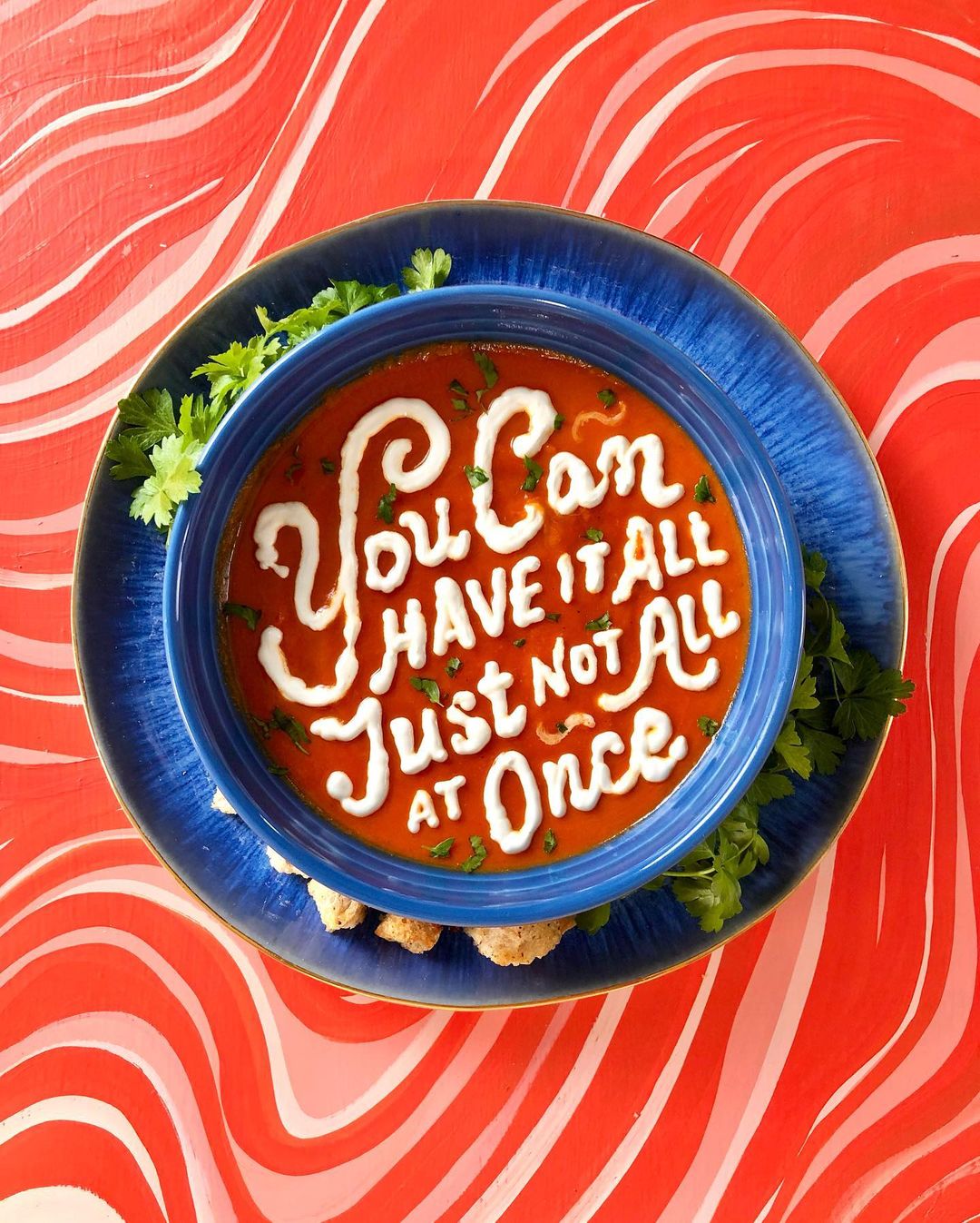
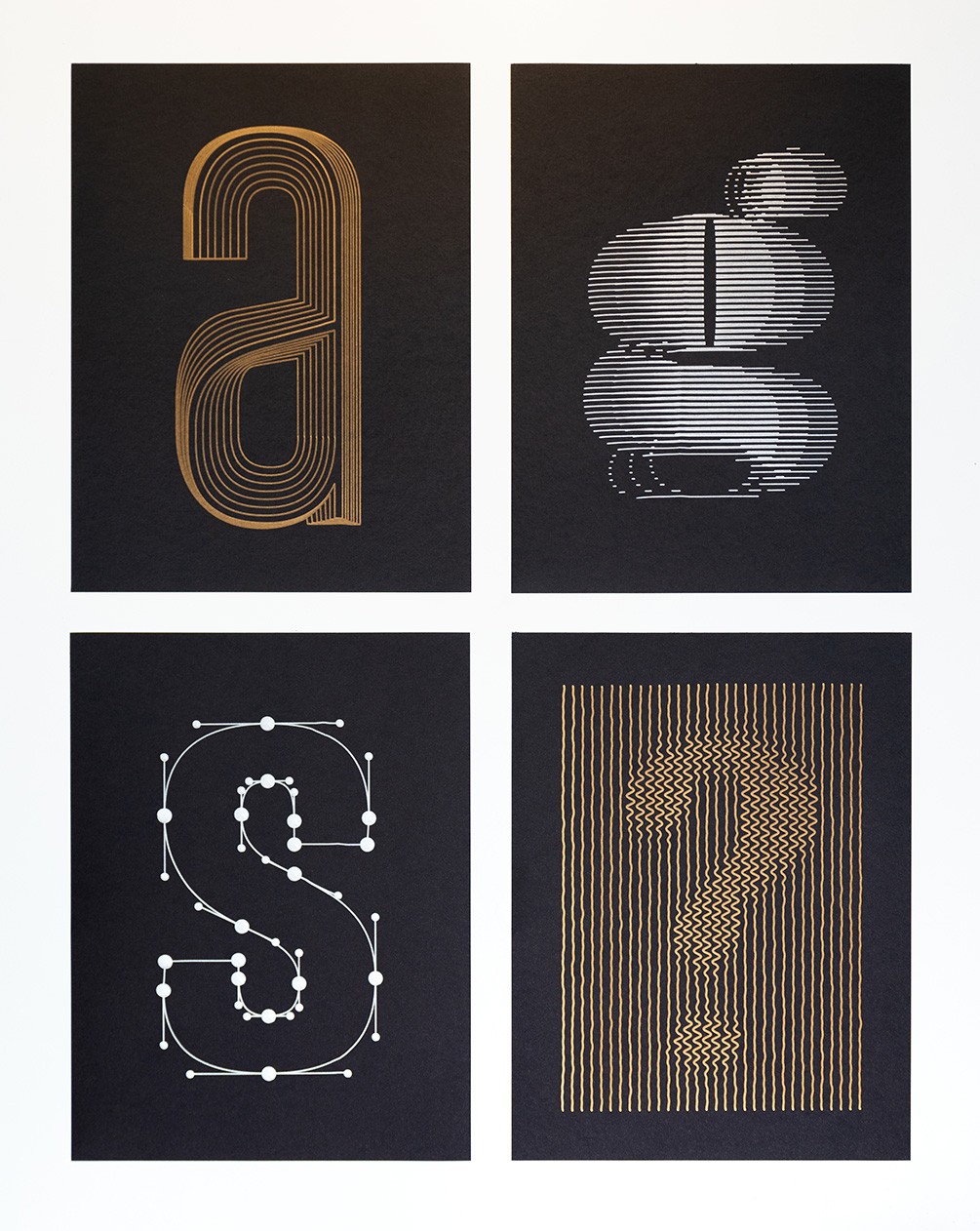
Let’s kick off with some typographic and graphic design inspiration. First up, and as I’m an unabashed fanboy of Lauren Hom, here are some more of her typofoodagraphic delights:
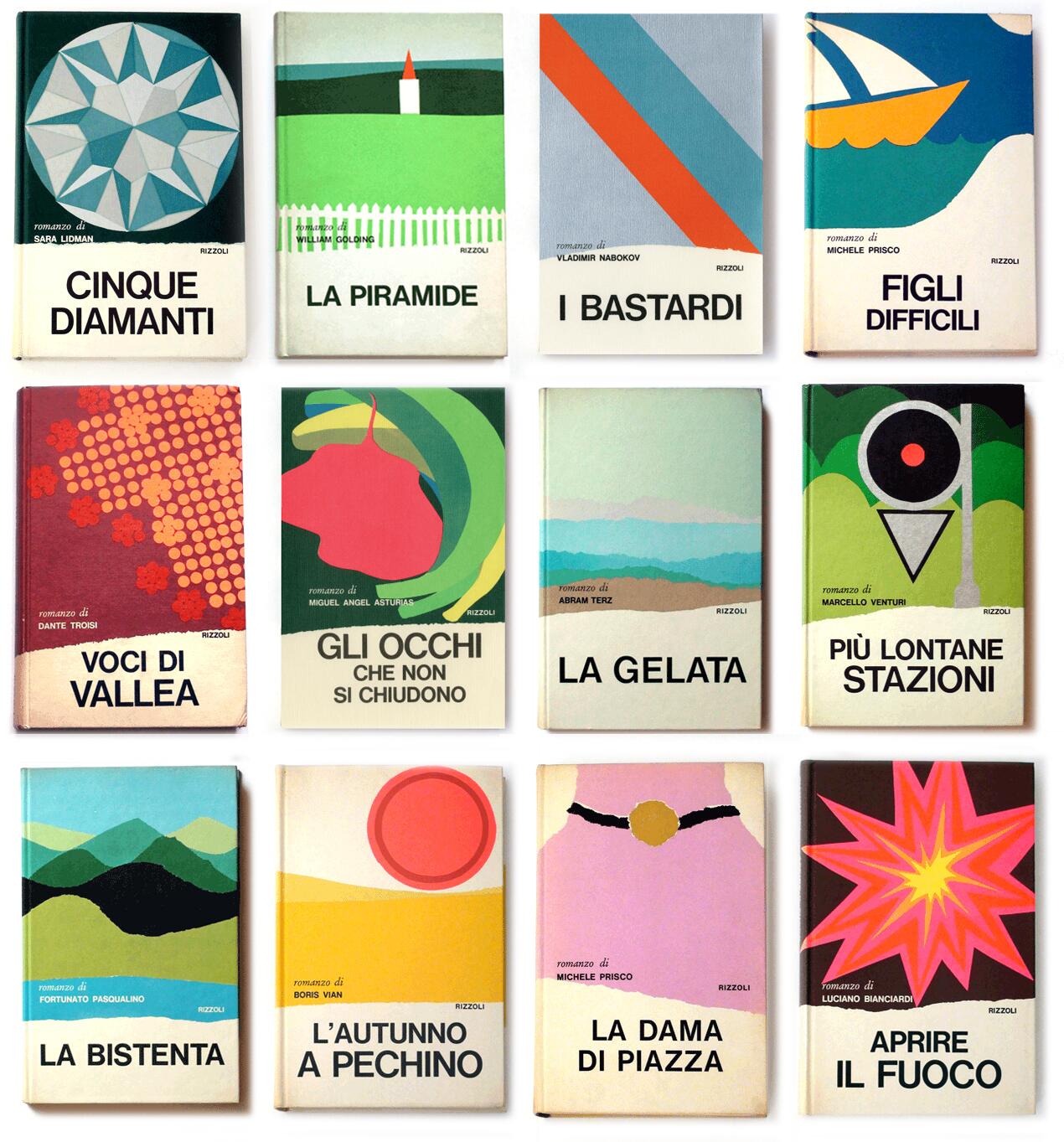
A reminder of just how good Mario Degrada’s 1970s covers for Rizolli were:
I’ve also begun pinning his best covers to our Mario Degrada Pinterest board, so follow us there.
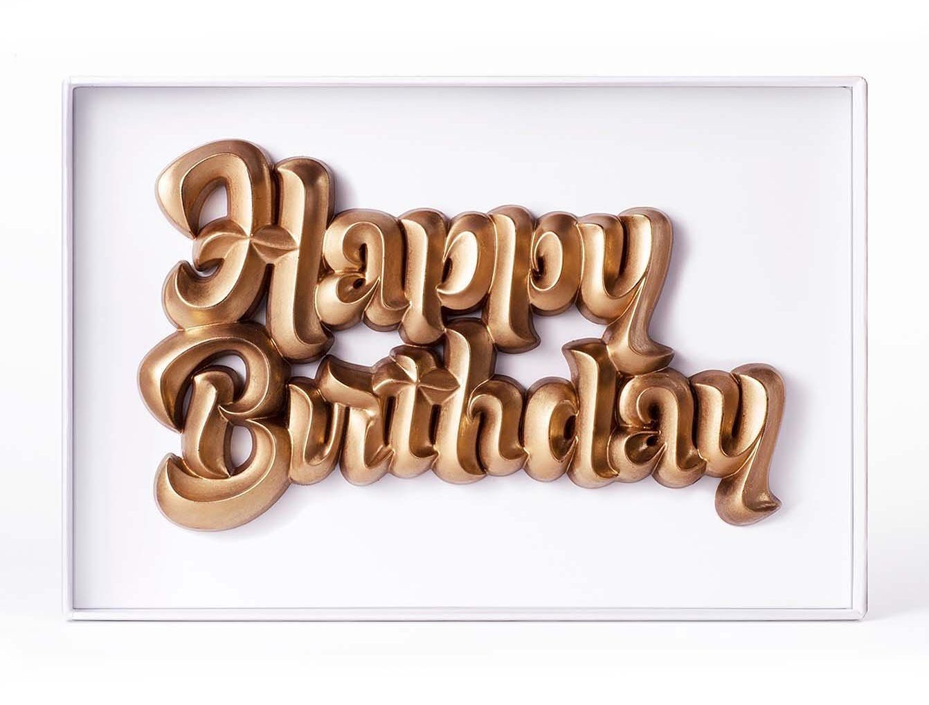
For fans of chocolate + type, say hello to Choco Letters:
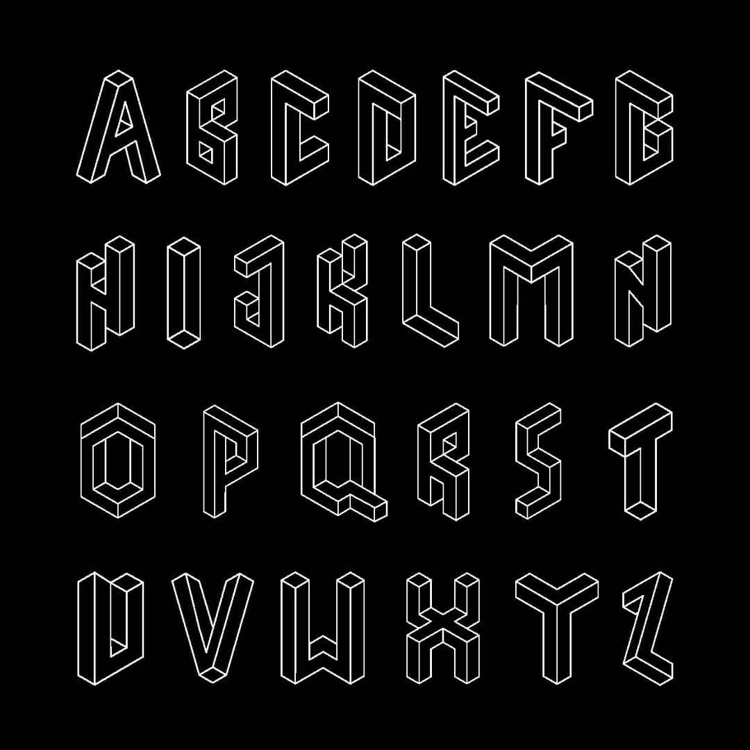
A very cool Escheresque isometric alphabet by Fleta Selmani:
Branding Inspiration
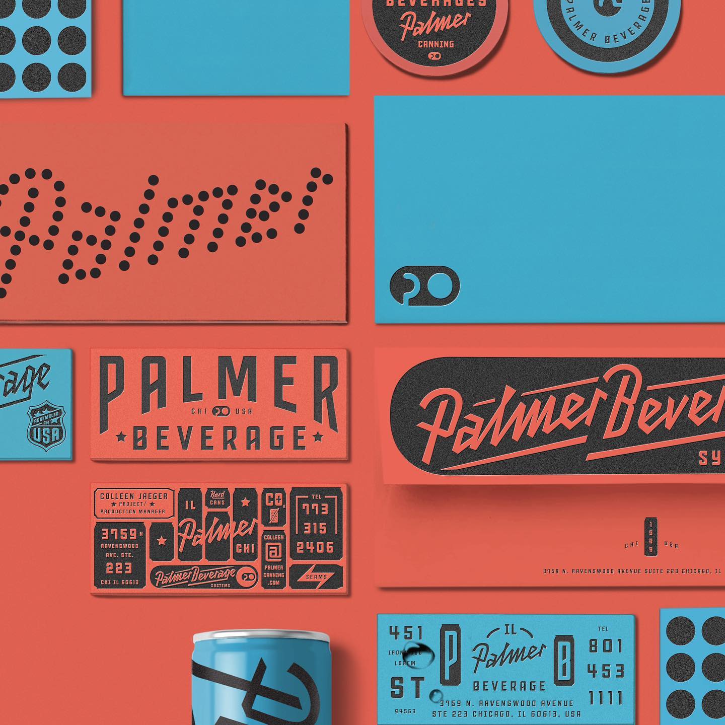
Wonderful rebrand for Palmer Beverage by Kevin Cantrell Studio. Love the palette and typography:
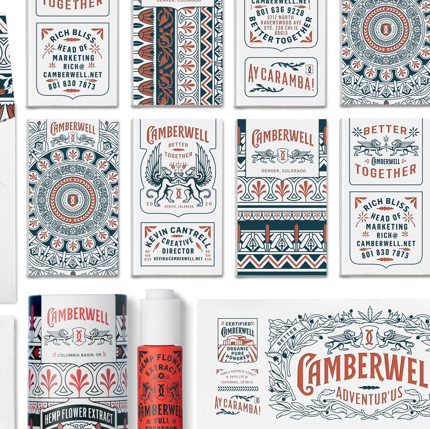
While you’re there, check out their branding work for Camberwell stationery:
Some cool new posters from Rosetta:
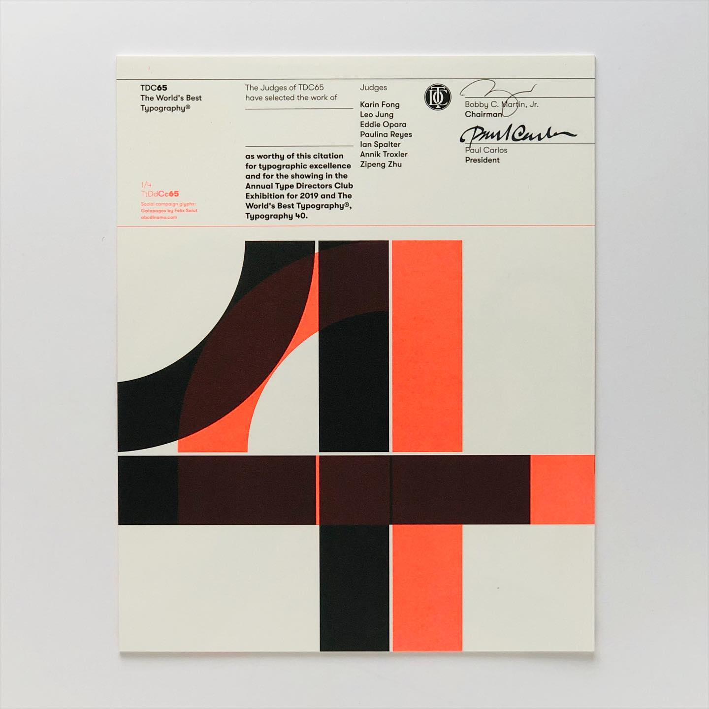
I’m not much interested in awards, but I love this TDC awards certificate from a few years back. Designed by BOND.
New Fonts
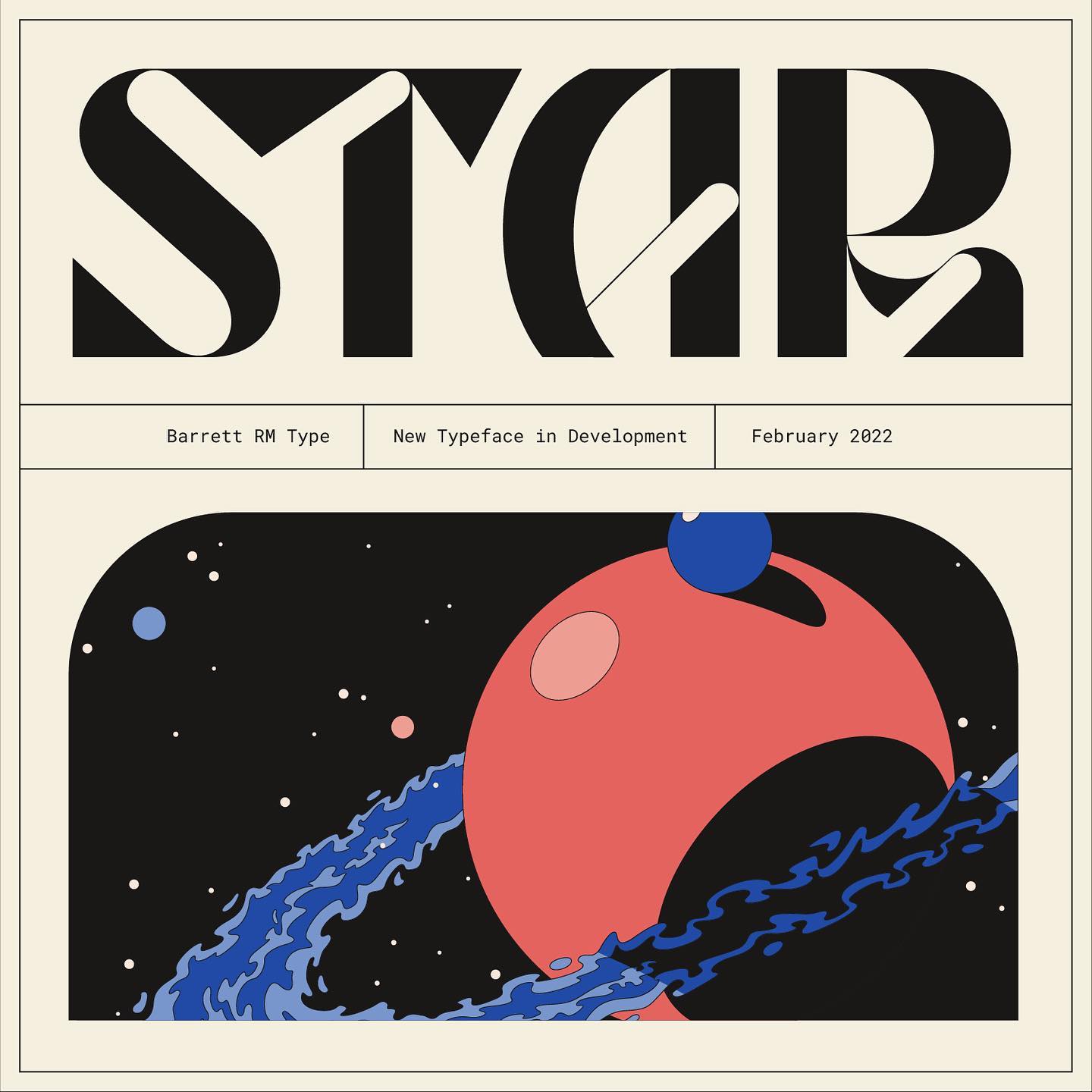
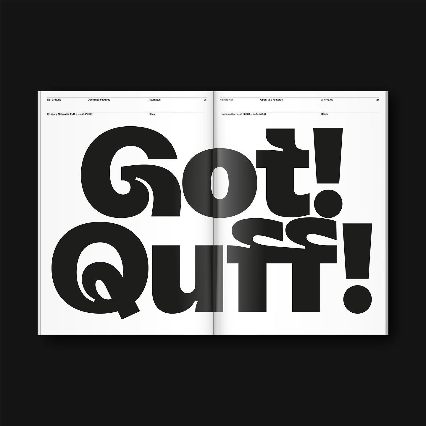
The new Wren Display from Barrett Reid-Maroney:
And be sure to check out new releases on ILT, including Sisteron and Astronef Super.
Streco v0.1 by Sophia Tai, a heavyweight geometric reversed contrast typeface:
Fonts on Things
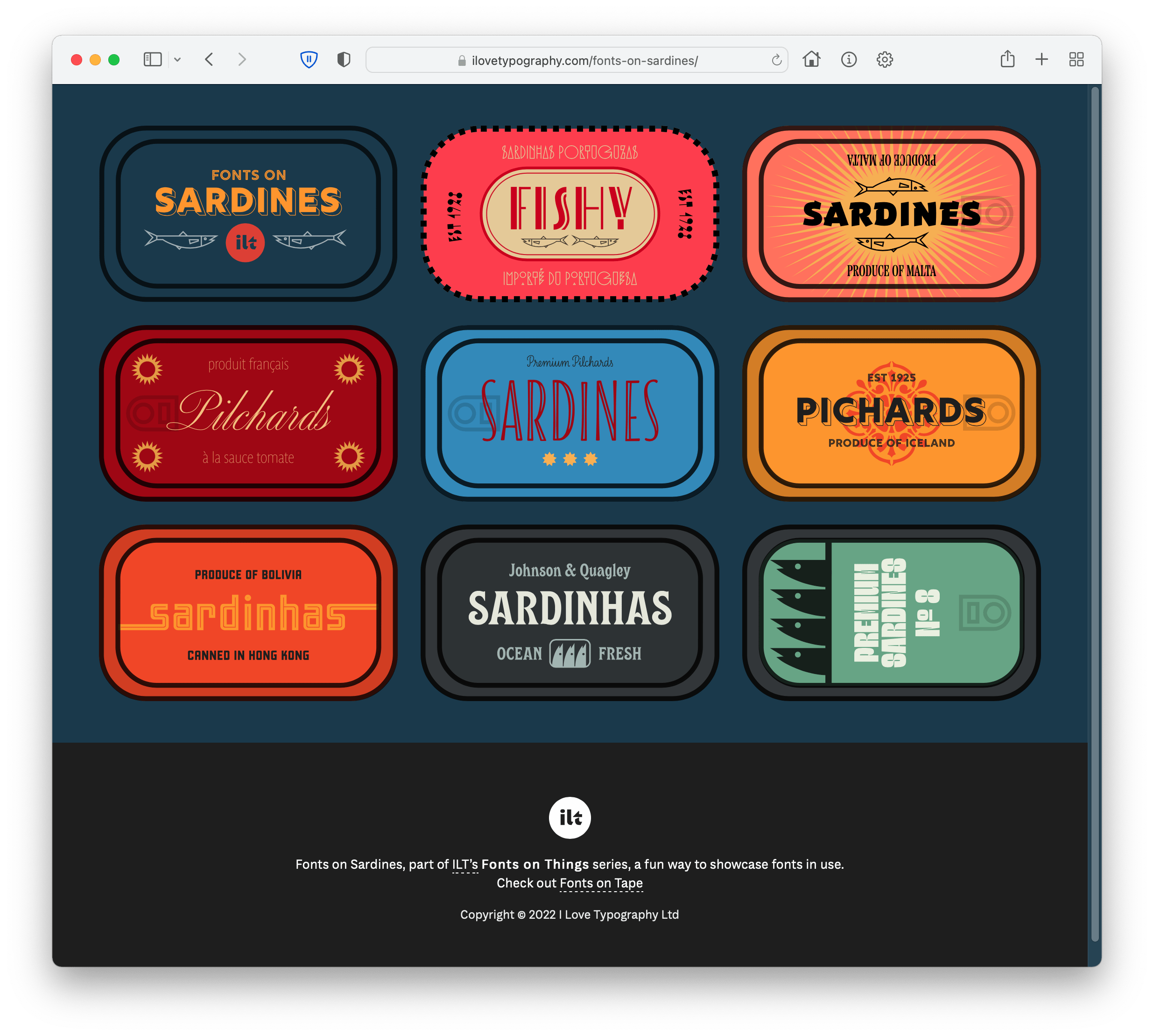
The second in our Fonts on Things series, our fun way to showcase great typefaces. After the huge success of Fonts on Tape, may we present Fonts on Sardines. Tap or hover to flip the tin and discover which fonts we’ve used.
Reading List
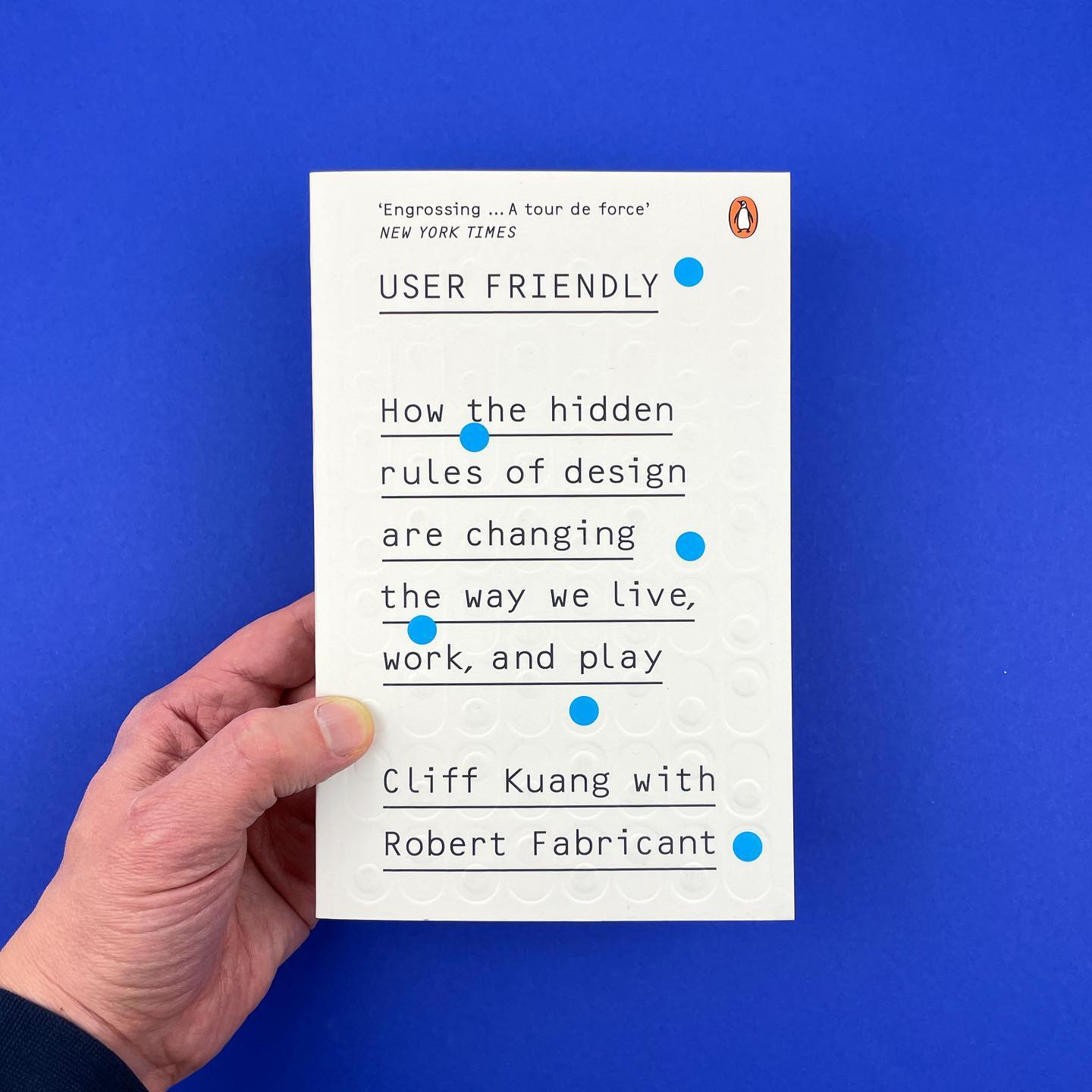
Some design reading to catch up on. First is User Friendly by Cliff Kuang and Robert Fabricant. Cover design by Rodrigo Corral Studio.
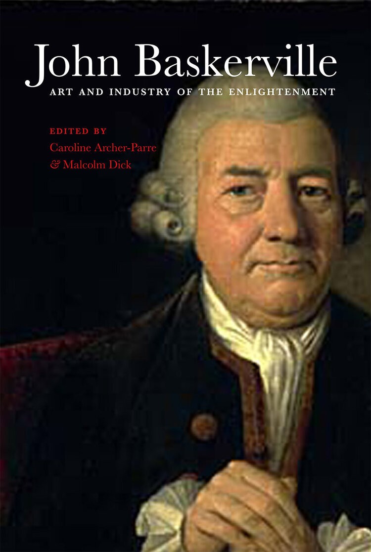 Not sure how I missed this one. Goes straight to the top of my wishlist: Dr Caroline Archer’s (ed.), John Baskerville: art and industry of the Enlightenment. From the blurb: His typographic experiments put him ahead of his time, had an international impact and did much to enhance the printing and publishing industries of his day.
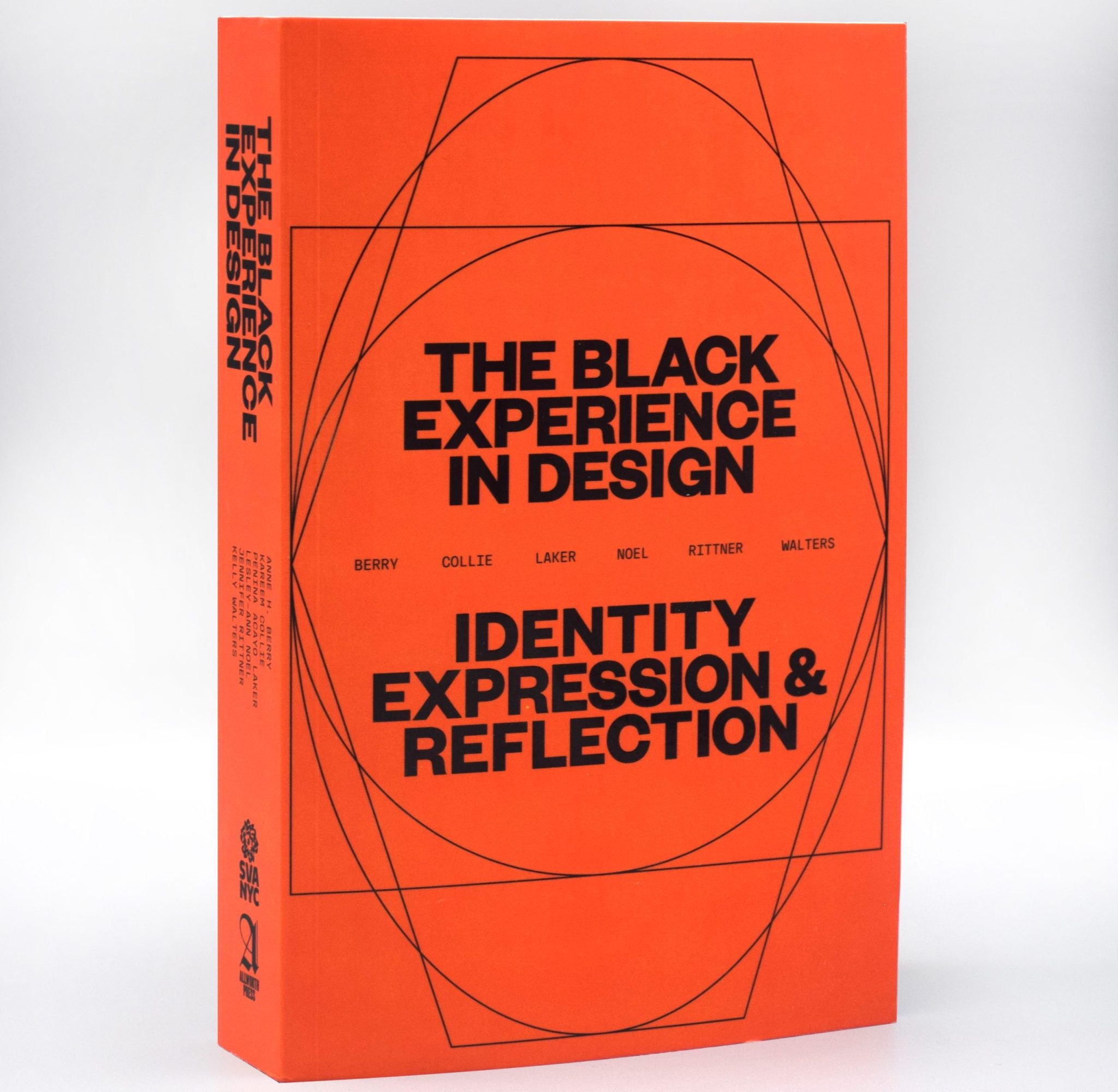
Steven Heller takes a look at a new book from Allworth Press, The Black Experience in Design, a collection of essays, articles, interviews, and case studies. Essential reading for design students.
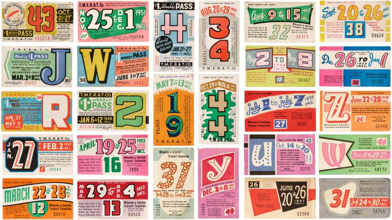
Stephen Coles on Milwaukee Transit Passes. Beautifully presented article too:
On the Socials
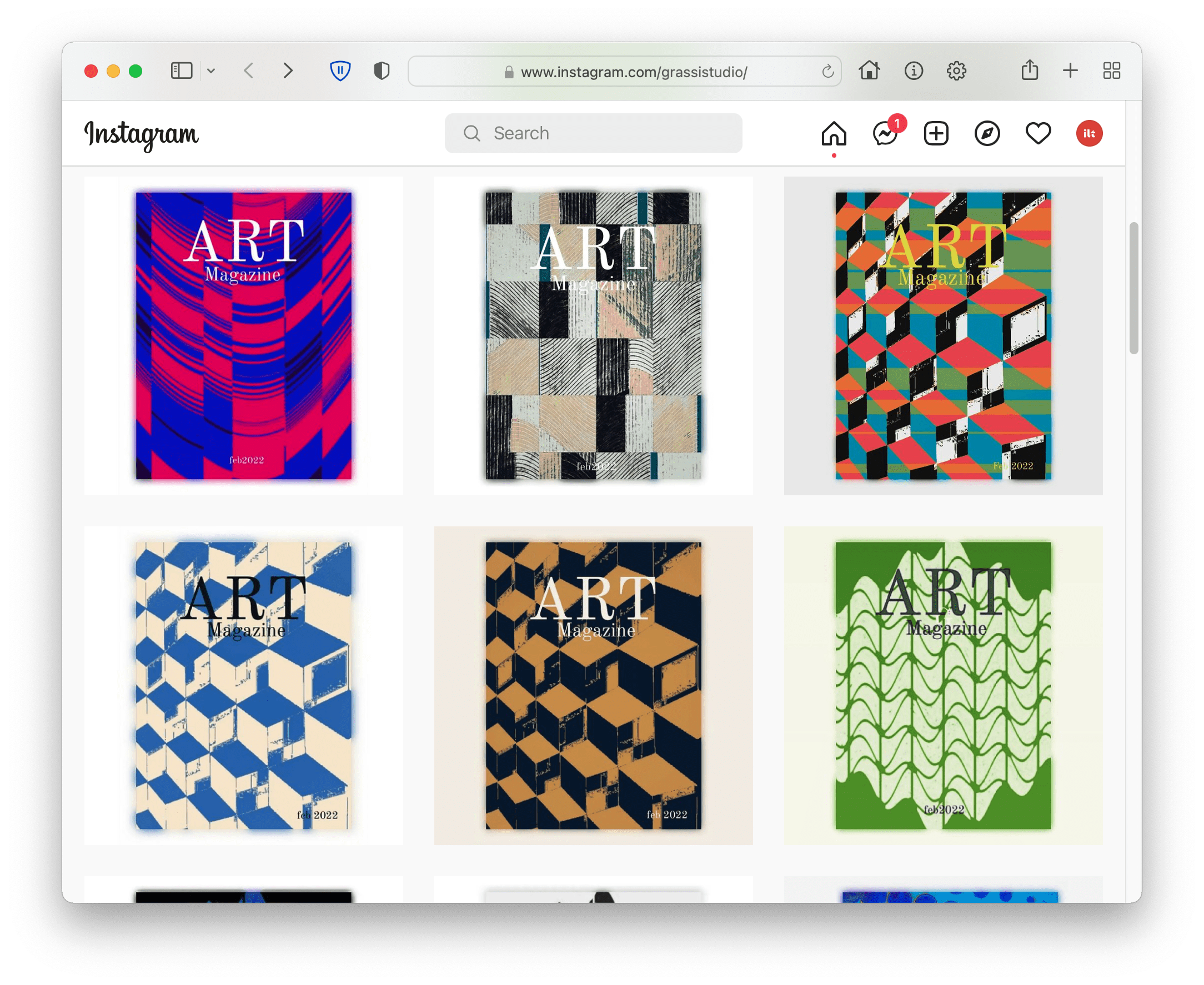
Must-follow design accounts: The Studio of Gregor Grassi:
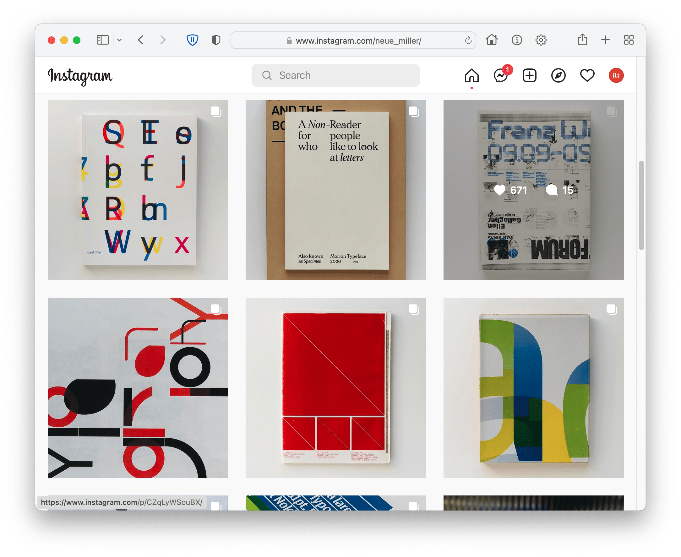
Tons of great work and inspiration in Hugh Miller’s Instagram:
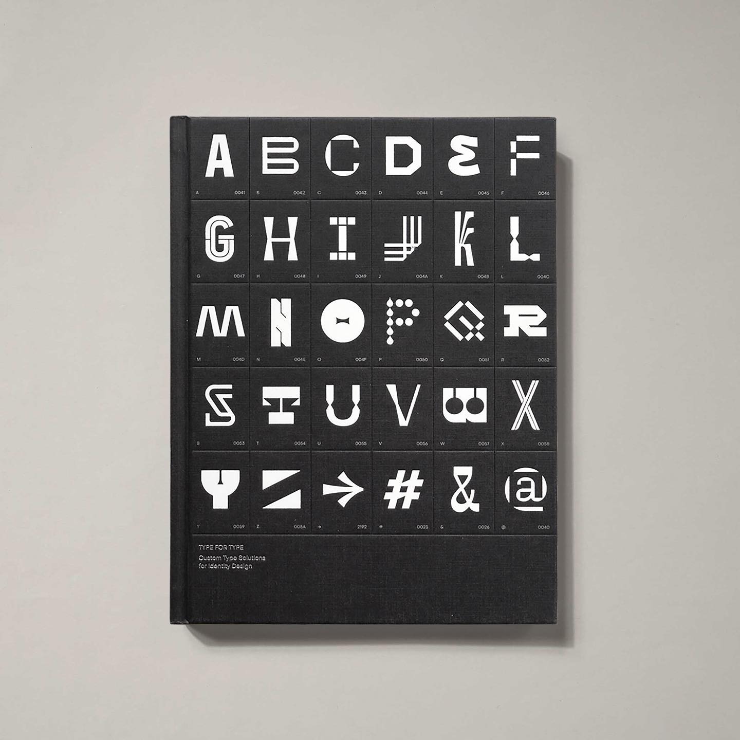
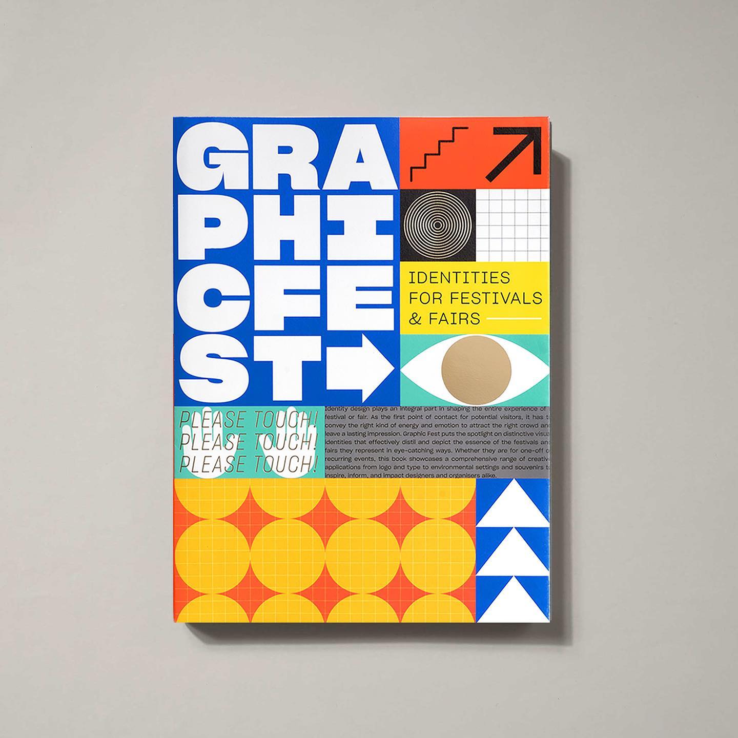
Publishing and book design by HK-based Victionary:
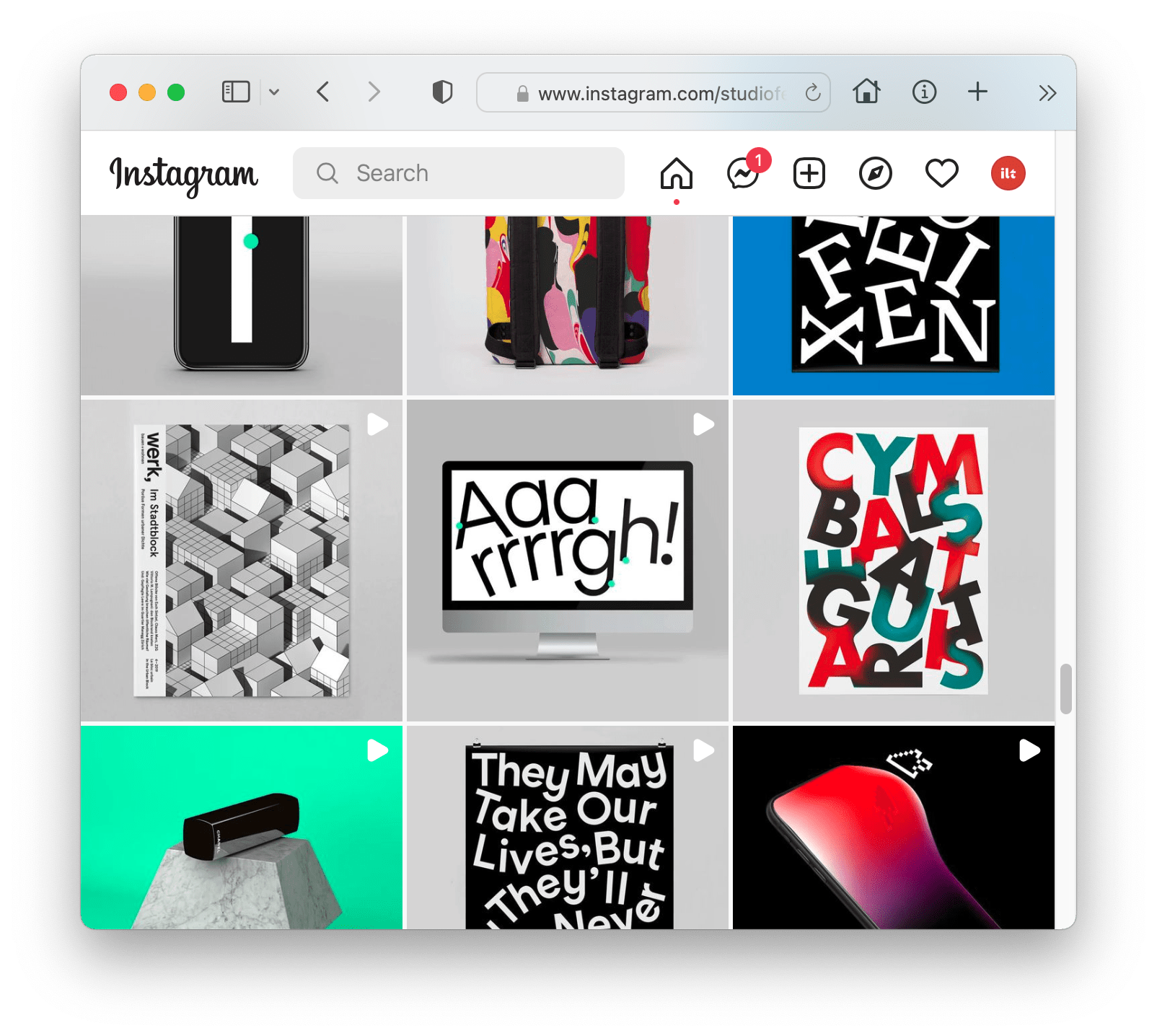
Studio Feixen, an independent Design Studio based in Lucerne, Switzerland:
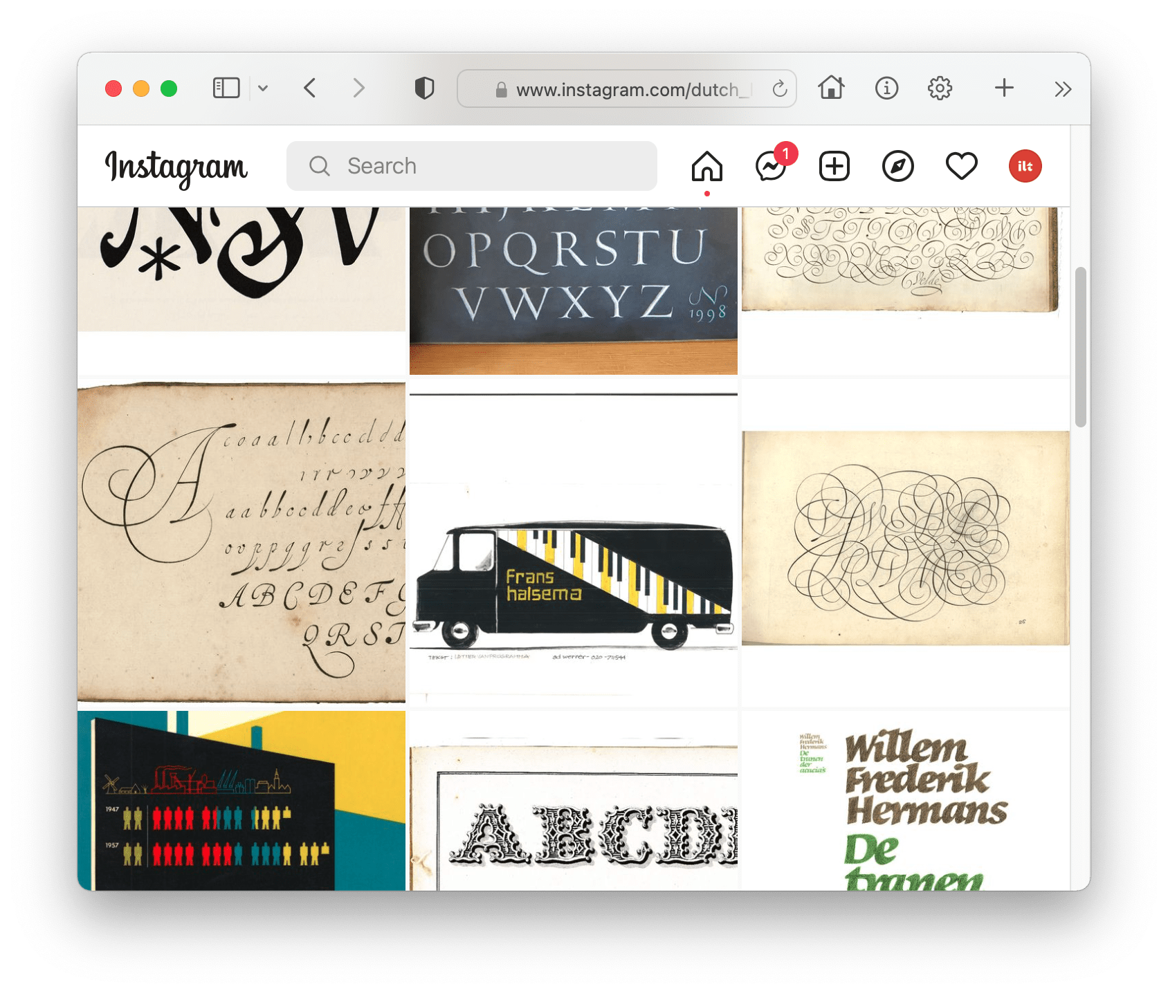
Dutch lettering history, curated by Mathieu Lommen:
Pimp my Wordle
The Wordle Font no one can see. Oliver takes a look at getting your font stacks right, missing webfont files and the word game that everyone’s playing.
Listen & Learn
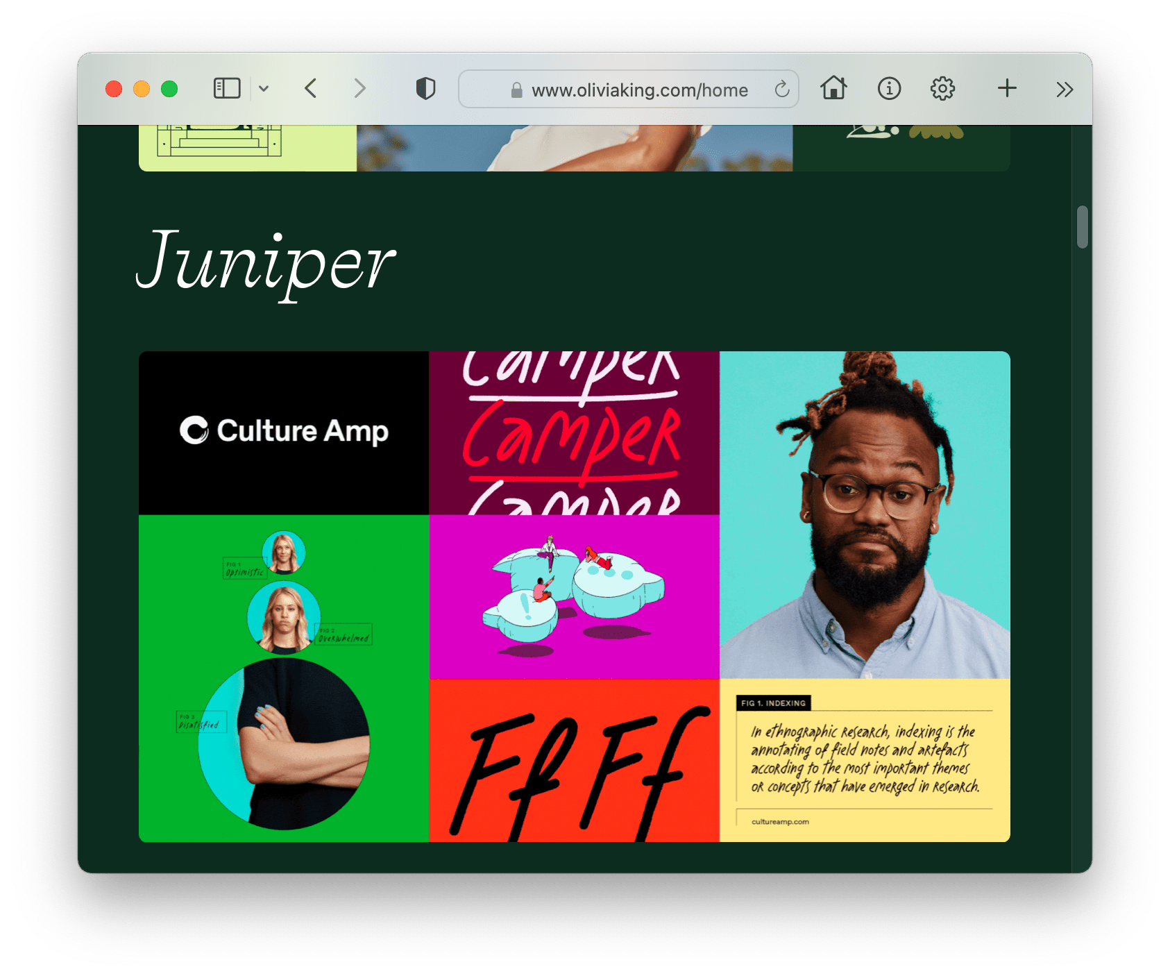
Olivia Kane interviews Australian design director and type designer, Olivia King.
Featured Free Font
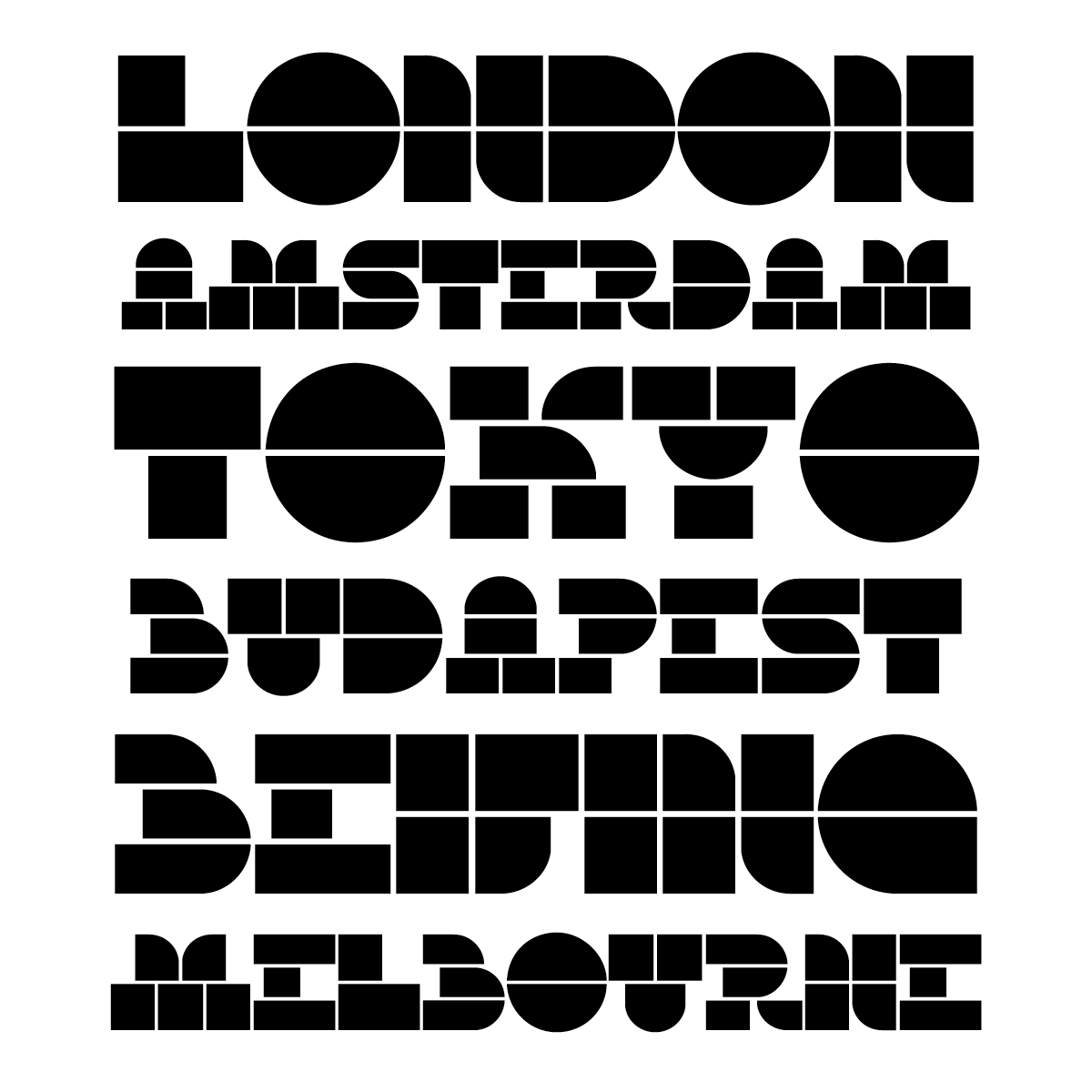
Let’s wrap up this episode with something free and fantastic: Milka Regular is this month’s featured free font. A fat stenciled gem of a typeface from the fine folk at Lettersoup. Download it from the ILT store now.
Thanks for joining me. I’ve now begun adding back issues of MIT here. You might also want to read our other monthly columns: Steven Heller’s Font of the Month, Hot New Fonts, and Featured Fonts. And, if we can do anything to help, just ask. We’re here to help!
pssst! If you have something you’d like to see featured in the next Month in Type — even your own work! — then email us here: MIT@ilovetypography.com


