The heart of the iPhone X‘s pitch is third-party apps. From augmented reality features to the TrueDepth sensor, the new features are meant to stir creativity and action in the developer community, bringing innovative new app experiences to iPhone X users. But even as Apple gives developers new toys to play with, it also has to make sure it doesn’t break their old ones.
The iPhone X is the most significant change to the iPhone in several years. It has a higher resolution and a different screen shape. It disposes of the home button and adds or changes touch gestures. Every one of those changes could create work for designers and developers… and then there’s the notch. You can expect more phones to do this, not just from Apple. But how do you design around it? How much work is it to adapt an app for it? Is it, as some critics say, bad design?
To find out, I spoke with designers and developers of apps and games for iOS who recently went through the process of updating their apps for the iPhone X. I wanted to ask some of these very questions, but by and large I wanted to hear how the transition to the new phone went for everyone working behind the scenes.
The apps from developers we interviewed
-
Alto’s Adventure on the iPhone X.
-
Agent A on the iPhone X.
-
Basecamp on the iPhone X.
-
Galley Foods on the iPhone X.Galley Foods
-
infltr on the iPhone X.
A bump in resolution
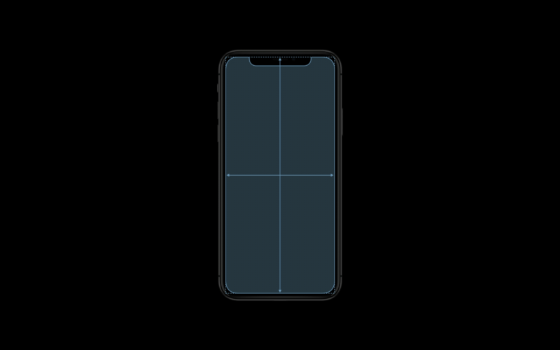
Let’s start by looking at the changes and challenges presented by a differently sized and shaped screen and how Apple recommends coping with them. Because iOS runs on devices at a variety of resolutions, Apple and developers on the platform measure their user interfaces in “points” rather than pixels—which is a very common concept in design, anyway. The iPhone X’s display has the same width in points as the iPhone 7 and 8 (375 points), but it is 145 points taller. The fact that the iPhone X shares its width with the regular iPhones and not the Plus models is why it doesn’t support the expanded landscape mode interfaces that you get on the Plus.

iOS apps also need to support displaying assets at multiple resolutions to look sharp at each device’s screen resolution; the signifiers @1x, @2x, or @3x are used for the three tiers of resolution for assets. Apple recommends producing assets as PDFs because they are resolution independent. If rasterized images are also needed, they currently must be offered in both @2x or @3x, which previously correlated to the standard-sized modern iPhones with retina displays and the Plus models, respectively. The iPhone X uses @3x.
Every developer I spoke with said they didn’t have any trouble with assets looking good on the new screen. Phillippe Levieux, co-founder behind photo editing app infltr, even enjoyed the new approach:
We are using vector assets inside infltr, they are PDFs. We didn’t have to make any changes for the iPhone X. This way of working is incredible. You only need one PDF asset that will be compiled into @1x, @2x, @3x.
Yak & Co Art Director Mark White (known for the adventure game Agent A) said his team weathered the asset transition well, and he framed it as a lesson that you should always expect the unexpected and implement accordingly. “We made the conscious effort early on to design things in a very flexible way because you really just can’t predict what kind of resolutions or screen shapes we’ll be running in the future,” he said.
But resolution has changed on the iPhone before without major event. The iPhone X makes three additional changes that developers haven’t had to contend with before. The corners are rounded, whereas other iPhones have had corners with right angles. There’s the controversial notch—Apple calls it the sensor housing—an intrusion of the camera and other hardware into the middle of the top of the screen. And finally, there’s also a new indicator in the UI that is ever present at the bottom of the screen.
The home indicator
iPhone apps used to have the entire screen to themselves most of the time—the only exceptions were the status bar and notifications—but that’s no longer the case. They have to cede real estate to the notch at the top and the home indicator at the bottom.
Apple already offered a set of rules and tools called Auto Layout to help iOS developers avoid potential pitfalls with using blocked-off real estate on prior iOS devices. The company describes it this way:
Auto Layout dynamically calculates the size and position of all the views in your view hierarchy, based on constraints placed on those views. For example, you can constrain a button so that it is horizontally centered with an Image view and so that the button’s top edge always remains 8 points below the image’s bottom. If the image view’s size or position changes, the button’s position automatically adjusts to match.
For developers who were already leaning primarily on Auto Layout, the transition to the iPhone X is much simpler than it is for those relying mostly on custom layouts. “My app uses Auto Layout for most of its drawing code,” said Galley Foods engineering head Chris Anderson. “So I only had to do minimal work to fit my app to the new dimensions. You recompile with iOS 11, sprinkle some ‘if iOS 11’ statements to pin your app to the new Apple-provide safe layout guide, and that got me most of the way to the finish line.”
-
This is Apple’s designated Safe Area in portrait mode on the iPhone X. Developers are cautioned to keep critical content and UI elements within the green area.
-
Here is a comparison of the safe area in landscape mode on the iPhone 8 and on the iPhone X.
-
The status bar extends farther down from the top on the iPhone X than it does on previous iPhones, but its size no longer varies.
-
Apple warns developers not to use background images that could get awkwardly cropped automatically when displayed in other iPhone aspect ratios.
-
Placing UI elements outside the safe area or along screen corners can get developers into trouble with the notch or the rounded corners.
-
Apple therefore suggests developers move UI elements that were positioned at the corners inside the Safe Area.
-
Some assets were built specifically to live in corners and must be redone for the iPhone X. This is especially common with games, which usually use custom layouts.
-
Apple tells developers not to deliberately place back bars at the top or bottom, which would make an iPhone X look a bit like an older iPhone.
-
Apple also prohibits developers from highlighting the home indicator bar in any way.
Apple added a new aspect to Auto Layout called the Safe Area in iOS 11. Based on the Safe Area, developers should confine content and critical UI elements to parts of the screen where they wouldn’t be blocked or interfered with by the hardware or system software. For other iPhones, the Safe Area was essentially the entire viewport. On the iPhone X, though, it’s more complicated. In portrait mode, the Safe Area blocks off part of the top of the viewpoint and part of the bottom. The top is to accommodate the status bar and the sensor housing, while the bottom gives a wide berth to the home indicator.
The home indicator is a thin bar that is almost always present at the bottom of the screen to indicate to the user that they can swipe up from the bottom to exit the app or reach the multitasking interface. Since this functionality was previously performed by the home button that sat below the screen, you could see the indicator as the new home button in a way. Apple allows developers to enable an auto-hide behavior for the home indicator, but only for viewing full-screen passive content like videos.
Alternatively, developers can activate Edge Protection. This gives the indicator a more subtle appearance, making the user perform two swipes instead of one to get out of the app. This is recommended if a swipe from the bottom is a core part of an app’s functionality, though obviously the best solution is to change that interaction to something else when possible. Apple nevertheless recommends vertically scrollable views extending all the way to the bottom of the display despite the indicator’s presence.
Developers who put UI elements like navigation buttons at the very bottom of the screen might have to move them if they previously rested outside of what is now the Safe Area. Galley Foods’ Anderson said that despite his relatively easy transition, this was the biggest problem he encountered in his app:
First, I had a lot of bottoms and actions pinned to the bottom of the screen; all of these required manual intervention (even with Auto Layout) to make sure the indicator line wasn’t covering up the button. Second, getting the spacing to look right required some manual tweaking for iPhone X and non-iPhone X layouts. And lastly, I’m still struggling on how to best design around that home indicator. With a bottom pinned button, you can either extend the button color to the bottom or cut it off above the line. Both are somewhat ugly options. The curved edges require you to give lots of spacing above the curve; so there are these extra margins that don’t look right.
The more developers stuck to Apple’s recommended ways of doing things, the easier the company made the transition for them. Still, Anderson said he felt Apple could have provided better guidance on handling the bottom bar in visually appealing ways. “With giant tab bars and the empty space below the on-screen keyboard, I think Apple themselves haven’t figured out what to do,” he added.

