At Shillington, we love to explore and celebrate great design from around the world. We’ve covered the work of many creatives, from freelance designers to animation studios, in many different countries so far. Now, we’re heading to the USA and, specifically, the Illinois city of Chicago. The Windy City is home to more than Bulls, Bears, Cubs and Deep Dish Pizza, Chicago was responsible for the significant advancement of some of the most important cultural movements of the last century. To name a few, house music, jazz, blues, soul, gospel and hip hop. It’s also jam packed full of incredible museums, theatres and architecture. Basically, there’s no shortage of things to inspire Chicago’s many amazing creatives.
And who are those creatives? There’s a lot of amazing design, illustration and type coming out of the Windy City. We picked out our top 10 to give you a taste of what Chicago has to offer.
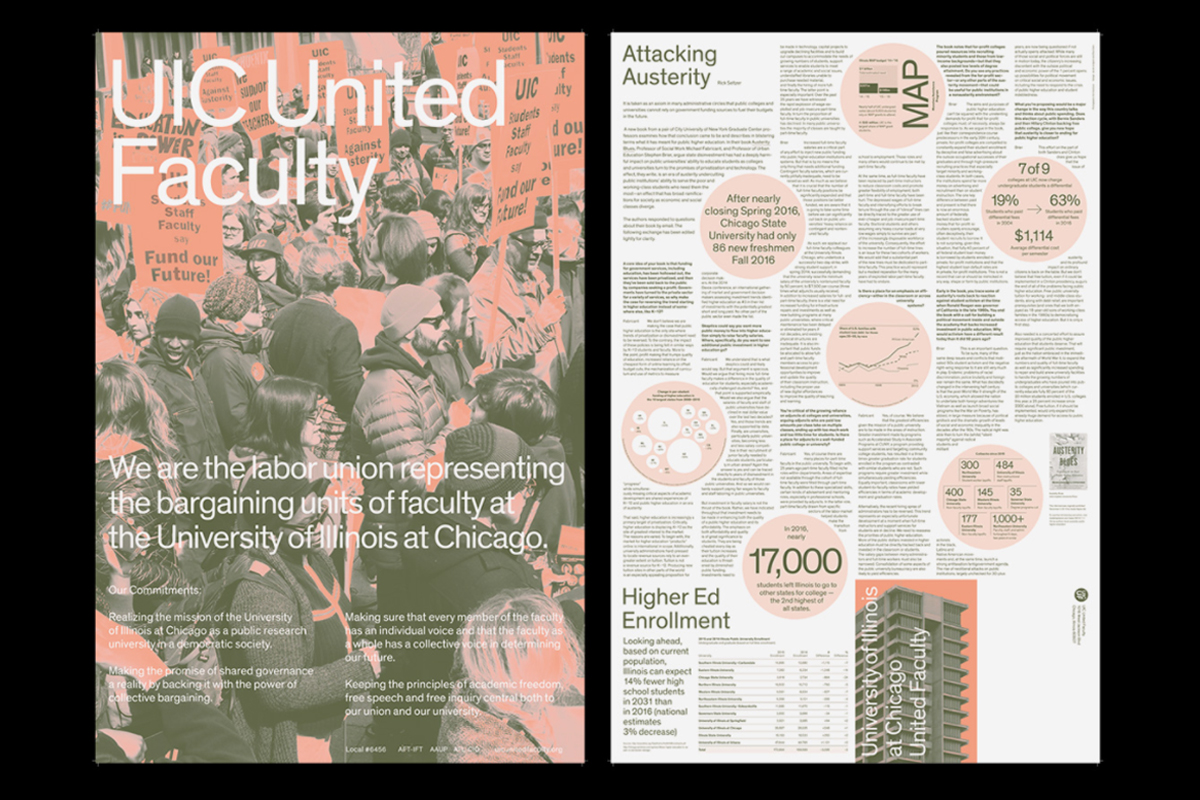
Founded in 2016 by Jacob Lindgreen and Paul Zdon, Platform is studio that focuses on visual identities, websites, book and other print projects. The pair’s work has an emphasis on typography which creates distinctive and attractive work—whether it’s something tangible or something digital. We especially loved their broadsheet posters for the UIC United Faculty. The two-colour offset poster folds out with a full ‘Attacking Austerity’ essay on the back. It delivers important information with beautiful impact.

We first stumbled across Adé Hogue’s work on Instagram last year and instantly fell in love! Adé has worked for The Obama Foundation, UnderArmour, Facebook, has delivered talks and workshops for the past five years and has been showing his work in exhibitions since 2012. In other words, he’s a busy and super talented guy! Being big lovers of all things handmade at Shillington, we couldn’t help but get excited by his tactile lettering. You name it, he’s made letters out of it. Coffee, blueberries, ash, pretzels, Reese’s Pieces and salt to name just a few.
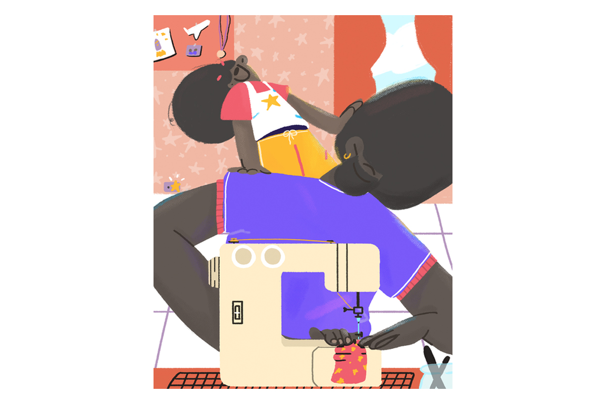
Caroline López Corominas is an illustrator and 2D motion graphics designer. Her work, both her illustration and motion design, is sure to stop you in your tracks. It’s bright, colourful and bold. Caroline puts this down to her upbringing in the Dominican Republic, which she refers to as “Summer Land”. Despite living and working in Chicago, the culture and colours of the Caribbean continue to inspire her work to this day. The most magical thing about Carolina’s work is that even her static illustrations are so energetic and lively that there’s no way they’re not going to bring a smile to your face.
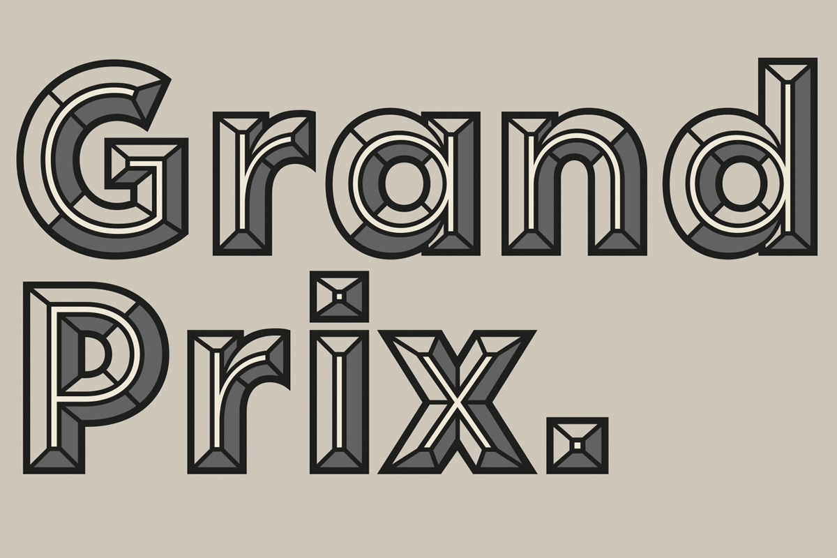
Impactful display typefaces is the name of the game at Central Type. The independent type foundry has created typefaces used across the world. For instance, their rounded display typeface Rodger has been used by global fast food giant Burger King and also by drinks start-up, Ugly. Their typefaces often recall typefaces of the past. The aforementioned Rodger is inspired by other round typefaces of the ’60s and ’70s. Whilst Halsted is reminiscent of both the 1920s Art Deco movement and its revival in the ’70s. Though, our personal favourite is Idler Pro which is definitely one of those impactful display typefaces we mentioned earlier. It’s big, bold and super detailed—creating an incredible 3D look to any text.
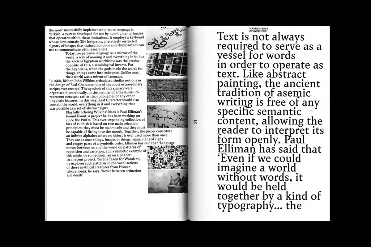
Pouya Ahmadi is a Graphic Designer and the creator of Amalgam Journal. His publication is a transdisciplinary journal that explores the intersection of typography, language and the visual arts. The journal, which both editions have now sadly sold out, plays with the limits of typography and of design itself. It also explores with typography’s links with other mediums and Pouya plans for each issue to push the boundaries more and more. Amalgam and Ahmadi’s other amazing work is concept-driven and influenced by theory and philosophy. His work has previously delved into theory-fiction, cultural theory and intersectional feminism. This has created a truly fascinating body of work.
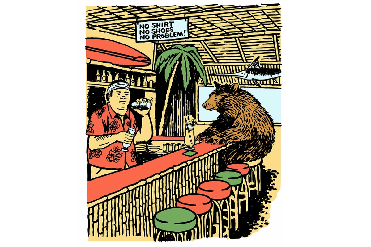
An illustrator, designer and printmaker Ryan Duggan has worked for eclectic but exciting clients including Childish Gambino, Enjoi Skateboards and Bulleit Bourbon. Alongside this he also runs Paper Hat, a print studio and gallery, in his hometown. His work, often humorous, is tinged with a warm nostalgia that recalls American mid-century glory days but is also unmistakably modern. We love his work for surf brand O’Neill Australia. It perfectly incorporates a sense of the Californian brands’ home state with a twinge of Duggan’s non-sensical weirdness. For instance, putting a cocktail-drinking bear into a beachside bar. Oh, you may also have heard of Ryan as the “Shitting Dog” guy because of his now 5 year ongoing series of prints of you can probably guess what!
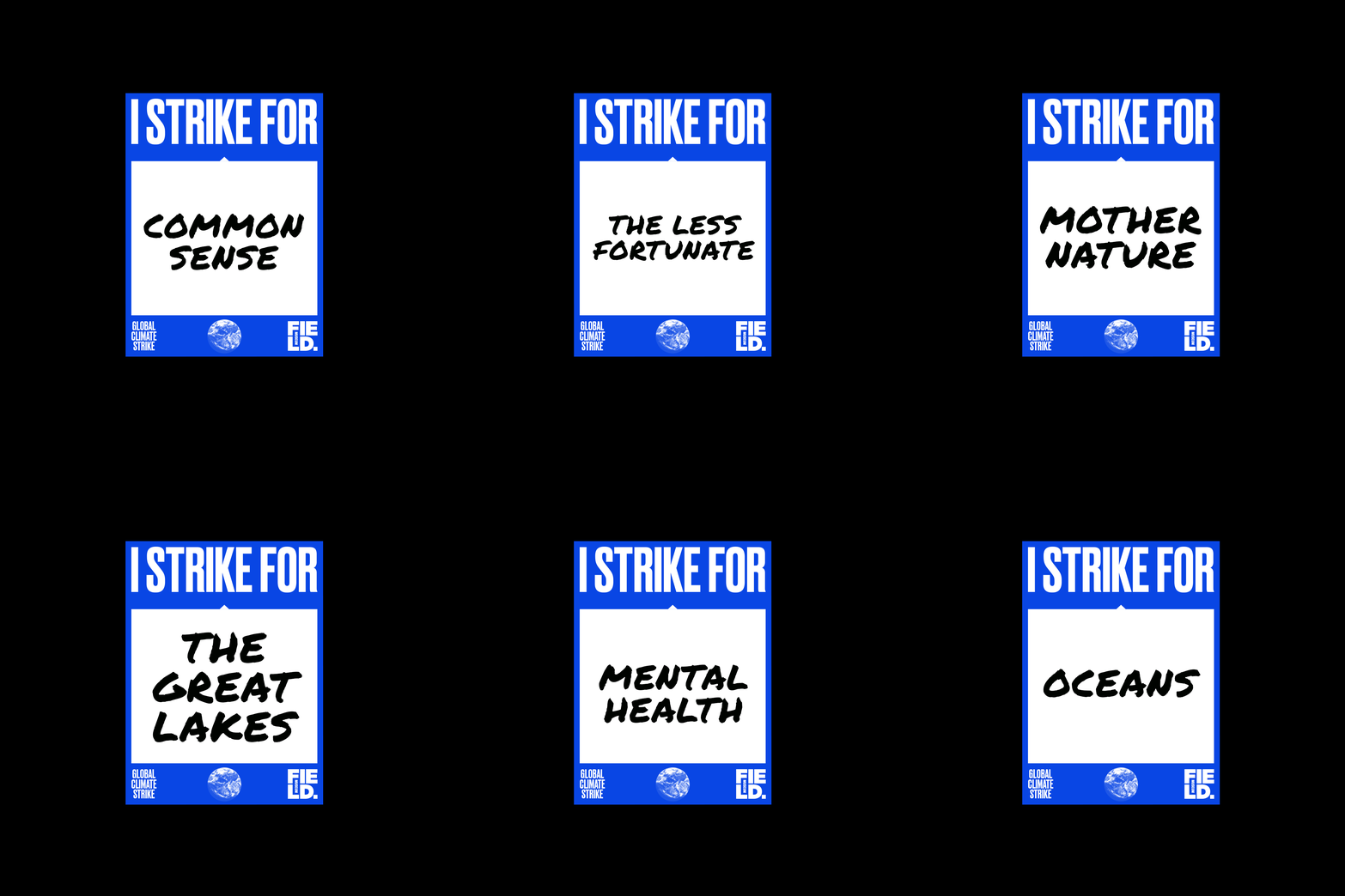
Michael Corey is a freelance designer whose obsession with type has lead to him proclaiming himself as Typographic Scientist. We like it. His practice involves experimenting with type, wearable messages, books, prints and objects. What immediately caught out eye was his typeface MOTEL 27 which cleverly uses small blocks and graphic elements to create letters. Though we were even more struck by his work with the Field Museum for 2019’s youth-led Climate Strike. Michael created the work whilst freelancing at Leo Burnett’s Department of Design. The simple posters and t-shirts that use a striking blue encourage the Chicago strikers add their own messages of why they are striking.

As both a graphic designer and a fine artist, Violet Luczak makes incredible work. Specialising in painting, layout design, print and illustration, Luczak’s work is a visual crossover of her mediums. This means her work crosses the boundaries of what design is and of what painting is. Her skills as a designer appear through the layout and typography used in her paintings. Her recent work has been created as a criticism of the meat and dairy industries with titles such as Your Ass Sucks Buttermilk and the pictured Milk & Money. Luczak’s clever combo of painting and design means that her work delivers an poignant message without having to shout about it.
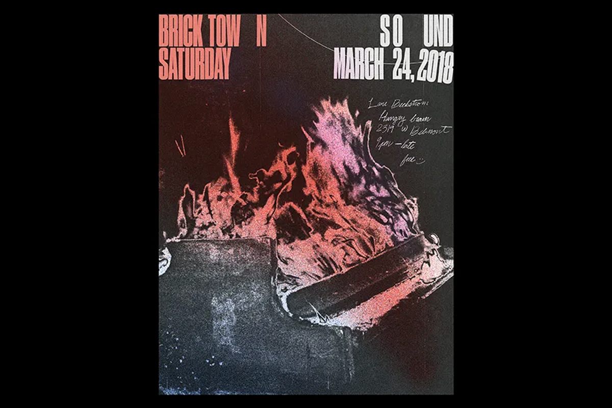
There are huge amount of influences on Crystal Zapata’s work. From music and dance (she has trained as a dancer for 15 years) to the collages she made out of magazine clippings when she was a child. Toying with illustration, t-shirt design, album artwork, objects, environmental design experiments—it seems like nothing out Zapata’s wheelhouse. Though, it’s Zapata’s posters we are particularly fond of. In particular, her posters for Bricktown Sound, a bi-weekly dance party in Chicago. Bricktown Sound is vinyl only and features a different DJ every event so Zapata took this as the main inspiration for her posters. She creates amazing posters using analogue methods to replicate the vinyl aspect of the night. The music itself then shapes what each poster ends up looking like.
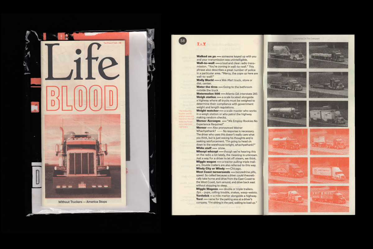
The brainchild of designer Kevin McCaughey, NONPOROUS is a graphic design and publishing studio. They mostly produce printed material such as zines and posters motivated by visual research and collaborating with other creatives. Through design, photography, music and film they address a huge variety of contemporary topics. NONPOROUS also own their own Risoprinting machine and its DIY aesthetic can be seen running throughout their output. Their 2017 zine Lifeblood was originally inspired by the fact that 1.7 million American trackers could lose their jobs to automation in the next decade. The publication dedicated to preservation and documenting experiences of driving long-haul through writings, design, photographs and various ephemera.
Want to see more amazing creatives from around the world? We recently visited Pennsylvania, Belgium and Russia.
Feeling inspired? Why not become a graphic designer yourself—study design in London, Manchester, New York, Sydney, Brisbane, Melbourne or Online with Shillington.
https://www.shillingtoneducation.com/blog/chicago-creatives/

