

Over Shillington’s three month full-time or nine month part-time course, our students undertake over 30 briefs—from start to finish. Narrowing these down to just 6 or 7 projects for their final portfolio is a difficult but there’s also one project that shines through as a firm favourite. Just take a look at our Student Showcase to see some of the incredible work they have to choose from.
Last year, eleven of our graduates shared their own personal favourites. This time around, we asked ten of our recent graduates from our six campuses, in London, Manchester, New York, Sydney, Brisbane and Melbourne, to share their favourite project from their Shillington portfolio. Check out their picks—from whiskey for women to origami chocolate wrappers—and prepare to be amazed.
1. Lenny Kai Yang

Project: Kindred Restaurant Branding
For his branding, Shillington Brisbane graduate Lenny Kai Yang chose an evolving quarterly restaurant—which he named Kindred. Using the typeface Young Serif for his logotype, family photos throughout the advertising material and a gorgeous colour palette, Lenny created a sense of homeliness and nostalgia in his branding.
Lenny told us:
I felt a significant pressure to create something with meaning. I thought of my identity and what it means to be a child of immigrant parents— something that a lot of others can relate too.
“Feeling conflicted as a child and between two cross-sections, I wanted to create something to bridge the gap of what I often felt. That was when I conceived of Kindred— an evolving restaurant catered to sharing family dishes so that the traditions and recipes aren’t lost. I wanted to create a feeling of homeliness and excitement through my idea. I spent a lot of time after the project was introduced, tweaking and working on perfecting it in-between projects. My instructors Nick and Bec were large help with passing on suggestions and opinions with the word mark. When it came to portfolio week, I had seen so much inspiration that the overall design of the brand came pretty quickly and naturally to me. I was lucky to surround myself with classmates that would not tire of me asking for their opinion which also aided in shaping my project!”
2. Maria Vazquez
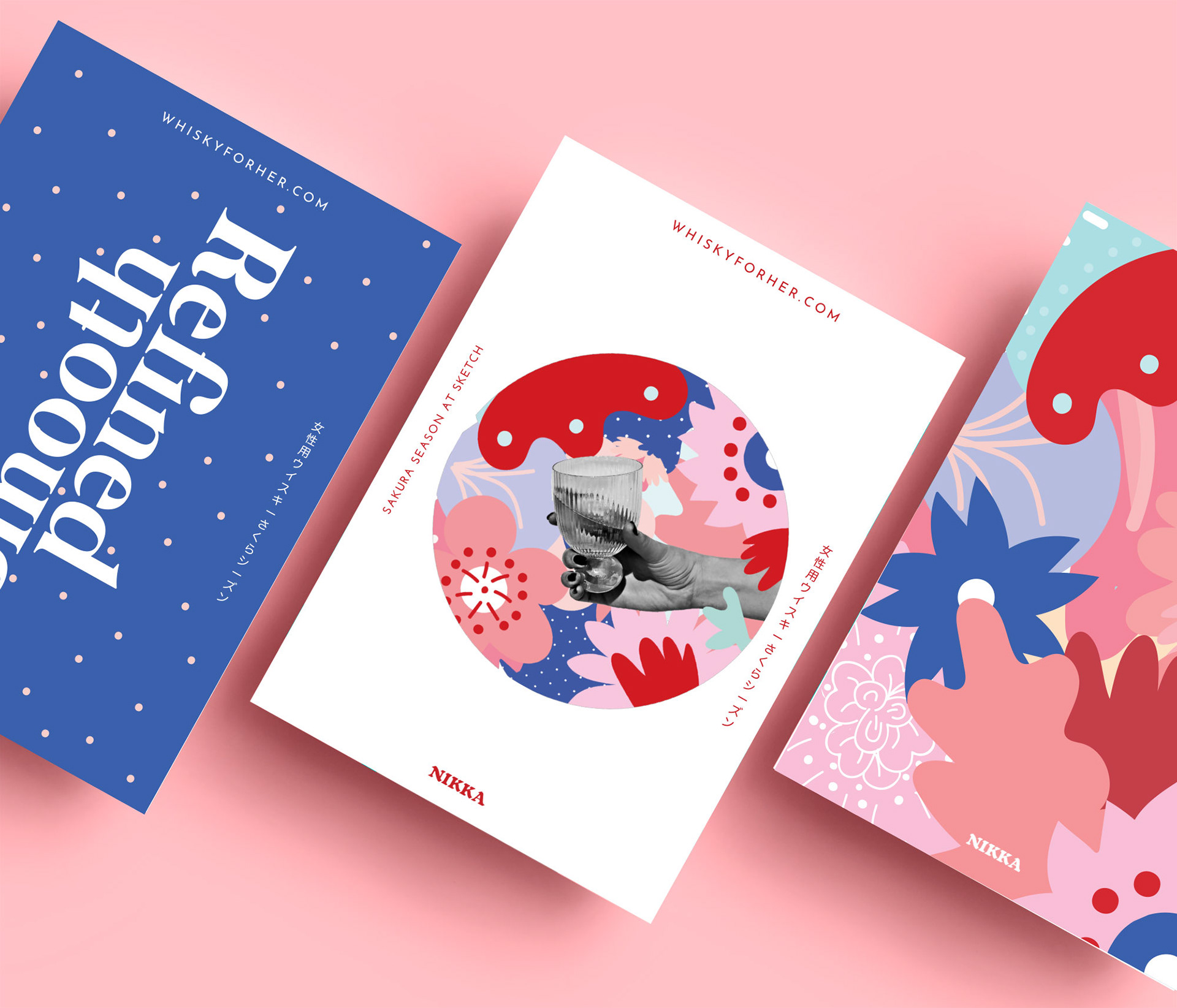
Project: Whisky for Her Campaign
Shillington London graduate Maria Vazquez‘s multi-channel campaign for the Japanese whisky brand, Nikka, targeted women to change the idea that whisky is a man’s drink. The results are fun and vibrant and use Maria’s own graphic elements and colour palette to engage the target audience. The campaign was designed to run through Sakura (Japanese cherry blossom) season and reflects this colourful time of year perfectly.
Maria reflected upon the project:
“It was my favourite because after learning so much during the entire course, we were free to apply all these new skills to our own interests.
This project challenged me in many ways because I had to learn how to have consistency through my entire work flow: from branding, creating a logo, designing the posters, creating illustrations and photography, coming up with a packaging, to finally creating a website and its content for social media.”
3. Leila Bartholet

Project: The Art of Math/The Math of Art Campaign
Leila Bartholet, who graduated from Shillington New York in 2018, had a shortlist for her favourite project—she had to decide between her The Art of Math/The Math of Art Campaign, her editorial design for Ugly Baby magazine and her beer packaging. Eventually her campaign came out on top. We think the combination of two totally different disciplines makes for a really interesting design.
Leila shared her thoughts with us:
“I wanted to show that math can be creative and art can be mathematical. I used shapes that can be viewed in two different ways. I thought this illusion was beautiful but also took precision to create. The name of the event also had two different ways of reading. The way the words are laid out, you can read the title The Art of Math or The Math of Art. Again, this was done to stress the importance of art in math and math in art.”
4. Sheena Chong

Project: Yorokobi Chocolate Packaging
Sheena Chong, who moved from Singapore to study at Shillington Melbourne, chose her packaging for chocolate brand Yorokobi as her favourite project. Her packaging could only be described as fun—using bright colours, pleasing graphic elements and a bold logo. It also promotes user interaction with instructions on the inside of the packaging to turn it into an origami heart.
Sheena said:
“I designed a fun chocolate bar packaging with a removable sleeve that has origami instructions printed on the inside. My idea is to give the chocolate bar wrapper a second life! We can fold it into a heart and gift it to someone or just make it for yourself.
For the patterns and colours of the packaging, I did research on Japanese minimalist graphic designs and posters.”
5. Babeth Olde Hanter

Project: Popping Display Typeface
Moving from working in a daycare in the Netherlands to studying at Shillington Manchester, Babeth Olde Hanter‘s favourite project was her Popping Display typeface that takes inspiration from two very different places—the famous Bauhaus style and the round die-cut shape of traditional popcorn box. Developed as a display typeface, Babeth’s project definitely pops!
Here’s what she had to say about the project:
Shillington made me aware of my love for typography—designer’s first lesson: never use comic sans!
“At home, I practiced hand lettering for a while, but creating a real typeface was something I never did before. I started, as we did for every brief, with brainstorming, making moodboards and sketching. During the course, I kept working on it at home and in the end, it was good enough to make it part of my portfolio.”
6. Ariana Villegas
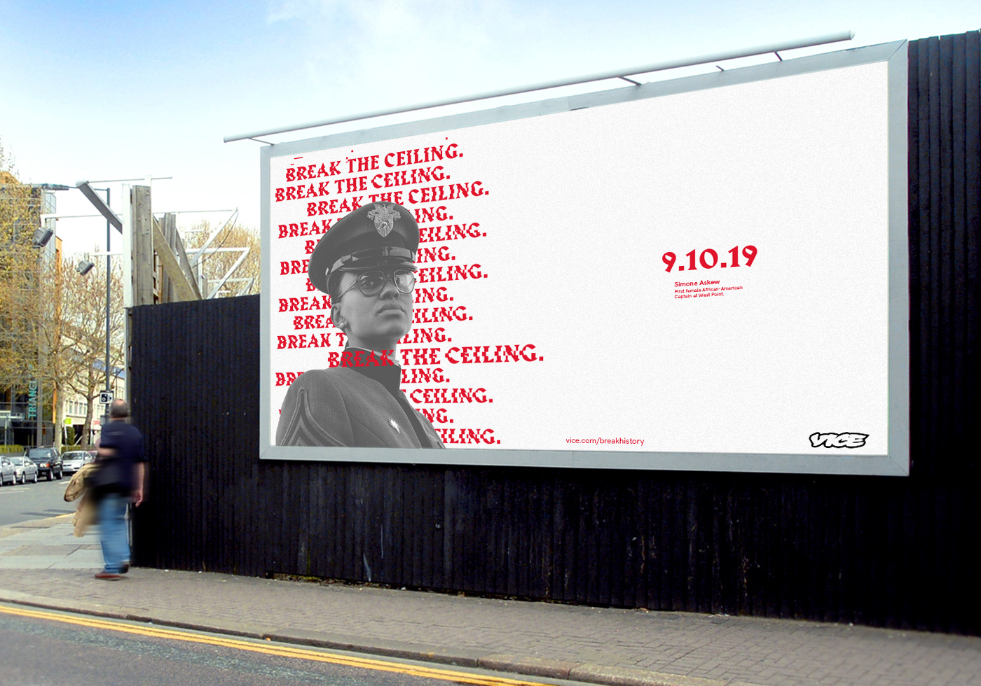
Project: Vice Media Campaign Identity
For her favourite project, New York graduate Ariana Villegas took on a media giant: Vice. She wanted to tackle the sexual harassment and old boy’s club culture that had unfortunately become a part of the company. She wanted to directly target these allegations and show Vice as being an open, inclusive business—one that she would want to work for, as she counts it as a dream company to work for.
She explained to use how she tackled the project:
“I thought the best way was to have an event that featured powerful women who have broken the glass ceiling in the workplace like Simone Askew, the first female African-American Cadet at West Point. I used an old typeface and broke it as a type treatment to convey breaking the history of unjust acts against women. The concept was ‘Break the Ceiling. Break History’. I think it worked out. Now I hope Vice actually does it!”
7. Jess White

Project: John Hughes Film Festival Branding
Shillington Brisbane graduate Jess White tackled the branding for a John Hughes film festival—legendary director of Ferris Bueller’s Day Off, The Breakfast Club, etc.—for her favourite project. The branding for the BFI-backed event needed to be nostalgic and hark back to those halcyon days of the 1980s that Hughes so perfectly captured—and Jess really hit the nail on the head.
We asked Jess how she went about developing her branding:
“For the particular brief, we had to pick a theme that captured the essence of a movie director of our choosing. Since I’m an 80s nerd, I went with the legendary John Hughes who’s known for his feel good and coming-of-age flicks. I chose ‘nostalgia’ for my theme—illustrated by exaggerated retro treatment and VHS/arcade elements.”
Moodboards and movie research were my best friends for this project, and really helped me to solidify the look of my brochure that I was then able to rollout onto other collateral. Overall, it was a really fun process.
8. Alessandra Conti
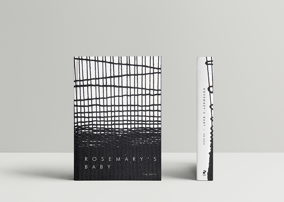
Project: Rosemary’s Baby Handmade Book Cover
Handmade Day is a firm favourite at all six Shillington campuses—with students stepping away from the computer and making some amazing with their hands. Alessandra Conti, who studied at Shillington London, agreed and her handmade project was her favourite of the lot. She took on Ira Levin’s classic horror novel Rosemary’s Baby, which she hand weaved a striking new cover for.
Alessandra told us why it topped her list:
“I loved the opportunity to use my craft skills for one of my designs. We also had a professional photographer come in to photograph the final crafted piece and I had the chance to do some art direction. I always have lots of good feedback for this project and I think that showing an off-screen approach really makes your portfolio stand out.”
Find out more about Alessandra.
9. Majo Crespo
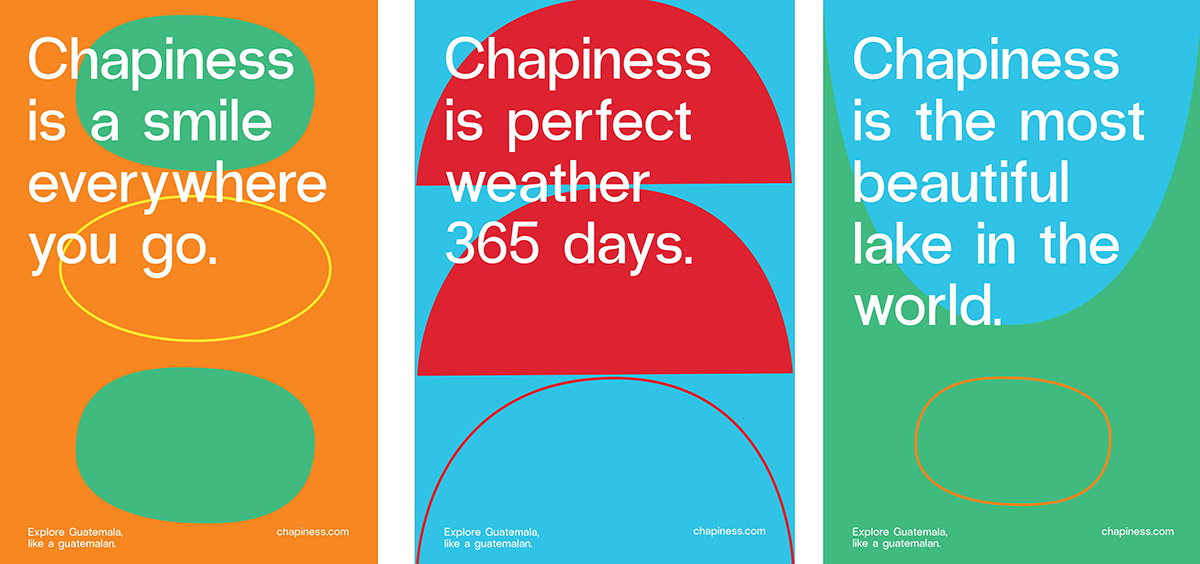
Project: Guatemala Rebranding
Majo Crespo, Shillington New York graduate, picked a favourite project that was literally very close to home. Her rebrand to attract visitors to her home country, Guatemala, which is often seen as a dangerous place to travel to. She decided on the name Chapiness—combining the Guatemalan’s colloquial name for themselves ‘chapín’ and ‘happiness’. This name was then combined with everything that makes Guatemala great: perfect weather, amazing scenery and delicious food to name a few.
She broke down the highs and lows of the project for us:
Because it was so close to my heart, this project came with many challenges and uncertainty. 99% of the time I design something, the path I want to take clearly comes to my mind and is revealed easily.
“With Chapiness it didn’t happen and I wasn’t prepared for that. My biggest obstacle was translating a culture so rich and unique as the Guatemalan into a universal language. A language that a French, a German and an American could understand. I received endless help from my teachers, regardless of how hard I was being towards them. For several days, I was totally neglecting any feedback or advice. I was closed. I know it sounds crazy, but this project felt like a baby to me. I wanted everyone to understand my origin, my customs, my people. And I did it.”
10. James Freebairn

Project: Roll The Dice Branding
Melbourne graduate James Freebairn chose his branding project for a Los Angeles-based men’s grooming company as his favourite project. The brief was to brand the company to men who like, if you’ll pardon the pun, a brush with danger. James’ project used a simple palette of black and yellow, which evokes a warning sign, and tattoo-inspired illustrations to perfectly answer the brief.
He revealed to us how he got to work on the project:
“The research for this brief was done outside of class and all that research and conceptual thinking was funnelled into a brief with a two day turn around. I really liked engaging with the research process of this brief and gaining a greater perspective of the consumers values and what determined their purchasing habits. From analysing these insights I crafted a brand that spoke to the person my demographic aspired to be. The final outcome ended up being called ‘Roll The Dice’ and was targeted at men between their mid 20–30s who thought of themselves as the type of guy who likes to flirt with danger. I had a lot of fun playing around with the visual identity of this brand and choose utilise a lot of symbolism that surrounded gambling, death and superstitions.”
Have any of the projects caught your eye? Want to learn graphic design, be able to tackle briefs and create amazing projects yourself? You can do with Shillington—in only 3 months full-time or 9 months part-time! Become a graphic designer by studying at Shillington in New York, London, Manchester, Sydney, Melbourne or Brisbane –> www.shillingtoneducation.com
https://www.shillingtoneducation.com/blog/10-shillington-graduates-share-favourite-student-design-portfolio-projects/