

A good designer knows that you’ve got to look beyond the now to produce the best designs. This means looking toward the future to predict what is coming, but just as importantly looking back to the past for reference and for inspiration. Here, we’re going to delve deep and dig out some of the most interesting vintage typography, all of which can inspire designers or even be used in your designs today.
It’s hard to define where typography as we know it began—early versions of what we would now call a printing press have supposedly been discovered in Ancient Mesopotamia, dating around the 2nd Century BC. Though, typographers tend to define the printing press as an East Asian invention in the 11th Century, which was introduced to the Western world by Johannes Gutenberg from Mainz in Germany in the 1440s. (That’s right—the long held belief that Gutenberg invented the printing press isn’t true!).
Fast forward 350 years and letters are being turned into metal or wooden blocks (see Antique below for an example of a woodblock typeface). These blocks are the beginnings of what we know as typefaces today—with a block being produced for each character. These were then sold on to print shops, where a typesetter (yep, there were even typesetting back in the 1800s) who would set the fonts to allow for maximum legibility.
Skip forward again to 1890 when things start up again and typography started to become what we know of today. Typography truly became an industry, especially with the invention of the Linotype machine in 1886, the Monotype system the following year and Phototypesetting in the 1950s. This industrialisation lead to a boom in the production of typefaces and a majority of the vintage typography in this list (and indeed the world) are designs from this period.
Of course nowadays a huge percentage of typefaces are produced digitally but, to look for the best retro and vintage typography we can find, its best to look to the days before computers ruled over the graphic design world. Here’s a list of the best vintage typography that we think you need to see, some undoubtedly you’ll know already but there’s some surprises in there too.
1. Futura
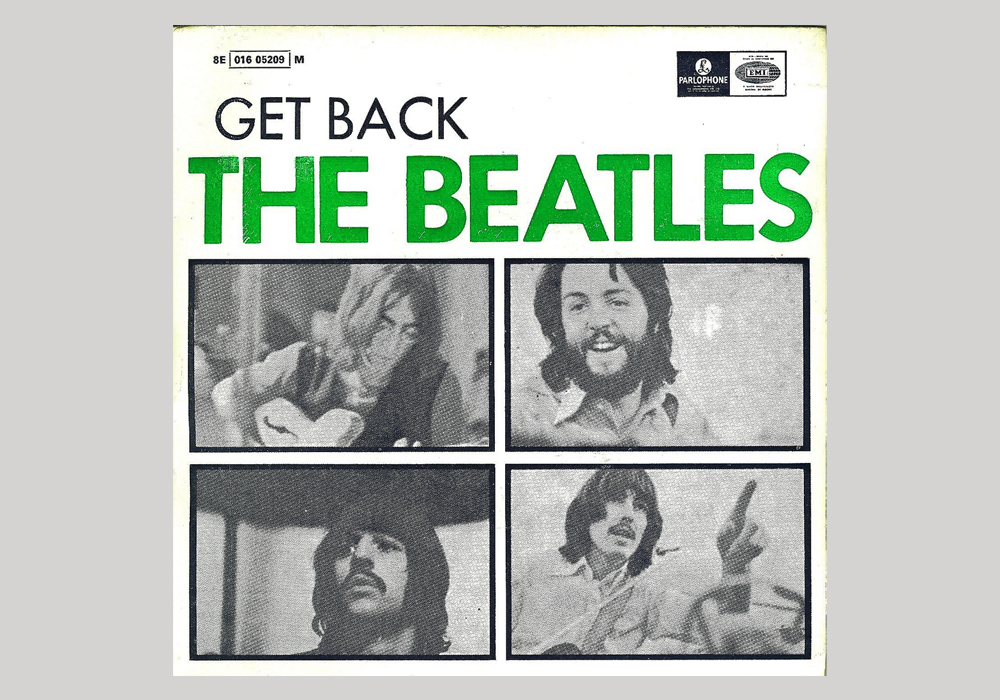
Get Back EP—The Beatles (Portugal, 1969)
Our first example of vintage typography is one we’re sure you all know! Futura is a sans serif geometric typeface design by Paul Renner in 1927, initially as a contribution to the New Frankfurt Housing Project. Futura has been widely used since its release, including in the famous Supreme box logo, on the Italian Railway System and across pop culture—in the Watchmen graphic novel and film, for instance.
2. Cooper Black
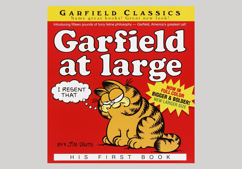
Garfield at Large (USA, 1970)
Though invented in 1922, its use throughout popular culture in the 1960s and ’70s means that Cooper Black embodies this period’s style. Designed by Oswald Bruce Cooper, a lettering artist from Chicago, Cooper Black is a ultra bold serif typeface, used predominantly for display.
3. Fat Albert
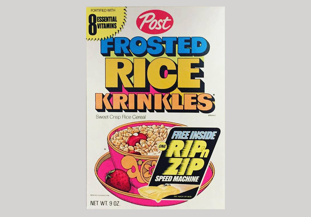
Post Frosted Rice Krinkles packaging (USA, 1972)
Released by Californian phototype manufacturer Lettergraphics around 1968, Fat Albert and its sister font Albert are all-caps typefaces designed for being used on movie posters. Bold and striking, Fat Albert went on to be used on packaging and record sleeves, as well as for its intended purpose.
4. Gemini
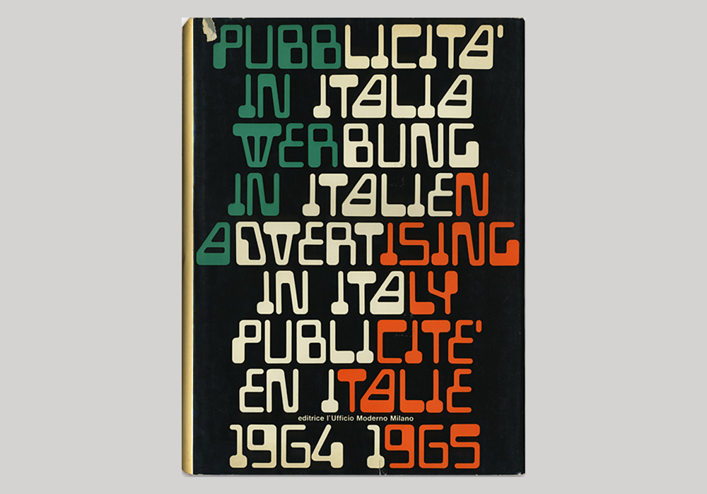
Pubblicità in Italia, 1964-1965 (Italy, 1965)
Designed around 1965 by an unknown designer and foundry, Gemini, which is also known as Gemini Computer, Automation or Sonic, is an extension of E-13B—the 14 character set of symbols developed to be read by computers and used on things like credit cards. It is the perfect example of vintage typography that can add a retro yet futuristic feel to projects.
5. Village & Orbit
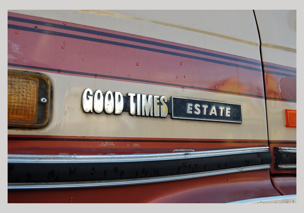
Chevrolet “Good Times Estate” Van (USA, 1983)
Two separate but very similar typefaces, Village & Orbit were designed by Humberto Gillan for Lettergraphics in 1968. Orbit is a common variant of Village, but without the flaring of the latter and a tail on the T and a straight legged R. They were used extensively across record cover art but also in other less usual places, such as on the tail of this 1983 Chevrolet Good Times Estate van.
6. Peignot
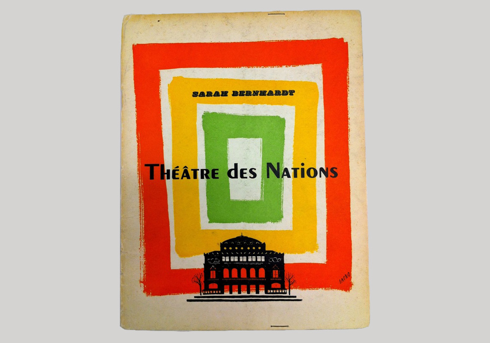
Théâtre des Nations (France, 1960)
Peignot was designed by Charles Peignot for foundry Deberny & Peignot. But, which came first? Surprisingly, the foundry which was started by Charles’ grandfather Georges in 1898. By 1937, when Peignot was released, Charles was the company’s director and worked on this typeface with colleague Adolphe Mouron Cassandre. The Art Deco typeface is unmistakably French and can be used in designs to give them a vintage French flair. It is interesting to note that Peignot doesn’t have a lowercase in the traditional sense—its “multi-case” combines lowercase letters and smaller uppercase characters.
7. Johnston
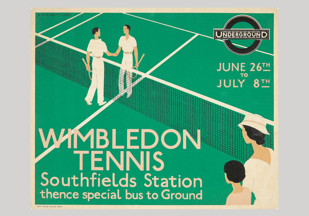
London Underground Wimbledon Tennis advert (UK, 1933)
Londoners, or in fact anyone who has visited London, will immediately recognise Johnston—it’s the typeface used on London’s extensive transport network for the past 104 years. The influential sans serif typeface was completed in 1916 and is perfect for way-finding and signage, but has also been used widely across advertising. We love how the tittle is shaped like a small diamond!
8. Bayer Universal
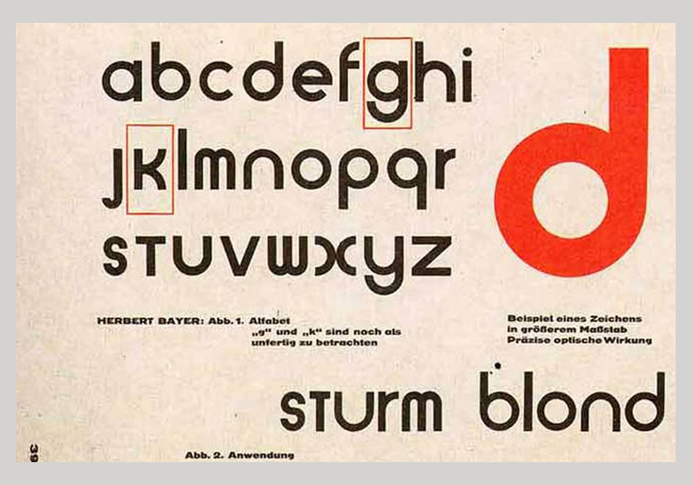
Universal Alphabet (Germany, 1925)
A student of the influential Bauhaus school, Herbert Bayer was also appointed director of printing and advertising after his four years of study there. From 1925-30, Bayer worked on a geometric sans serif typeface named Proposal for a Universal Geometric Typeface. Bayer’s typeface was never actually cast into type and existed only as a design. Until 1997, when P22 Foundry turned Bayer’s designs into the digital typeface Bayer Universal—bringing the Bauhaus’s typeface into the contemporary era.
9. Bauhaus
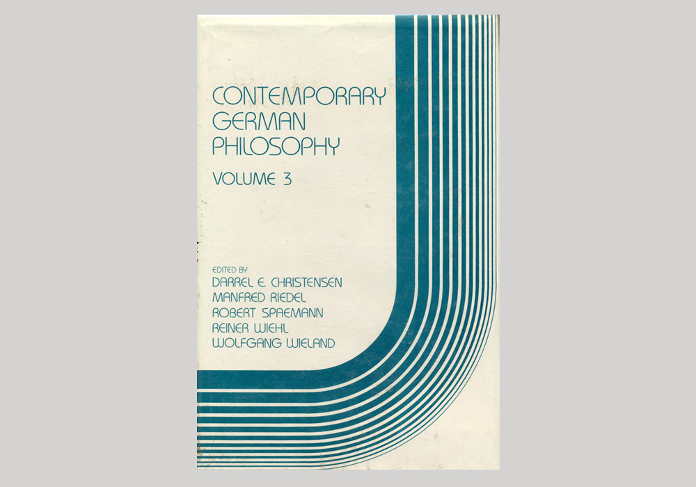
Contemporary German Philosophy Vol.3 (USA, 1983)
Designed by the International Typeface Corporation (ITC) and based on the aforementioned Herbert Bayer’s designs for Proposal for a Universal Geometric Typeface (aka Universal), Bauhaus was released in 1975. An invention of type legends Ed Benguiat and Victor Caruso, it uses the simple geometric shapes and monostroke weights of Bayer’s designs but also differs from it in that is also has upper case letters.
10. OCR-A

Innovation Lab logo (USA, 2005)
The invention and evolution of computers meant that new typefaces had to be created that could be read by both people and computers. OCR-A was one of the first of such typefaces that was developed by the American National Standards Institute. To ease legibility in computers, the typeface is made up of simple, thick strokes and is monospace with the glyphs placed 0.254cm apart. Given it was invented with the future in mind, OCR-A is perfect for creating a retro but simultaneously futuristic vibe.
11. American Typewriter
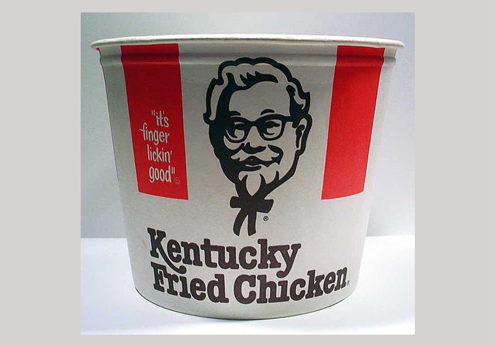
KFC packaging (USA, 1978)
Another ITC typeface, American Typewriter is a slab serif typeface created to mimic the look and feel of vintage typewriters that went out of use as computers became more and more commonplace. Given that typewriters are now considered dated technology, fonts like American Typewriter (which is by no means the only typewriter-inspired typeface!) are perfect for adding an old-fashioned and/or industrial feel to a project.
12. Bottleneck
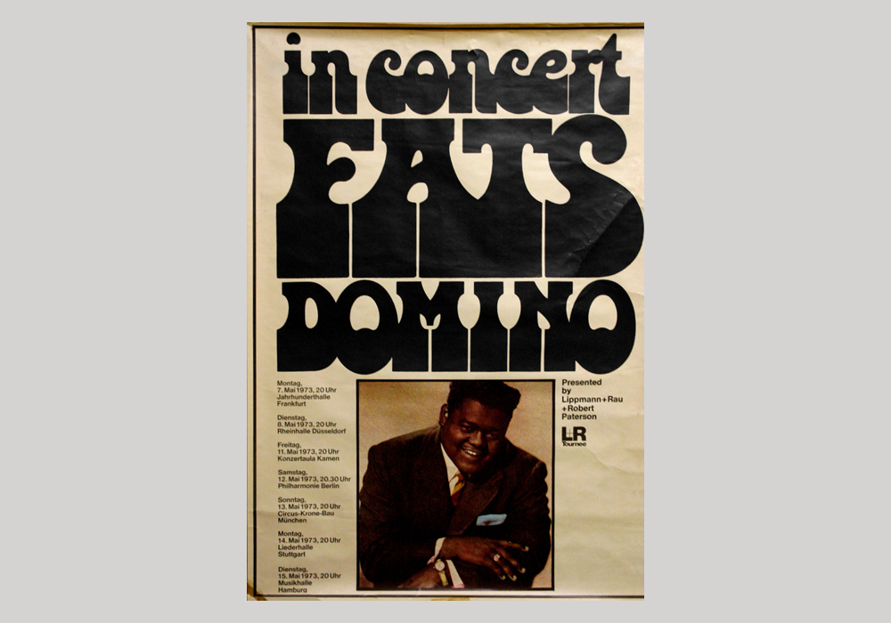
Fats Domino tour poster (USA, 1973)
Released in 1972, Bottleneck is a typeface that truly embodies the decade it was designed in. From designer Tony Wenman at foundry Letraset, Bottleneck brings to mind flares/bell-bottoms and platform shoes that were a huge part of ’70s fashion. It was used broadly across soul and funk records, posters and advertising but also appeared on catalogs and more everyday publications throughout the decade. It’s great for adding a sense of the seventies to your designs.
13. Univers
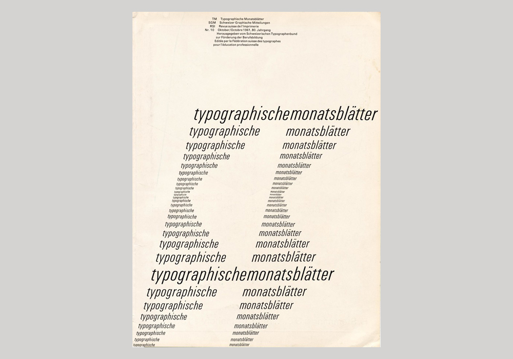
Typographische Monatsblätter No. 10 (Switzerland, 1961)
Adrian Frutiger, Swiss typeface designer, can be said to have determined and influenced type design in the second half of the 20th century. Univers is one of his most famous and widely used typefaces. First introduced by Frutiger in 1957, the typeface enjoyed enormous popularity in the two following decades including two Summer Olympic games—by Otl Aicher for the 1972 Munich Olympics and by Georges Huel and Pierre-Yves Pelletier for the 1976 Montreal Olympics. It can be used to create a vintage, clean and modern feel to designs.
14. Helvetica
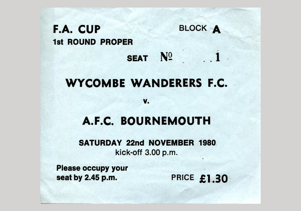
Wycombe Wanders v. AFC Bournemouth ticket (UK, 1980)
Released in the same year as Univers was arguably its biggest competitor, a typeface we all know: Helvetica. Alternatively known as Neue Haas Grostesk, Helvetica is also sans serif typeface by a Swiss typeface designer Max Miedinger. Helvetica was designed to be a neutral typeface with no intrinsic meaning in its form and has consequently become one of the most popular typefaces of all time. Given this, it has universal possibilities but given that it was invented 63 years ago can definitely be considered a vintage typeface.
15. Obese & Mania
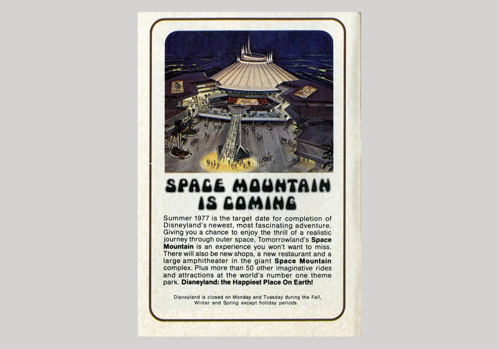
Disneyland Space Mountain advert (USA, 1976)
Despite sounding like an obscure ’90s DJ duo, Obese & Mania are two typefaces that are pretty much identical. Mania was created in 1968 by an unknown designer and Obese appears in PLINC’s Psychedelitypes from the same year—so it’s unclear which of the two typefaces was the first. The name ‘Obese’ definitely suits its chunky silhouette.
16. Eurostile
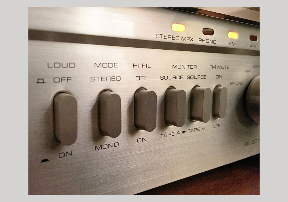
Setton RS220 Receiver (France, 1977)
The first Italian typeface on our list of vintage typography, Eurostile was designed by Aldo Novarese at Turin’s Nebiolo foundry in 1962. It’s usually used as a display font, especially on headings and signs. The typeface’s linear nature brings to mind modernist architecture both technically and functionally. Though, it’s also been said that it’s square shape with rounded corners recalls vintage television sets of the 1950s and ’60s. And, it was popular in science fiction artwork of the ’60s and ’70s. Therefore, it’s uses are far and wide and can produce a number of different styles in a project!
17. Gill Sans
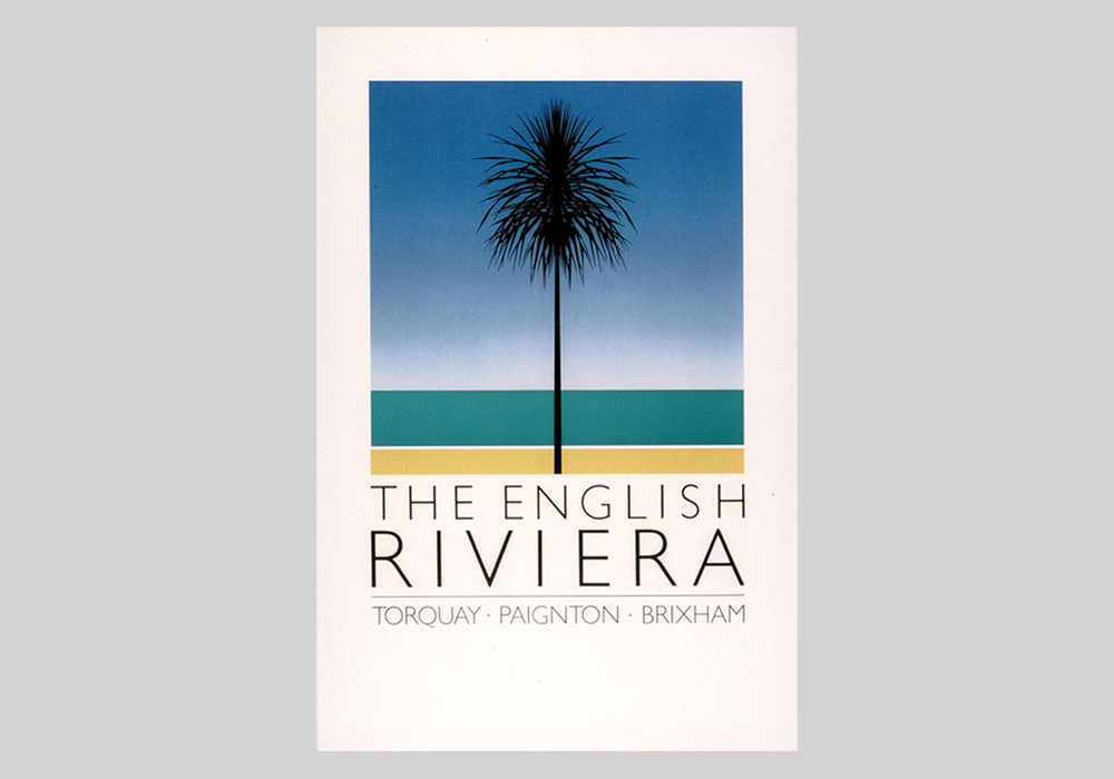
English Riviera tourism poster (UK, 1982)
British typeface Gill Sans was designed by sculptor, printmaker and typeface designer Eric Gill—who clearly named his most famous typeface after himself. Gill Sans was released in 1928 by the British branch of Monotype who marketed it as “classic simplicity and real beauty” and was used widely across posters and advertising right from its inception, including for the British Rail Network. It was also used on Penguin Books’ covers for a simple and modern look—and can do the same for your designs too.
18. Baby Teeth
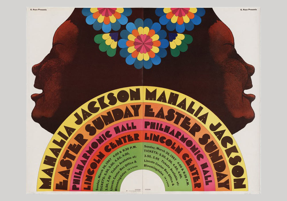
Mahalia Jackson concert poster (USA, 1967)
Probably the strangest named font on this list of vintage typography, Baby Teeth was design by Milton Glaser after seeing a similar hand-painted typeface on an advert for a tailor he saw in Mexico City. Dating from 1967, the display typeface became one of Glaser’s most famous and popular and was used by many musicians—from Led Zeppelin and Pink Floyd to Glaser’s own designs for Mahalia Jackson and Bob Dylan, the latter being one of his most famous posters. Baby Teeth really brings to life a sense of the swingin’ Sixties.
19. Friz Quadrata
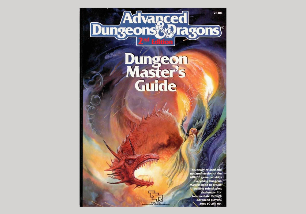
Advanced Dungeons & Dragons: Dungeon Master’s Guide (USA, c.1985)
A glyphic serif typeface from 1965, Friz Quadrata has become famous for its use by rock and punk bands, such as Black Flag, Bad Religion and The Offspring and for many of Quentin Tarantino’s credits. It has also been used widely by government and educational institutions—arguably two opposite ends of the scale. Designed for the Visual Graphics Corporation (VGC) by Ernst Friz and Victor Caruso, its a brilliant way to bring a vintage, striking feel to a project.
20. Cooper Nouveau Swash
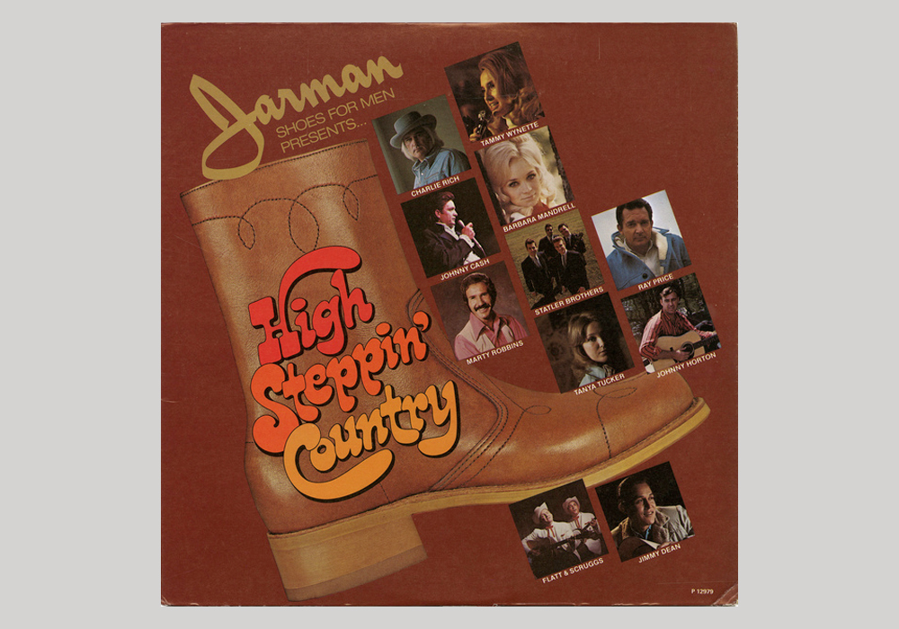
High Steppin’ Country (USA, 1975)
Inspiring a number of different typefaces, including Bronstein Bold and Lazybones, either of which would have fit in to our vintage typography list, Cooper Nouveau Swash was first designed by Dave West in the 1960s. Released alongside its counterpart Cooper Nouveau, which was a take on the aforementioned Cooper Black, the Swash variant is the more common—used on record sleeves and movie posters throughout the decades after it was released.
21. Clarendon (Haas)
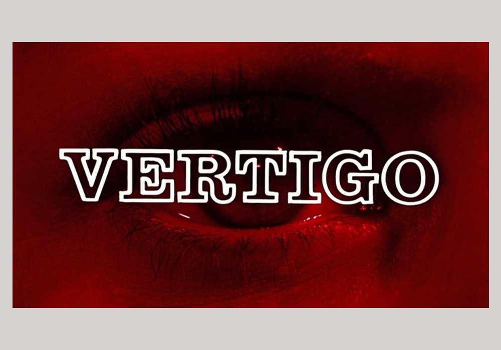
Vertigo opening titles (USA, 1958)
Based on a 19th century slab serif, Clarendon has been used consistently since its introduction in 1953. Created by Swiss (a common trend amongst these typefaces!) designer Hermann Eidenbenz, Clarendon can easily be distinguished by its heavy, bracketed serifs. You’ll see Clarendon used across advertising, signage and everywhere else. It can be used to give your designs a vintage but refined aesthetic.
22. Antique
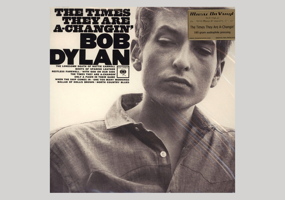
The Times They Are A-Changin’—Bob Dylan (USA, 1964)
The oldest example of vintage typography on our list, Antique was designed way back in 1828. It was designed by Wells & Web, a 19th century wood type manufacturer. Therefore, Antique started life as an actual typeface made out of wood for woodblock printing. Luckily it was revived for phototypesetting after it was introduced in 1949 and then interpreted for digital in 2006 so you can still use it to give your designs a rustic vintage look.
23. Rockwell
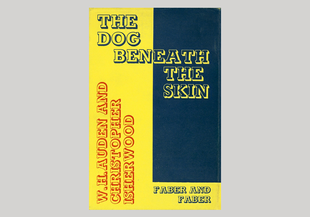
The Dog Beneath the Skin by W.H. Auden and Christopher Isherwood (UK, 1935)
Another Monotype-designed typeface, Rockwell is a geometric slab serif typeface that can be used in body copy or headlines to equal impact. As well as consistent use since its release in 1934, Rockwell was used in the early 1990s by the Guinness Book of World Records and in bold for London’s Dockland Light Railway throughout the ’80s and ’90s. It can be used to bring a sense of understated 1930s panache to any project.
24. Ed Interlock
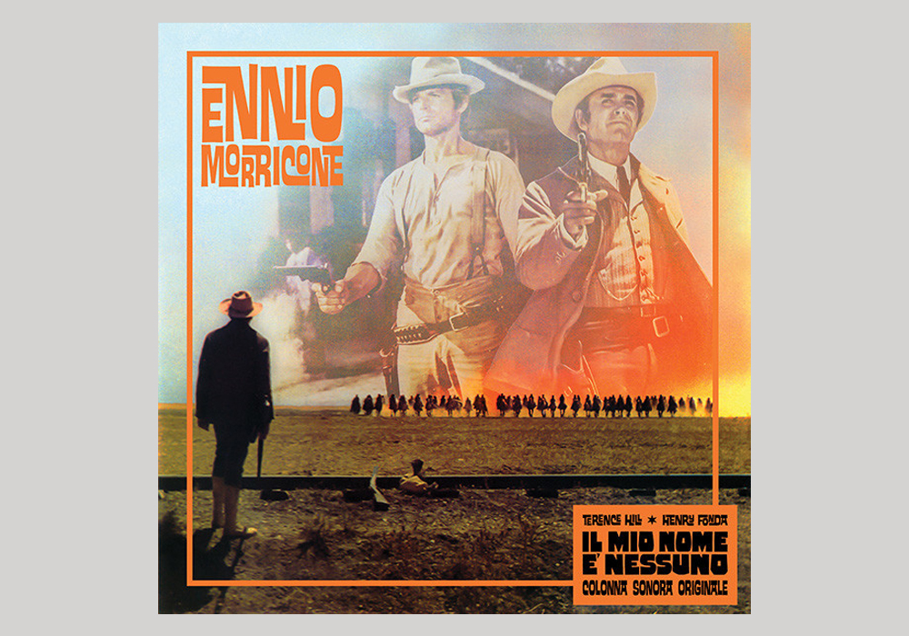
Il Mio Nome E’ Nessuno—Ennio Morricone (Italy, 2015)
We may be cheating a bit here as Ed Interlock was only introduced in 2004 and its foundry House Industries has only been around since the 1990s—a long time after much of the vintage typography the list came to light. Though, it also feels like this list of vintage typography wouldn’t be complete without some of House’s vintage-inspired typefaces. Ed Interlock, named after its designer Ed Benguiat, recalls both retro American cartoons, Spaghetti Westerns and other American ephemera. It’s perfect for bringing a sense of Americana to your designs.
25. Franklin Gothic
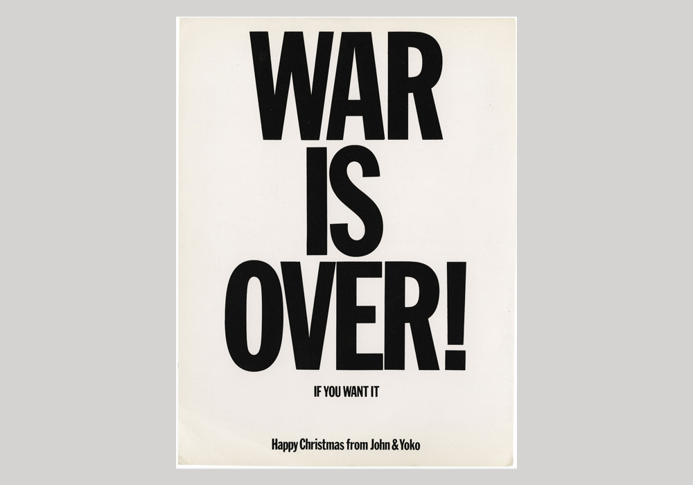
War Is Over! (If You Want It) by Yoko Ono & John Lennon (UK, 1969)
You may question why Franklin Gothic, a simple sans serif typeface, has made it to this list of vintage typography? Designed by Morris Fuller Benton in 1902 for the American Type Founders (ATF), Franklin Gothic was used extensively until it was eclipsed by some of the other typefaces in this list in the 1930s. Though this didn’t last long and it was picked up again the following decade. It been widely used since but is still great for adding some turn-of-the-century simplicity to a project. Bonus fact: Gothic used to mean ‘sans serif’ but has fallen out of use—it’s nothing to do the subculture.
26. Arnold Böcklin
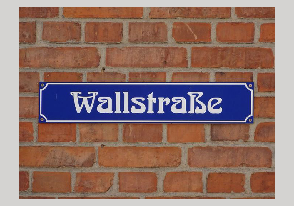
Street sign in Schwerin (Germany)
Designed by German typographer Otto Weisert, Arnold Böcklin is arguably the most popular and widely used Art Nouveau font of all time. It was named after the Swiss Symbolist painter Arnold Böcklin, who died three years before its release in 1904. It was a large part of the 1970s revival of Art Nouveau in design—even being used for the titles of TV show That ’70s Show. It can therefore be used in designs for multiple outcomes—as vintage typography to recall the Art Nouveau movement of the late 1800s or its revival 80 years later.
27. Koloss
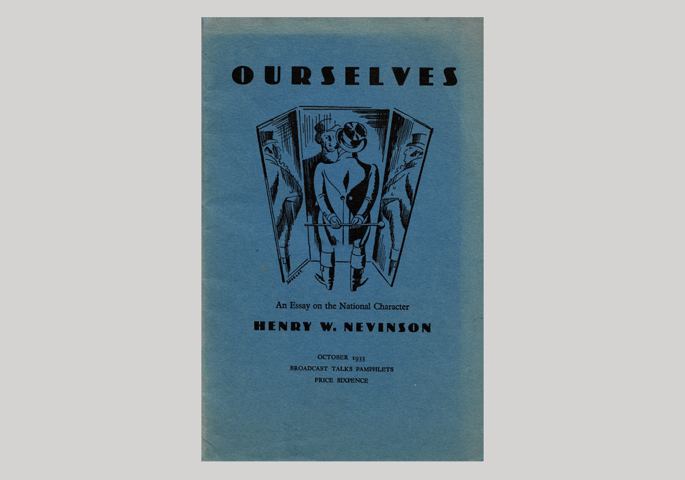
Ourselves by Henry W. Nevinson (UK, 1933)
Koloss, the 1923 extra bold alternative to Feder-Grotesk, is a headline typeface ideal for posters, book covers, etc. Designed by Jakob Erbar of Frankfurt-based foundry Ludwig & Mayer, the typeface uses high contrasts—thick stems, ascenders and bowls combined with thin descenders and terminals (Confused? Check out our foolproof guide to all things typography). Koloss is the best vintage typography for bringing a sense of Weimar Germany to your designs—striking but classy.
28. Fabulous
Another House Industries typeface that immediately screams one thing: Viva Las Vegas! Released in 2001 as part of House’s Las Vegas collection, Fabulous is inspired by the word ‘Fabulous’ on the famous Welcome to the Fabulous Las Vegas sign erected in 1959. It also nods to the neon lights of the city’s Fremont Street in its ’60s heyday. It’s the ideal piece of vintage typography for recalling the glitz, glamour and raunchiness of the Atomic City and, like Ed Interlock, for harking back to America’s Golden Age.
29. Akzidenz-Grotesk
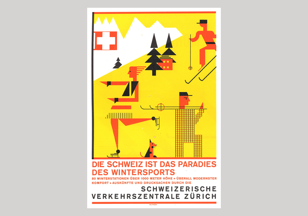
Winter Sports poster (Switzerland, 1929)
Developed in Berlin by one of the largest and most successful type foundries of all time, Berthold, Akzidenz-Grotesk was first released in 1898. Akzidenz-Grotesk is an unadorned, sans serif typeface that can serve many different purposes, especially compared to some of the other display typefaces in our list—the last two, Koloss and Fabulous, for example. It was also the favourite typeface of many of the post-war Swiss designers who designed some of the most influential typefaces of all time (which themselves are examples of vintage typography included in the list above!)
30. Baby Fat
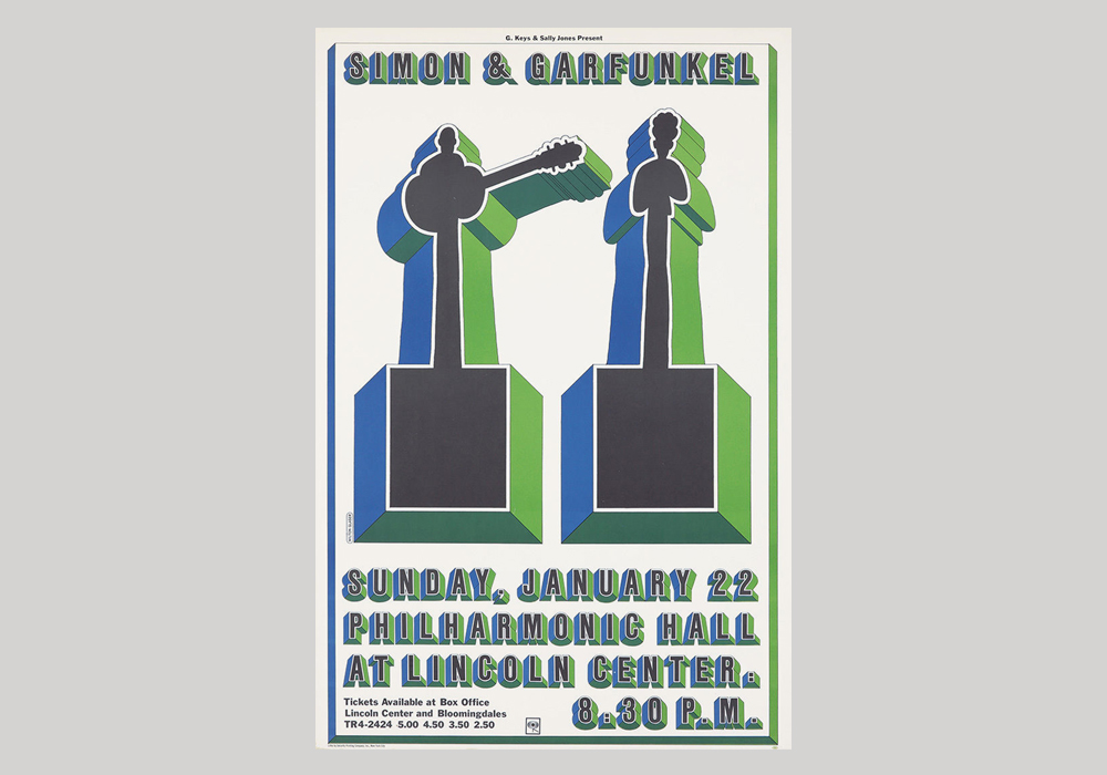
Simon & Garfunkel at Philharmonic Hall poster (USA, 1967)
Another Milton Glaser typeface, Baby Fat was designed by the I HEART NY designer in 1967 and first used on his iconic poster for Simon & Garfunkel’s concert at the New York City’s Lincoln Center Philharmonic Hall. It’s three-dimensional nature, created by shadows on each side of every letter, makes it an incredibly striking typeface—ideal for a project that combines impact and nostalgia and won’t be forgotten soon.
31. Festival
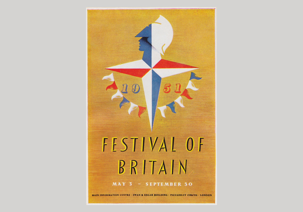
Festival of Britain poster (UK, 1951)
Festival is unmistakably mid-century modern and was, in fact, designed to be the official typeface for the peak of British mid-century modernism the Festival of Britain, a national festival held throughout the country in the summer of 1951. The typeface was designed by illustrator and designer Phillip Boydell, who had previous designed war propaganda and road safety posters. After its release to the public the year after the festival, Festival has been used to not only add a modernist twist to designs, but also a sense of celebration or summer.
32. Bravour
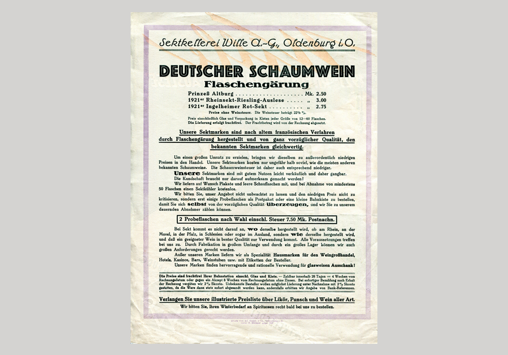
Sektkellerei Wille flyer (Germany, c.1925)
Bravour’s designer German-born Martin Jacoby-Boy was a renaissance man; training as a carpenter and practising as a painter and graphic artist before turning his attention to typefaces. He designed Bravour the year he joined the Deutsche Werkbund, 1912, and the heavy, serif typeface exemplifies the association’s aesthetic. It can be used to add an air of progressive German design to a project or add a vintage feel to a title or headline.
33. Stilla

Now I’m a Man—The Funkees (USA, 1976)
This chunky display typeface was designed by French type designer François Boltana, who worked for London foundry Letraset—it was in fact one of the winners of the Letraset International in 1973. It can easily be identified by it’s bulbous serifs on both its uppercase and lowercase letters. Stilla was frequently used on the sleeves of Funk and Soul records in the decade of its release. It is, therefore, one of those fonts that really echoes the era it was created in.
34. Bifur
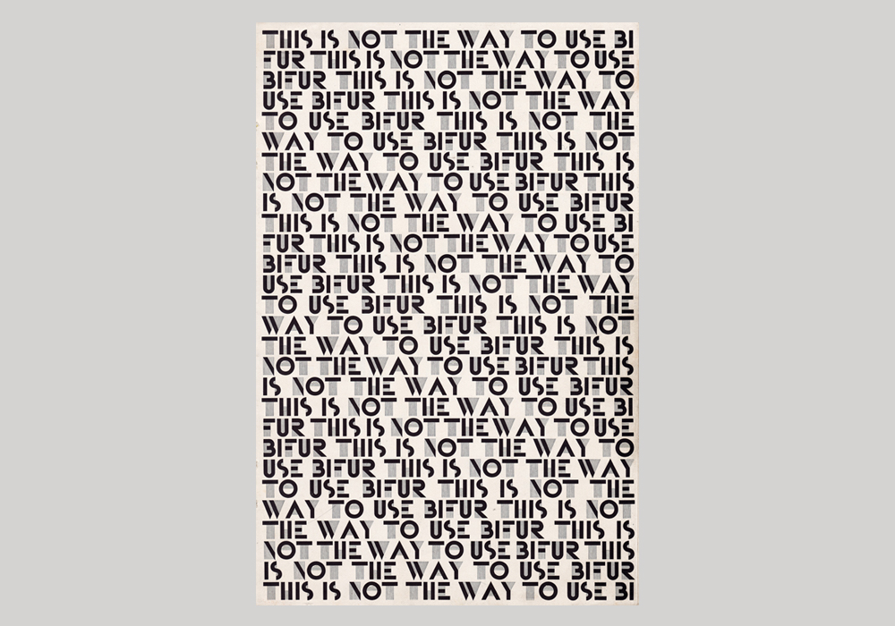
Bifur specimen (France, 1928)
It’s not difficult to guess which decade this beautiful Art Deco font was designed in: the 1920s, of course. Bifur was designed by Adolphe Mouron Cassandre, a Ukranian-French painter, graphic artist and designer of typefaces and posters. It was never an instant commercial success but certainly embodies the Art Deco aesthetic of crisp lines, bold geometry and decadent detail. It will definitely bring a Gatsby-esque 1920s’ luxury to any project.
35. Eames Century
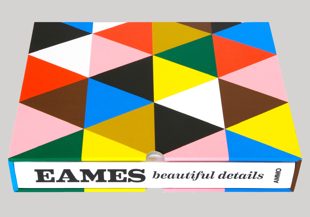
Eames: Beautiful Details (USA, 2012)
Named after Charles and Ray Eames, Eames Century is House Industries’ typographic tribute to the legendary designer couple—who worked across architecture, furniture design, graphic design, art and film. Designer Erik van Blokland wanted to capture the Eames’ modernist aesthetic while producing a functional typeface, across the entire typeface family. Eames Century is great for giving a design a mid-century modern feel, despite it only being released a decade ago.
There we have it! Vintage typography is a very wide field and there is countless amazing examples, but we wanted to give a short overview of the kind of things you can find digging through vintage record collections, from dusty old books, retro advertisements and anywhere else you can think of. The typefaces we have chosen are all hopefully ones you can still use today to give you project a retro flair—whether it’s body copy or a logo you’re designing.
Are you a budding type designer or want to learn more about typography? Take a look at our innovative graphic design course and become a graphic designer in 3 months full-time or 9 months part-time in New York, London, Manchester, Sydney, Brisbane or Melbourne.
https://www.shillingtoneducation.com/blog/vintage-typography/
