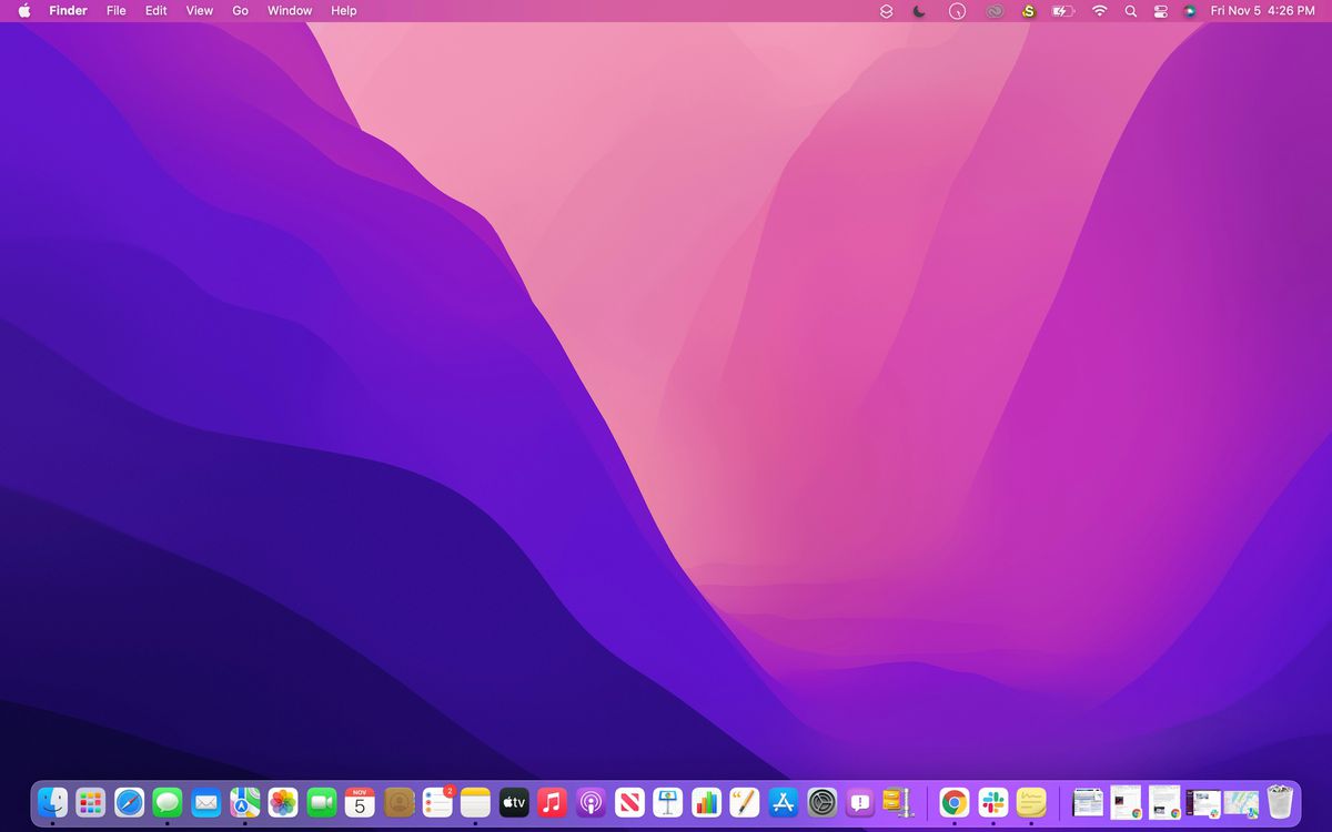
Downloading macOS Big Sur was a big change for me — visually, pragmatically, philosophically. It was the biggest macOS redesign we’d seen in years. And it was a new direction for the ecosystem in general; macOS looked and felt like iOS.
Downloading macOS Monterey, by contrast, has not impacted my life much. I installed the first beta over the summer, forgot that I was using it within a few days, and tried to download it again the following week. It looks like Big Sur, with some tweaks here and there. Many of them seem to be catch-up efforts, equipping Monterey with features that iOS (or competitors) already had. A few of the features are useful for me, but they’re features you have to seek out and set up. And we’re still waiting on some of the most innovative parts of Monterey that Apple announced earlier this year to arrive.
So my ultimate view on this operating system is, “Sure.” It’s a stable release that I’ve been using reliably for a few months. Nothing’s terribly broken. If you’re someone who prefers to exercise maximum caution and wait a while before upgrading, you’re also not missing all that much. As is often the case with releases directly following a major redesign, this is a building year for macOS.
FaceTime
The tweaks that Apple seems to be most excited about concern FaceTime. While I won’t go so far as to insinuate that Apple is trying to make FaceTime a Zoom competitor, it’s certainly introduced a number of features aimed at making its service more viable for group calls. The significant one for me is that you can now create links to FaceTime calls (as you can with Zoom calls) and send them out to participants ahead of time. These links are very easy to create with a single button on the app’s home screen — certainly slightly less of a pain than they are in the Zoom client on macOS. (On the other hand, the FaceTime link is just a link; it doesn’t come with dial-in numbers and you can’t join from a landline.)
These links also allow Android and Windows users to join such calls for the first time. Joining a FaceTime call from a Windows laptop is eerily similar to joining a Zoom or Google Meet call — you click the link, the call opens in your browser, you’re asked to enter your name, and you wait around until the host lets you in. Also in the vein of targeting the business market (or, at least, the calls-with-multiple-friends market), FaceTime now supports Grid View, which lays the faces of participants in front of you when you’re on a call (an option Zoom also has).
There are a few other neat features that pop up in Control Center, including Portrait Mode (which blurs the background behind you), Voice Isolation (which mitigates background noise while you’re speaking), and Wide Spectrum (which picks up all of your background noise, if you’re doing a virtual guitar lesson or something). Portrait Mode, in particular, works quite well, is easy to toggle on and off, and is something I’ll continue to use.

These features are actually available for third-party apps to support as well, though who supports what seems to vary. I could use Portrait Mode in both Zoom and Google Meet but couldn’t use the microphone controls. I haven’t been able to find a list of apps that support these enhancements, but I have asked Apple for one, and I’ll update this review if they dig anything up.
The most exciting new FaceTime feature, though — and the one that could really distinguish it from Zoom and other competitors when it comes to group calls — is still in beta. It’s SharePlay. SharePlay is a service similar to Teleparty, Scener, and Watch Together. It allows you and other people on your FaceTime call to watch or listen to streaming content together by syncing everyone’s video and playback controls. (So we’re both watching Foundation separately on our own Apple accounts — but when I pause or rewind, your video pauses or rewinds as well.)
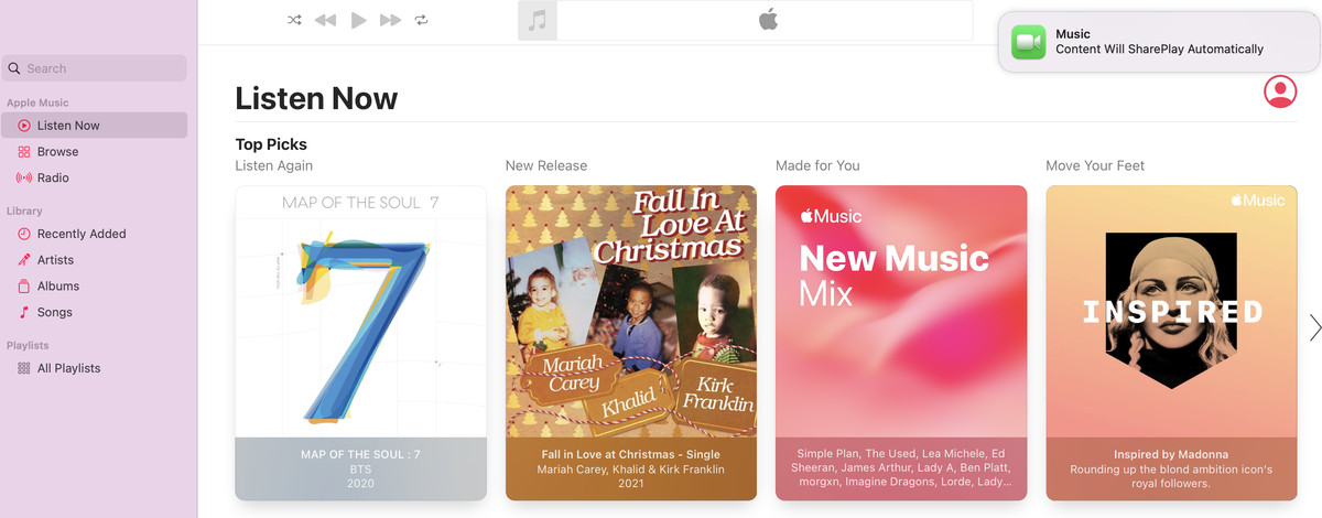
SharePlay, unfortunately, doesn’t seem ready yet. For one, the official list of services the feature supports isn’t easy to find — I had to get Apple to send me this App Store Preview page. The supported services are also relatively few, and it doesn’t include any non-Apple big players like Hulu, HBO, Netflix, or Spotify yet — which are the services that people I know reliably have. It also doesn’t have Apple’s own Podcast app yet. (It does include Tiktok, which is hilarious.) Hulu, Spotify and HBO Max are supposed to be adopting SharePlay at some point, but Apple hasn’t given me a timeline for Podcasts support.
That aside, the beta version of SharePlay is a nice experience — when it works. I played a few Apple Music tracks on a group call, and I would say SharePlay worked about 50 percent of the time. It was a good experience, and all parties could pause and skip without issue. But if I changed songs, my fellow callers would often stop hearing the audio I was trying to share and get stuck on a loading screen (while it continued to play on my end), and I’d have to quit and restart the Music app to get us synced up again. All told, I hope that Apple is able to polish SharePlay up before its final release — it still seems to be a beta feature.
Safari
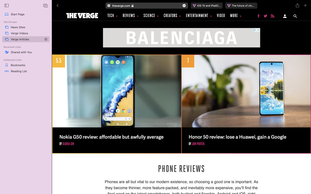
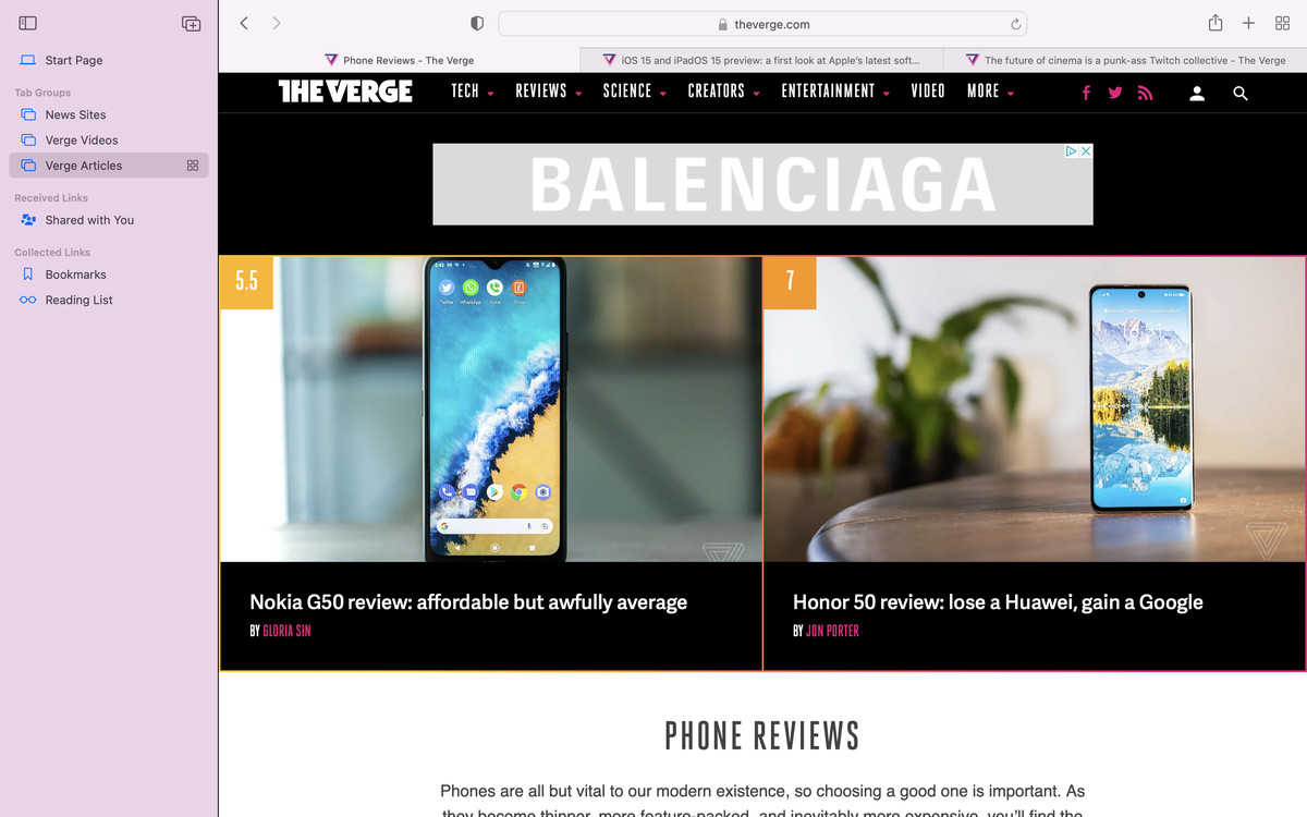
The latest version of Safari isn’t limited to Monterey — you can install it on Big Sur, too, but Apple tends to update it around the same time that it updates macOS. This year’s edition redesigns the way tabs look — or, at least, it tried to. In the first few Monterey betas, Apple combined Safari’s tab bar and URL bar into a single row. People ended up hating this — the franken-bar was a bit cramped, and it was easy to close tabs instead of selecting them — so Apple has brought back the old, discrete bars for the stable release. The combined tab bar is still an option if you want it — you can swap in Preferences. I encourage you to try both layouts if you’re a Safari user. I actually like the extra browser space that the compact tab layout affords, though it gets a bit unwieldy if you have tons and tons of tabs open.
Apple’s made a few other tweaks to tabs. They look slightly rounder now, and you can hover over one to reveal its full page title and URL. Safari also now has “tab groups” (another feature Chrome has had for a while). If you have three tabs open, you can click a little icon in the top-left corner to make them into a tab group. Later on, if you open the sidebar on the left of the Safari window, you’ll see it listed under a “Tab Groups” heading; you can click on it to reopen those three tabs. Also in that sidebar live your bookmarks and your reading list. This is — finally — an area where I think Safari is now a step ahead of Chrome. I’ve always found tab groups in Chrome to be quite confusing and have never used them, but they’re so simple in Safari that I’ve already made them part of my routine.
Tab groups also sync across devices (as do Bookmarks, extensions, etc.), though I had to dig into Settings on all my Apple products and give iCloud permission to do that before it worked. There are also a few new security features, including Intelligent Tracking Prevention, which prevents “known trackers” from viewing your IP address, and HTTPS Upgrade, which automatically switches sites from HTTP to HTTPS when possible.
And then there’s Quick Note. Quick Note ostensibly gives you an easy way to take notes on an article you’re reading — you can right-click highlighted text to add it to a Note, which will then pop back up whenever you return to that web page. I was excited about this when I tried it in early betas, but I never quite got the hang of them and haven’t actually ended up using it. It might be more useful for students who often have to take notes on long readings; I have trouble finding a use case for myself.
The new Safari as a whole was quite stable and speedy. Things weren’t randomly crashing or quitting. But the new sidebar, and the ease with which you can operate Tab Groups, has seriously made me consider switching to Safari. It’s surprisingly useful to have bookmarks, tab groups, and my reading list all in one place. If all the Chrome extensions I currently use make it over there, I’ll probably do it.
Continuity
When I asked Apple if there was any unifying theme or goal behind the big dump of features that is macOS Monterey, the company told me it was meant to further the journey Big Sur began of unifying macOS and iOS. Monterey has a few additions that are clearly meant to do that, though the biggest one isn’t ready yet. Universal Control will allow you to use an iPad as a secondary screen to your Mac, so you can drag / drop files between the two devices and operate them with a single mouse and keyboard. This has been one of the most anticipated Monterey features since the software was announced, but it’s still nowhere in sight.
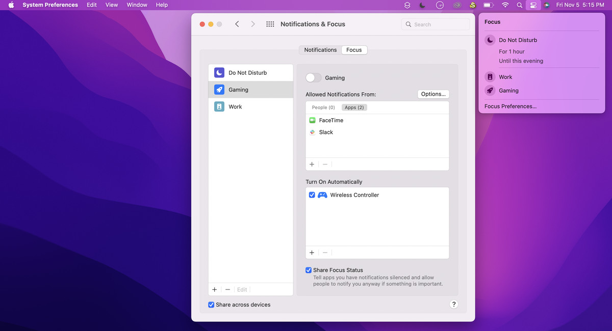
A few other iOS staples have made their way onto macOS Monterey. One is Focus, which allows you to filter notifications based on the task you’re doing. Within Focus preferences, accessible from the Control Center, you can create various Focus profiles for work, gaming, and other scenarios; for each profile, you’ll essentially whitelist applications or contacts that are allowed to send you notifications when that profile is on. You can schedule Focus to turn on automatically at various times, in various locations, or with the opening of various apps, and you can allow people and apps to choose to notify you anyway if something is urgent.
This is a feature I really wish I’d had in college — it would’ve been great for turning off social media while writing papers and such. Employed me finds it mostly useful for shutting up Slack after work hours (though you could already do that within the app itself). Switching to Focus in macOS can also switch it on across your iOS devices.
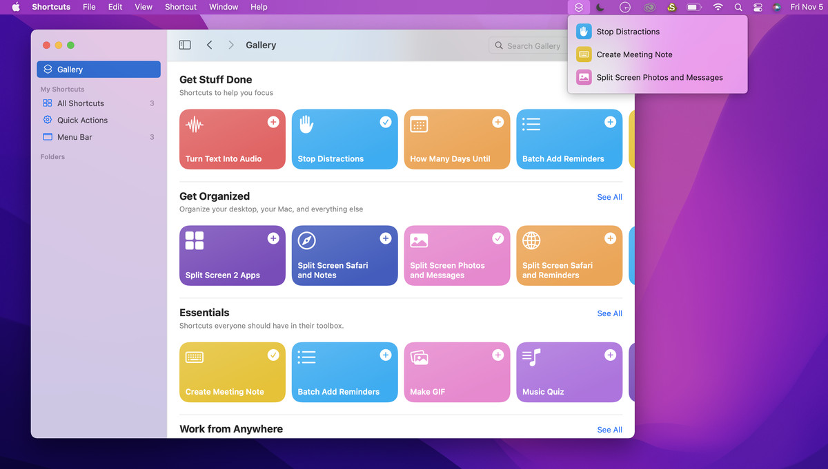
Another thing I’ve found surprisingly handy: Shortcuts. Yes, Siri Shortcuts are a thing on Macs now. I barely use these on my iPhone, but I’ve actually found a few of them handy on my MacBook because you can stick them on the menu bar for quick access. In particular, “Split Screen Two Apps” and “Start My Next Meeting” were convenient to have up there.
Odds and ends
Various other apps have gotten updates here and there. There’s a new tab called “Shared With You” in Photos, News, Safari, Apple TV, and Apple Podcasts, which displays media that you’ve recently received in Messages. This feature sounds potentially useful but didn’t actually work for me — nothing was showing up in my Shared With You tabs unless I pinned it. Apple is still trying to figure out what’s going on but tells me it’s not an issue they’ve seen before.
Speaking of Messages, if you text someone multiple photos, they’re now displayed as a collage or a stack, depending on how many you send. Sure. It’s cute. The app also displays a new button next to the photos you receive, which you can click to quickly save those photos to your device. Again, sure. It’s now slightly easier to save photos (though it wasn’t that hard before).
You can now tag your Notes, which is such a no-brainer I’m surprised it took Apple this long to implement it. Just type a hashtag followed by a word anywhere in the note in question, and it’ll show up as a tag in a “Tag Browser” on the left sidebar. Useful! I will use these.
Elsewhere, Apple seems to be trying to push Notes towards a similar vein to Google Docs. There are a number of new features that smooth out the process of collaborating on Notes in iCloud. You can now type an @ to get a friend’s attention within a Note and can see a summary of updates to shared Notes in a new Activity View. These things I’m not sure about — I already use Docs for the purpose Notes is moving towards here, and the former is still much more full-featured, not to mention more widely accessible outside of Apple’s ecosystem.
Maps, finally, has received what Apple says is its largest update yet. The main thing you’ll notice is that zooming all the way out reveals a cute interactive globe floating in space. You can click and drag to spin it around, and there are little details for mountains, rainforests, and such. When I say cute, I mean cute — it’s somewhat cartoonish and not like using Google Earth. But it’s neat to play around with, and I’ve had fun dropping pins in random places.
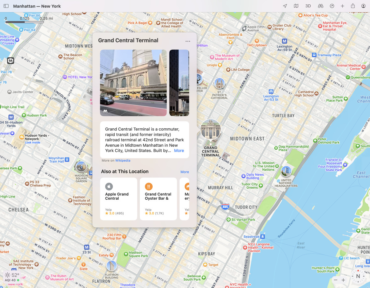
More pragmatically, city layouts have gotten more useful. Zoom in on San Francisco, and you’ll see icons over the Golden Gate Bridge, Alcatraz, Fisherman’s Wharf, Oracle Park, etc. Click those icons, and little cards pop up with basically all the information you might need about these destinations: hours, accessibility information, phone numbers, addresses, etc. I have actually started using Maps to plan trips instead of Google Maps because of these cards — I much prefer the card layout to having the information pop up in the sidebar like it does on Google. It takes up less space on the screen and doesn’t move everything else around when you open it.
Should you upgrade?
Sure, with the caveat that waiting a few weeks to download this stuff is always the safest course of action. For what it’s worth, Apple seems to have ironed out most of the bugs I saw in early betas, and it’s just released a patch to fix some upgrade headaches with older Macs. It’s also worth bearing in mind that two of the most anticipated parts of this operating system — SharePlay and Universal Control — aren’t ready yet. Other folks who are particularly cautious about bugs may want to sift through the new features and figure out which ones will benefit their lives. There may be some, and there may not.
Here’s what those features are for me: Portrait Mode, Safari Tab Groups, Shortcuts, Notes tags, and the new cards in Maps. None of these things have changed the way I observe or interact with macOS, but they’re all handy things that not all competitors have.

They are, I will note, also all things that also exist in iOS. In my review of macOS Big Sur, I noted that many of the port-overs from iOS weren’t as beneficial on a non-touchscreen laptop as they were on a phone. macOS Monterey is a more incremental step ahead, which is to be expected the year after a major redesign. But I think Apple has also done a better job this year of pinpointing the sorts of iOS features that make sense to have on a Mac.
With that said, macOS Monterey isn’t finished (despite a rather lengthy beta period), and I think there are still plenty of people who will upgrade and find little to no change to their macOS experience. That may be the case until SharePlay and Universal Control are ready to take the stage.
https://www.theverge.com/22765988/apple-macos-12-monterey-review-macbook-pro-air-imac-m1

