James Cropper’s Progressive Palettes report shines a light on colour trends for branding, packaging and social.
The oncoming end to the creative year is known for so-called ‘forecast trends’, guides from the likes of Shutterstock and Getty to gimmicky colours designers may need to be aware of come New Year’s.
A welcome and more thought-provoking antidote is something like Progressive Palettes, a report published today by materials and paper products group James Cropper that looks away from flashy shades and delves deeper into the various factors affecting colour choice in branding.
Canvassing the thoughts and opinions of over 500 designers, the report comes with analysis from creatives leads at Lush and Burberry for an in-depth look at colour use from packaging to social media. Find our breakdown below of the most salient points raised in the study.
Colours and Culture
The Progressive Palettes report provides a context for the recent arrival of Pantone colours like ‘bisexual lavender’, reminding us that colour trends don’t exist in a vacuum.
Brexit and the Trump era, sustainability and the gender debate are fuelling the colour choices brands, designers and manufacturers make. When it comes to sustainability the colour green is just one part of the rainbow according to Chris Grey, print and packaging buyer, at Lush Cosmetics.
“We’re now seeing browns, greens and blues lend share of voice to other shades in communicating sustainability credentials,’ he comments in the report.
“Other plays by brands to communicate the ‘we care’ message even include stripping out colour altogether to suggest purity.”
This same thinking explains how by choosing more ‘progressive’ colours like bisexual lavender, brands are showing they care about minorities against the backdrop of the ongoing ‘culture war’ defining our Trumpian era.
Stats and Storytelling
When it came to designers naming the biggest influence on colour choices, almost a third agreed on sustainability, a 13% increase from results gathered a decade ago by James Cropper.
This figure was just one per cent below the overall leading factor of brand identity; 20% went for the simple aesthetics of a colour itself as dealbreaker.
That brand identity remains the main consideration is no surprise, and elsewhere in the results we see 43% of designers agreeing that a brand’s equity sits with either its trademark colour or logo. Indeed, almost 40% say colour is key to creating a customer experience.
Colours and Customisation

Personalisation is expected to grow in relevance, with over half of designers surveyed predicting more brands will adopt customisable options such as coloured ribbons, tags and labels.
“One brand I know leverages the trend of personalisation through colour,” writes Elayne Cousins, sales manager for UK and Ireland at The IDP Group. “When you choose one of its tailor-made garments, it comes with a specialised service and bespoke packaging carrying a different colour.
“The packaging signals a higher-tier price bracket and is a direct response to the style choice they’ve made. It’s a powerful move, because while the papers are bespoke to the brand, their application is personal to the consumer.”
The personal touch then is another trend, but only with brands big enough to take on the large costs necessary for such tailor-made adjustments.
Scroll stopping colours

Over a third of the briefs designers receive include a requirement for the design to be ‘Instagrammable’; black and white is out, while bright ‘scroll stopping colours’ are most certainly in. But does that mean Instagram is the be all and end all for designers when it comes to colour choices? One person who doesn’t think so is Vincent Villeger, luxury packaging consultant and former Burberry director of packaging design.
“I’ve occasionally been briefed to create packaging that is aesthetically excellent on screen, but neglects texture, embossing or depth of colour in real life,” he writes.
“This approach can be particularly perilous for luxury brands, which have historically relied on the in-store experience to add value and gravitas.”
“Once a consumer has bought into a tile on Instagram, the tangible experience becomes king,” he continues. “Every moment from this point needs to validate the online experience. Packaging needs to deliver on the expectation, otherwise retention rates will suffer.”
Indeed, a third of designers polled agree that packaging replaces the in-store experience when shopping online.
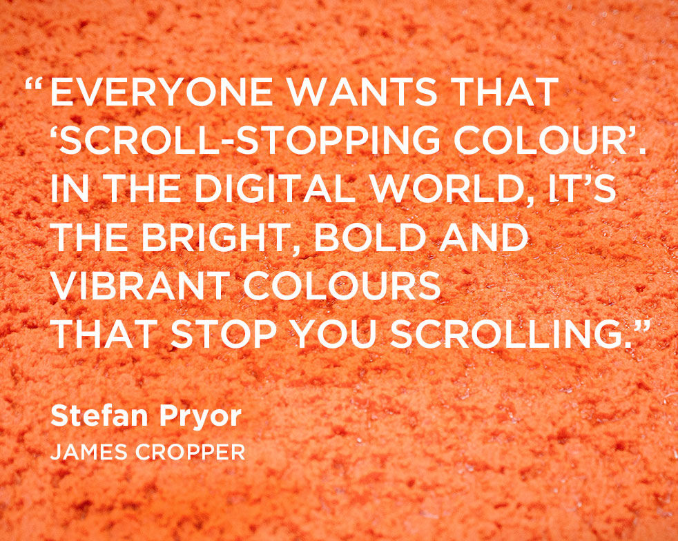
“Colour can stop you in your tracks, but so can tactility, finish, folds and texture,” says Stefan Pryor, market sector manager for packaging at James Cropper. “(The sort of) attributes which can only truly be experienced physically.”
“Colour helps brands deliver at all points whether it be online, offline, socially, environmentally or beyond,” he adds. “It’s a statement about the world and why consumers should connect with the brand.
“It means that in the future, the challenge for designers is more complex than ever,” Stefan concludes. “They need to navigate this landscape and find solutions which deliver against the expectations of the consumer in both the digital and physical worlds.”
Read next: Pantone has invented 294 new colours

https://www.digitalartsonline.co.uk/news/graphic-design/whats-influencing-colours-designers-choose-new-report-has-surprising-answers/

