Logos, movie posters, cover art and branding: the most immense identity work of the last decade.
Any product, service or package comes with an identity, whether it be book, brand or burrito. But how many went that extra mile in creativity? Which logos, adverts and cover artworks went on to inspire, entertain and – perhaps most importantly – encourage audience loyalty and plenty of online traction?
The last decade was one defined by a lot of brands around the world going colourful and cute, chasing the likes and views on social media through blocky images, knowing gags and an emphasis on characters, mascots and emoji. In spite of this, there was a lot of conservatism when it came to creativity, especially in the dominant realm of Silicon Valley. A lot of logos and rebrands from the likes of Elon Musk’s Tesla, Uber and Facebook just focused on text and a single shade of colour. Think about this: for all we heard about Elon Musk in the last five years, how many of us can draw the Tesla logo from memory? Exactly.
Luckily, when it came to giving identities to novels, albums and TV shows, imagination was more in abundance, from the sterling horror paperback logo of Stranger Things to Noma Bar’s vector heavy book covers to Margaret Atwood’s The Handmaid’s Tale reissue and The Testaments.
Below we list our favourite examples of identity branding in the twenty-tens; hit us on social with your views on anything we may have missed out.
Best Designed Film Poster: The Social Network
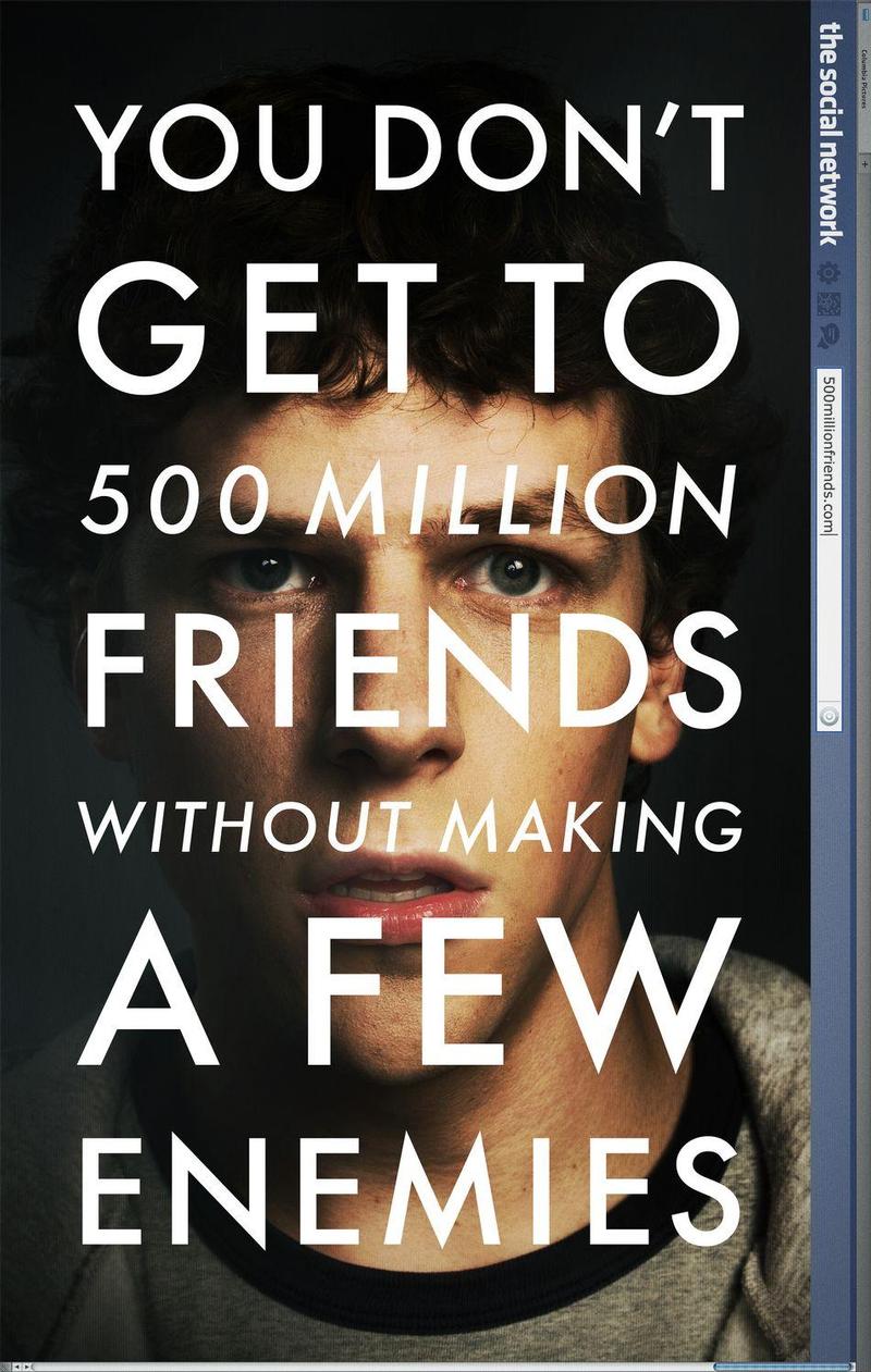
With so many great movie posters this decade, this was the toughest call on our list.
Get Out, Nymphomaniac, The Grand Budapest Hotel, Parasite, Moon, The Lobster, Moonlight – so much choice that we had to break it down by best designed and best illustrated posters.
First, on a design scale, the honour goes to the identity for 2010’s The Social Network, a movie which came out right at the start of the 2010s and whose subject matter continued to define the decade right until its close.
There’s a comparatively large amount of text here, but it comes perfectly set through sizing, spacing and italics so the message doesn’t get lost.
To the side of the poster, we get a nod to the bland blue design of Facebook, while its founder – as portrayed by Jesse Eisenberg – looks out at us as if from a mugshot or a prisoner behind the ‘bars’ of the text.
Words would turn out to be the be all and end all this decade, even as video content grew exponentially. One negative tweet or online newsflash, and figures found themselves crowned or toppled online – you could either become friend or enemy, in other words.
Best Illustrated Film Poster: Uncle Boonmee Who Can Recall His Past Lives
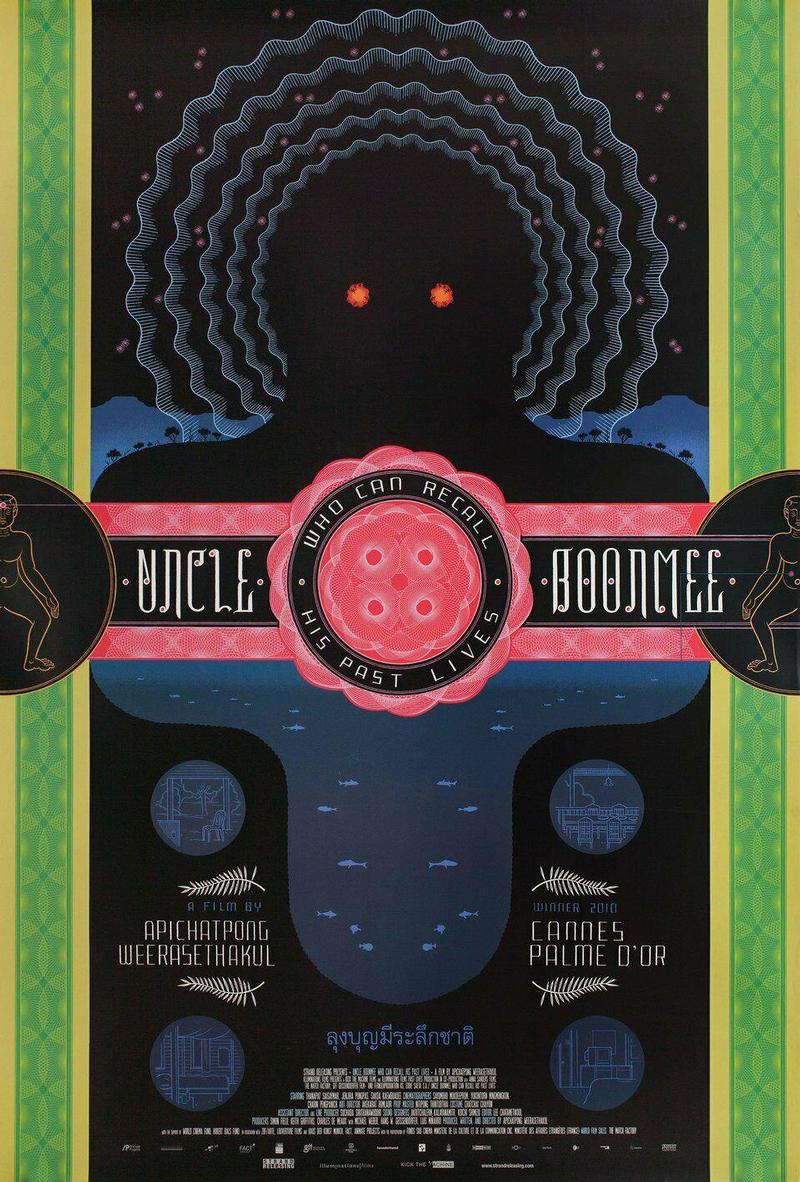
By Chris Ware, 2010
Our other top poster of the decade also came out in 2010, a singular piece of artwork made for a singular example of cinema.
Uncle Boonmee Who Can Recall His Past Lives is a sweltering, surrealist Thai movie by auteur Apichatpong Weerasethakul, often acknowledged as one of the best foreign language movies this decade. For its North American identity, none other than indie comic legend Chris Ware came on board, creating one of his rare posters for the movie industry (2007’s Savages had been his last, and it wasn’t until 2018 that he returned with artwork for Netflix’s Private Life.)
The poster suits the cryptic nature of the film, and is a nice deviation from Chris’s usually bright and sterile style, coloured with an enigmatic darkness and an intoxicating pink. You could view it as an illustration for a Buddhist text, but with that recognisable Ware touch for shapes and lines – circles are prominent, in some of them blueprints of objects and rooms, precise as the buildings and cities of his acclaimed comics.
Best Album Cover: Frank Ocean – Blonde
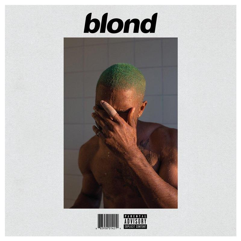
Frank Ocean’s sophomore release from 2016 came with various covers across CD, digital and even accompanying zine, reflecting the album’s unorthodox release distribution.
The cover everyone knows was actually taken from Wolfgang Tillmans’s photo series I’m a Morning Person. The image of a man crying in what looks like a bathroom was striking enough, but gained even more power laid out in a clean, nondescript framing style with a clean, curt Futura font reminiscent of the identity for clothing brand Supreme. Streetwear meets sadness, you could say.
The cover anticipated today’s ongoing conversations about male identity and mental health, with the green hair of the model perhaps symbolising queer or alternative sexualities.
It also established Frank Ocean’s brand to a wider audience, taking the singer from cult lo-fi bedroom artist to brand new heights. Whilst it isn’t Frank photographed, the figure stands-in for the wounded, confessional singer, the artist forever symbolised by the raw gracefulness of the cover.
Best Designed Book Cover: 1Q84 by Haruki Murakami
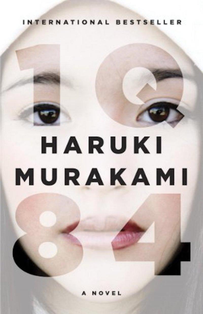
Cover by Chip Kidd, 2011
1Q84 was released in Japan one year before the twenty tens began, that’s true, but it wasn’t until 2011 that the English translation apparated.
When Knopf prepared the book for its American edition, they turned to probably the only man who could do the book justice – design titan Chip Kidd, who’d been behind all the iconic Murakami covers made for the west.
For his take on 1Q84, Chip told the official Haruki Murakami homepage that “the duality of (character) Aomame’s situation could be represented by an interaction of the book’s jacket with the binding/cover underneath.
“By using a semi-transparent vellum for the jacket, and printing the woman’s image in a positive/negative scheme with the title on the outside layer and the rest of her on the binding, once the jacket is wrapped around the book it ‘completes’ the picture of her face. But something odd is definitely going on, and before the reader even reads a word, he or she is forced to consider the idea of someone going from one plane of existence to another.”
Chip knocked it out of the park by producing something that feels both new and familiar to his other otherworldly identities for the Japanese author. Read our interview from this year with Chip about all things Japan and Batman.
Best Foreign Language Book Cover: Look Who’s Back by Timur Vermes
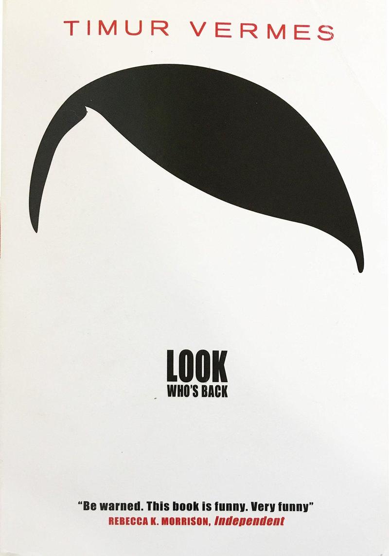
Cover by Johannes Wiebel (Punch Design), 2012
Known as Er ist wieder da in Germany where it was originally released, Timur Vermes’s farcical tale of Hitler’s 21st century return differs from the Murakami above in that its singular cover made it onto the English translation, other versions around the world, and even as the official movie poster for the book’s 2015 movie adaptation.
This could all be put down to the old adage that less is more; through a simple vector shape, a masterstroke of type and whole swatches of blank space, a familiar face returns in an approachable manner, conveying the satirical whimsy of the book without scaring readers away.
Best New Edition Cover: 1984 by George Orwell
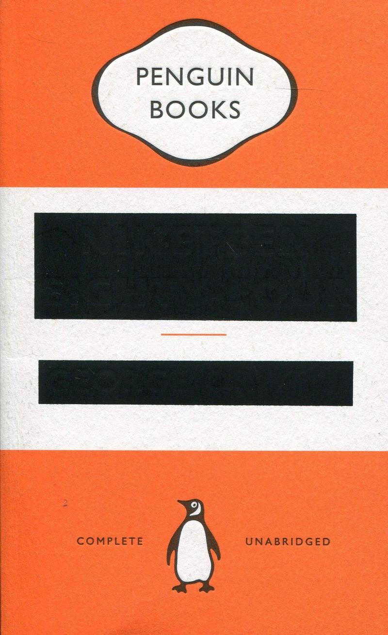
Cover by David Pearson, 2013
REDACTED
REDACTED
REDACTED
REDACTED
REDACTED
REDACTED.
REDACTED.
REDACTED.
REDACTED.
REDACTED
REDACTED
REDACTED
REDACTED.
Best Illustrated Book Cover: Normal People by Sally Rooney
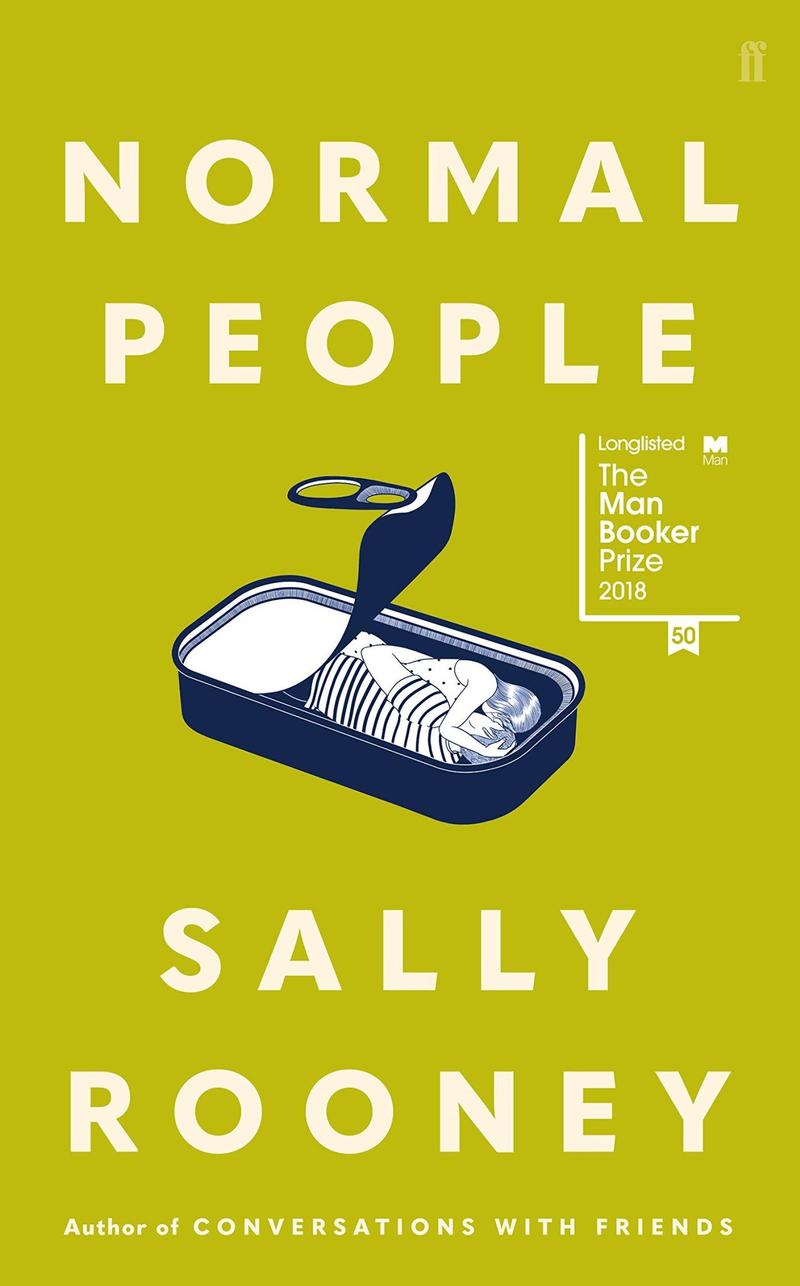
Cover by Henn Kim, 2018
It may only be a year old, but this cover is one of those you remember seeing in the book store for the first time.
While the 2010s saw book covers become ‘Instagrammable’ by being blocky, with the book title centered over bright vector shapes, Henn Kim’s artwork has the best of both worlds, keeping to one simple clean image surrounded by social media-perfect strong type. These elements are kept apart though, like all the book covers we grew up with before social became all-encompassing.
The design comes in two colours, of which we prefer the green background variant used for the hardback. It certainly best suits the blue tones of Henn’s singular illustration, two lovers in a sardine can that makes for a most abnormal image.
Best Branding & Advertising Campaigns: Channel 4
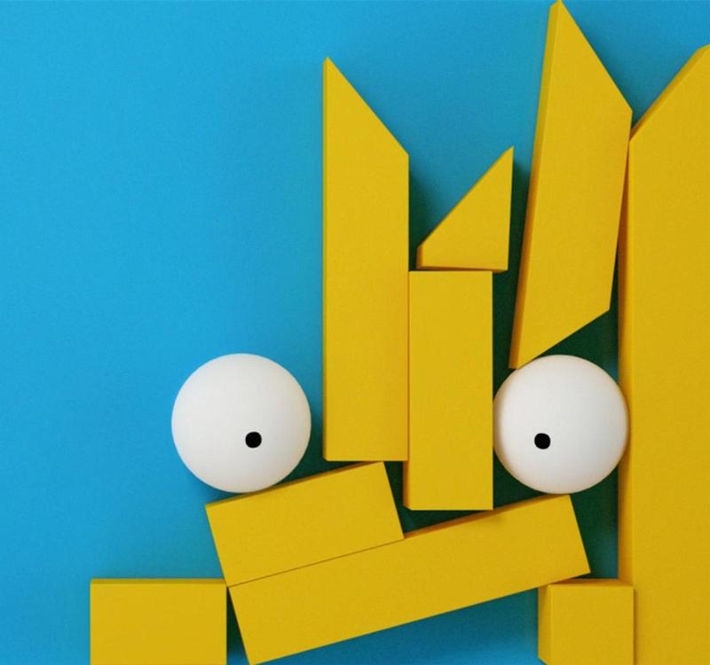
Best Brand Logo: Deliveroo

By DesignStudio
OK, this one is more of a rebrand, but the Deliveroo logo all Brits know and love today stems from 2016, three years after the food delivery app launched with its original illustration of a kangaroo as logo.
The abstract, child-like reinvention came just before the brand became ubiquitous in the UK, and remains one of the most lovable icons seen on couriers around the city. Its cheery turquoise-tones also elicit fond feelings (although that may just be as I’m hungry at the keyboard.)
Deliveroo won out by going with not just a friendly face, but an animal one, and thats just something you don’t get anymore, especially not at this level of pitch perfect creativity.
Best Rebrand: Mastercard
By Pentagram
Does a logo need your company’s name on it, especially when the logo is already world famous?
In a decade of countless dodgy rebrands, the Masterclass brand refresh is the one designers should take inspiration from, being proof positive that rebranding doesn’t always have to encourage excess or needless new forms.
Creative giants Pentagram were behind the original 2016 revision that moved the brand name below the iconic red and yellow circles. This came just in time for the money Masters to remain relevant among flashy young upstarts like Monzo and Revolut; by January 2019, Pentagram removed text altogether from the logo to worldwide acclaim.
The success of the project opens up exciting new avenues, and one wonders if one day we will see a brand with no name, totally symbolised by its logo like the late Prince attempted to pull off in the 1990s.
Best Social Media Campaign: Marvel’s ‘hashflags’
By 100% Soft, 2016
Marvel owned the decade in the pop culture stakes, in no small part due to canny marketing to the right audiences. Still though, we can’t say they particularly broke new ground with their campaigns; most true creativity stemmed from the hiring of ace illustrators like Sam Gilbey for some pretty stunning posters.
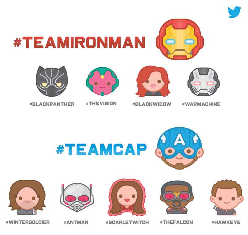
But great posters have always existed in cinema, so we’re more drawn to how Marvel Studios used the very 2010s invention of customised brand Twitter emojis, or ‘hashflags’ as they’re becoming known as.
Coca Cola were the first to buy emojis on the social media platform, ones that appear with the use of certain hashtags over a limited period of time. Once they’re gone, they’re gone – oh how I miss the #DoctorWho Tardis emoticon, for example – but the ones Marvel unveiled in the release of comic book sequel Captain America: Civil War still remain favourites for many, being a brilliantly example of both great art and audience understanding.
Allowing Twitter users to pledge allegiance to one of the two rival superhero teams in the movie (Team Cap or Team Iron Man) allowed fans to revel in geeky pleasures. That they could also get artist 100% Strong’s cute little emoji to represent their fave heroes on that team was the masterstroke, and one repeated by Marvel in 2018 then 2019 for the last two Avengers films of this decade.
For this year’s Avengers: Infinity War countless emoji were created for the film’s endless parade of characters, all to equally rabid appreciation – but the 2016 iteration deserves all the accolades for getting the ball rolling not just for Marvel but also other sci-fi cult media from the BBC and Netflix.
; we love them 3000.
Note: We may earn a commission when you buy through links on our site, at no extra cost to you. This doesn’t affect our editorial independence. Learn more.
https://www.digitalartsonline.co.uk/features/graphic-design/2010s-most-creative-commercial-work/

