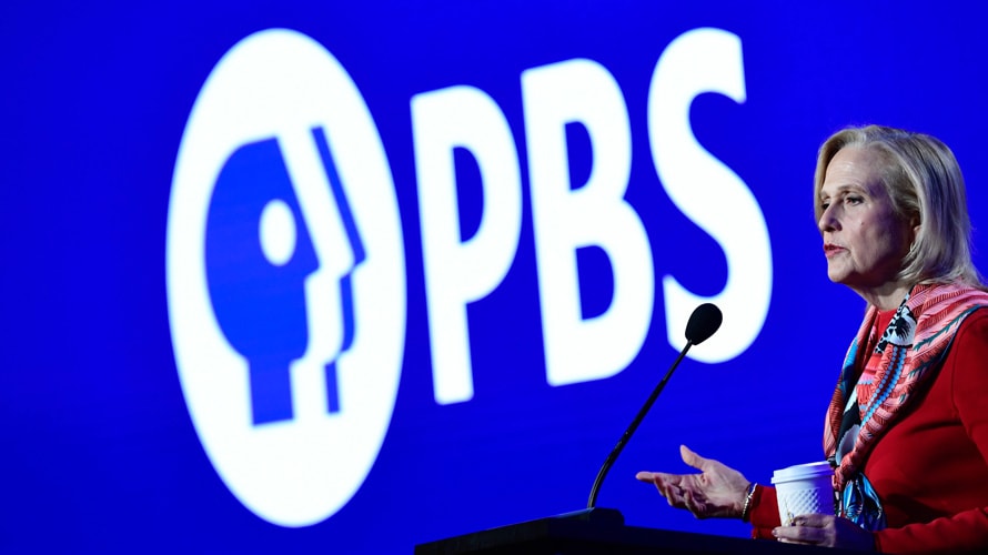
PBS is celebrating its 50th anniversary this year with a logo refresh that it hopes will help its viewers stay more connected with the brand across all platforms and stations.
The new look, which features an updated color, logo and typeface, was the result of a two-year process during which the company looked at the PBS brand and how it was represented across the country and on various platforms, PBS president and CEO Paula Kerger told reporters today at the Television Critics Association’s winter press tour in Pasadena, Calif.
“For most of our history, we have had television stations where we’ve controlled how our content is delivered, and now we’re in an environment where our stations are delivering content in multiple places,” said Kerger. “Being able to associate the brand of the station and the brand of PBS, no matter where you are, and making sure that [it] pops so that people can find you becomes increasingly important.”
PBS, working with global creative consultancy Lippincott, rolled out the brand refresh last November as it prepared to celebrate its 50th anniversary this year. The logo features a more modern typeface, designed to be highly legible across PBS’ broadcast, mobile and digital platforms.
The logo’s new color—known as PBS Blue—was designed to convey a sense of trust and integrity. “It’s distinctive. It doesn’t look like the Netflix red or anyone else’s,” said Kerger. “And it really does connect to the stations themselves.”
Prior to the refresh, “our old brand did not look so great,” said Kerger.
Over this year, close to 70% of the 330 local PBS member stations will be adopting the new brand identity to provide a consistent viewer experience
With those stations embedding the brand into their own logos, said Kerger, “it becomes an even more seamless opportunity for stations to connect to people in a way that, no matter whether you’re finding PBS content on your smartphone or you’re looking at PBS on the big screen in your living room, you find what you’re looking for and you’re able to connect to the stories that you’re hoping to see.”
At one point, PBS considered “a radical change” to its logo, said Kerger. “I’m sure it doesn’t surprise you that we don’t have billions to invest in a new logo and media effort, but we were prepared to put everything on the table to see if there was a way to look at this fresh.”
However, “there is a lot of equity in those P-heads,” she said, referring to the faces that make up part of the logo.
Tweaking the logo “also gave us an opportunity to freshen up our on-air look,” said Kerger, referencing the new sound and tonal elements. “We were really looking at freshening up anyway, but the big driver was around making sure that no matter where you see that logo, you immediately recognize it as PBS.”
https://www.adweek.com/tv-video/pbs-hopes-distinctive-logo-refresh-connects-viewers-across-all-platforms/

