Sandro Rybak has been working professionally as a freelance illustrator and graphic designer for the last three years, having worked in advertisement, editorial illustration and fashion.
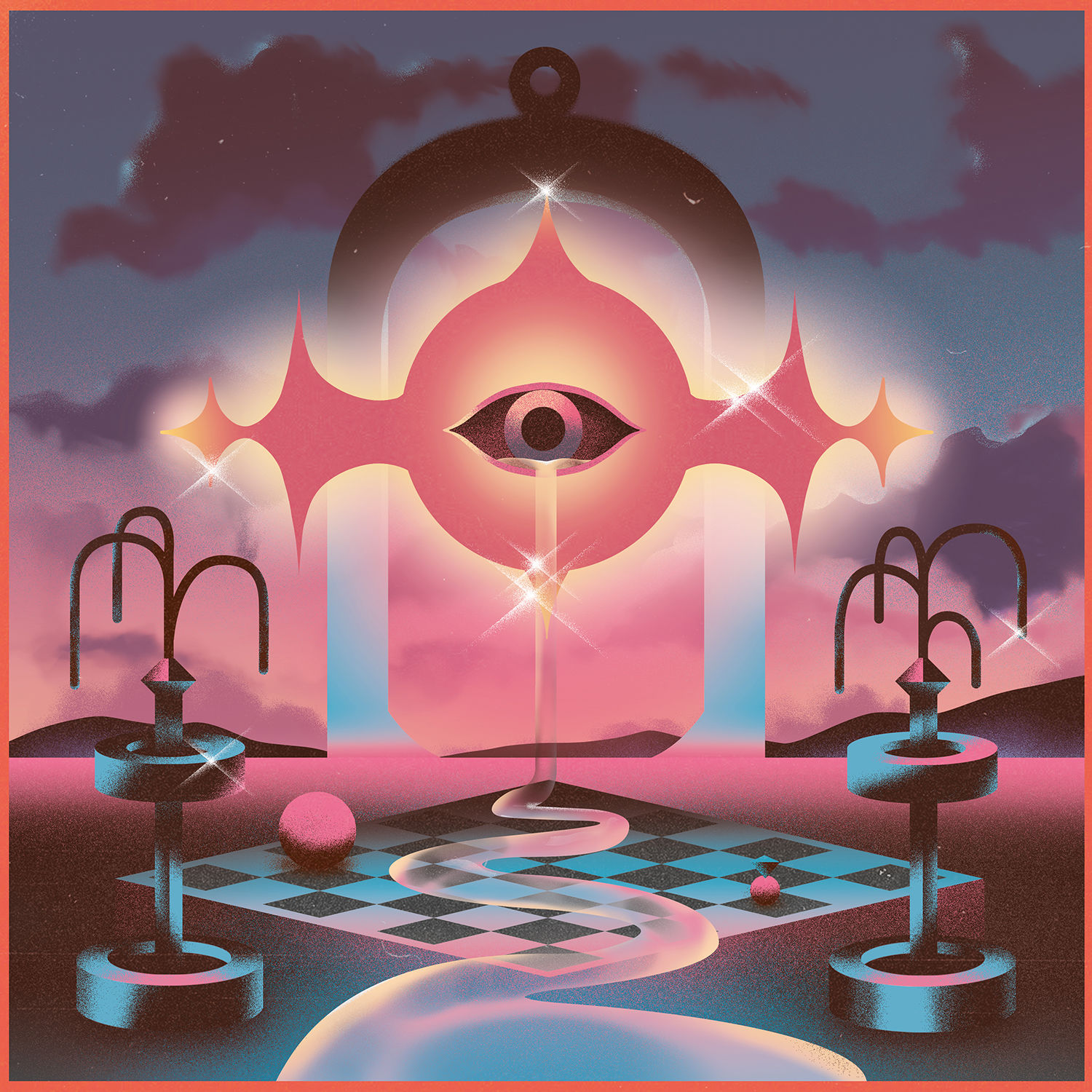
The Germany-based creative has caught our attention mainly with some stunning music artwork and gig posters, all bearing his trademark ‘digital airbrush’ feel. Find out more about Sandro and how he captures this style in our interview.
Commissioners, you can check out his portfolio here, with select pieces accompanying our conversation.
What traditional and digital tools do you use?
I don’t use a lot of tools for my illustrations. Give me Photoshop and a tablet and I’m ready to work.
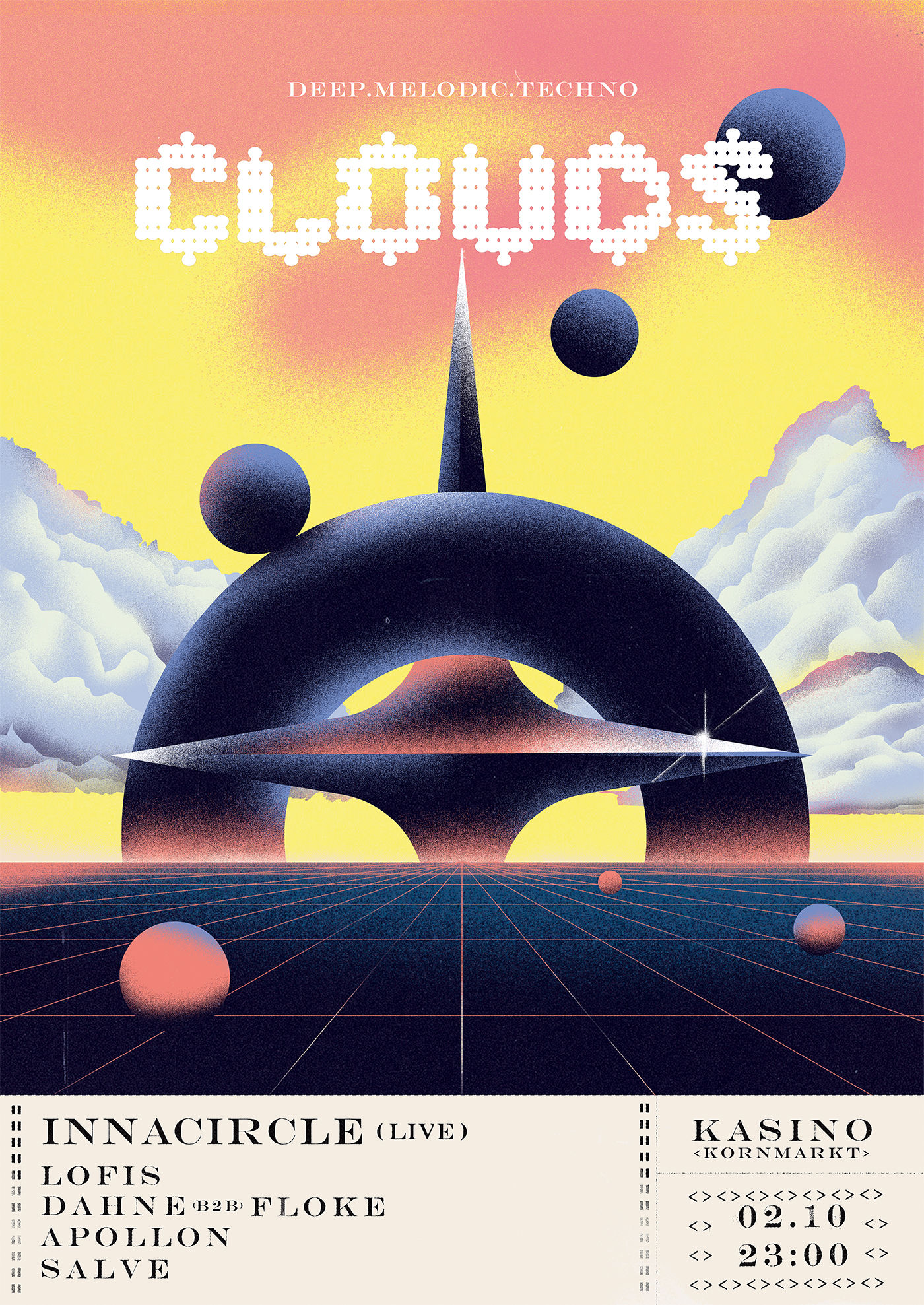
Besides record art and gig posters, what projects are you most proud of and why?
Due to the whole Corona-thingy this project was never finalised, but I was able to create the corporate identity for 2020’s Internet Freedom Festival in Valencia, Spain. This was the biggest and longest project I’ve ever worked on and it was a super interesting experience to design everything and learn to adapt a design to all kind of different things like flags, posters, shirts, pins, etc.
How has the ‘Corona-thingy’ impacted on you?
Like a lot of people, I lost some important jobs, but this also gave me some free-time to concentrate on myself and my well-being (and video games).
As the social aspect also broke away, I had a lot of time to be with myself and to tackle the things that I always planned to do another day.
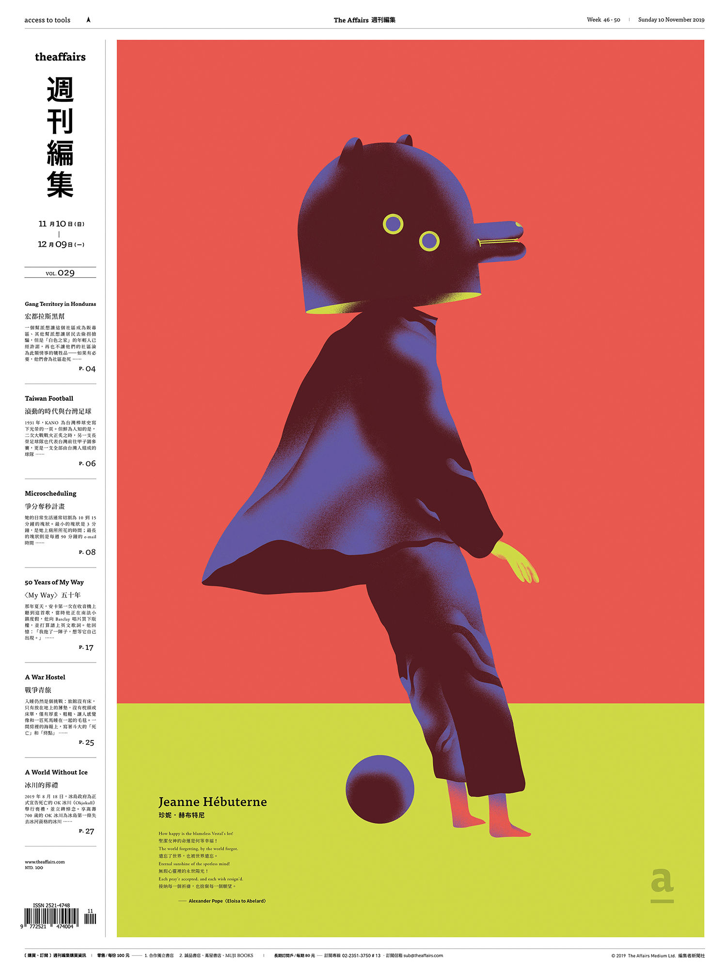
You seem to do many record sleeves: how did you get into this, and why do you enjoy it?
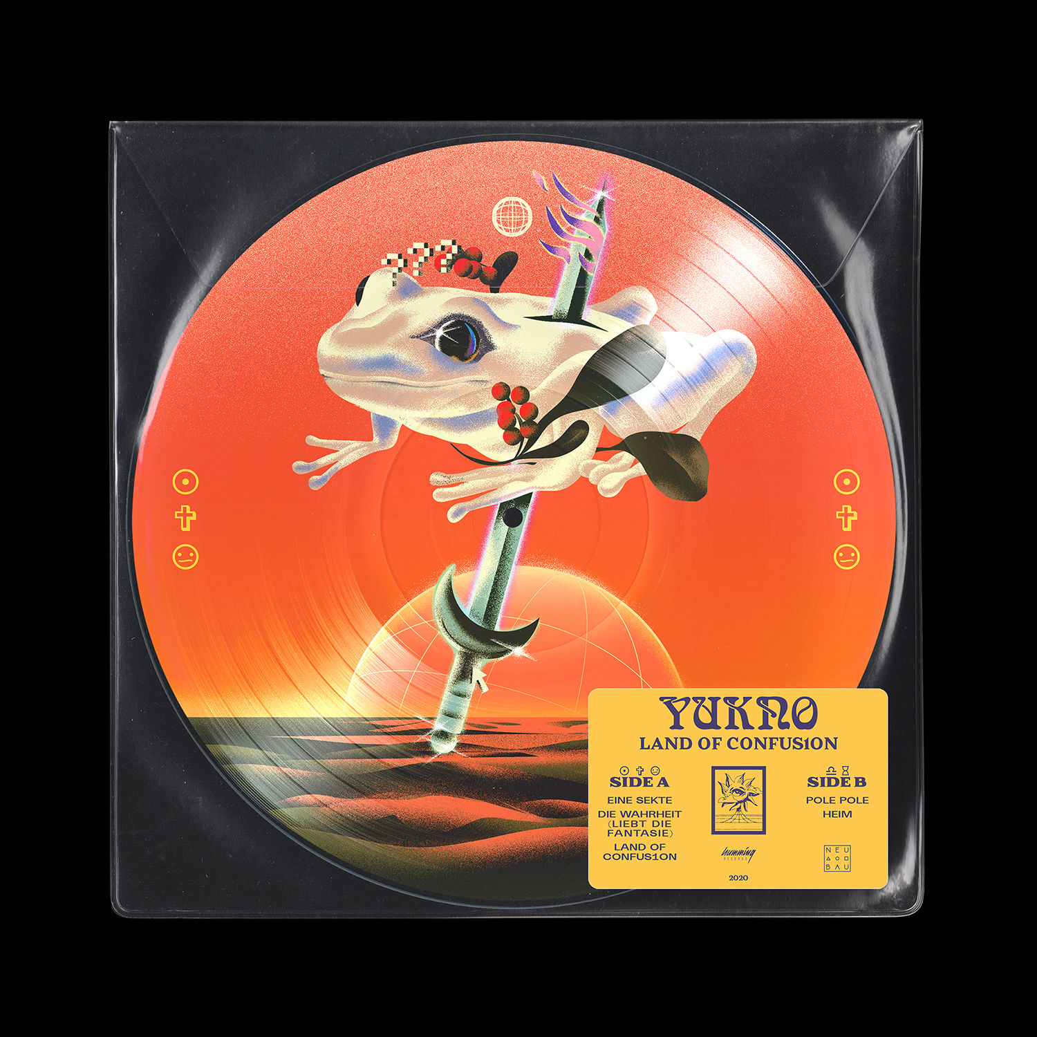
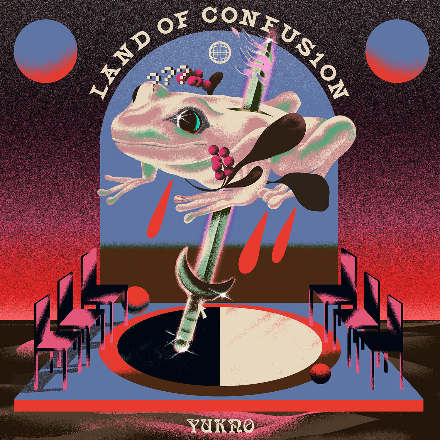
In 2019 I created a fan-poster for the song Tomorrowland by Yukno feat. Fibel and they contacted me after a while to create artworks for their upcoming releases, which I’m super happy about. This was something I wanted to make for a while, as I really enjoy the artistic freedom and experimental approaches I can take compared to more classic graphic design stuff.
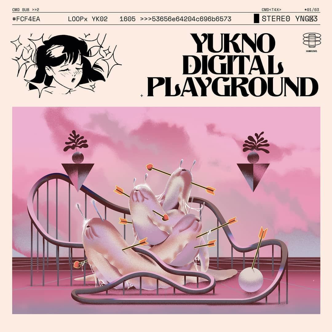
I love your Digital Playground cover for Yukno. Could you please tell me about this project a bit more?
Digital Playground is the first single from Yukno’s second album. In summary the song talks about how we use social media for self-appreciation purposes and how we are constantly looking out for feedback for self-assertiveness. I tried to represent this idea with a slug orgy.
Yes, a lot of your work for the band Yukno features animals and creatures. What are they and why this style?
Yukno are processing a lot of contemporary thoughts and problems on their latest release, like internet culture, digitalisation and how we fit in this world 2.0 as a society. I always liked the aspect of the internet, that it’s something like a global country, but nevertheless, it always was lacking its own mythology and symbolism.
We started off with super abstract artwork for the first singles and in time, I came up with this kind of religious images of animals that represent certain aspects of the digital world.
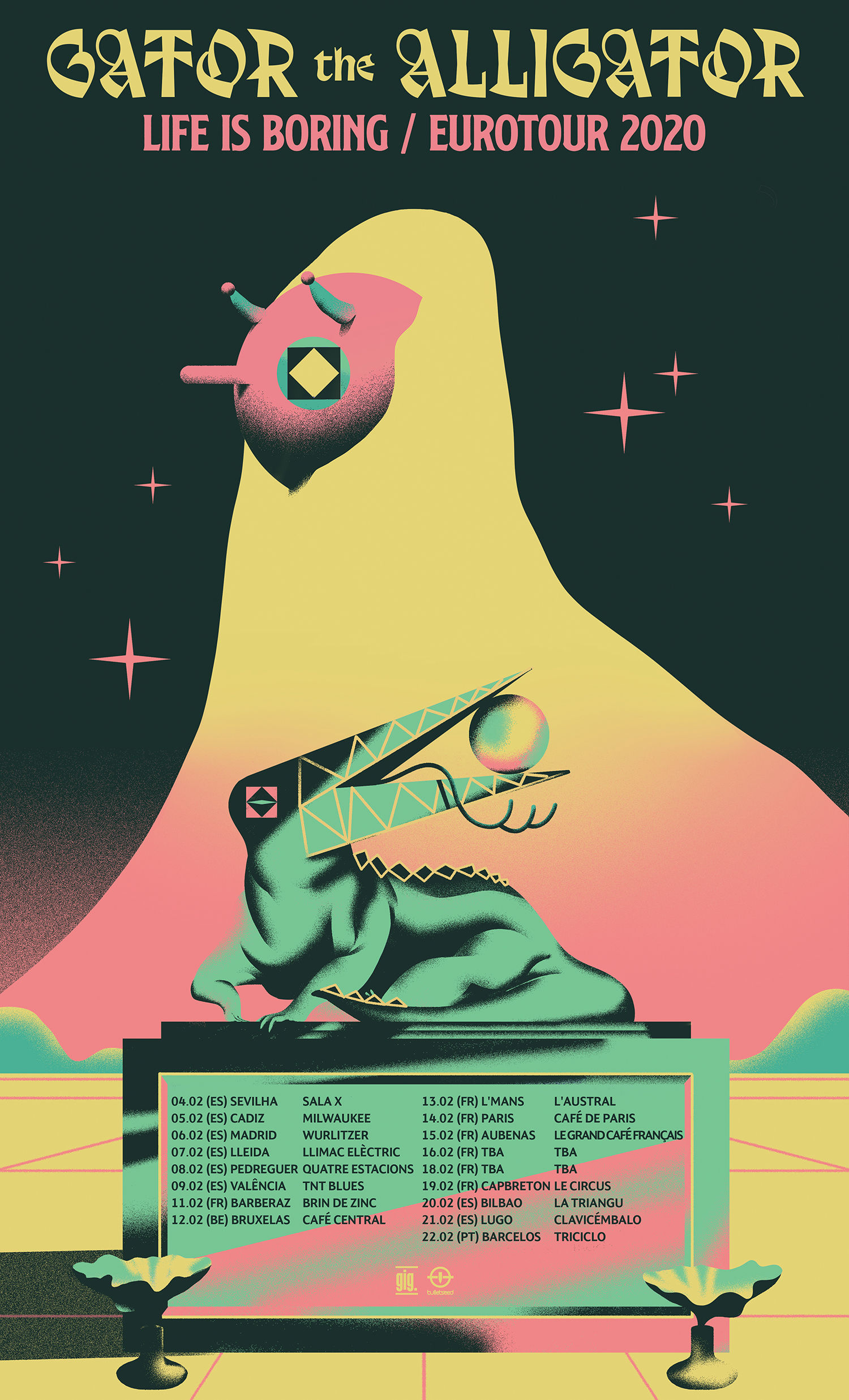
Your work generally has weird and wonderful characters. How you conjure them up? What do they mean to you?
There is an old walnut tree in the forest not far from my apartment and after a full-moon night you can find the ideas in the morning dew underneath the tree… but actually I think it’s because I spend my whole childhood watching cartoons.
Now I have a big catalogue of weird forms and creatures in my head. Drawing was always my hobby, but now that it became my job the relaxing aspect is a bit lost. So when I really want try to relax, I draw characters.
What’s the key to a great album or single cover?
For me a great cover has to spark my interest to listen to a band and make me wonder what the music sounds like.
How does the creation process differ when you create gig posters compared to music artwork?
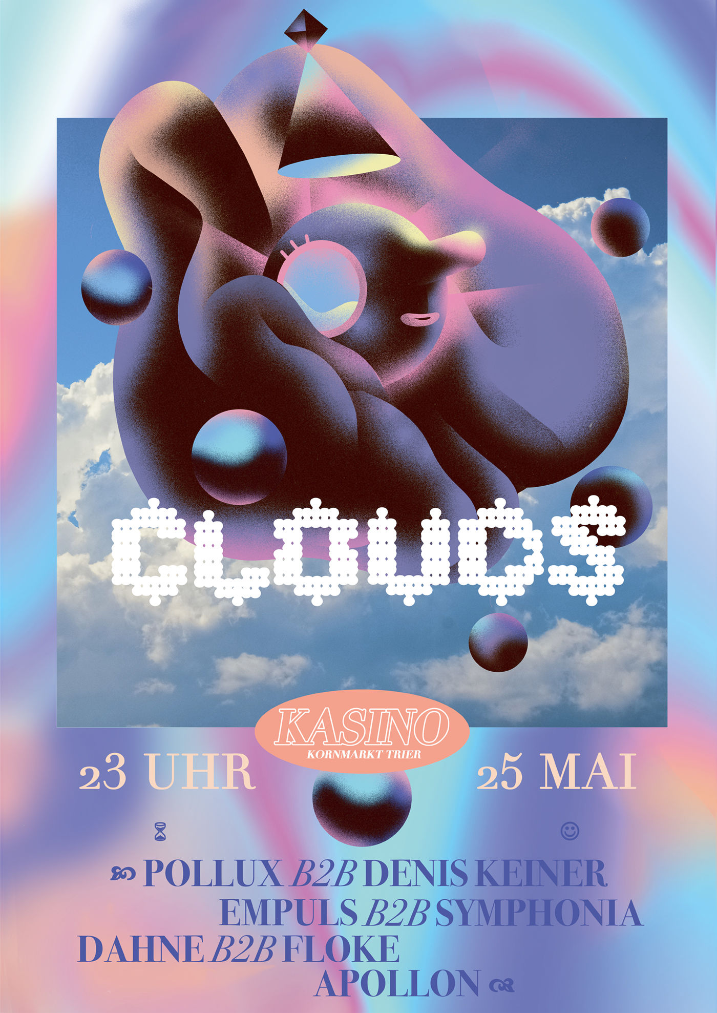
A gig poster has an informative aspect to it. So typography plays a big role and the illustration usually becomes less important. For me it always feels like a small challenge, as I have to add information that I have no control of, whereas cover work feels more artistic and free
What’s the key to a great gig poster?
I like to imagine that if someone is hurrying to work because he is already late, but stops to check out a gig poster, it’s already a win. Nevertheless I don’t have enough experience to say what makes a great gig poster and what not. Maybe I can answer this in a couple of years, haha.
What are your favourite ever album covers and gig posters?
I love the Currents cover by Robert Beatty for Tame Impala so much. This is also the cover that made me want to work the way I do. Asia has some amazing covers and the cover for July by Far Caspian, I love the intimacy of this photograph.
Concerning my favourite gig posters, I always loved the DIY-posters from local punk and rock concert, where the artwork feels like it was made super-quick from scratch and just copied/printed on A4 neon-paper.
What projects would you like to try next?
I would love to venture into the world of packaging design with my illustration, and see if my work fits well with products and dimensional objects.
Related: Vaporwave art makes the coffee table book of your dreams
https://www.digitalartsonline.co.uk/features/illustration/sandro-rybak-creates-slug-orgies-in-digital-airbrush-style/

