

Advertising is great, but if you’re marketing a CPG product, the first thing you need to get right is packaging. In the hyper-crowded market of a grocery store, packaging and use of shelf space often make the difference between success and failure.
But aside from getting inventive with images of green fields and happy cows, how do you make milk packaging pop?
If you are Russian design agency Depot, you create a clever interconnected design that practically pounces off the shelf.
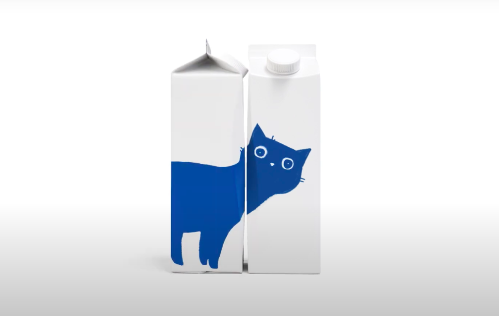
The cartons show elements of a blue cat, each on one side of the carton. But when the cartons are placed alongside each other on a shelf (and turned the correct ways), they reveal an image of the entire animal–a really clever way to grab attention. (Just don’t ask shelf stacking staff whether they’re pleased about the extra work of keeping the visual organized.)
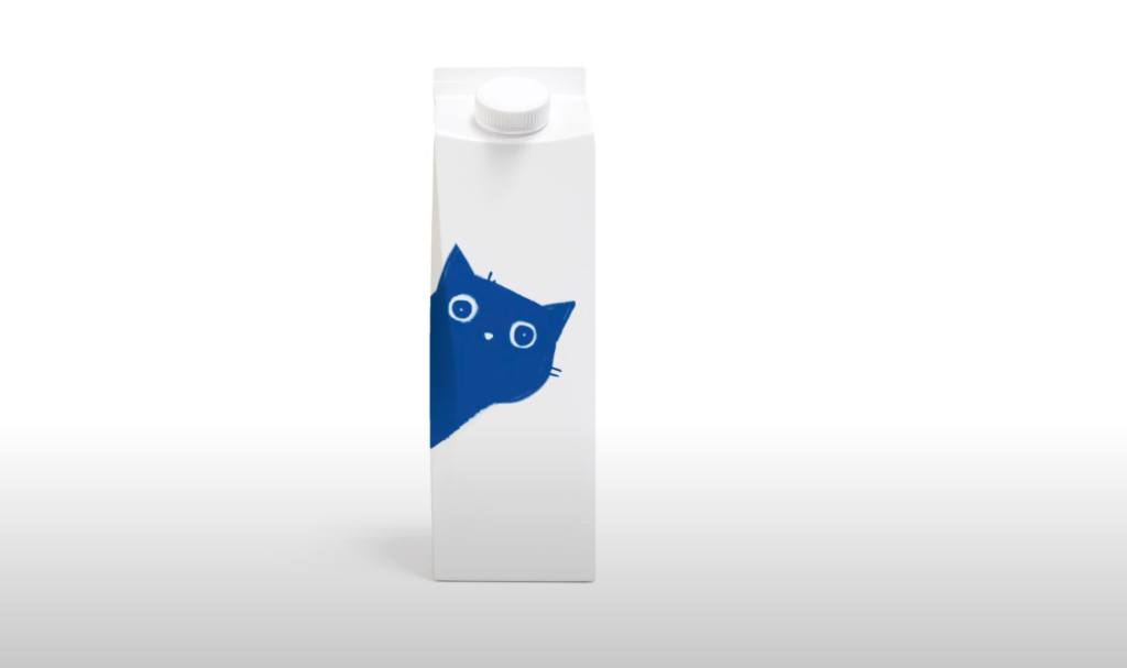

On its website, the agency said the playful, curious cat character was actually inspired by Brunhilde, a cat who belongs to the agency’s art director Vera Zvereva.
The packaging can also be moved around to achieve different designs, as this image shows.

https://www.adweek.com/agencies/this-milk-carton-design-is-almost-as-clever-as-it-is-adorable/
