This interview was originally conducted live on Twitter, July 20, 2021.
John Hudson, co-founder of Tiro Typeworks, world-class type designer and expert in font technology. Today it’s my honor to interview him and talk a little about the award-winning superfamily, Brill.
ILT: Thanks again for joining us, John. My first question for you is: Brill is a modern classic text typeface family. How did it come to be?
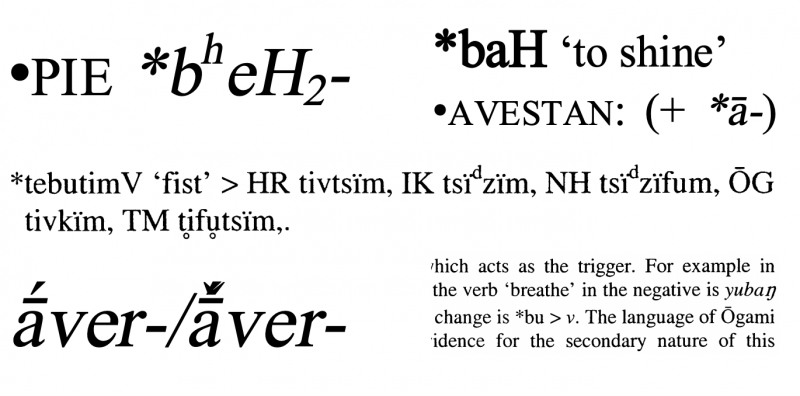
JH: Brill approached me initially in 2006, to discuss problems they were having in the typography of their books and journals. They’ve been in business since 1683, and used to cast their own types, but the transition to digital type had not been easy for them. Brill publishes titles across a wide swathe of the humanities, including a lot of linguistics, transcriptions of ancient languages, philology, Egyptology, etc. and their typography had become a mess of mixed fonts for different scripts, or even for individual characters.
ILT: Problems related to multilingual typography/typesetting?
JH: Exactly. So in the mid 2000s, they had begun to think that maybe they needed their own fonts, with a properly coordinated design across scripts and characters, to avoid this sort of thing:
ILT: I can’t even begin to imagine where I’d begin. How do you start a project like this? I mean, where do you begin?
JH: It took two years of discussions before the contract was signed, during which time we came up with a detailed plan and draft glyph set documentation. Pim Rietbroek at Brill had documented all the unique type forms he had found in their publications.
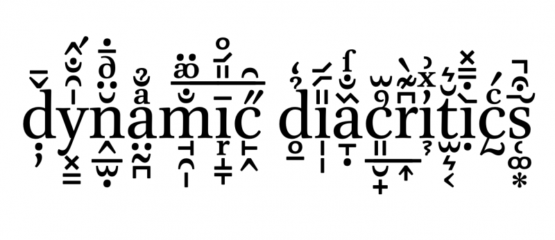
So then I needed to figure out how to implement them. I think initially, they were expecting each type form—including every diacritic letter+mark combination—to be created, but I was able to show them how it would be more flexible to rely on dynamic mark positioning.
ILT: Wow! I think that image half answers my next question: What are the greatest challenges to creating typefaces for text as opposed to display?
JH: That question might suggest that creating display typefaces is easier. I suppose it is for some people, but I find display types much more difficult, and I’ve really only done one (Gabriola for Microsoft). Text typography is where I am most comfortable. I suppose the particular challenge in designing a text typeface is in maintaining an even spatial frequency—what is sometimes called ‘colour’—across such a large number of glyphs, and then modulating that for secondary weights, italics, and everything that makes up the family.
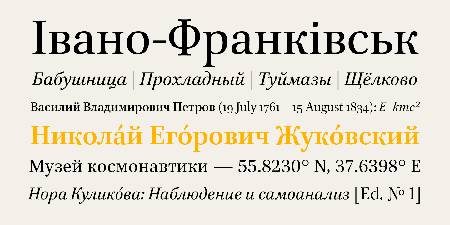
ILT: Across a large number of glyphs and scripts! Which leads me to my third question: The wider Brill superfamily covers Latin, Cyrillic, and Greek. How do you ensure that they all function like members of the same family, that they share the same DNA, so to speak?
JH: All three scripts were considered from the beginning of the project, which is definitely preferable to being asked to add script support to an existing design. So I was able to suggest a design direction for the types that I knew would adapt to different scripts. In the Brill types, the massively extended Latin character set also needed to be considered carefully, because it includes turned, flipped and mirrored shapes that do not work well in all the evolved styles on Latin typography.
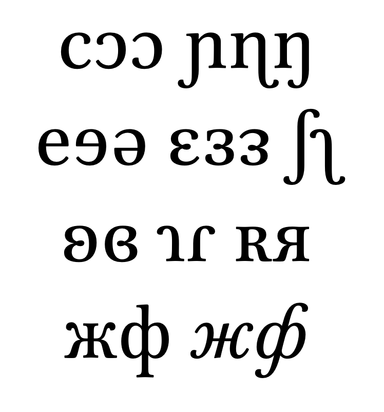
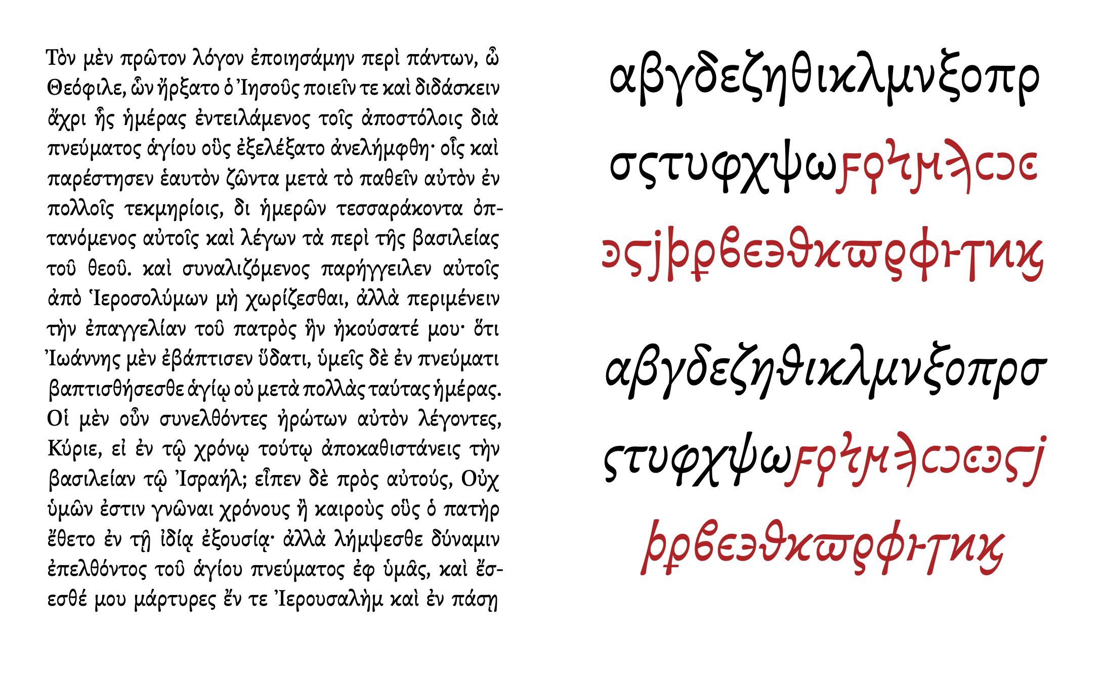
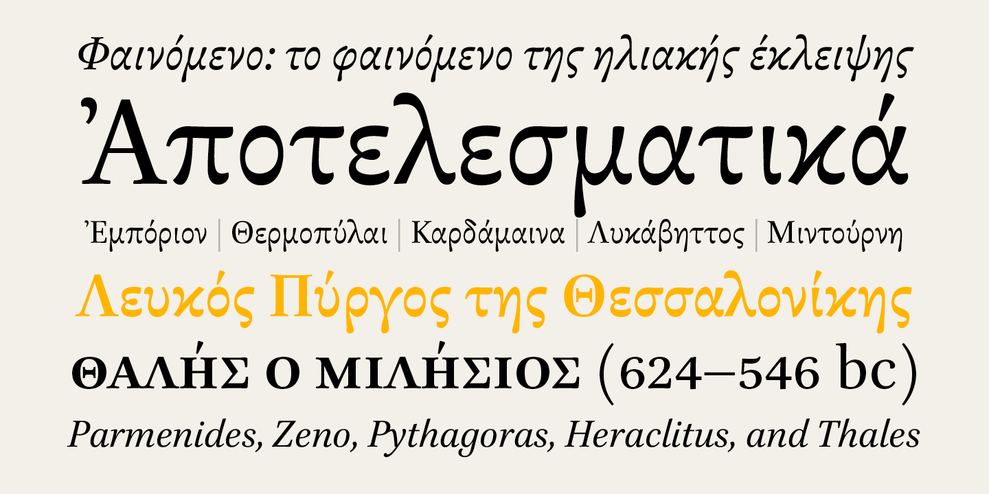
The Brill Greek follows the traditional stroke modulation pattern, and is a kind of neo-Didot style. So it is historically and idiomatically related to the Latin, while not being at all Latinised in its construction. And, of course, includes archaic and variant character shapes.
ILT: So once you had that ‘design direction’ in mind, did you then work on one script at a time, or were you working on the Latin, Greek, and Cyrillic in tandem?
JH: I did initial design explorations in all three scripts, refining each in reference to the other, which is my preferred way of working. It is particular helpful to work on Latin and Cyrillic simultaneously, because they share so many letters but have their own proportional systems.
ILT: You’ve been designing type for quite some time. Has there been any discernible shift in taste or fashion when it comes to text typefaces and book typography?
JH: Not so much a shift, but a gradual opening up to a greater variety of typefaces. One still sees a huge number of books set in digital versions of classic metal types—versions of Garamond, Caslon, Baskerville—and the early digital types, especially Minion. A lot of book and journal typography is very conservative, including in the choice of typeface, and perhaps especially in North America. But—without conducting a survey—I have the sense that the canon of accepted types is gradually expanding.
ILT: And do you have plans to extend Brill to support more scripts or writing systems?
JH: There have been some gradual extensions since the initial release, and last year we completed a major extension for version 4.0, which included support for some additional Cyrillic orthographies and Old Cyrillic characters. To date, the character coverage has been very much driven by Brill’s publishing needs, so e.g., it still doesn’t include a lot of Cyrillic letters used in minority language alphabets. Those would be first on my list of things to add.
Now that we’re selling commercial licenses to the fonts—in an income sharing agreement with Brill — I suspect some future developments might originate outside of Brill’s needs, in response to the kinds of work other customers are doing.
ILT: So a Brill Arabic is not totally out of the question?
JH: That would be fun! But almost certainly something that would originate, if at all, from outside of Brill: they use Decotype’s Tasmeem system for typesetting a lot of their Arabic materials.
ILT: I’ll need to Google ‘Tasmeem’. What’s your favorite part of type design?
JH: The first part. Coming up with the idea for a new design is always such an exciting and enervating process. It needs to be, because that energy needs to sustain a long, long period of less exciting work to complete the fonts. Each of the complete Brill fonts now includes more than 6,000 glyphs. Part way through the process, I found I really needed help, mostly because my energy and enthusiasm was flagging, so Alice Savoie did a lot of the work on the bold weights, and Paul Hanslow on recent additions.
ILT: 6000! Like so many others, I’ve started designing typefaces, but never got beyond the punctuation! Perhaps I’ll call Alice Savoie. My final question for you, John: On a more personal note, if you weren’t a type designer, what might you be doing?
JH: I’m actively trying to figure out how to make a living from playing at the beach with my dog (which is what I am going to do when this interview concludes). A few years ago, I developed an interest in volcanoes, so perhaps a volcanologist? ◉
The Brill font family is available to license in the ILT font store.


