-
Check out the right side of the taskbar—it’s an app drawer!Ron Amadeo
-
The app drawer, open on top of the settings.Ron Amadeo
Android 13 Developer Preview 2 is out, and with it come a bunch of changes for the next version of Android. Preview 2 is still a very early look at Android 13, and most of the big feature reveals for these Android previews come during Google I/O. The good news is that Google just set a date for that event: May 11–12.
First up, if you’re disappointed at the relatively tame tablet changes brought about by Android 12L, know that Google is still working on tablet features. The latest Android 13 preview adds an app drawer button to the taskbar, letting you easily access all your apps from any screen. It’s a great addition, and it’s hopefully a sign of things to come for the brand-new taskbar added in Android 12L.
Next, it would be great if the Android taskbar worked more like a Windows or Mac taskbar. The Android taskbar shows the bottom row of home-screen icons, and that’s it. Instead, it should show pinned apps on one side and recently opened apps on the other. Other operating systems work like this because it makes sense. Google officially calls this a “Taskbar,” so shouldn’t current tasks appear in it?
-
Android 13 now shows active apps at the bottom of the quick-settings panel. The power and settings buttons are down there, too.Ron Amadeo
-
What the “Active apps” pop-up looks like.Ron Amadeo
-
The media player has been completely redesigned. It definitely needs higher-resolution album art now.Ron Amadeo
-
The output picker looks different, too.Ron Amadeo
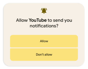
As usual, there’s a lot going on with the notification panel. Opt-in notifications are live, so every app will ask for notification permissions on first startup now. As someone who never wants to hear a notification from 90 percent of apps, it’s very satisfying to preemptively ban most notifications.

The settings (and power button) has been moved to the bottom of the quick-settings panel, and a new “active app” tracker lives down there, too. When you click on it, you’ll be able to see anything running in the background. Google actually calls this “active apps” button the “Foreground Services (FGS) Task Manager.”
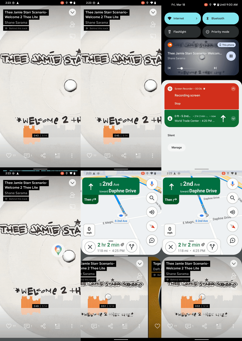
The special media notification introduced in Android 11 has been completely redesigned. Instead of showing the album art in a thumbnail, the art now covers the entire background of the notification. The media notification can’t be collapsed anymore, and it’s not always the height of two notifications. The removal of the double-height notification and the thumbnail leaves a lot more room for controls, and you’ll now see much more text, a seek bar, and “previous” and “next” buttons.
One problem with the media player is that some music apps don’t pass high-resolution images to the media notification. The apps expect the art to display in a tiny thumbnail, so it’s low resolution. Blowing the file up to a full-width background image tends to look terrible.

One of the coolest new features for split-screen addicts is the ability to drag an app out of the notification panel and into split-screen mode. Just long-press on a notification and start moving your finger around. The notification panel will collapse, and split-screen mode will activate. The only problem is that you can’t do this action with the media player yet because it makes weird, custom system notifications.
Google has something wild planned for Android’s mostly ignored screen-saver functionality. Amazon Fire tablets can plug into a charging dock and become an Alexa smart display, and it looks like Google wants to do something similar with the Google Assistant. The feature is not live yet, but Esper’s Mishaal Rahman has spotted code for “complications” that can run in the screen-saver mode. You’ll be able to display information like the weather, air quality, date, and time, which sounds a lot like a smart-display feature.
-
The screen saver has two new options, but the real news is the “complications” that turn an Android device into a smart display.Ron Amadeo
-
Display and font sizes are now on a single screen.Ron Amadeo
-
Android now has a built-in QR Code reader.Ron Amadeo
-
The privacy kill switches can be consolidated into a single button, which then brings up a very wasteful full-screen pop-up.Ron Amadeo
Android 13 has made some visible improvements to the screensaver settings already, such as new options to display a rainbow animation or photos from Google Photos. Elsewhere in the settings, Google made the sensible decision to combine the “display size” and “font size” screens since they both affect how big everything is. You can now manage everything from a single screen, and there’s a large “reset” button at the bottom if you mess something up.
Finally, we have two new quick-settings buttons: a QR code reader, which finally eliminates the need for a third-party app, and a new “Security and Privacy” tile, which bundles the microphone, camera access, and location kill switch into a single button. Google displays these three tiny buttons on a giant full-screen pop-up, which is hopefully just evidence of some early alpha awkwardness.
https://arstechnica.com/?p=1842070

