

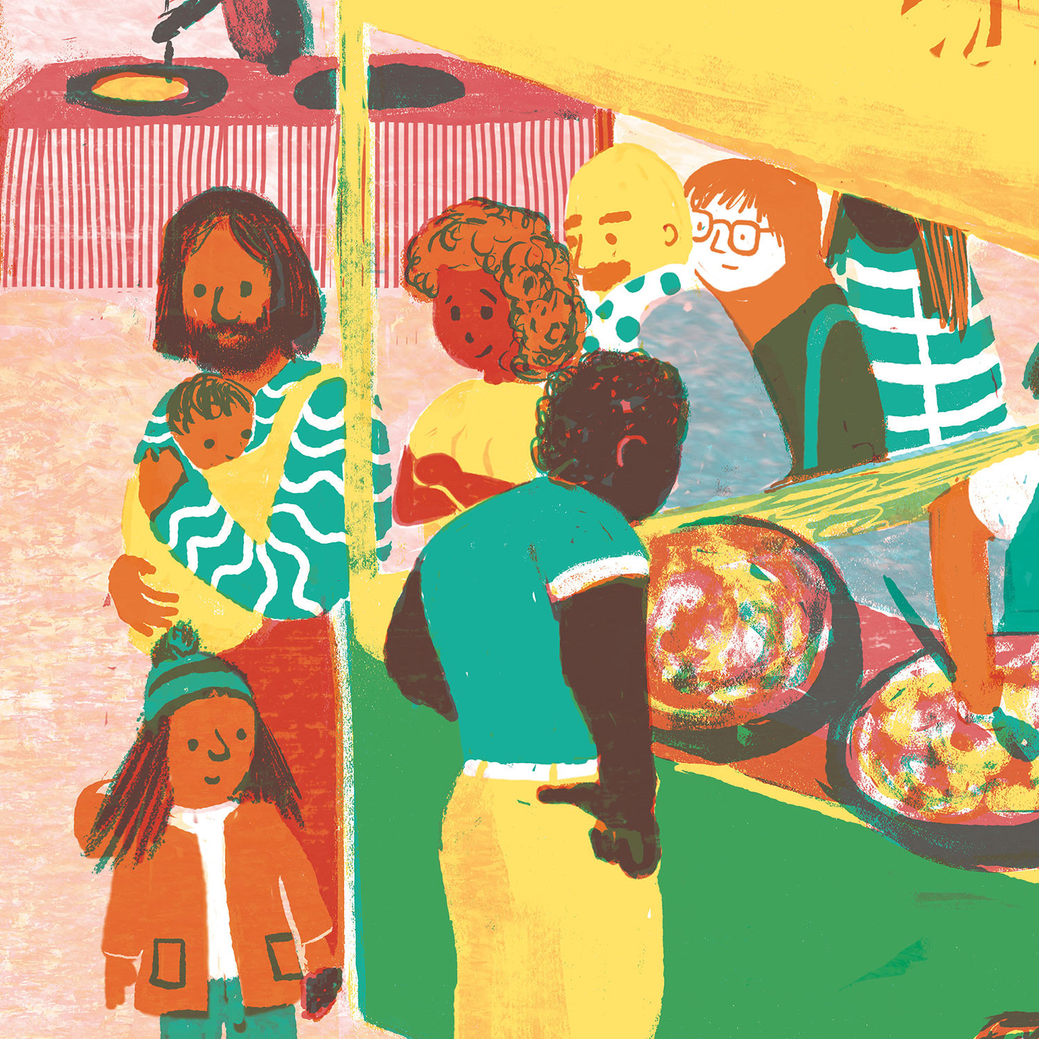
Recently Bloomsbury Farmers Market by Phoebe Swan was nominated for a Design Product & Packaging award in the AOI World Illustration Awards, a depiction of the London market made for the consumer research company Decision Technology.
Phoebe was commissioned by the company to make three artworks for their new office on Tottenham Court Road. As they handle statistics from cross-sections of the population, the theme was ‘diverse groups of people’.
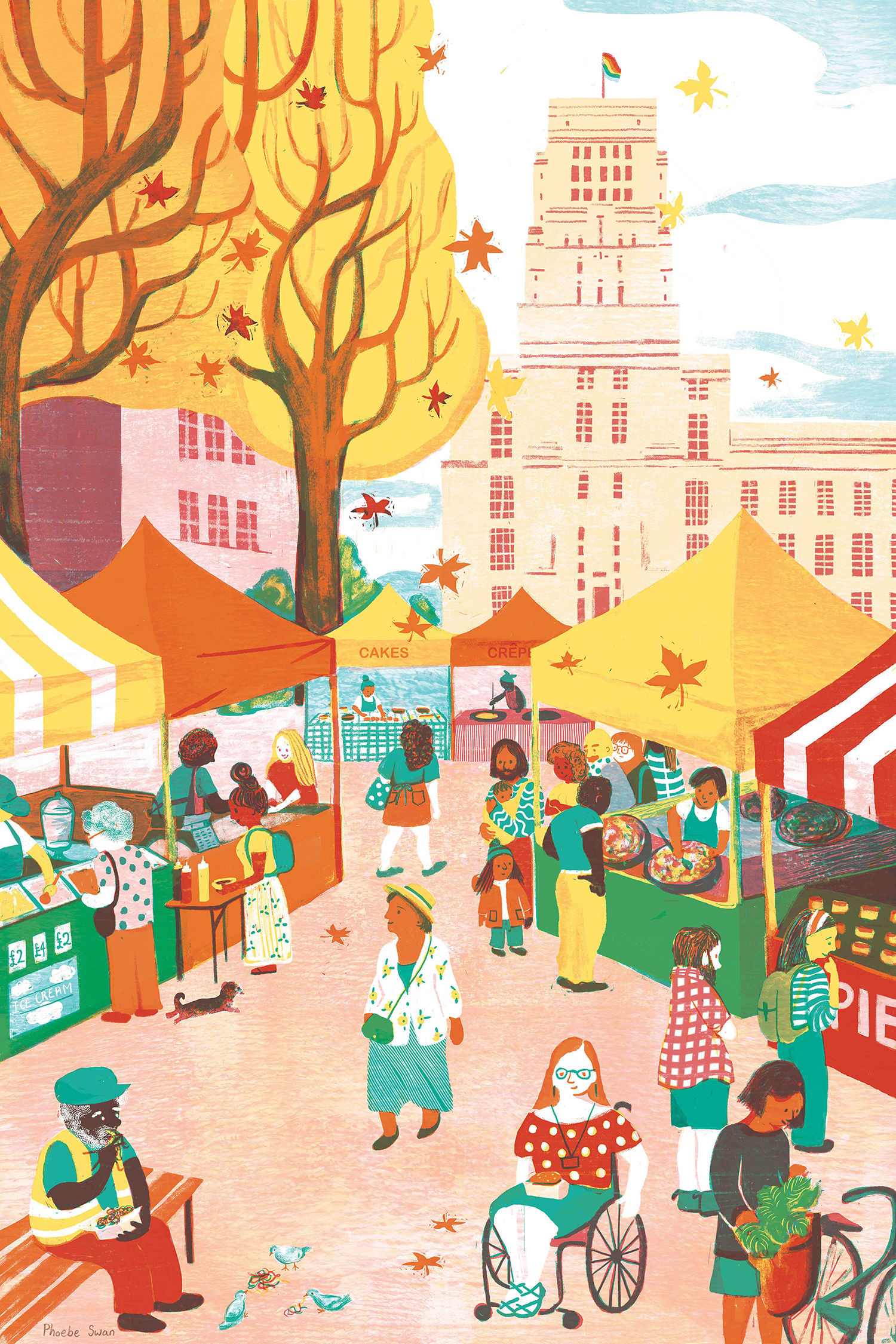
“Bloomsbury Market is part of an ongoing series of work I am making about my home city of London,” Phoebe emails us. “It started in 2016 with an image of Borough Market.
“In that image I contrasted the large architectural form of the Shard as the backdrop to the little narratives shown in the interactions between the people in the foreground. This was made in response to that year’s Association of Illustrators’ Prize for Illustration for which the theme was Sounds of the City.
“It made the shortlist and has been one of my best-selling prints ever since, particularly for people who have lived or worked in the area and have fond memories of it.
“I knew that I wanted to visually explore my city further and so I was very excited when the opportunity came along from Decision Technology.
“I proposed that the images be similar in format, each with a recognisable architectural feature in the background and a public space in which people from all walks of life naturally congregate in the foreground.
I took inspiration from Edward Bawden’s London scenes in which he uses the architectural forms of train stations and markets to compose scenes of everyday life. I spent time drawing and taking photographs in each location before composing the final designs in Photoshop.
“Almost every single character is based on a real person I drew from observation. I hope the little details give people something new and interesting to discover each time they look at them.”
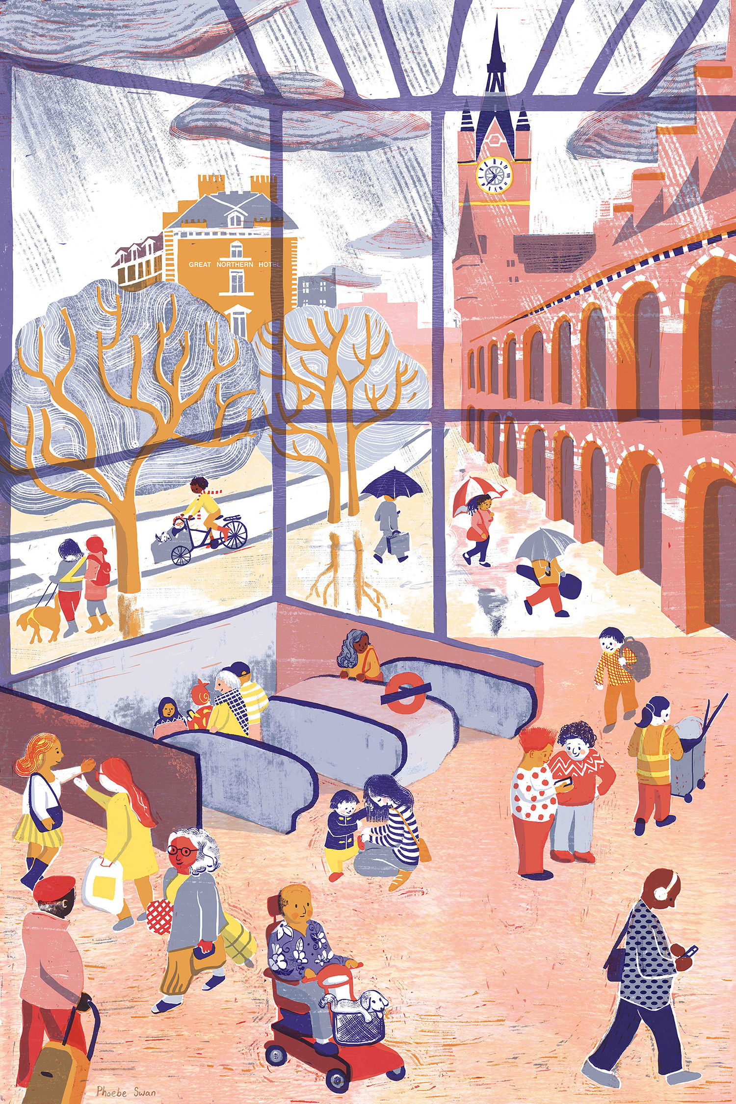
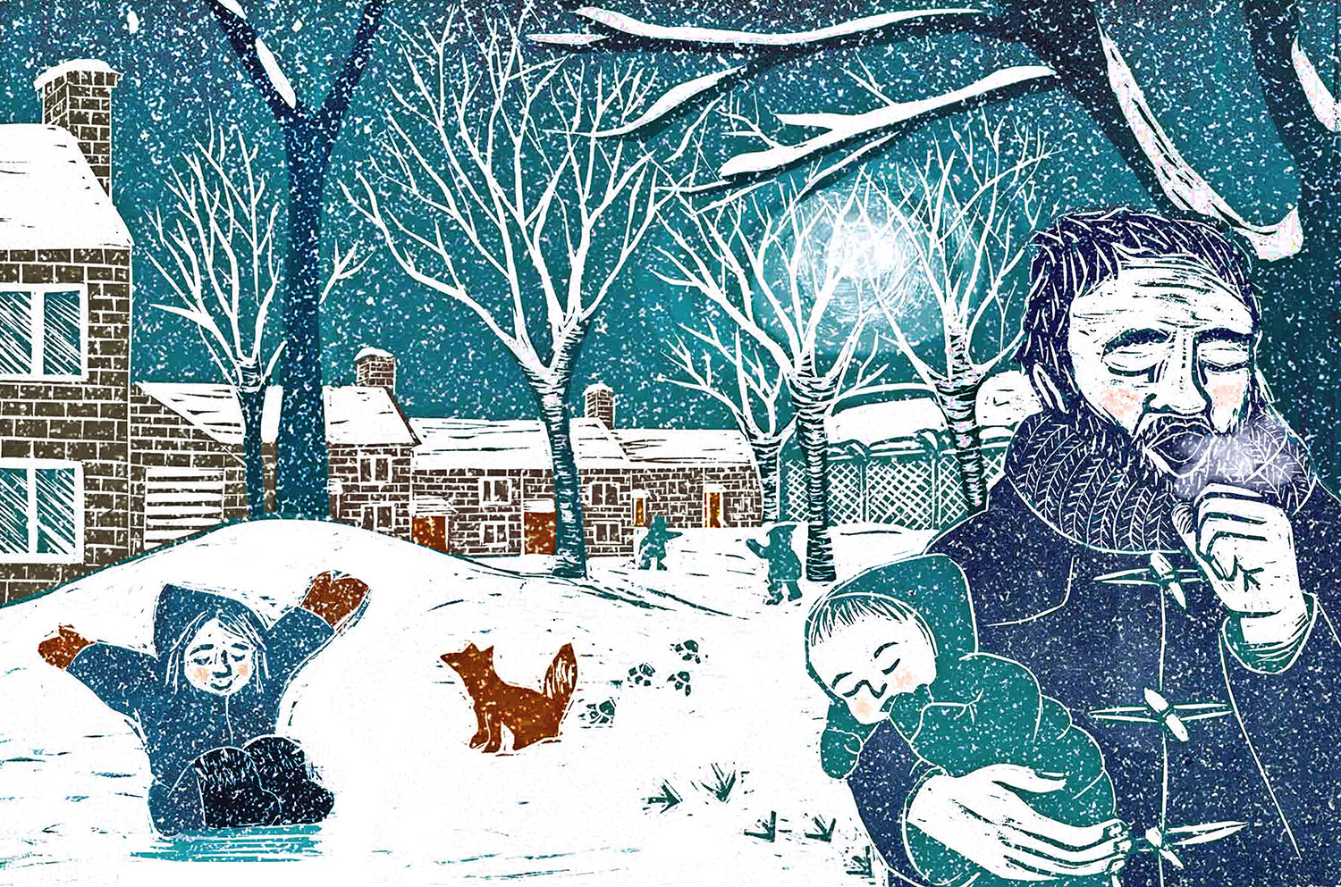
Phoebe chose locations that were meaningful to the staff, including Kings Cross St Pancras (above), commuting hub for some workers, along nearby Regent’s Park.
“I am interested in the way people build up their own personal relationships and histories with the built environment,” she continues. “For example, when my brother was born, our mum spent several weeks in UCLH hospital. When my Dad took me to visit, we would play a game of spotting the BT tower (which features in the Regent’s Park image) which would tell us that we were close to the hospital, and ever afterwards it was known within our family as ‘mummy’s tower’.
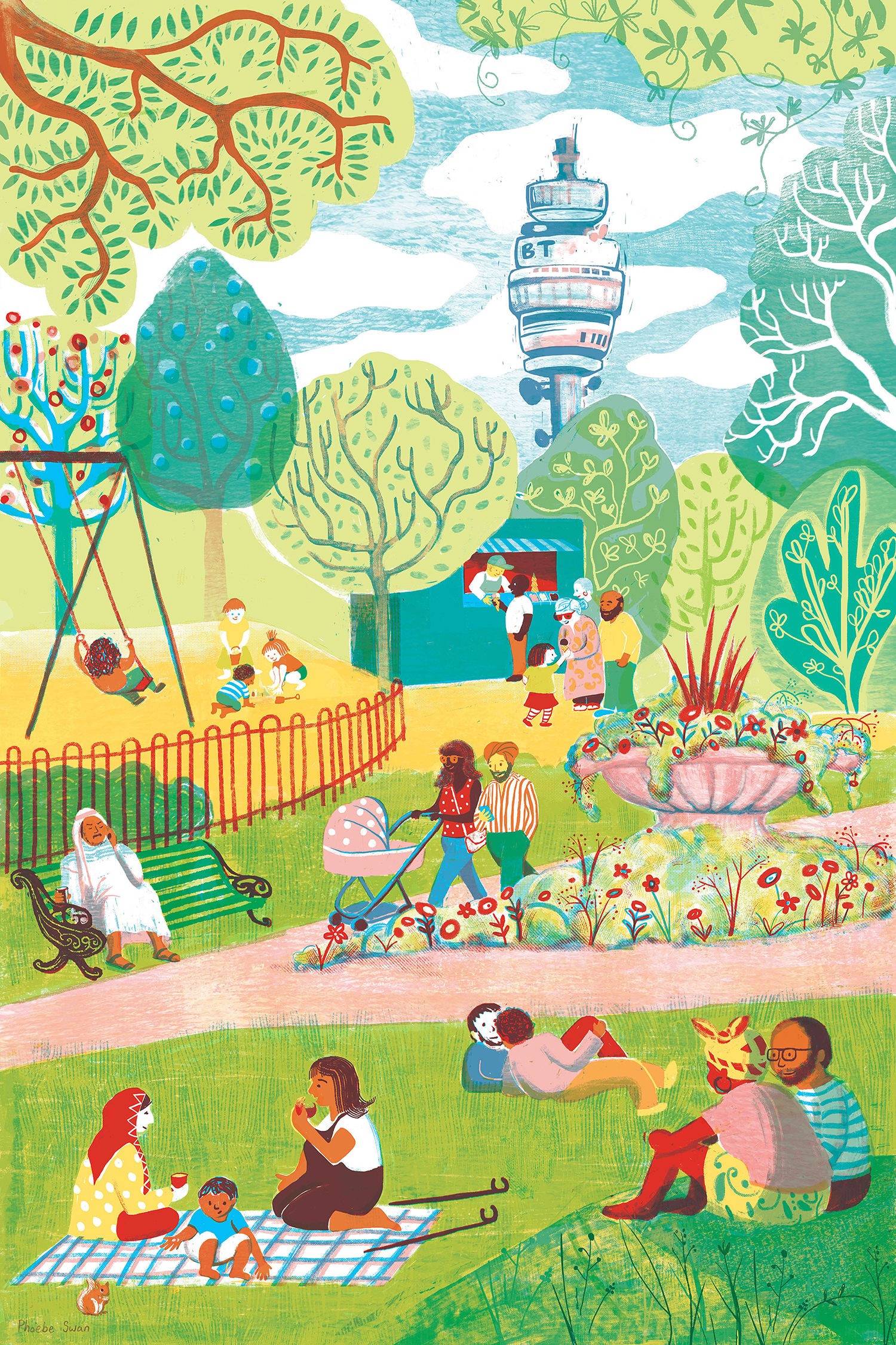
“I hope each of these images will mean something slightly different to different people, bringing back their own memories and experiences of the area.
“I recently added to the series with an image of Camden Town. I wanted to explore a location that included water. London’s canals and rivers provide another environment in which you have many people gathering for different purpose; you have people living on canal boats, and others using the water and towpaths for exercise and leisure.
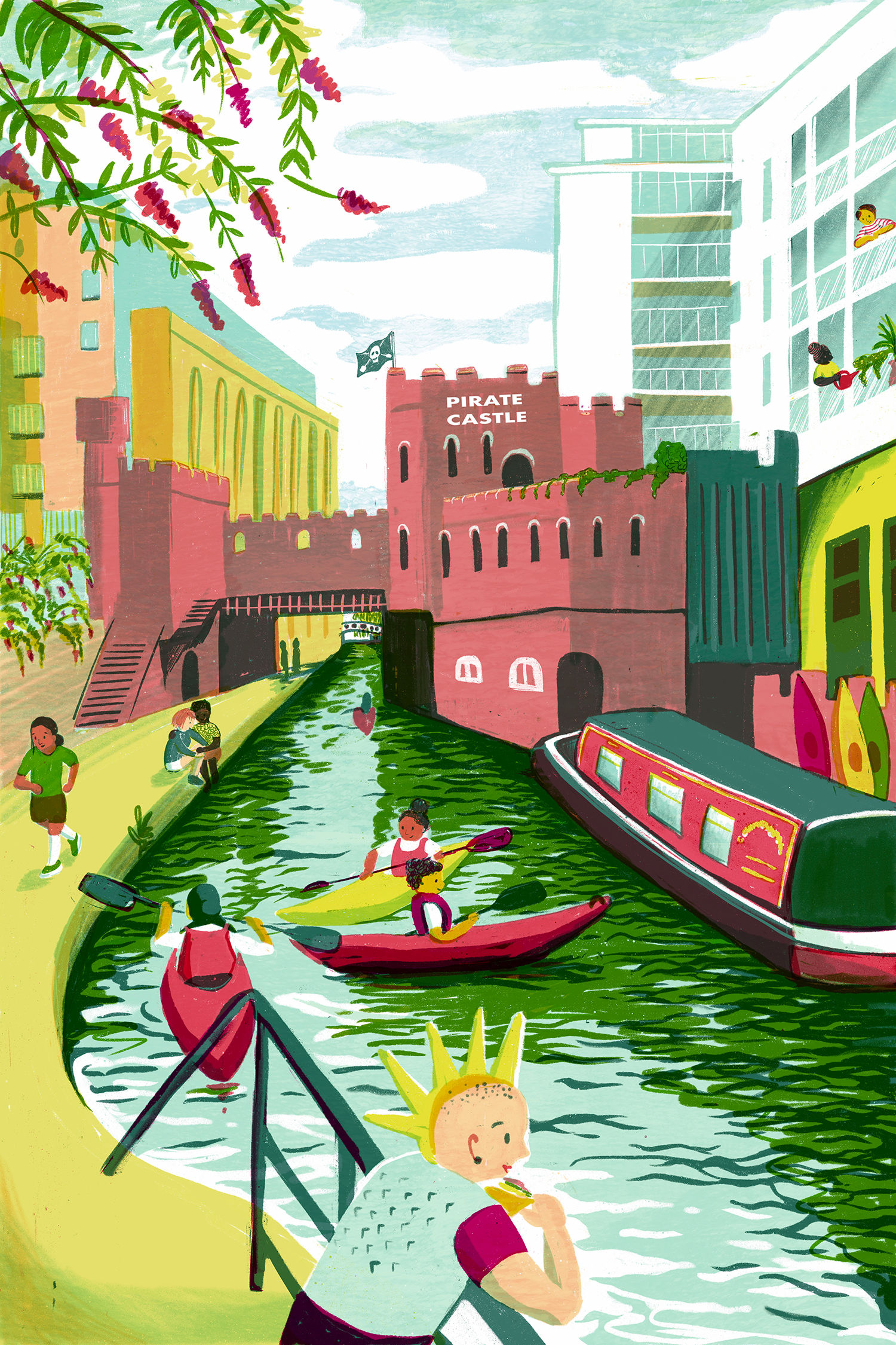
“Due to Covid-19 restrictions I didn’t go to draw on location for this one, so I had to rely on photographs and memories. It’s a scene that’s a bit away from the centre of Camden, and one that will be more familiar to people that have lived and worked in the area than those who have only passed through the main market.”
Phoebe’s style of working generally involves using blocks of colour within a limited range, often created out of compiling transparent layers, heavily influenced by having worked previously in linoprint.
“Printmaking was something that was very much encouraged on my MA in Children’s Book Illustration at Cambridge School of Art, but eventually I found it could only take me so far in what I wanted to achieve, so I started doing a kind of digital printmaking where I scanned sheets of printed textures, and ‘carved’ images out with my Wacom, using a layer mask.
“My first picture book, King Leonard’s Teddy, was produced this way, and it was a good way for me to bridge the gap between lino printing and digital drawing.
“But I knew that I wanted to push my artwork further, and booked some tutorials with Ness Wood of Orange Beak Studios to help me critically reflect on my working process. She helped me to see that I had a tendency, perhaps as a hangover from having worked in linocut, to sometimes heavily outline objects rather than allowing the shapes to be defined by their own edges.
“With Bloomsbury Market, Kings Cross and Regents Park, I worked hard to resist the urge to outline anything, and I think the result are images that feel a lot lighter and looser than some of my previous work.”
“I feel that working on the iPad has streamlined almost all those processes back into one tool (well two, with the Apple Pencil). I think I have kind of internalised the process I used to go through when designing and producing a physical print, so that when I draw onto the iPad I am drawing in the way that I used to print, but with the added benefit of all these different colours and textures at my fingertips.
“That abundance of choice can in itself be overwhelming, but the experience of working in linoprint taught me the value of having limitations, so I pick a limited range of colours – maybe two key colours and some neutrals and other colours made out of those and a couple of brushes or textures and stick to that, it stops me from getting carried away.”
Before finishing our interview I ask Phoebe which are her most beloved London spots.
“I really love places where the man-made and the natural collide,” she tells me. “This is why you will often see trees, birds and other natural elements in my urban scenes.
“One of my favourite places is the River Lea and its surrounding marshes, reservoirs and wetlands, which I live beside in Tottenham. An amazing example of an unexpected relationship between the built and the natural environment are the huge electricity pylons which stretch across the landscape.
“It is because of these that so much of the area has been left undeveloped and wildlife has flourished.”
See more of Phoebe Swan’s work on her site and Instagram.
Related: AOI World Illustration Awards 2020 showcase some of Earth’s best artists
https://www.digitalartsonline.co.uk/features/illustration/aoi-nominated-phoebe-swan-depicts-diverse-london/