Invisible branding: Another big name joins McDonald’s in playing hide and seek.
It’s still early in 2020 but we’ve found already found a major trend in design: ‘invisible’ branding.
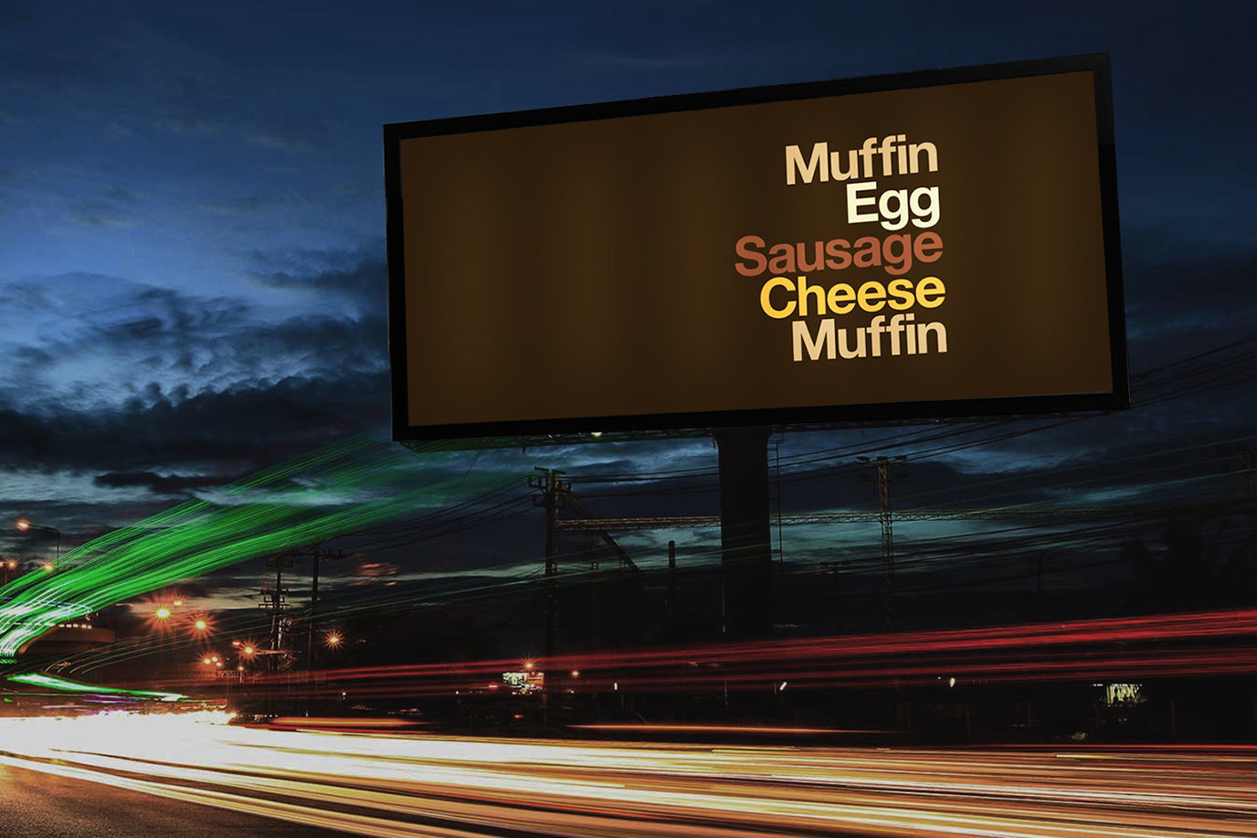
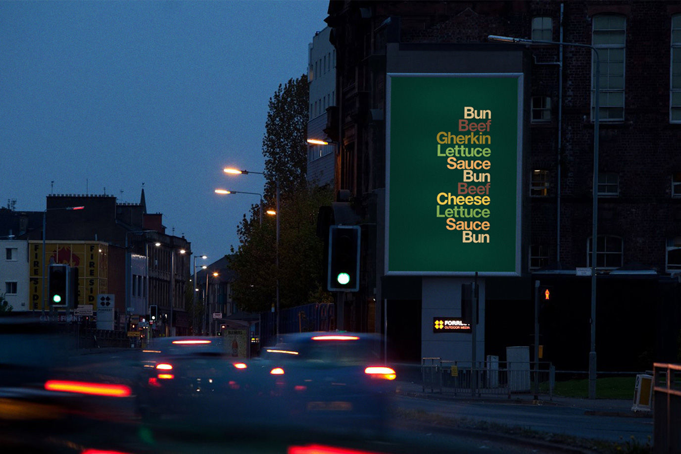
In the same month as McDonald’s advertised itself using five words, five colours and no product shots (see below), Coca-Cola pulls off the same trick using colour and logo.
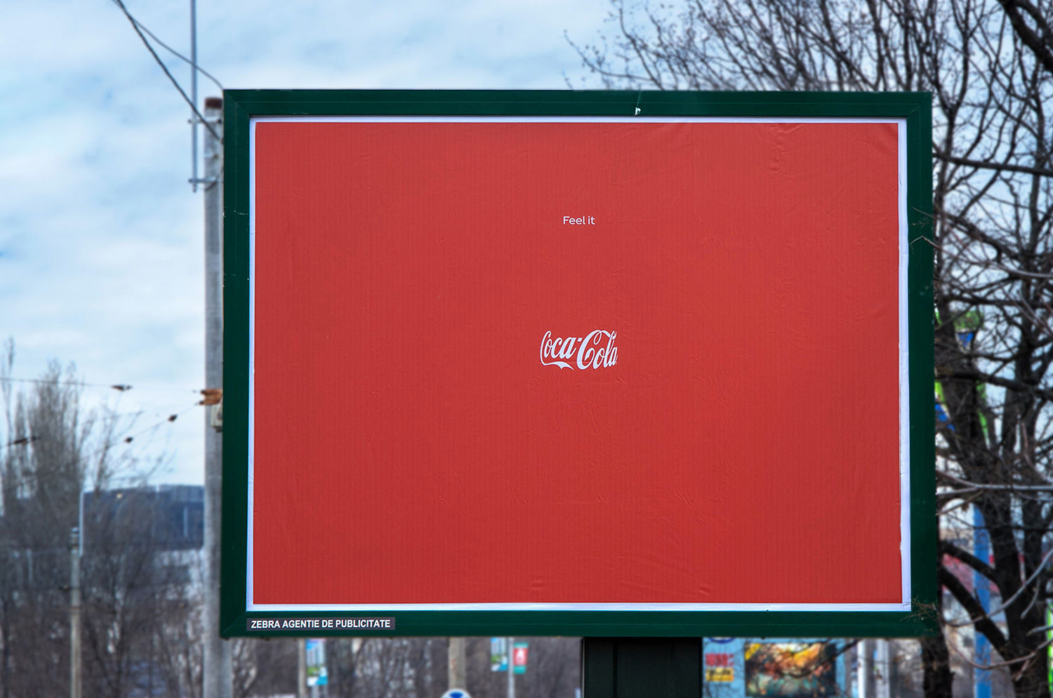
Look at the billboard above and you’ll get what we mean; for sure you’ll ‘see’ something else that isn’t there.


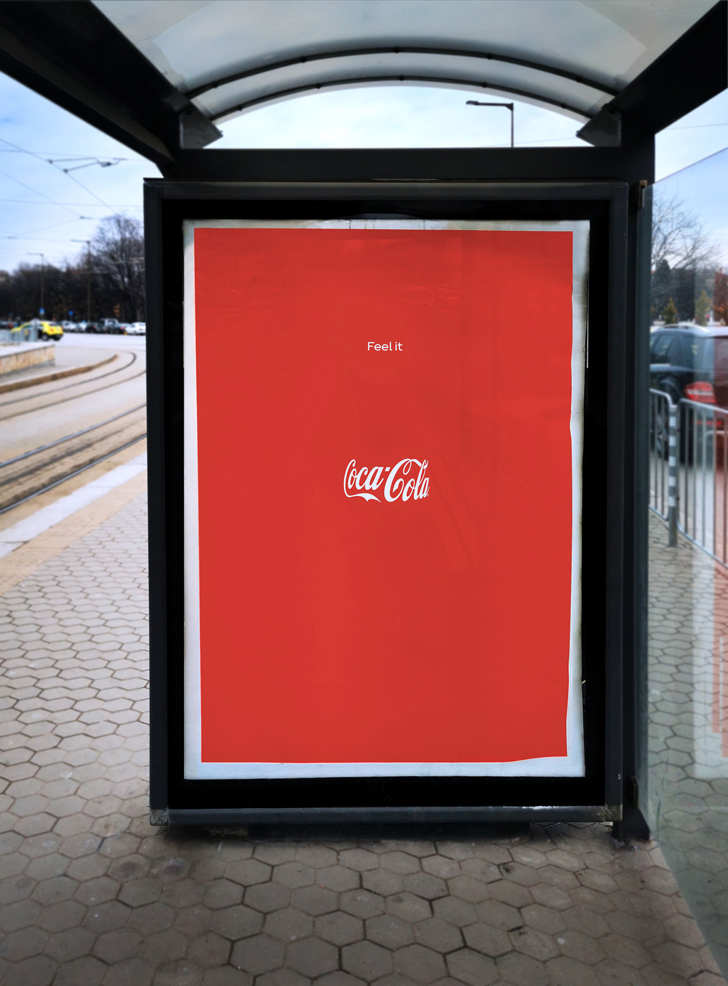
Where the McDonald’s ad relied on deconstruction and strong type, the magic of this Coke campaign from Publicis Italy comes from the optical illusion at its heart. Through the curve of that logo, and the perfect bottle-neck width of the ‘Feel it’ tagline, it does indeed feel like a bottle is there.
Arguably very few shapes in the world are as recognisable as the Coca Cola bottle, so iconic is it that our brain needs very little prompting to see it.

The Feel It campaign can be ‘seen’ in several Central and Eastern European markets on OOH, print and social.
Read next: These ads make you think of McDonald’s with just 5 words and 5 colours

https://www.digitalartsonline.co.uk/news/graphic-design/can-you-see-bottle-in-this-coke-ad/

