Already a freelance textile designer, Juliette van Rhyn studied part-time at Shillington to add another creative string to her bow. Upon graduating, her portfolio amazed the Shillington teachers—to the extent that a few months later Shillington London teacher George Simkin had Juliette working on a project alongside him.
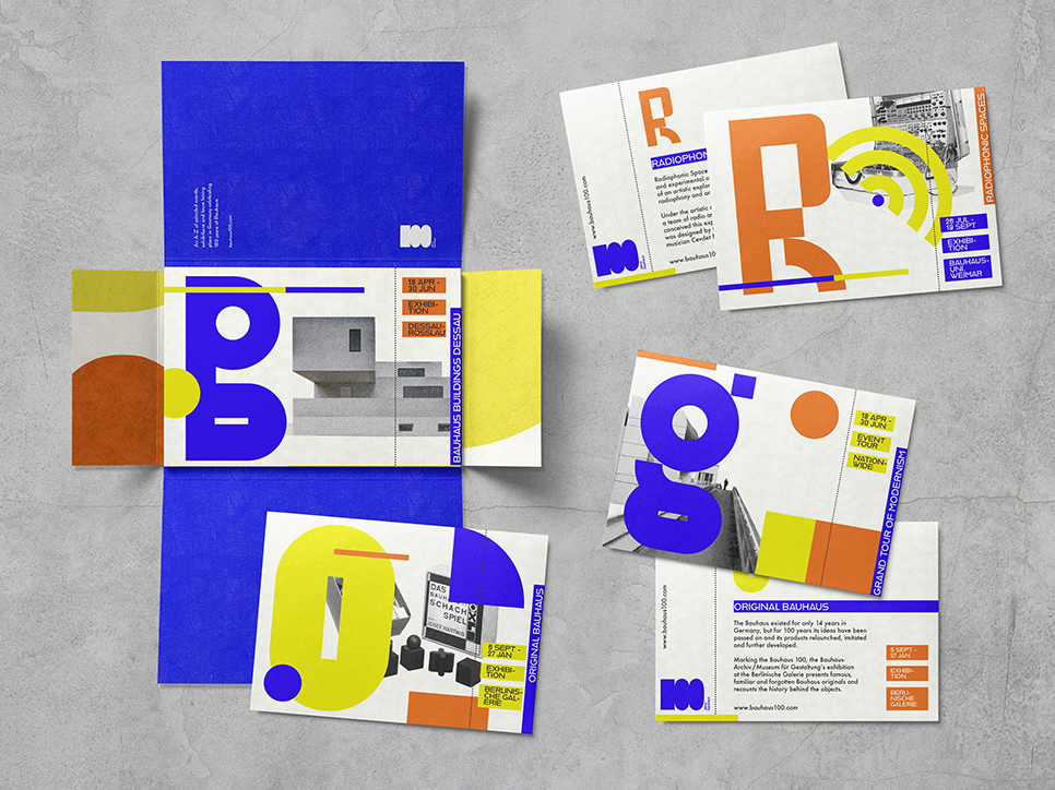
This case study takes a in-depth look at her project Our Play, Our Party, Our Work—an A-Z guide for the Bauhaus centenary.
Read on to learn more about the project; why she decided to work on it, how Juliette crafted her typeface and more.
We’ve been amazed by your ‘Our Play, Our Party, Our Work’ project since we first saw it in your portfolio. Can you tell us how the project came about?
This was one of my favourite briefs because it came together right at the last minute during portfolio time! I wanted my final project to be print and type-focused, but I wasn’t sold on my Travel Magazine piece. Time was getting tight to develop a new brief as well as finesse the other projects, but Shillington was great for teaching us how to deal with super tight deadlines. I pitched two ideas: a zine about Isamu Noguchi’s Play Mountain and an A-Z guide for the Bauhaus 100th anniversary.
It was clear that the Bauhaus guide had more clarity as a concept, as well as scope to design a typeface. As a huge Bauhaus fan it felt natural to create something in celebration of the 2019 centenary.
Would you be able to tell us about your concept development and any research you undertook for the project?
I only had a few days to work on this project, which forced me to be focused and decisive. There was something freeing in that; no time to agonise! I read a lot on the Bauhaus 100 website to familiarise myself with the centenary events, as well as doing some general research on the Bauhaus and its ethos. I wrote a short brief (‘Showcase four Bauhaus 100 events in a bold, experimental, creative way’), and used myself as an example of the demographic as this project felt particularly personal. I only had time to put a condensed presentation together, but it did the job; typography and layout moodboards helped me to explore possible visual directions and I very quickly thumb-nailed ideas for poster layouts. Even though the design development was short on this project, it was just enough to create a cohesive response to the brief.
The project is a celebration of the Bauhaus centenary. How did the famous design school inspire your work?
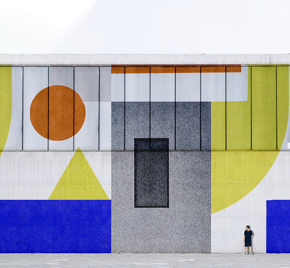
I love the bold, geometric Bauhaus aesthetic, as well as its pioneering work in typography. It’s so much a part of modern design language that it’s easy to forget how groundbreaking it was at the time!
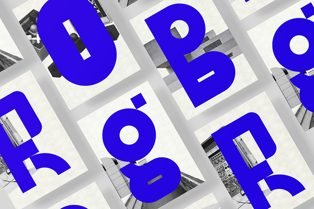
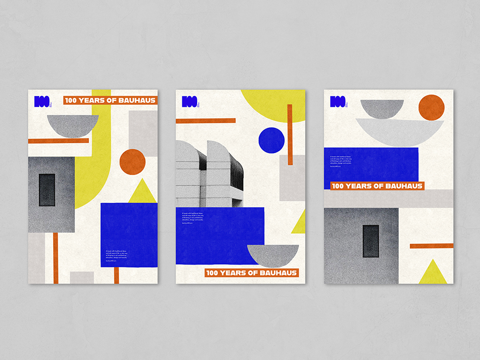
For this project I wanted to celebrate the Bauhaus’s distinctive visual language with an updated, contemporary spin. The direction became clear quite quickly as a mixture of chunky, geometric type, grainy photography and the characteristic primary colour palette.
What also really inspired me was the school’s creative ethos. In researching the Bauhaus program of study, I read about Johannes Itten’s lecture Our Play, Our Party, Our Work’, hence the title of the project. There was an emphasis on work as play and play inspiring work at the Bauhaus. This project felt light, energetic and fun—I thought of it as a celebration of the things I had learnt throughout the course.
Your typeface is particularly striking. How did you go about crafting it?
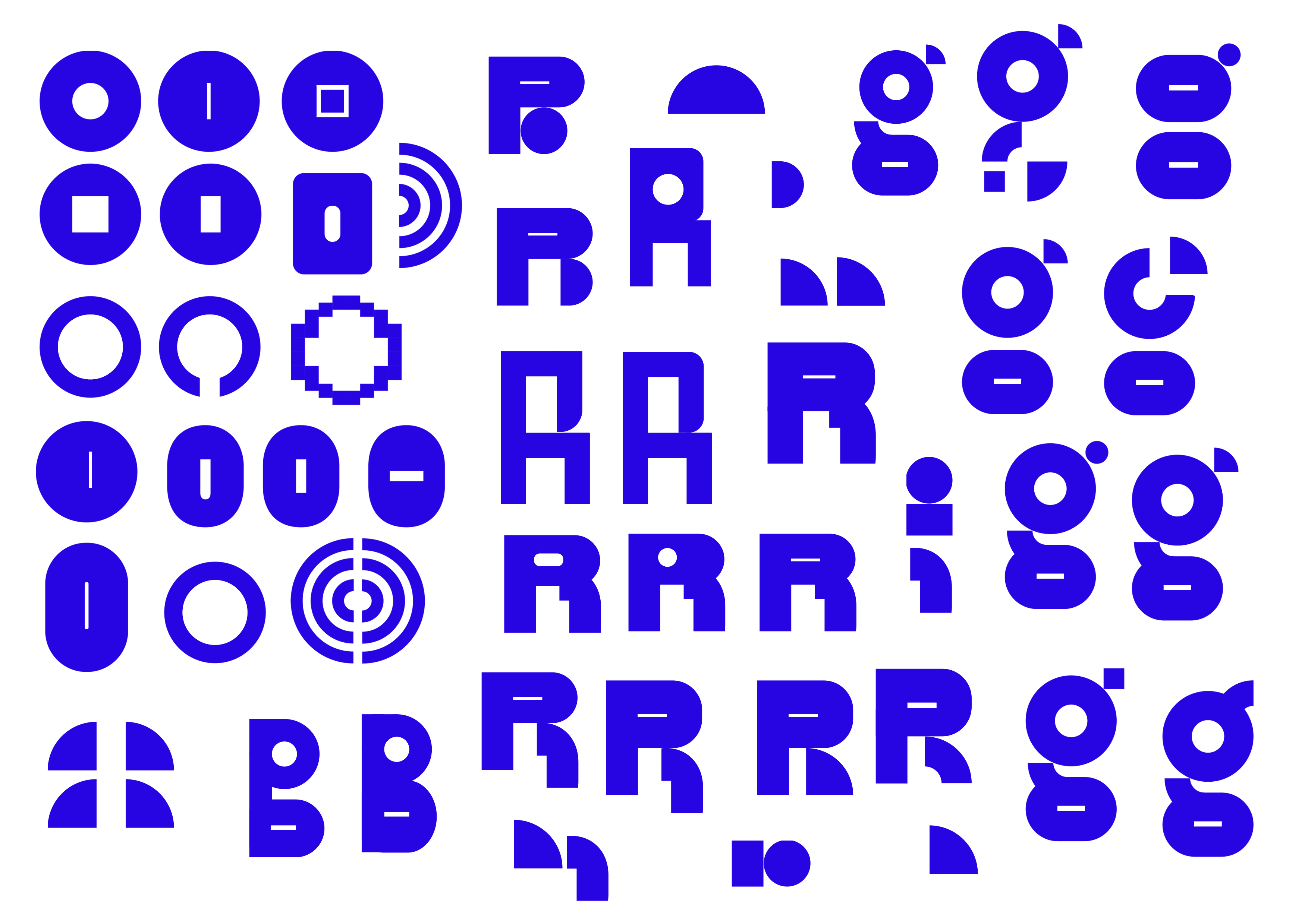
In the end time was so tight that I only designed five letters for the A-Z guide! I worked in Illustrator with a series of geometric shapes, playing with combinations until I had a page of options for each letterform. I worked quite quickly and instinctively, which only worked out because in the end I used each letterform in isolation. I would have loved more time on it to create a fully cohesive, usable typeface but it’s something I plan to come back to!
Tell us about the final poster design. Why you chose your specific blue? How did you go about sourcing photos?
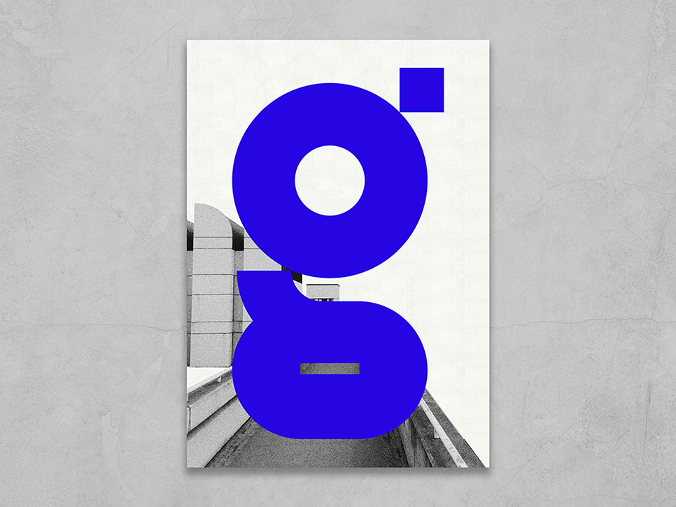
I chose Reflex blue because of its depth and intensity. It’s a powerful colour that draws your focus in and I wanted the posters to be bold and impactful. The A-Z guide and posters are all about attracting the viewer’s attention to specific events and the colour plays a big part in that.
Having spent some time in Berlin nerding out on Bauhaus, I had lots of photos of the Bauhaus-Archiv building and grounds. Its distinctive geometric roof forms seemed like the perfect backdrop for the main poster. I scoured royalty-free archives for the photographic elements on the other posters.
Any tips for students who want to create a project like this for their portfolio?
Finding something you connect with in a brief is key! This project was fun and intuitive because the brief was very personal to me; so perhaps consider creating your own brief to really showcase your skills and personality. I also think the tight deadline forced me to be more decisive and confident than if I had had weeks to overthink it.
Big thanks to Juliette for sharing her project and her processes with us! Take a look at more of both her textile and graphic design on her website and keep up-to-date with what’s she up to on Instagram.
https://www.shillingtoneducation.com/blog/design-case-study-juliette-van-rhyns-play-party-work/

