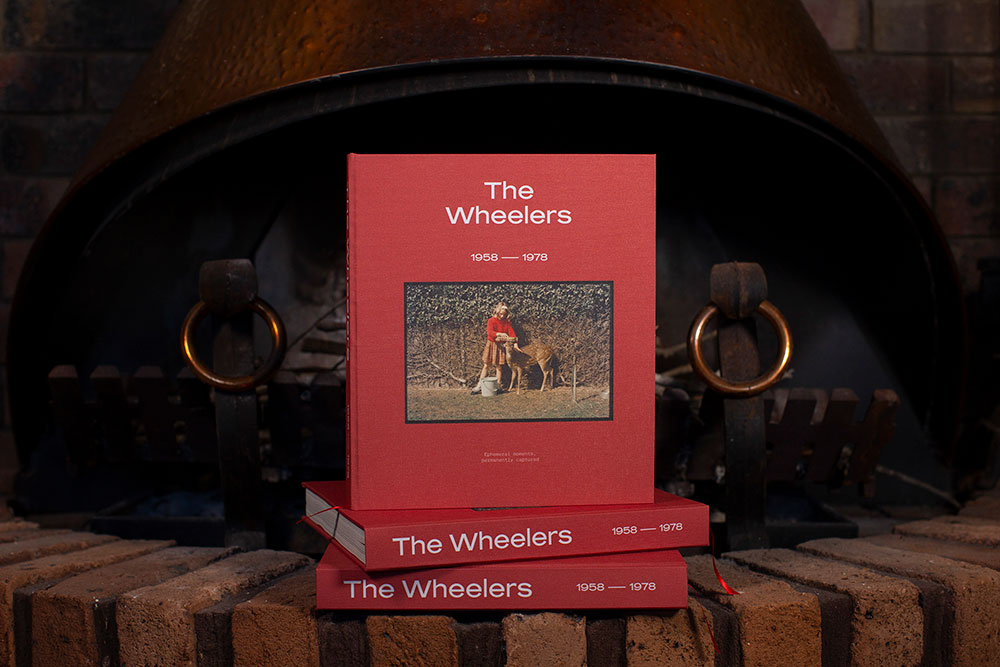
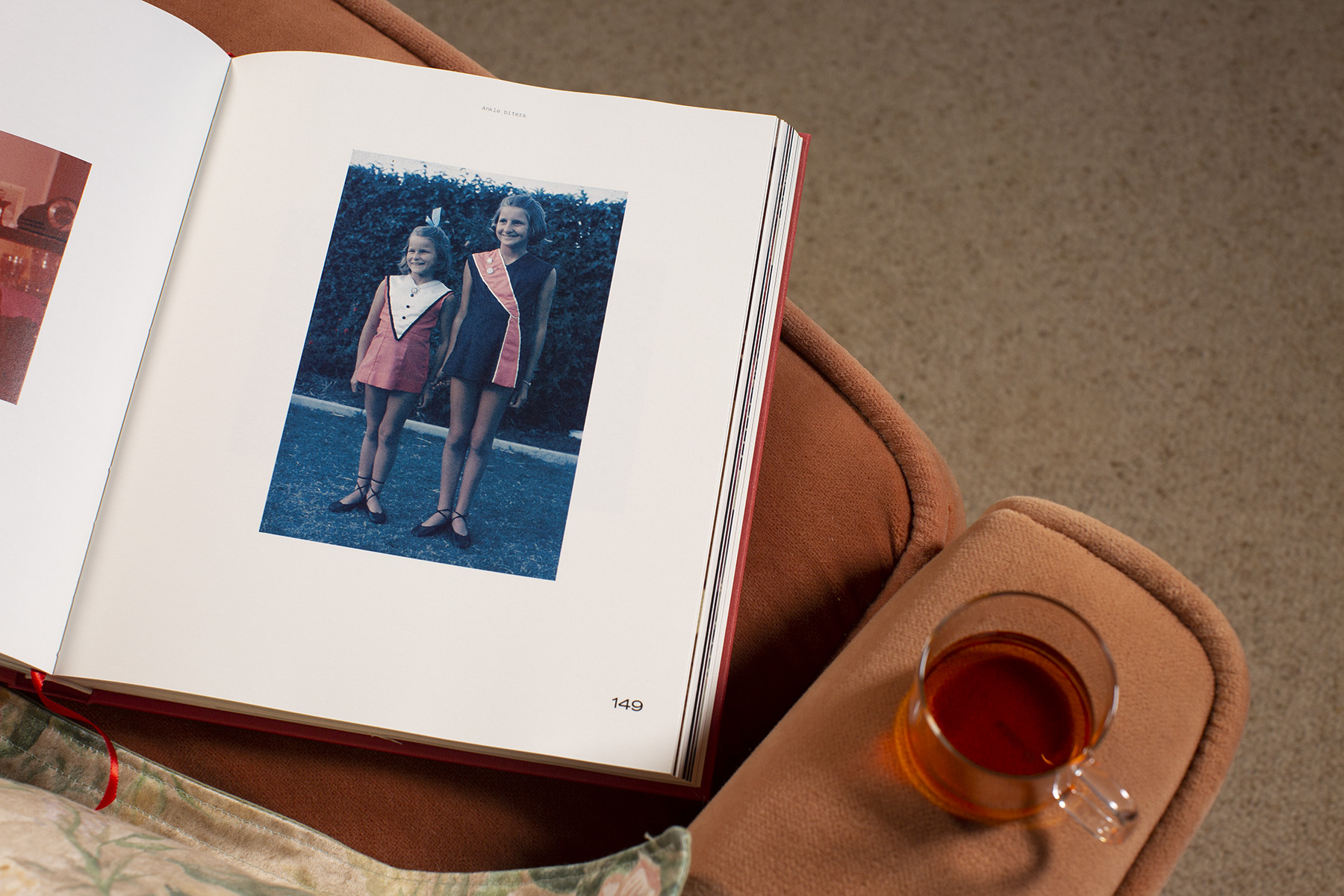
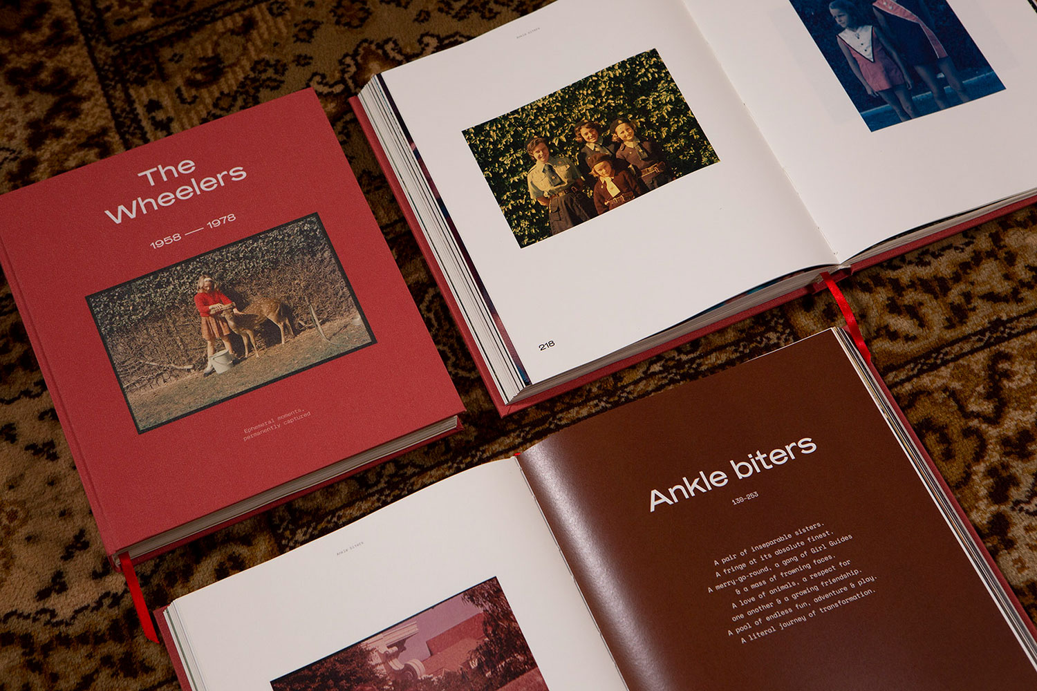
While the genesis of every passion project is as unique as the designer themselves, there are some projects that have a touch of kismet to them. For Shillington Sydney teacher Tim King, The Wheelers came to life with an unlikely discovery during a family working bee. While he was sorting out some cupboards at his Nan’s house, Tim was stopped in his tracks when he unearthed a box full of long sequestered family photographs. The beautiful collection of vintage slides were taken by his late Grandfather and documented years of family life in his mother’s childhood. He knew he had to do these images justice and thankfully being a graphic designer meant he could do just that.
Without hesitation, Tim began the laborious process of digitising the slides and planning out his design. We caught up with Tim to find out how he moved from this fateful discovery to creating the unique printed photobook that The Wheelers became. Read on to learn about Tim’s process for working with vintage slides, why taking our time—not only when reading books but also designing them—is essential and why art directing and documenting the printed editions at his Nan’s house was a no brainer.
Can you tell us a bit about the story behind how your passion project to create the limited edition photo book, The Wheelers? What got you started?
A couple of times a year, we head out to my Nan’s place for a “working bee”. She lives on 25 acres overlooking the local flood plains that collide into the foot of Razorback Mountain—in my eyes, it’s a stunning spot. We get our hands dirty with everything that needs fixing up and maintaining that Nan can no longer do.
One of my tasks for the day was rearranging and ordering the contents within some cupboards running along her hallway. While cleaning the uppermost shelves, tucked away in one of the remote corners of the cupboard, I stumbled upon a hefty old box.
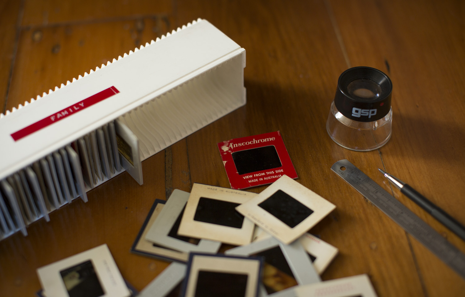
Hauling this beast of a box onto the dining room table, I lifted the fragile and weathered lid to find hundreds and hundreds of old 35mm slides. Calling out to Nan to get some form of explanation as to what these 35mm slides were all about, Nan’s eyes lit up as she says “They’re all Russ’s photographs…”. Russell (Russ) was the grandfather that I never had the opportunity to meet.
Having heard so much about Russ over the years, I was compelled to dig through this vast archive of imagery to find out as much as I could about his life, his passions and that particular time in history.
All the 35mm slides were taken roughly between 1958-1978. There were images of the Sydney Opera House under construction, Queen Elizabeth II visiting Australia, unhappy great-grandmothers, beach trips, handmade dresses, bad hair cuts, all mixed in with an array of funny, mildly inappropriate and truly touching moments in the history of our family.
These 35mm slides didn’t deserve to be put back into a cupboard to gather more dust—they needed to be celebrated and seen over and over again.
What better way to do that than create a book, giving them a new platform to stand on.
What was the project scope for The Wheelers?
It all started off as a curious discovery exercise (like how most of my side projects begin), that soon lead into a 5 month book design journey.
My deep love for books, their design and contents, has always been strong, but designing a book, rather than just consuming one, is a totally different ball game.
This project involved individually scanning almost 1000 35mm slides; solving the problem of how to categorise the images, as it was impossible to do it chronologically; sleepless nights of copywriting; working out the appropriate size of the book; lots of indecision and layout iterations; designing a grid system that could show off individual images in the best possible light, while also working in harmony with the neighbouring page; endless searching for an appropriate typeface to express the right tone of the book—shall I keep going?
Can you walk us through your process for the book design?
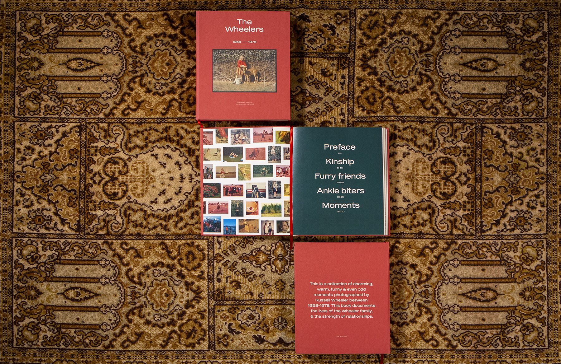
Initially, I lugged the dusty box home, got out my loupe and lightbox, put some tunes on and began to look through all the images to get an idea of the scope this book might take the form of. As I was looking through the slides, I began to roughly categorise the shots—Family and friends, animals, children and miscellaneous. Looking through the archive of images at my desk, I started to develop a picture of what the book would look like and the architecture of the book.
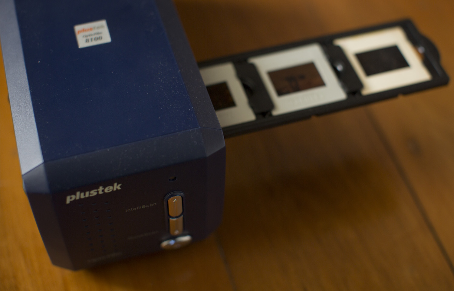
After looking through all of the images and categorising them, I then embarked on a mission to find a specialised scanner that could scan 35mm slides to the best quality I could afford. Then began the tedious job of individually scanning each 35mm slide and creating backups of backups of backups, so I would never lose the files.
As soon as the scanning was done, I dove deep into sketching numerous layouts and creating a system that could house the images.
I finally created a design system that was working well for both text and image. It was important to get the proportions and the pacing of the book right.
When experiencing a book, it is something we have the luxury of taking our time to engage with and move through, so I didn’t want to rush anything.
I wanted space for the text to have impact, while also allowing the images to breathe.
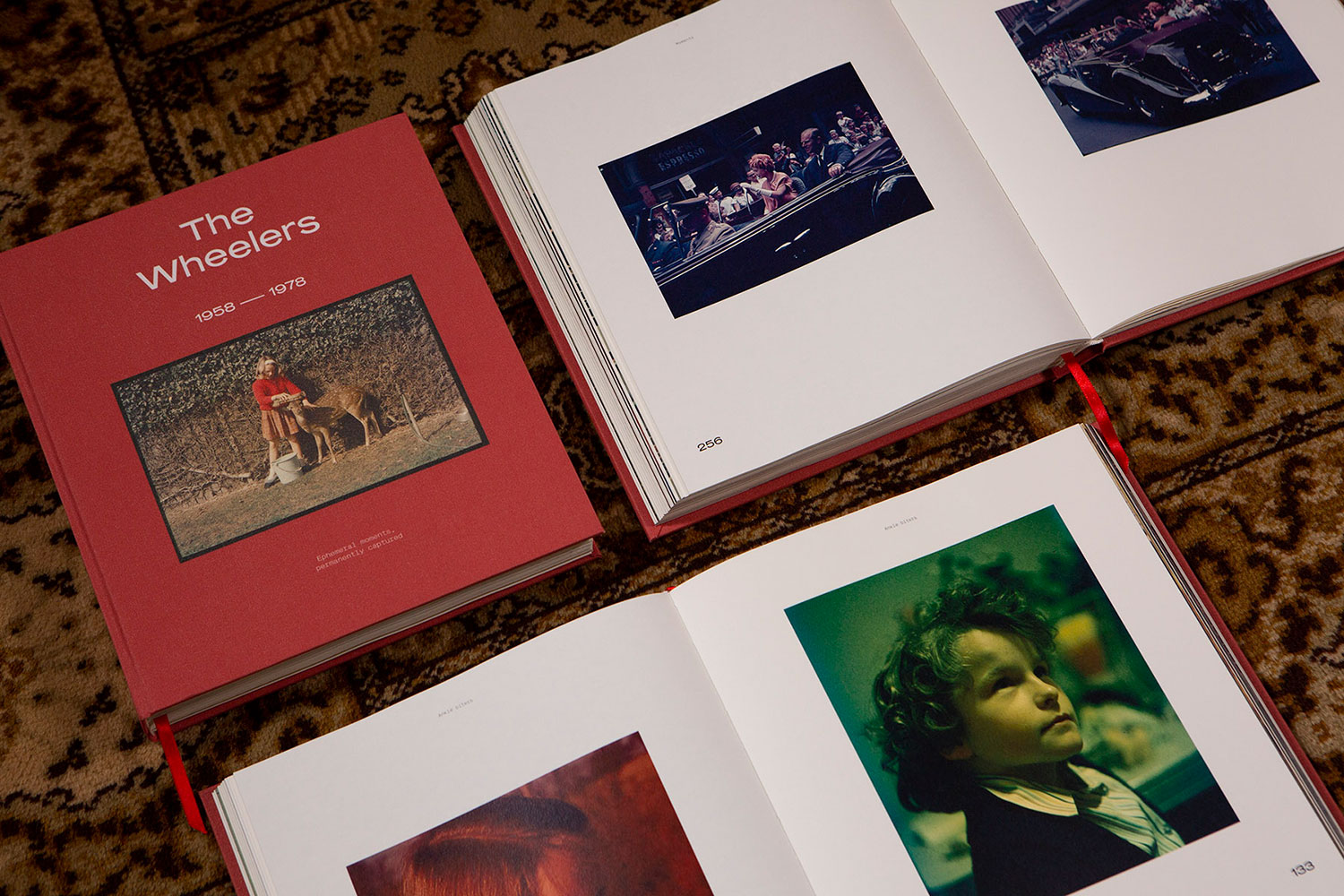
Once the design system was completed; images were placed in; the typeface was chosen (Mars, by Production Type) and text was set, I approached DigitalPress to discuss the most effective process to assemble and print the book. We selected a soft white paper to add a warmer, nostalgic feel to the interior pages. I also wanted to maintain the integrity of the images so I refrained, as much as I could, from retouching and colour correcting any of the images. I did undertake some minor retouching to some of the faces for clarity, but that was the extent of the image refurbishments.
Considering this is a self-initiated project, what were some ways you were able to push the design of the book, which perhaps you wouldn’t have been able to for a larger scale client project?
I think I’m a very intuitive designer and I think the feeling of a piece of design, as an idea, is very important to me. This approach, or way of expression, can sometimes be hard to get across the line due to the subjective nature graphic design can encompass. Trust between designer and client is paramount and if you don’t have that, the work and outcome will often be unsuccessful.
Being client and designer all at the same time allowed me to really tap into and follow my own approach at every stage. I also had the luxury of spending my entire life with my target audience for this project, so that was moderately helpful.
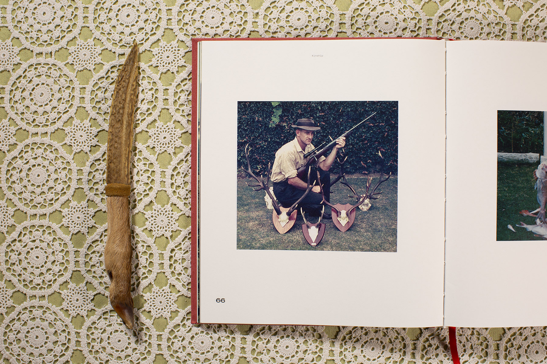
A big part of the narrative for this book for me was the conscious effort to create a relationship between each image, for each spread in the book. As you move through the book, I have placed images together that tell a story–sometimes for humour, sometimes for delight and other times just for a striking comparison.
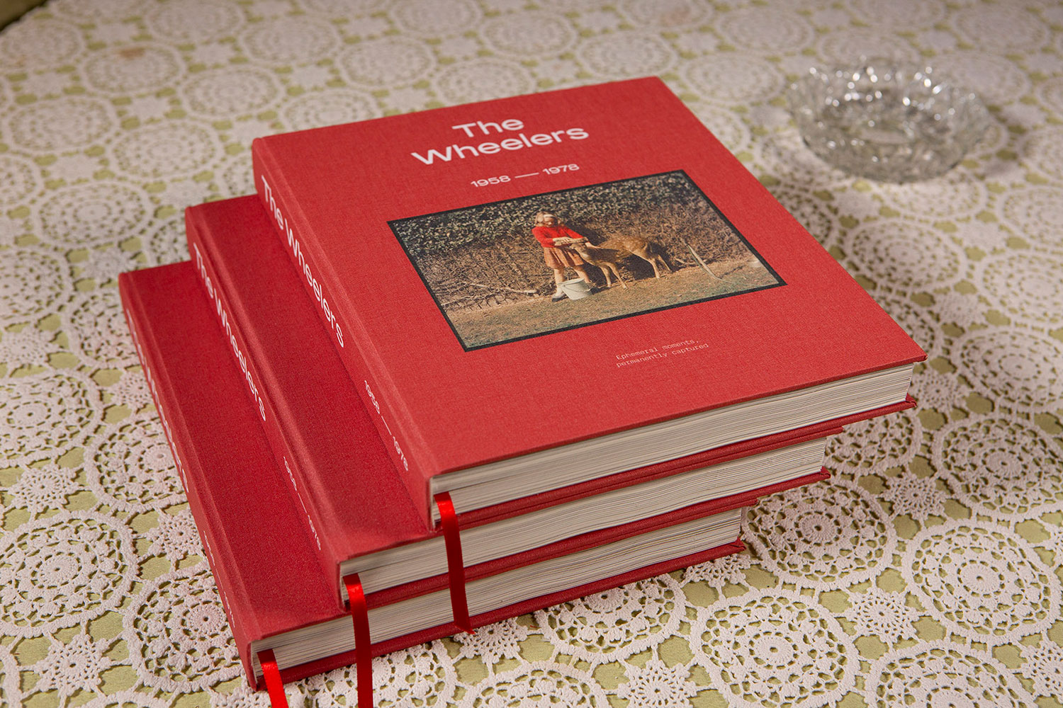
We love that you chose to document the finished product at your Nan’s house. Can you walk us through your process for the photography and art direction of the finished books?
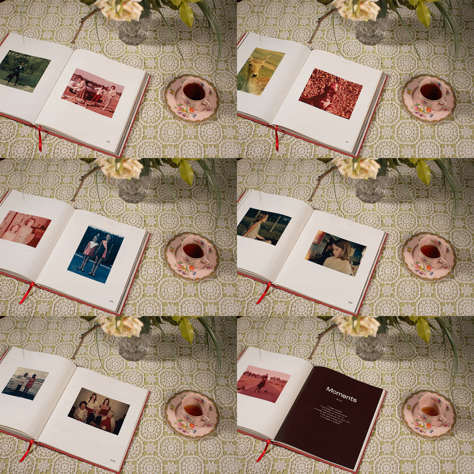
For me, documenting the book at my Nan’s house was a no-brainer. It just made sense. It gave the book beautiful context and extended the story beyond the book itself.
Russ lived out his life in that house with my Nan, so a lot of moments were created within the Kiah (the name of the property) grounds. I was lucky enough to be given artifacts from my family’s history to use as props to help add the narrative.
I’m a keen photographer and have shot still life objects within a studio environment previously, so I hired some lights, stands, a backdrop and had my cousin Mitch volunteer as my trusty assistant for the shoot.
I roamed Nan’s house to find ideal locations for all the shots I planned to take. I then sketched up some ideas of how I could assemble each shot, set up the lights, camera and tripod and jumped straight into shooting the books. I wanted the surroundings to compliment the book, but not overpower it, so there was a fine balancing act at play throughout the day of shooting.
What part of this project did you find the most enjoyable and why?
Every part of the project, from start to finish, was immersive and engaging. All the small, painful and tedious parts all added to the book and my experience of creating it. Even the part where I almost burnt our house down by leaving one of the 35mm slides in an old projector for too long(!). But if I had to pick one part of the project, it would have to be the day I sat my Nan, aunty and mum down together to present them with the book. Seeing the sheer delight on those three faces, I will never forget that. I sat a dictaphone down next to the three of them and recorded their reaction to every page that was turned. There were tears, laughter and endless stories hurled across the room as they all immersed themselves in the book.
Can you offer some advice for other designers looking to create and design a book?
Deadlines are a designers best friend—as are constraints.
Make your life easier by setting yourself some deadlines for each stage and giving yourself some parameters to design within, otherwise you’ll muck about and get nothing done. Also, done is better than perfect.
What have you learnt from this project that you can apply forward to future design projects for yourself and for clients?
The value of spending quality time on projects to get the desired result. So many projects demand such a fast turn around that can often result in work that misses the mark.
Be open with clients and get them to understand that good design and crafting something, takes a lot of brain power, time and effort to get right.
There is so much that goes on behind the scenes in the design process that never sees the light of day. Seeing the final results is only a small fraction of the work.
You work as a designer alongside teaching full-time at Shillington. How do you find your balance in juggling all that?
I don’t (Ha!) It’s a constant battle, but I love what I do. If it bothered me, I’d be doing something else with my time and energy.
What do you think makes passion projects so important for designers at every level of the game?
It’s an opportunity for experimentation; to visualise and express true passions that lay outside of graphic design; further creative fulfilment; having the ability to have ultimate control over the outcome; diving into aspects of design you may not get to exercise in your current job; investigating and discovering different processes and ways of working that push your design skills into new territories and an opportunity to fail reasonably hard with minor repercussions. For me, these are just some of the important points.
Do you have any other passion projects happening at the moment that you’d like to tell us about?
Through the process of this book, I have discovered a love for documenting artifacts, places, people and things. I visited an exhibition by Ed Ruscha in London at the Tate late in 2019. His book Twentysix Gasoline Stations struck a chord with me as it documents exactly what the titles describes—26 gas stations. I found the book hilarious and it further sparked my interest in documenting the mundane and often overlooked objects in life.
I have a few passion projects floating around at the moment. They’ll most likely be in the form of books, giving artifacts their own opportunity and time in the sun. I think this is going to be the start of my hoarding career. It’ll be quite a successful one.
And lastly, what and who is keeping you stoked and inspiring you to create right now?
Music has always been a huge part of my life and creating a monthly Soundcloud playlist, mainly electronic music, has been keeping my energy levels high.
Recent Pentagram partner Matt Willey has been doing a great job at keeping me stoked—he’s constantly finding ways to deepen my love for the printed page. His title designs for Killing Eve and his mastery of the printed page is next level!
Javier Jaén and Mike McQuade have been doing work at a genius level too!
Huge thanks to Tim for walking us through his journey and process for his self-directed project, The Wheelers. Don’t hesitate to head on over to his website to check out more of his work and follow him on Instagram to see what he is cooking up next.
Meet the rest of our amazing Shillington teachers and team from around the world!
https://www.shillingtoneducation.com/blog/design-case-study-tim-king/


