New #ILoveTheseGuys post for Design Sake Studio from New York student Rayna Lucier. Find out more about the agency and project highlights.
Design Sake Studio is based in San Francisco, California and the agency specializes in branding & packaging, transforming ideas into designs that stand out.
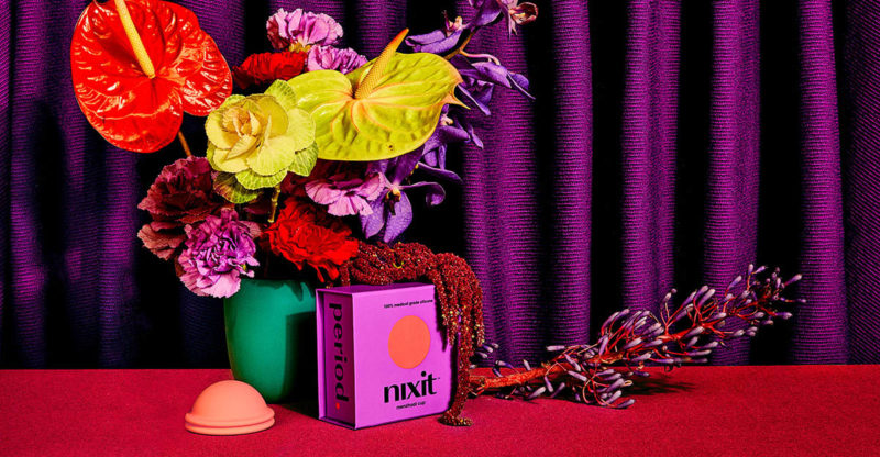
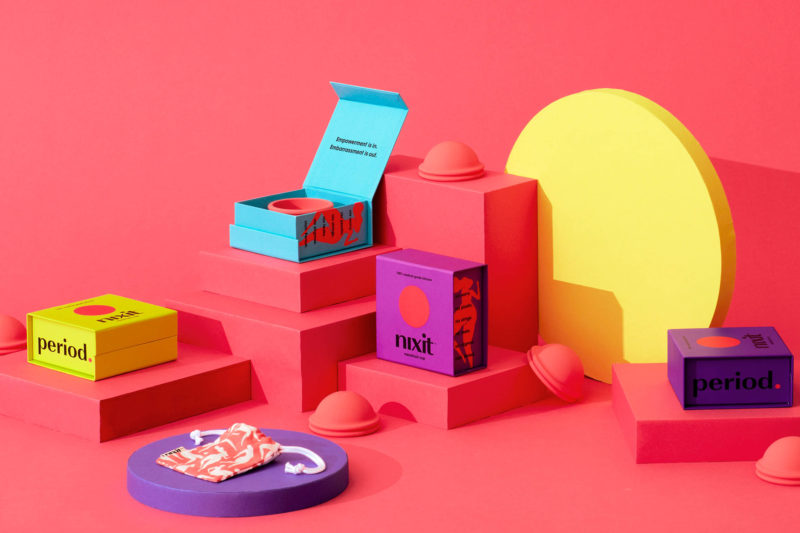
I really enjoyed the packaging for the Nixit project and their use of the product as a graphic device. The ads appeared modern because of the packaging, yet retro and kitschy due to the font and image treatments. Also, this is an all-female design studio. Girl Power!

“Nixit is a revolutionary one size fits all menstrual cup. It’s circular, soft, suction-free and lasts up to 12 hours. It’s an innovative period product that’s easy to use, better for your health, better for the environment, and won’t bleed your budget.” For this product, they used bright colors combined with clean typography, and direct messaging on the packaging.

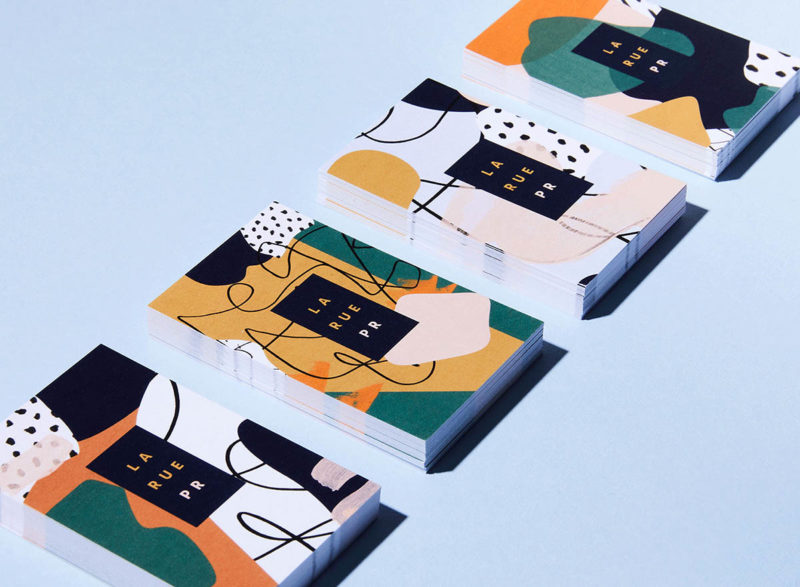
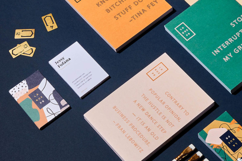
Another great project is for LARUE, a PR agency specializing in fashion, beauty, lifestyle and design. “This not so typical PR agency came to us asking for a new identity that reflected their bold yet unconventional approach. Friendly typography, color blocking, and abstract patterns yield an eye-catching print and digital experience.”


https://www.shillingtoneducation.com/blog/design-sake-studio/

