What top designers learned about futureproofing through design when working on a major new IKEA project.
The best, most effective brand logos aren’t just immediately recognisable, they can flex across touchpoints as varied as gigantic out-of-town store signage to an end-card on a Instagram film.
This poses no problem if you’re designing a brand from scratch, but what if, like IKEA, you’ve got a logo that’s literally mid-century? Adapting a brand identity to work on screen and on mobile especially can be tricky.
IKEA’s logo is globally recognised and iconic. Originally created in 1951, it was redesigned in its current blue and yellow form in 1983 – some 14 years before the launch of IKEA’s first website – and tweaked again in 2001 for a cleaner, crisper look.
Fast forward to 2018, when Inter IKEA Systems, owner of the IKEA Concept and worldwide IKEA franchisor, identified a need to adopt a new approach towards optimising its logo to ensure it meets the brand’s needs and matches current consumer behaviour.
But what would ‘optimisation’ mean for IKEA?
What to change, and why?
A complete redesign of the brand was not what was needed.
Any change should be driven by the evolution of consumer behaviour – namely the shift in time people spend interacting with IKEA through its famous print catalogue and visits to its out-of-town stores to experiencing the brand on Instagram and at inner city outlets, for example.
A review of touchpoints revealed parts of IKEA’s identity and experience that had never been considered that closely. These included how the brand appeals to our sense of hearing, how it might look when dynamic or compressed, and the emotions consumers feel towards it.
So as well as creating a logo that’s screen friendly, we were thinking about how it would work across all our senses and emotions, both today and as we hope it to be experienced by consumers in the future.
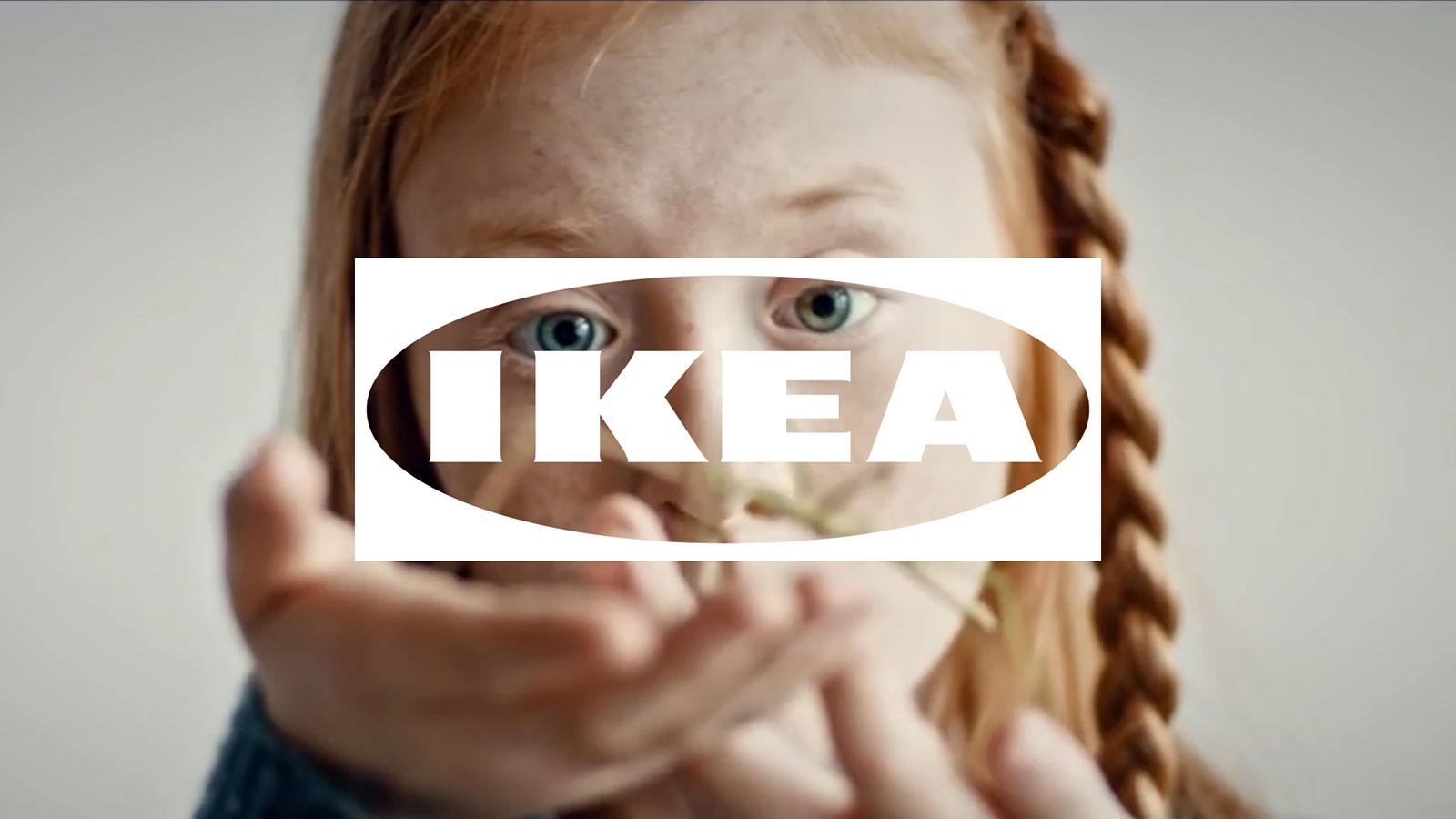
The solution was the Fönster (meaning ‘window’): a dynamic application of the IKEA logo that is part of a new system devised by taking digital and mobile behaviours as the starting point instead of an add-on.
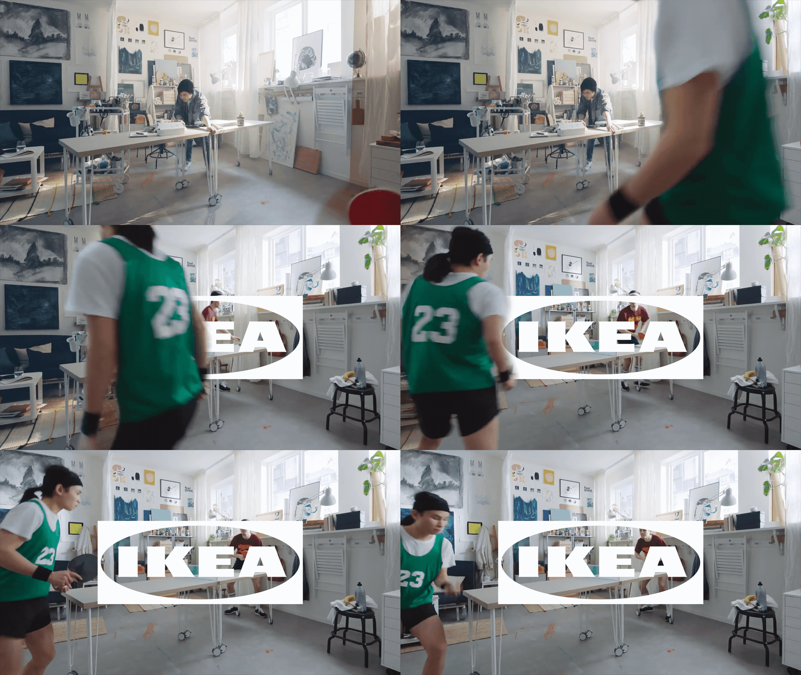
Fönster is a white and transparent (the middle is see through) version of the familiar blue and yellow logo, meaning any imagery it is laid over is visible through it. This transparency reflects the IKEA values of openness, curiosity and optimism – values which are central to the brand’s purpose of creating a better everyday life for the many.
It also integrates the brand more effectively into modern customer touchpoints and non-traditional channels. The idea is to use the Fönster as a tag and to brand IKEA content, whether it is originated by the brand’s marketing teams or in collaboration with co-creators.
Accordingly, the usual logo usage guidelines are now less about rules which dictate the dimensions and placing of the Fönster and more to do with suggestions about how it can be used. They encourage IKEA co-workers to think about ways the logo might highlight emotions and draw people into a story, for example, or tag examples of IKEA being progressive.
At 72andSunny Amsterdam, our work for IKEA is driven by our philosophy that branding should be felt as much as seen. And we believe this is something many should be considering.
A multi-sensory approach to brand identity
Traditionally, a brand’s logo was one-dimensional in purpose, existing as a stamp of approval, a mark of quality, proof of authenticity.
There’s a huge opportunity to make logos work much harder than that. Any brand, no matter whether they are ‘digital’ or not, can find value in paying close attention to optimising their identity for different needs and behaviours. This is an important marketing communications tool – and designing a logo to be dynamic and screen friendly is just a starting point.
One powerful opportunity lies in optimising a brand’s identity in a way that allows storytelling and branding to become more closely integrated as part of any brand experience. Another is to use that logo as a lens to reflect how customers will interact with it in the future, where that brand wants to go and what it wants to be.

Four questions for brand owners to ask themselves
This work with IKEA has led us to devise a list of questions which we feel are important to ask when experimenting with brand optimisation.
What are our brand values?
Design is a vehicle for brand values, so to optimise and future proof a brand’s identity you must begin with a set of clear and distinct brand values on which to build.
Where will audiences encounter our brand?
Understand where people meet the brand today and where they will meet the brand tomorrow. Design for that consumer experience – not just brand experience – to develop a more integrated approach across your design, UX design and communications strategy.
What does our brand make people feel?
It is critical for a brand owner to think about the emotions a brand inspires in its audience at all its touchpoints. That means considering not only visuals but other sensual and emotional forms of impact.
How can we deepen people’s experience of the brand?
Taking your findings from the first three questions, develop a sensorial and multi-dimensional brand design which touches audiences wherever they encounter it.

In this way, brand identity can – and will – convey additional layers of values, relevance and meaning that can truly set a brand apart by appealing to a broader array of senses.
Richard Harrington is director of design at 72andSunny Amsterdam; Michael Roberts is communications strategy director at 72andSunny Amsterdam.
https://www.digitalartsonline.co.uk/features/graphic-design/how-designers-can-future-proof-brand/

