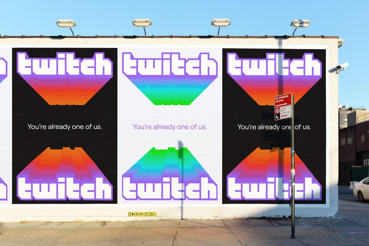
Twitch is getting a new look ahead of this year’s Twitchcon in North America, bringing a new logo, new purple color, and new font to the streaming site’s branding.
The new design has been a year in the making, says Byron Phillipson, the company’s executive creative director. The team went deep, he continued, digging into what makes Twitch Twitch. The idea was to future-proof the brand and to better represent its creator community. “I think the important feature is that we’re not tearing everything down,” says Phillipson. “Twitch is a brand that is loved by a lot of people, and we want to be very considerate to our community.” (He did add that the number of people with the Twitch glitch tattoo made the team give the refresh some extra consideration.)
The nuts and bolts: there is a new purple; there is a new font called Roobert, which is based on the Moog synthesizer typeface; there are around 20 new colors; and there is a new glitch. The net effect is that Twitch’s logo looks sleeker and more modern. It’s less blocky and way less 2011 than its predecessor. The new font is also accessible, says Tricia Choi, director of design systems, and there are plans to implement a high contrast feature; to that end, the company is hiring a program manager for accessibility and inclusive design, which points to its ambitions in that arena.
The change comes with a new slogan — “You’re already one of us” — which is meant to both welcome new creators to the platform who aren’t necessarily the company’s core audience of gamers and to showcase the variety of content that is already on the platform.


The new look will be paired with a large ad campaign featuring some of the platform’s biggest names to introduce it to the world. Phillipson says the company plans to bring “new folks to Twitch through the vehicle of our creators.” That seems to be at the heart of the redesign. It feels like the new look is meant to draw people in while keeping the focus squarely on the platform’s community.
During the research process, the company tried to identify a framework to guide the redesign. “The monster that we set out to fight in our mission was the fear of irrelevance,” says Phillipson. “Everything we do needs to be in service of making sure that the folks that are on our platform — our community — really feel like they matter.”
https://www.theverge.com/2019/9/26/20885219/twitch-redesign-accessible-logo-font-color-glitch-purple-twitchcon

