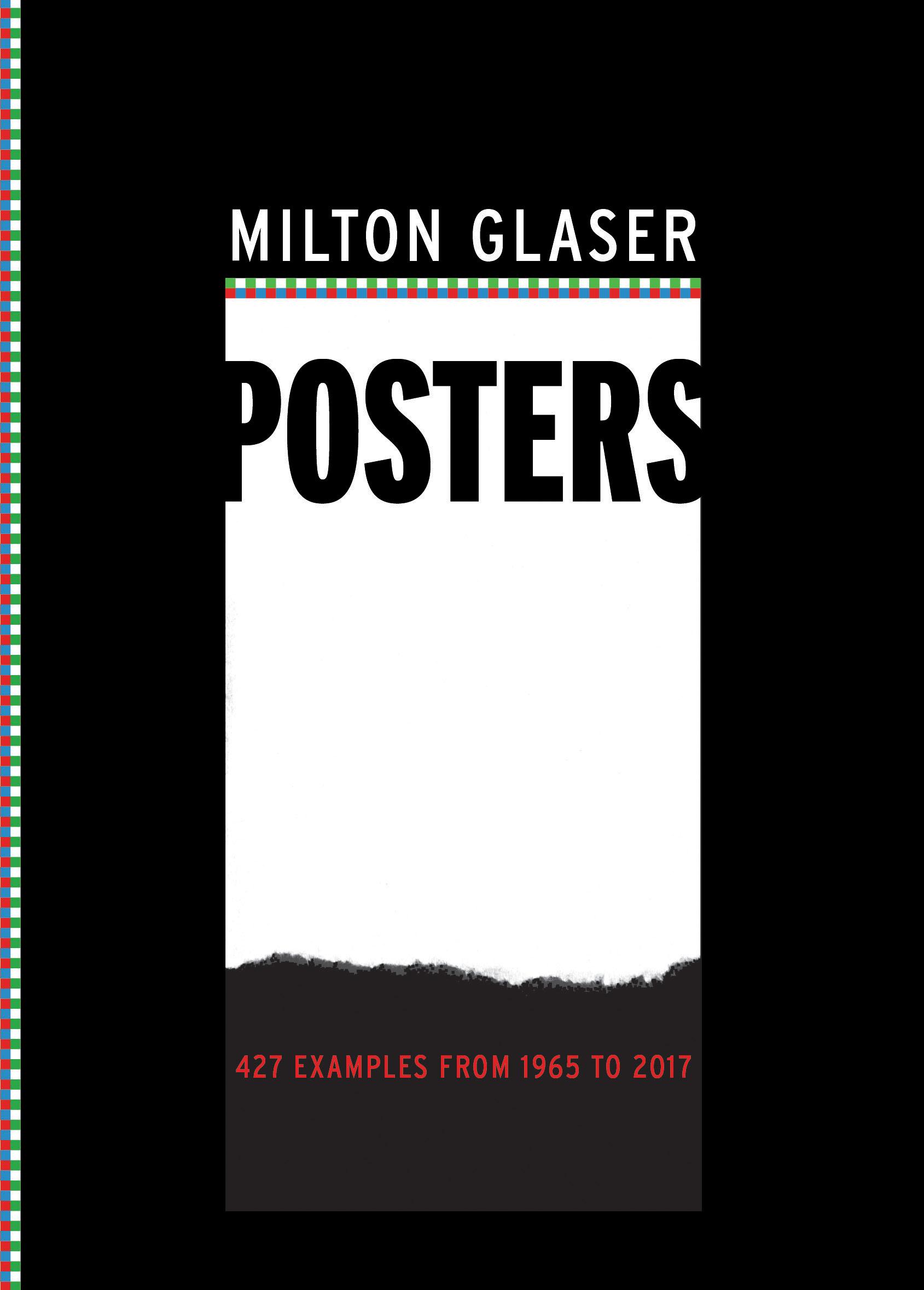
Luminary American graphic designer Milton Glaser, widely known for his ‘I Love New York’ iconic logo, is also notably a master of poster design. Throughout his extensive career ranging from 1965 until now, Milton has designed everything from his 1967 Bob Dylan ‘Greatest Hits’ poster for Columbia Records to numerous posters promoting his own university, the School of Visual Arts.
A collection of more than 450 Milton Glaser posters will be showcased in a book celebrating his hugely iconic work. The book includes all of his poster designs accompanied by Milton’s own commentary describing his creative process and visual expression, creating an insightful journey through the popular culture of half a century. Definitely a book for the coffee table or display shelf for any designers and illustrators.
Here we have featured eight posters from the collection – including posters of Elvis Presley and Bob Dylan for publishers and music record companies – and alongside each one we have published Milton’s own commentary.
Pre-order Milton Glaser’s Posters by Milton Glaser from Abrams for £22.99. Available from March 27.
Dylan
1967. four-colour offset lithography
Client: Columbia Records
Milton Glaser: “This poster, included with the 1967 Bob Dylan’s Greatest Hits album, is probably the best-known work of mine, with the exception of the “I Love New York” identity campaign. Why certain works become iconic is not easily understood, but here the celebrity of the subject is certainly part of the story.
“When I first encountered the Duchamp self-portrait below, I filed it away in my brain to use at some future time. The power of that simple silhouette against its background is overwhelming. The difference between influence and plagiarism is not always clear.”
I Love NY More than Ever
2001. four-colour offset lithography
Client: School of Visual Arts
Milton Glaser: “This was my response to the events of September 11, 2001. It was posted all over the city by students from the School of Visual Arts and accurately reflected the feelings of most New Yorkers in response to that horrifying day. A bureaucrat from the state called me, saying they would like to use the image but without the black mark on the heart.
“When I told him that that was the point of the poster, he threatened to sue me for being in violation of the state’s “I ♥ NY” logo. When I responded that I designed that logo, he said, “That’s why you should know better.” I sent a note to the governor, the mayor, and the New York Times. Two days later, the bureaucrat called back to suggest that we simply drop the matter.”
Elvis
1979. four-coluor offset lithography
Client: McGraw-Hill Book Company
Milton Glaser: “This portrait of Elvis represents him at his most innocent, before his physical decline. Early Roman paintings and sculpture show an almost identical face to indicate the ideal of male beauty. This poster also served as a cover for a best-selling book.”
Pasta
2006. four-colour offset lithography
Client: Allan Heller
Milton Glaser: “This poster was designed for the furniture manufacturer Heller as an introduction to his line of plastic, pasta-shaped pillows. The only clue that we are not talking about edible pasta is the measurement indicating that it is sixty centimetres wide—a mouthful even for ravioli lovers. The dimension wasn’t sufficiently visible, so almost all viewers think this is an ad for an unknown pasta maker.”
We Are All African
2005. four-colour offset lithography
Client: School of Visual Arts
Milton Glaser: “All proceeds from the sale of this poster went directly to organisations involved in the effort to improve conditions in Africa, including the International Rescue Committee, Doctors Without Borders, and the American Red Cross.”
Bach
1989. four-colour offset lithography
Client: Tomato Records
Milton Glaser: “Bach in a fuguing suit (the geometric pattern gets larger as it moves from the vest to the suit to the wall) as I imagined he might look today: an eccentric fellow but with a lot of flair. The idea of a fugue is that the theme is established and then played and varied according to a precise musical structure. I’m still not sure whether this idea comes through or if it contributes to understanding the message.”
Milton Glaser
1984. four-colour offset lithography
Client: Cooper Union
Milton Glaser: “I took a scrap of splattered paper and poked my hand through it to create this curious face that served as an announcement for a show of my work at Cooper Union, a great school and my alma mater.”
Southampton Writers Conference
2006. four-colour offset lithography
Client: Stony Brook Southampton
Milton Glaser: “A poster designed for the annual Southampton Writers Conference, organised by Stony Brook University. The goofy blue crab has become the identity for the writers’ program.”
https://mobile.digitalartsonline.co.uk/news/graphic-design/explore-milton-glasers-iconic-poster-designs-from-1960s-present-including-bob-dylan-i-love-new-york-more/

