At the mention of Foursquare, the first thing that comes to mind for many casual observers is the consumer app that launched in 2009—the early days of social media—that offered a way to “check in” at different locations, review businesses, read recommendations and get badges for their activity.
Since then, the company has evolved into a technology platform that quietly ensures that so many other top consumer apps—Uber, Spotify, Apple Maps, Airbnb—have accurate and smoothly running location services. Foursquare’s consumer-facing apps still exist in the forms of Swarm and Foursquare City Guide, but compared to those early days, they’re a smaller piece of what the tech company does overall.
In the last two years, Foursquare has made two major mergers and acquisitions, solidifying its position as the leader in location services technology. In May 2019, it purchased competitor Placed from Snap Inc., and in April 2020, it merged with location data company Factual. Heading into 2021, Foursquare will have a new chief executive at the helm after current CEO David Shim announced last month that he’s stepping down and will be replaced by Foursquare board member Gary Little, managing director at global merchant bank The Raine Group.
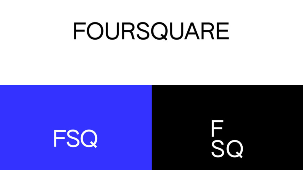
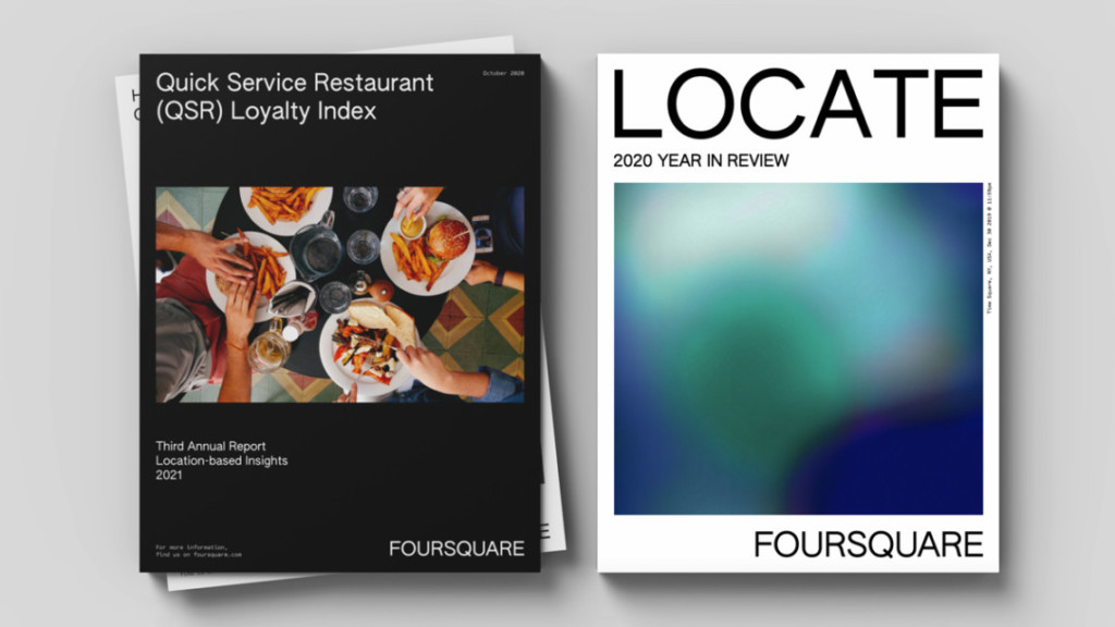
To mark this new chapter, the brand unveiled a new brand identity today that’s simpler and more modern to visually demonstrate the direction it’s headed. A clean, sans serif typeface replaces the blocky, superhero-style logo of its previous iteration, and photography and elegant gradients are incorporated as a nod to the brand’s location-based services.
“We’re past the adolescent phase of the company,” said co-founder Dennis Crowley. “We know who we are—we are an enterprise technology company; we’re the leader in location technology.”
A new look
As part of the rebrand, which L.A.-based design agency PlayLab, Inc. worked on, Foursquare has entirely revamped its website to introduce consumers, brands, partners and observers to its new visual identity. In addition to the main Foursquare logo, it’s also incorporating a truncated version of the name in FSQ, shorthand that’s long been used internally.

The gradient images, which add a mature pop of color to the new look, are developed using Foursquare’s location data.
“The whole idea behind the gradient was about trying to create art out of our data,” explained Foursquare creative director David Godycki. The data is completely anonymized, he said, and then run through an application that the team created in-house to show “how people move.”

“I’m really excited to where this could go next year,” continued Godycki. “We’re in the infancy with the idea. Right now, we’re just creating some gradients that are related to the company itself.”
This includes some of the art used on the website and in promotional materials, but also extends to personalized business cards for Foursquare employees. Each card is personalized per employee.
“We’ll see how it evolves and see how we can continue to build out the identity and use the idea of human movement to drive the visuals and the brand concept,” said Godycki.

Expert analysis
While the new visual identity comes at a critical moment for the brand, Georgetown University marketing professor Christie Nordhielm cautioned against asking too much of the logo itself.
https://www.adweek.com/digital/foursquares-brand-refresh-reflects-its-mission-as-a-location-based-services-company/

