

Adapting Frank Miller’s vision to be more PG-13, and less 300.
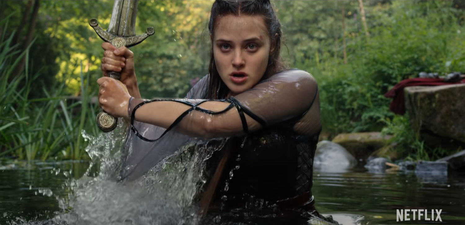
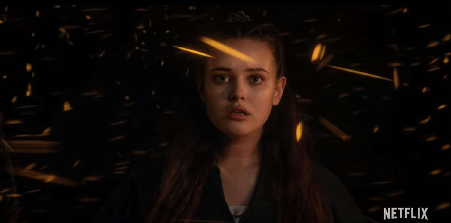
The Netflix series Cursed is a comic book-inspired retelling of the Arthurian legends – so you’d expect a lot of sword-fighting and bloody combat. Behind the scenes, VFX artists from Goodbye Kansas Studios had to work hard to make the violence look vivid and visceral, without making the action too intense for a young adult audience.
Cursed is based on a graphic novel written by Thomas Wheeler and illustrated by Frank Miller, the celebrated comic book writer who made the leap into cinema to make films like 300 and Sin City. Goodbye Kansas’ London studios worked on the VFX for Cursed, which tells the story of a young heroine called Nimue who is destined to become the Lady of the Lake and pass an ancient, legendary sword to King Arthur.
As well as building Pendragon Castle, one of the most iconic locations in the series, Goodbye Kansas was in charge of the sensitive job of creating blood and gore for the show’s action scenes. Artists and producers worked with Frank Miller, combining his famous graphic aesthetic with realistic touches required to ground Cursed in reality and make the action believable.
Ditch Doy, VFX supervisor, said: “Some of our work involved adding a bit of gore. I’m a huge fan of Frank Miller’s work, but even though we loved 300, we wanted Cursed to be violent, but believable.
“300 is based on a graphic novel and is a total blood fest. It looks really cool and has a beautiful stylish aesthetic – which wasn’t right for Cursed.
“We had to tread a fine line between making the show bloody enough to look stylised and cool, whilst making sure it didn’t go over the top. So we did a whole library of different squibs and splats so we could dial the violence up or down where necessary. It was a lot of fun!”
Frank Miller originally wanted to use the colour Pantone Warm Red C for the blood, but after experimenting with this vivid tone, Goodbye Kansas decided on a different approach.
“You can use Warm Pantone C as the colour of blood if you’re putting it on a page with a pen, but if you’re trying to place blood in a real environment with realistic lighting, it will just look like a weird glowing neon liquid,” Ditch adds. “Cursed was shot in a photorealistic environment with human actors, whereas 300 was filmed against a green screen and was effects driven.
“We tried the Warm Pantone C, but it didn’t work. You have to remember that VFX has to obey the physical lighting of the environment in order to look believable. If you have Pantone colour-blood lit with blue light, it’s jarring and takes the audience out of the scene and away from the drama. Instead of engaging with the action, they’re just wondering why there’s this neon red stuff all over the place.
“It was a learning curve, but I think our blood is still a little graphic, but realistic. We pushed it as far as we could whilst still keeping everything believable.”
The Goodbye Kansas team used a number of colours for the blood to fit the scene and generated the VFX in Houdini.
Ditch says: “We changed the colour depending on what it was doing and what the background looked like. If you get dark blood against a dark background, you won’t see it, so it had to be made more colourful with a red, gory specular tone. But if the background was light, then the blood could be black.
“We used Houdini to do the simulations which created the blood, because it’s very good at fluid dynamics.”
Cursed is available to watch now on Netflix.
Related: Goodbye Kansas on the making of Cyberpunk 2077‘s Keanu-tastic trailer
https://www.digitalartsonline.co.uk/features/motion-graphics/how-cursed-vfx-toned-down-gore-without-losing-its-edge/