The Kantar-award winner brings data to life in surprising ways – including a rebuttal of claims made by a certain world leader.
The recent Information is Beautiful awards from Kantar highlighted delightful projects in the datavis world like the Play-Doh-centric work of Amy Cesal, but it also showed how a good visual sense can help to hit hard-hitting facts home.
Case in point: Lena Groeger, San Francisco-based infographic designer and winner of Outstanding Individual at the awards for her mighty and varied work for the likes of non-profit newsroom ProPublica.
Singled out by the judges was her project What Happened to All the Jobs Trump Promised? (below), a joint report with Isaac Arnsdorf looking at over 30 separate claims of jobs created and announced by the current President of the United States. The work is a fine example of Lena’s knack for conveying data and findings using a smart visual hook, in this case a graph that whittles down the supposed number of jobs as you scroll along the article.
“I’d like to think that the Trump piece was recognised for making a point simply and clearly,” Lena tells me by email. “Often data visualisations are trying to explain very complex ideas or phenomena, but in our case, Isaac and I tried to focus in on answering a single question: Did Trump actually create all the jobs he promised? Turns out, he has not.”
When asked why she went with this particular method and petris dish-style visualisation of Trump’s fairytale jobs, Lena explains it was all inspired by the President’s infamously un-scientific proclamations.
“Because the exact number of jobs being promised or created were often fuzzy – ‘at least 10,000’, or ‘over 50,000’ – we wanted to convey a sort of roughness around the numbers,” she says. “A sort of blobby circle, we thought, conveyed quantity but not exact precision.
“At first we started with just dots, but wanted to humanise the graphic. These are promises about jobs for real people, after all. So at the last minute we decided to use real people instead of dots, taking advantage of a font that my editor had developed for ProPublica a few years back called ‘Wee People’.
“We thought it instantly made the graphic a little more tangible and less anonymous,” Lena continues. “Fun fact for you – most of the wee people icons were based on real ProPublica employees, and that’s me in the note that says ‘Each [] represents about 1,000 jobs.'”

Lena’s infographic portfolio though goes beyond shapes and icons, incorporating illustrations and even comic book strips in her mission to present a story in the most entertaining and informative way possible. But how does she settle on a medium for her work, and does have a wishlist of things she’d love to try out for a piece?
“I usually start with a feeling that a certain visual form might work well, or I might think about how other graphics I’ve seen solve the same problem,” Lena reveals. “For the Trump Jobs piece, I definitely drew inspiration from a piece by Haeyoun Park and Troy Griggs in the New York Times, about unauthorised immigrants in the US.
“The subject matter was very different, but the problem of how do you visually represent millions of people was similar, and so I took a similar approach. I usually have a running list in my head of graphics I’ve seen that solve specific problems that I’ll draw on when I need to come up with a new one.
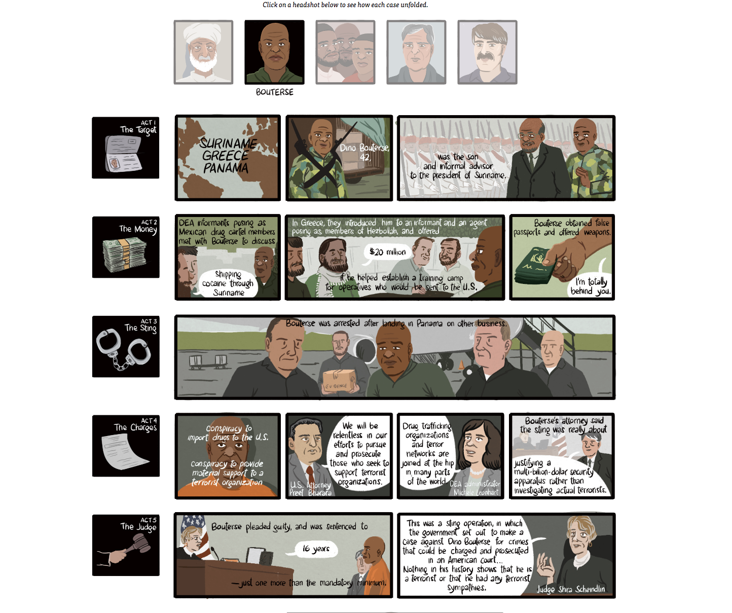
“Sometimes we have a form that we’ve wanted to try, say an investigative comic, and we’re just waiting for the right subject matter to come along. That’s definitely what happened in the narco terrorism piece we did (below).“

A lot of Lena’s works are solo efforts, while others are borne out of collaboration; while Lena pins down the ‘look’ of a story, another reporter provides the statistical meat and bones.
“Sometimes I’ll be working on my own piece, and responsible for the reporting, writing, design and development of a project,” as Lena says. “Other times I’ll work in collaboration with another reporter at ProPublica who has an interesting dataset, and we’ll work closely throughout the process, going back and forth on ideas and designs until we settle on the best visualisation or the best interactive.
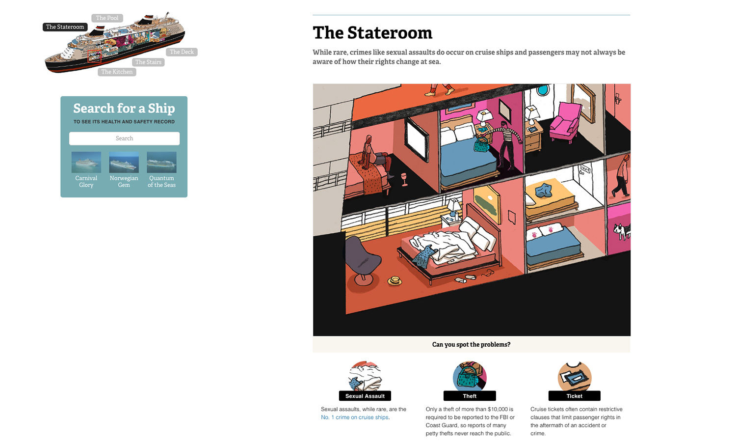
“Sometimes we’ll hire an outside illustrator (like we did with a project on public health and safety on cruise ships, below) to make a dataset really come alive. We are definitely not afraid to experiment.”

At the heart of each project though is the reader, and I ask Lena what advice she can give to designers on the art of presenting information.
“I would probably ask what advice those designers can give us journalists,” she jokes. “But if I had to pick something, it’d be to question your own assumptions going into any design or data visualisation.

“Seek out people who are different than you (aka, not another designer, and maybe someone who doesn’t look like you) for input and criticism. Think carefully about who you have in mind when you picture ‘the user’, and try to imagine a different person in their spot.”
Read next: Amy Cesal’s Play-Doh infographics bring fun and colour to datavis
https://www.digitalartsonline.co.uk/news/graphic-design/how-designer-lena-groeger-exposed-trumps-lies-using-stylish-infographics/

