

National Instruments becomes NI through a lavish design identity.
For 40 years, National Instruments has been a leader in test and measurement, fostering a devoted community of engineers that work to power the world’s most ground-breaking technologies and innovations. To continue to grow globally, the brand needed to speak to the needs of larger enterprises while remaining true to the community of passionate and brilliant engineers they’ve always served.
NY based studio Gretel’s brief was to evolve the brand to better reflect the business, helping to identify the human side of precision technology through a top-to-bottom re-evaluation of everything from purpose and values to the visual identity – even the name. Ryan Moore, ECD and Partner at Gretel told us how the rebrand took the company from National Instruments to the new NI.
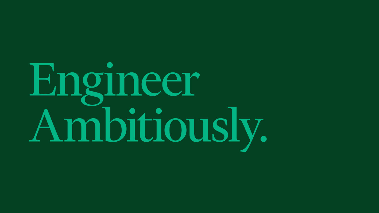
Engineer Ambitiously
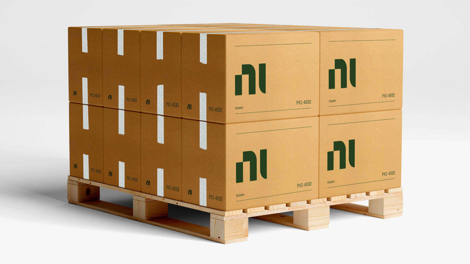
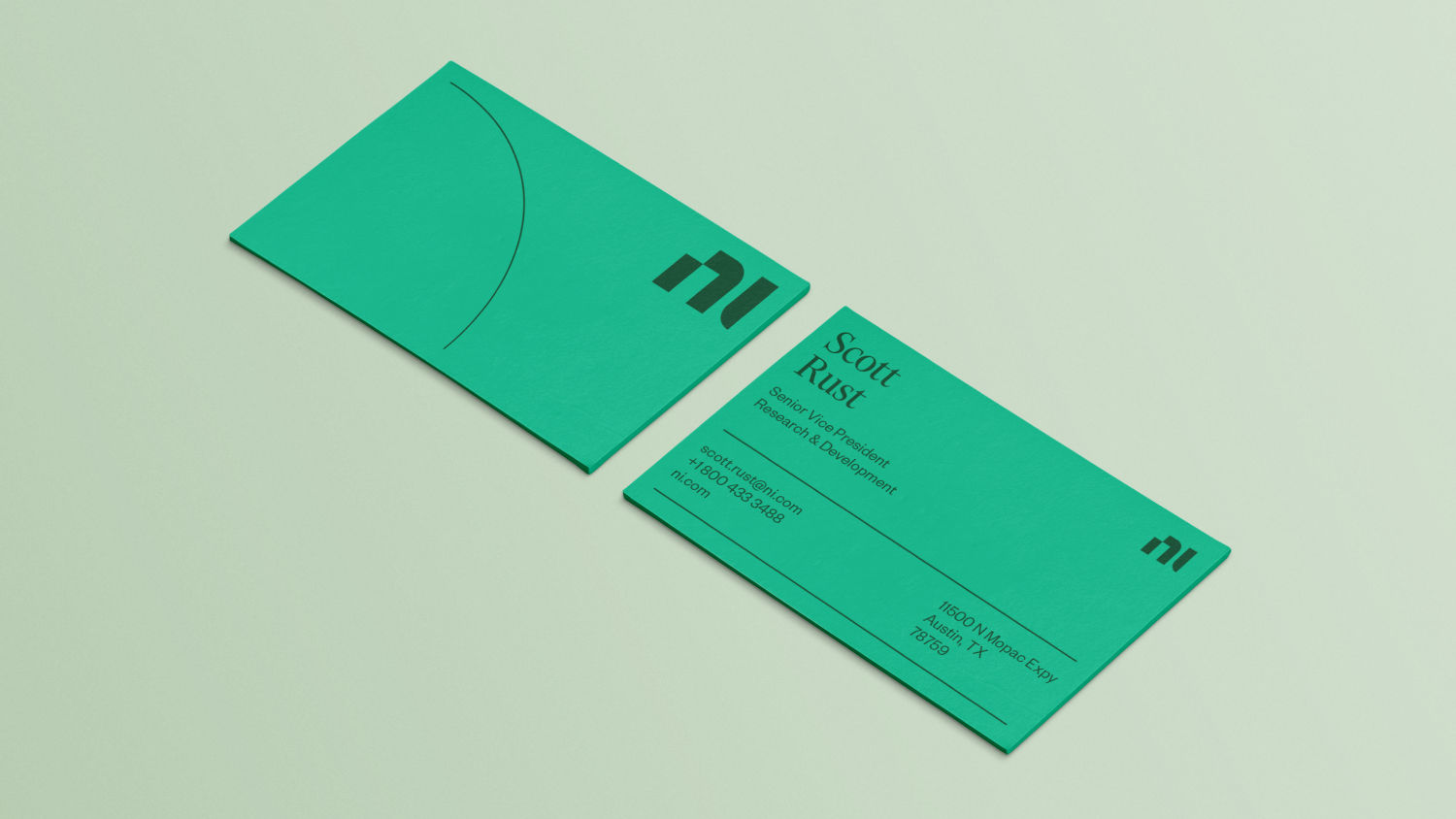
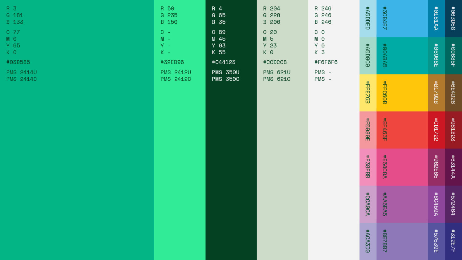
“We built a new, dramatically different brand. Different from where they were before and from everyone else in their category. We delivered a comprehensive brand strategy, voice, messaging and visual identity system including a new mark, colour palette, typography, illustration, photography, and motion. And of course we built tools and templates along with thorough brand guidelines to implement it all.
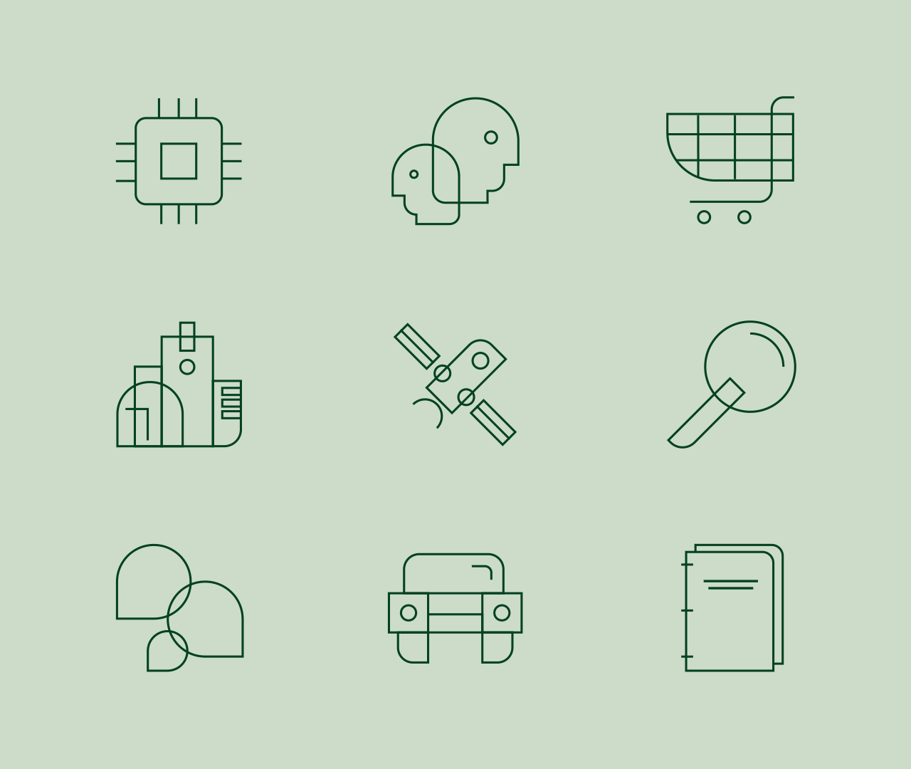
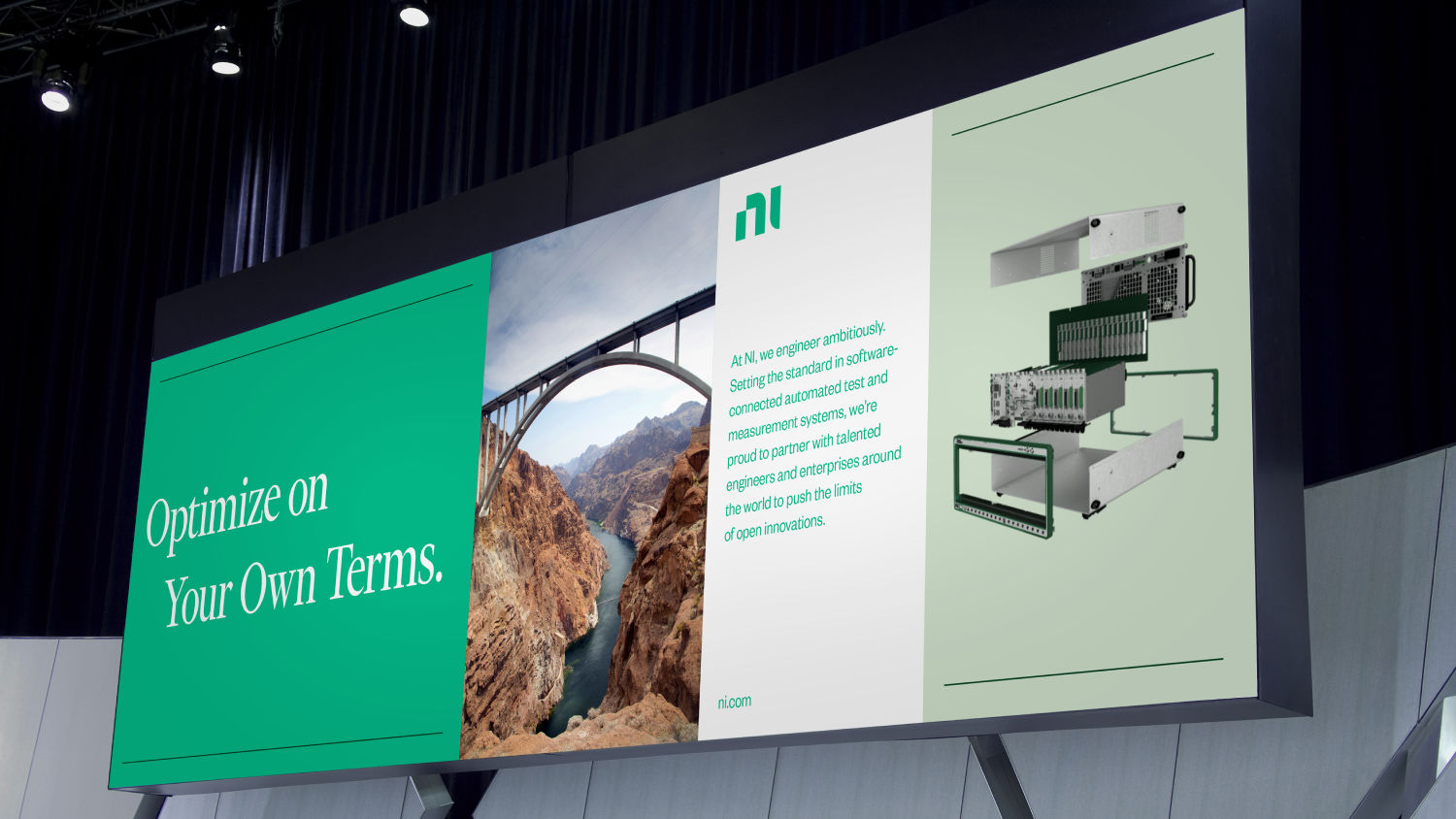
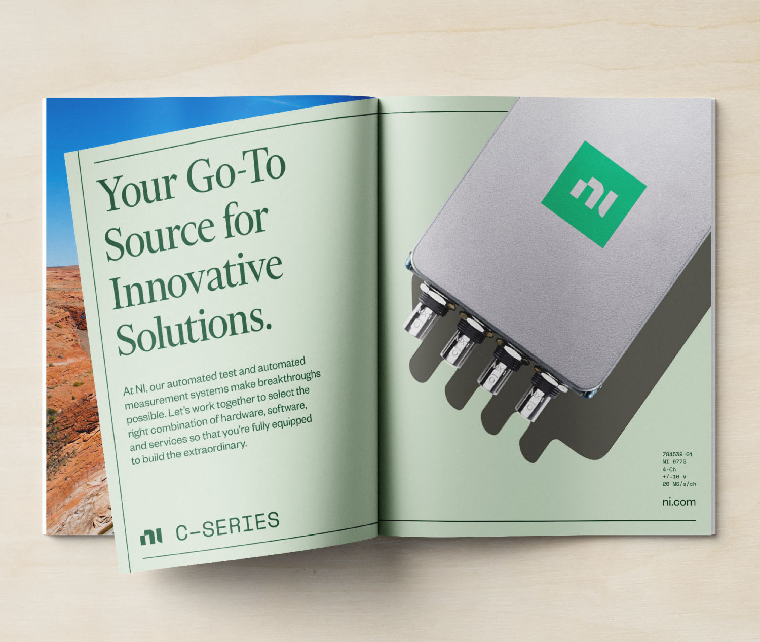
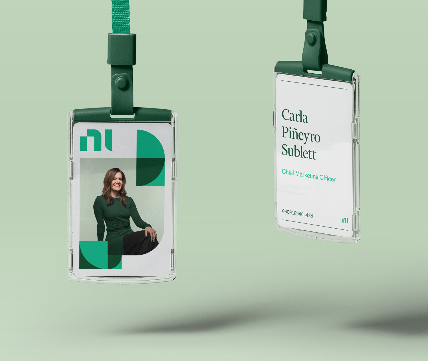
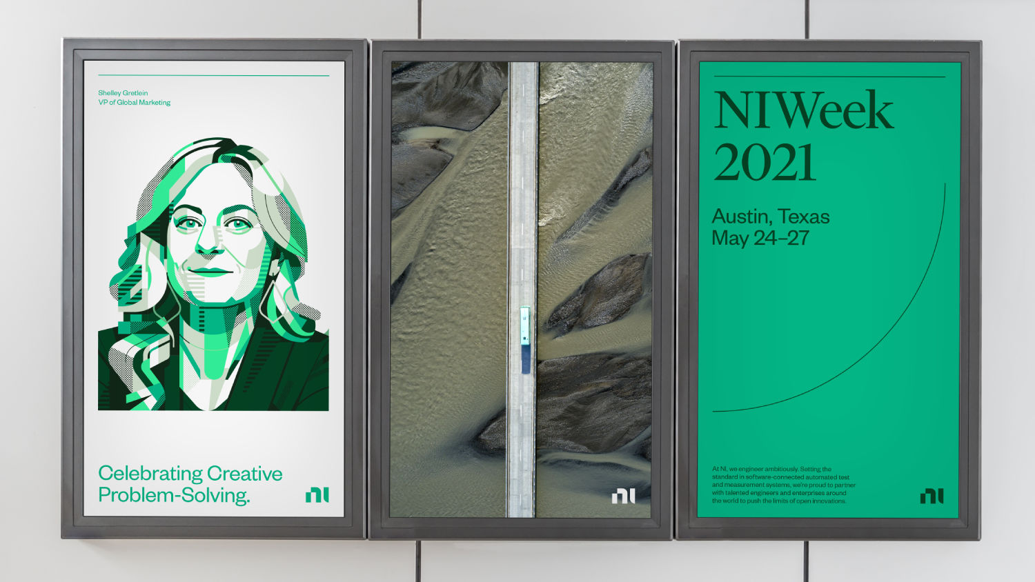
“Each component of the new brand identity reflects the balance between technical precision and human ingenuity at the heart of NI. It’s a deliberate contrast to the very tech-and-data-focused category, we wanted our design language to maintain an editorial feel. Photography plays a key role here by featuring the people, partners and impact of the innovations powered by NI, not just their products. The brand purpose, the colour palette, illustration and even the logo reflects the connection of hard and soft, rationality and creativity, tech and people.
“It’s all underpinned by the brand purpose: Engineer Ambitiously. Those two words are a great summary of how NI empowers innovation, both internally within its culture but also externally with its clients as well. The brand strategy, voice and messaging framework all anchor on those two words. To modernise, globalise and align better to the breadth of their offering we shifted the brand name from National Instruments to simply: NI.”
Challenges along the way
“At first, the entire category was a bit of a learning curve for our teams. Although the test and measurement space is pervasive across industries it’s still relatively unknown and invisible to the general public. It was helpful to simplify. We always referred to NI as a company that “makes the tech that makes everything work.” Once we had a base understanding of what NI did, getting up to speed on today’s biggest engineering challenges like 5G and AI advancements was enlightening for everyone involved.
“Many of the key stakeholders were engineers themselves and the company’s success is built on precision, data and quantitative metrics, so getting everyone to feel comfortable in making this very sweeping change in the way they present themselves to the world was a challenge.
Our strategy team fielded a global research study across three continents, had group discussion sessions at conferences, had intimate conversations with NI’s clients, colleagues and partners, all to ensure that everything we created was anchored in truth. Explaining the thinking behind each of the component pieces of the brand was critical. Every decision was thoroughly considered and rooted in our research, the landscape, the business and the culture.
“One unexpected challenge was photography, which plays a key role in the brand. We had planned a few shoots to help build up the initial image libraries at launch. We were able to capture some of the faces and personalities behind the innovation at NI in a staff shoot, but subsequent shoots to showcase clients, partners and global impact had been postponed due to the pandemic. Luckily we were able to supplement existing NI photography with licensed imagery, illustration and iconography to help fill the gaps that nicely complemented the rest of the identity.”


Flexibility and freedom
“We talk a lot about clarity, both in strategy and identity and we think this work exemplifies that. We love building systems that allow for flexibility and freedom. Because each element is anchored to the brand strategy, the individual components can be combined and remixed to yield a wide array of results that all stay on brand and feel uniquely NI. The client loved this flexibility, and understood it intuitively. This system of distinct and interchangeable components applies to branding and engineering alike.”

Related: The AI robots getting a retro Saul Bass twist
https://www.digitalartsonline.co.uk/features/graphic-design/how-gretels-rebrand-found-human-side-of-precision-technology/