

Create stylish festival campaigns that’ll catch young eyes using advice from promising newcomers in illustration.
You may not know them yet but the UK-based Rossetti sisters have been featured on DA before for their individual work – Lucia Rossetti was highlighted as a one to watch from the 2017 D&AD New Blood grad show, while by complete coincidence we awarded the same honour to Rosanna Rossetti a year later.
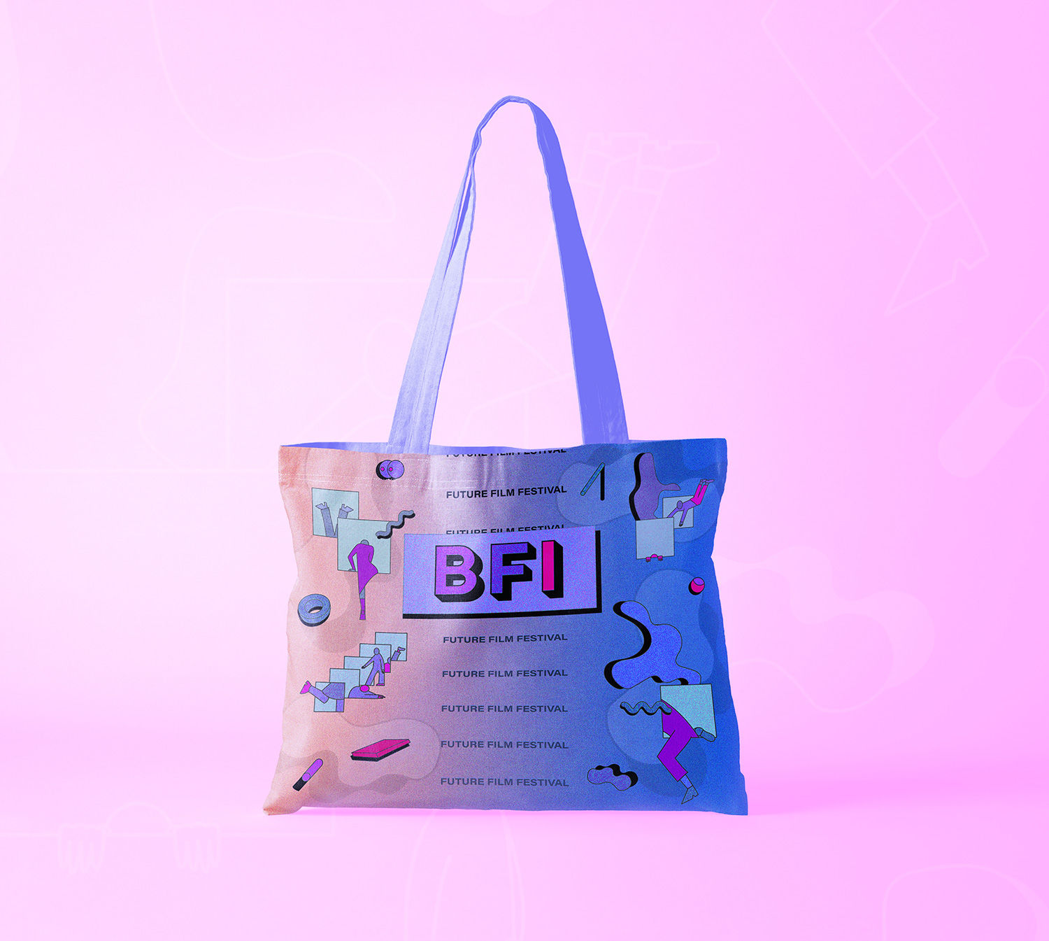
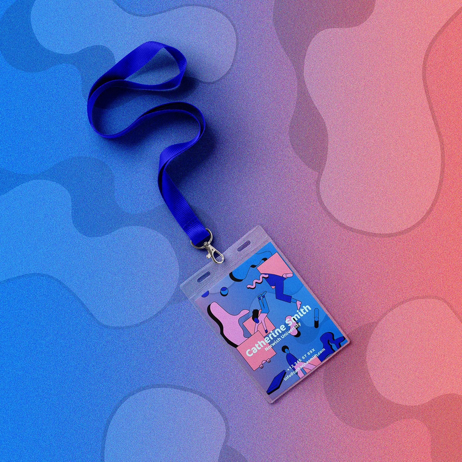
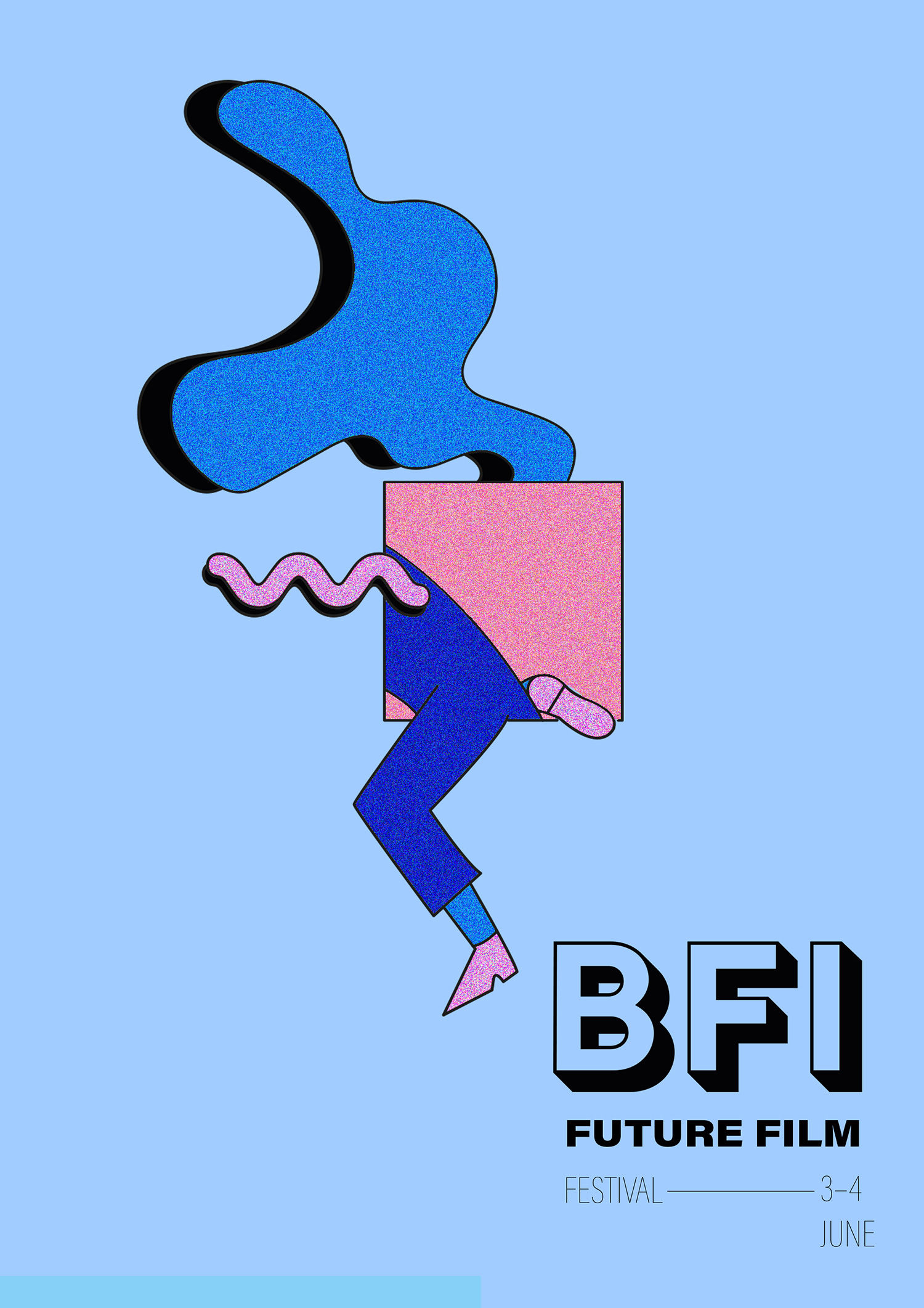
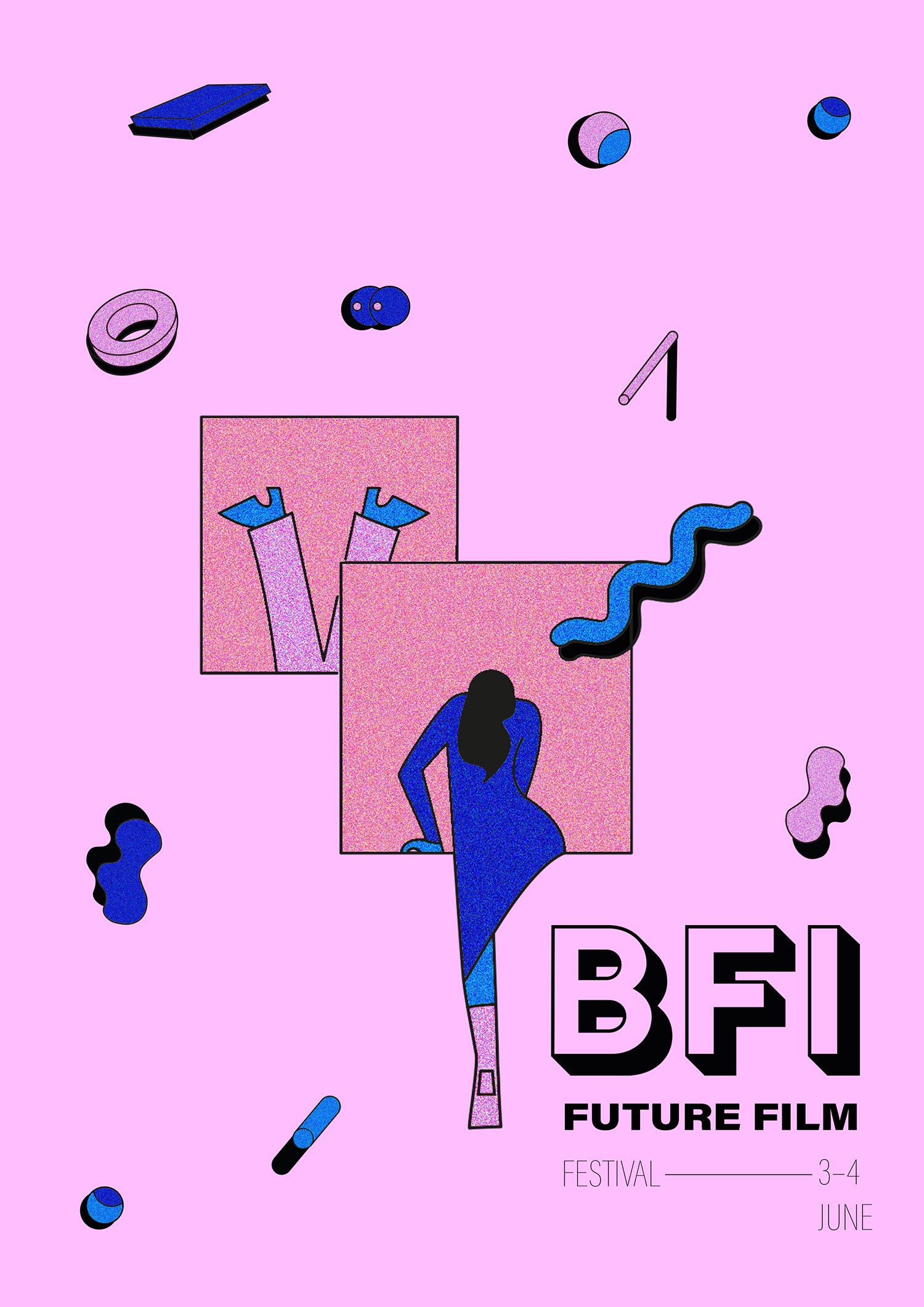
The pair collaborated last year after being tapped by venerable UK film institute the BFI to brand their annual Future Film Festival, taking place in London this February. Across a range of posters, tote bags and online material, the sisters stylishly incorporate the festival’s AR/VR focus for this year with some great graphics. You can see this great vision even on their unused concepts for the fest (below), which come infused with a moody neon look with grainy textures and characters stepping in and out of portals into other worlds.
“The BFI got into contact with us because the D&AD New Blood academy recommended Rosanna,” the sisters explain in a joint interview by email. “When we had our first meeting with the BFI they explained to us that they deliberately chose a young person to do the job because the nature of the festival is about nurturing fresh film talent.
“In that way they were an excellent client to work with as they took into consideration that we were juniors and still learning the ropes.”
“For the brief we were asked to create the artwork for the festival and then the BFI’s in-house designers would take it from there,” they continue. “So once it came to the illustrations we tried to create elements that are easily movable and customisable, that could then easily be placed onto merchandise and posters.
“When it came to showing the BFI our work we wanted to mock it up on different formats to give an idea of different ways the artwork could be used.”
Mocking up designs on physical items like ID badges and tees is an effective way for designers to sell their idea to a client, as the below images demonstrate. Note though that doesn’t necessarily mean you’ll need to work out the dimensions for when it comes to printing across such a wide variety of formats.
“We had the really fun job of creating the art work and didn’t have to think about the sizes of anything which made our jobs a lot easier,” the sisters reveal.
“The BFI made our jobs a bit easier by taking care of the specs and printing which was much appreciated as it allowed us to completely focus on the artwork”
As long as the image looks fine in the mockups, then, there won’t be that added stress as one might expect, especially with bigger clients .

Before starting your festival design project, it pays to research not only the theme of your event but also the history of it, especially if the event’s been running for a few years or more.
“The first thing we did was look at previous branding for the Future Film Festivals to see how other creatives interpreted the brief,” the duo explain.
“For the 2019 festival the British Film Institute wanted a virtual reality theme so we thought of lots of ways we could visually express this and looked at a lot of inspiration, especially on Pinterest and Behance.
“We think it’s important to make sure you’re clear on what the theme is and keep referring back to it as it’s easy to go off on a tangent.”
You should also think about your budget before launching straight into creating; this means deciding on what’ll be your main art form for the project.
“We also had to think about what medium we were going to use that wouldn’t blow our budget,” say the sisters. “Photography would have been really cool for this but it would have been expensive by the time we had hired out a studio and equipment.”
Just as important is knowing your audience. Looking around at other festivals is a good place to start, and the event which first shun a light on the sisters to both the BFI and us at Digital Arts proved to be an invaluable source of inspiration.
“The Future Film festival is aimed at 16-25 years old but the client and ourselves were clear that we didn’t want the festival artwork to be too childlike and in turn patronising for the younger audience,” they explain.
“We looked at existing festivals that targeted a younger audience, for example the D&AD New Blood Festival’s branding always does a really nice job of coming across up-to-date and cool, (evoking) a place where younger people would want to go and that’s the kind of feeling we wanted this festival to encapsulate.
“We both agree that it’s important for illustrators to always keep in mind the target audience for what they are creating to insure the best possible response.”
One way of doing this is to catch the eye, with the sister’s main aim for this project being to stand out from the thousands of adverts seen in London by creating a campaign both bright and unique.
A final piece of advice from the team is to be as flexible as possible with regards to your work.
“A big challenge was learning not to be overly precious about your work and accept that everyone has different opinions and tastes,” they conclude.
“We avoided disappointment by showing the work to the client as often as possible to insure lots of time didn’t go into something that wasn’t going to be used.”

Check out the Rossetti sister’s individual work on Behance through Lucia’s profile here and Rosanna’s homepage and own Behance page.
Read next: Charles Williams on designing music festival identities
https://www.digitalartsonline.co.uk/features/graphic-design/how-to-brand-a-festival-for-generation-z/